What is Synoptic Weather Map?
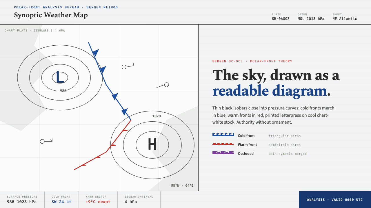
The synoptic weather map turns an atmosphere in motion into a disciplined page of lines, symbols, coastlines, and pressure.
Synoptic Weather Map in brief
A synoptic weather map is the working drawing of early-twentieth-century forecasting. Thin black isobars close into pressure curves; blue cold fronts and red warm fronts cross coastlines; H and L marks pin high- and low-pressure systems into place. Its achievement is not decorative illustration but legibility: the sky is made readable as a diagram.
The visual language belongs to synoptic meteorology and the Bergen School polar-front model. It treats weather as a field of connected forces rather than a collection of isolated icons. Curves describe pressure, fronts establish movement and encounter, and lettered pressure marks give the composition focal points. The resulting page feels both scientific and geographic.
As a design system, the style rebuilds the character of a printed chart: cool chart-white ground, black linework, cold-front blue as the dominant accent, restrained red for warm fronts, and the faint grain of letterpress printing. Triangles, semicircles, isobars, and coastlines form a strict line-drawn grammar. Every mark has a job, so the page stays calm even when it depicts unstable weather.
Where does Synoptic Weather Map come from?
The style emerged from synoptic meteorology in Western Europe during the first half of the twentieth century. Its central setting was Bergen, Norway, where the Bergen School developed an approach to weather that could be represented across a shared map rather than understood only as conditions at separate locations. The map became a practical surface on which changing systems could be read together.
Vilhelm Bjerknes and Jacob Bjerknes are the names most closely associated with this transformation. Their Bergen School front model formalized the relationship between air masses, pressure systems, and fronts around 1918–1922. That framework gave chartmakers a coherent symbolic vocabulary: pressure curves could be paired with front lines, and the state of the sky could be organized as a single visual field.
Halvor Solberg and Tor Bergeron belong to the same Bergen School context. Alongside the Bjerkneses, they anchor the design language in a collective scientific practice rather than in an individual graphic style. The recognizable map was shaped by the need for a common notation: marks had to remain intelligible when repeated, compared, and read across national meteorological services.
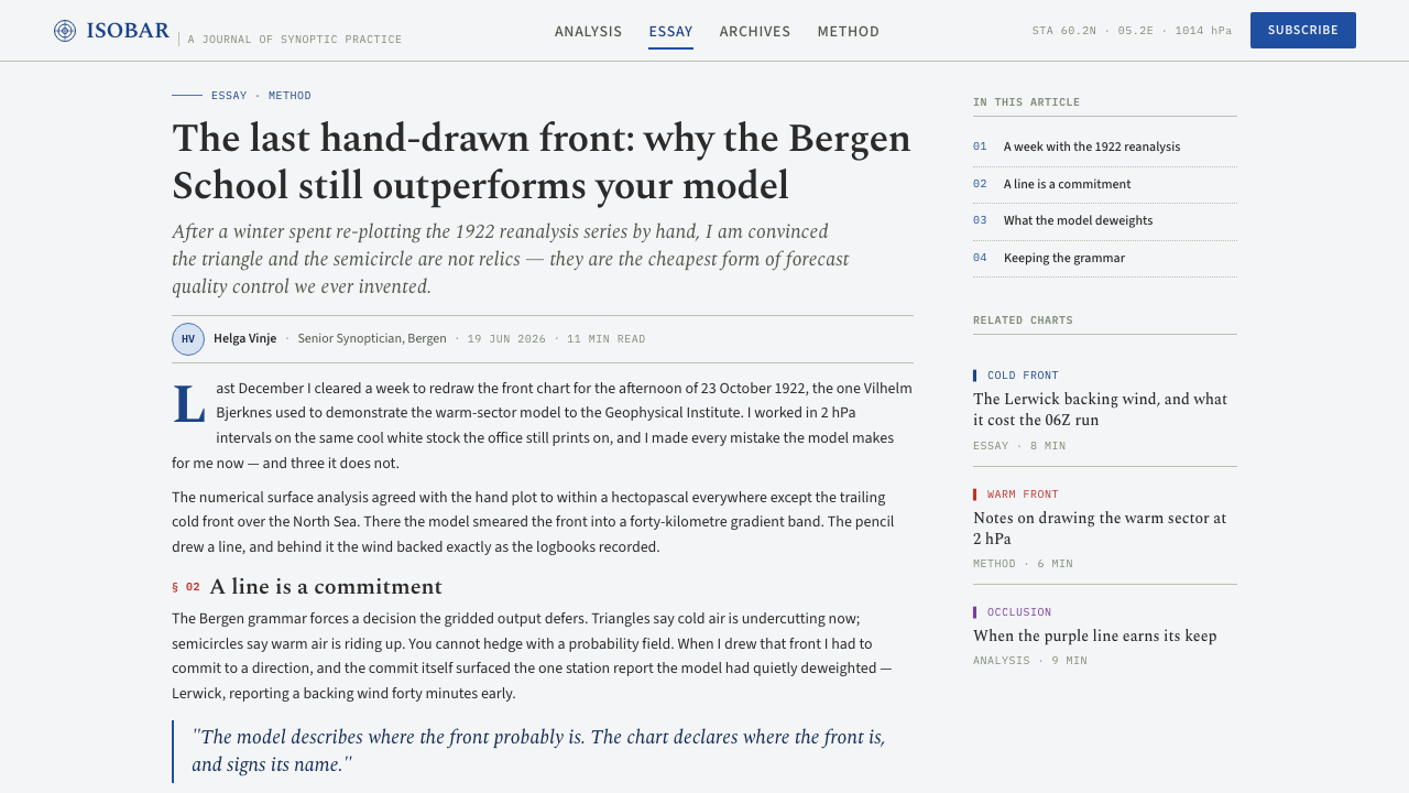
From roughly 1900 to 1950, standardized weather-chart cartography gave this notation its printed identity. Black linework carried the continuous structure of the chart; blue and red distinguished the two front types; coastlines supplied orientation without becoming pictorial scenery. The enduring appeal comes from that balance: geographic enough to locate oneself, abstract enough to reveal the system.
What defines the Synoptic Weather Map look?
Chart-White Ground
The background should feel like cool, slightly aged chart stock rather than a luminous digital canvas. It is quiet enough to carry dense information and tactile enough to suggest a working document. Any paper grain stays subordinate to the marks, recalling letterpress character without turning the map into a distressed poster.
Isobar Linework
Black isobars are the structural spine. They should remain fine, even, and continuous as they bend, close, and gather around pressure systems. Their authority comes from repetition and restraint: a curve is not expressive brushwork but measured evidence of an atmospheric pattern.
Front Symbols
Cold fronts are drawn in blue with repeated triangles, while warm fronts use red semicircles. The symbols create direction without requiring arrows or explanatory decoration. Their cadence makes movement visible: a front advances as a sequence of clear, repeated forms laid directly on the geographic field.
Pressure Anchors
H and L marks act as visual anchors amid the moving curves. Their simple typographic presence prevents the page from becoming an anonymous web of lines. They are not logos or decorative initials; they name the pressure centers around which the rest of the chart gains order.
Restricted Color
The palette is functional before it is expressive. Black carries measurement and geography, blue gives cold fronts their signature identity, and red is reserved for warm fronts. The contrast is immediate but never festive. Color separates meteorological roles, so adding unrelated accent colors weakens the map's logic.
Printed Precision
The preferred finish is precise but not sterile. Slight letterpress grain can soften large empty fields and make the diagram feel handled, archived, and reproducible. It should never interrupt fine symbols or make the chart seem handmade; the atmosphere is institutional, practical, and quietly physical.
Who shaped Synoptic Weather Map?
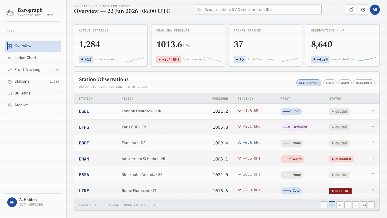
Vilhelm Bjerknes is a central figure in the Bergen School context from which the synoptic weather map gained its modern conceptual structure. His importance to this visual language lies in helping establish weather as a connected system that could be represented, studied, and communicated through a common map.
Jacob Bjerknes is closely associated with the Bergen School front model formalized around 1918–1922. That model made fronts central to the readable weather chart, giving blue triangles and red semicircles more than visual force: they became compact signs within a standardized account of atmospheric change.
Halvor Solberg belongs to the Bergen School group that shaped synoptic meteorology and polar-front theory. His place in the style's story emphasizes that the map was built through shared analytical practice, with conventions designed to be read consistently rather than treated as private visual expression.
Tor Bergeron is another key figure named within the Bergen School tradition. In design terms, that tradition matters because it joined scientific classification with standardized weather-chart cartography, producing a visual system where line, symbol, color, and geography all carry distinct responsibilities.
How do you use Synoptic Weather Map today?
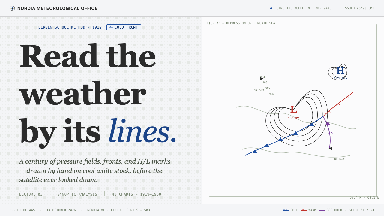
For presentation covers, use the chart as an atmospheric proposition rather than a literal weather report. Let a cropped field of black pressure curves establish the page, then place a single blue cold-front segment or a restrained H or L as the focal event. Titles should sit with the authority of a label on a working document: direct, spare, and clearly separated from the map marks.
Content slides benefit from the style's line-drawn hierarchy. Use a coast-like contour or an isobar path to organize sections, while keeping explanatory text in calm blocks that do not compete with the diagram. On data slides, charts should inherit the same discipline: black structural marks, blue for the primary active series, red only where a contrasting warm-front role is genuinely meaningful. The goal is analytical clarity, not decorative meteorology.
For web interfaces, the style suits dashboards, monitoring tools, research portals, and pricing or planning pages that need to make complex relationships feel navigable. Use a chart-white field, thin dark dividers, and sparse front symbols as navigational cues or status indicators. Panels should feel like portions of one large map, not unrelated cards piled on a screen; labels, lines, and selected states should share the same cartographic logic.
For editorial and marketing work, the system is especially effective when the subject involves change, conditions, routing, geography, or analysis. A feature story can use isobars to carry a reader through sections, while a campaign can frame a service as a system that turns uncertainty into readable signals. Keep imagery secondary or heavily integrated with the linework. The style is strongest when it remains a diagram with editorial confidence, not a costume pasted over generic copy.
The common mistake is to borrow the blue, red, and paper texture while abandoning the chart's functional grammar. Random triangles, oversized H and L marks, decorative contour lines, and unrelated nautical imagery make the result feel like vintage weather merchandise. A convincing application assigns every line, symbol, and color a communicative role. If a mark cannot be read as part of the system, remove it.
Synoptic Weather Map — FAQ
Is this style simply a vintage map aesthetic?
No. Its vintage character comes from printed-chart materials and early-twentieth-century cartography, but its core is operational. Isobars, front symbols, pressure marks, and coastlines form a notation for reading connected conditions. A design can look old without using this system; it becomes synoptic-weather-map inspired only when its marks remain organized as meaningful evidence.
Can the style work without a literal map or coastline?
Yes, provided the diagram retains spatial discipline. Isobars can become organizing curves across an interface or publication, and front symbols can indicate transition, contrast, or movement. Without geography, however, the composition needs another clear field of reference. Otherwise the marks lose the cartographic relationship that makes them readable rather than ornamental.
Why is blue the dominant accent rather than red?
The supplied visual system identifies cold-front blue as its signature accent and reserves red for warm fronts. This produces a stable hierarchy: blue can guide the eye through the chart, while red appears as a specific contrasting condition. Giving both colors equal visual force makes the front notation harder to scan and reduces the map's quiet analytical character.
What should replace icons in a synoptic-weather-map interface?
Prefer the system's own signs: a short front segment, a pressure letter, a contour fragment, or a carefully drawn directional relationship. These elements work best as cues embedded in labels and geography, not as a large icon set. The style gains coherence when interface signals look like observations on one shared chart.
Related design styles
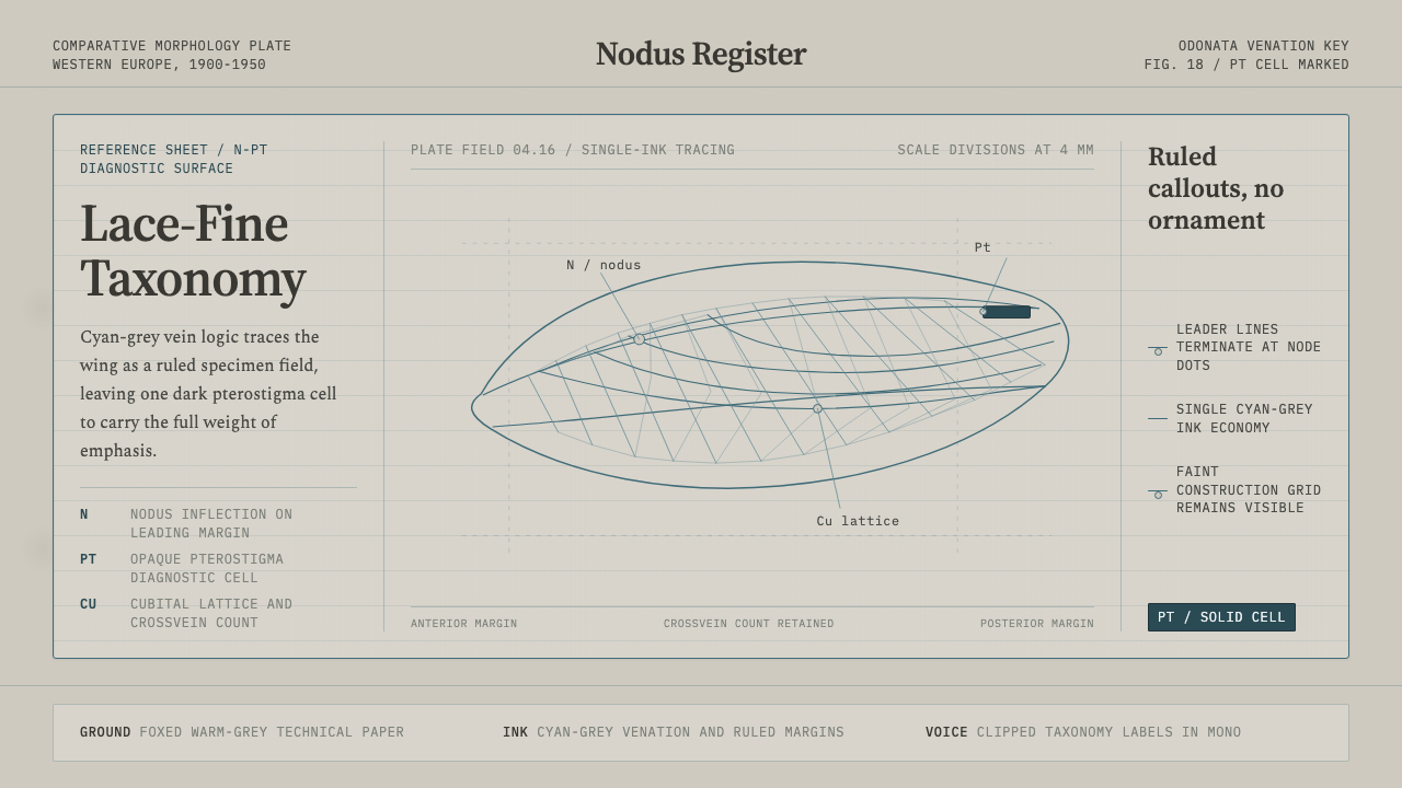 Dragonfly Wing VenationPrecision, nearly weightless. Cyan-grey veins rule a foxed paper taxonomy pla…
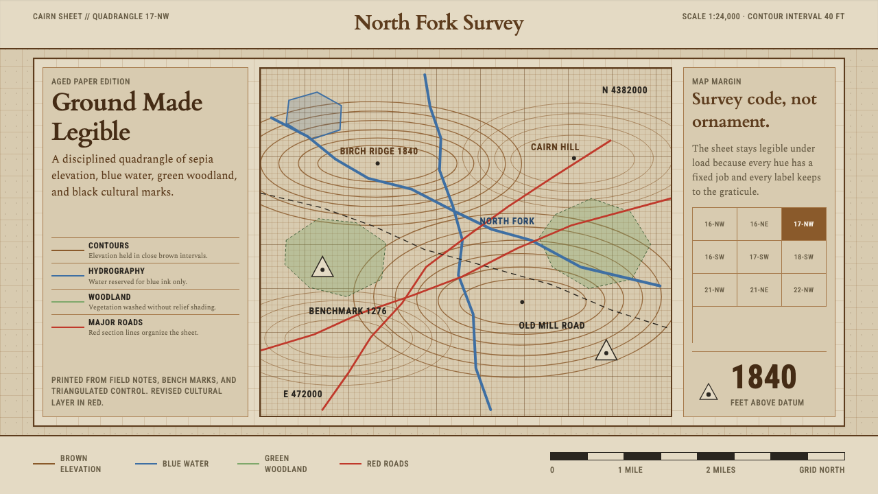 Topographic Survey MapMeasurement becomes beauty. Sepia contours and blue hydrography sit on aged m…
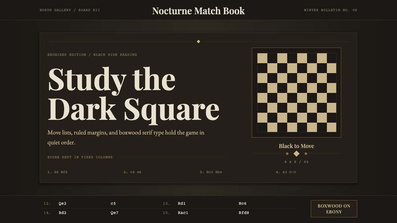 Chess TournamentQuiet intellect. Cream Playfair type, walnut rules, and notation glow on ebon…
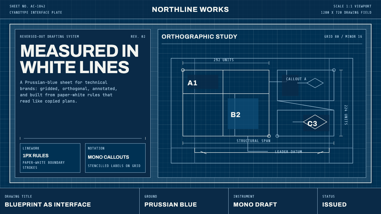 Architect CyanotypePrecision in negative. Prussian blue ground, paper-white grid, mono dimension…
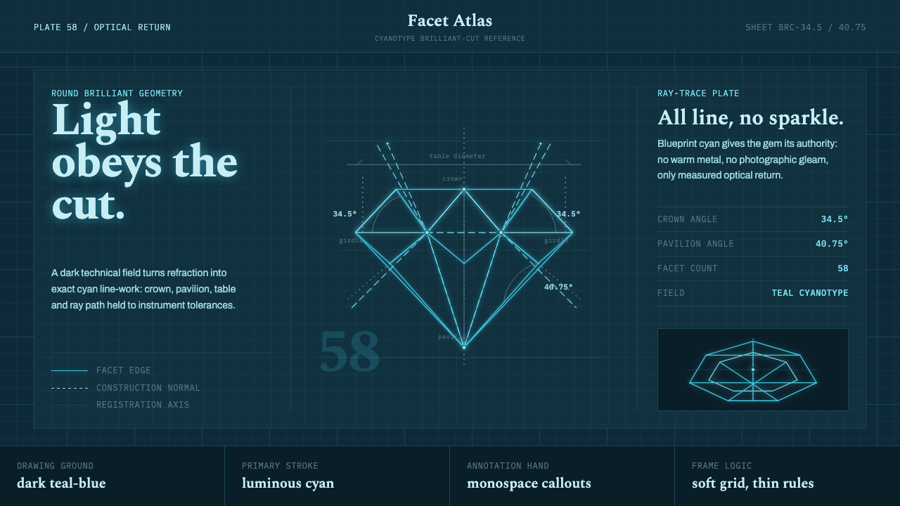 Brilliant Cut Facet DiagramOptics becomes blueprint. Cyan facet lines and ray paths glow on dark teal.
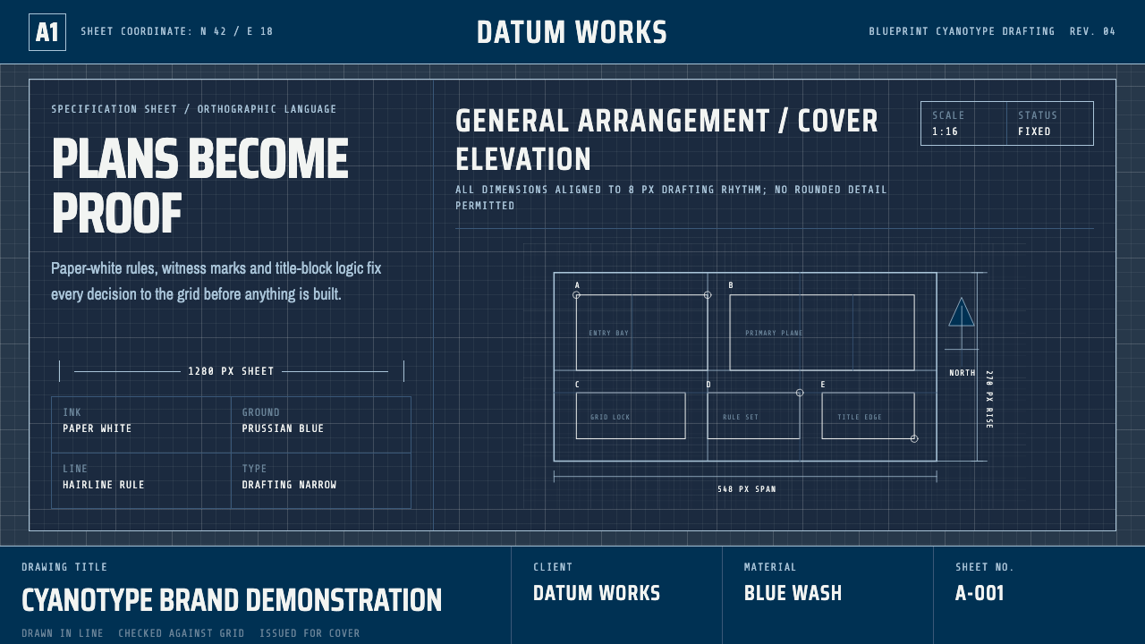 Cyanotype BlueprintPrecision is the ornament. Prussian blue grid, paper-white hairlines, and tit…