What is Brilliant Cut Facet Diagram?
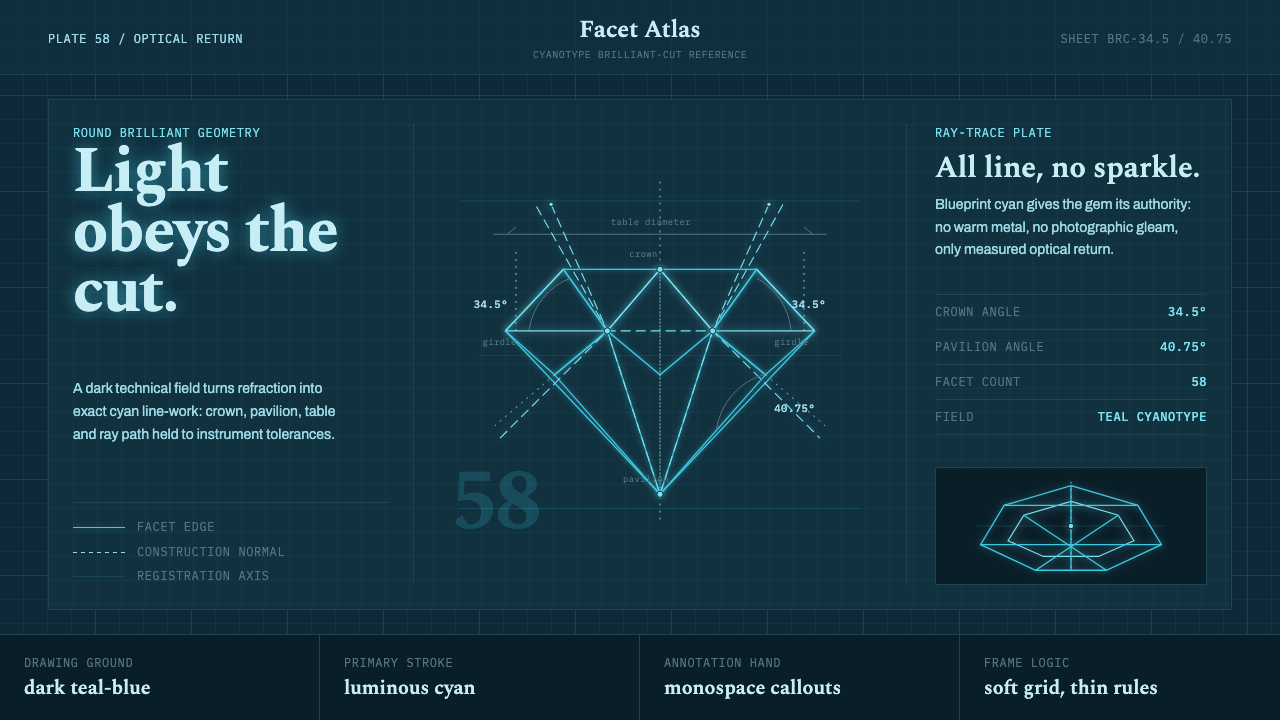
Brilliant Cut Facet Diagram turns a diamond into an optical argument — luminous facet lines, measured angles, and disciplined ray paths suspended against a dark technical field.
Brilliant Cut Facet Diagram in brief
Brilliant Cut Facet Diagram is a visual system derived from Marcel Tolkowsky’s 1919 book Diamond Design and its optical construction of the round brilliant cut. Instead of presenting the diamond as luxury photography, polished merchandise, or decorative crystal, it treats the stone as an engineered arrangement of planes. Crown and pavilion sections, facet boundaries, dimension marks, construction normals, and paths of refraction become the primary imagery.
Its defining transformation is an inversion of the original technical plate. Tolkowsky’s thin black line-work on white becomes luminous cyan drawing on a dark teal-blue field. The result evokes both an optical laboratory diagram and the cyanotype reproduction lineage of engineering blueprints. Everything remains linear: facets are outlined rather than filled, rays pass through the structure as directed trajectories, and labels sit close to the geometry they explain.
The style depends on the tension between scientific restraint and the inherent brilliance of its subject. It does not imitate sparkle with photographic highlights or faceted gradients. Instead, luminosity is suggested through contrast, repetition, and the convergence of precise lines. The diamond appears valuable because its optical logic is exposed with unusual clarity; the diagram itself becomes the object of fascination.
Where does Brilliant Cut Facet Diagram come from?
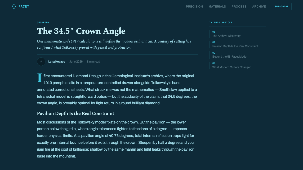
The system begins with Diamond Design, published in 1919 by the engineer-gemologist Marcel Tolkowsky. Working within the diamond-cutting world associated with Antwerp and London, Tolkowsky approached the round brilliant cut through first principles of optics. The problem was not merely how to arrange a pleasing pattern of facets, but how crown and pavilion geometry could capture incoming light, redirect it inside the stone, and return it toward the viewer.
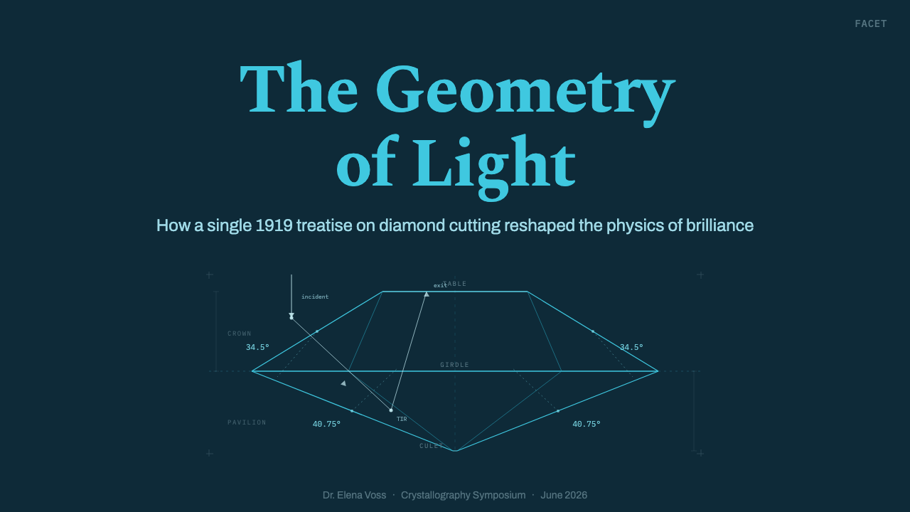
Tolkowsky’s argument was communicated through technical plates rather than glamorous representations. Crown sections and pavilion sections reduced the stone to a controlled profile. Refraction paths showed light changing direction as it entered, while total-internal-reflection paths demonstrated how rays could be retained and redirected within the pavilion. Dotted construction normals clarified the geometric basis of those changes. Angle callouts such as 34.5° and 40.75°, together with the 58-facet arrangement and dimension figures, made the cut readable as a calculated optical structure.
The original visual language belonged to engineering publication: thin black marks, white paper, sparse annotation, and diagrams whose authority came from their economy. It shared the broader logic of technical drawing, in which a line is not expressive decoration but a claim about structure, direction, measurement, or causality. The diamond’s familiar associations with glitter and luxury were secondary to the plate’s explanatory task.
Brilliant Cut Facet Diagram reissues that material through the reproduction language of the blueprint. The field becomes dark teal-blue and the line-work turns luminous cyan, recalling a cyanotype technical print without abandoning the source diagram’s precision. This inversion changes the emotional register: the plate no longer feels like a page extracted from a treatise, yet it remains recognizably analytical. Optics becomes atmosphere, but the atmosphere is produced entirely by preserving the blueprint’s disciplined system of evidence.
What defines the Brilliant Cut Facet Diagram look?
Optical Cyan Palette
The palette is intentionally narrow: luminous cyan lines occupy a dark teal-blue ground, with restrained lighter accents reserved for the most important rays, labels, or intersections. The background should feel deep enough to hold the diagram like an illuminated instrument panel, but not so black that the blueprint lineage disappears. Color distinguishes information through relative brightness and emphasis rather than through a collection of unrelated hues.
Line Without Fill
Facet geometry is constructed entirely from outlines. Large solid planes would turn the diamond into an emblem or illustration, while the unfilled network preserves its analytical character. Every segment should appear to describe a boundary, axis, section, or optical event. The density of overlapping lines can create visual richness, but that richness must emerge from structure rather than surface treatment.
Facet Geometry
The round brilliant is presented as an ordered relationship between crown, girdle, and pavilion rather than as a sparkling silhouette. Repeated triangular and kite-like divisions establish the 58-facet logic, while sectional views reveal how the visible pattern relates to depth. Symmetry is important because it communicates the cut’s coherence, yet sectional diagrams and off-axis ray paths prevent the composition from becoming merely ornamental.
Ray Paths and Normals
Directed ray paths provide the diagram’s narrative motion. They enter the crown, bend at a surface, travel through the stone, meet the pavilion, and return according to the optical argument. Dotted normals act as quiet explanatory scaffolding, distinguishing construction from the principal geometry. Rays may receive stronger emphasis than facet boundaries, but they should remain precise trajectories rather than expressive beams or atmospheric glows.
Measured Annotation
Angle callouts, dimension figures, leader lines, and concise labels are integral visual components rather than captions added afterward. The 34.5° crown reference, the 40.75° pavilion reference, and the 58-facet structure communicate that the form has been derived, not improvised. Annotation should cluster near the geometry it explains, with enough separation to keep intersecting rays and measurements legible.
Technical Typography
Typography should feel neutral, compact, and subordinate to the drawing. Headings may carry the authority of a plate title, while labels function like coordinates in an optical proof. A restrained sans-serif voice suits the blueprint reinterpretation, provided it does not become futuristic display lettering. Hierarchy comes from placement, capitalization, and relative scale, with generous dark space protecting the diagram from typographic noise.
Controlled Luminosity
The diagram appears luminous because bright lines are isolated against a dark field, not because every element is surrounded by a diffuse effect. Key intersections and principal rays may feel more radiant, while secondary construction remains quieter. This controlled hierarchy preserves the sharpness of technical drawing. When every line glows equally, the distinction between facet, ray, normal, and annotation collapses.

Who shaped Brilliant Cut Facet Diagram?
The engineer-gemologist behind Diamond Design, Tolkowsky supplied both the intellectual foundation and the visual source for the style. His optical derivation connected crown and pavilion geometry to the capture, internal redirection, and return of light. Just as importantly, his plates showed how a diamond could be explained through sections, ray paths, normals, and measurements rather than through pictorial sparkle.
Published in 1919, Diamond Design is the source work from which the system draws its subject, vocabulary, and explanatory discipline. Its technical plates organize the round brilliant as an optical problem and make calculation visible through thin line-work. In the contemporary reinterpretation, the book’s white page and black marks are inverted into the dark field and luminous cyan structure of a blueprint.
The round brilliant cut is the central geometric subject: a 58-facet structure understood through crown and pavilion relationships, section drawings, and controlled ray paths. Within this visual system it is not a decorative diamond icon. It is a compact optical machine whose apparent brilliance emerges from the organization of planes and the movement of light through them.
How do you use Brilliant Cut Facet Diagram today?
For presentation covers, use one commanding facet diagram as the entire visual premise. A crown profile, pavilion section, or frontal facet network can occupy the field while the title aligns with a construction axis or sits in an area of uninterrupted darkness. A small plate label or angle callout can establish technical context. Avoid placing a photographic diamond beside the drawing; the diagram should carry both identity and atmosphere.
Content slides work best when they behave like annotated plates. Divide the page through alignment rather than boxes, keep explanatory text in compact groups, and connect each group to a relevant facet, ray, or section with restrained leader lines. Preserve a clear hierarchy between primary geometry, optical paths, auxiliary normals, and prose. For sequential explanations, reveal the argument conceptually: incoming ray, refraction, internal reflection, and return.
Data slides can translate values into the same language without pretending that every chart is a gemstone. Use thin axes, measured labels, radial comparisons, sectional schemes, and concise legends that share the diagram’s cyan-on-teal discipline. A central geometric construction may organize categories around it, while conventional bars or lines remain available for accurate comparison. The style should clarify the data through technical order, not force decorative facets onto unrelated quantities.
For web interfaces, the system suits analytical dashboards, technical product pages, and pricing comparisons that benefit from precision and controlled luminosity. Dark panels can hold line-based diagrams, while brighter cyan accents identify active states, key totals, or selected tiers. Pricing cards should resemble coordinated specification plates rather than glowing luxury boxes: concise headings, orderly feature lists, measured dividers, and one clearly dominant action. Editorial and marketing pages can alternate expansive diagrams with narrow explanatory passages, using angle callouts and sectional details as navigational landmarks.
The most common mistake is confusing blueprint luminosity with generic neon futurism. Excessive glow, many competing colors, dense interface chrome, or decorative circuit patterns weaken the connection to Tolkowsky’s optical plates. Another error is using the diamond outline without the evidence that makes the style distinctive. Facet boundaries, ray behavior, normals, dimensions, and disciplined annotation must remain meaningful; otherwise the result is merely a cyan gemstone on a dark background.
Brilliant Cut Facet Diagram — FAQ
Is Brilliant Cut Facet Diagram simply a luxury jewelry style?
No. Its subject is a diamond, but its governing language is engineering explanation. Luxury imagery usually emphasizes material surface, rarity, reflection, and sensual polish. This system suppresses those qualities in favor of sections, rays, measurements, and construction logic. It can support a premium impression, but that impression comes from precision and intellectual clarity rather than opulent decoration.
Why use a dark teal-blue ground instead of reproducing the original white plates?
The dark ground reframes the technical drawing through the blueprint and cyanotype reproduction lineage. It allows cyan lines to appear luminous while preserving the source material’s dependence on line, contrast, and annotation. The inversion creates a more atmospheric contemporary system, but the underlying discipline remains the same: no pictorial fill is needed for the geometry to communicate.
Does every composition need the complete 58-facet diagram?
No. A full facet network is useful when the complete cut is the subject, but a crown section, pavilion detail, ray-path sequence, construction normal, or measured angle can carry the style independently. What matters is that the fragment remains structurally intelligible. Cropping may heighten drama, provided it does not turn meaningful geometry into arbitrary diagonal decoration.
How should photography be combined with the diagram?
Photography should remain secondary and carefully separated from the explanatory line system. A rendered or photographed diamond can provide material context, but placing it directly beneath dense facet lines often muddies both layers. A stronger approach is to alternate image and diagram, isolate the photograph within a quiet field, or pair a material view with a distinct sectional plate. The diagram must remain readable as evidence, not become a decorative overlay.
What separates this style from a generic science-fiction interface?
A generic science-fiction interface often uses luminous lines as atmosphere without requiring them to explain anything. Brilliant Cut Facet Diagram gives each line a role grounded in optical construction: facet boundary, section, ray, normal, leader, or dimension. Its visual authority comes from the correspondence between mark and meaning. If the geometry, labels, and rays cannot be interpreted as parts of a coherent optical argument, the design has left the style’s historical and technical foundation.
Related design styles
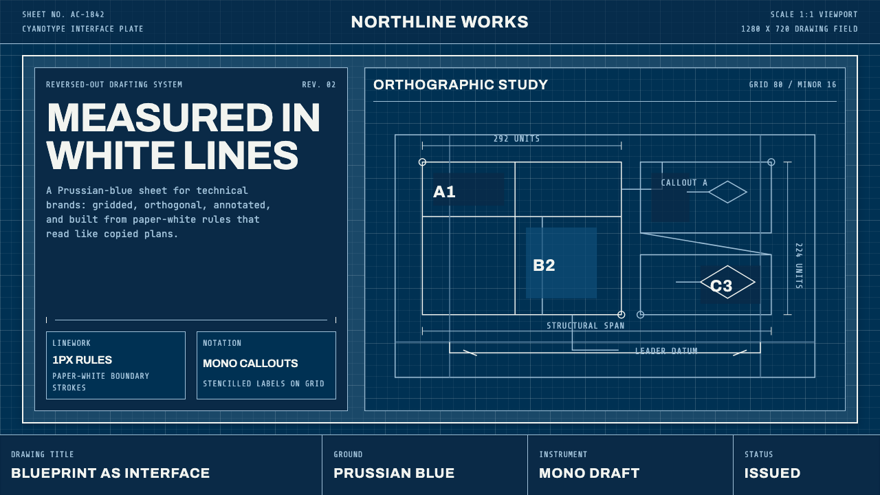 Architect CyanotypePrecision in negative. Prussian blue ground, paper-white grid, mono dimension…
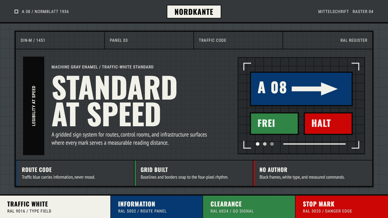 DIN 1451 SignageAuthorless and exact. Enamel gray grid, traffic-white DIN type, and RAL signa…
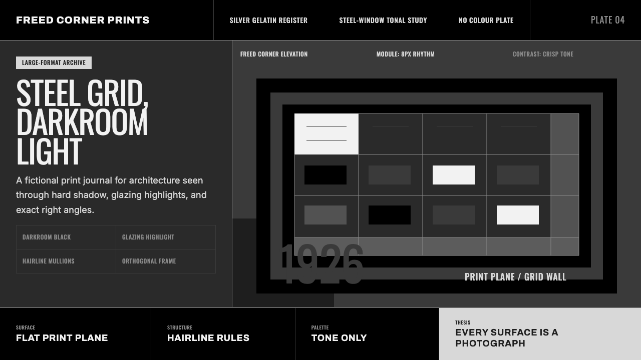 Dessau GrayscaleAustere monochrome authority. Darkroom black, glazing gray, and a steel-windo…
 Frutiger CDG AirportLegibility at runway scale. Navy panels, white humanist sans, arrow-led grids.
 Transport UK Road SignsClarity at seventy. White mixed-case lettering advances across recessive moto…
 Cyanotype BlueprintPrecision is the ornament. Prussian blue grid, paper-white hairlines, and tit…