What is Hydrogen Airship Freight?
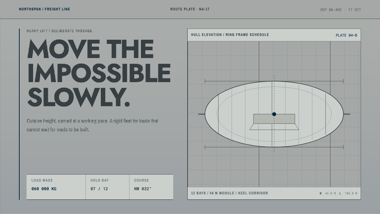
Hydrogen Airship Freight presents slowness as a capability — a matte aluminum-gray ground, hairline blueprint drawings, and the plain typography of a cargo operations manual.
Hydrogen Airship Freight in brief
Hydrogen Airship Freight is a design language modeled on the paperwork of rigid airship cargo operations: the timetables, mooring-mast rigging plates, hold designations, and load and center-of-gravity charts that surrounded a vehicle the size of a building. It draws on the era of rigid airships, from 1928 to 1940, and on the freight revival of the 2010s to the present, and it treats the two as one continuous idea — lighter-than-air transport as a patient, heavy-lifting service rather than a spectacle.
Its ground is the airship's own skin. The outer covering of a rigid airship was cotton cloth finished with a cellulose-based dope loaded with aluminum powder, which gave a matte, faintly warm silver-gray. The color was not chosen to look good. It bounced sunlight away from the gas cells so the hydrogen would not heat, expand and vent. The design system takes that surface as its background and sets everything on it as if printed for a hangar office.
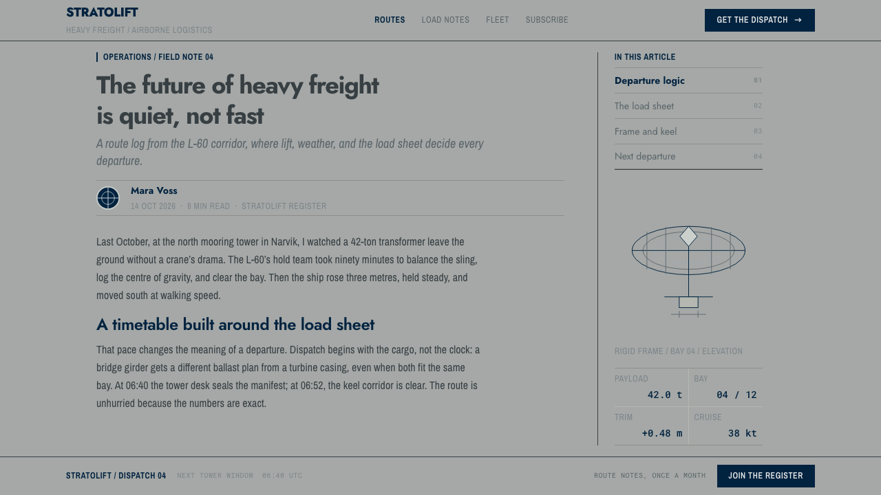
The result reads like an operations manual for a vehicle that sells slowness. The typography is the period pairing done straight: a geometric sans for titles and route names, a condensed transport-lettering sans for tower signs, gate numbers and hold designations, and a monospaced face for every mass figure, ballast table and departure time. Rules are hairlines of blueprint weight, corners are square, and nothing on the interface is glossy.
Where does Hydrogen Airship Freight come from?
The visual world begins in Friedrichshafen, a lakeside town in southern Germany, where the Zeppelin works built rigid airships through the late 1920s and 1930s. These were not balloons but structures: a skeleton of light girders inside a long hull, gas cells inside the skeleton, cabins slung beneath. Operating one was an exercise in bookkeeping. Every unit of fuel burned, ballast dropped or cargo loaded changed the ship's trim, so the documents that mattered were tables and charts — load plans, ballast tables, center-of-gravity diagrams — produced by people who thought in margins of safety.
The ships did not operate in isolation. The source material points to Lakehurst in the United States and to Moffett Field, with its enormous hangar, as the other poles of the system: places where a ship came down to a mooring tower, was handled by ground crews with lines and rigging, and was fed, ballasted and loaded. Mooring-mast rigging plates, hold designations and gate numbers are the paperwork of those handoffs. The aesthetics of the system are the aesthetics of procedure — where things go, how much they weigh, and when they leave.
Two typographic movements meet in the system. The geometric sans of Paul Renner belongs to the German Neue Typografie, which wanted letterforms stripped of historical ornament and built from circles and straight lines, a fitting match for a machine whose profile was itself a simple geometric solid. The condensed lettering that German transport signage standardized as DIN 1451 was designed for engineers, railways and factories: narrow so long words fit on a small plate, plain so they can be read at a glance. Titles in the first and signage in the second is the pairing the period itself offers.
The second root is the freight reboot of the 2010s to the present, centered today in France and the United States, where lighter-than-air transport has been revisited for heavy, bulky or remote cargo. The argument is that slow, quiet, low-emission lift is a capability: a vehicle that needs no runway can reach places roads and airports do not. That is why the style frames slowness as a feature rather than an apology. It borrows the earlier era's operations paperwork and uses it to speak, with the same unembellished confidence, about a new generation of ships.
What defines the Hydrogen Airship Freight look?
Aluminum-Dope Gray
The ground is a matte, faintly warm silver-gray, the color of varnished cloth loaded with aluminum powder. It is deliberately dull: its original purpose was to reflect sunlight, not to impress. In a digital translation it becomes a flat, slightly warm mid-to-light gray with no sheen, no metallic gradient and no glow, so that the page feels like a printed sheet rather than a lit screen.
Hairline Blueprint Rules
Lines are thin and exact, the weight of a technical drawing rather than a poster. Tables are ruled with fine lines, dimension marks end in clean ticks, and corners meet at true right angles. The hairlines do the work that boxes and shadows do in other styles: they separate, align and measure, and they make a page feel checked.
The Measured Hull Elevation
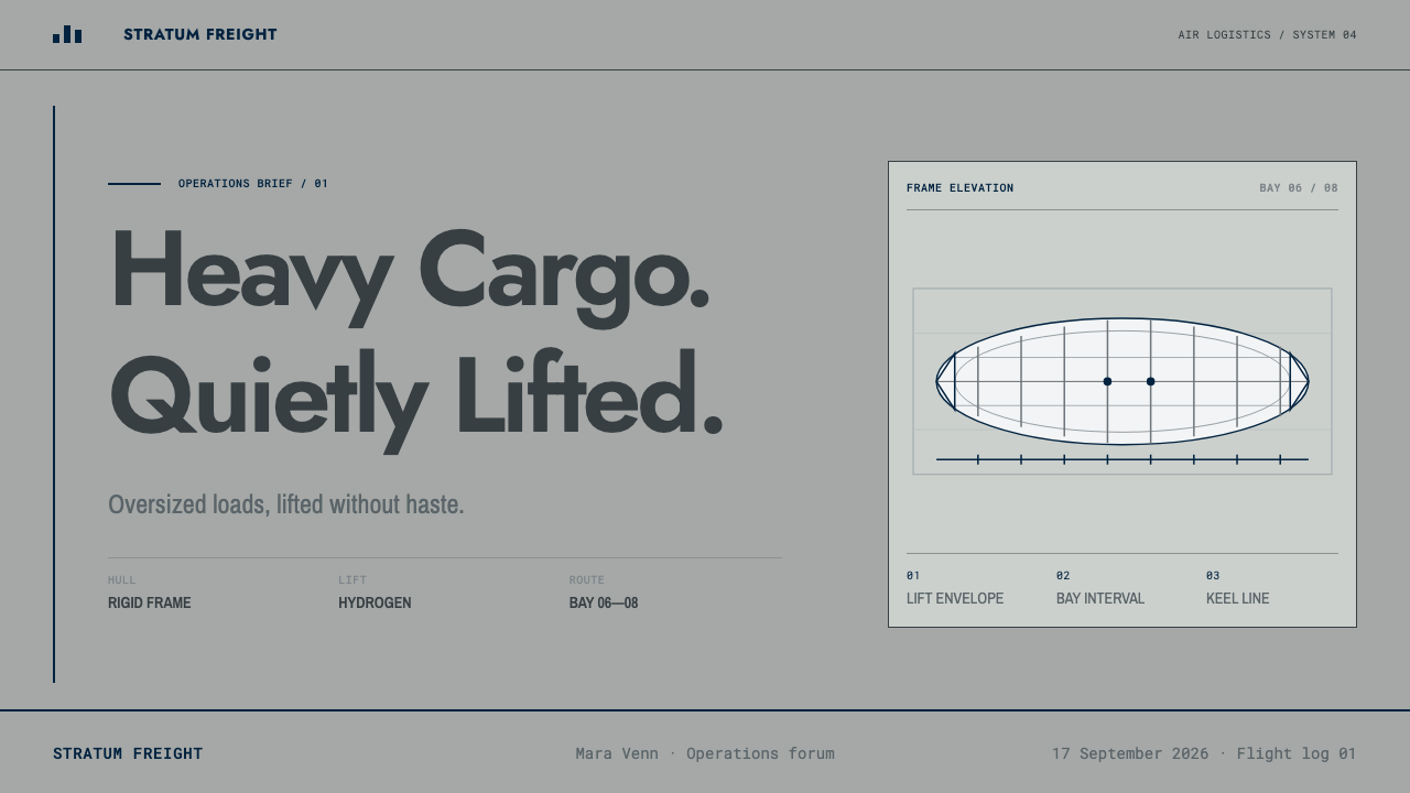
The signature image is a side view of the ship drawn like an engineering elevation, with stations marked along its length and dimension lines running beside it. It is not an illustration of an airship so much as a measurement of one. Used as a hero graphic, it acts as a ruler across the page and ties headline claims about capacity and range to an object that can be inspected.
DIN-Style Grids
Layout follows the logic of German transport standardization: fixed columns, aligned numerals, narrow labels in tight cells. Information is dense but orderly, like a timetable or a manifest, and every field has a predictable place. The grid is not hidden behind whitespace; it is visible in the ruling and in the way columns of figures line up.
Three Typographic Voices
Each typeface has a fixed job. A geometric sans, descended from the New Typography, speaks titles and route names. A condensed transport-lettering sans speaks the signage layer: tower signs, gate numbers, hold designations. A monospaced face speaks every number — mass figures, ballast tables, departure times — so columns align and values can be checked by eye. Mixing these roles, or adding a fourth voice, weakens the manual-like clarity.
Square Corners, Nothing Glossy
There are no rounded cards, no glass, no glow and no soft ambient shadows. Surfaces behave like paper and enameled signs: matte, flat and edged. Hierarchy comes from ruling, spacing and the contrast between the three typographic voices. The effect is of a document that has been through a process, and that wants to be trusted for exactly that reason.
Who shaped Hydrogen Airship Freight?
Eckener is the figure most closely tied to the commercial life of the Zeppelin airship, remembered as its great captain and its advocate as a scheduled transport service. His career stands for the idea that an airship was a matter of routes, timetables and loads rather than of stunts, which is exactly the attitude this style inherits: a vehicle presented through its operations, not its romance.
Dürr is remembered as the chief engineer behind the structural design of the Zeppelin airships, associated with the light girder framework that made a vessel of that scale possible. His legacy in this style is the engineering sensibility itself: structure shown as structure, dimensions drawn rather than implied, and a surface that exists to do a job.
Renner designed the geometric sans that became a landmark of the Neue Typografie, built from circles, triangles and straight strokes with historical ornament removed. In this style his typeface is the voice of titles and route names: modern, clear and slightly austere. His work connects an airship's technical mission to the broader interwar belief that design should be rational and reproducible.
Goller is listed among the key figures of the transport-lettering strand of this style, the one tied to DIN 1451. The public record behind him is thin, so his place here is as a representative of the engineers and standard-setters who made lettering for transport a matter of norms: narrow, legible, reproducible and indifferent to fashion.
How do you use Hydrogen Airship Freight today?
Hydrogen Airship Freight suits any project whose message is capability, patience and dependable logistics rather than excitement. It rewards content that is already structured as tables, schedules, specifications or routes. Applying it well means committing to the manual metaphor: the page should feel like a controlled document, and every decoration should be justified by a measurement or a label.
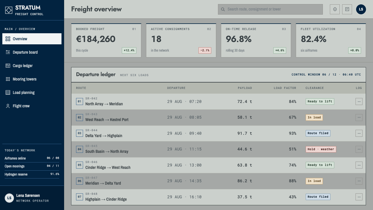
On slides, a cover can be a matte gray field with a long, finely ruled hull elevation running across it, the title set in the geometric sans and a small block of monospaced figures in one corner. Content slides work as tables and diagrams with narrow-lettered labels. Data slides are natural territory: monospaced numerals aligned in columns, thin axes, and charts that look like load diagrams. The restraint makes figures feel verified.
On the web, the style fits logistics dashboards, tracking pages, fleet and route tools and anything built around manifests. Use the gray ground, hairline rules between rows, square-cornered panels and numerals in the monospaced voice. A pricing or quote page can present a rate card as a schedule, with services as hold designations and weights as ballast figures. Keep interactions plain: no glossy buttons, no hover glows, just a clear change in rule weight or fill.
For editorial and marketing work, it suits infrastructure, industrial technology, climate and energy stories, and brands whose product is slow, heavy or reliable. Long articles can use a narrow measure with margin notes set like drawing annotations. Marketing pages can lead with a single measured elevation and a plain claim, letting the paperwork do the persuading. The tone should be literal and specific: ranges, payloads and timetables, not slogans.
A common mistake is to push the style into retro-futurist costume: sepia tint, brass, rivets and glowing airships. The reference is the operations office, not the adventure poster. Other mistakes are adding gloss or shadows to the gray, using the monospaced face for body copy, or introducing saturated accent colors that compete with the matte ground. If an element cannot be explained as a label, a measurement or a rule, it probably does not belong.
Hydrogen Airship Freight — FAQ
Is this a retro Zeppelin or steampunk look?
No. It borrows the paperwork of the airship era, not its romance. There are no brass fittings, no sepia, no decorative flourishes. What you see is the operations office: schedules, rigging plates, hold designations, balance charts. Anything that works as a prop rather than a document pushes the style in the wrong direction.
Why that particular gray?
Because it is the color of the airship's actual skin. Rigid airships were covered in cloth finished with aluminum-loaded dope, which reflected sunlight so the hydrogen inside would not heat and expand. The gray is therefore a functional color, matte and faintly warm, and the style keeps it that way: no sheen, no metallic shimmer, just a calm working surface.
Why use a monospaced face for numbers?
Because freight is about figures that must be compared and checked. In a monospaced face every digit takes the same width, so mass figures, ballast values and departure times line up in columns and errors are easy to spot by eye. The face also signals that a number is data rather than prose, which is the point of the three-voice arrangement.
Can it work as a dark theme?
The style is built on a light, matte ground, and its documents-on-paper feel depends on it. A dark variant is possible if you treat it as a night-shift version of the same manual: dark neutral ground, thin pale rules, the same three typographic voices and no glow. The danger is drifting into a sci-fi dashboard, which would lose the plain, procedural character that defines it.
Where does this style struggle?
It struggles when warmth, play or emotional appeal is the goal: consumer lifestyle, children's products, celebration or entertainment. Its density can also feel heavy on small screens if every table is carried over unchanged. It works best where the audience values precision and reliability and is willing to read a little more closely in return.
Related design styles
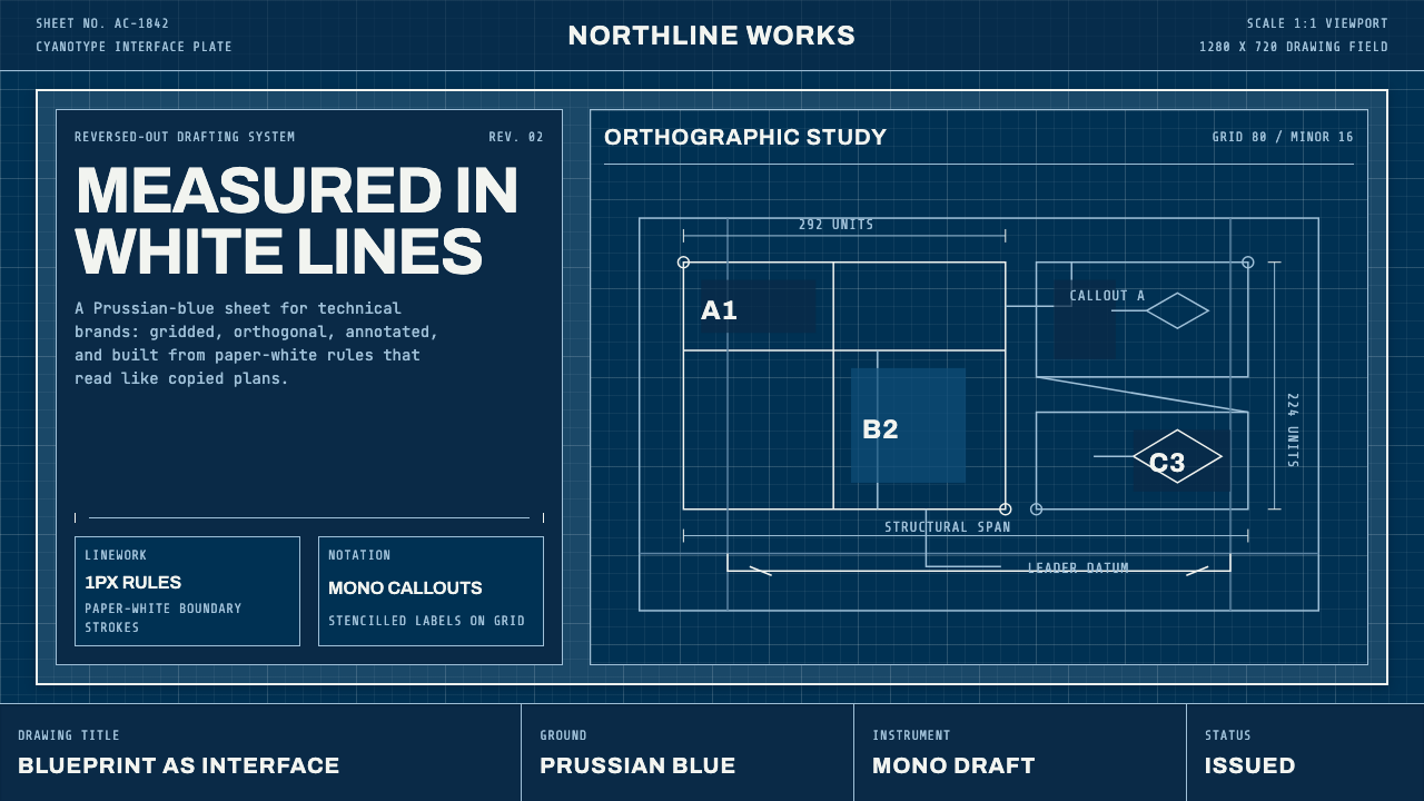 Architect CyanotypePrecision in negative. Prussian blue ground, paper-white grid, mono dimension…
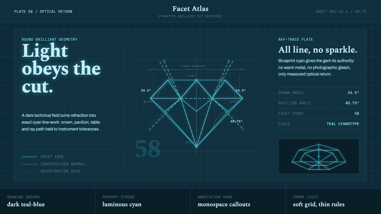 Brilliant Cut Facet DiagramOptics becomes blueprint. Cyan facet lines and ray paths glow on dark teal.
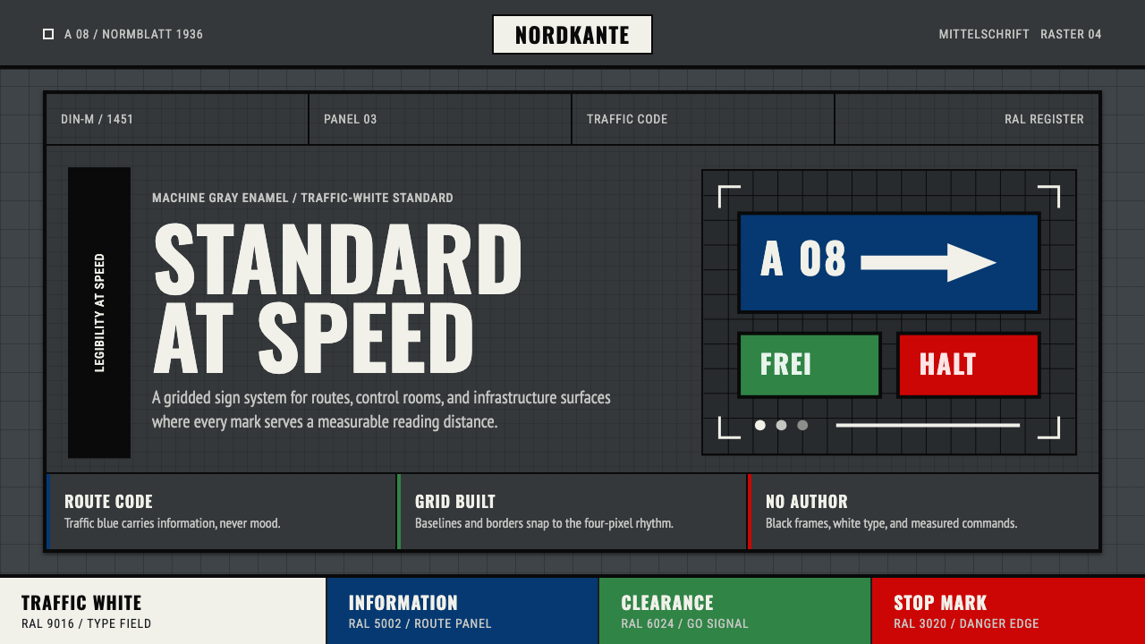 DIN 1451 SignageAuthorless and exact. Enamel gray grid, traffic-white DIN type, and RAL signa…
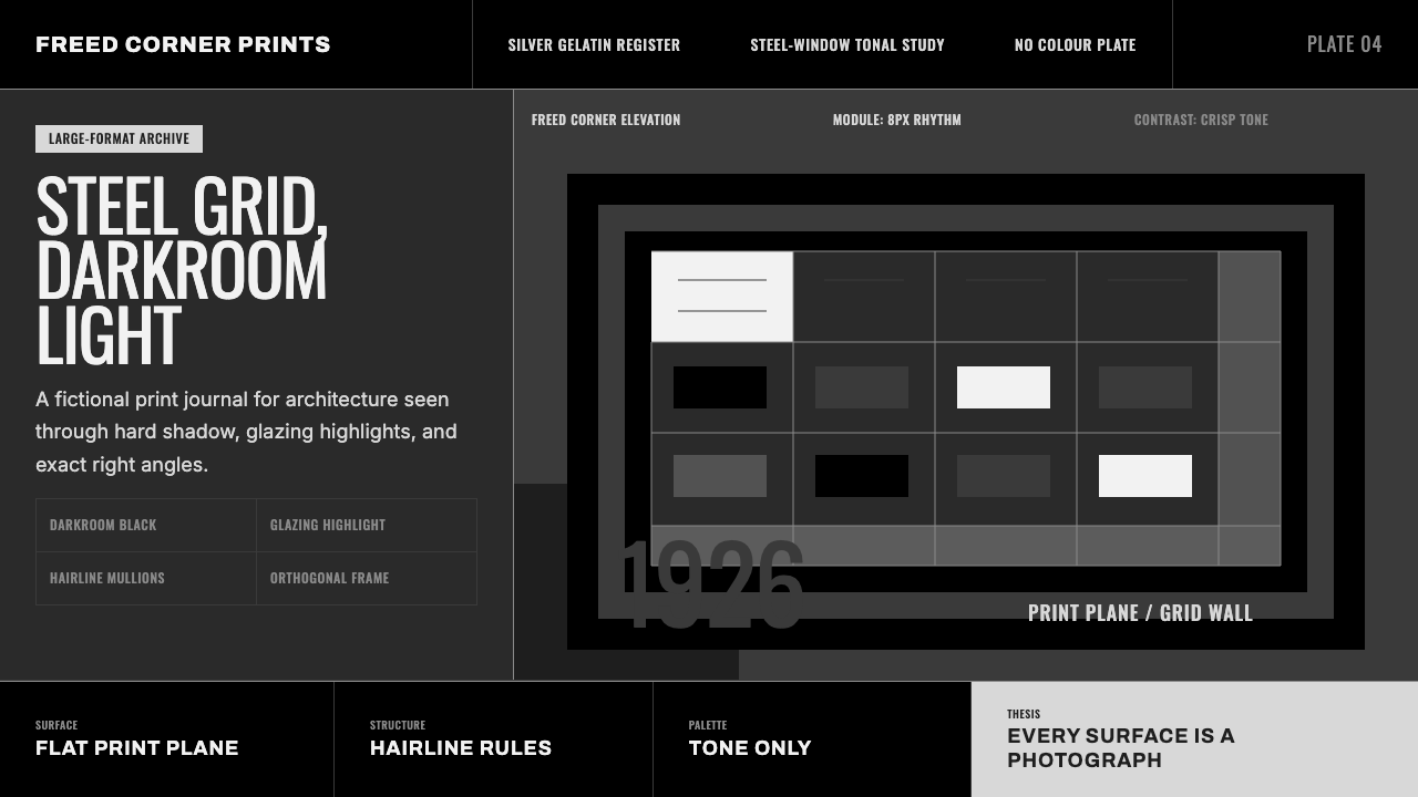 Dessau GrayscaleAustere monochrome authority. Darkroom black, glazing gray, and a steel-windo…
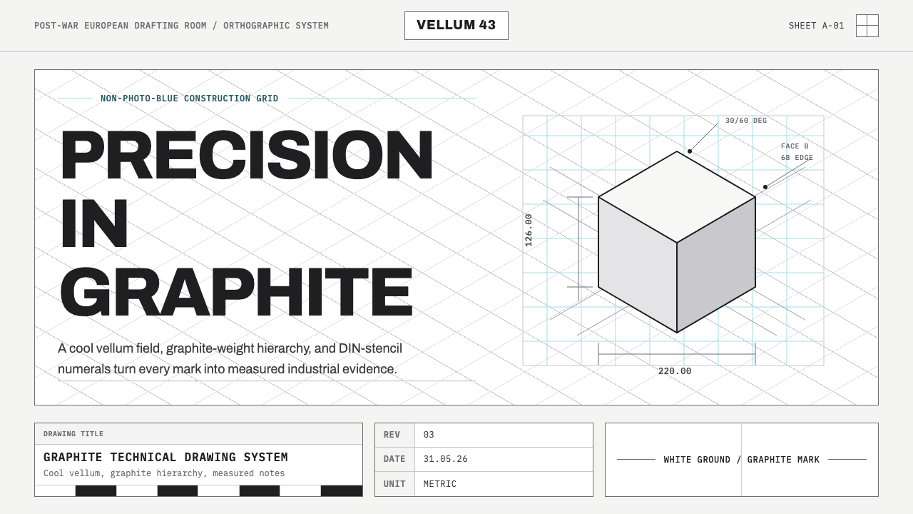 Graphite Technical DrawingDrafting-room precision. Non-photo-blue grid and graphite DIN lettering do th…
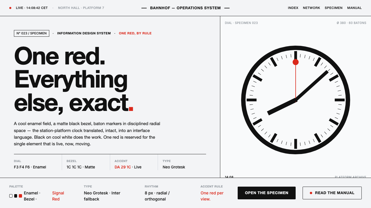 Hilfiker Railway ClockEverything exact, one thing live. Black hands on cool enamel white — one red…