What is Cricket Whites Flannels?
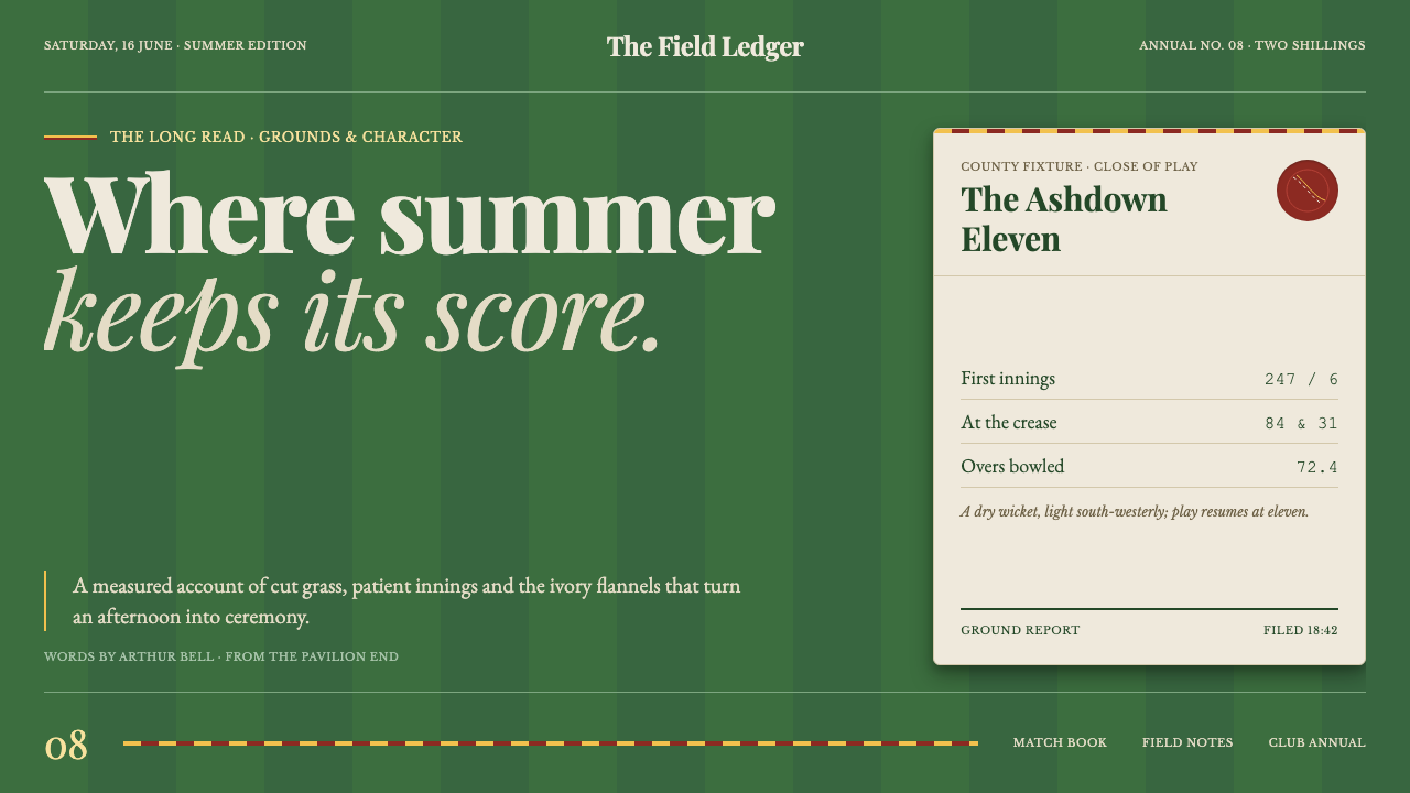
Cricket whites reverse the usual summer palette: ecru flannel and club trim stand out as disciplined signs against the deep green of a freshly mown English field.
Cricket Whites Flannels in brief
Cricket Whites Flannels is a heritage editorial system rooted in England and in the gentleman’s game associated with the Victorian Marylebone Cricket Club. Its defining move is perceptual rather than decorative: the ivory cricket flannel is not treated as the page background, but as a panel, heading, or field of text placed over the dark mown green of the playing ground.
The palette is therefore led by deep grass green, with ecru, scarlet, and gold used as controlled counterpoints. Green supplies the atmosphere and the visual ground. Ecru carries the authority of cloth and paper. Scarlet-and-gold egg-and-bacon trim survives as a fine club accent, closer to a narrow tie stripe than a broad decorative band.
Its character comes from the meeting of formal order and seasonal tactility. Period serifs establish a gentlemanly hierarchy; mown-stripe banding introduces rhythm; curved references to a ball seam soften the otherwise disciplined structure. The result should feel inherited and well kept, not theatrical: a heritage editorial language rather than a nostalgia costume.

Where does Cricket Whites Flannels come from?
The source places this style in England, Western Europe, during 1900–1950, while tracing its deeper root to the Victorian MCC gentleman’s game. That positioning matters because the visual language is not generic sport branding. It belongs to a world of ordered grounds, inherited club conventions, flannel clothing, and carefully maintained distinctions.
The Marylebone Cricket Club supplies the central cultural reference. Its presence is expressed less through literal illustration than through hierarchy and restraint: the page behaves like a well-kept ground, where every line has a place and every accent carries the memory of club colours. The dark field is the first signal that this is cricket read from its setting outward.
The second source movement is the tradition of MCC laws and colours. In design terms, that tradition becomes a system of boundaries, repeatable marks, and narrow chromatic signals. Scarlet and gold are not allowed to become a festive palette; they remain a trace of institutional identity, carried by a line, stripe, seam, or small directional detail.
Fox Brothers appears in the approved source alongside the MCC as a key figure, tying the concept to the material imagination of flannel. Within the system, cloth is not represented through artificial texture or costume effects. It is suggested through ecru surfaces, calm contrast, measured spacing, and the sense that a panel has been cut, pressed, and placed with care.
What defines the Cricket Whites Flannels look?
Mown Green Field
Deep mown green is the ground of the system, not a decorative accent. It should feel broad, quiet, and slightly absorbent, like the outfield behind the action. Ecru elements become legible because the green gives them contrast without making them appear luminous or synthetic. The field establishes the style’s dark, composed atmosphere.
Ecru Flannel
Ecru replaces stark white with a warmer, more material presence. It can hold body copy, cards, editorial panels, or large titles, but should never flatten the green field into a pale page. Its value lies in contrast and touch: the impression of pressed cloth, old paper, and summer clothing kept in excellent order.
Period Serif
Serif typography provides the voice of the system. Letterforms should feel literary, established, and quietly authoritative rather than ornate. Large display type may carry the dignity of a club notice, while smaller text remains calm and readable. Hierarchy comes from scale, weight, placement, and contrast, not from a collection of competing type personalities.
Club Trim
Scarlet and gold appear as a narrow institutional signal. The egg-and-bacon reference works best as a ruled line, a small border, a seam-like divider, or a restrained marker beside a heading. It should feel inherited and coded, carrying identity through precision rather than announcing itself as decoration.
Stripe Rhythm
Mown-stripe banding introduces repetition without becoming pattern wallpaper. Alternating tonal bands can organize a section, support a table, or suggest the direction of a field. The rhythm should remain quiet enough for typography to lead. Stripes are evidence of care and maintenance, not an excuse for visual busyness.
Ball-Seam Curves
Curves derived from a red leather ball and its seam provide the system’s softer geometry. They can shape a small emblem, a crop, a divider, or a transition between editorial fields. Used sparingly, they prevent the grid and serif hierarchy from becoming severe. The curve is a tactile reminder of play within an otherwise ordered world.

Who shaped Cricket Whites Flannels?
The MCC is the principal institutional reference named by the source. In the visual system, it stands for a disciplined club culture expressed through rules, colours, hierarchy, and continuity. Its influence should be felt in the composure of the page rather than through excessive badges, crests, or literal sporting illustration.
Fox Brothers is named as a key figure beside the MCC, giving the style a material anchor in flannel. Its role within the article is not a logo treatment but a reminder that ecru surfaces should suggest cloth, pressing, and care. The reference supports a tactile editorial mood without requiring simulated textile imagery.
Gentleman’s cricket names the social and visual atmosphere behind the system. It suggests formal conduct, considered presentation, and a game understood through setting as much as action. In design, that becomes measured spacing, restrained colour, period serifs, and a refusal to confuse heritage with theatrical nostalgia.
This named movement supplies the logic of repetition and boundary. Colours are not scattered for atmosphere; they are assigned to marks that organize the page. Lines, trims, and small accents should therefore feel codified, as if they belong to a visual language whose conventions were learned before they were redesigned.
How do you use Cricket Whites Flannels today?
For presentation slides, use the dark green field as the continuous ground of the deck. A cover can place a large ecru title block against it, with a restrained scarlet-and-gold line or a seam-like curve providing orientation. Content slides should preserve the serif hierarchy and generous breathing room. Data slides can use mown-stripe bands to separate groups, while a single accent colour identifies the active measure or important conclusion.
For web interfaces, the style suits dashboards, pricing pages, and other products that need authority without appearing industrial. Keep the interface grounded in deep green, use ecru for reading surfaces, and reserve scarlet or gold for selected states, boundaries, and calls to action. Panels should feel like placed pieces of flannel or paper. Navigation benefits from clear words and club-like order, with decorative marks kept subordinate to the information.
For editorial and marketing work, Cricket Whites Flannels supports long-form reading, seasonal campaigns, club announcements, and products that want heritage without costume. Use narrow text measures, quiet rules, restrained bands, and occasional ball-seam curves. A marketing page can alternate deep green fields with ecru panels, letting each change feel like a shift from ground to garment, from playing surface to carefully presented object.
For data-rich content, treat the palette as a system of roles rather than a collection of attractive colours. Green establishes the field, ecru carries the readable material, and scarlet or gold marks significance. Charts should remain composed and editorial, with stripes or ruled lines organizing information instead of decorative illustration. The visual language works best when every accent appears to have a reason for being on the ground.
The common mistake is to turn the theme into literal cricket memorabilia: oversized balls, busy crests, fake fabric textures, or broad red-and-gold decoration. That approach loses the source’s central inversion. The style is not white clothing pasted onto a sports poster; it is a dark playing field whose ecru flannel, club trim, serif voice, and seam curves are introduced with discipline.

Cricket Whites Flannels — FAQ
Why is the background dark if the theme is called Cricket Whites?
Because the style reads the whites through their setting. The ecru flannel matters precisely because it is placed against the deep green of the mown outfield. Making the page pale would reverse the intended hierarchy and remove the atmosphere of the playing ground.
Is this simply a vintage sports style?
No. Its references come from cricket, flannel, the MCC, and the period between 1900 and 1950, but its method is editorial. It uses hierarchy, restraint, spacing, and controlled colour rather than memorabilia. The aim is a heritage system that feels maintained and usable in the present.
How much scarlet and gold should appear?
They should remain narrow and purposeful. Think of a club trim, tie stripe, ruled line, or seam marker rather than a broad field of colour. Their authority comes from rarity and precision. When they begin competing with the green ground or ecru reading surfaces, the system has become too decorative.
Can the style support a dashboard or pricing page?
Yes, when its order is treated as functional rather than ornamental. Deep green can establish the interface field, ecru can carry cards and readable content, and scarlet or gold can identify selected states or important distinctions. The result should feel like a well-kept club system, not a decorative sports theme.
What keeps the style from becoming costume-like?
Restraint. Use the green field as the primary atmosphere, let ecru provide the readable material, and keep the cricket references indirect. Period serifs, quiet stripes, and seam curves are enough. Literal crests, oversized sporting objects, and simulated fabric effects should not replace the underlying editorial structure.
Related design styles
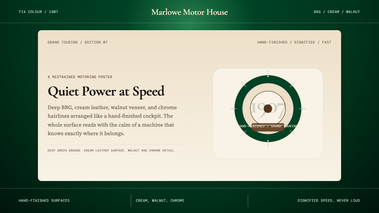 British Racing Green (Motorsport, 1907)Quiet authority at speed. Deep BRG, cream leather, walnut, and chrome hairlin…
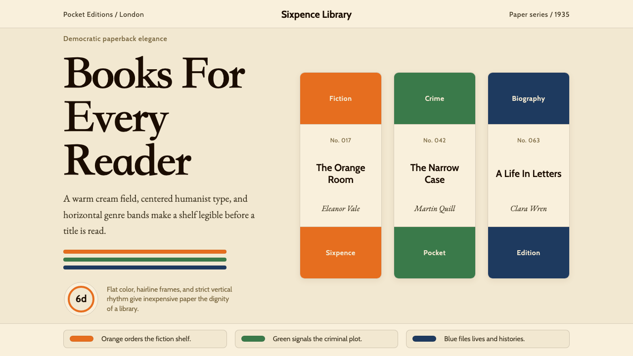 Penguin Books (1935)Paperback democracy. Cream stock, Cabin type, and orange-green-blue bands mak…
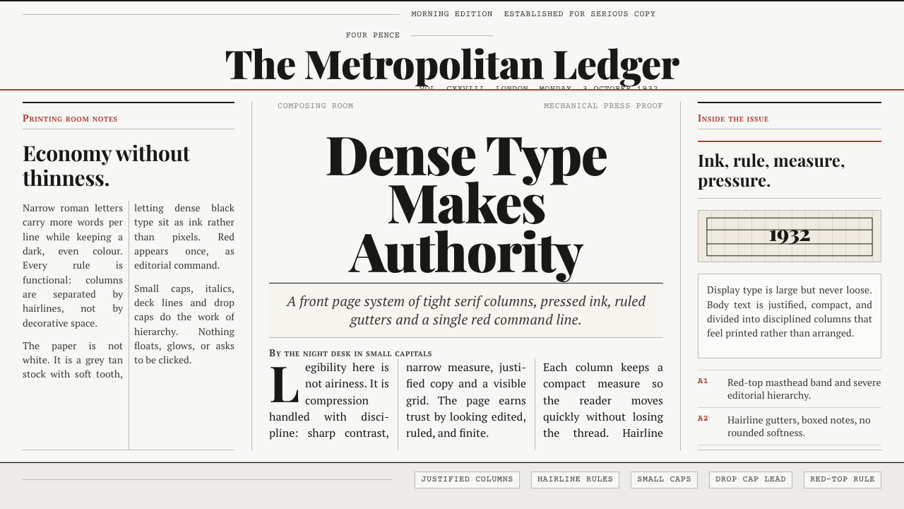 Times New Roman by MorisonAuthority under pressure. Dense black serif columns on grey-tan newsprint, ru…
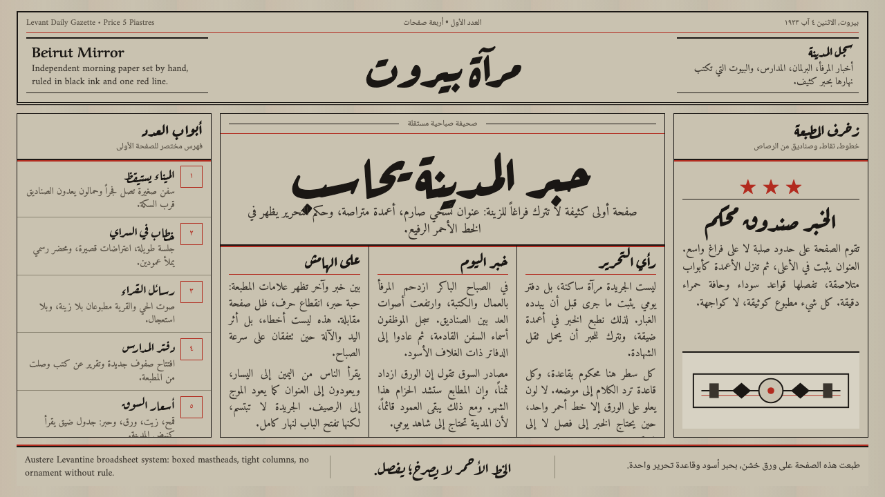 An-Nahar Beirut PressDense authority. Aged newsprint, black naskh columns, and one red rule hold t…
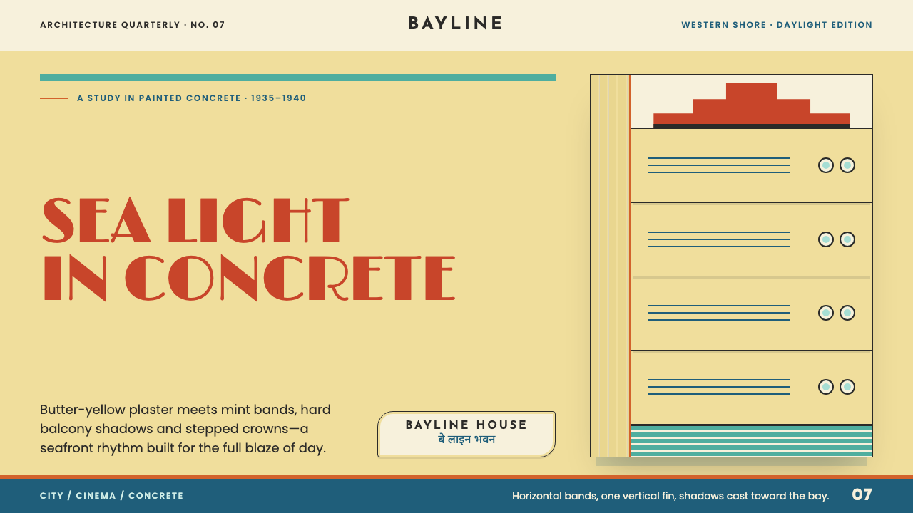 Bombay Marine Drive DecoDeco built for daylight. Butter-yellow plaster, mint bands and stepped crowns…
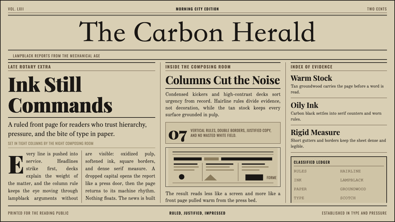 Broadsheet LetterpressAuthority in ink. Lampblack serif decks lock into tan paper with strict ruled…