What is Times New Roman by Morison?
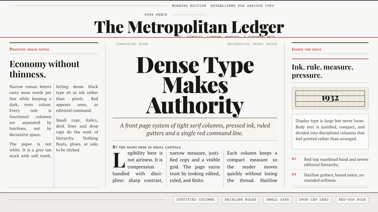
Times New Roman turns constraint into authority: narrow serif type, dense justified columns, and a red rule that makes a page feel printed under deadline.
Times New Roman by Morison in brief
Times New Roman is a newspaper type system rooted in the composing room rather than the drawing board of a luxury publisher. Cut by Stanley Morison with draughtsman Victor Lardent at Monotype, it first appeared in The Times of London on 3 October 1932. Its narrow proportions, pronounced stroke contrast, and efficient roman forms were made to carry substantial amounts of readable copy through tight newspaper columns.
The style reconstructs the typeface’s original habitat rather than treating it as a neutral default. Dense ink-black serif text sits on a grey-tan ground that suggests aged newsprint. Copy is justified into orderly vertical blocks, separated by exceptionally fine rules. Above them, a single red masthead band supplies the page’s strongest note of color and establishes the visual authority of a front page.
Its character comes from productive pressure. Headlines, standfirsts, bylines, column rules, and tightly packed body text do not compete as separate decorative moments; together they make information appear edited, ranked, and ready for print. The result should never resemble an immaculate white software interface. It should feel like an editorial surface where space is valuable, language has weight, and every line belongs to a larger publishing system.
Where does Times New Roman by Morison come from?
The debut of Times New Roman belongs to London newspaper production in 1932. Its first printing in The Times on 3 October fixed the typeface to a practical editorial setting: a publication needed to place a great deal of copy in columns that remained legible to a fast-moving reader. The design’s economy was therefore not an afterthought or a visual trend. It was part of the problem the typeface was made to solve.
Stanley Morison and Victor Lardent developed the face at Monotype, linking editorial direction, draughtsmanship, and type production. Morison’s role places the design within Monotype’s revival programme, while Lardent’s role identifies the drawing work behind its forms. Their collaboration matters because the typeface is neither merely historical reference nor purely mechanical utility: it is a deliberately shaped roman adapted for a contemporary newspaper.
The supplied lineage points to the earlier Plantin as a basis. That relationship gives Times New Roman a historical foundation without making it a museum reproduction. In its newspaper setting, inherited roman character is pressed toward narrower, more economical use. The resulting system joins revival thinking with twentieth-century newspaper typography: the authority of established letterforms is retained, but the page is organized for dense, current information.
This origin explains why the style works as a complete page language. The defining unit is not an isolated letter specimen but the column, the deck, the byline, and the masthead working together. The visual world is London’s newspaper composing room: composed text, disciplined alignment, restricted color, and a printed surface whose slight age makes the black type appear even more forceful.
What defines the Times New Roman by Morison look?
Newspaper Ground
The background is grey-tan rather than clean white, recalling paper that has absorbed ink, handling, and time. This muted ground prevents the page from feeling digitally sterile and lets the dark serif text carry the strongest contrast. It should read as paper first, screen second.
Dense Roman
The roman is narrow, economical, and visibly high in stroke contrast. Long passages are not treated as empty texture; they are the central material of the composition. Dense setting communicates editorial seriousness, provided the forms remain legible and the columns preserve a steady visual rhythm.
Justified Columns
Justification gives the page its unmistakable newspaper discipline. Straight column edges turn prose into blocks of published matter and make vertical alignment part of the design. The effect depends on restraint: columns should look carefully composed, not mechanically stretched into a grid.
Hairline Rules
Fine rules divide columns without competing with the type. They operate as editorial architecture: quiet boundaries that separate stories, preserve scanning paths, and reinforce the sense that the page has been assembled under exacting production conditions. Their delicacy is essential to the contrast with dense black copy.
Red Masthead Band
A single red band at the top is the page’s editorial signal, not a decorative accent repeated everywhere. It compresses the authority of a masthead into one decisive horizontal gesture. Because the rest of the palette is subdued, the red reads as urgency, hierarchy, and publication identity.
Editorial Hierarchy
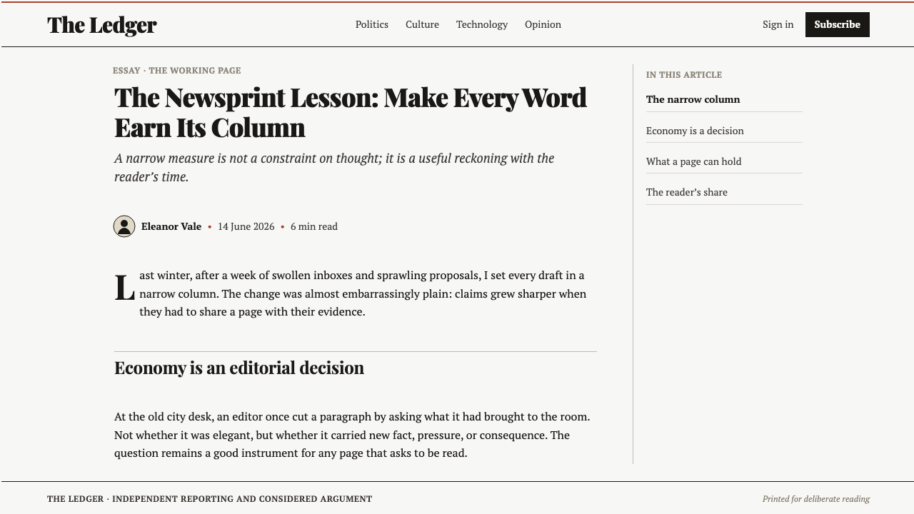
Headline deck, standfirst, small-caps byline, and body copy establish hierarchy through editorial roles. The page should make clear what must be read first, what frames the story, and what supports it. Authority comes from this disciplined ordering, not from oversized spectacle or ornamental display.
Who shaped Times New Roman by Morison?
Morison cut Times New Roman at Monotype and places the typeface within the company’s revival programme. His contribution connects an earlier Plantin basis to the needs of twentieth-century newspaper typography.
Lardent was the Monotype draughtsman who worked with Morison on the design. His named role keeps attention on the drawn letterform behind the finished newspaper page.
Monotype was the setting in which Times New Roman was cut and the revival programme through which its historical basis was developed into a newspaper-facing roman.
The Times first printed Times New Roman on 3 October 1932. Its newspaper columns supplied the practical environment that defined the typeface’s compact, readable character.
How do you use Times New Roman by Morison today?
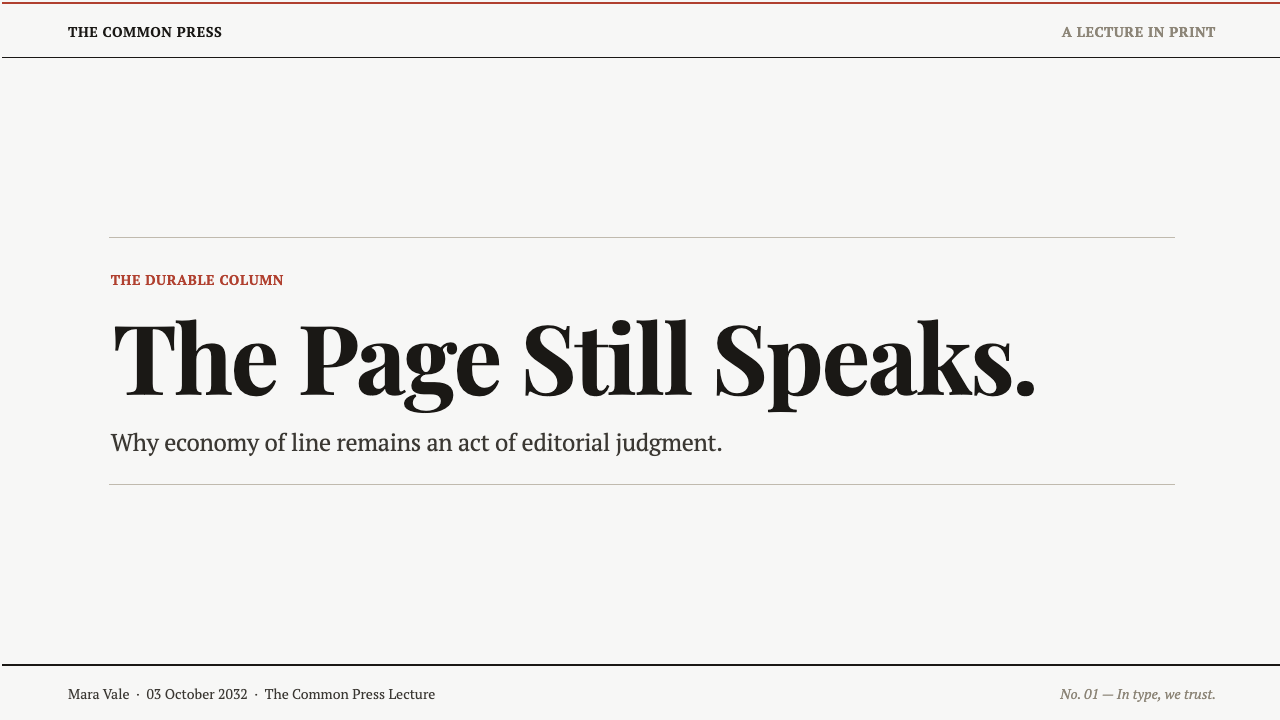
For presentation covers, use the page as a masthead rather than a poster. Let one firm headline lead, support it with a concise standfirst, and reserve the red horizontal band for the publication-level signal. A grey-tan paper ground and dark serif type create immediate editorial gravity; extra illustrations or decorative badges usually weaken that premise.
For content slides, convert the newspaper column into a disciplined reading structure. Give the main argument a clear headline, place supporting text in narrow justified blocks where readability permits, and use fine rules to separate sections or notes. Data slides can adopt the same hierarchy: a decisive finding in the headline, a short framing paragraph, then the chart or table treated as published evidence rather than floating dashboard furniture.
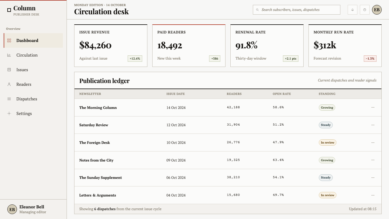
For web interfaces, this style is strongest in dashboards, research tools, archives, pricing pages, and any product that benefits from an editorial sense of scrutiny. Use columns to organize dense information, assign the red band to the most important status or brand layer, and preserve ample distinction between headlines, standfirsts, labels, and body copy. The interface should feel composed, not merely filled with text.
For editorial and marketing work, the system is especially useful when a product needs to project seriousness, history, or informed judgment. Landing pages can open with a masthead-like strip, then move through stories in ruled columns. Campaign material benefits when claims, proof, and attribution are visibly ordered; the aged-paper ground gives language material presence without requiring nostalgic illustration.
The common mistake is to use Times New Roman alone and assume the newspaper character will appear automatically. The style depends on the whole habitat: dense but readable copy, justified columns, fine rules, a restrained paper-like ground, and one red editorial signal. Avoid pristine white space, multiple competing accent colors, soft interface cards, and decorative type pairings that dissolve the pressure and discipline the system needs.
Times New Roman by Morison — FAQ
Is this style simply the use of Times New Roman?
No. The typeface is its foundation, but the visual system also depends on its newspaper habitat: grey-tan newsprint, ink-black justified columns, hairline rules, headline and standfirst hierarchy, small-caps bylines, and a single red masthead band. Removing those relationships leaves a familiar serif face, not the editorial atmosphere described here.
Why are the columns so dense?
Times New Roman was engineered to pack legible copy into tight newspaper columns. Density is therefore a functional expression of the typeface’s origin, not a retro effect added afterward. The goal is concentrated information with a stable reading rhythm, never illegible compression. If the reader cannot follow the text, the style has lost the very economy it was designed to achieve.
What role does the red band play?
The red band acts like a masthead signal. It gives the page one concentrated point of urgency and identity while allowing black type and the subdued paper ground to do most of the work. Repeating red throughout buttons, captions, rules, and charts weakens its editorial authority. Its force comes from being singular and structural.
Does the style suit a clean modern product interface?
It can, but it should not be reduced to conventional clean-screen minimalism. It is most convincing when a product genuinely benefits from dense information, visible hierarchy, and editorial authority, such as a dashboard, research environment, archive, or pricing page. Products centered on airy neutrality may retain selected cues, but a fully newspaper-like treatment will change their tone toward scrutiny and publication.
Related design styles
 An-Nahar Beirut PressDense authority. Aged newsprint, black naskh columns, and one red rule hold t…
 Aramco World MagazineMatte Gulf modernism. Desert green, gold sun-discs, classic serif, and naskh…
 British Racing Green (Motorsport, 1907)Quiet authority at speed. Deep BRG, cream leather, walnut, and chrome hairlin…
 Broadsheet LetterpressAuthority in ink. Lampblack serif decks lock into tan paper with strict ruled…
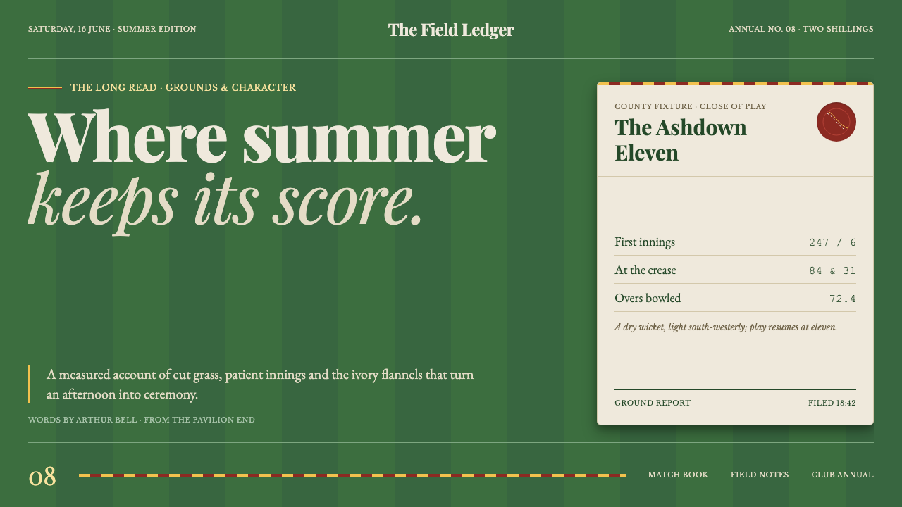 Cricket Whites FlannelsSummer, kept in good order. Ecru serif and fine club trim cross a dark mown g…
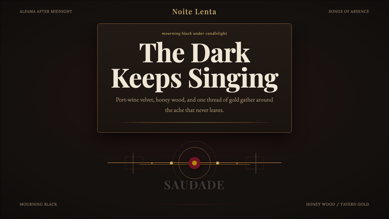 Fado SaudadeSaudade in shadow. Mourning black holds wine red, honey wood, and one gold li…