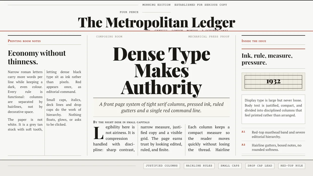
About Times New Roman by Morison
Times New Roman was cut by Stanley Morison and draughtsman Victor Lardent at Monotype and printed for the first time in The Times of London on 3 October 1932. Narrow, economical, and high in stroke contrast, it was engineered to pack legible copy into tight newspaper columns. This system rebuilds that habitat: dense ink-black roman set justified on aged grey-tan newsprint, ruled with hairline column rules and topped by a single red masthead band. The page reads like a front page — headline deck, standfirst, small-caps byline — never a clean white screen.
- Origin
- London, England — the newspaper composing room
- Era
- 1932 debut in The Times (Monotype); based on the earlier Plantin
- Key figures
- Stanley Morison · Victor Lardent
- Movements
- 20th-century newspaper typography · Monotype revival programme
Times New Roman by Morison design spec
Colors
Typography
The other 11 sections — buttons, cards, spacing, motion, techniques and more — open once you unlock. Download the DESIGN.md or send it to your AI in one click. Unlock once, yours forever.
Sign up nowStyles similar to Times New Roman by Morison
Also inspired by print & type, with a close feel.
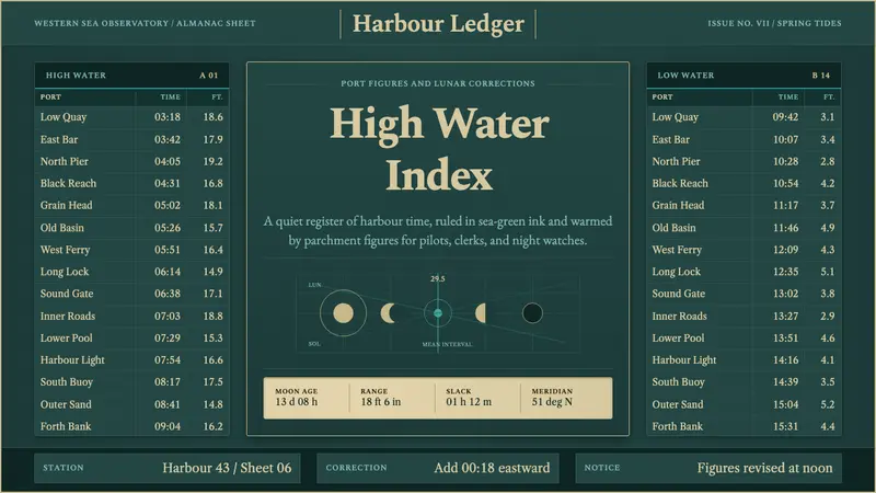 Tide Table AlmanacData becomes ornament. Deep teal grids and parchment serif figures carry a calm tide-table voice.
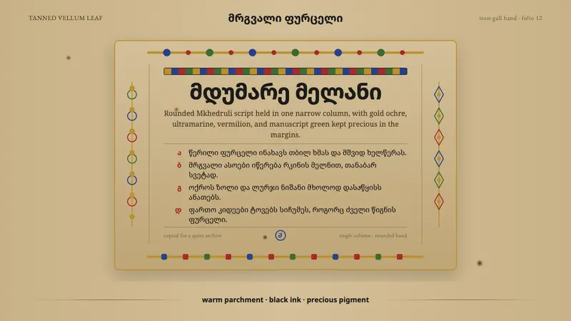 Georgian MkhedruliA manuscript breathes slowly. Tanned vellum, round Mkhedruli ink, ochre and ultramarine.
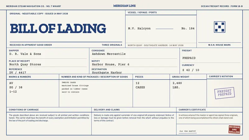 Bill of LadingRecords become an artefact. Blue rules, typewriter black, violet and oxblood overprints.
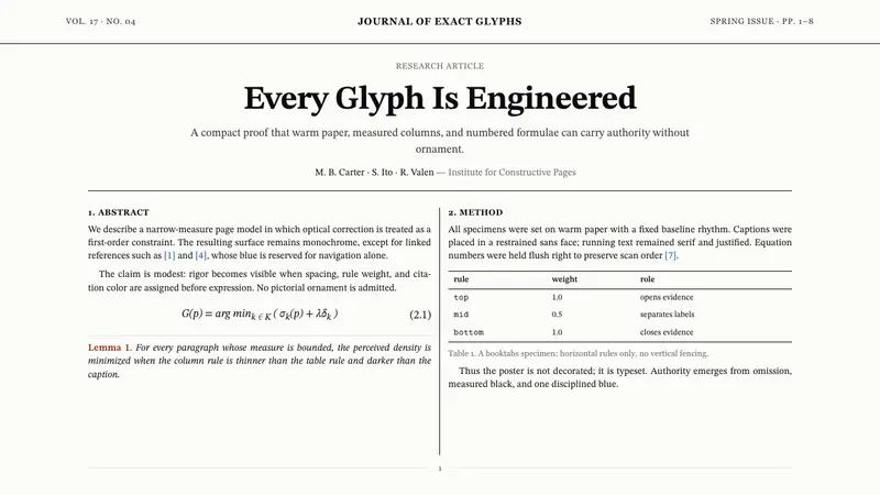 TeX Academic PaperRigor without ornament. Warm paper, Computer Modern text, hairline columns, one blue link.