What is Aramco World Magazine?
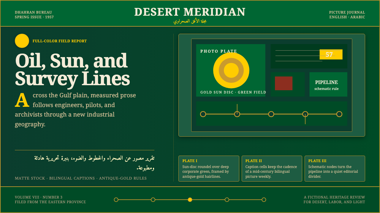
A bilingual oil-company magazine borrowed the visual voice of Life and Look to bring the Arab world to American readers — and left behind a matte, desert-green print language all its own.
Aramco World Magazine in brief
Aramco World Magazine reconstructs the visual identity of the bilingual periodical founded in 1949 by the Arabian American Oil Company — a mid-century corporate publication built to introduce Western readers to the history, culture, and geography of the Arab world, printed alongside naskh Arabic text for a bilingual readership.
The system is grounded in a deep desert-green field, accented with gold sun-disc roundels and schematic pipeline diagrams that nod to the magazine's industrial sponsor. Editorial content is set in a classic serif in the tradition of Times, giving the whole system the calm, authoritative rhythm of a well-funded corporate magazine rather than the urgency of daily news.
Nothing in this language is digital or screen-lit. Every surface is matte print stock — the visual memory of a physical, glossy-but-not-electronic photo magazine from an era when full-color printing itself was still a technical achievement worth celebrating.

Where does Aramco World Magazine come from?
In 1949, the Arabian American Oil Company — the same enterprise that built the Dhahran residential camp — launched Aramco World as a bilingual magazine intended to bridge American corporate interests in the Gulf with broader cultural understanding of the Arab world. Rather than a trade publication focused narrowly on oil production, it was conceived from the start as a general-interest photo magazine, modeled explicitly on the American picture magazines of the era, above all Life and Look.
That modeling was deliberate and visible. Life and Look had, by the late 1940s, established a visual template for mass-circulation photojournalism: large-format full-color or high-contrast black-and-white photography, generous white space, and editorial copy set in a classic, highly legible serif — usually a variant in the Times tradition — that let the photography carry the emotional weight of a story while the type carried its information. Aramco World adopted this template wholesale, then layered onto it a second column of flowing naskh Arabic script running alongside the English, a structural decision that made the magazine bilingual by design rather than by translation supplement.
The magazine reached a milestone in 1953 with its first full-color photo cover — a technical achievement in an era when color printing at scale was still expensive and difficult to execute reliably. That cover marked the moment the magazine's ambitions matched its production capability: lavish, full-color photo features on Arab history, geography, craft, and daily life, printed to a standard that rivaled its American inspirations.
Visually, the magazine's corporate sponsorship shaped its iconography as much as its editorial ambitions did. Gold sun-disc motifs and schematic pipeline diagrams recur throughout its design vocabulary — the sun-disc gesturing toward the desert setting and cultural warmth the magazine sought to convey, the pipeline diagrams a quieter, more literal reminder of the oil infrastructure that funded the entire enterprise. The desert-green ground ties both together: a color drawn from the region's oases and cultivated land rather than the ochre of open desert, positioning the magazine's visual identity as one of cultivation and connection rather than extraction alone.
What defines the Aramco World Magazine look?
Color
The system leads with a deep desert-green ground, a color chosen to evoke oases and cultivation rather than open sand. Gold appears as the primary accent, carrying the sun-disc motifs and headline treatments, while the palette otherwise stays restrained — no bright, saturated secondary hues compete with the green-and-gold pairing.
Typography
Editorial copy is set in a classic serif in the Times tradition, chosen for its calm authority and mass-market legibility — the same design logic that made it the standard for American photo magazines of the era. This serif carries the English text, while flowing naskh Arabic runs alongside it, giving the system a genuinely bilingual typographic identity rather than a single-script one with translated captions.
Sun-Disc Iconography
Gold roundel motifs — stylized sun-disc shapes — recur as a recognizable graphic device across headers, section markers, and decorative flourishes. They function as the system's signature icon, evoking both the desert setting and the warmth of the magazine's cultural mission.
Pipeline Diagrams
Schematic, line-based diagrams referencing oil infrastructure appear as a quieter secondary motif — technical, understated illustrations rather than dramatic industrial photography. They serve as a discreet reminder of the magazine's corporate sponsorship, rendered with the same restrained, diagrammatic clarity as an engineering document.
Photographic Editorial Rhythm
Layouts follow the classic photo-magazine rhythm of large-format imagery paired with generous white space and calm, unhurried body copy — a pacing borrowed directly from Life and Look. Photography carries the emotional and narrative weight; type stays measured and subordinate.
Matte Print Quality
The system's surfaces read as matte print stock rather than glossy magazine paper or a digital screen glow. This texture signals the physical, tactile nature of a mid-century corporate print publication, positioning the design as archival and considered rather than immediate or digital.
Bilingual Structure
The pairing of English serif text with flowing naskh Arabic is a structural, not decorative, feature of the system — both scripts carry equal editorial weight, reflecting the magazine's founding purpose of genuine bilingual communication rather than a primary language with a secondary translation.

Who shaped Aramco World Magazine?
As the magazine's corporate founder and funder, Aramco shaped both its editorial ambition — introducing Western readers to the Arab world — and its visual iconography, including the sun-disc and pipeline motifs that quietly signal the oil enterprise underlying the publication.
The editorial team responsible for the magazine's content and layout adopted the American photo-magazine template of Life and Look wholesale, then adapted it into a genuinely bilingual publication by running naskh Arabic alongside English text — a structural decision that defines the system's typographic identity.
How do you use Aramco World Magazine today?
This system carries the calm authority of a well-funded corporate magazine, and it applies best to content that benefits from that same measured, editorial confidence rather than urgency or informality.
For presentation slides, the style suits cultural, heritage, or corporate-history content especially well. Cover slides can use the deep desert-green field with a gold sun-disc as a focal graphic device, while content slides should follow a calm photo-and-caption rhythm — large imagery, generous margins, serif captions — rather than dense bullet-point layouts.
For web interfaces, the palette works well for cultural publications, heritage archives, or any product wanting to signal editorial credibility and a considered, print-derived pace. Green should anchor backgrounds or major sections; gold suits headers and key accents; the pipeline-diagram motif can appear subtly in dividers or iconography without dominating the page.
For editorial and marketing work, this is close to a native fit: magazine-style feature layouts, long-form cultural storytelling, and any content that benefits from a large-photography, generous-whitespace treatment will read naturally in this system. Bilingual or multilingual content pairings are a particularly strong use case, echoing the magazine's own English-Arabic structure.
A common mistake when applying this system is treating the gold sun-disc and pipeline motifs as interchangeable decorative flourishes rather than distinct, meaningful icons — overusing either dilutes their specific symbolic weight. Similarly, lightening the green ground toward a bright, modern teal breaks the desert-oasis association that gives the palette its identity.

Aramco World Magazine — FAQ
Why does this style model itself on Life and Look rather than a purely Middle Eastern print tradition?
Because Aramco World was, historically, an American corporate publication designed to introduce Western readers to the Arab world — its founders explicitly borrowed the visual template of the era's dominant American photo magazines to reach that audience. The system reflects that specific hybrid origin: American photojournalism conventions applied to Middle Eastern subject matter, with naskh Arabic layered in as a genuinely bilingual structural element.
What does the gold sun-disc motif represent?
It functions as the system's signature graphic device, evoking the desert setting and the cultural warmth the magazine sought to convey to its readers. It is a stylized, recurring roundel rather than a literal illustration of the sun, appearing across headers and section markers as a consistent brand-like signal.
Why include pipeline diagrams in a cultural magazine's design language?
Because Aramco World was, despite its cultural and editorial ambitions, funded and published by an oil company. The pipeline diagrams are a quiet, diagrammatic acknowledgment of that corporate sponsorship — understated rather than dramatic, consistent with the magazine's overall calm, restrained visual tone.
Is this style appropriate for purely digital, screen-native products?
It can work well for digital products that want to evoke print credibility and editorial calm — cultural archives, digital magazines, and heritage content especially — but it should retain its matte, print-derived surface quality rather than being rendered with glossy, screen-native gradients or effects, which would undercut the system's core visual identity.
Related design styles
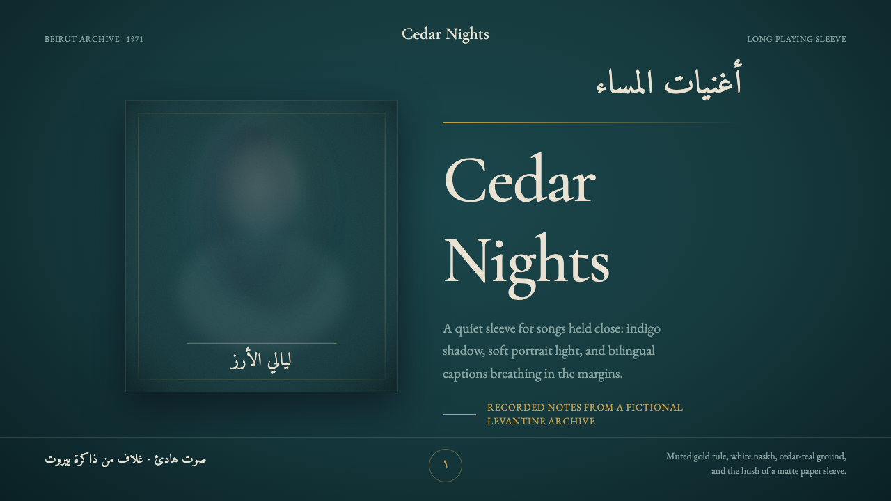 Fairuz Record SleeveQuiet luxury holds the sleeve. Cedar teal, white naskh, and one muted gold ru…
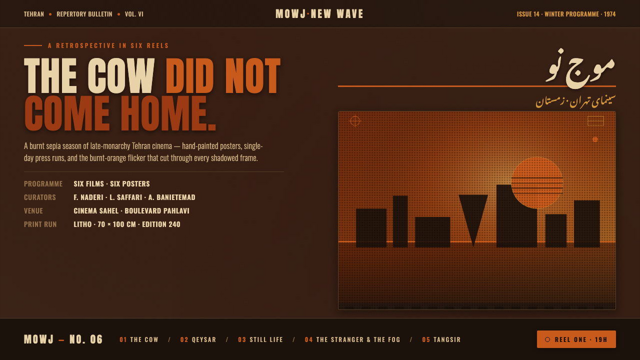 Iranian New Wave PosterPre-revolution Tehran cinema, burnt. Grainy ochre duotone over dark sepia, st…
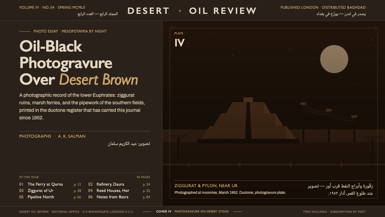 Iraq Petroleum MagazineCorporate gravity in oil-black. Desert-brown photogravure, Gill Sans bound to…
 Turkish Meyhane Raki TableThe slow Aegean tavern, in serif. Raki off-white on deep Cycladic indigo, bra…
 Akubra Outback (1970s Stockman)Worn honesty. Leather brown, Pilbara orange, and cream catalogue frames carry…
 Times New Roman by MorisonAuthority under pressure. Dense black serif columns on grey-tan newsprint, ru…