What is Iranian New Wave Poster?
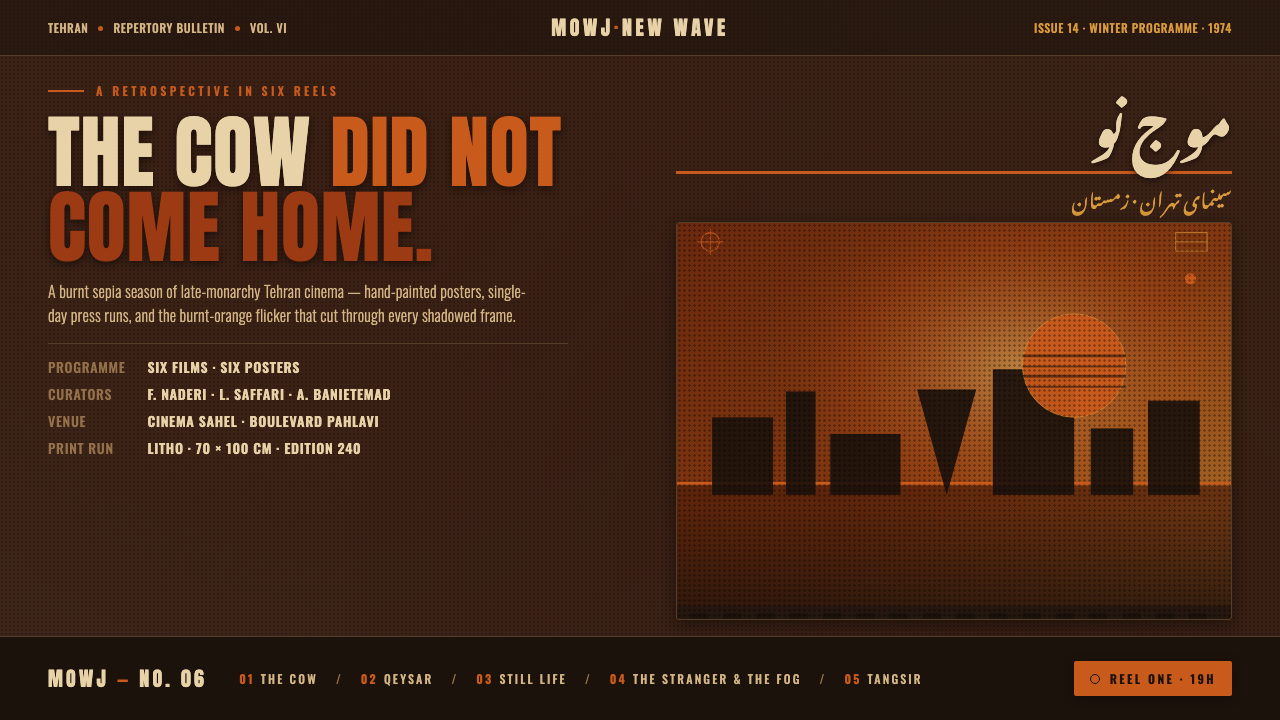
Iranian New Wave posters turned scarcity into atmosphere — grain, burnt ochre, dark sepia, and Persian lettering charged with cinematic unease.
Iranian New Wave Poster in brief
Iranian New Wave Poster refers to the visual language surrounding pre-revolution Tehran cinema, especially the Iranian New Wave movement from 1969 to 1979. Its defining image is a large, often hand-painted film poster built from a grainy ochre-and-burnt-orange duotone photograph, set against a dark sepia field and interrupted by stark Persian nasta'liq titling.
This was a visual language shaped by limitation. Posters were produced on low budgets and often completed in single-day runs, so the image had to carry mood immediately, with a restricted palette and forceful lettering doing the work that elaborate production could not. The result is not polished minimalism. It is compressed, tactile, and visibly made under pressure.
As a design system, the style translates that pressure into a dark, cinematic interface. The background remains deep and brown-black, imagery is reduced to burnt tonal families, grain supplies physical presence, and a single bright orange accent cuts through the gloom. The composition should feel asymmetrical and suspended, as though a film still, a handwritten title, and a fragment of urban memory have been held in the same frame.
Where does Iranian New Wave Poster come from?
The source places the broader visual era between 1950 and 1990, with the Iranian New Wave itself concentrated from 1969 to 1979. Its geographic and cultural center is Tehran, in the Middle East, before the revolution. The movement is also identified by its Persian name, mowj-e now, a term that situates the work within a specifically Iranian modern cinema rather than a generic international poster style.
The production conditions are essential to understanding the look. These were large-format film posters, often hand-painted, made for low-budget cinema and frequently completed in single-day runs. The compressed schedule encouraged visual decisions that could be executed quickly and read from a distance: a dominant image, a limited tonal range, assertive lettering, and a surface that retained the evidence of manual or rough reproduction.
The palette and image treatment formed a unified atmosphere rather than a collection of decorative choices. Grainy ochre and burnt orange gave photographic imagery a heated, weathered quality, while the dark sepia field created the surrounding darkness. Against that ground, Persian nasta'liq titling appeared stark and isolated, turning language into a major compositional object rather than a quiet caption.
The design system takes its spiritual reference from the cinema named in the source, particularly Dariush Mehrjui's The Cow and Masoud Kimiai's Kaiser. It does not attempt to reproduce a single poster. Instead, it extracts a recurring mood: pre-revolution Tehran rendered as tense, nocturnal, cinematic, and materially imperfect, with one bright orange signal cutting through a field of brown-black quiet.
What defines the Iranian New Wave Poster look?
Burnt Duotone
Color is deliberately narrow and heated. Ochre and burnt orange carry the image, while dark sepia provides the surrounding field and black-brown tones support legibility. The palette should feel developed in smoke and dust rather than selected from a bright digital spectrum. A brighter orange may appear as the lone signal of urgency, but it should remain exceptional so that its arrival has cinematic force.
Grain as Matter
Grain is not a finishing filter applied after the design is complete. It is part of the visual substance, making images and fields feel printed, photographed, and physically handled. The grain should remain visible enough to interrupt digital smoothness, but it must still allow faces, objects, and lettering to hold their shape. Its purpose is atmosphere and material memory, not random noise.
Dark Sepia Ground
The background is a field of darkness rather than an empty neutral surface. Deep sepia gives the interface its nocturnal, pre-revolutionary atmosphere and allows the ochre image to appear as something emerging from shadow. Large quiet areas are important: the darkness should surround the content with tension, not be filled until the page becomes uniformly busy.
Stark Nasta'liq
Persian nasta'liq titling is treated as a visual event. Its role is not merely to label a film or section but to create a suspended, expressive counterforce against the photograph. The title may sit apart from the image, cut across it, or occupy an unexpectedly commanding position. Whatever its placement, it should feel deliberate and singular, with enough contrast to remain legible inside the dark tonal world.
Cinematic Asymmetry
Composition should feel like a frame caught at an unstable moment. The image, title, and accent do not need to balance through symmetry; they balance through tension, scale, and the direction of attention. A heavy photographic mass may sit against an open dark field, while the title hangs at an angle or occupies a separate visual register. The layout should imply a scene continuing beyond its edges.
Hand-Made Urgency
The style should retain the pressure of its production context. Edges may feel slightly rough, image transitions may remain blunt, and lettering should not be made excessively pristine. This does not mean careless execution. It means allowing the work to show that it was made for a real cinema, under real constraints, with atmosphere arriving through decisive marks rather than ornamental refinement.
Who shaped Iranian New Wave Poster?
Dariush Mehrjui is one of the key figures named in the source for Iranian New Wave cinema. His film The Cow is identified as a spiritual origin for this design system, making his name especially important when the visual language needs to suggest psychological unease, dark theatricality, and a cinema emerging from constrained conditions.
Masoud Kimiai is another key figure in the source material, with Kaiser named alongside The Cow as a spiritual reference. His place in this system reinforces the connection between the poster language and pre-revolution Tehran cinema: tense, image-led, dark in mood, and capable of carrying an entire dramatic charge through a single poster surface.
Sohrab Shahid-Saless belongs to the source's constellation of Iranian New Wave figures. His inclusion broadens the reference field beyond the two named films and keeps the style connected to a movement rather than reducing it to a single director's signature. In practical design terms, that means preserving the movement's shared grain, darkness, and cinematic restraint.
Bahram Beyzai is named among the movement's key figures and helps anchor the style within the wider pre-revolution Tehran cinema context. For a Curio design system, his reference is useful as a reminder that the visual language should remain culturally specific: Persian titling, burnt photographic atmosphere, and a sense of place are structural parts of the style.
How do you use Iranian New Wave Poster today?
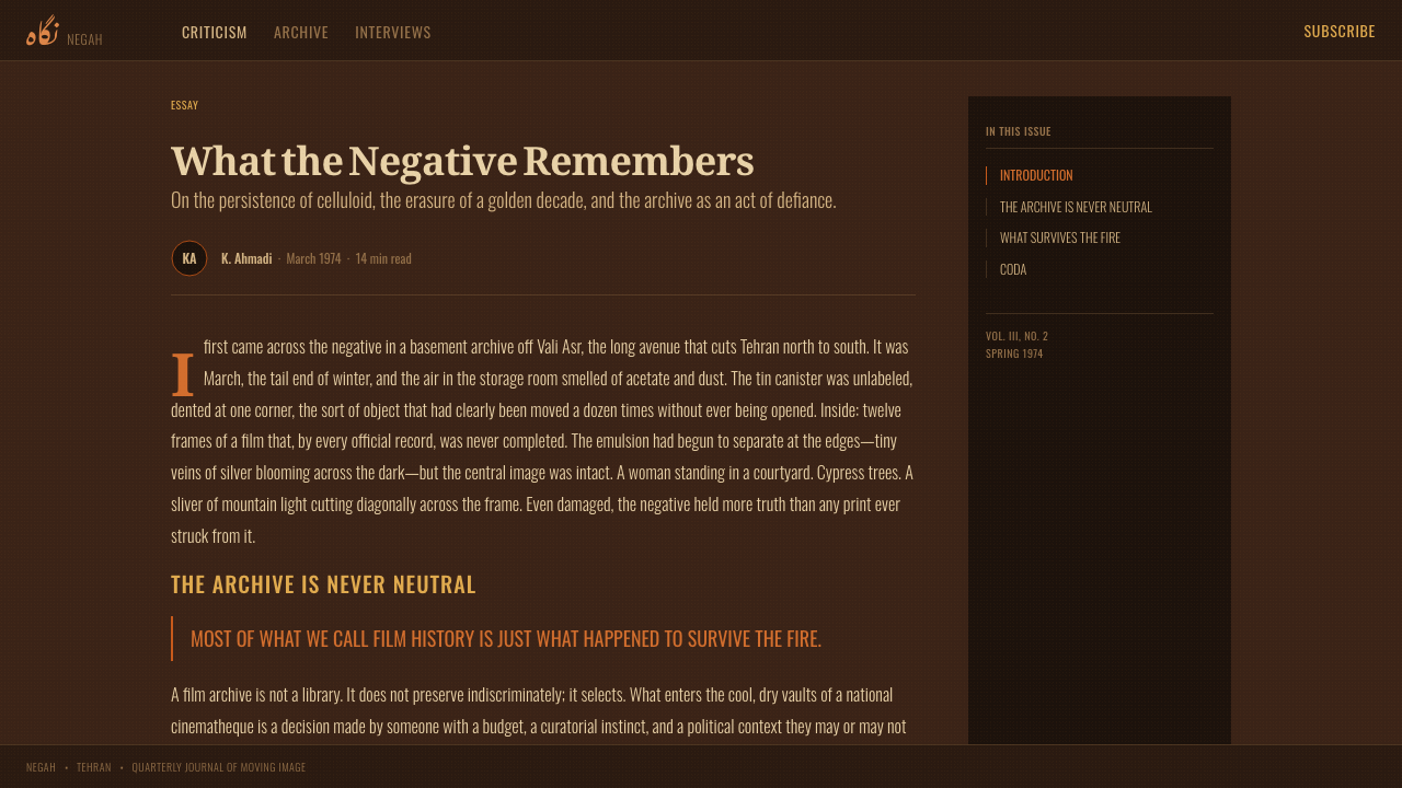
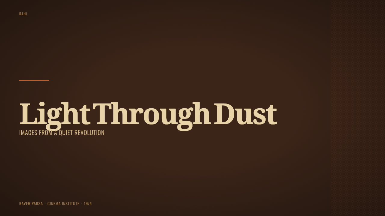
For presentation slides, use the cover as a poster-like frame: a dark sepia field, one dominant grainy image, a stark title treatment, and a restrained orange signal. Content slides should preserve that atmosphere without turning every page into a film poster. Let one image or one phrase carry the mood, then organize supporting text in quiet areas around it. Data slides can treat charts as cinematic evidence, using burnt tonal families and the bright accent only where attention must land.
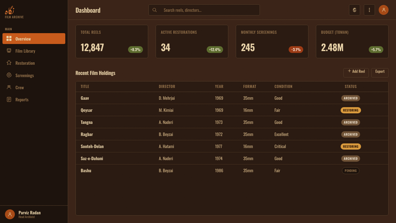
For web interfaces, the system suits dashboards, monitoring tools, archives, and pricing pages that want to feel serious, atmospheric, and culturally specific. Keep the interface grounded in deep sepia, use ochre for image-led surfaces, and reserve bright orange for active states, warnings, selected plans, or decisive actions. Cards should feel like framed scenes rather than floating objects, while navigation remains spare enough for the dark field to retain its tension.
For editorial and marketing work, the style is strongest when the page behaves like a sequence of stills. Open with a large photographic moment, follow with narrow blocks of text, and use the Persian title treatment as a structural interruption between sections. Marketing campaigns can alternate between image-heavy frames and nearly empty dark fields, allowing a single orange phrase or action to become memorable. The result should feel like a cinema program, a hand-made poster wall, or an archive of charged fragments.
The system also works well for cultural institutions, film archives, event programs, and products whose identity depends on atmosphere rather than friendliness. Grain can distinguish hero images, section backgrounds, and featured objects, while the sepia ground keeps unrelated content within one visual world. When Latin-language content is required, maintain the same suspended title logic through scale, placement, and contrast instead of pretending that ordinary interface labels are Persian calligraphy.
The common mistake is treating the style as a sepia filter plus decorative grain. That produces a generic retro surface and loses the movement's pressure. The image must carry a specific cinematic weight, the title must behave as an active compositional force, and the bright orange accent must remain rare. Adding many warm colors, smoothing away every rough edge, or filling all dark space with content weakens the tension that makes the system recognizable.
Iranian New Wave Poster — FAQ
Is Iranian New Wave Poster simply a sepia style?
No. Sepia is only the ground of the system. Its identity comes from the combination of grainy ochre-and-burnt-orange imagery, a dark field, stark Persian nasta'liq titling, asymmetric cinematic composition, and the pressure of low-budget hand-made production. Remove the image tension or the title's structural force, and the result becomes generic retro styling rather than Iranian New Wave Poster.
Why is grain so important to the style?
Grain preserves the sense that the image has passed through a physical process. The source describes posters that were often hand-painted, made on low budgets, and completed rapidly. Grain translates those conditions into surface language: it interrupts digital smoothness, thickens the atmosphere, and makes the image feel like an object from a cinema archive rather than a clean screen asset.
Can this style work on a light background?
It can be adapted, but the dark sepia field is one of its strongest identity markers. A light variation should retain the burnt photographic treatment, visible grain, stark title behavior, and restrained orange accent. If the background becomes broadly pale and the image loses its shadowed atmosphere, the design may remain warm and vintage but will no longer carry the same pre-revolution Tehran character.
How should Persian nasta'liq titling be used in a non-Persian interface?
Use it as a compositional reference, not as a decorative costume. The important qualities are the title's isolation, expressive presence, and ability to interrupt the image. If the product cannot support Persian lettering, a Latin title can still occupy a similarly commanding position, with comparable contrast and suspension. The goal is to preserve the relationship between image and title, not to imitate a script without cultural or linguistic purpose.
What makes the bright orange accent effective?
It works because the rest of the system remains dark, burnt, and restrained. The orange accent becomes a signal cutting through the sepia field, so it can mark urgency, selection, or a decisive action without competing with the photograph. If bright orange appears everywhere, it stops functioning as a signal and the entire interface loses the contrast between brooding atmosphere and sudden illumination.
Related design styles
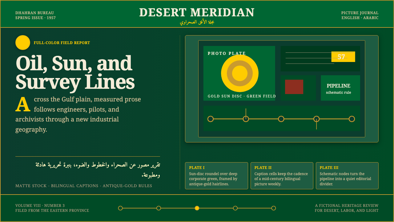 Aramco World MagazineMatte Gulf modernism. Desert green, gold sun-discs, classic serif, and naskh…
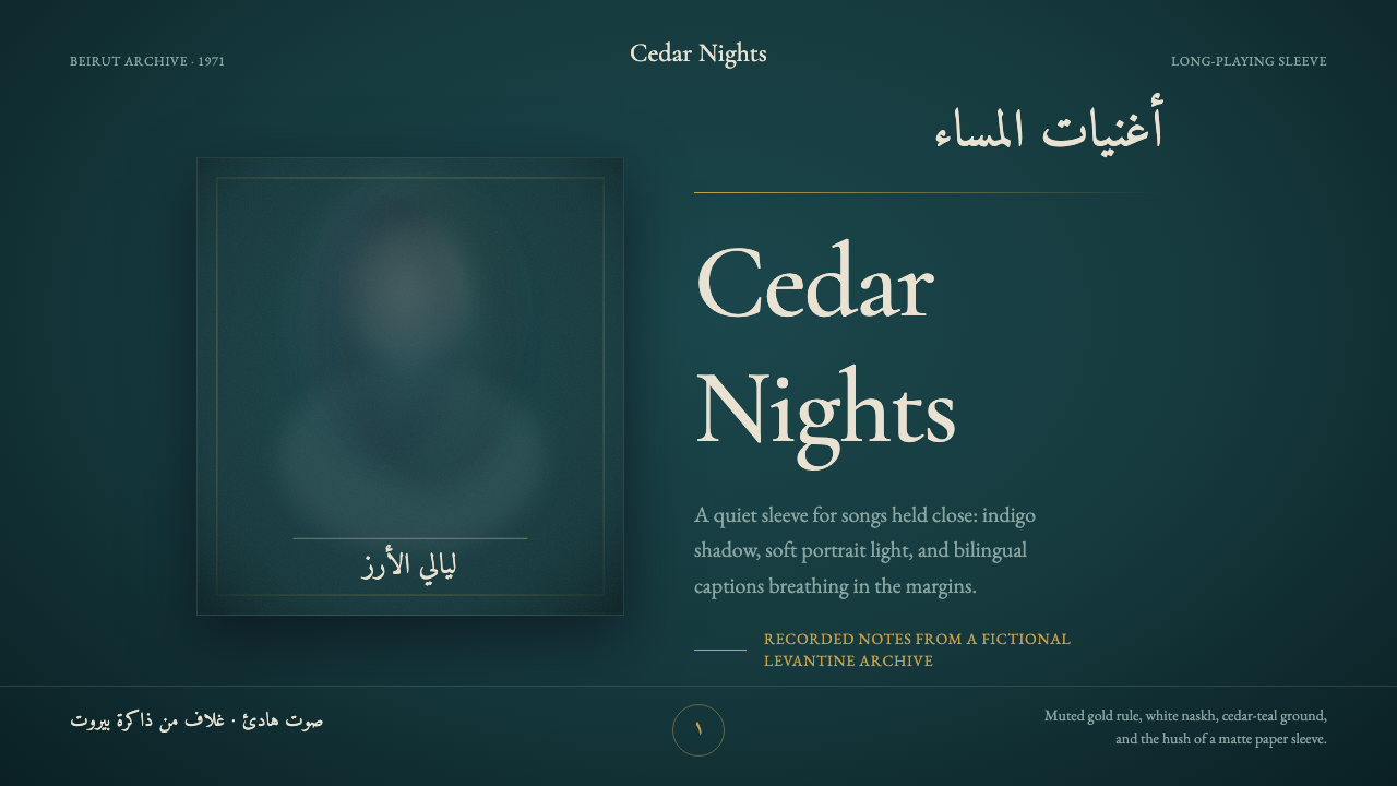 Fairuz Record SleeveQuiet luxury holds the sleeve. Cedar teal, white naskh, and one muted gold ru…
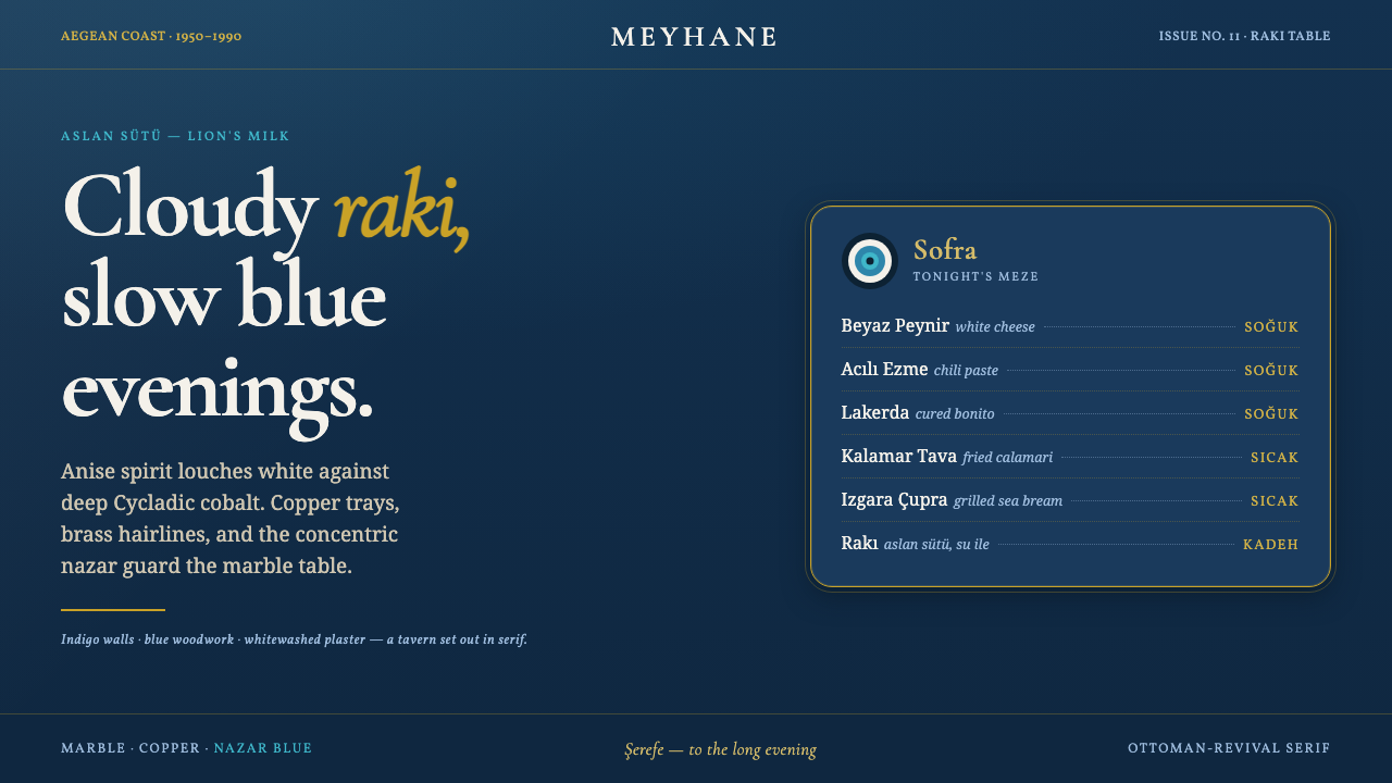 Turkish Meyhane Raki TableThe slow Aegean tavern, in serif. Raki off-white on deep Cycladic indigo, bra…
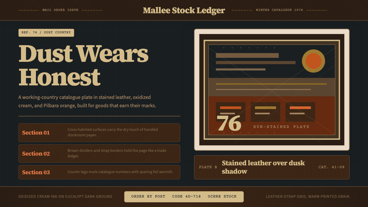 Akubra Outback (1970s Stockman)Worn honesty. Leather brown, Pilbara orange, and cream catalogue frames carry…
 Czechoslovak New Wave CinemaNoir without nostalgia. Letterbox bars, off-white titling, and 35mm grain do…
 Cuban Malecón 1960 PosterPublic voice in flat ink. Turquoise wall, cream stock, brick red and cobalt b…