What is Fairuz Record Sleeve (1971)?
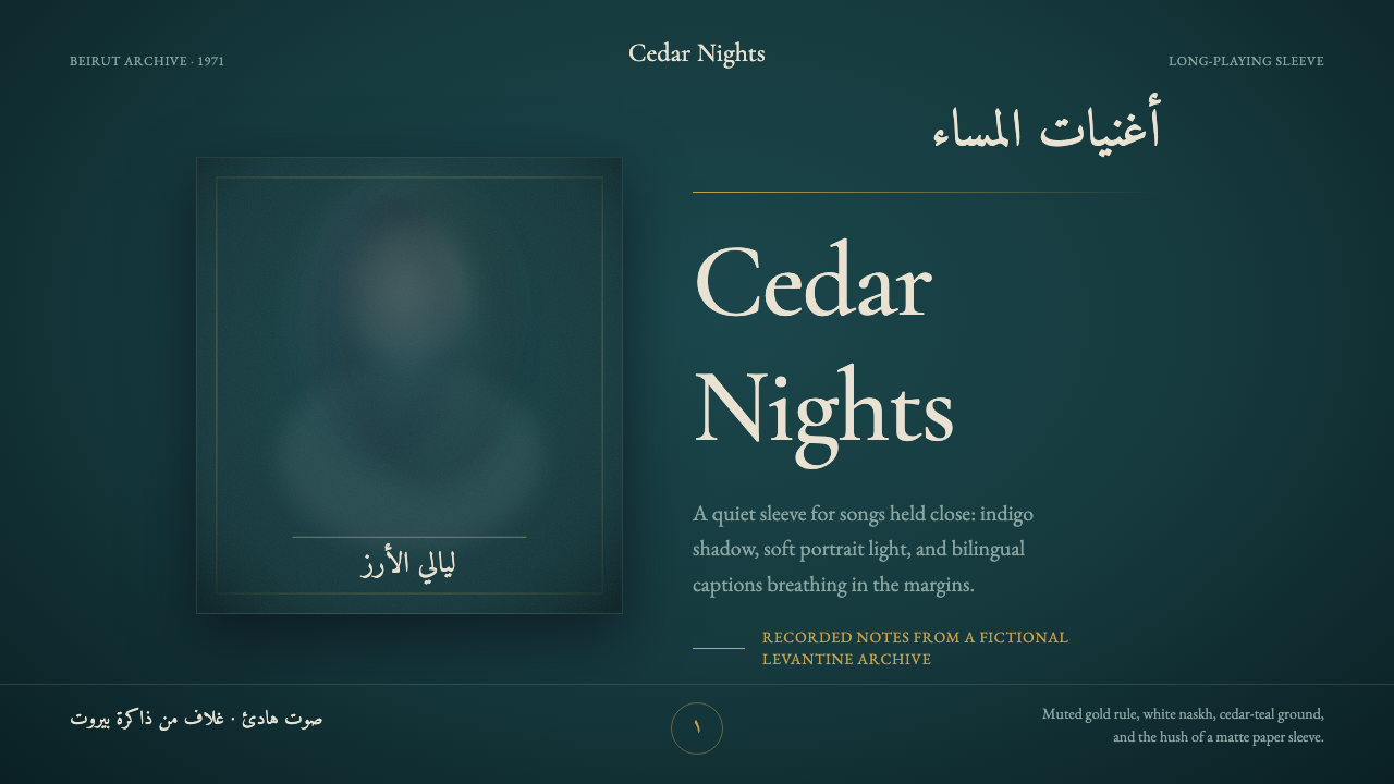
A Fairuz record sleeve from 1971 makes luxury almost silent — a softened face, white Arabic script, and one muted gold line suspended in cedar-dark space.
Fairuz Record Sleeve (1971) in brief
Fairuz Record Sleeve is a visual style distilled from the early-1970s album covers associated with Lebanese singer Fairuz and the Rahbani brothers, Assi and Mansour. Its essential composition is remarkably spare: a single soft-focus portrait floats against a deep cedar-tinged teal or indigo field, accompanied by elegant white naskh Arabic and a restrained Latin serif. A muted gold rule may divide or anchor the information, but little else interrupts the darkness.
The style is luxurious without display. Its refinement comes from controlled absence: quiet margins surrounding the portrait, subdued color relationships, delicate typography, and photographic softness that feels intimate rather than theatrical. Instead of filling the sleeve with explanatory imagery or graphic motifs, the design allows a face, a name, and a few measured alignments to carry the entire emotional weight.
In digital form, the language depends on preserving this restraint. Dark teal establishes atmosphere; white lettering provides luminous clarity; muted gold introduces ceremony without glitter. Gentle film grain prevents the ground from feeling mechanically flat, while generous spacing turns emptiness into an active compositional element. The result should resemble a private listening moment, not a nostalgic collage.
Where does Fairuz Record Sleeve (1971) come from?
The style belongs to Beirut and the wider Levantine culture of record-sleeve design. Its source period extends across Fairuz and the Rahbani brothers' long creative era from 1950 to 1990, but the visual reference is concentrated in covers from the early 1970s, with 1971 serving as the defining point. These sleeves joined Levantine art-song presentation with the compact, portrait-led language of the mid-century LP.
Fairuz supplies the still emotional center. The sleeve does not treat her portrait as ordinary publicity photography crowded by supporting information. Her face is softened, isolated, and given room to hover within the dark field. This removal from a literal setting changes the image from documentation into presence: recognizable yet distant, personal yet iconic.
Assi and Mansour Rahbani form the other essential axis of the source material. Their association with Fairuz situates the sleeve within a shared musical identity rather than a purely individual celebrity image. The visual economy reflects that seriousness. Typography names the work; the portrait establishes intimacy; the dark ground contains both. The cover communicates confidence by declining to explain more than necessary.
The historical synthesis is narrow but potent. Mid-century portrait LP photography contributes the singular face, soft focus, and compact hierarchy. Levantine art-song sleeve design contributes Arabic calligraphy, regional identity, and an atmosphere of cultivated performance. Deep cedar teal and indigo bind these elements together, while white naskh and a muted gold rule lend the composition clarity and quiet ceremony.
What defines the Fairuz Record Sleeve (1971) look?
Cedar-Dark Color
The dominant field is a deep teal touched by cedar green, sometimes moving toward indigo. It should feel nocturnal and mineral rather than brightly aquatic. White supplies the clearest contrast, while muted gold appears only as a measured accent. The palette creates depth through restrained relationships, not through a large range of hues.
Soft-Focus Portrait
A single portrait carries the image system. Focus is gentle, contours are softened, and the face appears suspended rather than placed inside a descriptive scene. The photograph remains recognizable but avoids clinical sharpness. Its softness introduces memory, intimacy, and emotional distance without requiring added symbols or illustrative effects.
Arabic and Latin Pairing
Elegant white naskh Arabic supplies the principal calligraphic voice, paired with a refined Latin serif when bilingual information is needed. The two scripts should not compete for spectacle. Their relationship is built through alignment, calm scale contrast, and shared visual delicacy, allowing each writing tradition to retain its own rhythm.
The Muted Gold Rule
Gold is not a decorative coating but a single restrained event. A fine muted rule may separate title from supporting information, establish an axis, or close a composition. Its value lies in rarity. Repeated borders, metallic flourishes, or glittering surfaces would turn quiet ceremony into generic opulence.
Quiet Margins
Large areas of unoccupied dark ground surround the portrait and type. This space is neither unfinished nor neutral: it slows the eye, heightens the perceived delicacy of the lettering, and makes the portrait feel solitary. Elements gain authority because they are not crowded by secondary messages.
Film-Grain Surface
Gentle grain gives the dark field a tactile, photographic atmosphere. It should be perceived as a soft material presence rather than an obvious retro filter. The grain unifies portrait and background, tempers digital smoothness, and helps the surface feel printed and handled without introducing illustrative texture.
Intimate Restraint
Every component is asked to speak quietly. Contrast is clear but not harsh; the portrait is iconic but not monumental; luxury appears through refinement rather than accumulation. This balance is the style's governing discipline. Removing one element may strengthen the composition, while adding an expressive flourish usually weakens it.

Who shaped Fairuz Record Sleeve (1971)?
Fairuz is the visual and emotional center of the sleeve language. Her soft-focus portrait gives the otherwise abstract field a human presence, yet the surrounding darkness keeps that presence poised and distant. The style depends on this tension: the viewer encounters a recognizable performer, but the sleeve withholds the ordinary immediacy of publicity photography.
Assi Rahbani belongs to the creative identity surrounding Fairuz in the source period. His presence places the sleeve within the world of the Rahbani brothers and Levantine art song, giving its restraint cultural and musical context. The design is therefore more than a portrait treatment; it is a visual threshold into a shared body of performance.
Mansour Rahbani completes the fraternal creative frame named by the source material. Together with Assi and Fairuz, he anchors the style in a specific Beirut and Levantine context rather than in generalized vintage luxury. That specificity matters: Arabic script, portrait stillness, and ceremonial restraint operate as parts of one cultural presentation.
How do you use Fairuz Record Sleeve (1971) today?
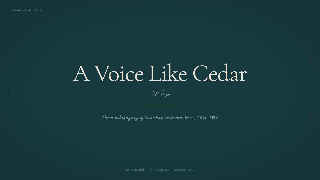
For presentation covers, begin with atmosphere rather than information density. Let a single portrait occupy a contained area within a broad cedar-teal or indigo field. Place the title in white, using either Arabic-led typography or a refined serif voice, and introduce one muted gold rule if the hierarchy needs an anchor. The cover should feel composed before it feels informative.
Content slides require a quieter adaptation. Preserve generous margins, keep paragraphs in compact groups, and use the gold rule only at meaningful transitions. A small portrait or cropped photographic detail can accompany a section opening, but ordinary content pages should rely on typography and space. For data slides, use restrained white marks and one subdued accent so that charts remain legible without breaking the nocturnal mood.
In web interfaces, the style is best suited to selective dashboards, cultural archives, listening experiences, and pricing presentations that benefit from calm authority. Dark teal can organize the overall field, while white text establishes the primary reading layer and muted gold identifies chosen plans, active states, or important totals. Panels should be separated by spacing and fine rules rather than numerous decorative containers.
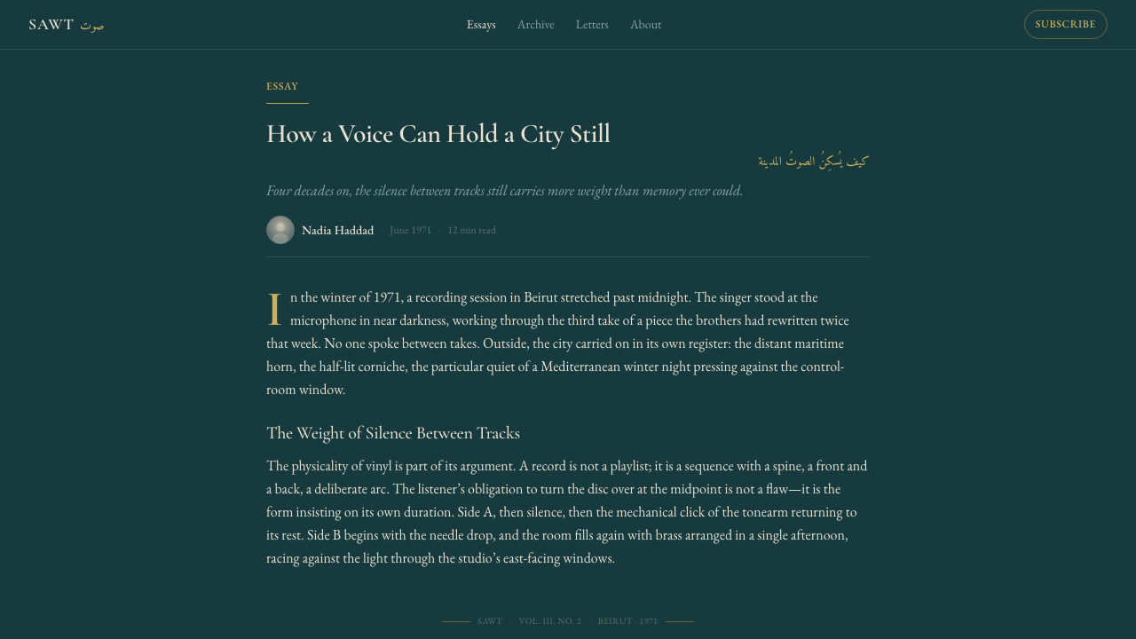
Editorial and marketing layouts can borrow the sleeve's portrait logic directly. Open an article or campaign with one softened image and a brief title surrounded by deep space; allow subsequent sections to alternate between image-led pauses and carefully measured text. Marketing copy should remain concise, because crowded claims contradict the style's confidence. A single call to action is more convincing here than a cluster of competing prompts.
The common mistake is to confuse quiet luxury with abundant luxury signals. Large amounts of gold, ornate frames, several portraits, dramatic glow, and conspicuous vintage distress all weaken the source language. Another error is treating Arabic script as decoration instead of meaningful typography. The style succeeds when every script remains readable, the portrait retains emotional primacy, and the dark field is allowed to stay substantially empty.
Fairuz Record Sleeve (1971) — FAQ
Is Fairuz Record Sleeve simply a dark vintage style?
No. Its identity comes from a specific combination of Beirut and Levantine art-song context, early-1970s portrait sleeve design, white naskh Arabic, refined Latin serif typography, and cedar-dark color. Generic vintage treatments often add decorative wear, elaborate frames, or nostalgic objects. This style is distinguished by how little it needs: one portrait, limited text, a quiet rule, and disciplined space.
Why is the portrait deliberately soft rather than sharply detailed?
Soft focus changes the portrait from factual description into emotional presence. It allows the face to remain recognizable while reducing incidental detail that might compete with the typography or dark field. The softness also joins the image to the gentle film grain, making portrait and ground feel like one continuous printed atmosphere rather than separate digital layers.
Can the style be used without Arabic typography?
A related composition can be made with a refined Latin serif alone, but it loses one of the source language's defining cultural and visual relationships. White naskh is not an interchangeable ornament; its flowing structure contributes rhythm and identity. When Arabic is genuinely part of the content, it should be treated as readable primary typography, not as a decorative imitation.
How much gold should appear in an authentic application?
Very little. The source material describes one muted gold rule, and that singularity is central to its effect. Gold works as a ceremonial pause or structural accent precisely because it is surrounded by dark teal and white. Expanding it across headings, borders, icons, and large surfaces removes the restraint and shifts the result toward conventional luxury branding.
Where does this style work poorly?
It struggles when an interface must display many simultaneous alerts, dense controls, brightly differentiated categories, or several competing actions. Its authority depends on low visual noise and a clear emotional center. It is also unsuitable when the portrait is merely filler, because the image must carry genuine significance. In dense products, the sleeve language is often strongest on covers, gateways, selected pricing moments, or editorial openings rather than every operational screen.
Related design styles
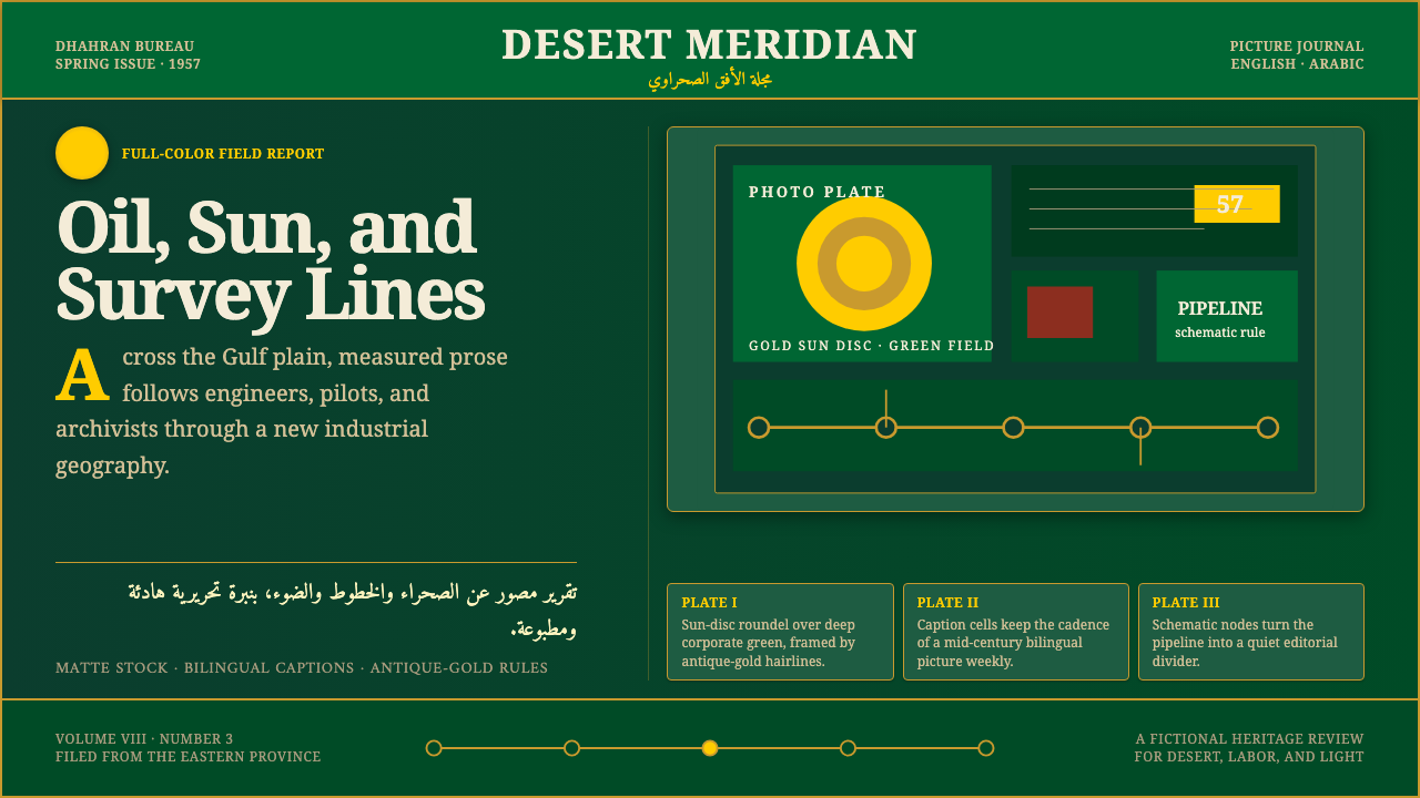 Aramco World MagazineMatte Gulf modernism. Desert green, gold sun-discs, classic serif, and naskh…
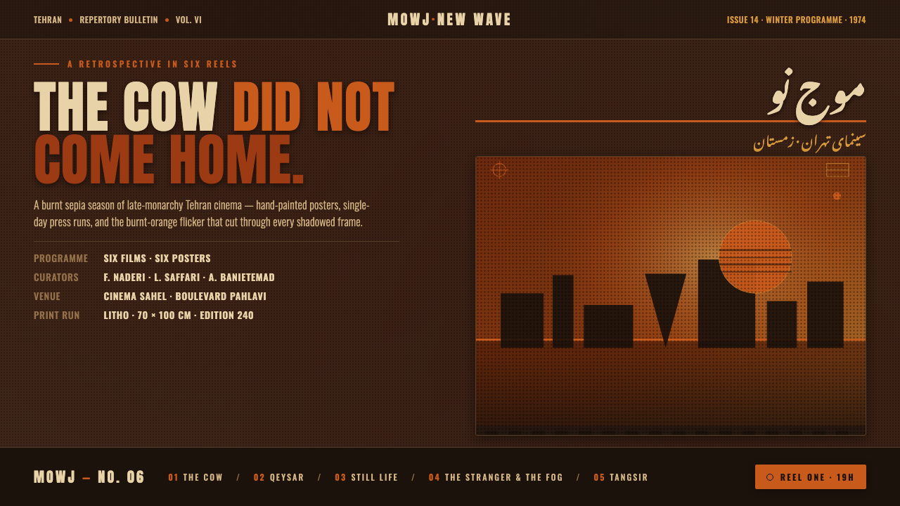 Iranian New Wave PosterPre-revolution Tehran cinema, burnt. Grainy ochre duotone over dark sepia, st…
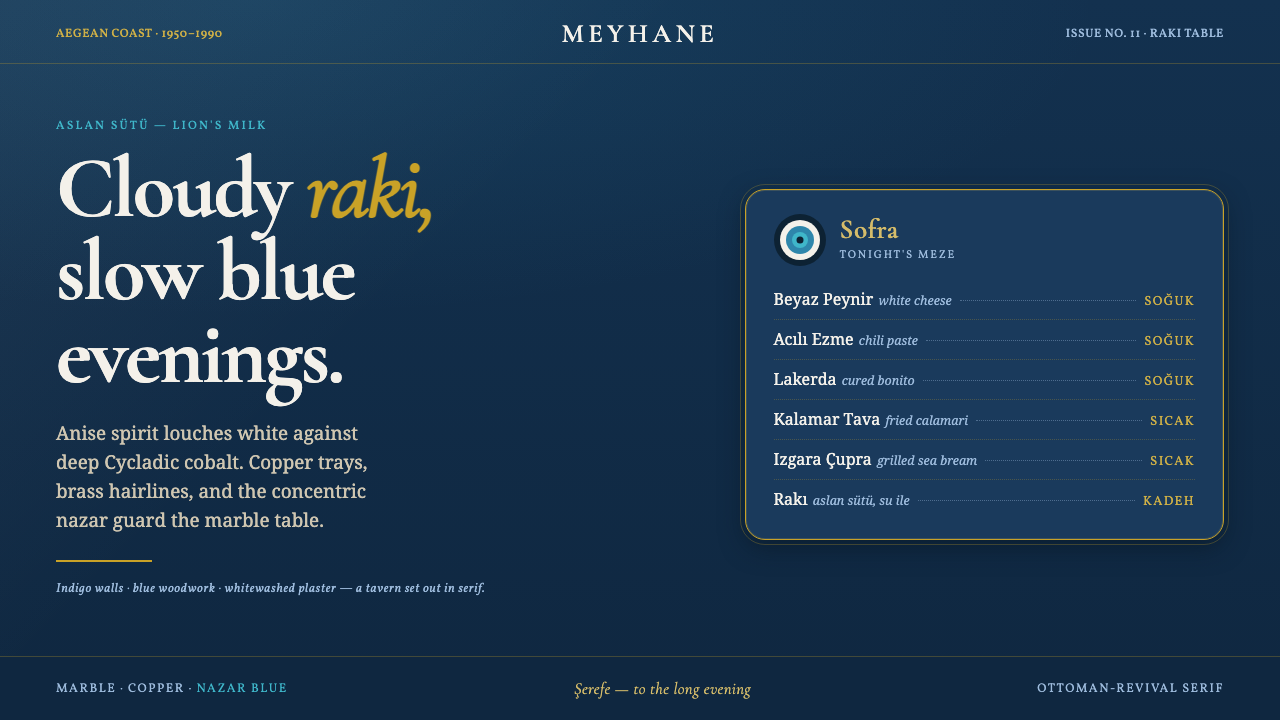 Turkish Meyhane Raki TableThe slow Aegean tavern, in serif. Raki off-white on deep Cycladic indigo, bra…
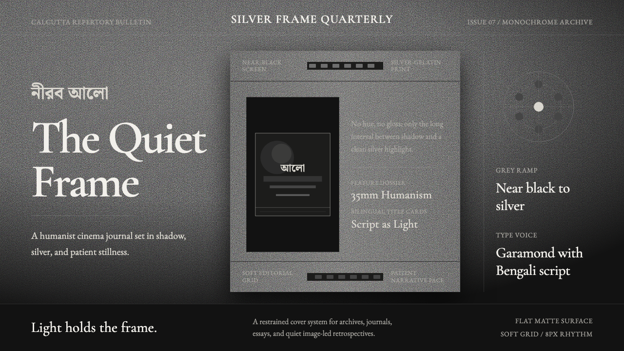 Bengali Art-House CinemaLight becomes restraint. Near-black ground, silver serif, and Bengali script…
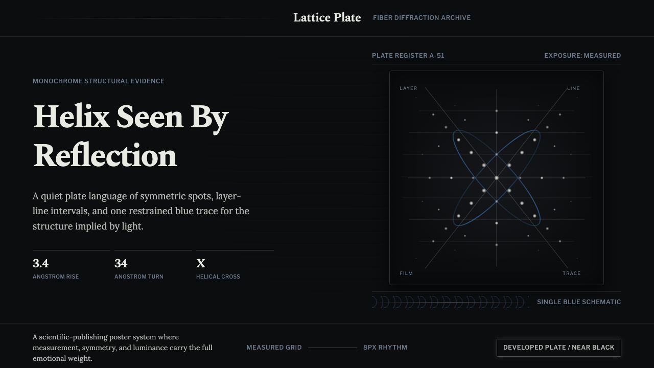 X-Ray CrystallographyQuiet evidence glows. Near-black film, Spectral serifs, and an X-cross spot l…
 Bahraini Pearl Diving GreyQuiet authority at dusk. Nacre grey type and hairline grids hold one brass-wa…