What is Turkish Meyhane Raki Table?
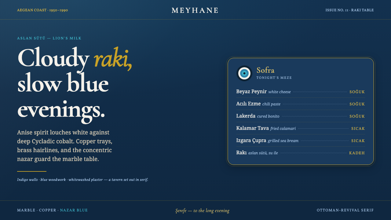
Turkish Meyhane Raki Table turns the slow, crowded Aegean tavern into an interface of indigo depth, cloudy raki light, brass glints, and the patient ceremony of meze.
Turkish Meyhane Raki Table in brief
Turkish Meyhane Raki Table draws from the classic Aegean meyhane: a coastal tavern world associated with indigo-painted walls, whitewashed plaster, blue woodwork, marble-topped tables, cloudy raki, and tables gradually covered in meze. It is not a sterile Mediterranean postcard. Its visual character depends on accumulated presence: a dark room, reflective metal trays, pale drink and tableware, painted architectural surfaces, and small protective symbols that make a shared table feel inhabited.
The central contrast is between depth and bloom. Deep Cycladic cobalt and indigo establish the enclosing, evening-like ground; raki off-white arrives as a soft, cloudy interruption, recalling the drink known as lion’s milk. Brass and copper introduce warmth without breaking the nocturnal mood, while nazar blue adds a sharper, watchful note. The result is layered rather than minimal: darkness is the field that lets pale serif lettering, decorative borders, and table-like clusters of information become legible.
As a design system, the style translates lived-in tavern warmth into a dark interface without pretending that a screen is a literal restaurant interior. Ottoman-revival serif typography carries the voice; ornamental framing gives modules ceremony; blue-and-white architectural references keep the palette grounded. The intended feeling is unhurried hospitality: information should seem placed on a table, offered in courses, and held together by a setting that invites conversation rather than speed.
Where does Turkish Meyhane Raki Table come from?
The source setting is the Aegean meyhane of 1950–1990, a period identified here as the classic era of this tavern atmosphere. Its geography joins Aegean Turkey to the wider Mediterranean and Cycladic blue-and-white belt. That regional frame matters because the style is not built from a single object. It comes from the meeting of painted coastal architecture, table service, drink ritual, and folk protection at the same table.
Meyhaneci tavern-keepers are central figures in this visual world because the meyhane is fundamentally a place of hosting. The room is defined not only by walls and signage but by how a marble-topped table receives raki, meze, trays, and company. In design terms, this gives the style its hospitality-first logic: a page should feel arranged for gathering, with a stable dark setting and a sequence of clearly offered elements rather than a blank canvas decorated after the fact.
Aegean meze cooks supply the other half of the table’s identity. Meze implies variety gathered into a shared spread, not a single isolated centerpiece. The interface equivalent is controlled abundance: related cards, labels, notes, or categories can sit in proximity like dishes on one table, but they need a common ground and clear boundaries. Brass and copper accents work best as the glint of serving ware—selective, warm, and tied to attention—rather than as a universal finish applied everywhere.
Ottoman-revival sign painters, Aegean vernacular blue-and-white architecture, and nazar folk craft form the visual movements named by the source material. Their combination explains the style’s distinctive tension. Serif lettering brings ceremonial, sign-like presence; blue-painted wood against whitewashed plaster supplies architectural contrast; the concentric blue nazar boncuk gives ornament a protective function. These references should remain intertwined. Remove the table warmth and the result becomes merely dark and decorative; remove the typographic and folk details and it loses its meyhane specificity.
What defines the Turkish Meyhane Raki Table look?
Indigo Ground
Deep Cycladic cobalt and indigo are the enclosing field, not a decorative accent. They should make a screen feel like a tavern interior at evening: dense enough to hold pale text, metal ornament, and grouped content, yet calm enough that the interface does not read as theatrical darkness. The dark ground gives every lighter element the effect of something placed on a table or catching light across the room.
Raki Off-White
The pale counterpoint should evoke raki turning cloudy in the glass rather than stark paper white. It is the principal reading color for serif titles, body text, rules, and table-like surfaces. Used against indigo, it softens contrast without losing clarity and makes the palette feel poured, chalked, or washed rather than digitally clinical. Its restraint is essential: this light tone should carry voice and legibility before it becomes a large decorative field.
Brass and Copper Glint
Brass-gold ornament and copper-like highlights belong to trays, rims, separators, and moments of emphasis. Their role is reflective rather than dominant: a suggestion of serving ware catching warm light beside a cool blue room. Fine decorative lines, framed headings, and selected symbols can use this family of warmth, but broad metallic fields quickly overpower the meyhane atmosphere. The glint works because it appears as a reward for looking closely.
Ottoman-Revival Serif
Typography is carried by an Ottoman-revival serif voice rather than neutral modern utility lettering. The serif should feel like painted tavern signage: formal enough to announce a name, menu section, or invitation, but warm enough to live beside food, drink, and conversation. Hierarchy comes through measured changes in scale, density, and placement. Supporting text can remain quieter, but the main typographic presence should preserve the room’s old-sign character.
Nazar Protection
The nazar boncuk contributes concentric blue protection rather than generic decoration. It is best treated as a small guardian at a threshold: beside a section title, at the end of a divider, near a selected action, or within a badge-like detail. Its visual force comes from contrast between circular concentration and the broader indigo field. Repeating it indiscriminately weakens its meaning and turns a protective table symbol into wallpaper.
Layered Table Composition
Composition should resemble a table gradually filling with meze: grouped, varied, and generous, yet held together by one shared surface. Cards and content regions may overlap in emphasis through borders, trays, labels, and inset panels, but they should not compete at equal volume. The eye needs a clear host element, supporting dishes of information, and breathing room around the spread. This is abundance with hospitality, not clutter.
Who shaped Turkish Meyhane Raki Table?
The tavern-keepers embody the hosting logic behind the style. Their importance is not tied to a named individual but to the act of arranging a room and table for shared time: raki, meze, trays, conversation, and a setting that feels prepared rather than merely furnished. In a design application, they are the reminder that hierarchy should welcome and guide, not simply display.
Aegean meze cooks represent the shared spread that gives the meyhane table its visual and social rhythm. Their contribution suggests variety under a common table logic: many distinct offerings, each readable in itself, becoming more meaningful through adjacency. This is the source of the style’s preference for curated clusters over isolated feature blocks.
Ottoman-revival sign painters provide the typographic and ornamental voice. Their presence anchors the use of expressive serif lettering and framed details in a vernacular sign-making tradition rather than in luxury branding alone. The lesson is to let type behave as an architectural and social signal—something that names, welcomes, and establishes atmosphere.
How do you use Turkish Meyhane Raki Table today?
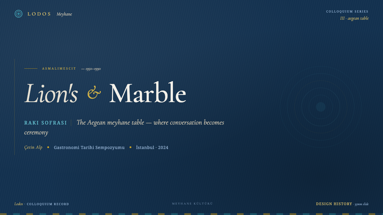
For presentation covers, use the indigo field as an enclosing room and let one raki-off-white serif title take the role of the table’s invitation. A restrained brass frame or a small nazar detail can establish the setting, but the cover should leave darkness visible around the title. Content slides should become courses rather than posters: introduce one idea at a time, hold supporting points in clearly related groups, and use pale rules or framed labels to maintain sequence without flattening every section into the same card.
Data slides suit the style when data is treated like a carefully laid table rather than a technical report stripped of atmosphere. Keep the dark ground stable, make the main reading layer pale and calm, and reserve brass warmth or nazar blue for selected distinctions. Charts should remain direct and easy to compare; ornament belongs around the information as a framing device, never inside the data itself. A concise note, a highlighted series, and a serif section heading can make a dense slide feel hosted rather than crowded.
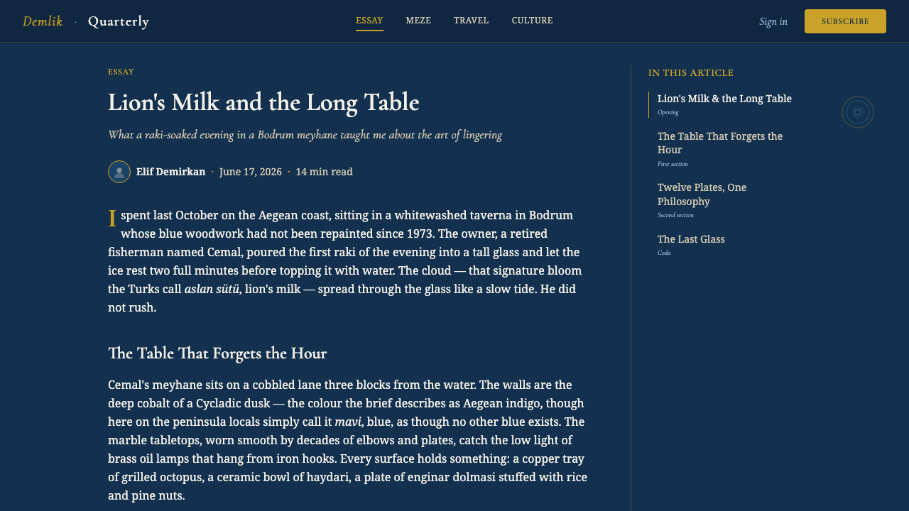
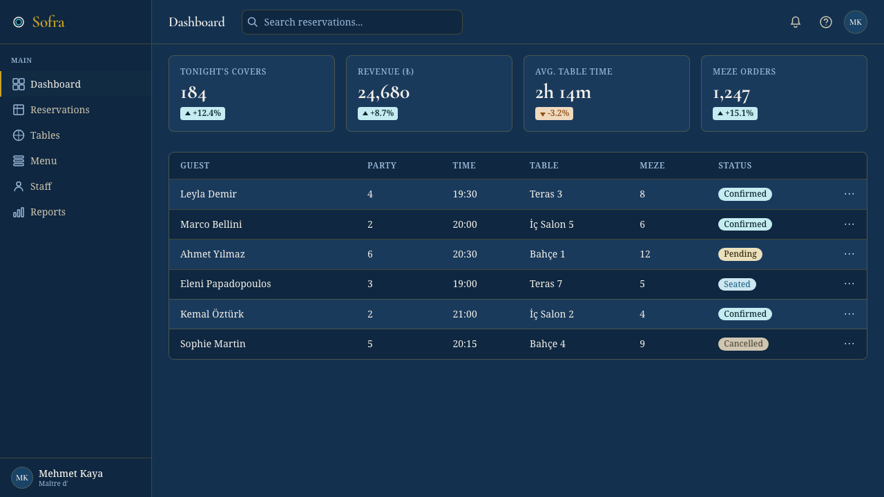
For web interfaces, this style is particularly effective for dashboards, member spaces, reservations, menus, collections, and pricing pages where a sense of occasion can coexist with strong navigation. Use indigo as the continuous environment, then organize panels like trays set on a shared table. Important actions should emerge through raki light, warm metal-like outlining, or a carefully placed protective-blue detail. Pricing tiers can feel like distinct place settings, but must preserve a clear path for comparison and selection.
Editorial and marketing pages benefit from the style’s ability to combine ceremony with intimacy. A long article can open with a serif title on a dark ground, then move through pale reading surfaces, framed pull quotes, and small ornamental pauses. A campaign page can make products or offerings feel like courses in a meal: begin with invitation, reveal detail in layers, and keep the blue-white-brass relationship consistent. The language should remain hospitable and specific; excess theatricality undermines the slow Aegean mood.
The common mistake is to reduce the style to a dark blue background with gold decoration. That loses the table ritual, the cloudy raki contrast, the whitewashed and blue-painted architectural relationship, and the nazar’s protective role. Another mistake is making every border, title, panel, and icon equally ornate. Authentic use depends on selective glints, quiet reading areas, and a hierarchy that feels prepared for guests. Let the dark field do much of the work, then add warmth only where attention or welcome genuinely needs it.
Turkish Meyhane Raki Table — FAQ
Is this style simply Mediterranean blue-and-white design?
No. The blue-and-white architectural belt is one source, but the style is specifically organized around the Aegean meyhane table. Raki off-white, meze abundance, brass and copper tray glints, Ottoman-revival serif lettering, and nazar protection give it a more social and ceremonial identity than a generic coastal palette. Blue and white establish the place; the table ritual gives the place its character.
Why should raki off-white be used instead of a pure bright white?
Because the intended pale tone refers to cloudy raki, called lion’s milk, against a deep cobalt setting. That association softens the visual language and connects reading surfaces to the drink at the center of the table. A harsh bright white can make the interface feel clinical and detach it from the layered warmth of plaster, marble, glass, and shared food.
Can the nazar boncuk be used as a repeating decorative pattern?
It can appear more than once, but it works best as a deliberate protective marker rather than a background texture. The source material describes the concentric blue nazar boncuk as guarding the table. Preserve that role by placing it near thresholds, selected details, or moments of welcome. When repeated without purpose, its concentrated visual and symbolic effect disappears.
Where does the style work best in a product?
It works best where a product benefits from depth, hospitality, and a sense of curated gathering: dashboards with meaningful collections, menus and reservation flows, membership areas, editorial spaces, and pricing pages. It is less suitable for interfaces that require a wholly neutral or highly compressed visual tone. The style needs room for dark atmosphere, serif voice, and selective ornament to establish its table-like rhythm.
What is the fastest way to make this style feel inauthentic?
Treating every element as luxury ornament is the fastest route to a generic result. The source system is warm because it balances indigo enclosure with raki light, metal glints with whitewashed calm, and decorative signs with practical hosting. If every panel is gilded, every word is dramatic, and every empty area is filled, the slow tavern feeling vanishes. Keep the table visible beneath the decoration.
Related design styles
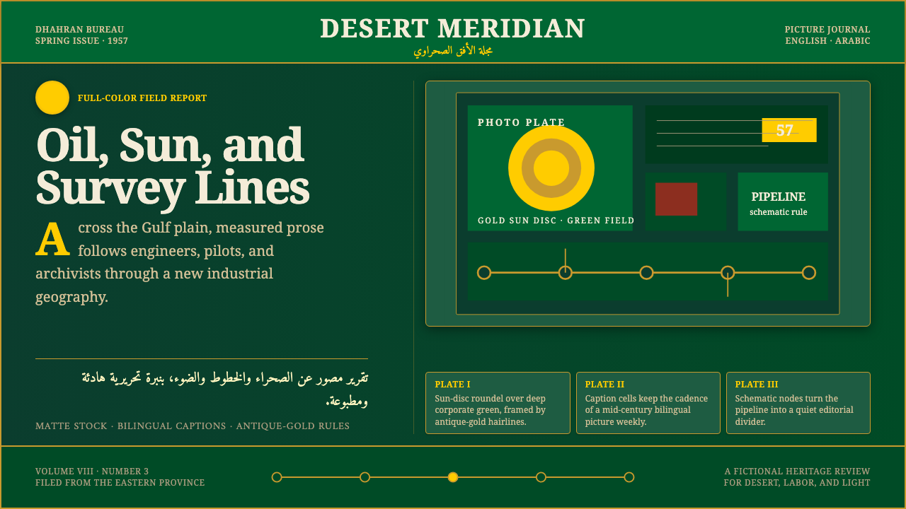 Aramco World MagazineMatte Gulf modernism. Desert green, gold sun-discs, classic serif, and naskh…
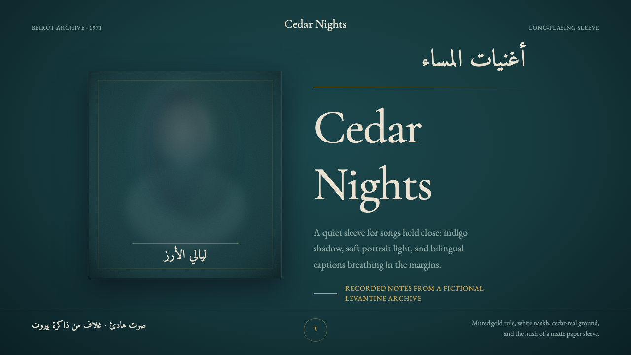 Fairuz Record SleeveQuiet luxury holds the sleeve. Cedar teal, white naskh, and one muted gold ru…
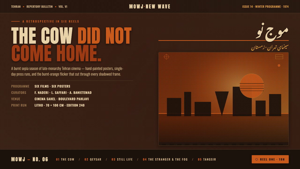 Iranian New Wave PosterPre-revolution Tehran cinema, burnt. Grainy ochre duotone over dark sepia, st…
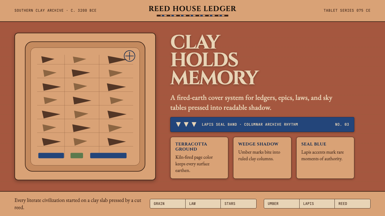 Mesopotamian Cuneiform TabletsWritten memory feels fired. Terracotta, umber wedges, and lapis bands build t…
 Caslon English Text SerifWarm authority, pressed into paper. Caslon capitals and engraved rules comman…
 Garamond Old-Style French SerifInk ages with grace. Warm-grey rag paper, Garamond columns, and red rubric ma…