What is X-Ray Crystallography?
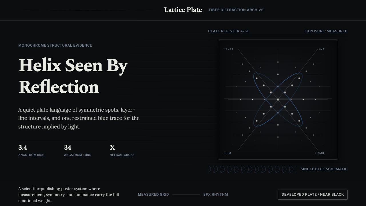
X-Ray Crystallography turns the most famous photograph in the history of biology — a diagonal cross of grey-white spots on a near-black exposed plate — into a design system built entirely on measurement, not decoration.
X-Ray Crystallography in brief
X-Ray Crystallography is a design language distilled from fiber-diffraction photography — the genre of scientific image best known through Photo 51, the exposure that first showed the world DNA's helical structure. The visual signature is unmistakable: luminous grey-white reflections scattered across a near-black exposed plate, arranged not randomly but in a precise diagonal cross, the diffraction fingerprint that any helical molecule leaves when X-rays pass through it.
The system reads it as a monochrome, measured aesthetic rather than a photographic one. A near-black ground stands in for the exposed film itself. Spots are arranged as a symmetric lattice around that diagonal cross. Evenly spaced horizontal bands — the layer lines that crystallographers actually measure to calculate a helix's pitch and diameter — give the whole composition a quiet, ruled rhythm, like a barcode built from physics instead of ink. A single restrained, cool schematic blue is allowed in, used the way a scientist annotates a print — a pointer, a bracket, a highlighted measurement — never as a decorative color field. Labels are set in a period scientific-journal serif, the kind of typeface that was actually printing structural biology papers in the middle of the twentieth century.
The overall feel is closer to holding a developed negative up to a light box than to looking at a screen. It is deliberately not futuristic — no neon glow, no terminal-green scan lines, no glossy sci-fi HUD. Its authority comes from an older, slower kind of evidence: patient exposure, careful measurement, and a photograph that spoke for itself because nothing extraneous had been added to it.
Where does X-Ray Crystallography come from?
X-ray crystallography as a technique predates DNA by four decades. In 1912 the German physicist Max von Laue showed that X-rays passing through a crystal produce a regular diffraction pattern, proving both that X-rays are waves and that crystals have an ordered atomic structure. The father-and-son team of William Henry Bragg and William Lawrence Bragg turned that observation into a working method — Bragg's Law — for calculating exactly how atoms are arranged inside a crystal from the geometry of its diffraction spots, work that earned them the Nobel Prize in Physics in 1915. From the start, the genre carried a particular publishing convention: the diffraction photograph itself, dots on film, was reproduced directly in scientific journals as the primary evidence for a structural claim, not illustrated or redrawn.
Applying the technique to biological fibers rather than hard crystals came later and proved far harder, since fibers like wool, muscle tissue, or DNA are only loosely ordered. In the 1930s and 1940s the chemist William Astbury, working at the University of Leeds, took the first X-ray photographs of DNA fibers and correctly inferred that the molecule had a regular, repeating internal structure — a crude but foundational result that told later researchers a clean structural answer was findable, if the fiber preparation and the photography could be made precise enough.
That precision arrived at the Medical Research Council's Biophysics Research Unit at King's College London, directed by John Randall. Rosalind Franklin, a physical chemist trained in X-ray diffraction techniques in Paris, joined the unit in 1951 and, working with research student Raymond Gosling, dramatically improved both the preparation of hydrated DNA fibers and the precision of the resulting photographs. In May 1952, using a carefully humidified fiber of what crystallographers called the B form of DNA, Franklin and Gosling produced an extended exposure that came to be known as Photo 51 — the now-iconic diagonal cross of spots that is the unambiguous diffraction signature of a helix.
In January 1953, Maurice Wilkins, the unit's deputy director, showed Photo 51 to the American biologist James Watson without Franklin's knowledge. Combined with unpublished calculations of Franklin's that had separately reached Cambridge through research-committee channels, the image gave Watson and the physicist-turned-biologist Francis Crick the missing structural confirmation for the double-helix model they had been building. Nature published the Watson-Crick model in April 1953 in the same issue as separate papers by Franklin and Gosling and by Wilkins's group. Franklin left King's later that year for Birkbeck College, where she turned to X-ray studies of viruses before dying of ovarian cancer in 1958 at thirty-seven. Watson, Crick, and Wilkins shared the 1962 Nobel Prize in Physiology or Medicine; Nobel Prizes are never awarded posthumously, so Franklin was ineligible, and historians have argued ever since over how fully her contribution was acknowledged at the time — a debate this design borrows the evidence from without needing to settle.
What defines the X-Ray Crystallography look?
Monochrome Field
The ground is a near-black tone standing in for exposed photographic film, not a decorative dark background. Luminous grey-white reflections sit on top of it, and a single restrained, cool schematic blue is allowed in only as an annotation — a pointer, a bracket, a highlighted measurement — never spread across the composition as a color scheme.
Spot Lattice
Diffraction spots are arranged as a symmetric lattice organized around a diagonal cross — the signature pattern a helical molecule produces under X-ray exposure. Where a conventional layout organizes content around a rectangular grid, this system can organize a focal composition around that diagonal cross instead, using symmetry itself as the structural device.
Layer-Line Spacing
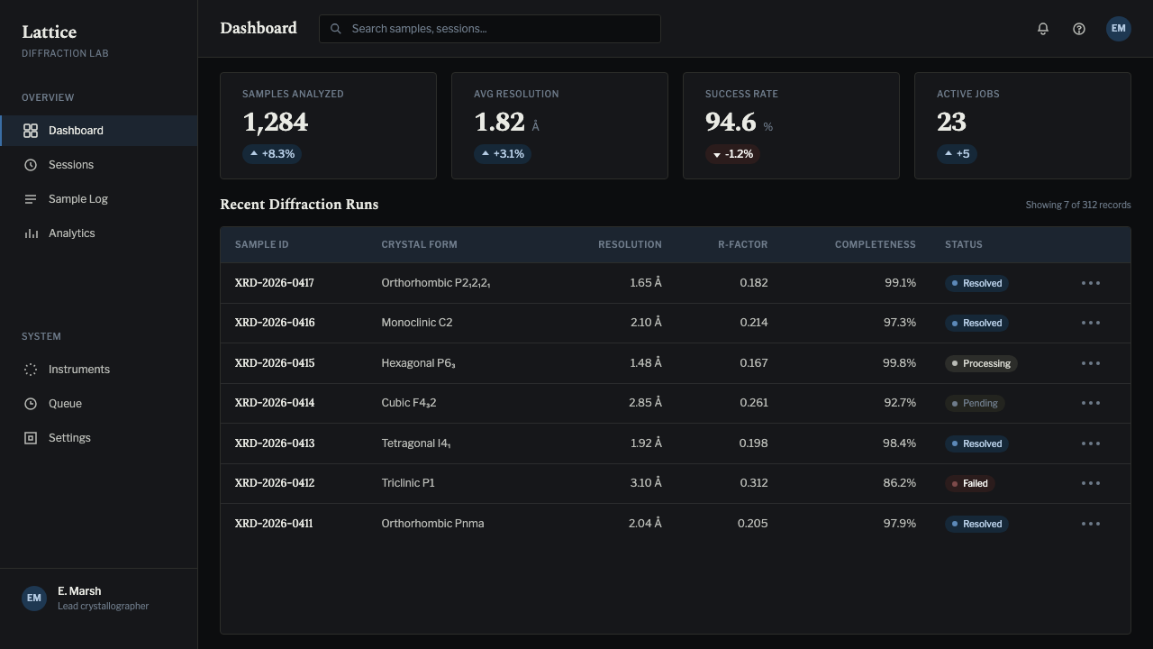
Evenly spaced horizontal bands — the layer lines a crystallographer actually measures to calculate a helix's pitch — give the system a quiet, ruled cadence. This rhythm translates naturally into rows of information: a list, a table, or a sequence of data points can borrow the same measured, evenly ticked spacing without needing any additional ornament.
Period Scientific Serif
Labels and captions are set in a quiet, period-appropriate serif rather than a laboratory-instrument sans or monospace readout. The choice deliberately places the system in mid-century academic publishing — the printed journal page — rather than in a digital control panel, which is what gives it a paper-and-archive weight instead of a screen-and-sensor one.
Photographic Grain
Surfaces carry a faint, uneven grain and mottling rather than crisp vector cleanliness — the texture of a physical negative rather than a rendered graphic. This slight imperfection is load-bearing: a perfectly clean digital gradient would read as a screen effect, while grain reads as an object with a physical history, something developed rather than generated.
Measurement over Ornament
Every element in the system reads as evidence rather than decoration: a labeled point, a measured interval, a symmetric arrangement that could, in principle, be re-measured to recover a real number. Nothing exists purely to look interesting. This is the same discipline the original photograph itself embodied — a spot is where it is because a molecule put it there, not because a designer chose it.
Who shaped X-Ray Crystallography?
A physical chemist and X-ray crystallographer trained in Paris, Franklin joined King's College London in 1951 and brought a level of rigor to DNA fiber preparation and photography that made Photo 51 possible. She insisted on characterizing DNA's two structural forms fully before drawing conclusions, and died in 1958, before the extent of her contribution to the double-helix discovery had been widely recognized.
A research student who worked first under Maurice Wilkins and then under Rosalind Franklin at King's College London, Gosling did much of the hands-on fiber preparation and camera work, and was the co-photographer, alongside Franklin, of Photo 51 itself in May 1952.
Deputy director of the King's College London biophysics unit, Wilkins carried out his own X-ray studies of DNA and, in January 1953, showed Photo 51 to James Watson without Franklin's knowledge — an act that supplied Cambridge with decisive structural evidence. He shared the 1962 Nobel Prize in Physiology or Medicine with Watson and Crick.
An American biologist working at Cambridge, Watson co-built the double-helix model of DNA with Francis Crick after seeing Photo 51 and learning of Franklin's unpublished calculations, publishing the structure in Nature in April 1953.
A British scientist who had moved from physics into biology, Crick worked alongside Watson at Cambridge's Cavendish Laboratory to translate the diffraction evidence — including Photo 51's layer-line spacing — into a physically coherent double-helix model, one of the foundational results of modern molecular biology.
How do you use X-Ray Crystallography today?
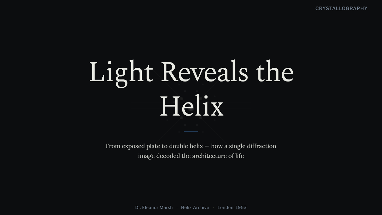
On a presentation cover slide, this style works as a quiet claim of rigor: a near-black field carries one striking symmetric spot pattern or a diagonal-cross diagram as the sole graphic, the title sits in a restrained period serif, and the single schematic blue is spent on exactly one small accent — an arrow, an underline, a highlighted word — rather than a wash of color.
Content and data slides are where the system does its best work, because the whole aesthetic already reads as measurement. Bullet lists and rows can borrow the evenly ticked rhythm of layer-line spacing instead of needing dividers or icons. Data slides benefit even more directly: a chart rendered as a symmetric cluster of points or a dot-plot on a near-black ground reads as authentically scientific, with the blue accent reserved for the one series, finding, or number the slide exists to surface.
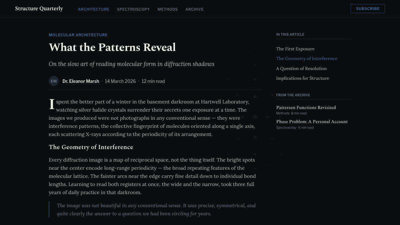
For web interfaces, the style suits research tools, health-tech and diagnostics platforms, academic and lab-adjacent software, and any data product that wants to read as instrumentation rather than consumer software. Dashboards built on a near-black ground with grey-white content and a single blue accent for the one metric that matters read as precise rather than flashy. Pricing pages benefit from the same restraint — a quiet monochrome table with the recommended tier marked by the single blue accent, and captions set in the period serif rather than a display sans.
Editorial and marketing work suits the style particularly well for science, health, research, and history-of-discovery content: a long-read article can open with a hero image styled like a diffraction photograph, run pull quotes in the period serif, and caption images with a measured, archival tone rather than a casual one. Marketing pages for precision-positioned products — optics, diagnostics, research instruments, data-heavy tools — can use the diagonal spot-cross as a recurring graphic motif that signals rigor before a single word is read.
The most common mistake is treating the dark ground as license for a science-fiction control-panel look — adding neon glow, gradient washes, or a futuristic display face contradicts the actual mid-century, paper-and-darkroom source material and turns quiet evidence into cheap spectacle. A second mistake is letting the blue accent spread across many elements instead of staying a single schematic annotation, which erases the restraint the whole system depends on. A third is swapping the period serif for a laboratory-instrument sans or monospace readout, which shifts the reference from a printed scientific journal to a digital sensor display and loses the specific historical weight the style is drawing on.
X-Ray Crystallography — FAQ
Is this a sci-fi or hacker-terminal aesthetic?
No, and the distinction matters. A terminal aesthetic draws on glowing phosphor screens, scan lines, and neon monospace type — a digital, futuristic reference. This style draws on analog photographic evidence from the middle of the twentieth century: exposed film, measured spacing, and printed scientific-journal type. The mood is closer to an archive than a control room.
What separates this from a generic dark UI with a blue accent?
The specifics carry the whole system. A generic dark UI can use any dark tone and any accent color arranged in any layout. This style requires the symmetric spot lattice organized around a diagonal cross, the evenly ticked layer-line rhythm, photographic grain rather than flat digital cleanliness, and a period serif rather than a modern interface sans. Remove any one of those and it collapses back into an ordinary dark theme.
Does the design require a literal X-shaped image somewhere?
It is not strictly required, but it is the strongest single move available — a hero moment built around the diagonal spot-cross does more to establish the reference than any other single element. Even without a literal photograph, the system still carries through in the measured layer-line rhythm and the discipline of treating every element as evidence rather than decoration.
Why a period serif instead of a lab-instrument sans or monospace type?
Because the reference is a printed page, not a digital readout. Mid-century structural biology papers were typeset in the serif conventions of academic publishing, and the diffraction photograph itself was reproduced as a printed figure inside that page. A lab-instrument sans or monospace face would shift the reference to a modern sensor display, trading the archival weight of a scientific journal for the clinical feel of a machine readout.
What products suit this style, and which struggle with it?
It suits research tools, health and diagnostics platforms, academic and scientific publishing, and any data-heavy product that wants to project quiet, evidence-based authority. It struggles for playful consumer products, e-commerce, or anything that needs to feel warm and approachable rather than precise and clinical — the same restraint that reads as rigorous in a research context can read as cold or sterile in a context built around delight and ease.
Related design styles
 Everest Expedition (1953)Quiet heroism, precisely measured. Ice-blue contours and mono data cross a sn…
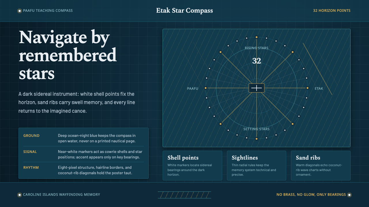 Micronesian Etak Star CompassNavigation as memory. White star points and sand ribs map a 32-point ocean-ni…
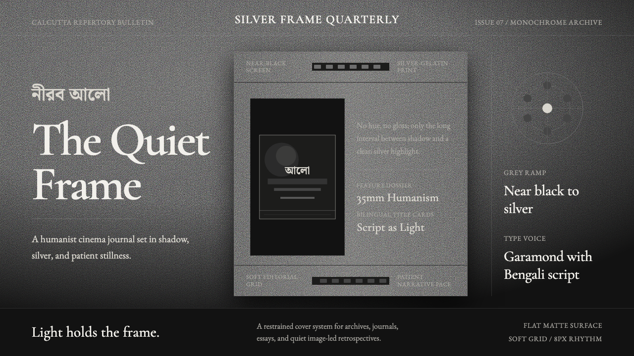 Bengali Art-House CinemaLight becomes restraint. Near-black ground, silver serif, and Bengali script…
 Fairuz Record SleeveQuiet luxury holds the sleeve. Cedar teal, white naskh, and one muted gold ru…
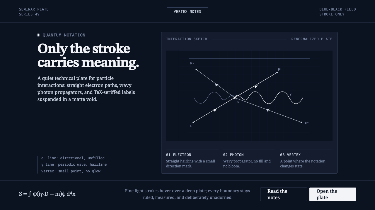 Feynman Diagram QEDMeaning reduced to strokes. Pale QED lines and TeX serif type float on blue-b…
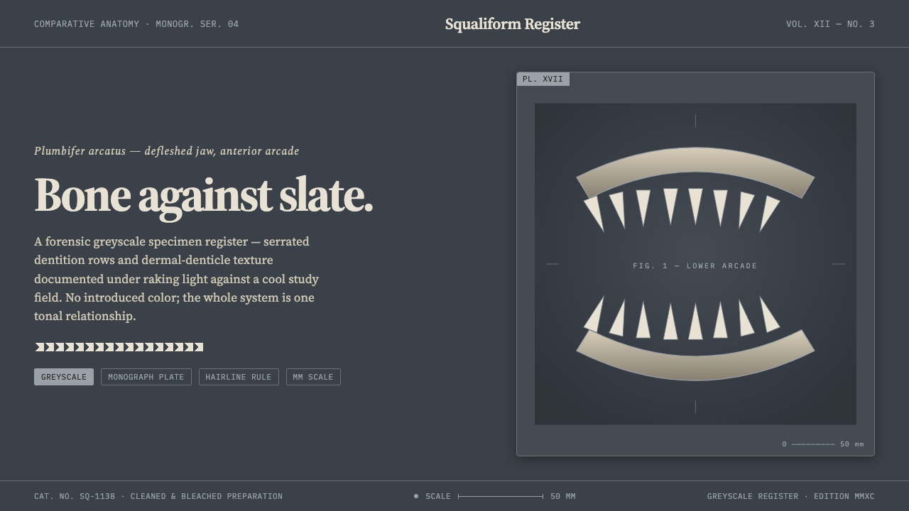 Shark Jaw & DentitionForensic and strictly greyscale. Bone-white serrated dentition floats on a co…