What is Everest Expedition (1953)?
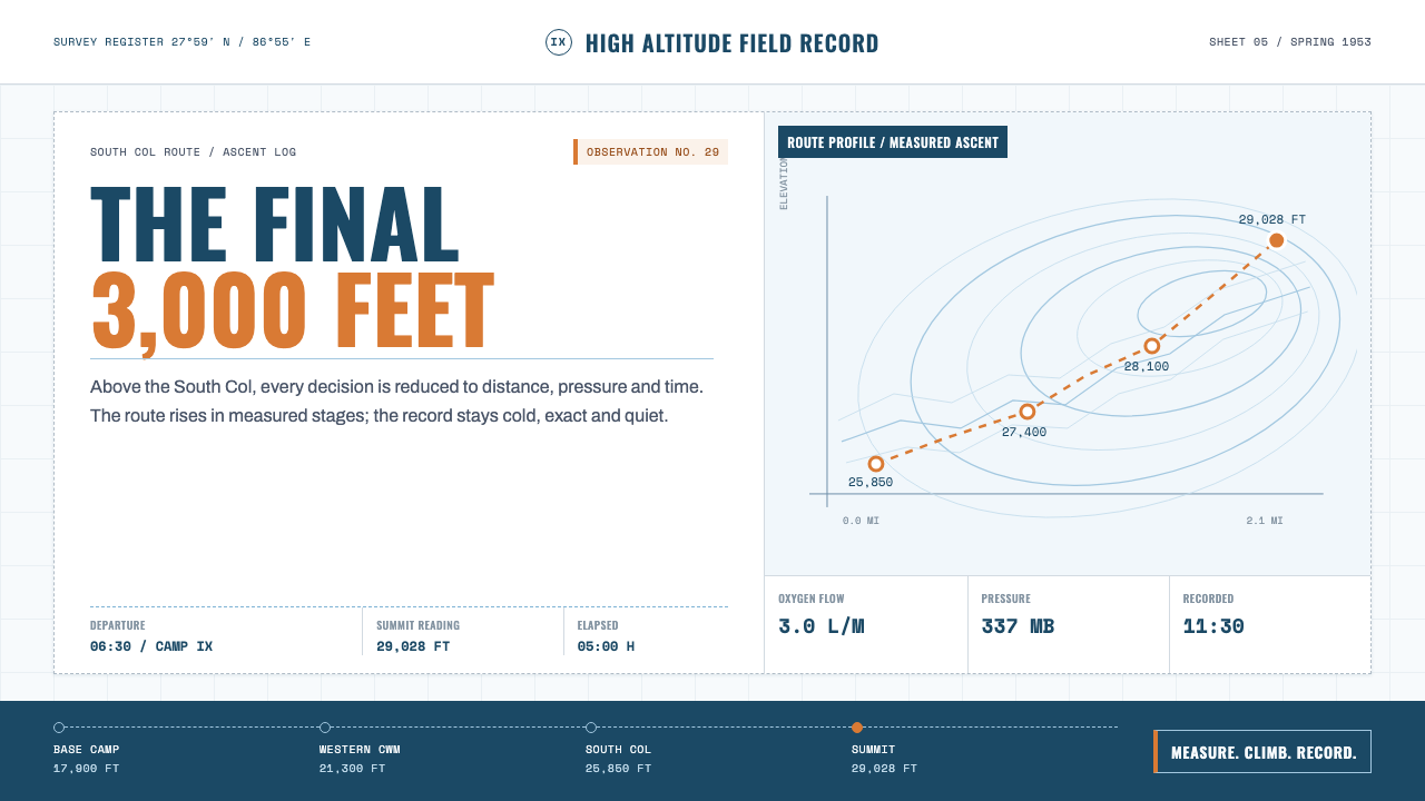
The 1953 conquest of Everest turned a mountain into a measured surface — survey lines, oxygen gauges, and gear tags, rendered with the same cool precision as the climb itself.
Everest Expedition (1953) in brief
This style rebuilds the 1953 British Everest Expedition as a page: half field logbook, half Royal Geographical Society survey sheet. The ground is snowfield white, the kind of bright, slightly cold white that reads like glare off ice rather than a blank canvas. Across it run thin ice-blue contour lines, tracing camps and route the way a cartographer traces elevation, never as decoration. Black is reserved for structure — rules, labels, and the small printed marks of an instrument panel.
Typography does the work that color refuses to do. Elevation markers and camp names are set in compressed sans capitals, tight and official, the way a map legend speaks. Log entries — the kind a climbing leader might scrawl at day's end — sit in a plain, workmanlike grotesque, unpretentious and legible in poor light. Numbers get their own register entirely: altitude, oxygen pressure, and grid coordinates are set in monospace, so every column of figures lines up like a ledger, because on an expedition a misread number is not a typo, it is a hazard.
Nothing here is sentimental, and that restraint is the entire point. The expedition succeeded through discipline — pre-planned oxygen loads, rationed fuel, camps pitched at calculated intervals — and the visual system carries that discipline forward. Gear tags dangle from illustrated duffels exactly as they would from real equipment crates: small, rectangular, string-tied, printed with contents and weight. The mountain is measured in feet, the oxygen in litres, and everything that isn't a measurement is left off the page. What remains reads as quiet heroism rather than declared heroism — competence photographed from a slight distance.
Where does Everest Expedition (1953) come from?
By 1953, Everest had already refused eight British attempts, plus a determined Swiss push the year before that had come within roughly 250 metres of the summit. The Joint Himalayan Committee, drawing on the Royal Geographical Society and the Alpine Club, handed leadership of the ninth British expedition to John Hunt, an army officer whose reputation rested less on daring than on organization. Hunt planned the climb the way a general plans a campaign: staged camps, calculated loads, and a logistics chain built to put two fit climbers at the summit with enough oxygen and strength left to get back down.
That planning leaned heavily on the work of Griffith Pugh, a physiologist attached to the expedition who had spent the preceding years studying how the human body performs — and fails — at extreme altitude. Pugh's research into hydration, acclimatization schedules, and the comparative merits of open-circuit and closed-circuit oxygen sets was, in effect, an act of measurement applied to human endurance. Earlier expeditions had relied on willpower and improvisation; the 1953 team relied on data. That shift from heroics to measurement is the design's whole argument: the mountain and the climber's body are treated with the same instrumented respect.
The climb itself moved in careful stages: through the Khumbu Icefall, up the Western Cwm, along the Lhotse Face, to a high camp on the South Col. From there, on 29 May 1953, Edmund Hillary, a New Zealand beekeeper turned mountaineer, and Tenzing Norgay, a Sherpa climber who had already attempted the mountain multiple times with earlier expeditions, made the final push and stood on the summit — the first confirmed ascent in history.
News of the summit reached Britain by coded telegram just in time to be announced on the morning of Queen Elizabeth II's coronation, 2 June 1953, and the story fused instantly with a national mood of postwar renewal. What survived that moment, beyond the headlines, was the paperwork: the RGS-trained surveys, the equipment manifests, the gauge readings logged at every camp. That paper trail — precise, unadorned, built for use rather than display — is the direct visual ancestor of this style.
What defines the Everest Expedition (1953) look?
Color
The palette is almost a non-palette: snowfield white as the dominant ground, a single thin ice-blue for contour lines and route markings, and black reserved for type and structural rules. There is no accent color competing for attention — blue and black each do one job and never overlap. The effect reads as cold, clean, and instrumented, like a print run off a survey office rather than a poster.
Typography
Three registers, three jobs. Compressed sans capitals mark elevations, camp names, and headings — tight, official, map-legend voice. A plain grotesque carries log-entry prose, chosen for legibility over character. Monospace figures handle every number — altitude, oxygen litres, coordinates — so columns of data align the way a ledger would, and a reading error becomes visually obvious before it becomes a mistake.
Contour and Route Lines
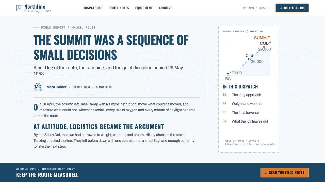
Thin ice-blue lines trace elevation contours and the climbing route the way a cartographer would, never widened for drama and never colored differently to imply danger. Camps appear as small marked points along the line. The line is information, not illustration — it could be redrawn from a real survey and lose nothing.
Instrumentation and Data
Oxygen-cylinder dials, altimeter faces, and pressure readings appear as small diagrammatic elements, drawn the way an equipment manual would draw them — circular gauges with a needle, tick marks, a plain numeric readout. They function as content, standing in for narrative the way a chart stands in for an argument.
Labels and Tags
Every duffel, crate, and cylinder carries a small rectangular tag tied on with string, printed with contents and weight in the same plain grotesque as the log entries. The tag motif is the style's most flexible unit — it can label a section of content, a product tier, or a data point without ever feeling decorative.
Grid and Margins
Layouts follow the logic of a survey sheet: a defined border, generous unornamented margins, and content locked to a strict grid of rules and columns. White space is not emptiness but working room — the same room a surveyor leaves around a hand-drawn map for annotation.
Restraint
No gradients, no soft shadows, no expressive flourish anywhere. Every mark on the page answers to a measurement or a function. This is not minimalism for its own sake — it is the visual manner of people who had every reason to be dramatic and chose, deliberately, not to be.
Who shaped Everest Expedition (1953)?
A New Zealand beekeeper and mountaineer, Hillary reached the summit alongside Tenzing Norgay on 29 May 1953, completing the first confirmed ascent of Everest. His post-expedition life — decades of expeditions and humanitarian work in the Khumbu region — reinforced the same understated, unsentimental public persona that the visual style borrows: competence stated plainly, without embellishment.
A Sherpa mountaineer who had already taken part in several earlier Everest attempts, Tenzing brought irreplaceable high-altitude experience and route knowledge to the 1953 team. He summited alongside Hillary, and the question of who stepped onto the top first was, by mutual agreement between the two men, never treated as a point of competition — a restraint that mirrors the design's own refusal of drama.
An army officer chosen to lead the ninth British Everest expedition, Hunt organized the climb with a logistics-first discipline: staged camps, calculated oxygen loads, and a plan built to give any of several strong climbing pairs a real shot at the summit. His leadership style — methodical rather than romantic — set the tone that the entire visual system reflects.
A physiologist attached to the expedition, Pugh studied hydration, acclimatization, and oxygen-equipment performance at extreme altitude, turning earlier expeditions' guesswork into calculated protocol. His research is the intellectual root of the style's obsession with measurement — the conviction that a mountain, like a body, can and should be read in numbers.
How do you use Everest Expedition (1953) today?
This style is most powerful wherever a project needs to communicate serious competence without theatrics — a register many brands reach for and few achieve, because the instinct under pressure is almost always to add drama rather than remove it. Applying it well means treating every visual element as if it had to justify its presence on a survey sheet: if a mark doesn't measure something or label something, it doesn't belong.
For presentation slides, the cover works best built around a single contour-line motif — a thin blue path crossing the white field, with the title set in compressed sans capitals in one corner, the way a map's title block sits apart from the map itself. Content slides should behave like log pages: a ruled header, a data column in monospace, and short entries in the plain grotesque rather than long paragraphs. Data slides are a natural fit — an oxygen-dial motif or a simple gauge diagram communicates a single metric more convincingly than a generic bar.
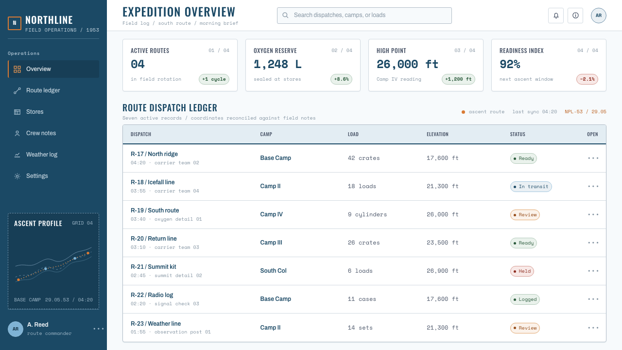
For web interfaces, the style suits dashboards, expedition or fitness-tracking products, and any B2B tool that wants to read as rigorous rather than playful. A strict grid, hairline rules instead of card shadows, and monospace numerals for all data readouts carry the aesthetic through without needing the mountain imagery at all — the underlying logic is what transfers, not the literal ice axes and tents.
For editorial and marketing work, the tag motif and the survey-sheet margin make excellent homes for call-outs, footnotes, and pull quotes. A narrow measure for body text, generous white space at the margin for annotation-style asides, and section breaks marked by a plain ruled line rather than an ornament will carry the tone into a long-form article or a product one-pager alike.
The most common mistake is reaching for generic 'adventure' signifiers instead of the specific 1953 survey-and-logbook vocabulary — khaki textures, rope-border frames, or distressed paper effects. None of that belongs here. The style earns its authority precisely by being clean, measured, and cartographic rather than rugged or weathered; adding texture for atmosphere undoes the entire argument.
Everest Expedition (1953) — FAQ
Is this the same as generic outdoor or adventure branding?
No. Generic adventure branding tends toward texture — worn leather, distressed paper, rope motifs — meant to suggest ruggedness. This style is the opposite instinct: it borrows from cartography and scientific field logs, so it reads as clean, measured, and institutional rather than weathered. The 1953 expedition succeeded through planning and data, not improvisation, and the visual language reflects that specific history rather than adventure in general.
Can this style work with a dark background?
It resists inversion more than most styles, because snowfield white is not an incidental choice — it is the entire emotional register, the visual equivalent of glare and altitude. A dark variant would need to replace that white with something equally cold, such as a deep slate rather than true black, and would have to work harder to keep the ice-blue contour lines legible without letting them glow decoratively, which would break the style's core restraint.
Why monospace numerals specifically?
Monospace figures keep every digit the same width, so columns of altitude readings, oxygen pressures, or coordinates align vertically without any manual adjustment. On an actual expedition, a misaligned or misread number in an oxygen log is a safety issue, not a typo — the style preserves that logic by making columns of numbers behave like a ledger rather than flowing prose.
How literal should the contour lines and route maps be?
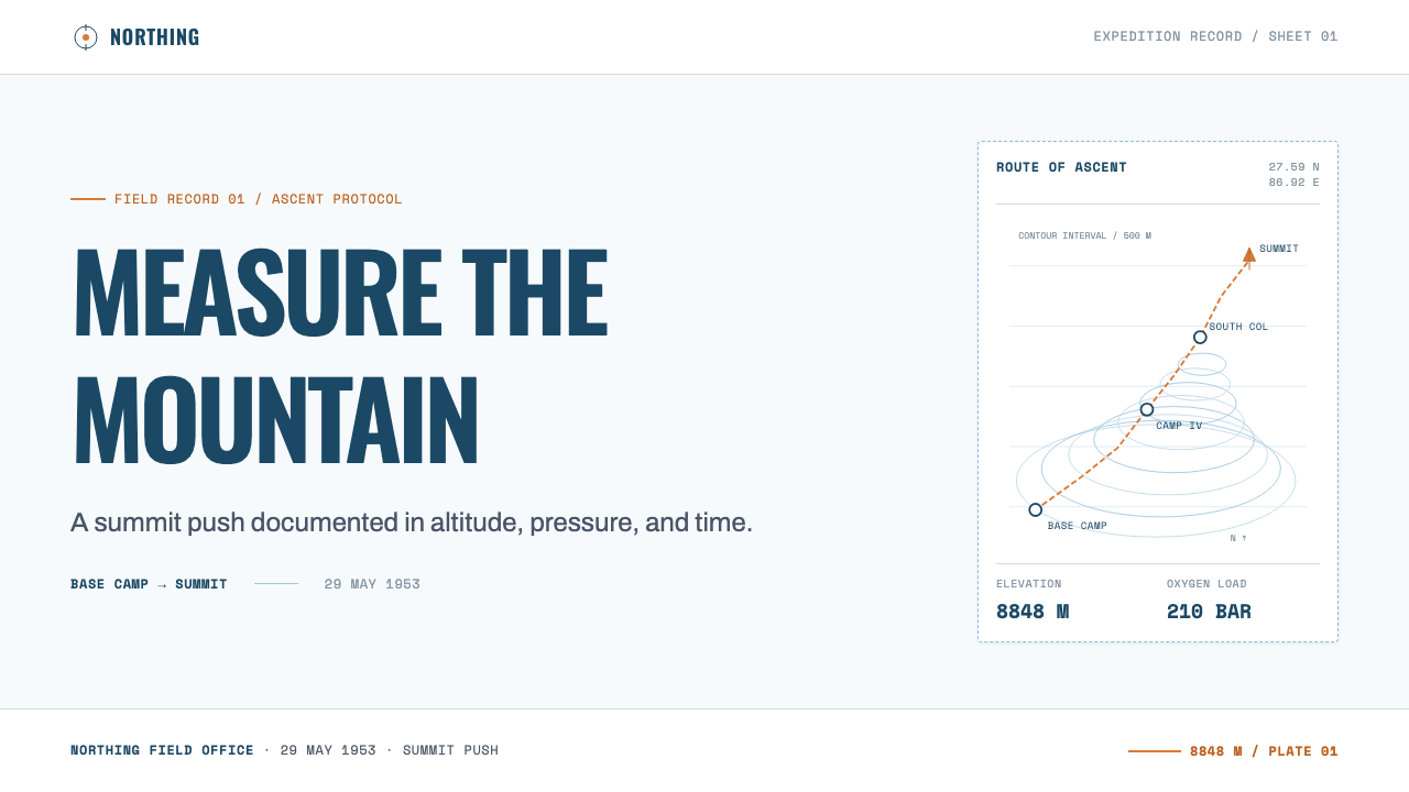
They should be legible as cartography without needing to be geographically accurate to the real Khumbu route. What matters is that the line behaves like a survey line — even spacing, no dramatic widening, small marked points for camps — rather than an illustrative flourish. A schematic, invented route drawn in this manner will read correctly; a decorative squiggle will not, regardless of accuracy.
Does this style suit consumer-facing, playful products?
Generally no. Its authority comes from restraint and implied seriousness, which reads as cold or overly formal in contexts built for delight, casual browsing, or entertainment. It fits products and content that want to be trusted for their precision — analytics tools, scientific or research-adjacent brands, expedition and outdoor-performance products, and long-form journalism — more than it fits anything designed to feel fun first.
Related design styles
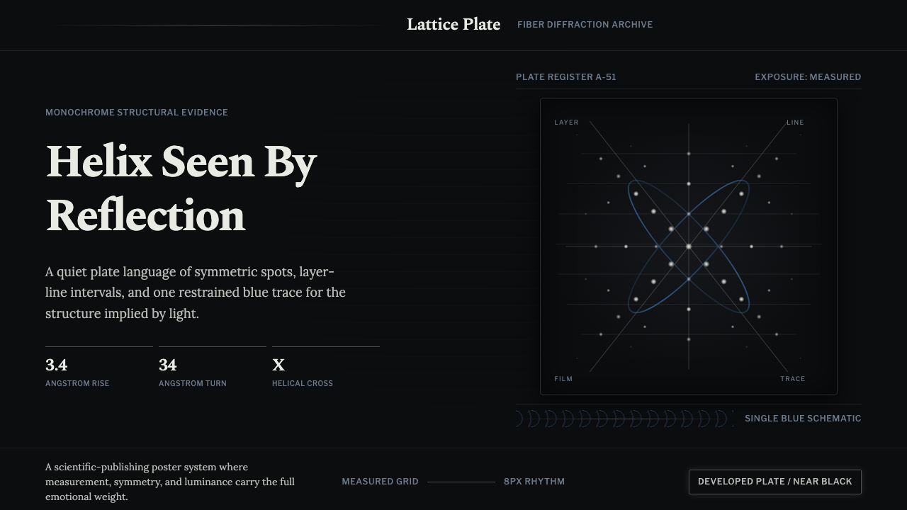 X-Ray CrystallographyQuiet evidence glows. Near-black film, Spectral serifs, and an X-cross spot l…
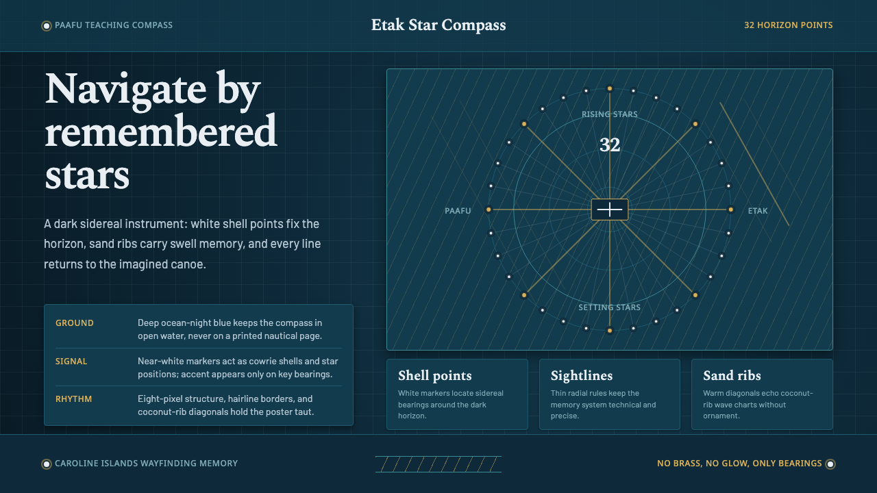 Micronesian Etak Star CompassNavigation as memory. White star points and sand ribs map a 32-point ocean-ni…
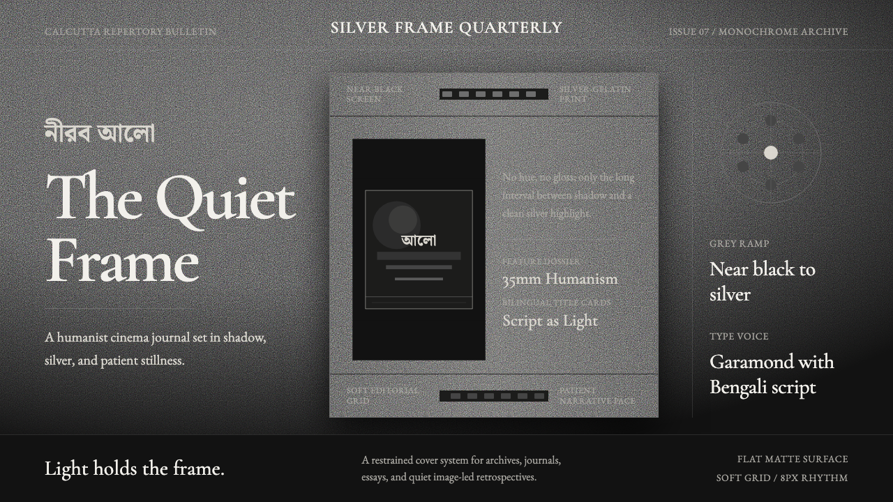 Bengali Art-House CinemaLight becomes restraint. Near-black ground, silver serif, and Bengali script…
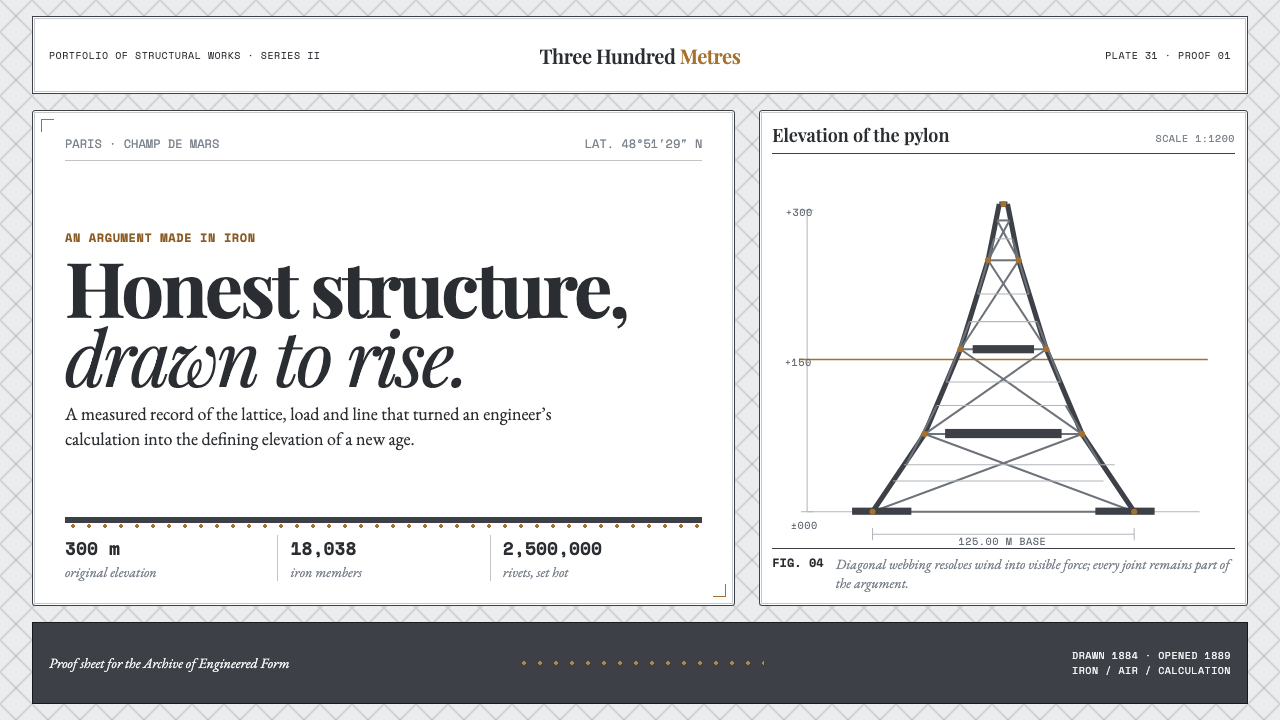 Eiffel Tower (1889)Structure speaks plainly. Graphite lattice, bronze rivets and measured type m…
 Fairuz Record SleeveQuiet luxury holds the sleeve. Cedar teal, white naskh, and one muted gold ru…
 Feynman Diagram QEDMeaning reduced to strokes. Pale QED lines and TeX serif type float on blue-b…