What is Seydou Keïta Portraits?
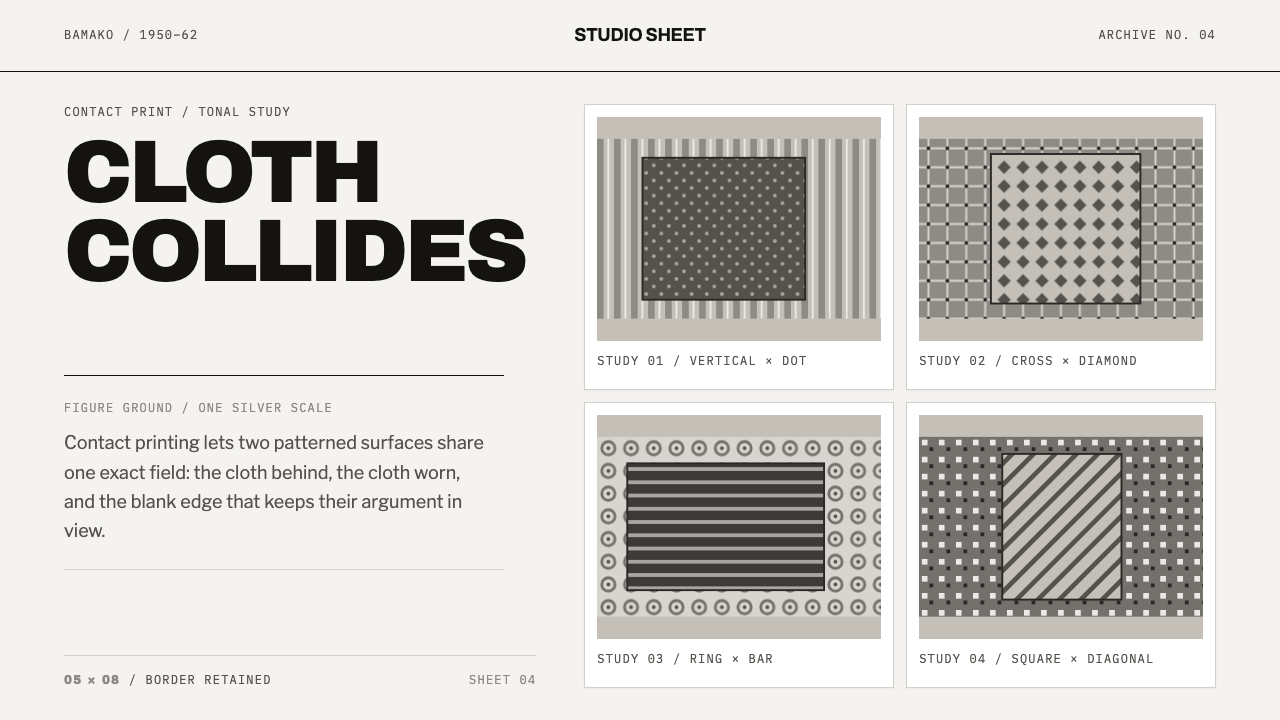
In Seydou Keïta's Bamako studio, pattern was the portrait: patterned cloth against patterned cloth, held in order by a crisp white contact-print margin.
Seydou Keïta Portraits in brief
Seydou Keïta Portraits is a design style built from the studio photographs that Seydou Keïta made in Bamako between 1948 and 1962. Its visual language is silver-grey tonal fields of patterned cloth, set inside a clean white margin like the border of a small glossy contact print, with a handful of everyday objects (a radio, a scooter, a wristwatch, a fountain pen) serving as its iconographic vocabulary.
The defining idea is that the frame is never empty. Keïta hung patterned cloth behind every sitter, so a patterned garment stood against a patterned backdrop and the two figure-grounds argued with each other. In a black-and-white print the argument cannot be settled by colour; it is settled only by tone, by how dark or light each pattern sits against the other, and by the sitter's pose and gaze. The design system takes that argument as its structure. Pattern is not decoration laid over content. Pattern is the content, and legibility comes from careful control of grey values.
The result is a style that is both busy and disciplined: dense surfaces held inside a precise, bright frame. It suits work about people, identity, fashion, memory and modernity, and any interface that wants richness without colour noise. Because the whole thing lives in silver-grey tones, it is an unusually calm way to be visually loud.

Where does Seydou Keïta Portraits come from?
Between 1948 and 1962, Seydou Keïta worked in a studio behind the prison in Bamako, the capital of what was then French Sudan, part of French West Africa and today the country of Mali. The source describes the portraits he made there as the pictures that still define West African modernity. The key word is modernity: his sitters were not posed as relics of a tradition but as people of their moment, dressed, equipped and photographed to be seen as fully contemporary in a post-war world that was changing quickly around them.
The studio's method gives the style its look. Keïta used a large-format camera, which meant contact prints rather than enlargements: small glossy gelatin-silver sheets of roughly five by eight inches, each one carrying a white margin all the way round. The paper's own white is therefore the base colour of the system, and the margin is a structural frame, not a graphic flourish. Because nothing was enlarged, the image has a particular crispness and a particular modest scale. It is meant to be held in the hand, passed around, kept in a wallet or on a shelf.
The backdrops are the second half of the story. Keïta hung patterned cloth behind every sitter and replaced it every few years. First came his own bedspread, fringed at the edge; then a floral cloth; later an arabesque vine pattern. A patterned boubou, the long flowing robe, therefore stands against a patterned backdrop, and only the depth of grey separates one from the other. The source is explicit that this pattern-on-pattern effect is not an accident but the whole point. He also kept props ready: a radio, a scooter, a wristwatch, a fountain pen. These were objects of aspiration and ownership, and in the design system they become a small, repeatable icon vocabulary.
The source places the style in three overlapping movements: West African studio portraiture, post-war French West African modernity, and mid-century Swiss and French type design. The third is a deliberate pairing. Keïta's photographs supply the images and the grey-scale logic, while the printed lettering of the same mid-century moment supplies the type: clean, clear lettering from the Swiss and French tradition, and the key figures list includes Adrien Frutiger and Roger Excoffon on that side. The pairing is a design decision, not a claim about a historical meeting. It gives the style a typographic voice that feels of its time without imitating studio signage.
What defines the Seydou Keïta Portraits look?
Contact-Print Margin
Every image sits inside a white margin that runs all the way round, the way a contact print keeps the paper's edge. The white is the colour of the photographic paper, not a neutral screen default, and it acts as a frame, a separator and a breathing space in one. It is applied evenly, never as a drop shadow or a rounded card. This margin is the system's most recognisable signature and its main source of calm.
Silver-Grey Tonal Fields
The palette is the range of a gelatin-silver print: a scale of silvery greys from near-white to near-black with a gentle cool cast. Large areas of the page are filled with these tonal fields, and hierarchy is built from tone alone. There is no accent colour competing with the pictures. Where the interface needs emphasis it uses a deeper or lighter grey, not a hue, and glossy highlights echo the sheen of the paper.
Pattern on Pattern
The defining move is to put pattern against pattern. A patterned element sits on a patterned ground, and the two are separated only by their grey values: one reads darker, the other lighter, and the eye does the sorting. The effect is lively and slightly vibrating, and it is deliberate. Authentic use means controlling the tonal gap carefully so the figure does not dissolve into the ground; sloppy use simply looks cluttered.
The Sitter Is the Centre
Composition is frontal and centred. The subject faces the camera directly, often seated, with the body filling a large share of the frame and the gaze held steady. In layout terms, the main subject, whether a photograph, a headline or a product, is set squarely and confidently, and the surrounding pattern frames rather than overwhelms it. There is dignity in this; it is the posture of someone choosing how to be seen.
Props as Icons
A radio, a scooter, a wristwatch and a fountain pen recur in the portraits as marks of ownership and aspiration. In the design system they supply a small icon vocabulary: simple, recognisable objects drawn plainly and in grey, used sparingly as markers or bullets. They carry the sense that this is a style about people and their things, not about abstraction, and they keep the interface grounded in the everyday.
Mid-Century Lettering
Type comes from the mid-century Swiss and French tradition rather than from the studio. It is clean, even, readable lettering in the neutral-grotesque spirit, with, at most, a small amount of lively French display character reserved for headings. Set in plain grey or near-black against the pale margin, it keeps the interface legible while the pictures do the talking. Type never competes with pattern; it quietly labels it.

Who shaped Seydou Keïta Portraits?
The photographer himself, who worked from a studio behind the Bamako prison from 1948 to 1962. With a large-format camera he made small glossy contact prints, hung patterned cloth behind each sitter, changed the backdrops every few years and kept props ready. His portraits are the reason the system exists: the white margin, the grey tonal fields, the pattern-on-pattern argument and the plain, upright dignity of the pose all come from his studio practice.
A Swiss type designer working in France in the mid twentieth century, associated with clear, rational, highly legible letterforms. He is listed among the key figures on the movement side of mid-century Swiss and French type design. Nothing in the source links him to Keïta's studio; his place here is as a reference for the clean, neutral lettering that lets patterned images keep the foreground.
A French graphic and type designer of the same mid-century period, known for lettering with more brush-like warmth and movement than the Swiss tradition allowed. Like Frutiger, he is a typographic reference rather than a collaborator of the photographer. His inclusion explains the small amount of lively display character the style permits in headings, which keeps its typography from turning cold.
How do you use Seydou Keïta Portraits today?
Seydou Keïta Portraits is a strong choice whenever people are the subject and the page should feel rich without turning noisy. It rewards restraint on the colour side and care on the tonal side: the more you control the grey values, the more the patterns read as intentional rather than chaotic.
For presentation slides, a cover can place a single large portrait or pattern field inside a white margin, with the title set in plain mid-century lettering underneath or beside it. Content slides work as framed plates, each with an image or pattern field and a caption, all sharing the same margin. Data slides can use grey-scale charts, with bars and segments distinguished by tone and, where it helps, by simple pattern fills, so that the chart itself feels like a printed plate rather than a screen graphic.
For web interfaces the style suits portfolios, profiles, team pages, fashion and lifestyle catalogues, archives and any product built around people. Cards become contact-print plates: a flat white margin, a grey image field and a short caption, with no shadows and no rounded corners. Navigation stays quiet and typographic. Dashboards can adopt it for monochrome reporting where status is shown by tone and iconography rather than hue, though the gentlest approach is to keep the dashboard calm and put the pattern fields in a header or sidebar.
For editorial and marketing work the style is natural for photo essays, interviews, exhibition pages and campaign sites about identity, memory and modern life. Pull-quotes and captions sit in the margin; pattern fields serve as section dividers or full-bleed intros. Product photography can be placed against patterned grey backdrops in the same way the sitters were, as long as the tonal gap between object and ground is kept clear.
The common mistake is to flatten the pattern into a bland grey, or to colourise it. The effect depends on grey-scale tone and on pattern meeting pattern, so a pastel version or a plain wash defeats the point. The opposite error is to let the pattern fight the subject: if figure and ground sit at the same grey value, the image turns to mush. Keep the white margin consistent, keep the tonal gap clear, and keep ornament inside the picture, never on the frame.

Seydou Keïta Portraits — FAQ
Why does the style use a white border around everything?
Because the source images are contact prints. A large-format camera, no enlargement and a glossy gelatin-silver sheet leave a white margin all the way round the picture, and that margin became the system's frame. It separates dense pattern from the surrounding page, gives each element a plate-like presence and keeps the layout calm. Remove the border and the pattern fields will bleed into one another.
Is this a black-and-white photography style, or can it use colour?
It is built on the silver-grey range of a gelatin-silver print, so the core system is monochrome. Colour is not forbidden in principle, but hue competes with the pattern-on-pattern effect and removes the tonal discipline that holds the image together. If you need emphasis, use a deeper grey, a heavier weight or more white space before you reach for a colour.
What does pattern on pattern mean in a UI?
It means a patterned element, such as a textile image, a repeating fill or a graphic texture, is placed on a patterned ground and separated only by tone. In practice it appears as pattern fields in headers, backgrounds and image panels, with a clearly lighter or darker subject set on top. The rule is that the subject must remain legible; if you cannot tell figure from ground at a glance, adjust the grey values.
Do the Frutiger and Excoffon references mean the type is from Mali?
No. They belong to mid-century Swiss and French type design, which is a separate tradition from the photography. The pairing is a design choice: Keïta supplies the images and the tonal logic, and the period's printed lettering supplies a clean, legible typographic voice. Treat it as a pairing of two mid-century sources, not a claim that the studio used that lettering.
Can the style work on a dark background?
The source logic is the pale paper of a print, with its white margin, so the system is designed as a light style. A dark version is possible by inverting the tonal scale, but it loses the key effect of the bright border framing dense grey fields. If you go dark, keep the margin as a clear light line, keep the grey range wide and avoid letting the patterns sink into black.
Related design styles
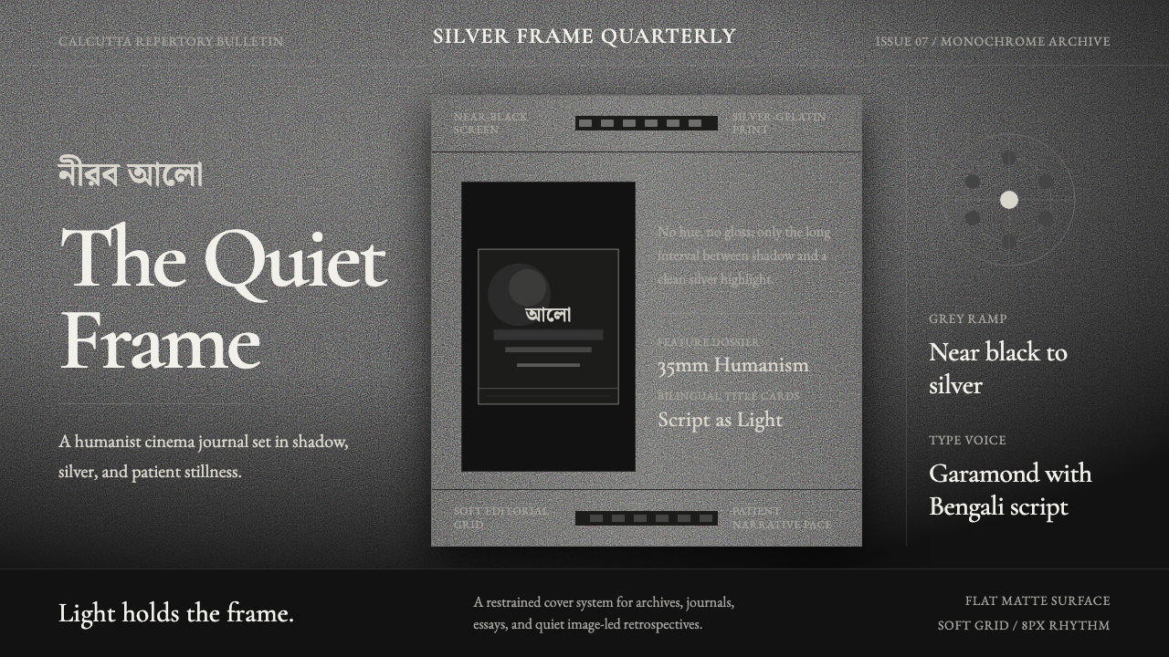 Bengali Art-House CinemaLight becomes restraint. Near-black ground, silver serif, and Bengali script…
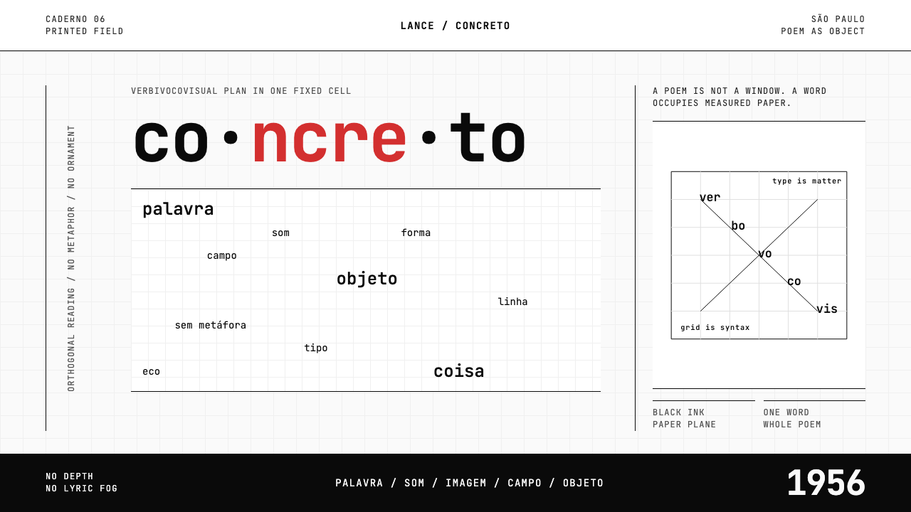 Brazilian Concrete PoetryWords become objects. Monospace cells, black-white paper, one cadmium red rup…
 Everest Expedition (1953)Quiet heroism, precisely measured. Ice-blue contours and mono data cross a sn…
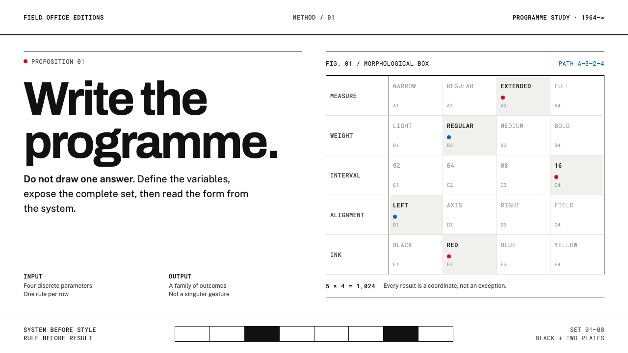 Karl Gerstner ProgrammesDesign becomes a programme. Black hairlines and a strict matrix turn paramete…
 NID Ahmedabad ModernismStructure earns trust. Black rules and equal-weight scripts hold craft color…
 Sol LeWitt ConceptualInstruction becomes art. Mono certificates face wavering graphite grids in fo…