What is Bengali Art-House Cinema?
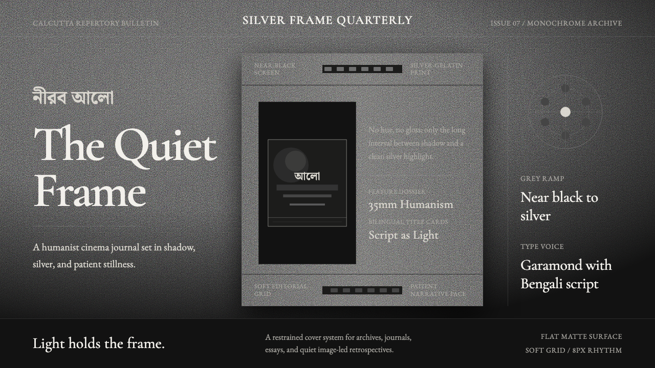
Satyajit Ray filmed 1950s Bengal in stark black-and-white and hand-lettered his own title cards, building a humanist visual language where restraint, not color, carries the emotion.
Bengali Art-House Cinema in brief
This is a monochrome world built entirely from a grey ramp — no hue anywhere, only the distance between a near-black screen and a silver-gelatin highlight. It draws its visual identity from Bengali art-house cinema of the Satyajit Ray era, and specifically from the high-contrast 35mm black-and-white cinematography of his Apu Trilogy, where light itself, not color, does the emotional work.
The grey ramp is disciplined rather than muddy: shadows sit close to true black, highlights sit close to a cool silver rather than a warm white, and the middle of the range carries most of the visible detail — faces, textures, the grain of film stock. Nothing is allowed to drift toward a warm cream or an inky blue-black; the palette stays strictly neutral, closer to a photographic print than to a stylized 'vintage film' filter.
Typography carries an unusual amount of the visual identity, because Ray hand-drew his own film titles. Classical Western serif letterforms sit beside Bengali calligraphic script, both rendered with the same restrained, slightly literary hand — no gloss, no color, no flourish beyond what the letterform itself needs. The effect is quiet and intimate rather than cinematic-spectacular, which is exactly the register this whole visual system is built to hold.
Where does Bengali Art-House Cinema come from?
Satyajit Ray was born in Calcutta in 1921 into a family already central to Bengali print and visual culture: his grandfather, Upendrakishore Ray Chowdhury, was a pioneering children's author and printer who helped introduce half-tone printing technology to India, and his father, Sukumar Ray, was a celebrated writer and illustrator. Ray grew up immersed in printing, illustration, and Bengali literary culture before he ever picked up a camera, which is part of why his films carry such a strong, deliberate graphic identity in their titles and posters.
He studied art at Visva-Bharati University in Santiniketan, the institution founded by Rabindranath Tagore, under the painter Nandalal Bose, a central figure of the Bengal School of Art. Ray then worked for several years as a commercial artist at the Calcutta advertising agency D.J. Keymer, where he illustrated book covers — including an abridged children's edition of Bibhutibhushan Bandyopadhyay's novel Pather Panchali, the very book whose full adaptation would become his directorial debut.
Pather Panchali was shot on a near-nonexistent budget between 1952 and 1955, financed partly by Ray selling personal possessions and eventually completed with support from the West Bengal state government. Its premiere at Cannes in 1956, where it won the award for Best Human Document, launched both Ray's career and what would become known internationally as India's 'parallel cinema' movement — positioned in direct contrast to mainstream commercial Hindi cinema's song-and-dance spectacle. Cinematographer Subrata Mitra, who worked alongside Ray from this film onward, pioneered a bounce-lighting technique using diffused cloth reflectors to simulate natural daylight indoors, giving the trilogy's interiors their distinctive soft, humanist quality.
Ray's visual authorship extended well beyond directing. He hand-lettered his own film titles, designed several of his own posters, edited and illustrated the long-running Bengali children's magazine Sandesh founded by his grandfather, and in the 1970s designed two typefaces licensed to the type foundry Monotype. He remains one of very few filmmakers in cinema history whose graphic design output is considered as historically significant as the films themselves; shortly before his death in 1992, he received an Honorary Academy Award for lifetime achievement, one of world cinema's highest honors.
What defines the Bengali Art-House Cinema look?
Grey Ramp
No hue appears anywhere in the system. Every surface lives somewhere on a single tonal ramp running from near-black to a cool, silver-toned highlight, and the discipline of staying strictly neutral — never warming toward cream, never cooling toward blue — is what separates this look from a generic 'black and white' treatment.
Diffused, Humanist Light
Light is soft and bounced rather than harsh and directional, following the bounce-lighting technique that gave the era's interiors their naturalistic, indoor-daylight quality. Shadows fall gently rather than in hard graphic blocks; the mood is intimate and observational rather than dramatic or theatrical.
Calligraphic Typography
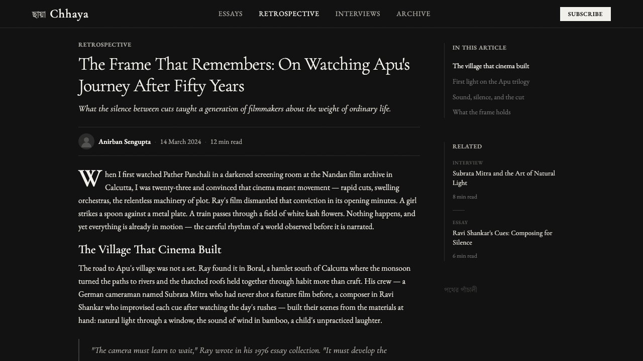
Titles and headline text are treated as hand lettering rather than typeset display type: classical Western serif letterforms sit beside Bengali calligraphic script, both drawn with a restrained, literary hand rather than a rigid geometric structure. The letterforms feel authored, not templated.
Film Grain and Print Texture
Surfaces carry a faint, consistent grain reminiscent of 35mm film stock and silver-gelatin printing, rather than the flat, noise-free smoothness of a digital gradient. This texture is subtle, never decorative, but it keeps the palette from feeling clinical or screen-native.
Intimate Composition
Framing favors quiet, human-scaled compositions over sweeping or spectacular ones — a face, a doorway, a small domestic interior — reflecting the humanist neo-realist tradition the style descends from. Negative space is used to isolate a single subject rather than to create dramatic emptiness.
Restraint Over Gloss
Nothing in the system is polished to a shine. Surfaces stay matte, highlights stay soft rather than specular, and no element is treated with the kind of glassy gloss common to contemporary digital interfaces. The restraint reads as sincerity rather than as a limitation.
Bilingual Script Pairing
Bengali script and Western serif letterforms are treated as equal partners rather than one being decorative accompaniment to the other, reflecting Ray's own bilingual, bicultural literary and design formation. Neither script is simplified or caricatured to make it 'match' the other; each is rendered with its own calligraphic integrity.
Who shaped Bengali Art-House Cinema?
Ray directed the Apu Trilogy and personally hand-lettered many of his own film titles and posters, making him one of very few filmmakers whose graphic design work is considered historically significant alongside his direction. He also designed typefaces, edited an illustrated children's magazine, and received an Honorary Academy Award shortly before his death in 1992.
Ray's cinematographer on the Apu Trilogy, Mitra pioneered a bounce-lighting technique that used diffused cloth reflectors to simulate natural daylight in indoor scenes, largely without the harsh artificial lighting conventions of studio filmmaking at the time. His approach is central to the soft, humanist quality that defines the visual system's treatment of light.
The Bengali novelist whose 1929 book Pather Panchali provided the literary source for Ray's directorial debut. His humanist, closely observed depiction of rural Bengali life gave the trilogy its narrative and emotional foundation, and its visual restraint can be read as a direct translation of his literary tone into image.
A contemporary of Ray and fellow pioneer of India's parallel cinema movement, Ghatak worked in a more overtly melodramatic and formally experimental register, but shared Ray's commitment to serious, humanist Bengali subject matter over commercial spectacle. His work helps place Ray's restraint in context as one of several possible responses to the same historical moment, not the only one.
The painter and central figure of the Bengal School of Art who taught Ray at Santiniketan, Bose instilled a disciplined, observational approach to visual composition rooted in Indian artistic tradition rather than imported Western convention. His teaching underlies the intimate, human-scaled compositional instincts visible throughout Ray's visual work.
How do you use Bengali Art-House Cinema today?
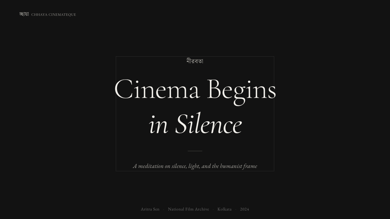
On presentation slides, this register works best for cover pages and quote-led content rather than data-heavy pages — a single line of restrained serif or calligraphic type against a near-black field, with a soft grey portrait or texture behind it, immediately signals seriousness and craft. Content slides should keep hierarchy minimal: one idea per slide, generous negative space, and no color accent breaking the grey discipline.
Data slides are the hardest fit and should be used sparingly — this is not a style built for charts. Where data must appear, render it in the same grey ramp with no color coding, relying on scale and position rather than hue to distinguish values; a single, very restrained highlight tone can mark the one number that matters, echoing the way a highlight falls on a single face in a dimly lit frame.
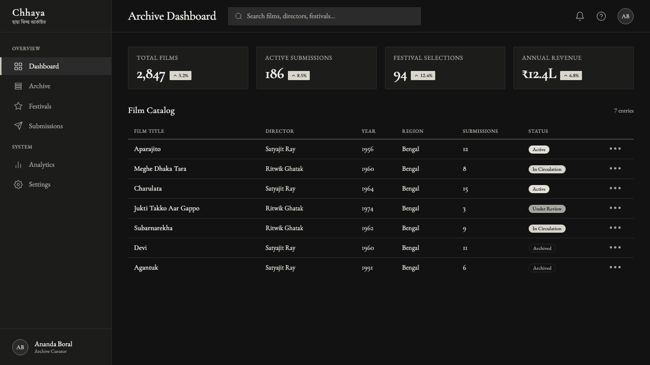
For web interfaces, the style suits editorial platforms, portfolio sites for photographers or filmmakers, and dark-mode arts and culture products far better than transactional dashboards. Where it is applied to a dashboard, it works best for reflective or archival products — a research tool, a journal, a slow-media reading app — where quiet and focus are the desired feeling rather than urgency or conversion.
In editorial and marketing contexts, the register fits film festival branding, literary and cultural magazine identity, and any campaign built around craft, heritage, or seriousness rather than youth or energy. A publisher launching a translated-literature imprint, a cinema retrospective, or an archive-focused cultural institution can all borrow this restraint convincingly.
A common mistake is treating this as simply 'a black-and-white theme' and adding a bright accent color for calls to action — that single addition breaks the entire discipline, because the whole point of the system is that nothing competes with the grey ramp. A second mistake is over-polishing surfaces into a glossy, high-contrast digital look; the style depends on soft, diffused light and matte restraint, not the crisp specular highlights common in modern interface design.
Bengali Art-House Cinema — FAQ
Isn't this just a black-and-white theme?
The absence of color is only the surface. What actually defines the style is the diffused, naturalistic quality of the light, the restraint of the typography, and the intimate, human-scaled composition — all inherited from a specific film tradition. A layout can be perfectly grayscale and still miss the style entirely if its lighting logic is harsh and graphic rather than soft and observational, or if its type is bold and geometric rather than calligraphic and quiet.
Does this style work with color photography?
Not without significantly diluting the identity. The entire system depends on the absence of hue as its defining constraint — introducing color photography reintroduces exactly the variable the style was built to remove. A more faithful adaptation would desaturate any photography used to match the grey ramp exactly, rather than letting color imagery sit alongside a monochrome interface.
How is this different from a generic film-noir aesthetic?
Film noir typically relies on hard, high-contrast directional lighting — deep shadows, venetian-blind patterns, stark graphic silhouettes — to build a mood of danger and suspicion. This style relies on the opposite lighting logic: soft, diffused, bounce light that produces gentle gradations rather than hard blocks of shadow, in service of intimacy and observation rather than tension. The two can look superficially similar in a single desaturated screenshot but come from very different technical and emotional traditions.
Is this suitable for a tech or SaaS product?
It can work well for products that want to feel quiet, focused, and serious — a reading app, a research or archival tool, a journal or notes product — where the absence of color and gloss reads as calm rather than as a limitation. It is a poor fit for products that need to feel energetic, urgent, or playful, since the entire visual grammar is built around restraint and stillness.
The style pairs Bengali script with a Western serif — how should that pairing be handled when most viewers only read one of the two scripts?
Treat both scripts as carrying equal visual weight rather than making one purely decorative. In practice this usually means the dominant reading language sets the primary hierarchy while the second script appears at a meaningful, legible size — a subtitle, a secondary title line — rather than as a small decorative flourish squeezed into a corner. The goal is bilingual respect, echoing Ray's own bicultural formation, not a token gesture toward a script most of the audience cannot read.
Related design styles
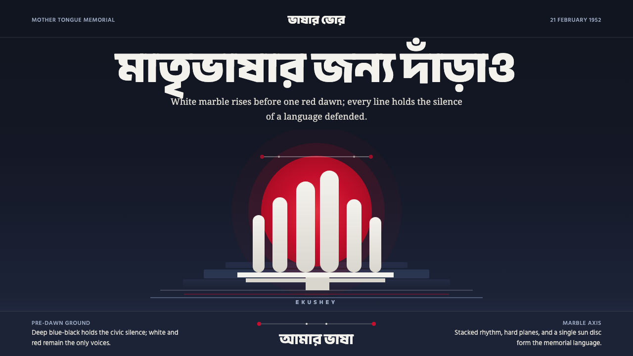 Dhaka Shaheed MinarSolemn before dawn. Marble columns and one red sun hold the page in civic sil…
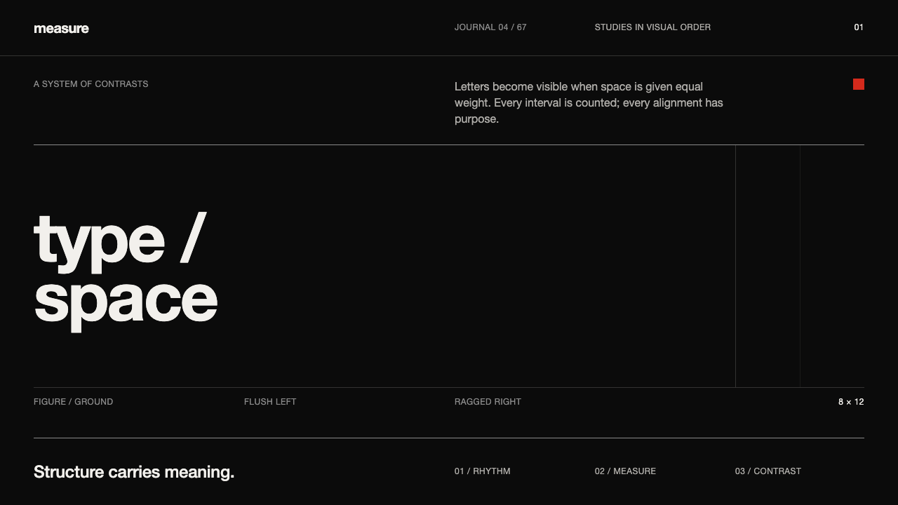 Emil Ruder TypografieDiscipline makes type visible. Near-white grotesque and measured space cut th…
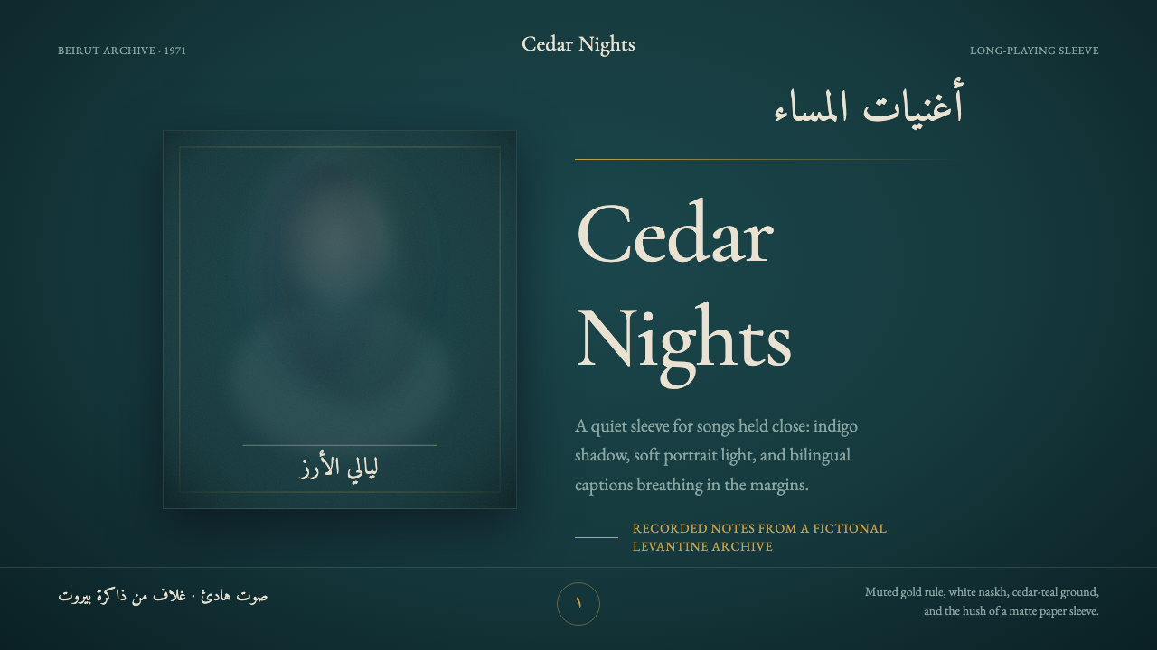 Fairuz Record SleeveQuiet luxury holds the sleeve. Cedar teal, white naskh, and one muted gold ru…
 Feynman Diagram QEDMeaning reduced to strokes. Pale QED lines and TeX serif type float on blue-b…
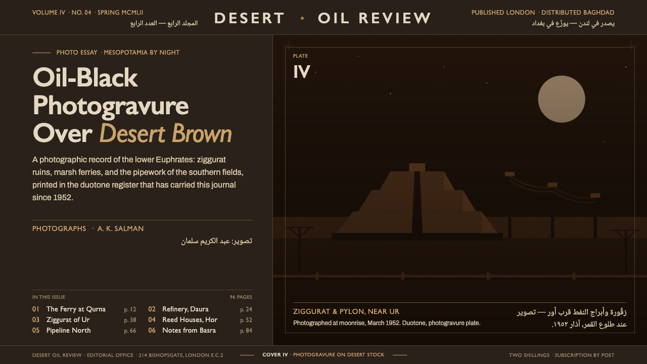 Iraq Petroleum MagazineCorporate gravity in oil-black. Desert-brown photogravure, Gill Sans bound to…
 Lewerentz Dark BrickMass that absorbs light. Near-black engineering brick, broad soot mortar, one…