What is Dhaka Shaheed Minar?
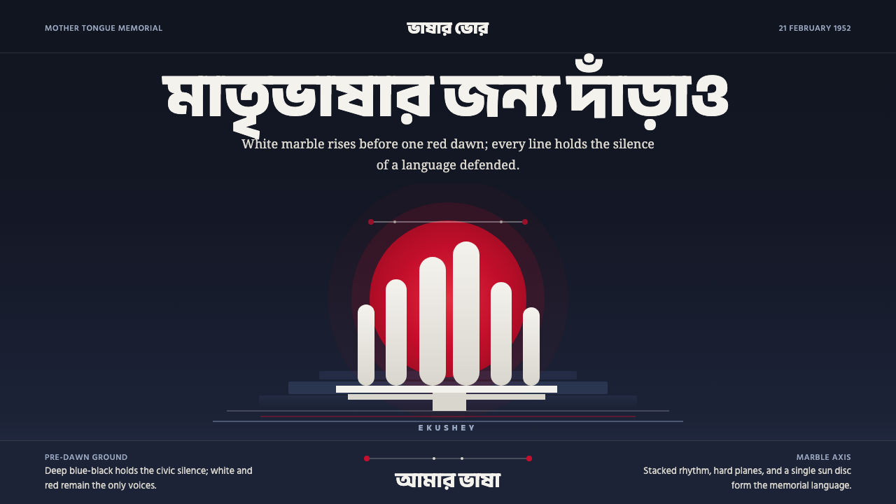
Dhaka Shaheed Minar turns remembrance into form — white marble figures, a single red sun, and the deep silence of a city before dawn.
Dhaka Shaheed Minar in brief
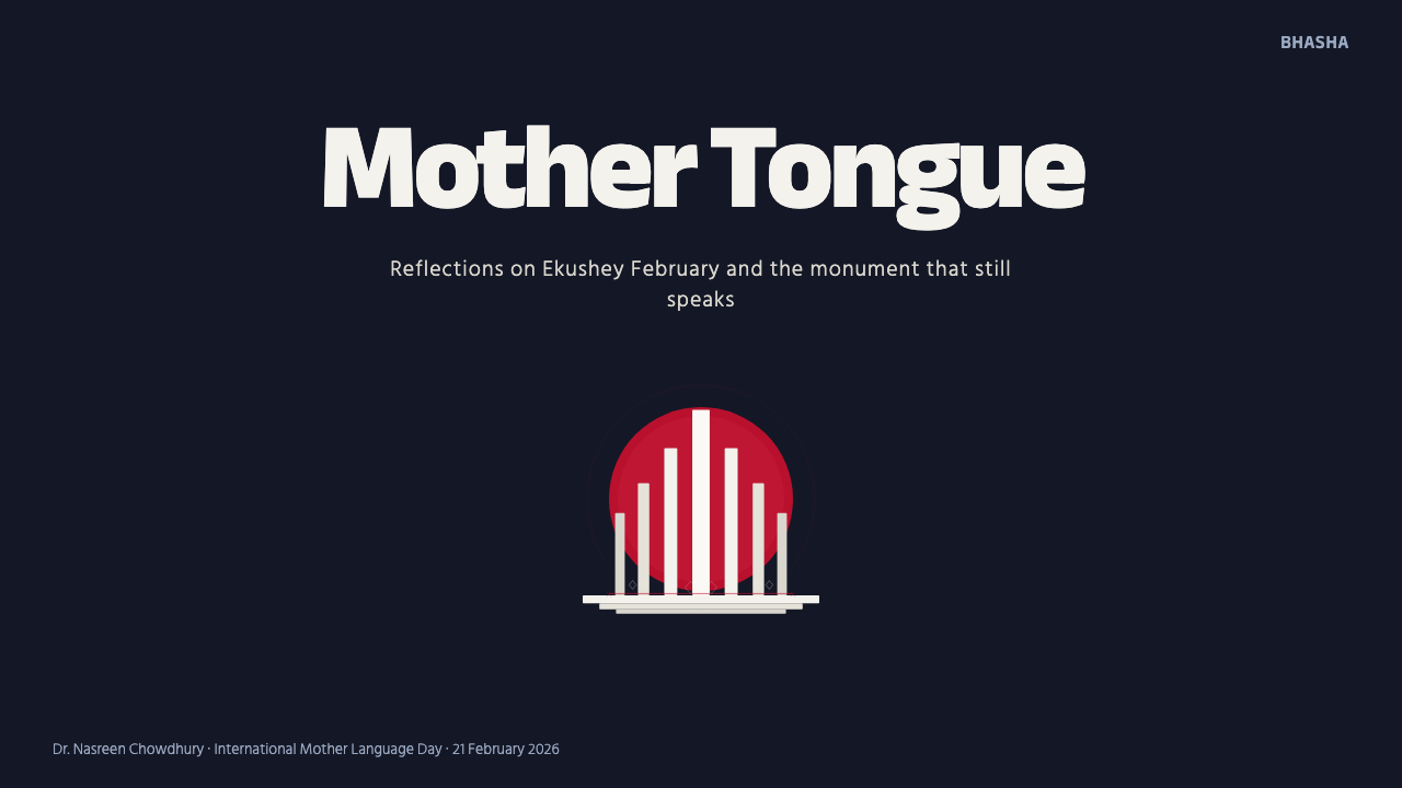
Dhaka Shaheed Minar is a solemn visual language derived from the Central Shaheed Minar in Dhaka, Hamidur Rahman’s 1963 memorial to the students killed while defending Bengali on 21 February 1952. Its essential composition is stark and symbolic: half-circular white marble columns, understood as a mother sheltering her fallen sons, stand before a red sun disc against a dark pre-dawn sky.
The style translates that civic monument into graphic and digital form without reducing it to a decorative motif. White carries the presence and gravity of marble; red concentrates attention into a single emblematic sun; blue-black creates the surrounding silence. Bold Bengali lettering gives language a physical presence, while restrained alpana line-motifs connect the monumental composition to Bengali visual culture.
Its minimalism is ceremonial rather than fashionable. Empty space is not merely clean layout but a pause around memory. Repetition recalls the monument’s columns, curvature echoes their sheltering formation, and the red disc acts as both focal point and emotional horizon. Every element should feel placed for commemoration: monumental, controlled, and grave, never playful or ornamental.
Where does Dhaka Shaheed Minar come from?
The historical center of the style is the Bengali Language Movement and the students killed defending Bengali on 21 February 1952. In this memorial tradition, language is not treated as an abstract academic subject. It is bound to public identity, sacrifice, and collective memory. The design therefore begins with civic gravity: it must communicate that the subject is a loss remembered by a community, not simply an event represented through attractive graphics.
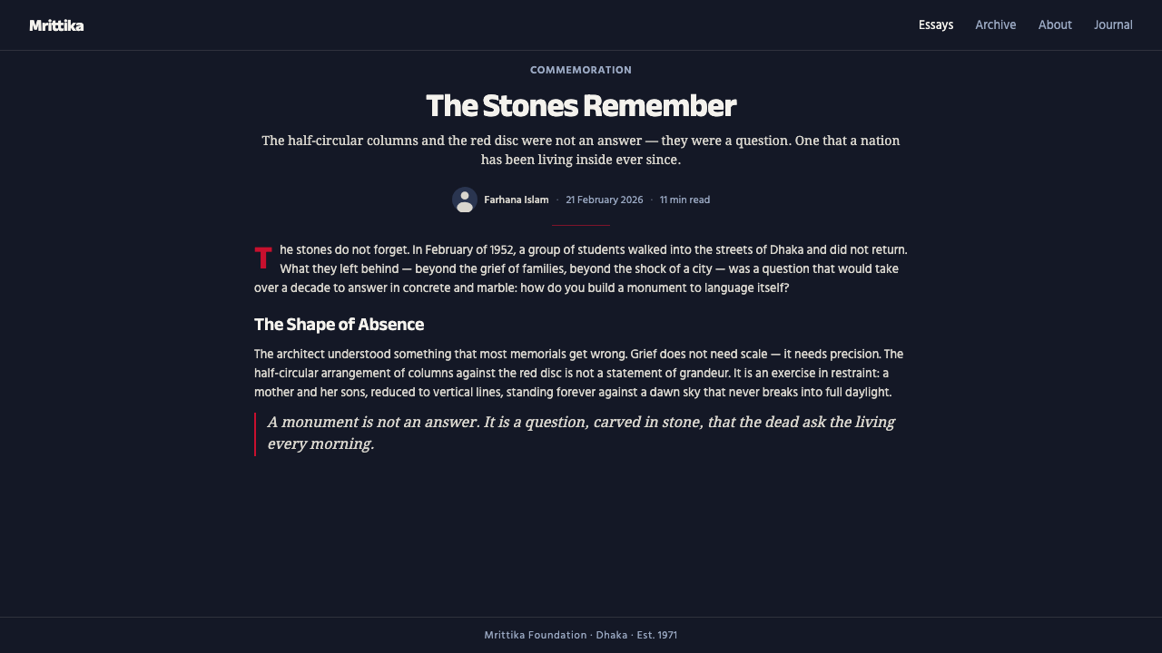
Hamidur Rahman’s 1963 design for the Central Shaheed Minar gave that remembrance a monumental form. The half-circular white marble columns are read as a mother sheltering her fallen sons. Their repeated upright forms create both a family group and a civic structure, joining human grief to architectural order. Behind them, the red sun disc establishes an elemental image that can be recognized even when the monument is reduced to a spare silhouette.
The monument belongs to mid-century modernist civic design, yet its meaning is inseparable from Dhaka and the Bengali Language Movement. Its abstraction does not erase cultural specificity. Bold Bengali lettering foregrounds the language being commemorated, while alpana line-motifs introduce a local graphic vocabulary with restraint. Modernist reduction and Bengali identity therefore operate together: one supplies formal clarity, while the other supplies historical and cultural meaning.
Ekushey February observance keeps the memorial from becoming a static historical object. The visual language remains connected to an act of remembrance centered on 21 February. For contemporary designers, this continuing commemorative role sets an ethical boundary around the style. Its forms may be adapted to slides, interfaces, publications, and public campaigns, but their solemn origin should remain legible through disciplined contrast, measured pacing, and respect for the memorial subject.
What defines the Dhaka Shaheed Minar look?
Color
The palette is concentrated around deep pre-dawn blue-black, stark marble white, and one commanding red. Darkness occupies the field, white defines the principal forms and text, and red is reserved for the sun or an equally consequential focal point. The colors should not be scattered evenly. Their unequal distribution creates hierarchy: silence first, memorial structure second, emotional concentration last.
Monumental Form
Upright columns, repeated intervals, and a sheltering half-circle form the structural vocabulary. Elements should feel assembled like a civic monument rather than arranged like decorative cards. Vertical forms suggest endurance and collective presence; curvature introduces protection and grief without becoming soft or sentimental. Even a small composition should imply a scale larger than the page or screen.
Typography
Bengali lettering is bold, direct, and central to the identity of the system because the memorial commemorates a struggle over language. Type should carry architectural weight, with decisive headlines and quieter supporting text. Large lettering may behave like another column in the composition. Decorative scripts, whimsical forms, and crowded mixtures of type styles weaken the civic authority of the page.
Red Sun
The red disc is the composition’s emotional center. It works best as one complete, unmistakable form placed in tension with the white columns, not as a repeating badge or decorative dot. Its force comes from isolation. Cropping may make it feel like a horizon or rising presence, but multiplying it turns a memorial symbol into a pattern and dissolves its gravity.
Alpana Restraint
Alpana-inspired lines provide cultural texture without taking command of the composition. They may frame an edge, mark a transition, or create a quiet ceremonial threshold. Their role is connective rather than ornamental excess. Dense all-over patterning competes with the monument, while a few measured line-motifs can make an otherwise severe modernist field feel rooted in Bengali visual culture.
Silence and Space
Negative space functions as civic silence. Broad dark fields allow the white structure and red sun to stand without visual noise, while restrained spacing slows the reading rhythm. The page should not feel empty through neglect; it should feel cleared for remembrance. Supporting information belongs in compact, orderly groups so that no secondary element interrupts the main symbolic relationship.

Who shaped Dhaka Shaheed Minar?
Rahman is credited with the 1963 design of the Central Shaheed Minar in Dhaka. His composition transformed remembrance of the 1952 Language Movement martyrs into an abstract civic image: white half-circular columns read as a mother sheltering her fallen sons, placed before a red sun. The enduring clarity of that relationship provides the foundation for the digital style.
Novera Ahmed is identified among the key figures connected with the monument’s creative history. Within the style’s cultural frame, her presence helps locate the Shaheed Minar beyond anonymous international modernism and within a specifically Bengali memorial tradition. References to that history should remain respectful and should not turn the monument’s forms into detached visual fashion.
The students killed defending Bengali on 21 February 1952 are the human reason the memorial exists. They are not background context to the aesthetic but its central subject. The columns, red sun, Bengali lettering, and solemn darkness acquire meaning through this remembrance. Any adaptation that preserves the silhouette while discarding the sacrifice has retained the appearance but lost the style’s purpose.
Ekushey February observance represents the continuing public act of remembrance associated with 21 February. It gives the visual language a ceremonial rhythm: approach, pause, name, and remember. In contemporary communication, this suggests deliberate sequencing, quiet transitions, and a clear hierarchy that gives commemorative words and images room to be encountered rather than rapidly consumed.
How do you use Dhaka Shaheed Minar today?
For presentation covers, begin with the monument’s primary relationship: a broad pre-dawn field, a white vertical group, and one red sun. The title should be bold enough to share the composition’s architectural authority but should not cover the symbolic forms. Content slides need a quieter version of the system, using repeated vertical divisions, generous dark space, and compact text groups. The monument silhouette should appear sparingly, ideally where a section begins or a commemorative statement requires emphasis.
Data slides should preserve solemn clarity rather than turning the palette into spectacle. White columns or bars can represent comparable quantities against the dark field, while red identifies only the most consequential point, exception, or total. Labels should remain direct and legible, and explanatory text should sit apart from the main diagram. Avoid decorative chart effects: the visual argument should feel as stable and public-facing as an inscription.
For web interfaces, the style suits civic dashboards, archives, educational platforms, and restrained pricing or membership pages where trust and hierarchy matter. Dark surfaces can hold white content panels or column-like information groups, while red is reserved for the primary action or a critical status. Navigation should be calm and typographic. Cards should feel like aligned slabs rather than floating objects, and interactive emphasis should never make the interface cheerful or game-like.
Editorial and marketing applications should treat the style as a narrative of memory, language, and collective identity. An article can open with a large red disc partially obscured by white forms, then move into narrow text passages separated by broad pauses. Campaign pages may use bold Bengali lettering as a central image, with alpana lines marking transitions. The strongest marketing use is institutional and cultural; commercial urgency should remain subordinate to dignity.
The most common mistake is to copy the red disc and white columns while ignoring their commemorative meaning. Another is to fill every empty area with alpana patterns, icons, or glowing effects, confusing cultural specificity with decorative density. Authentic application depends on restraint: one dominant symbol, a limited hierarchy, substantial silence, and typography that respects language as the subject rather than treating unfamiliar letterforms as exotic texture.
Dhaka Shaheed Minar — FAQ
Is Dhaka Shaheed Minar simply a dark modernist style with a red accent?
No. Its dark field, white geometry, and red disc come from a specific memorial: the Central Shaheed Minar and its commemoration of the 1952 Language Movement martyrs. Generic dark modernism may use the same contrast for drama, but this style organizes contrast around remembrance, Bengali language, and the image of a mother sheltering fallen sons. Historical meaning is part of the formal system.
Must every composition include the monument silhouette?
No. Repeating the full silhouette everywhere can turn a solemn symbol into branding wallpaper. The style can remain recognizable through its deeper relationships: white vertical rhythm against pre-dawn darkness, a single isolated red focus, bold Bengali lettering, measured alpana lines, and substantial negative space. Use the literal monument when remembrance is central; use the abstract grammar for supporting pages and interfaces.
How should alpana motifs be used without making the design decorative?
Treat them as quiet ceremonial markers rather than surface coverage. A line-motif can frame an opening statement, signal a section boundary, or connect two otherwise separate areas. It should remain visually secondary to the columns, sun, and language. If the viewer notices the pattern before the commemorative content, its scale, frequency, or contrast has become too assertive.
Can the style be used for ordinary commercial products?
It can be adapted, but the fit must be judged carefully. The language works best where solemnity, public trust, education, cultural memory, or institutional authority are relevant. It is poorly suited to playful entertainment, casual lifestyle promotion, or sales tactics built on excitement and urgency. Using memorial forms merely to make a product appear dramatic risks trivializing the history that gives them meaning.
Why is Bengali typography so important to the system?
Because the Central Shaheed Minar commemorates students killed defending Bengali. Lettering is therefore not an optional cultural flourish; it embodies the subject of the memorial. Bold Bengali text can function simultaneously as language, image, and structure. Even in multilingual work, Bengali should be treated with full typographic dignity rather than reduced to a small decorative caption or an exotic visual sample.
Related design styles
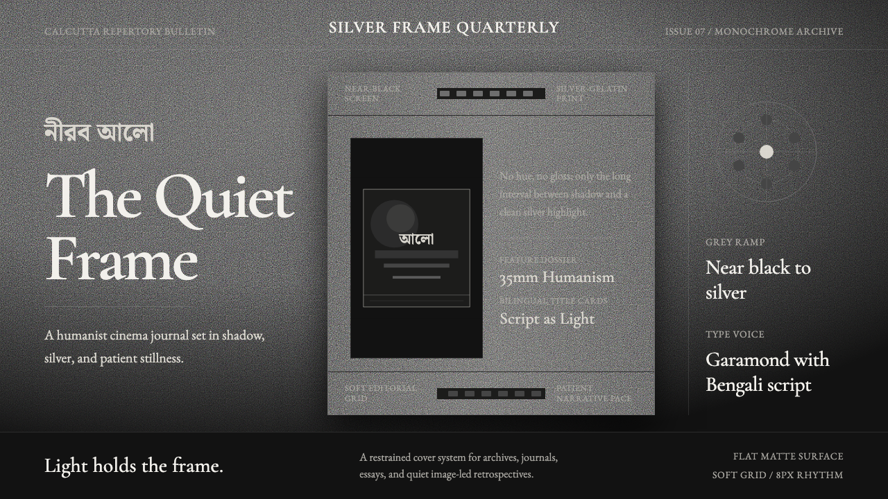 Bengali Art-House CinemaLight becomes restraint. Near-black ground, silver serif, and Bengali script…
 Joy Division — Unknown PleasuresRestraint becomes signal. Black field, tight Helvetica, and white pulsar line…
 Nakagin Capsule TowerArchitecture as cells. Cool gray modules, dark cores, and porthole circles lo…
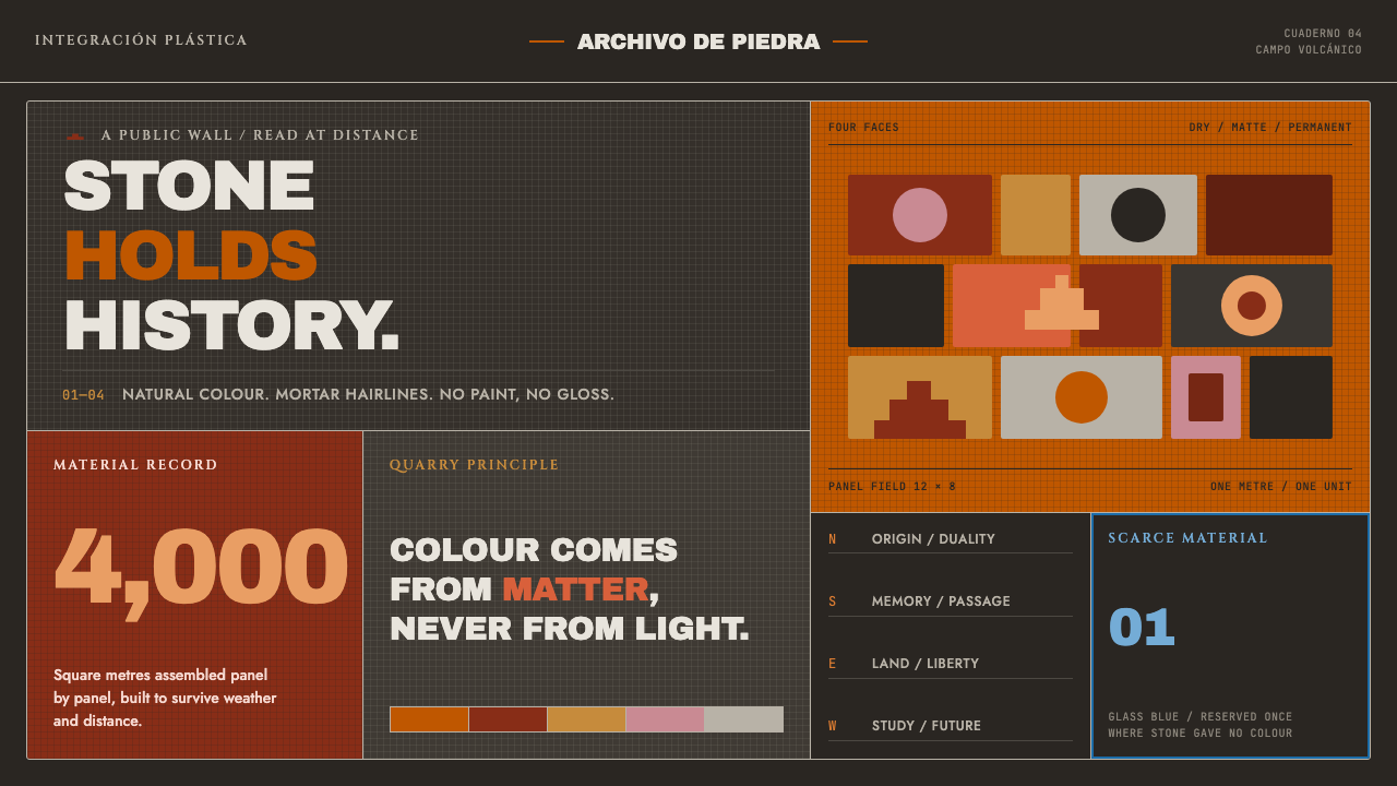 UNAM Library MosaicStone outlasts paint. Burnt-orange panels lock across volcanic gray with one…
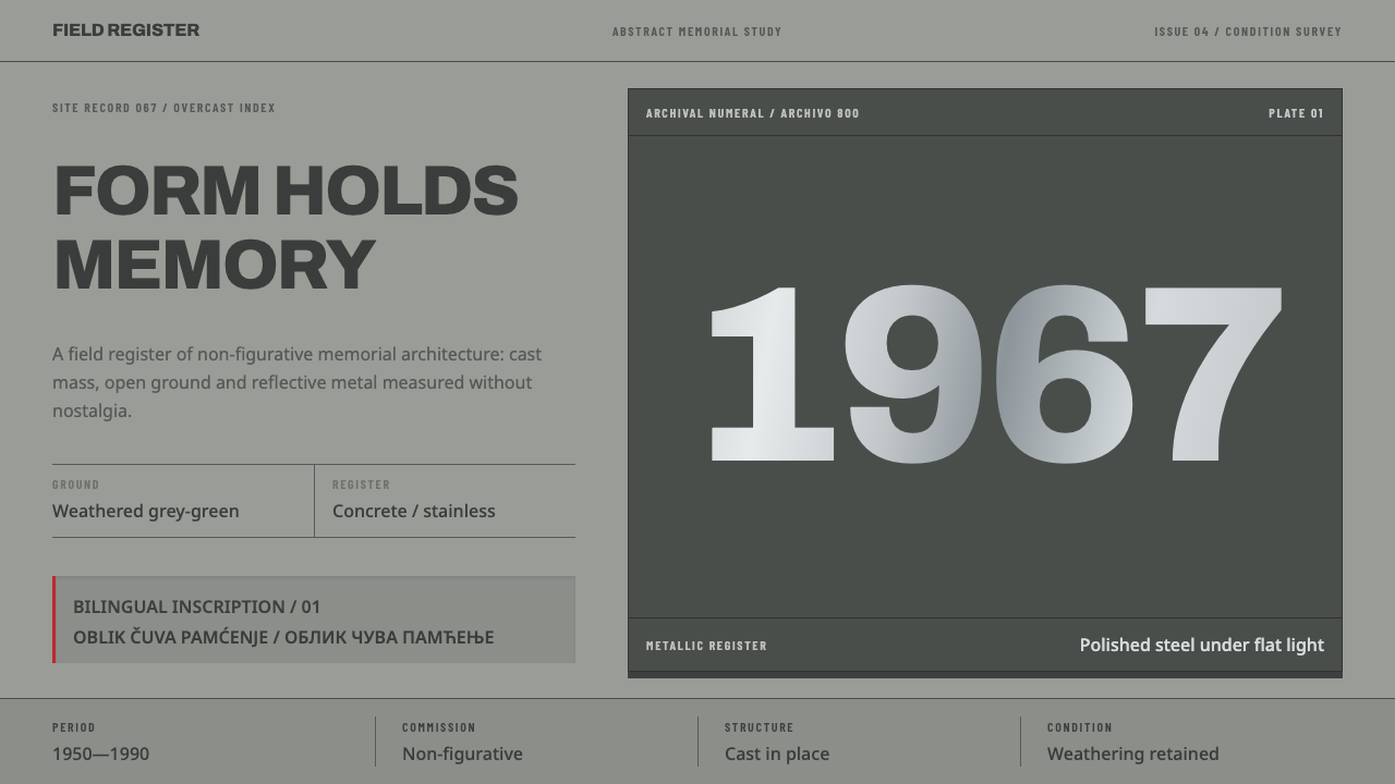 Yugoslav SpomenikMonumentality without figures. Concrete grey-green meets stainless geometry a…
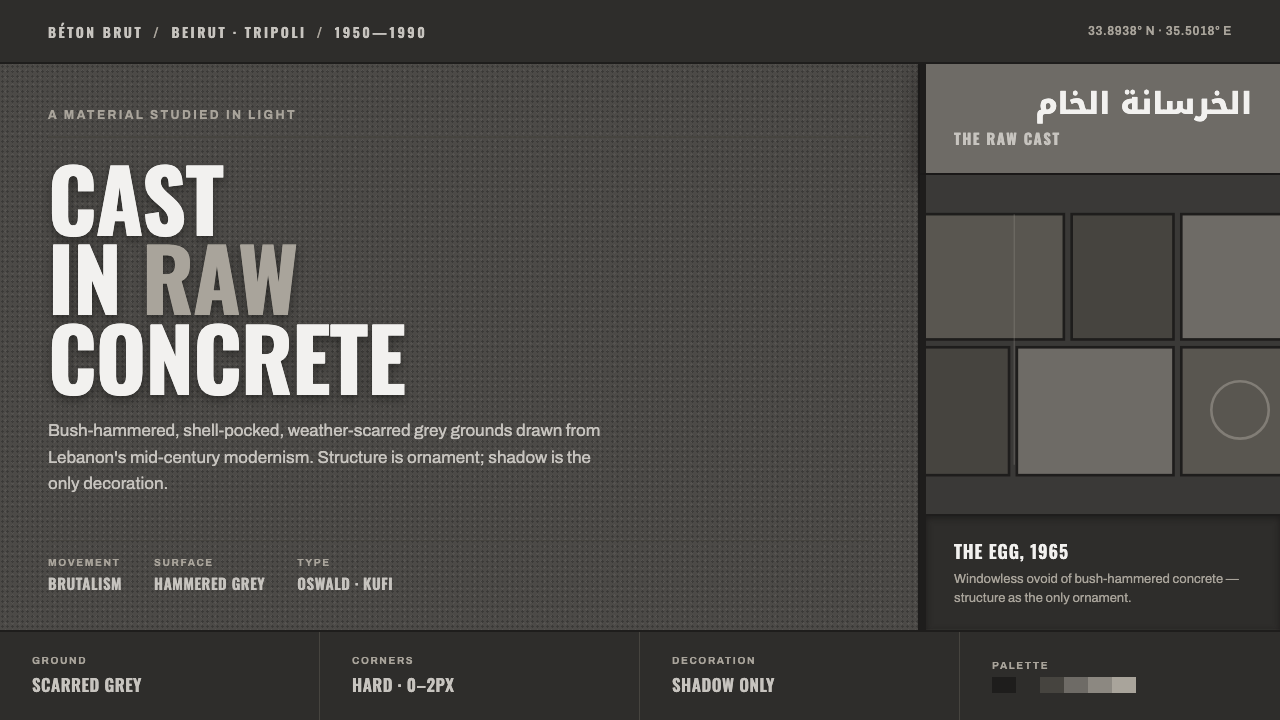 Beirut Brutalist GrayStructure is the only ornament. Scarred bush-hammered grey, monumental Oswald…