What is Nolan Ned Kelly Series?
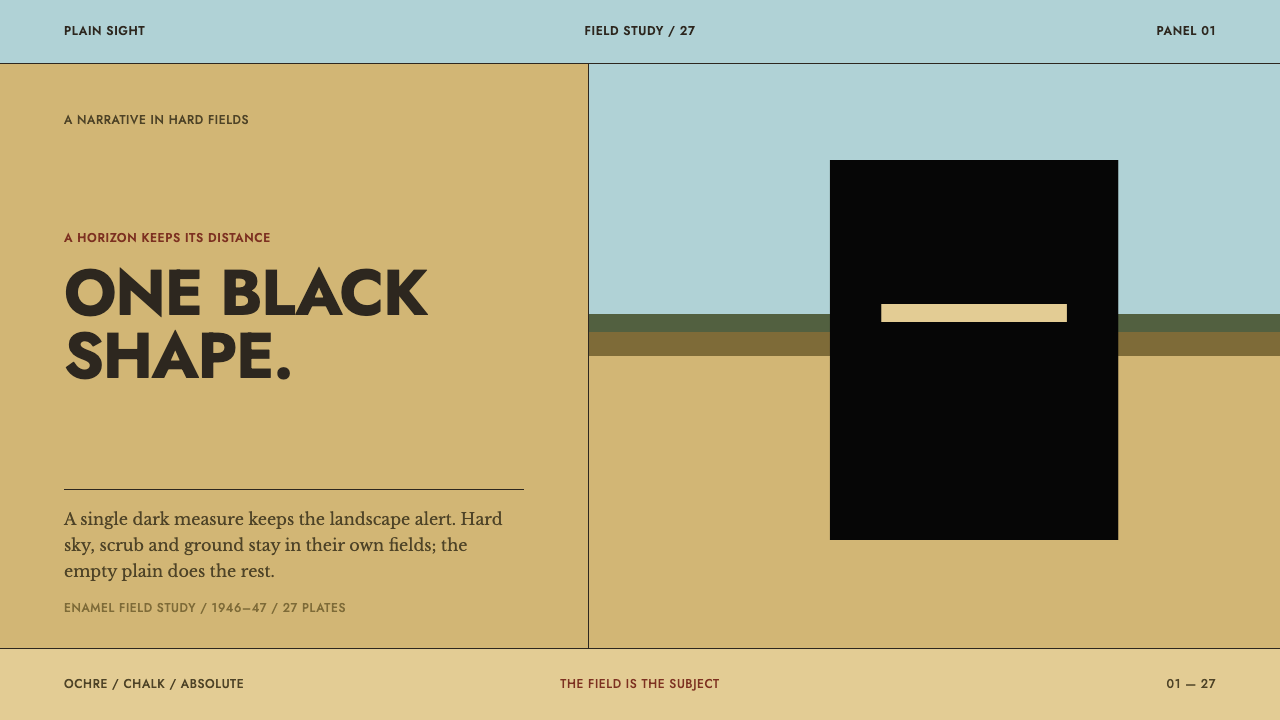
Nolan's Ned Kelly panels reduce a national legend to one black box with a slit, standing on a plain of ochre and chalk-blue enamel — a whole story told by a single dark form and a great deal of sunlit emptiness.
Nolan Ned Kelly Series in brief
The Nolan Ned Kelly Series is a design language drawn from one of the best-known sequences in Australian painting: twenty-seven panels made in 1946 and 1947 at Heide, in Heidelberg, Victoria, of which twenty-six are held by the National Gallery of Australia. The panels were painted in Ripolin, a commercial household enamel, and that choice of material explains almost everything about how they look. The paint dries quickly, dries flat and dries with a slight gloss, so a painter working with it cannot blend, model or glaze. What can be done is to lay down fields.
The visual grammar is short enough to state in a sentence: one dark form, a lot of empty ground, and a horizon. Kelly is not rendered as a man with a beard and a rifle. He is a plain black box with a horizontal slit, a shape that swallows all the light around it, while the ochre plain and the pale sky behind him stay sharply sunlit. The contrast between that single absorbing shape and the open, bright fields is the whole drama of the picture.
In a design context the style is a lesson in restraint of a very particular kind. It does not ask for minimalism for its own sake. It asks for large unmodulated blocks of colour, one point of darkness, and visible evidence of the hand: brush drag caught at the edge of each band, the grain of the hardboard support showing through thin passages. It suits work that wants to feel spacious, serious and a little uneasy, where the emptiness is doing as much work as the content.

Where does Nolan Ned Kelly Series come from?
The series was painted in 1946 and 1947 at Heide, the property at Heidelberg, Victoria, that belonged to Sunday and John Reed. Heide was more than a house. It was a gathering place for the Melbourne modernists, closely tied to the Angry Penguins circle of writers and artists, and it gave painters working there something rare in the period: space, sustained patronage and an audience of people who understood what they were trying to do. This is the Australian modernism of the mid-1940s, a moment when local subject matter was being taken seriously by artists who were fully aware of modern painting elsewhere.
The subject is Ned Kelly, the nineteenth-century Victorian outlaw whose homemade armour became one of the most recognisable silhouettes in Australian culture. The country in the pictures is the Victorian outback around Glenrowan, the landscape associated with the last chapter of the Kelly story. Nolan was working in a tradition of figurative narrative painting, telling a story across a sequence of panels, but he refused the conventions of portraiture. Kelly has no face and no expression. The armour is the character.
The material is the decisive fact. Ripolin was an ordinary commercial enamel, the sort of paint made for household surfaces rather than for fine art, and its behaviour set the terms of the work. Because it dries fast and flat, colour goes down as unmodulated fields with no blending between neighbours. Because it is applied thinly in places, the hardboard beneath shows through. Because the brush is dragged across a quick-setting surface, each band keeps a ragged edge where the stroke ended. Nothing here is a stylistic affectation; every feature is the paint telling the truth about itself.
Today twenty-six of the twenty-seven panels are in a single public collection, which has helped the series function as a kind of visual shorthand for Australian modernism: the black box, the slit, the plain. The design system built on it keeps the constraints of the original paint rather than the story. What carries over to the screen is the discipline of three or four flat colours, one dark focal form, wide stretches of untouched ground and a surface that admits it was made by hand.
What defines the Nolan Ned Kelly Series look?
Color
The palette works in three registers and no more: a warm ochre for the ground, a pale chalk-blue grey for the sky, and a dense black for the single figure. The ochre reads as sun-baked earth and the blue-grey as bleached air, and neither is mixed toward the other. Because the black is the only truly dark value in the picture, it carries all the weight, and the two lighter fields exist mainly to make it look heavier.
The Single Dark Form
Every composition is organised around one black silhouette. It is not outlined and not shaded; it is a solid shape with a narrow horizontal opening where the eyes would be. The slit is the only interior detail, and it is what makes the shape feel watchful rather than merely heavy. The rule that follows is strict: a second dark mass would not add interest, it would dissolve the focal point.
Flat Enamel Fields
Colour is laid in as whole areas, with no blending between neighbours and no modelling inside them. The finish is flat and slightly glossy, the way household enamel dries, so the surface has a quiet sheen rather than a soft matte bloom. Depth comes entirely from placement and scale, never from gradient. A field is simply a field, and its edge is a decision.
Horizon and Bands
Ground and sky meet in a clean horizontal division, and the picture reads as stacked bands: sky above, plain below, the figure standing across the join. Horizontal bands give the composition its stillness and its sense of enormous distance. Vertical elements are rare, which is exactly why the upright black form is so commanding when it appears.
Emptiness as Subject
Much of each panel is simply empty ground. That emptiness is not leftover space waiting to be filled; it is the outback itself, and it is what makes one small dark shape feel isolated and exposed. In layout terms this means generous margins and long stretches without content, held together by a single anchor.
Surface and Hand
The finish is not perfectly clean. Brush drag is caught at the edge of each band, and in thinner passages the grain of the hardboard support shows through. These traces keep the flatness from turning sterile. They tell the viewer that the fields were laid by a hand with a loaded brush, quickly, before the enamel set.
Compressed Narrative
The story is cut down to the minimum needed to recognise it. There are no faces, no expressions and no props beyond the shape itself; everything that might distract has been removed so the silhouette can carry the legend alone. The figure is a symbol rather than a portrait, and the design language inherits that economy.

Who shaped Nolan Ned Kelly Series?
Nolan painted the twenty-seven panels in 1946 and 1947 while working at Heide. He chose Ripolin household enamel over conventional oil paint and let its fast, flat, slightly glossy behaviour dictate a pictorial language of unmodulated fields. His reduction of Kelly to a black box with a slit is the defining image of the series and one of the most recognisable shapes in Australian modernism.
Sunday and John Reed were the owners of Heide, where the series was painted. As hosts and patrons they stood at the centre of the Melbourne modernist circle associated with Angry Penguins. The working conditions they provided, including space, support and a community of artists and writers, are the setting in which the panels came into being.
The nineteenth-century Victorian outlaw is the subject of the series, though not its portrait. Nolan shows him as a black box with a horizontal slit, set against the country around Glenrowan. Turning a legend into a shape is the decision that makes the paintings translate so well into a visual system: a recognisable silhouette needs very little else around it.
The paint is the quiet co-author of the series. A commercial enamel made for ordinary surfaces, it dries fast, flat and slightly glossy, and it leaves brush drag at the edge of every band. Its limitations became the style: no blending, no modelling, no soft transitions, only fields of colour placed next to one another.
How do you use Nolan Ned Kelly Series today?
The Nolan style is a strong fit when a project needs to feel spacious, serious and slightly austere without falling back on the usual vocabulary of minimalism. Its logic is compositional rather than decorative: large fields, one dark anchor, a horizon. Applying it well means committing to that logic on every screen or page, and resisting the urge to add a second point of interest.
On a cover slide, divide the canvas into two broad horizontal bands of ochre and chalk blue-grey, and let a single black block sit across the join, with the title either set in a pale colour inside it or placed on open ground beside it. The block can carry one narrow horizontal opening as a quiet echo of the slit. Content slides should keep the same banding, with one dark element per slide, such as a key figure, a pull quote or a section marker, and a great deal of unfilled ground around it. Data slides work best when one series or one number is rendered in black and everything else stays as flat, quiet fields, so the chart behaves like the paintings: one dark fact against an open plain.
In web interfaces the style suits dashboards, portfolios and product pages that want calm rather than density. Use broad flat background areas stacked as horizontal sections, and reserve black for exactly one thing per view: the primary action, the headline metric or the hero statement. On a pricing page, give the recommended plan the single dark treatment and leave the other plans as plain colour fields without borders or shadows. Cards should read as flat blocks of colour rather than lifted surfaces, and buttons as solid shapes rather than gradients or glass.
For editorial and marketing work the style rewards long, quiet pages: a wide margin of empty space around a short passage of text, images cropped into horizontal bands in the manner of the panels, and section changes marked by a shift from one flat colour field to another instead of by rules or ornaments. A campaign can use a single black shape as a recurring mark, used once per spread so that it keeps its force.
The most common mistake is to treat the black form as a motif to be repeated. The paintings work because there is only one; two or three black blocks turn tension into pattern and lose the focal point. Equally damaging is adding gradients, soft shadows or glossy highlights to simulate the enamel sheen. The gloss belongs to the material, not to the interface, and imitating it with effects makes the fields look decorated instead of flat. Finally, resist filling the empty ground. The emptiness is the subject.

Nolan Ned Kelly Series — FAQ
Why is Ned Kelly shown as a black box instead of a person?
Because the series is about the figure as a symbol, not as a likeness. Nolan reduces the outlaw's armour to a plain black shape with a horizontal slit, so the silhouette can carry the legend without a face or expression. For design, this is the useful lesson: a single, strong, recognisable shape against open ground communicates more than a detailed illustration, and it leaves room for everything else to stay quiet.
Why does the style depend on Ripolin enamel?
The paint dries fast, flat and slightly glossy, which rules out blending and modelling. That is why the panels consist of unmodulated fields with brush drag at the edges and hardboard grain in the thin passages. The design system keeps the consequences rather than the substance: flat colour areas, hard edges, visible traces of the hand, and no gradients that would pretend the surface is something it is not.
Can the style be used in a dark layout?
It is built on light fields with a single dark form, so a fully dark page reverses its logic. If you need a dark context, keep the same principle in inverted form: broad, quiet, low-key fields and exactly one bright or contrasting form as the anchor. The danger is losing the tension. Once everything is dark, the black box has nothing to stand against and the painting's central device disappears.
How is it different from generic flat design or minimalism?
Generic flat design removes depth cues but usually keeps a busy hierarchy of components, icons and accents. The Nolan style is stricter in one direction and looser in another: it allows only one dark element and a very small palette, but it welcomes imperfection, wide empty space and a surface that shows its making. It is less about tidiness and more about weight, distance and a single point of tension.
What kinds of projects does it suit, and where does it struggle?
It works for work that benefits from stillness and gravity: portfolios, cultural institutions, editorial features, reflective product pages and presentations with a single strong argument. It struggles in dense, multi-action interfaces, playful consumer products and any context that needs many competing calls to action, because its whole strength depends on one dark focal point and a great deal of unfilled space.
Related design styles
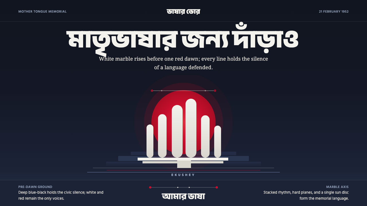 Dhaka Shaheed MinarSolemn before dawn. Marble columns and one red sun hold the page in civic sil…
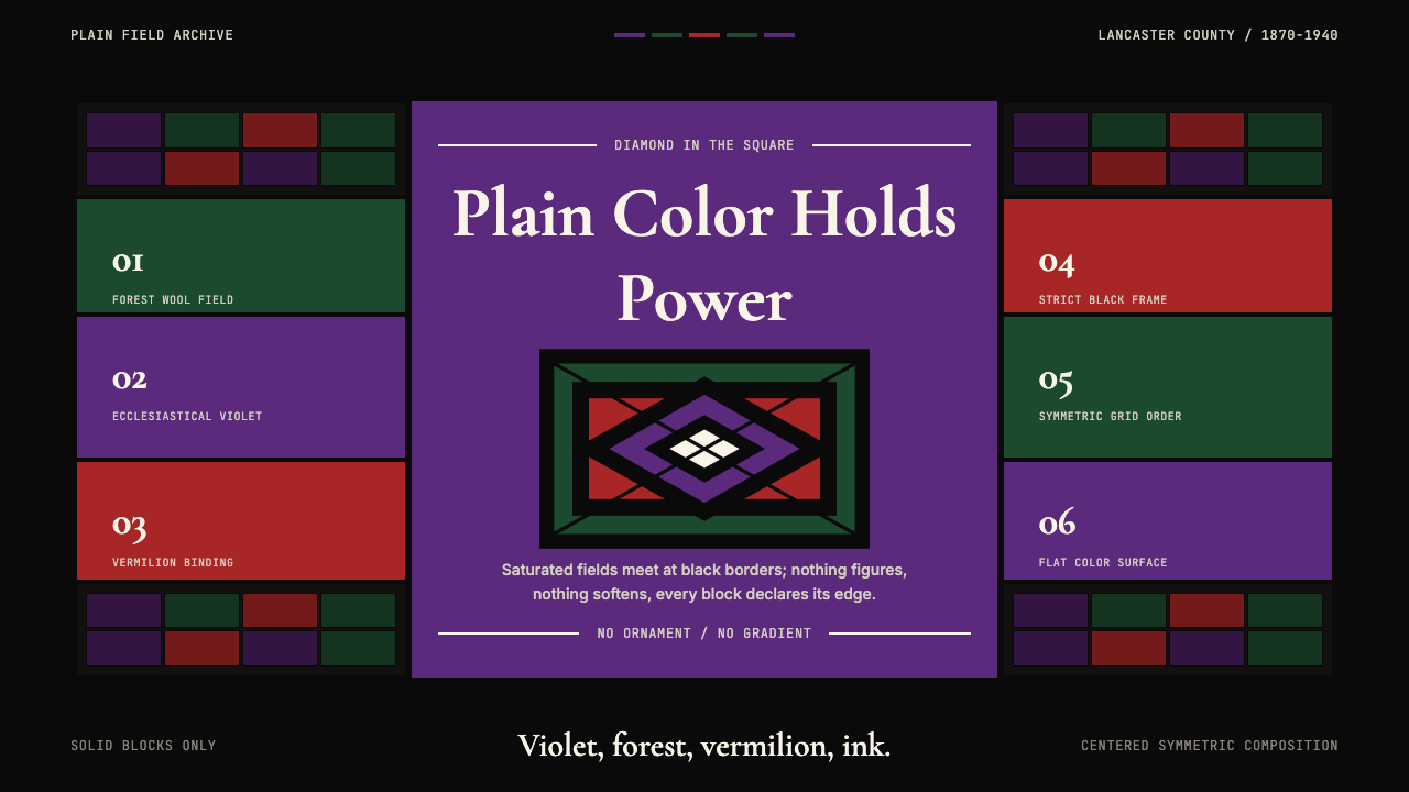 Amish Pennsylvania Quilt Bold GeometricRadical plainness. Violet, forest, and vermilion blocks lock into ink-black q…
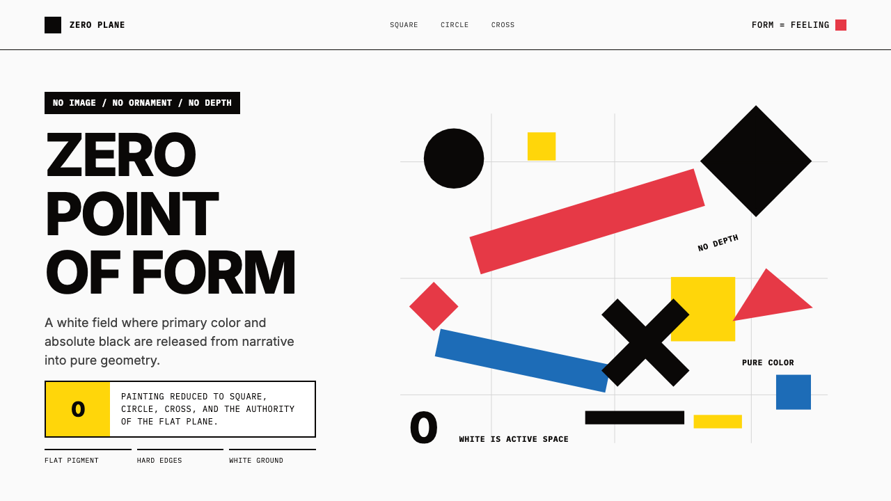 Malevich SuprematismGeometry declares zero. Red, yellow, blue and black blocks float on active wh…
 Metropolis (Fritz Lang, 1927)Monumental and severe. Black grid, cream type, sepia shadows.
 Picasso CubismSingle sight is shattered. Cream collage paper fractures brown-gray planes wi…
 Torres-García UniversalismoGlyphs become structure. Dirtied primaries sit in unequal ruled cells on boar…