What is Torres-García Universalismo?
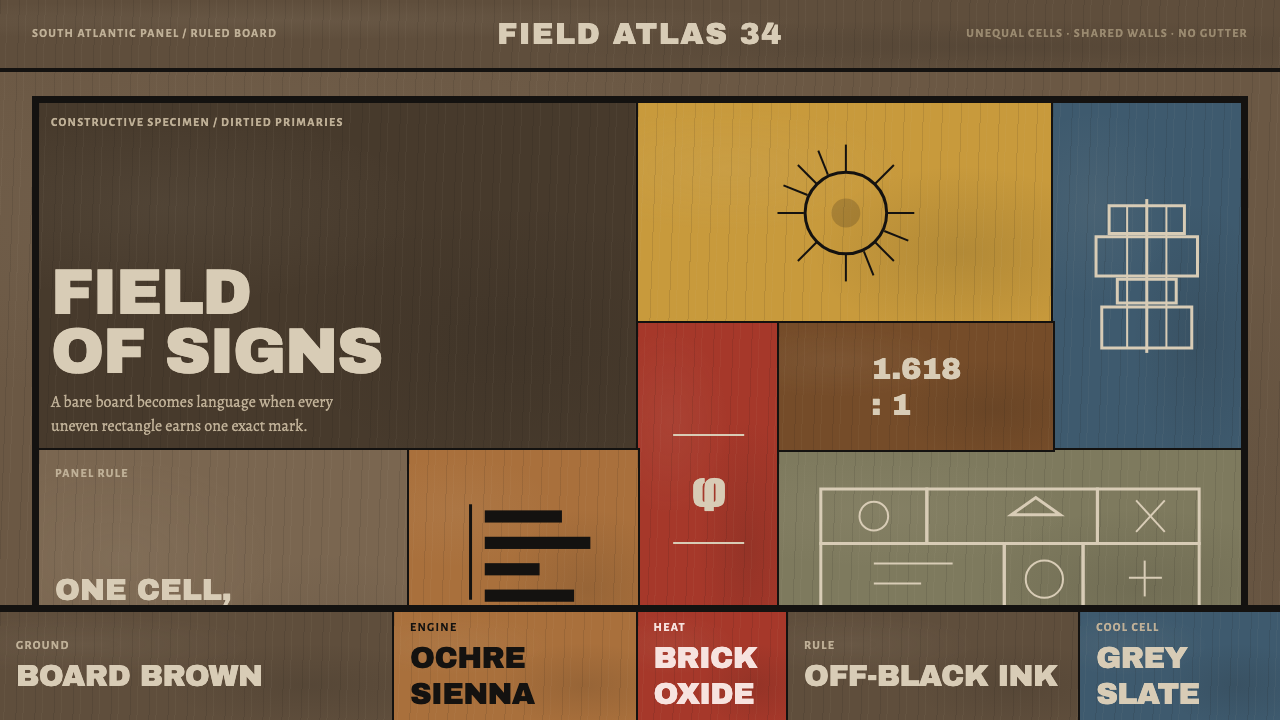
Torres-García stopped painting pictures and began writing: unequal ruled cells on raw board, each holding one schematic glyph in earth-dirtied primaries.
Torres-García Universalismo in brief
Torres-García Universalismo is the visual language of Joaquín Torres-García's Constructive Universalism, developed in Montevideo from 1934: a grid of unequal rectangles ruled onto board, each cell holding a single schematic glyph, painted in dirtied primaries that let the wood show through. It looks like a writing system that has been built, not a painting that has been composed.
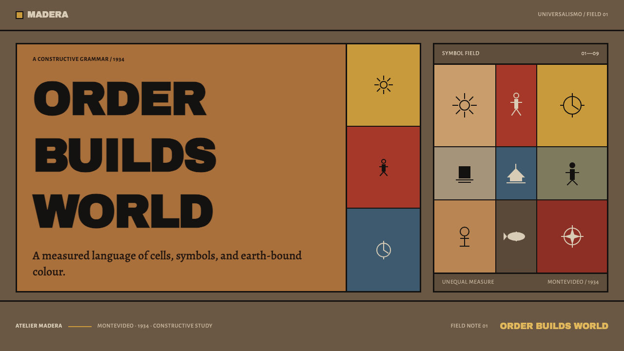
The glyphs form a small, repeated vocabulary: sun, ship, anchor, fish, clock, ladder, key and a standing human figure. They are drawn flat and schematic, with no perspective and no modelling. Their meaning comes from where they sit in the grid and how they stand beside one another, the way the meaning of a word comes from its place in a sentence.
The grid is not even. Cells vary in size and are proportioned on the Golden Ratio, and they stack with no gaps between them, like the courses of Inca masonry. The colours are the primaries, but deliberately earth-bound: brick for red, ochre for yellow, a greyed slate for blue, with the grain of the board reading through everything. It is rationalist structure with an American accent, and the accent is the point.
Where does Torres-García Universalismo come from?
Joaquín Torres-García returned to Montevideo in 1934 after decades abroad, by way of Barcelona and Paris, and what he did next amounted to a change of vocation: he stopped making pictures and set about making a language. The move home was also a move of conviction. He believed the Americas had been taught to look to Europe for their forms, and that a modern art could be built from the continent's own ground.
The method had been formed in Paris. In 1929 Torres-García took part in Cercle et Carré, Circle and Square, with the Belgian critic Michel Seuphor, a group of artists committed to construction and structure and set against the dream imagery of Surrealism. Piet Mondrian moved in the same orbit, and his austere ruled grid in primary colours stands behind Torres-García's work as the model he learned from and refused to copy.
Back in Montevideo, the grid became a way of speaking. Torres-García ruled his cells with compass and straightedge directly onto found carpentry board and set a single glyph in each. The hand-ruled line trembles a little, corners wear white, and the surface keeps the scuff of the material. He called the result Universalismo Constructivo, and he meant it as a pictographic script for a whole continent, not as a personal style.
He organised others around the idea. The Taller Torres-García, his workshop, taught students the grid and its glyphs, and the language continued to develop until his death in 1949, which closes the period this style covers. The work he left, and the workshop that carried it on, made Montevideo one of the places where constructive abstraction and a specifically American pictorial language met.
What defines the Torres-García Universalismo look?
Unequal Ruled Cells
The structure is a ruled grid of rectangles that do not match. Some cells are wide, some narrow, some tall, and they fit together like the pieces of a wall rather than the squares of a spreadsheet. The inequality is the point: it gives the surface a hierarchy and a rhythm that an even grid cannot, and it tells the viewer where to look first.
One Glyph per Cell
Each cell contains exactly one schematic glyph: a sun, a ship, an anchor, a fish, a clock, a ladder, a key or a standing figure. The glyph is flat, simple and frontal, with no shading and no scene. This one-thing-per-cell rule makes the whole composition legible like a line of writing, and it is the quickest way to tell this style from a decorative pattern.
Dirtied Primaries
Red, yellow and blue are all present, but none is clean. Tempera and oil laid thin over unprimed wood turn red into brick, yellow into ochre and blue into greyed slate. The effect is earth-bound and slightly sober. Pure saturated primaries would belong to a different tradition; here the colour is allowed to be tired, because that is how paint behaves on raw board.
Board and Grain
The ground is not a blank page but a piece of wood, and the grain reads through paint, glyph and line. Because the paint is thin and the board unprimed, the support is never hidden. A faithful digital version needs that same transparency: a ground with visible grain and slight variation, not a smooth, perfectly even fill that pretends to be nothing.
Hand-Ruled Line
The lines are drawn with compass and straightedge, by hand. They tremble slightly, corners wear white, and edges are never mathematically perfect. Those marks are not flaws; they are the accent of the language, the evidence that someone built it rather than generated it. A razor-straight, pixel-clean border would make the style look like software pretending to be a painting.
Stacked Like Inca Masonry
Cells sit directly against one another, with no gutters and no gaps. They stack the way the courses of an Inca wall stack, each block seated hard against its neighbours and cut to fit. This tightness gives the composition its weight and sets it apart from card layouts, where space between boxes does the separating. Here the ruled line is the only separator.
Golden Ratio Proportion
The cells are proportioned on the Golden Ratio, which is how an irregular grid still feels ordered. Torres-García treated proportion as the hidden law of the work, a rule that ties each rectangle to the next. For a designer, the lesson is to let unequal sizes come from a consistent proportion, and not to scatter arbitrary widths.
Who shaped Torres-García Universalismo?
The Uruguayan painter who returned to Montevideo in 1934 after decades abroad and created Constructive Universalism, a ruled-grid language of schematic glyphs on board. He treated the Americas as the source of a modern art rather than a province of Europe, and he worked the idea through paintings, writing and teaching until his death in 1949.
A Belgian critic and writer who co-founded Cercle et Carré with Torres-García in Paris in 1929. The group gathered artists around construction and structure at a moment when Surrealism dominated the conversation. Seuphor's role in the story is organisational and intellectual, and it connects Torres-García to the wider European constructive movement from which he later departed.
The Dutch painter whose austere ruled grid and primary colours moved in the same Paris orbit as Cercle et Carré. His work stands as the reference point that Torres-García both learned from and declined to follow: where Mondrian pursued clean primaries on a bright, empty ground, Torres-García made them earthy, filled the cells with glyphs, and let the board show through.
The workshop Torres-García led in Montevideo, which trained students in the grid and its vocabulary of glyphs. It carried the language beyond a single artist's studio and turned it into a shared practice. The workshop is the reason Constructive Universalism can be described as a school of thought as well as a body of paintings.
How do you use Torres-García Universalismo today?
This is a dark, earthy, structural style that suits projects with a point of view: cultural platforms, museums, publishers, research tools and any product that wants to look built rather than generated. The governing rule is that the interface should read like a ruled script. Every area is a cell, every cell holds one thing, and the lines between them are the only decoration.
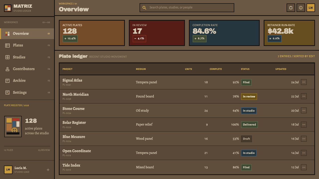
For presentation slides, a cover works as a grid of unequal cells on a board-like dark ground, with one large cell holding the title and the others holding single glyphs. Content slides can place one idea per cell, with the ruled lines doing the work of headings and rules. Data slides suit this style especially well: each metric gets its own cell and a simple glyph, and charts are drawn flat in the dirtied primaries without gloss.
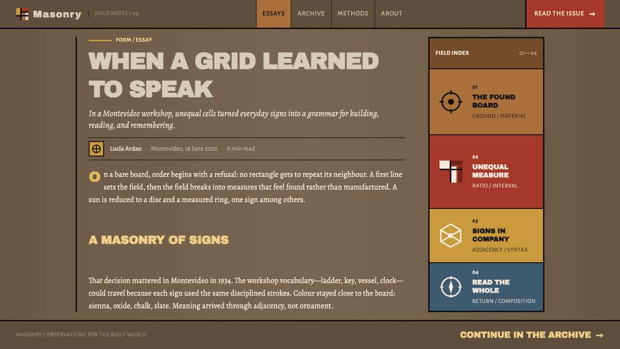
For web interfaces, a bento-style dashboard is a natural fit, provided the cells really are unequal and really do touch. Use a ruled line between cells instead of a gutter, keep corners square, and assign each cell a single schematic icon in place of a stock illustration. Pricing tiers can sit in cells of different widths, and navigation can be a column of small labelled cells, with the active one marked by colour from the earthy primaries.
For editorial and marketing work, the style gives a strong, literate identity for writing about art, Latin America, craft and ideas. Section markers can be glyphs, article layouts can be built from stacked cells of text and image, and pull quotes can occupy a larger cell. Photography should be flat and frontal, with real texture, and the page should keep the sense of a material surface: a board with grain, scuffed edges and a hand-ruled line.
The most frequent mistake is to clean it up. Mondrian-bright primaries, perfectly even cells, razor-sharp edges and a smooth digital ground all remove the qualities that identify the style. Equal cells with gutters between them turn it into a generic card grid. Putting several glyphs or a full illustration in one cell breaks the one-thing-per-cell rule, and gloss, gradients and soft shadows contradict a surface that is meant to be flat paint on raw wood.
Torres-García Universalismo — FAQ
How is this different from Mondrian?
Both use ruled grids and primary colours, but they point in opposite directions. Mondrian pursues a clean, pure, bright abstraction with empty cells. Torres-García fills each cell with a schematic glyph, dirties the primaries so they look earthy, lets the wood grain show, and makes the grid unequal and hand-ruled. The first is a system of pure relations; the second is a script, a writing system for a continent.
What do the glyphs mean?
They form a small vocabulary of sun, ship, anchor, fish, clock, ladder, key and a standing figure, drawn flat and schematic. Their meaning comes from position and relationship in the grid, as with words in a sentence, not from a fixed dictionary for any one glyph. For a designer, the practical rule is consistency: choose a small set, use each one the same way, and never use more than one in a cell.
Why are the colours so muted compared with other primary-colour styles?
Because the paint is thin tempera and oil laid over unprimed wood, which turns red into brick, yellow into ochre and blue into greyed slate. The result is earth-bound by nature, not by a decision to be dull. The muting also suits the intent of the work: a language of the Americas that grows out of the ground rather than copying the clean primaries of European abstraction.
Does the style work as a dark theme?
Yes, and it is a natural fit. Treat the ground as a dark, material board, not a flat black screen: it should carry grain and slight variation. The dirtied primaries read well against it because they are already muted and earthy. Keep the ruled lines pale and slightly uneven, so they look scratched into the surface, and avoid neon accents, which would pull the style away from raw wood and paint.
Can I use this style for modern interfaces?
It translates well to any interface that is already built from blocks, such as dashboards, portfolios, archives and editorial homepages. The key is to keep the principles: unequal cells that actually touch, one idea or one icon per cell, ruled lines as the only separator, earthy colour and a visible material ground. A generic card grid with a brown palette is not this style; the structure is what makes it recognisable.
Related design styles
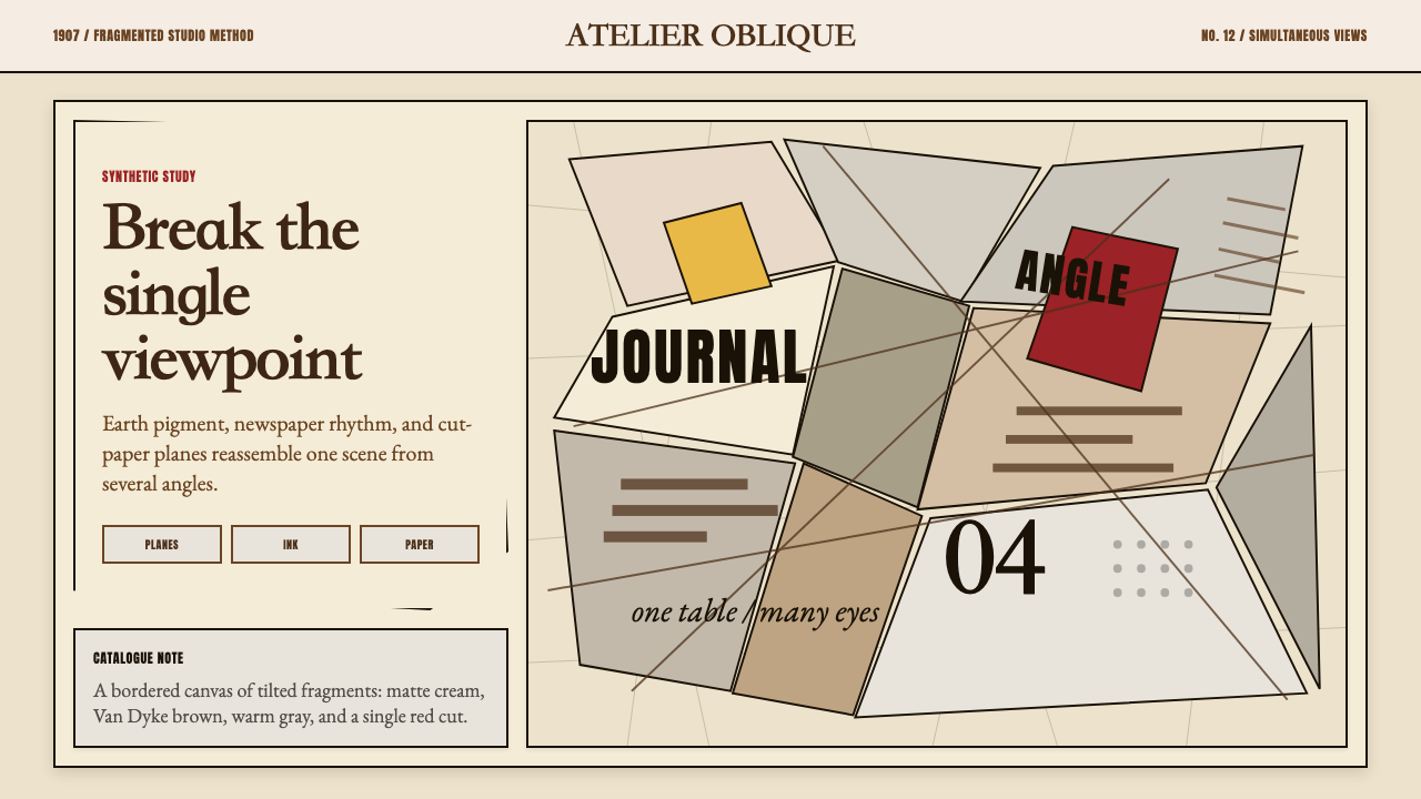 Picasso CubismSingle sight is shattered. Cream collage paper fractures brown-gray planes wi…
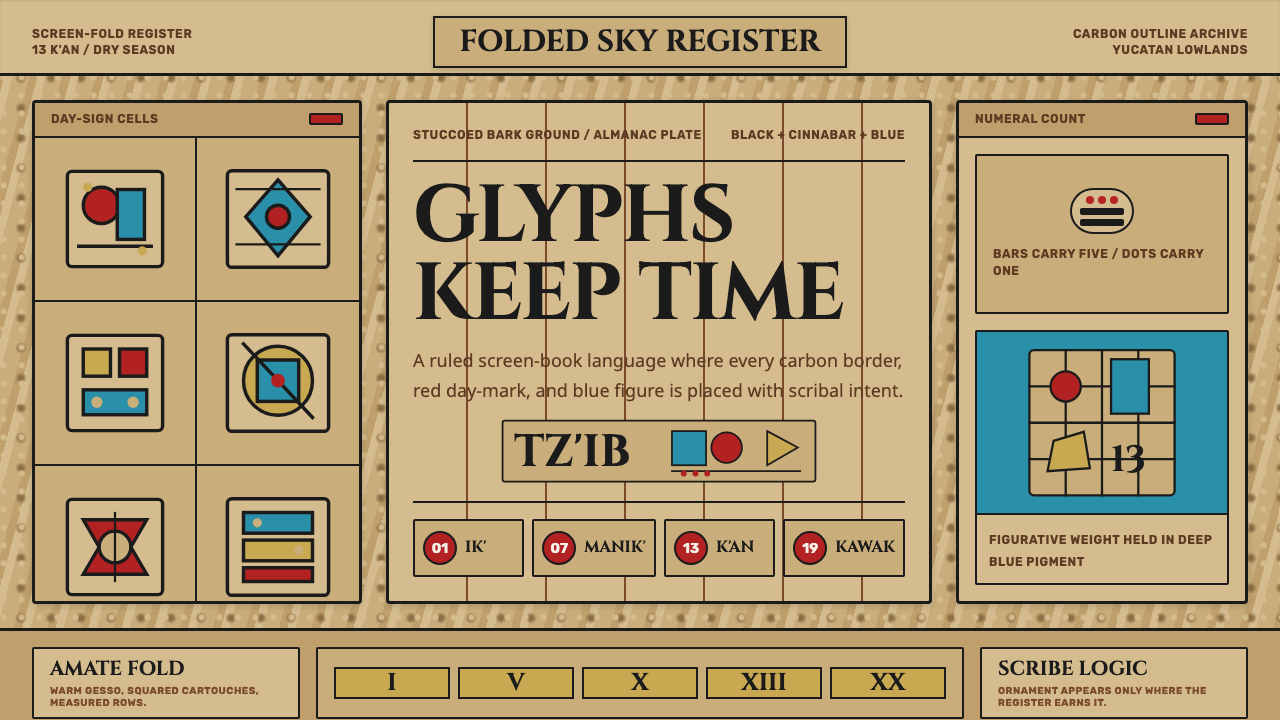 Maya Glyph CodexScribal authority on bark. Cinnabar, Maya Blue, and carbon rules lock into al…
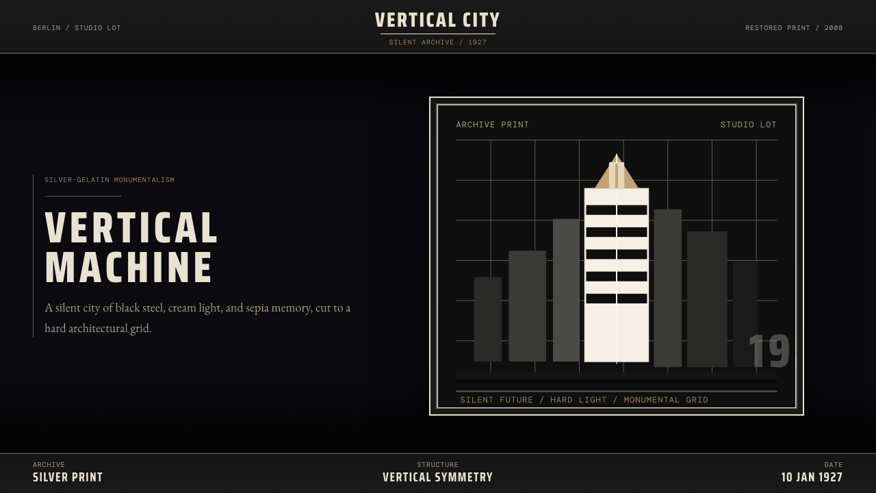 Metropolis (Fritz Lang, 1927)Monumental and severe. Black grid, cream type, sepia shadows.
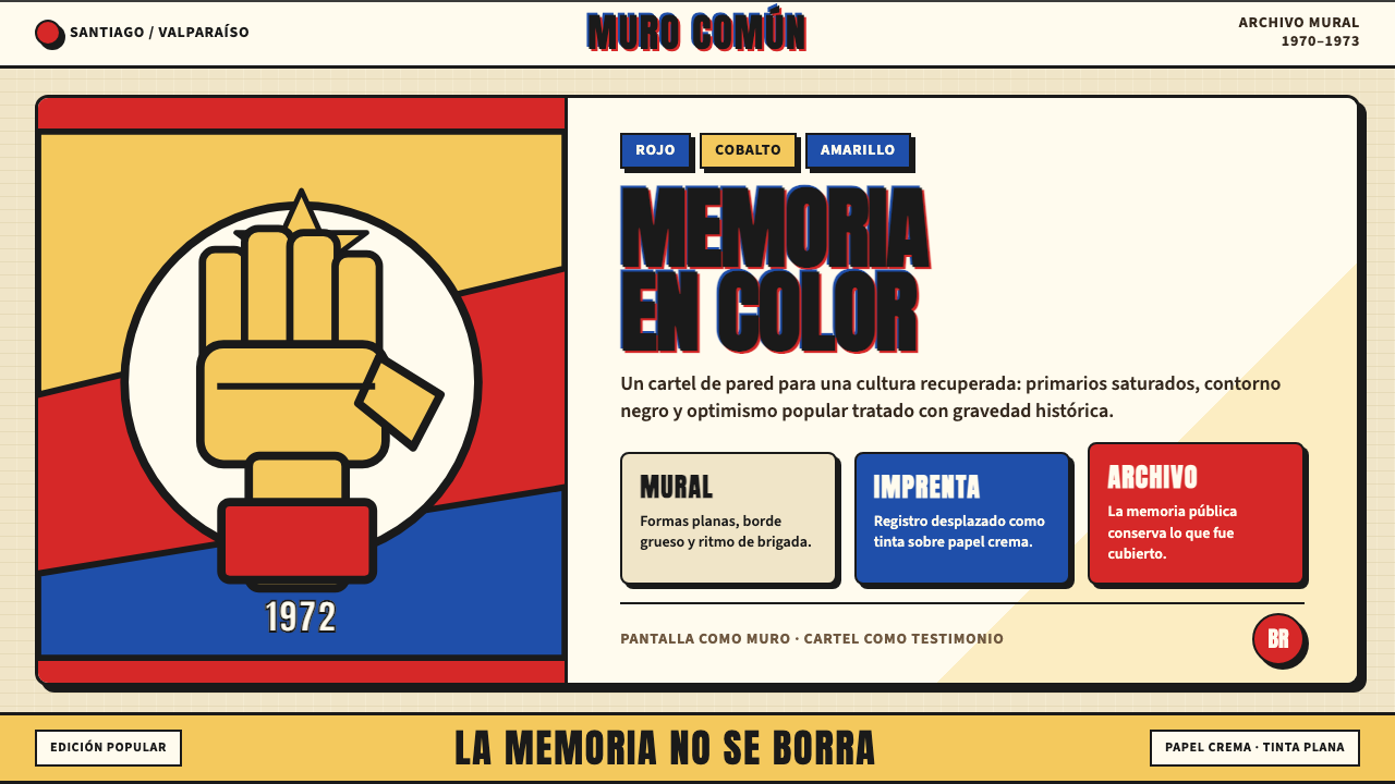 Chilean Allende-Era Propaganda (1972)Solemn revolution. Red, cobalt and yellow lock into thick black mural geometr…
 Olympic Poster Berlin (1936)Monumental and legible. Green-gray, cream, and gold turn type into architectu…
 Olympics Five Rings (1912)Ceremony without noise. Saturated five-ring color on pure white, locked to a…