What is Estridentismo?
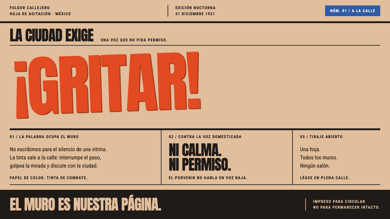
Estridentismo is what a manifesto looks like when it has to be read from across a street — vermilion wood type, black bars and buff bill stock, printed overnight and pasted up beside the bullfight bills.
Estridentismo in brief
Estridentismo — Stridentism in English — was a Mexican avant-garde of the early 1920s, and as a design language it is the look of a manifesto sheet: condensed wood-type capitals in vermilion relief ink, heavy black rules and bars, and a ground of coloured buff stock rather than white paper. It is best known through Actual No. 1, a single-sheet manifesto issued on the last day of 1921, and through the periodicals that carried the same attitude forward, Irradiador and Horizonte.
The defining idea is that this work was printed before it was read. It was made to interrupt. It was set on a charity-school press, on whatever coloured bill stock the shop had to hand, and pasted on the walls of Mexico City next to the bullfight and theatre bills. Everything about the look follows from that situation: the poster scale, the compressed letters that fit more shout into a narrow measure, the rough ink, and the complete absence of a polite white margin.
Visually the sheet is a field of controlled collision. Sizes jump inside a single line, words break wherever the measure runs out, and blocks of text tilt off the grid as if pasted on in a hurry. Woodcut vignettes of masts and factories drop in where a photograph would feel too polite. The style borrows energy from Italian Futurism and Russian Constructivism, but its subject is local: radio antennas, telegraph wires, factories and the city of Mexico itself.
Where does Estridentismo come from?
Estridentismo was born in Mexico City at the very end of 1921. Manuel Maples Arce set Actual No. 1 on a charity-school press and issued it on 31 December 1921 as one large sheet printed on both sides. The country had only just come out of a decade of revolution, its cities were taking on radio antennas, telegraph lines and factories, and a generation of writers and painters wanted a literature and a visual art that sounded like that new city rather than like the nineteenth-century salon. The paper, tellingly, was not chosen: it was whatever coloured bill stock the shop had, and the sheet went up on the walls of Mexico City the same night, jostling with bullfight and theatre bills.
The sheet was a collective statement more than a one-man act. Around Maples Arce gathered Ramón Alva de la Canal and Leopoldo Méndez, who cut the woodblocks; Germán List Arzubide, a writer who later set down the movement's story; and the painter Fermín Revueltas. The movement's centre of gravity was Mexico City, with a second home in Xalapa, in the state of Veracruz, and it kept publishing through to 1927. Its later periodicals, Irradiador and Horizonte, celebrated radio antennas, factories, telegraph wire and the city itself.
Two foreign currents sit in the system's lineage. Italian Futurism supplied the posture: a love of machines, speed and the metropolis, and the habit of issuing manifestos. Russian Constructivism supplied the grammar of heavy bars, diagonals and type treated as construction material. But Estridentismo was never a copy. The shop where it was printed dictated its look: wood type rather than metal fonts, one strong relief ink, coloured stock instead of white, and woodcuts instead of photographs. The poverty of the means became the style.
What survives of the movement is as much a way of printing as a body of poems. Cheap stock, a single hot ink, rough impressions and the street wall as a gallery all became deliberate choices rather than limitations. Several of the people involved went on to long careers in painting and printmaking, which is one reason the movement's rough, loud printing sensibility is so often traced into later Mexican graphic work.
What defines the Estridentismo look?
Buff Bill Stock
The ground is never white. It is a warm buff, a brownish cream that reads as cheap coloured bill stock, the paper a print shop kept for invoices and handbills. Because the colour belongs to the paper itself rather than being a tint laid on top, everything printed on it feels pressed into the sheet. Lighter panels, where they appear, are simply less inked areas of the same stock.
Vermilion Relief Ink
The hot colour is vermilion, laid on as relief ink from raised type and blocks. It is not an even digital red: edges bite and fray, the depth of ink varies from letter to letter, and a second impression can land slightly off register. Those flaws are part of the grammar. They say that the thing was printed by hand, quickly, in quantity.
Condensed Wood-Type Capitals
Letters are capitals only, compressed to extreme narrowness in the manner of the big wood type that print shops used for posters. Narrow forms pack a great deal of shout into a short measure and stack into tight walls of text. There is no tasteful contrast between a heading face and a body face; the same blunt voice carries through the whole sheet.
Size Jumps and Broken Words
Within one line the letter size can leap from small to enormous, and words are cut wherever the measure runs out rather than where hyphenation rules would place the break. Reading speed is not the goal; attention is. The eye is dragged from one huge word to the next and fills in the small ones afterwards.
Tilted Blocks and Black Bars
Blocks of text are pasted on at a slant, as though a bill-poster had put them up in a hurry. Heavy black rules and bars fence the blocks, nail the headline to the sheet and divide one shout from the next. They are structural rather than decorative: they are the frame that stops the diagonal energy from sliding off the page.
Woodcut Vignettes
Where a modern layout would reach for a photograph, this system drops in a small woodcut: a mast, a factory, a chimney, an antenna. Black, flat and cut with a gouge, these vignettes stay honest to the printing method and keep the subject matter on the new industrial city. They are emblems rather than illustrations: small, blunt and used sparingly.
Who shaped Estridentismo?
Maples Arce is the poet at the centre of the movement. He set Actual No. 1 on a charity-school press, used the coloured bill stock that happened to be in the shop and had the result pasted across Mexico City the night it was printed. His name is attached to the idea behind the whole look: a printed object designed to interrupt, not to be admired from a polite distance.
Alva de la Canal is one of the two artists credited with cutting the woodblocks that give the sheets their vignettes of masts and factories. His blocks show how the movement turned the shop's limits, a few colours, relief processes and blunt line, into an aesthetic, and they remind us that the style is as much about image as about lettering.
Méndez, the other woodcut hand, went on to become one of Mexico's best-known printmakers. His early work for the movement already shows the habit of strong black masses and hard-edged cutting that runs through the later graphic tradition, and it ties this design language to the larger history of the Mexican woodcut and the street print.
List Arzubide was a writer of the movement who later gave it a written history, which is one reason its character is known beyond the surviving sheets. His presence also marks the movement's second centre, Xalapa in Veracruz, where its later publications and ideas found a home alongside the Mexico City circle.
Revueltas was a painter in the same circle, and his name is a reminder that Estridentismo was never only poetry. The group worked across poem, painting, woodcut and printed sheet, which is why this design language fuses all of them: a poem's rhythm, a painter's diagonal and a woodcutter's black.
How do you use Estridentismo today?
Estridentismo is not a quiet style, which makes it one of the most useful when a project needs an unmistakable voice. Reach for it where the point is to interrupt: a launch, a call to action, a statement, a provocation. The system works because it commits to one loud gesture per page and builds the rest of the layout in service of it.
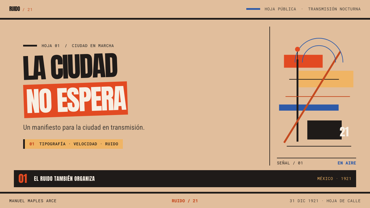
For presentation slides, treat the cover as a manifesto sheet. A single declarative line in condensed capitals, vermilion on buff, sits slightly tilted and is anchored by a heavy black bar. Content slides should carry one claim each, with sizes jumping inside the headline and black rules doing the dividing; a small woodcut-style emblem can sit in a corner. Data slides let bars be solid black blocks, set the key number enormous, and keep vermilion for the single value the room should remember.
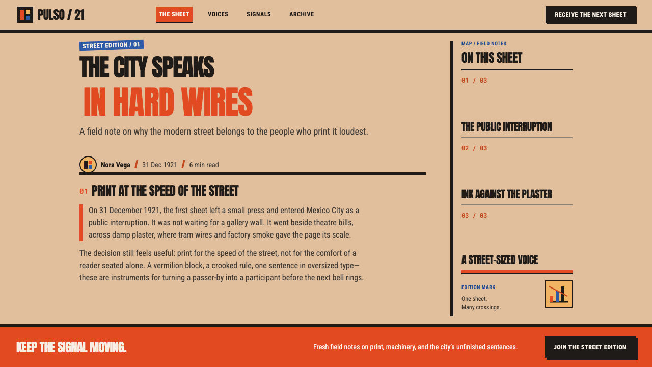
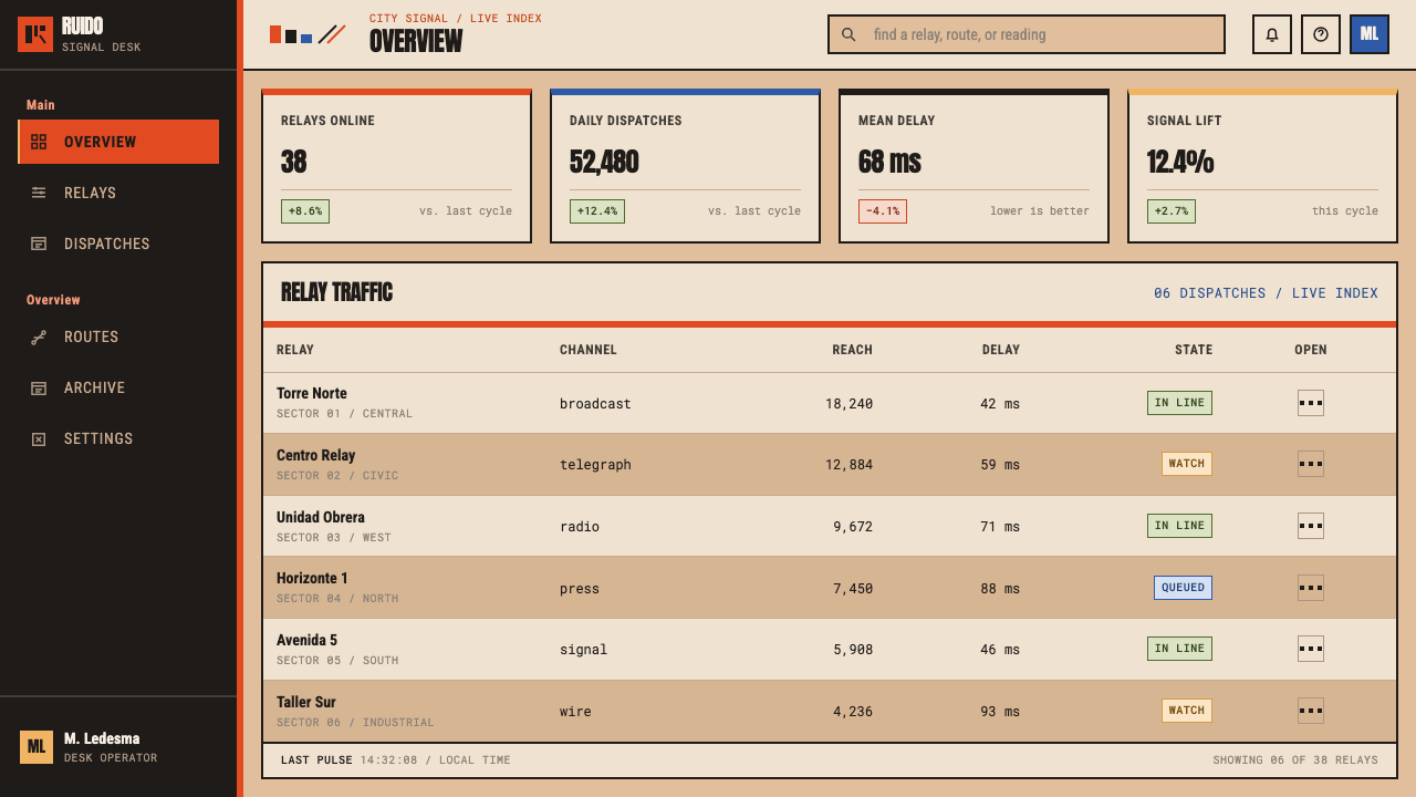
On the web it suits campaign sites, event pages, launch pages and pricing pages that want conviction rather than reassurance. Keep the buff ground, run heavy black rules between sections and set headlines in condensed capitals. Limit tilt and size jumps to the hero and a few headline moments so that forms, tables and checkout steps stay steady. Dense dashboards are a weaker fit; if you use the style there, confine the shouting to page titles and let the numbers be plain, well-aligned black on buff.
In editorial and marketing work it excels at posters, zines, festival and exhibition announcements, newsletter mastheads and product manifestos. Write short declarative lines, set the headline first and the supporting copy after, and use woodcut-like emblems rather than photography. Copy meant for long reading should be plainer and more legible than the headline, so that the page shouts once and then speaks.
The most common mistake is applying every device at every level: tilting every block, jumping sizes in every line and spreading vermilion everywhere. A manifesto sheet works because the chaos has a skeleton of black bars and a single hot colour; take the skeleton away and the result is merely messy. The opposite mistake is cleaning it up, with a white ground, hairline rules and smooth gradients, which keeps the red but loses the street.
Estridentismo — FAQ
Is Estridentismo the same as Futurism?
No. Italian Futurism is one of the movements in its lineage, alongside Russian Constructivism, and the three share a love of machines, cities and loud manifestos. But Estridentismo is a Mexican movement of the early 1920s with its own subjects, radio antennas, factories, telegraph wire and the city of Mexico, and its own printing conditions: wood type, relief ink, coloured bill stock and woodcuts made on a small local press. The design here follows those conditions rather than copying a European style sheet.
Why use buff stock instead of white paper?
Because the first manifesto was printed on whatever coloured bill stock the shop had. The colour is not decoration; it is evidence of how the object was made and where it was posted. A white ground reads as a polished magazine, which is the opposite of this style. The buff ground also lets vermilion and black sit as printed inks rather than as screen colours.
Can this style be used for long-form reading?
It is built for short, loud statements. Condensed capitals and broken words are tiring over long text. For long articles, keep the system's ground, rules and headline treatment, but set body paragraphs in a plainer, more legible role and keep the loud devices for headings, pull quotes and section breaks.
What should I use for imagery?
Woodcut-style emblems: masts, factories, antennas and chimneys, cut in flat black with blunt, gouged edges and used small and sparingly. Photographs and soft illustrations undercut the printed-sheet logic. If a photograph is unavoidable, treat it as a flat black-and-buff halftone that sits inside a bar, not as a glossy window onto a scene.
Does it work on a dark background?
The system is a light, paper-based style, and buff stock is its identity. A dark inversion loses the ink-on-paper logic. If you need a dark moment, use the black bars as large solid fields inside the buff page and keep vermilion as the voice, rather than turning the whole page dark.
Related design styles
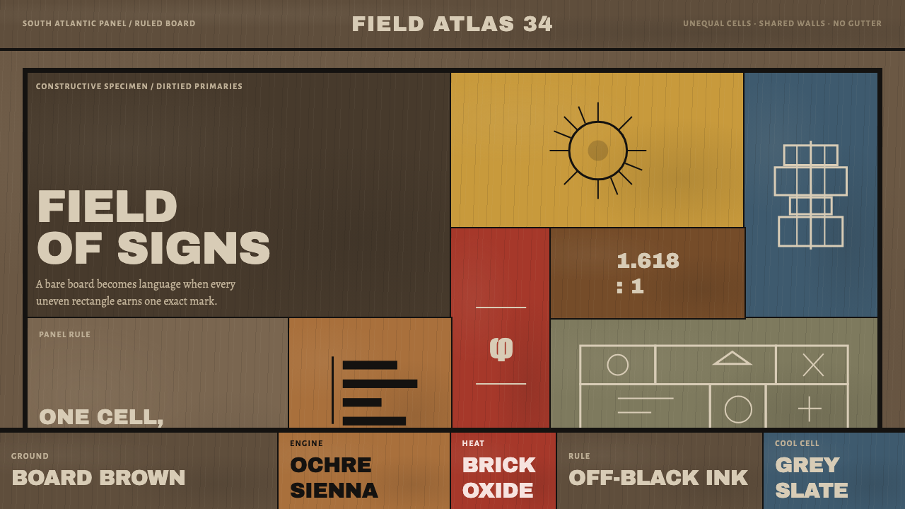 Torres-García UniversalismoGlyphs become structure. Dirtied primaries sit in unequal ruled cells on boar…
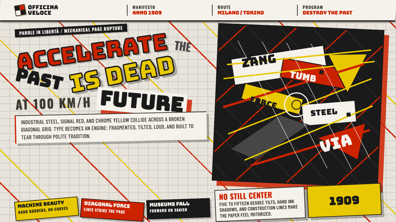 Italian Futurism (Marinetti 1909)Speed murders tradition. Signal red and chrome yellow slash a broken diagonal…
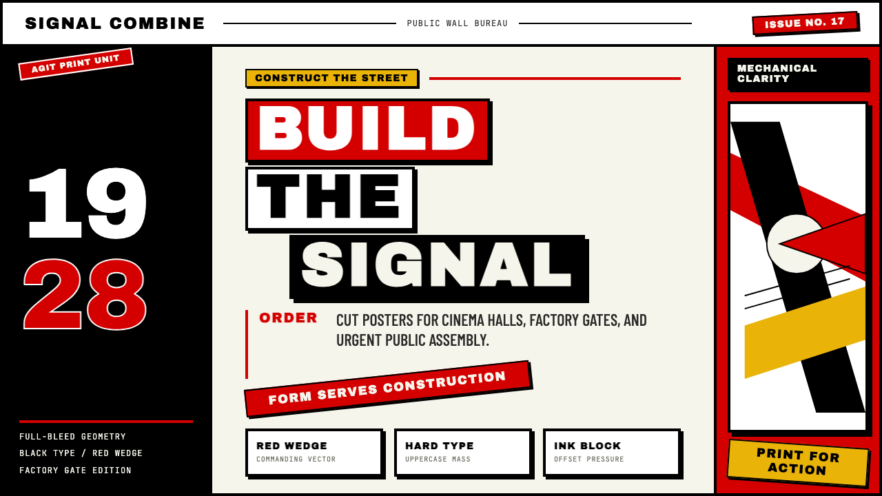 Russian ConstructivismRevolution red, slashed across black and white. Diagonal sans-serif, photomon…
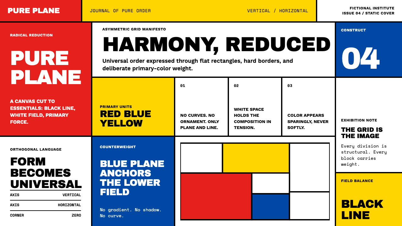 De StijlPrimary colors, locked in a black grid. Mondrian's compositions, in thick bor…
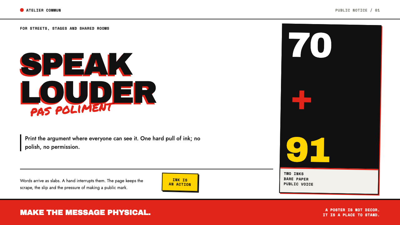 Grapus CollectivePrints dissent without polish. Red-black type slabs are disrupted by blunt ma…
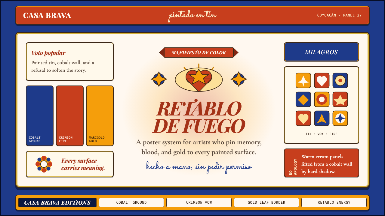 Mexican Folk Art (Frida-era)Defiance painted on tin. Cobalt ground, crimson vows, marigold borders, hard…