What is Mexican Folk Art (Frida-era)?什么是 Mexican Folk Art (Frida-era)?
Mexican Folk Art of the Frida era turns every surface into an act of cultural defiance — cobalt grounds, crimson sacred hearts, marigold gold, and hand-lettered banners that refuse to whisper.弗里达时代的墨西哥民间艺术让每一块界面都成为文化反叛的宣言——钴蓝底色、深红神圣之心、万寿菊金与拒绝低语的手写字幅。
Mexican Folk Art (Frida-era) in briefMexican Folk Art (Frida-era) 速览
Mexican Folk Art of the Frida era is a saturated, hand-painted visual language rooted in indigenous Mexican identity. It draws from retablo votive paintings, Tehuana embroidery, Day-of-the-Dead iconography, and the post-revolutionary Mexicanidad movement, which sought to reclaim native artistic traditions against the long dominance of European modernism. The result is maximalist, warm-blooded, and uncompromising: every element carries symbolic weight, every color is declarative rather than decorative.弗里达时代的墨西哥民间艺术是一套根植于墨西哥本土身份认同的浓烈手绘视觉语言。它汲取自祈愿画(retablo)、特瓦纳刺绣、亡灵节图像学,以及后革命时期的「墨西哥性」(Mexicanidad)运动——那场运动致力于在欧洲现代主义长期主导之后,重新夺回本土艺术传统。由此产生的结果是最大化的、温热的、不妥协的:每一个元素都承载象征重量,每一种色彩都是宣言而非装饰。
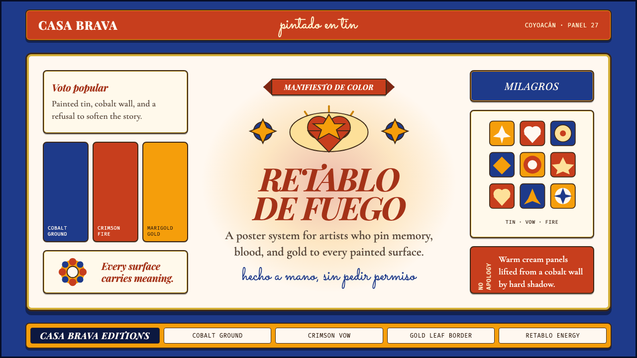
The aesthetic is built around a fearless palette — deep cobalt blue, crimson red, marigold gold, and warm earth tones layered against one another without apology. Forms are bold and flat, with hard outlines that recall both pre-Columbian craft and hand-painted tin ex-votos. Pattern and ornament are not afterthoughts but structural arguments: floral borders, embroidered chevrons, and curling folk script fill space that European modernism would have left empty. Shadows, where they appear, are cast and hard rather than ambient, giving painted objects a presence like objects placed on an altar.这套美学建立在无所畏惧的色彩体系之上——深钴蓝、深红、万寿菊金与温暖的大地色调相互叠压,毫无歉意。形态大胆而平面,以硬朗的轮廓线勾勒,令人联想到前哥伦比亚时期的工艺品与手绘锡板祈愿画。图案与装饰不是事后的添加,而是结构性的论点:花卉边框、刺绣人字纹与卷曲的民间字体,填满了欧洲现代主义会选择留空的每一处空间。投影(若出现)是投射式的硬边,而非环境漫射,赋予被绘物体如同安放在祭坛上的实体存在感。
Applied to contemporary design, this aesthetic offers what few historical styles can: an unapologetically full visual field that still communicates hierarchy. The imagery vocabulary — sacred hearts, marigolds, calaveras (decorated skulls), birds, and botanical motifs — is internationally recognizable yet culturally specific. The system works because its rules are rooted in ritual: in traditional Mexican folk art, every symbol has a place, a meaning, and a relationship to the whole. Translated into digital surfaces, that same discipline produces layouts that feel deliberate and alive.应用于当代设计,这套美学提供了极少数历史风格所能提供的东西:一个毫不道歉的饱满视觉场域,同时仍能传达层级关系。图像词汇——神圣之心、万寿菊、骷髅头(calavera)、鸟类与植物纹样——具有国际认知度,同时保有高度的文化特殊性。这套体系之所以奏效,是因为其规则根植于仪式:在传统墨西哥民间艺术中,每个符号都有其位置、含义以及与整体的关系。将这种自律转化到数字界面,同样能产生令人感到刻意而鲜活的版面。
See the Mexican Folk Art (Frida-era) design system查看 Mexican Folk Art (Frida-era) 完整设计系统
Where does Mexican Folk Art (Frida-era) come from?Mexican Folk Art (Frida-era) 从何而来?
The Frida era spans roughly the 1920s through 1954, the year of Frida Kahlo's death, and its visual culture cannot be understood outside the political upheaval that preceded it. The Mexican Revolution (1910–1920) had shattered the Porfiriato's Eurocentric cultural hierarchy and created a new national identity crisis that artists and intellectuals rushed to fill. The Mexicanidad movement — championed by intellectuals such as José Vasconcelos, who served as Minister of Public Education from 1921 — argued that Mexico's authentic cultural foundation lay not in European classical tradition but in the indigenous, mestizo, and popular arts that had survived centuries of colonial suppression.弗里达时代大致跨越1920年代至1954年——弗里达·卡罗辞世之年——而其视觉文化若不置于之前的政治剧变中则无从理解。墨西哥革命(1910—1920年)摧毁了波菲里亚托时期以欧洲为中心的文化等级秩序,造成了艺术家与知识分子竞相填补的国家身份认同危机。「墨西哥性」运动——由曾于1921年出任公共教育部长的何塞·巴斯孔塞洛斯等知识分子倡导——主张墨西哥真正的文化根基不在于欧洲古典传统,而在于历经数百年殖民压制而存活下来的本土、混血与民间艺术。
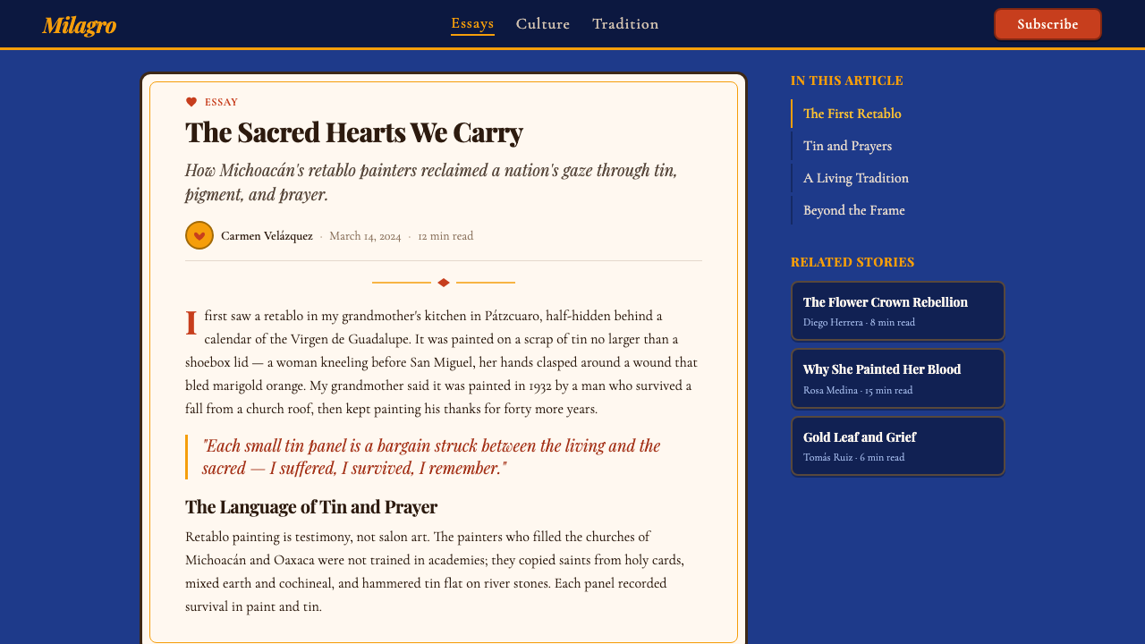
Retablo painting was perhaps the single most important visual ancestor of this aesthetic. Retablos — also known as ex-votos — are small devotional paintings on tin or copper sheet, produced by anonymous folk artists to thank saints for miraculous intervention in accident, illness, or crisis. The format is rigid: a scene of peril in the upper portion, the miraculous resolution below, a painted caption in folk script identifying the grateful subject. The visual language is direct and unselfconscious — flat figures, saturated color, hard outlines, and a complete absence of atmospheric perspective. Frida Kahlo collected hundreds of them and hung them throughout the Casa Azul; their compositional logic infuses her painting and, through her, the wider Frida-era aesthetic.祈愿画(retablo)也许是这套美学最重要的单一视觉先祖。祈愿画——又称还愿画(ex-voto)——是由无名民间艺人绘于锡板或铜板上的小幅虔诚绘画,用以感谢圣徒在事故、疾病或危机中施行奇迹。格式严格:上部为险境场景,下部为奇迹化解,以民间字体书写的题记标注感恩主体。视觉语言直接而无矫饰——平面人物、饱和色彩、硬朗轮廓,以及对大气透视的彻底摒弃。弗里达·卡罗收藏了数百幅,悬挂于蓝色之家的各处;它们的构图逻辑渗透进她的绘画,并经由她影响了更广泛的弗里达时代美学。
Tehuana dress and Zapotec embroidery contributed equally to the iconographic vocabulary. Kahlo adopted the traditional dress of the Tehuantepec isthmus — heavily embroidered huipiles, floral headdresses, and layered skirts — both as political statement and as visual system. The embroidery patterns themselves, with their dense floral geometries, became a template for how ornament and ground could coexist at equal intensity: neither the figure nor the field submits to the other. This approach to pattern — where decoration is not applied to a neutral ground but constitutes the ground itself — distinguishes this aesthetic from European decorative traditions.特瓦纳服饰与萨波特克刺绣对图像词汇同样贡献匪浅。卡罗将特万特佩克地峡的传统服饰——大量刺绣的华皮尔上衣、花卉头饰与层叠长裙——既作为政治宣言也作为视觉体系加以采用。刺绣图案本身,以其密集的花卉几何构成,成为装饰与底面如何以同等强度共存的范本:图形与底面互不妥协。这种图案处理方式——装饰不是附加于中性底面,而是构成底面本身——使这套美学区别于欧洲装饰传统。
José Guadalupe Posada, the printmaker whose calavera illustrations appeared in Mexico City broadsheets from the 1880s through the 1910s, supplied the skeleton iconography that would become central to Day-of-the-Dead imagery and, later, to the Frida-era aesthetic's confrontational relationship with mortality. Posada's prints were not made for museums but for mass distribution — sold on street corners, plastered on walls, folded into political pamphlets. Their hand-cut lines and dense hatching defined a graphic vernacular that valued legibility at a distance and immediacy of impact over refinement. Diego Rivera, Kahlo's husband and the most prominent muralist of the era, absorbed Posada's vocabulary and scaled it to the walls of government buildings, bringing folk-art symbology into the mainstream of post-revolutionary Mexican visual culture.版画家何塞·瓜达卢佩·波萨达(José Guadalupe Posada)的骷髅(calavera)插图从1880年代至1910年代频繁出现于墨西哥城的街头印刷品,为后来成为亡灵节图像核心——以及弗里达时代美学中对抗死亡命题——的骷髅图像提供了来源。波萨达的版画不是为博物馆而作,而是为大规模发行——在街角出售,张贴于墙壁,折入政治小册子。其手刻线条与密集排线定义了一种重视远距离可读性与即时冲击力而非精致感的平民视觉语言。卡罗的丈夫、当时最具影响力的壁画家迭戈·里维拉吸收了波萨达的词汇,将其扩展至政府建筑的墙面,将民间艺术符号学引入后革命时期墨西哥视觉文化的主流。
What defines the Mexican Folk Art (Frida-era) look?Mexican Folk Art (Frida-era) 的视觉特征是什么?
Color色彩
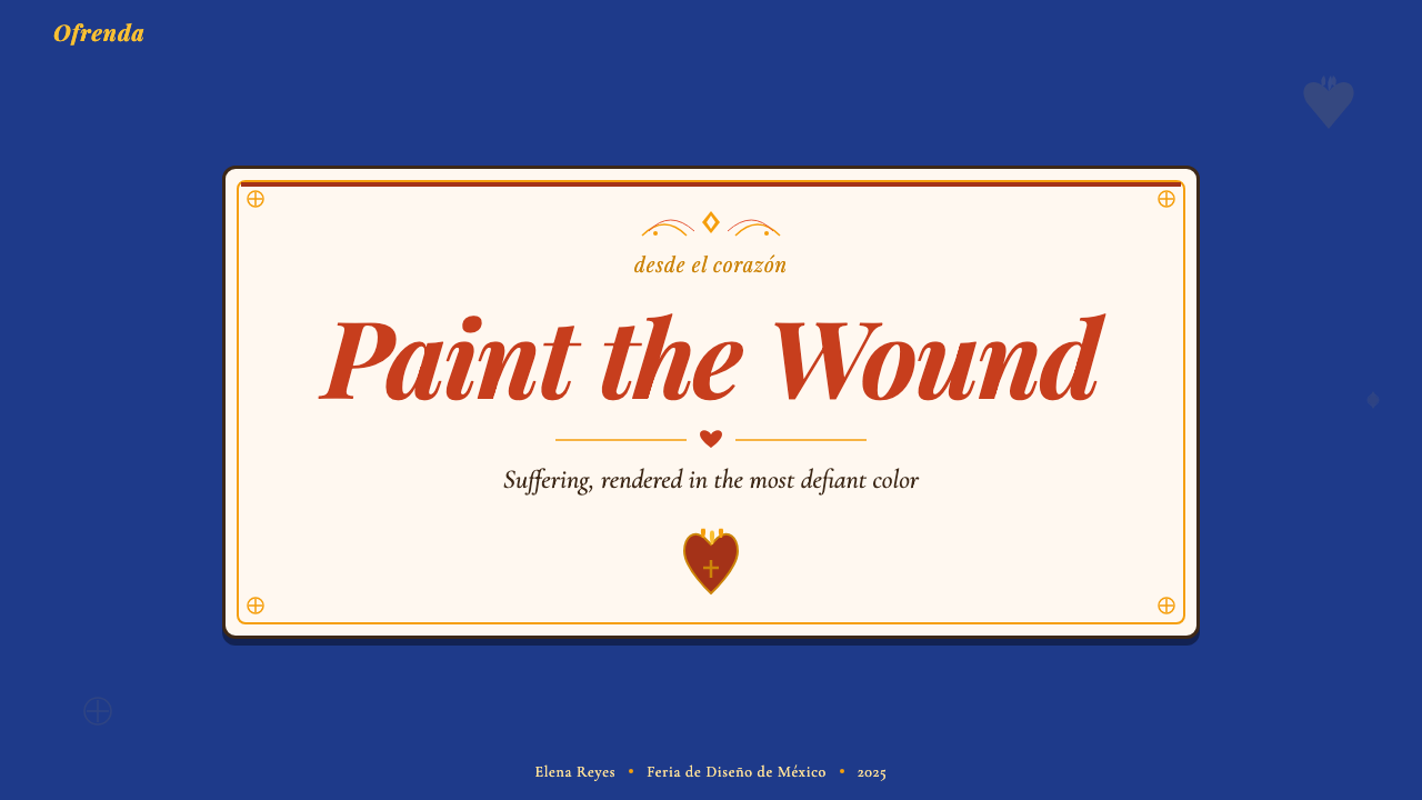
The palette centers on deep cobalt blue, crimson red, and marigold gold — the three colors most associated with Kahlo's painted self-portraits and with Mexican ceremonial life. These are supported by warm earth tones, terracotta, forest green, and near-black. Color relationships are maximalist and simultaneous: no single hue dominates by neutralizing the others; instead, all colors are deployed at high saturation and asked to coexist. The effect is richly warm and slightly confrontational, resembling the layered surface of a hand-painted ex-voto where every inch of the tin has been claimed.色板以深钴蓝、深红与万寿菊金为核心——这三种颜色与卡罗的自画像及墨西哥仪式生活关联最为密切。辅以暖大地色调、赤陶红、森林绿与近黑色。色彩关系是最大化且同时并置的:没有任何一种色调通过压制其他颜色来主导画面;相反,所有色彩以高饱和度共同出场,被要求和谐共存。效果温热而略带对抗性,酷似手绘锡板祈愿画的叠层表面——每一寸锡板都已被色彩占领。
Ornament and Pattern装饰与图案
Ornament is not applied on top of this aesthetic — it is structurally inseparable from it. Borders are not frames but active participants: floral garlands, embroidery-derived chevron bands, and repeating botanical motifs define edges, sections, and hierarchies. Empty space is treated as an opportunity for pattern rather than a moment of rest. This runs directly counter to modernist design orthodoxy and is, in fact, a deliberate cultural argument: in Tehuana embroidery and retablo painting, a fully occupied surface signals care, devotion, and abundance.装饰不是附加在这套美学之上的——它与之在结构上不可分割。边框不是画框,而是积极的参与者:花卉花环、源自刺绣的人字纹带与重复的植物纹样定义着边缘、分区与层级。空白空间被视为图案的机遇而非休息的时刻。这与现代主义设计正统直接抵触——事实上,这是一种刻意为之的文化论点:在特瓦纳刺绣与祈愿画中,被完全占满的表面意味着用心、虔诚与丰盛。
Iconography图像志
A specific set of symbols recurs across the tradition and carries stable meanings: the sacred heart (love, pain, devotion), the marigold (death and remembrance, used to guide spirits in the Day of the Dead), the calavera or skull (mortality celebrated rather than feared), the hummingbird (luck and love), and the serpent (both pre-Columbian divinity and earthly danger). In design contexts, these icons function as high-recognition graphic marks that carry cultural weight even when their users do not know their full symbolic history. They should be used with specificity rather than as generic decorative elements.传统中反复出现一套具有稳定含义的特定符号:神圣之心(爱、痛苦、虔诚),万寿菊(死亡与追忆,用于引导亡灵节中的灵魂),骷髅头(被庆祝而非被恐惧的死亡),蜂鸟(幸运与爱情),蛇(前哥伦比亚时期的神性与尘世危险兼而有之)。在设计语境中,这些图标作为高识别度的图形标记运作,即便其使用者不了解完整的象征历史,也能承载文化重量。应以具体性而非作为通用装饰元素来使用它们。
Hand-Lettering and Typography手写字与字体排印
The typographic voice of this aesthetic is the curling, looped script of retablo captions and market-stall signage — hand-rendered letterforms with slightly uneven weight, visible pen-lift, and a quality of sincerity that no mechanical typeface can replicate. Headlines in this system feel painted rather than set. When display type must be used at scale, the spirit of hand-lettering should govern: letterforms with personality, uneven baseline, and organic variation. Body text, by contrast, can be set in more neutral forms so that the hand-lettered accent elements remain visually primary.这套美学的排印声音是祈愿画题记与市集招牌中那种卷曲、圆润的手写体——字重略微不均、可见提笔痕迹、具有任何机械字体都无法复制的真诚质感。这套体系中的标题感觉是被画上去的,而非被排印出来的。当展示字体必须在大尺寸下使用时,应由手写精神主导:有个性的字形、不均匀的基线与有机的变化。正文则可采用更中性的形式,以使手写风格的强调元素在视觉上保持主导地位。
Hard Outlines and Flat Depth硬朗轮廓与平面深度
Figures and objects in this tradition are consistently outlined in a dark, definite line — not a soft glow or a gradient edge but a hard boundary, like the lead channels between pieces of stained glass. This outline strategy gives individual elements strong silhouette legibility even within a very busy compositional field. Depth is achieved not through shading gradients but through compositional layering: objects overlap, and where an object casts a shadow, that shadow is a solid dark shape at a fixed angle rather than a diffuse darkening of the ground beneath.这一传统中的人物与物体始终以深色、明确的线条勾勒——不是柔光或渐变边缘,而是硬朗的边界,如同彩色玻璃拼块之间的铅条。这种轮廓策略使单个元素即便在极为繁复的构图场域中也能保持强烈的剪影可读性。深度不通过明暗渐变实现,而通过构图叠压实现:物体相互遮挡;物体投射阴影时,那阴影是一个固定角度的实心深色形状,而非底面的漫射变暗。
Altar Composition祭坛式构图
The underlying compositional logic in Frida-era Mexican folk art resembles the ofrenda — the Day-of-the-Dead altar — rather than the classical Western picture plane. An ofrenda is tiered, symmetrical in its overall structure but asymmetric in the placement of individual objects, and organized by meaning rather than visual balance alone. Applied to layout, this produces compositions with strong vertical tier structures, a tendency to center the most symbolically significant element (rather than the largest), and a sense that each visual zone has a distinct ritual purpose.弗里达时代墨西哥民间艺术底层的构图逻辑更像亡灵节祭坛(ofrenda)而非西方古典画面。祭坛分层排列,整体结构对称,但个别物品的摆放是非对称的,且由意义而非单纯的视觉平衡加以组织。应用于版面设计,这种逻辑产生具有强烈垂直分层结构的构图,倾向于将象征意义最重要的元素(而非最大的元素)置于中心,并赋予每个视觉区域明确的仪式目的感。
Warmth and Tactility温热感与触觉感
Unlike design systems built on the cool authority of mathematical grids or the austere logic of function-only form, this aesthetic has a quality of handmade warmth — the sense that something has been painted, embroidered, or stamped by a person with intentions. Slight imperfection is not a flaw but a marker of authenticity. In digital implementation, this translates to textures that suggest painted or printed surfaces, color fields that have some visible variation rather than perfectly flat fills, and type that reads as drawn. The aesthetic is fundamentally human-scale and human-temperature.与建立在数学网格冷静权威或纯功能冷峻逻辑上的设计系统不同,这套美学具有手工制作的温热质感——那种被某个有意图的人画过、绣过或印过的感觉。轻微的不完美不是缺陷,而是真实性的标志。在数字实现中,这转化为暗示着被绘或被印表面的肌理、具有某种可见变化而非完美平涂的色彩域,以及读起来像是被画出来的字体。这套美学从根本上是人的尺度与人的温度的。

See the Mexican Folk Art (Frida-era) design system查看 Mexican Folk Art (Frida-era) 完整设计系统
Who shaped Mexican Folk Art (Frida-era)?谁塑造了 Mexican Folk Art (Frida-era)?
Frida Kahlo (1907–1954) is the central figure through whom Frida-era aesthetics are understood internationally. Her self-portraits are simultaneously folk-art objects and psychic autobiography: painted on metal or masonite in the format of retablo ex-votos, they use the saturated palette, hard outlines, and symbolic iconography of the popular tradition while addressing interior experience with unprecedented directness. Her adoption of Tehuana dress as her daily costume — political, theatrical, and visually total — transformed the embroidery and textile traditions of the Tehuantepec isthmus into internationally recognized graphic signatures. The Casa Azul in Coyoacán, where she lived and worked, remains the primary spatial reference for the aesthetic: cobalt walls, terracotta floors, folk-art ceramics, and retablos hung floor to ceiling.弗里达·卡罗(1907—1954年)是弗里达时代美学在国际上得以被理解的核心人物。她的自画像同时是民间艺术品与心灵自传:以祈愿画的格式绘于金属板或纤维板上,使用民间传统的饱和色板、硬朗轮廓与象征图像志,同时以前所未有的直接性处理内在体验。她将特瓦纳服饰作为日常着装加以采用——政治性的、戏剧性的、视觉上无死角的——使特万特佩克地峡的刺绣与纺织传统成为国际认可的图形标识。她生活与工作的科约阿坎蓝色之家是这套美学的主要空间参照:钴蓝色墙壁、赤陶地板、民间陶艺,以及从地面挂至天花板的祈愿画。
Diego Rivera (1886–1957) was the principal architect of Mexican muralism and the most influential figure in translating pre-Columbian and popular art vocabularies into monumental public form. His murals in the National Palace, the Ministry of Public Education, and the Detroit Institute of Arts brought the visual grammar of retablo painting, Aztec codex illustration, and market-stall craft to audiences numbered in the millions. Rivera was also a major collector and advocate of pre-Columbian antiquities, and his insistence that indigenous visual culture was as historically significant as European art helped shift the intellectual framework within which folk objects were understood. His relationship with Kahlo was volatile and mutually generative; the aesthetic they developed together, and separately, is the defining double axis of the era.迭戈·里维拉(1886—1957年)是墨西哥壁画主义的主要缔造者,也是将前哥伦比亚与民间艺术词汇转化为宏大公共形式的最具影响力的人物。他在国家宫、公共教育部与底特律艺术学院的壁画,将祈愿画、阿兹特克手抄本插图与市集手工艺的视觉语法带给了数以百万计的观众。里维拉同时也是前哥伦比亚古物的重要收藏者与倡导者,他对本土视觉文化具有与欧洲艺术同等历史意义这一主张的坚持,帮助转变了人们理解民间物件的知识框架。他与卡罗的关系既动荡又相互生发;他们各自与共同发展的美学,是这个时代决定性的双轴心。
José Guadalupe Posada (1852–1913) was a Mexico City printmaker whose calavera illustrations — skeletons dressed in the clothes of politicians, socialites, soldiers, and street vendors — appeared in cheap broadsheets distributed throughout the city in the late nineteenth and early twentieth centuries. Posada worked in the tradition of popular graphic satire, using hand-cut zinc plates to produce images that were reproduced by the thousands and sold for pennies. His most famous image, the Calavera Garbancera — later named La Catrina by Rivera — shows a female skeleton wearing an elaborate European-style hat, satirizing Mexican elites who aped French fashion while indigenous culture was suppressed. The image became the defining icon of Day-of-the-Dead aesthetics and one of the most cited visual sources in Frida-era folk art.何塞·瓜达卢佩·波萨达(1852—1913年)是墨西哥城的版画家,他的骷髅(calavera)插图——身着政客、社交名流、士兵与街头小贩服装的骷髅——出现于十九世纪末至二十世纪初在全市发行的廉价街头印刷品中。波萨达在大众平版讽刺画传统中工作,使用手刻锌版制作以数千份印量复制、以几分钱售出的图像。他最著名的图像——骷髅加班赛拉(Calavera Garbancera),后被里维拉命名为「卡特里纳」(La Catrina)——展示了一具戴着精致欧式帽子的女性骷髅,讽刺在本土文化被压制之际模仿法国时尚的墨西哥精英阶层。这幅图像成为亡灵节美学的标志性图符,也是弗里达时代民间艺术中被引用最多的视觉来源之一。
Tina Modotti (1896–1942) was an Italian-born photographer and political activist who spent her most creatively productive years in Mexico City during the 1920s and 1930s. Her photographs of Mexican workers, markets, folk objects, and architectural details provided some of the first international documentation of the visual world that the Mexicanidad movement was working to valorize. Modotti's eye for the graphic quality of everyday Mexican objects — the geometry of stacked sombrero brims, the pattern of a lily's center — helped translate folk-art aesthetics into the international language of modernist photography, giving the material a visibility it had not previously enjoyed outside Mexico.蒂娜·莫多蒂(1896—1942年)是意大利裔摄影师与政治活动家,其最具创造力的岁月在1920至30年代于墨西哥城度过。她对墨西哥工人、市集、民间物件与建筑细节的摄影,提供了「墨西哥性」运动致力于彰显的视觉世界最早的国际性记录之一。莫多蒂对日常墨西哥物件图形品质的敏锐眼光——叠放的宽边帽帽沿的几何感,百合花心的图案——帮助将民间艺术美学转化为现代主义摄影的国际语言,使这些素材在墨西哥以外获得了此前从未享有的能见度。
José Vasconcelos (1882–1959) was a philosopher and politician who, as Mexico's Minister of Public Education from 1921 to 1924, commissioned the murals that would make Rivera, David Alfaro Siqueiros, and José Clemente Orozco internationally famous. Vasconcelos's theory of the 'cosmic race' — the idea that Mexico's mixed indigenous and European heritage was not a liability but a unique civilizational synthesis — provided the ideological scaffolding for the Mexicanidad movement. His public art commissions were explicitly intended to build a new national visual identity rooted in indigenous and popular imagery, and they established the institutional framework within which Frida-era aesthetics developed and received official sanction.何塞·巴斯孔塞洛斯(1882—1959年)是哲学家兼政治家,1921至1924年任墨西哥公共教育部长期间,他委托创作了使里维拉、大卫·阿尔法罗·西盖罗斯与何塞·克莱门特·奥罗斯科享誉国际的壁画。巴斯孔塞洛斯的「宇宙种族」理论——认为墨西哥混合的本土与欧洲传承不是负担而是独特的文明综合体——为「墨西哥性」运动提供了意识形态支柱。他的公共艺术委托明确旨在建立植根于本土与民间图像的新国家视觉身份,并建立了弗里达时代美学在其中发展并获得官方认可的制度框架。
How do you use Mexican Folk Art (Frida-era) today?今天怎么用 Mexican Folk Art (Frida-era)?
Mexican Folk Art (Frida-era) is one of the few historical styles that succeeds at maximum visual density without collapsing into noise. Applying it correctly requires embracing rather than moderating the style's fullness — the instinct to simplify, to remove pattern, to add white space, works against the system's fundamental logic. Instead, the design challenge is to organize abundance: to make a fully occupied surface that still guides the eye through clear hierarchy.墨西哥民间艺术(弗里达时代)是极少数能在最大视觉密度下不崩溃为噪音的历史风格之一。正确应用它需要拥抱而非节制这种风格的饱满——简化、去除图案、增加留白的本能,与这套体系的根本逻辑背道而驰。设计挑战在于组织丰盛:让一个被完全占满的表面仍能通过清晰的层级引导视线。
For presentation slides, this aesthetic works best when it commits fully to the visual world it creates. A cover slide in this style sets a deep cobalt or terracotta ground, uses a central symmetrical composition with the title treated as a hand-lettered banner, and surrounds the content with a floral or embroidery-derived border that frames rather than clutters. Content slides should establish clear tier zones — a title band at top, a content field in the center, a decorative footer — and keep the number of active iconographic elements to two or three per slide so that individual symbols retain their legibility. Data slides benefit from treating chart elements as folk-art objects: bar shapes filled with solid saturated color, axis labels in a script-inflected display face, a border that gives the data field a contained ceremonial quality.在演示文稿中,这套美学在完全投入所创造的视觉世界时效果最佳。这种风格的封面页以深钴蓝或赤陶色为底面,使用居中对称构图,将标题处理为手写横幅,并以花卉或刺绣衍生的边框环绕内容,起框架作用而非造成杂乱。内容页应建立清晰的分层区域——顶部标题带、中央内容域、装饰性页脚——并将每页的活跃图像元素数量保持在两到三个,使单个符号保持可读性。数据页从将图表元素作为民间艺术对象处理中受益:以实心饱和色填充的柱状形状,以带有手写风格的展示字体标注坐标轴,以边框赋予数据域一种被包容的仪式感。
For web interfaces, the style is best suited to contexts where warmth, cultural identity, and festivity are the product's primary emotional register: food and beverage brands, cultural institutions, travel platforms, and artisan markets. Dashboard and product pages in this style require a strong grid discipline to prevent the richness of the visual vocabulary from overwhelming functional elements. The recommended approach is to treat the UI chrome — navigation, cards, containers — as the decorated surface, and to keep interactive data elements (inputs, tables, charts) slightly more restrained so users can distinguish between the expressive and the functional. Pricing pages work well with this style's altar-composition logic: tier cards stacked vertically with the recommended tier positioned as the central, symbolically elevated element.对于网页界面,这种风格最适合温热感、文化身份与节日氛围是产品主要情感基调的语境:食品饮料品牌、文化机构、旅游平台与工匠市集。这种风格下的仪表板与产品页面需要强烈的网格自律,以防止丰富的视觉词汇淹没功能性元素。建议的做法是将界面框架——导航、卡片、容器——作为被装饰的表面,同时保持交互数据元素(输入框、表格、图表)相对克制,使用户能够区分表达性元素与功能性元素。定价页面适合这种风格的祭坛式构图逻辑:套餐卡片垂直叠排,推荐套餐被置于中央、象征上被抬升的位置。
For editorial and marketing work, the style excels at creating standout visual identity in crowded content environments. A Frida-era inspired editorial layout uses a warm colored ground rather than white, sets headlines in a bold display face with folk-lettering character, and deploys iconographic spot illustrations at section breaks in place of conventional dividers. Marketing pages benefit from the poster quality inherent in the aesthetic: full-bleed feature sections with a single dominant icon at large scale, surrounded by a pattern border, create the visual drama of a Mexican market banner or a retablo display. Email campaigns in this style perform well because their warm palette and recognizable iconography stand out strongly against the typically neutral backgrounds of email clients.对于编辑与营销内容,这种风格在拥挤的内容环境中创造突出视觉身份方面表现出色。弗里达时代风格的编辑版面使用暖色底面而非白色,以具有民间字体特性的粗展示字体排印标题,并在段落分隔处使用图像志点缀插图代替常规分隔线。营销页面从这套美学内在的海报品质中受益:带有单一大尺寸主导图标的全出血特性区块,被图案边框环绕,创造出墨西哥市集横幅或祈愿画展示的视觉戏剧感。这种风格的电子邮件营销表现良好,因为其温暖的色板与可识别的图像志在电子邮件客户端通常中性的背景中格外醒目。
A common mistake when applying this style is treating it as surface decoration — adding marigold borders and calavera icons to an otherwise neutral layout and expecting the result to feel authentic. The visual logic of Frida-era folk art requires that color, pattern, and iconography be structural rather than ornamental: the border defines the zone, the color signals the meaning, the symbol carries the weight. A second mistake is flattening the cultural specificity of the iconography by mixing symbols from unrelated traditions, or by using folk-art imagery ironically. The aesthetic carries the history of a political and cultural movement; it communicates most powerfully when its symbols are used with knowledge of what they mean.应用这种风格时最常见的错误是将其作为表面装饰——在一个原本中性的版面上添加万寿菊边框与骷髅图标,并期待结果感觉真实。弗里达时代民间艺术的视觉逻辑要求色彩、图案与图像志是结构性的而非装饰性的:边框定义区域,色彩传递意义,符号承载重量。第二个错误是通过混合来自不相关传统的符号,或以讽刺性方式使用民间艺术图像,来抹平图像志的文化特殊性。这套美学承载着一场政治与文化运动的历史;当其符号被以了解其含义的方式使用时,它传达的力量最为强大。
See the Mexican Folk Art (Frida-era) design system查看 Mexican Folk Art (Frida-era) 完整设计系统
Mexican Folk Art (Frida-era) — FAQMexican Folk Art (Frida-era) · 常见问题
How is Frida-era Mexican Folk Art different from generic 'colorful' design?弗里达时代墨西哥民间艺术与普通「五彩缤纷」的设计有何不同?
The difference lies in iconographic specificity and compositional logic, not simply in the quantity of color used. Generic colorful design uses a broad palette to create visual energy without a governing symbolic system. Frida-era folk art has a fixed set of symbols — sacred hearts, marigolds, calaveras, birds, botanical motifs — each with stable cultural meanings, and a compositional tradition — the retablo, the ofrenda, the embroidered textile — that dictates how elements relate to one another. Color in this tradition is not decoration; it carries meaning. Cobalt blue has associations with protection and the divine; marigold gold signals remembrance and the passage between worlds; crimson red is associated with the sacred heart and with sacrifice. Applying this style authentically requires using these elements as a vocabulary rather than as a mood board.区别在于图像志的特殊性与构图逻辑,而非简单的色彩使用量。普通的多彩设计使用宽泛的色板制造视觉能量,却没有统御性的象征体系。弗里达时代民间艺术拥有一套固定的符号——神圣之心、万寿菊、骷髅头、鸟类、植物纹样——各有稳定的文化含义;以及一套构图传统——祈愿画、祭坛、刺绣纺织品——规定着元素间的关系。这一传统中的色彩不是装饰,它承载含义。钴蓝与保护与神性相关联;万寿菊金象征追忆与两个世界之间的通道;深红与神圣之心及献祭相关联。真实地应用这种风格需要将这些元素作为词汇而非情绪板使用。
Can this style work in a digital product that requires high functional clarity, like a SaaS dashboard?这种风格能在需要高功能清晰度的数字产品中运作吗?比如SaaS仪表板?
Yes, but it requires a clear division between the expressive and the functional layers of the interface. The approach that works is to treat the decorative elements of the style — borders, background patterns, iconographic accents — as the chrome of the interface, and to keep data-display elements (charts, tables, status indicators) in a more restrained register that the decorative frame sets off rather than competes with. The danger is applying the full visual density of the folk-art tradition to every element including interactive and data-display components, at which point the user can no longer distinguish the surface from the signal. Used with this discipline, the aesthetic can make a data-heavy dashboard feel warm and culturally grounded in a way that purely neutral design systems cannot achieve.可以,但需要在界面的表达层与功能层之间建立清晰的划分。有效的做法是将这种风格的装饰元素——边框、背景图案、图像志点缀——作为界面的框架,同时保持数据展示元素(图表、表格、状态指示符)在更克制的层级,由装饰性框架衬托而非与之竞争。危险在于将民间艺术传统的完整视觉密度应用于每一个元素,包括交互与数据展示组件,届时用户将无法区分表面与信号。以这种自律使用这套美学,能使一个数据密集的仪表板呈现出纯粹中性设计系统无法实现的温热感与文化根基感。
Is it appropriate for a brand without Mexican heritage to use this aesthetic?没有墨西哥文化背景的品牌使用这套美学是否合适?
This is a question worth taking seriously. The Frida-era aesthetic is not a generic decorative style; it is the visual expression of a specific political and cultural movement that emerged from Mexican indigenous and popular traditions during a period of anti-colonial identity reclamation. Using its symbols without acknowledging that context — deploying calaveras as edgy decoration, lifting embroidery patterns as graphic assets without engagement with their origin — is a form of cultural extraction that the movement itself was a response to. The most defensible uses are those that engage with the tradition knowingly: citing sources, collaborating with Mexican artists or cultural organizations, using the symbols with specificity rather than generic appeal, and communicating to audiences where the aesthetic comes from. The style can be used in good faith by brands outside Mexico, but that use requires intentionality and honesty about what is being borrowed and from whom.这是一个值得认真对待的问题。弗里达时代美学不是一种通用的装饰风格,它是在反殖民身份重建时期从墨西哥本土与民间传统中涌现出的特定政治与文化运动的视觉表达。不承认这一语境地使用其符号——将骷髅头作为前卫装饰来部署,将刺绣图案作为图形素材提取而不关注其来源——是一种文化提取行为,而这场运动本身正是对这类行为的回应。最站得住脚的使用是那些有知情地与传统接触的使用:引用来源、与墨西哥艺术家或文化机构合作、以具体性而非泛化吸引力使用符号,以及向受众传达这套美学的来源。这种风格可以被墨西哥以外的品牌以善意方式使用,但这种使用需要对借用的是什么、从谁那里借用保持刻意性与诚实性。
What is the relationship between this aesthetic and Day of the Dead (Día de los Muertos) design?这套美学与亡灵节(Día de los Muertos)设计之间是什么关系?
Day-of-the-Dead design is a subset of the broader Frida-era Mexican folk aesthetic, not its entirety. They share iconography — marigolds, calaveras, ofrendas, candles — and many of the same visual conventions: saturated color, hard outlines, pattern-filled surfaces. But the Frida-era folk art tradition encompasses a much wider iconographic range, including sacred hearts, Tehuana embroidery, retablo narrative painting, pre-Columbian motifs, and the specific symbology of the Mexicanidad movement. Day-of-the-Dead design is also now a well-established commercial genre with its own conventions and a risk of genericness; the Frida-era framing is broader and historically richer, and tends to produce more specific and culturally grounded design work when applied with care.亡灵节设计是更广泛的弗里达时代墨西哥民间美学的一个子集,而非其全部。两者共享图像志——万寿菊、骷髅头、祭坛、蜡烛——以及许多相同的视觉惯例:饱和色彩、硬朗轮廓、被图案填满的表面。但弗里达时代的民间艺术传统涵盖更广泛的图像志范围,包括神圣之心、特瓦纳刺绣、祈愿画叙事绘画、前哥伦比亚纹样,以及「墨西哥性」运动的特定符号体系。亡灵节设计现在也是一个拥有自身惯例、具有通俗化风险的成熟商业类型;弗里达时代的框架更宽广、历史上更丰富,在细心应用时往往能产生更具特殊性与文化根基的设计作品。
How should this style handle text-heavy content without losing its visual character?这种风格如何在处理大量文字内容时不失去其视觉特性?
The key is to treat the text environment as distinct from — and visually framed by — the decorative system, rather than applying the full folk-art visual density to the type itself. In practice: set body text in a clean, legible face with no folk-lettering characteristics, maintain clear line spacing, and use a near-neutral warm ground for extended reading passages. Reserve the hand-lettering style for display elements: headlines, pull quotes, section labels, call-to-action text. Use iconographic spot elements and border patterns to delineate the zones where long-form text lives rather than penetrating those zones with visual complexity. This approach creates the effect of a richly decorated context — a hand-painted room — in which readable text sits as a clear, protected element.关键在于将文字环境视为与装饰体系截然不同——并由其视觉框定——的区域,而非将完整的民间艺术视觉密度应用于文字本身。在实践中:以干净、可读的字体排印正文,不带任何手写特性,保持清晰的行间距,对延伸阅读段落使用接近中性的暖色底面。将手写字体风格保留给展示元素:标题、引语、章节标签、行动号召文字。使用图像志点缀元素与边框图案划定长文字所在区域的边界,而非以视觉复杂性渗透这些区域。这种做法创造出一个被丰富装饰的语境效果——一个手绘的房间——可读文字在其中作为清晰、受保护的元素存在。
Related design styles相关设计风格
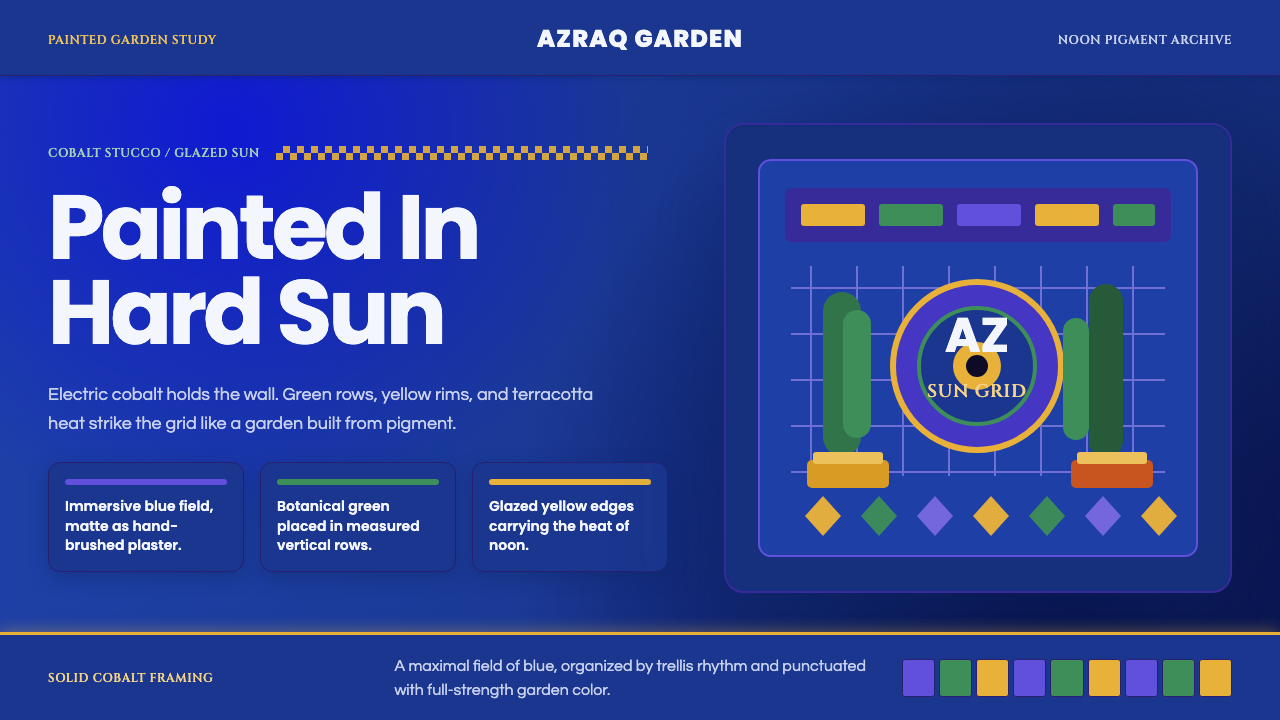 Jardin Majorelle BlueCobalt refuses restraint. Electric blue, glazed yellow and grid rhythm turn s…钴蓝拒绝收敛:电光蓝、釉黄与强网格,把灰泥晒成烈日。
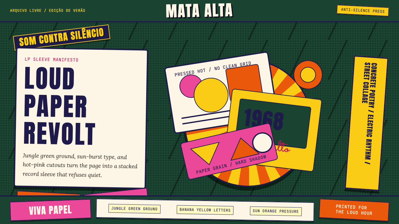 Brazilian Tropicália (1968)Art must be loud. Jungle green, banana yellow Anton type, and hard-shadow col…艺术必须喧哗:丛林绿、香蕉黄Anton字与硬阴影拼贴爆发。
 Alpine Ski PosterCold speed sells winter. Cobalt sky, snow planes, sun rays, and one resort-re…冷峻速度贩卖冬日:钴蓝天空、雪白斜坡与一抹度假红。
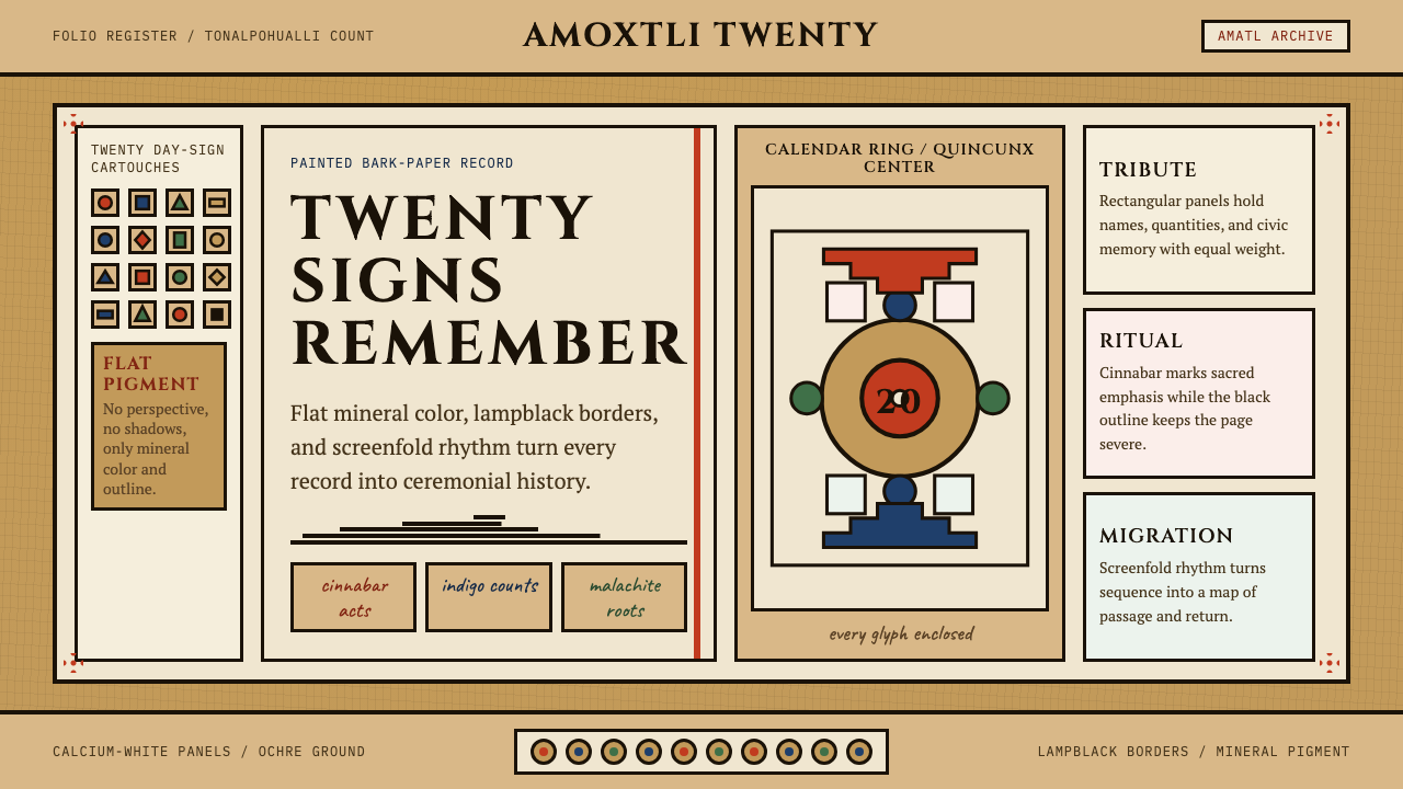 Aztec CodexSacred records stay severe. Ochre amatl ground, Cinzel capitals, black cartou…神圣记录保持庄严。赭黄纸底、Cinzel 大写与黑色匣框。
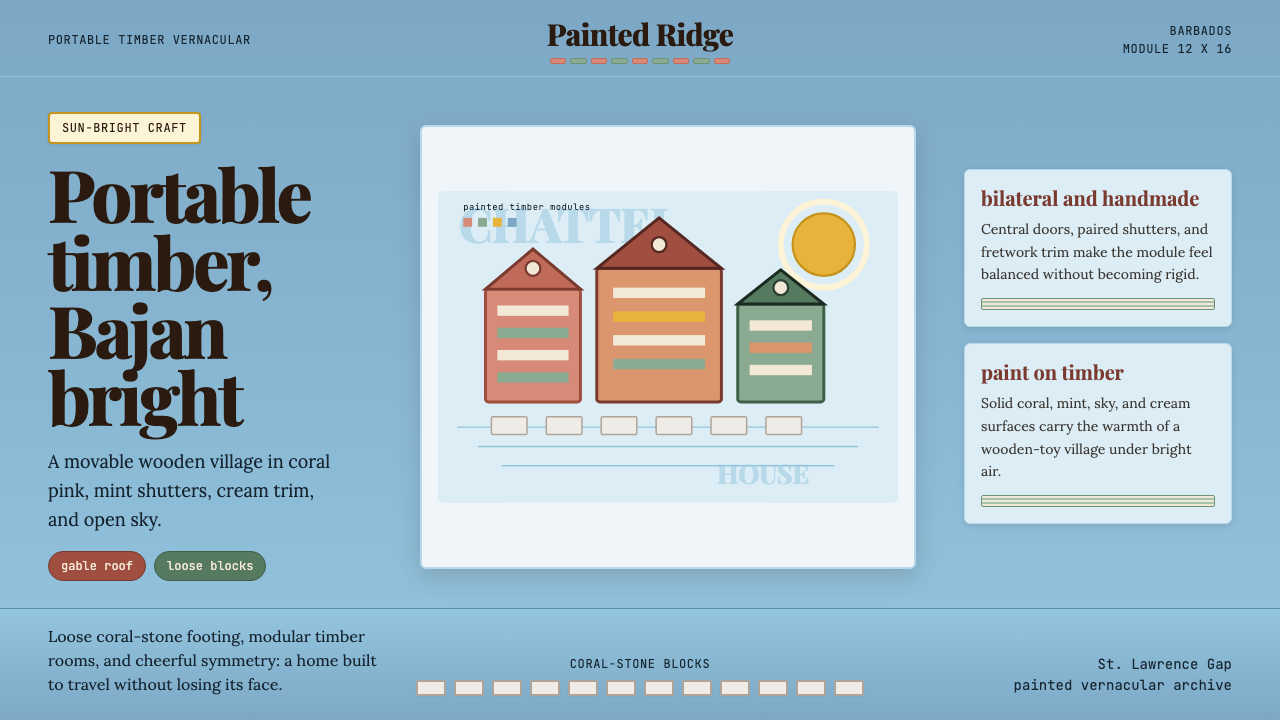 Barbadian Chattel HouseJoy made portable. Coral pink timber, mint shutters, sky-blue space, modular…可移动的快乐:珊瑚粉木墙、薄荷百叶与天蓝网格。
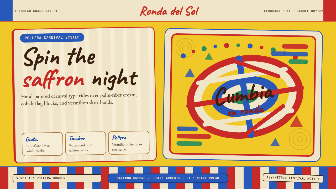 Colombian Cumbia (Pollera Carnival)Carnival heat spins. Saffron ground, Caveat script, vermilion stripes, cobalt…狂欢热度在旋转:藏红花黄底、Caveat手写字、朱红条纹与钴蓝节拍。