What is Colombian Cumbia (Pollera Carnival)?
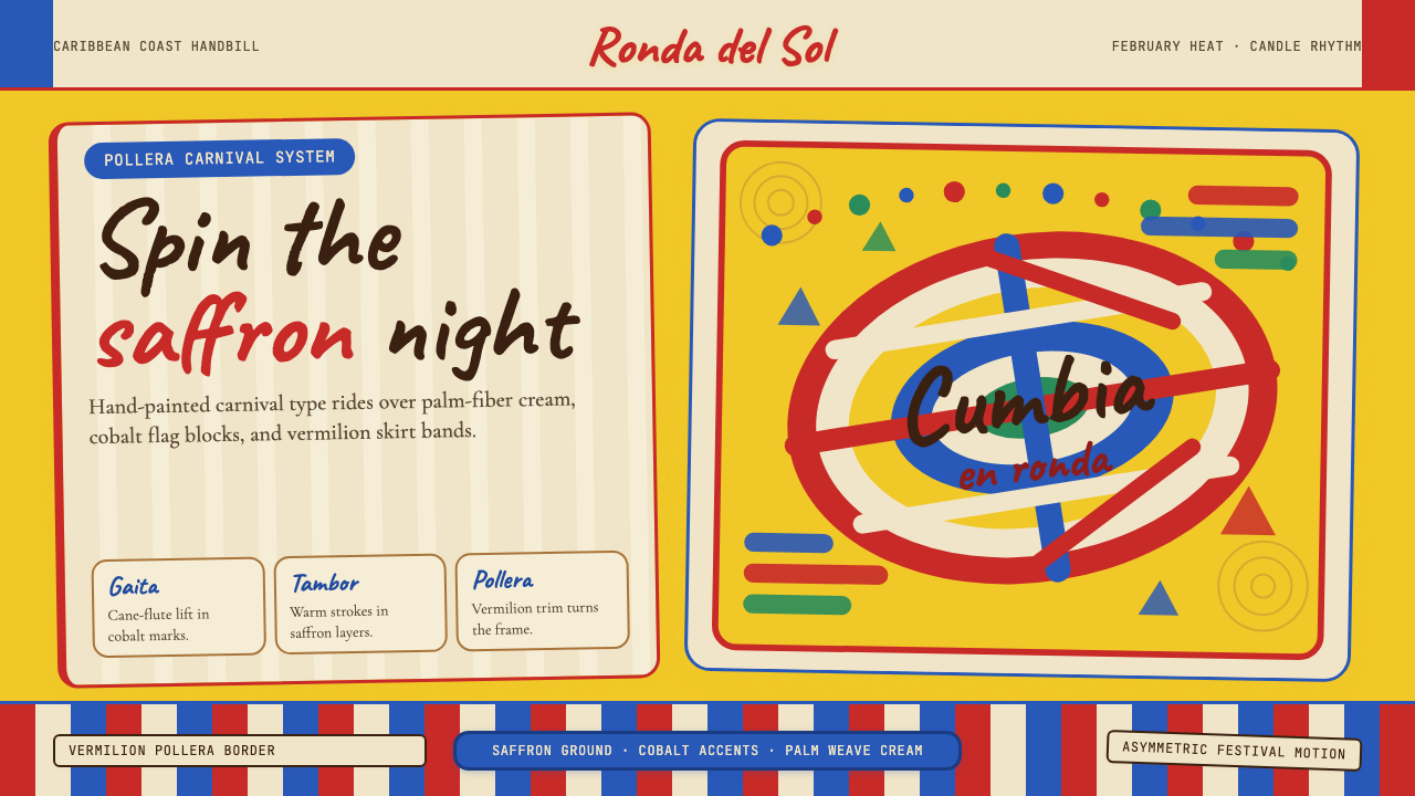
Colombian cumbia fuses African drums, Indigenous flutes, and Spanish melody into a visual language of blazing carnival color, hand-lettered exuberance, and the asymmetric momentum of a spinning pollera skirt.
Colombian Cumbia (Pollera Carnival) in brief
Colombian Cumbia (Pollera Carnival) is a design style rooted in the Barranquilla Carnival tradition — Colombia's most celebrated festival and a UNESCO Intangible Cultural Heritage since 2003. Its visual language distills the heat, motion, and layered cultural identity of the Caribbean coast into a coherent graphic vocabulary: a saffron-yellow ground borrowed from the Colombian flag, cobalt-blue accents that echo coastal skies, vermilion stripes lifted from the pollera skirt's ruffled tiers, and hand-lettered display type that carries the spontaneous energy of festival signage.
At its core, the style is a three-culture synthesis expressed through bold, joyful contrast. African influence arrives through rhythmic repetition and the percussive weight of saturated color blocks. Indigenous heritage shows in organic geometry and patterns that evoke woven palm fiber and beaded craftsmanship. Spanish colonial history contributes the formal structure — the processional pageantry, the hierarchical arrangement of visual elements, and the theatrical scale of the compositions. None of these threads is decorative in isolation; together they produce something unmistakably of the Colombian Caribbean.
Unlike purely archival or ethnographic design references, the cumbia pollera style is alive and evolving. Barranquilla's February carnival is one of the largest street festivals in Latin America, and its visual culture — the towering floats, the hand-painted banners, the costumed comparsa troupes — is actively produced each year by artisans, graphic designers, and community organizations. This living quality gives the style its defining tension: it is rooted in centuries of syncretism, yet it generates new visual material constantly, making it far more dynamic than a frozen historical aesthetic.
Where does Colombian Cumbia (Pollera Carnival) come from?
Cumbia's origins lie in the sixteenth and seventeenth centuries, when African enslaved people brought to Colombia's Caribbean ports — primarily Cartagena de Indias — encountered the Indigenous Zenú and Mokana peoples of the Magdalena River basin. The music that emerged from this encounter layered African membrane drums (the tambor alegre and llamador) over Indigenous gaita flutes, a vertical cane flute blown in pairs. Spanish colonial culture added guitar-derived melodic instruments, European dance formations, and the elaborate costuming conventions that would eventually produce the iconic pollera.
The pollera — the wide, multilayered cotton skirt that defines cumbia dance visually — developed across the eighteenth and nineteenth centuries as a fusion garment. Its basic structure echoes European colonial dress, but the explosion of color, the hand-stitched floral appliqué, and the candle held aloft during the dance all reflect African and Indigenous aesthetic sensibilities. The male dancer's woven Vueltiao hat, made from cañaflecha palm and recognized as a symbol of Colombian national identity since 2004, adds another layer of Indigenous craft tradition to the visual system.
By the mid-nineteenth century, cumbia had migrated from coastal villages and port celebrations into the urban popular culture of Barranquilla, the largest Caribbean port city and Colombia's commercial gateway. The Barranquilla Carnival, institutionalized around 1888, became cumbia's primary public stage — a four-day festival preceding Ash Wednesday that drew dancers, musicians, artisans, and satirical political floats. The carnival's visual culture consolidated the style's defining elements: saffron yellow and cobalt blue from the Colombian flag, the crimson and white of the pollera stripes, and the festive hand-lettering that decorated banners, invitations, and parade programs.
The mid-twentieth century brought a second transformation when composers like Francisco 'Pacho' Galán and Lucho Bermúdez took cumbia from the street into the recording studio and the ballroom. Their urban, orchestrated arrangements reached radio audiences across Latin America and the Caribbean, and spawned regional variants including vallenato-inflected cumbia, Peruvian chicha, and Mexican cumbia norteña. This diaspora spread the style's visual references internationally, attaching the pollera skirt's color palette and the tambor drum's rhythmic geometry to a broader Latin popular-music aesthetic. Today, that transnational circulation makes Colombian cumbia one of the most visually recognized folk traditions in the Western Hemisphere.
What defines the Colombian Cumbia (Pollera Carnival) look?
Color
The palette is anchored by three sources: the Colombian national flag's saffron yellow and cobalt blue, the pollera skirt's vermilion and ivory stripes, and the warm amber of carnival candlelight. Yellow functions as the dominant ground — expansive, luminous, and heat-saturated — while cobalt blue appears as structural accent marking rhythm and direction. Vermilion stripes carry the dance's kinetic energy, appearing in layered or diagonal application that suggests movement and rotation. White and ivory provide breathing space between color blocks, preventing the high saturation from collapsing into visual noise.
Typography
Hand-lettered and brush-script display faces dominate headings and titles, directly referencing the painted signage of carnival floats, street banners, and festival programs. These letterforms are irregular in baseline and stroke weight, conveying spontaneous gesture rather than mechanical precision. Body text, in contrast, tends toward rounded or slightly condensed forms that echo the warmth of the display type without competing with it. Lettering is typically set at generous scale with open tracking, giving individual characters room to breathe as they would on a painted surface.
Pattern and Texture
Woven stripe patterns derived from the pollera skirt's tiered construction appear as structural dividers and background fills. These stripes are rarely uniform in width; they vary rhythmically, mirroring the visual beat of cumbia percussion. Palm-fiber weave textures — abstracted from the Vueltiao hat's diagonal cañaflecha construction — introduce a tactile warmth to flat surfaces without relying on photographic reproduction. Floral appliqué motifs, simplified into graphic form, appear as decorative accents that carry the handmade quality of artisan embroidery.
Motion and Asymmetry
The spinning pollera skirt is the style's defining kinetic reference, and its rotational momentum is encoded into compositional structure. Elements are arranged with deliberate rotational offset — diagonal stripes, angled type, and circular motifs placed slightly off-center — to suggest a dancer caught mid-turn. Symmetry is used sparingly and purposefully; the default compositional state is dynamic equilibrium rather than static balance. This asymmetric energy distinguishes the style from more formally European carnival traditions and roots it firmly in the African rhythmic aesthetic that lies at cumbia's core.
Scale and Festivity
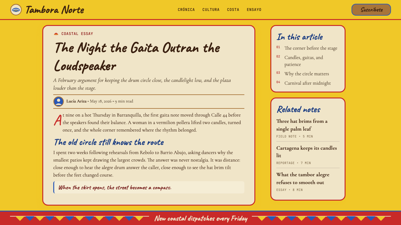
Carnival visual culture operates at the scale of the street — floats must be read from hundreds of meters, banners from across a plaza, costumes from within a surging crowd. This origin in large-scale public spectacle produces a visual logic that is bold, generous, and unapologetically loud. Headlines command the surface. Color contrasts are maximized rather than harmonized. Decorative elements repeat across large fields rather than appearing as isolated accents. When translated to screen or print, this festive generosity produces work that feels celebratory without effort — a quality that makes the style particularly effective for event promotion, cultural programming, and contexts where enthusiasm itself is part of the message.
Candlelight and Warmth
The female cumbia dancer traditionally carries a lit candle throughout the performance, holding it above her head as she circles her partner. This candlelight motif is embedded in the style's tonal qualities: warm amber glows, soft halos of illumination against deep night-sky backgrounds, and the way the saffron yellow ground reads as radiant rather than simply bright. The warmth is not nostalgic or sepia-toned — it is festive warmth, the warmth of a crowd gathered under string lights at night, which gives the style a particular effectiveness in contexts where intimacy and communal celebration coexist.
Layering and Depth
The pollera skirt achieves its visual spectacle through the physical layering of fabric tiers, each ruffled edge catching light and motion independently. This principle of visible layering translates directly into the design vocabulary: color bands overlap with a slight drop shadow or outline to suggest the depth of stacked fabric; pattern fills are placed beneath typographic layers with enough contrast to remain readable; decorative stripes are laid over solid grounds in sequences that build visual complexity without opacity. The result is work that feels materially rich — textured and constructed — rather than flat, even when rendered in entirely digital media.
Who shaped Colombian Cumbia (Pollera Carnival)?
Pacho Galán (1906–1988) was the composer and bandleader most responsible for bringing cumbia from its coastal oral-tradition roots into the mid-century Latin popular-music mainstream. His 1950s recordings, arranged for large brass-and-rhythm orchestras, gave cumbia the urban sophistication that made it broadcast-ready across the continent. Galán's work effectively codified the visual imagination attached to cumbia — the swirling skirts, the candles, the carnival heat — as a transmissible aesthetic package, linking the music's visual identity to the graphic language of album covers, dance-hall promotion, and mass-media entertainment.
Lucho Bermúdez (1912–1994) is considered the architect of the 'classic' cumbia sound that spread through Latin America from the 1940s onward. His orchestrations were more sophisticated harmonically than Galán's, drawing on Cuban son, Colombian porro, and big-band jazz while retaining the tambor-and-gaita rhythmic foundation. Bermúdez's long career as a radio and recording artist ensured that the cumbia visual vocabulary — the flag colors, the pollera silhouette, the carnival setting — became inseparable from a sense of sophisticated popular culture rather than purely folk tradition.
Sonia Bazanta Vides, known professionally as Totó la Momposina (born 1940), is the singer most associated internationally with traditional rather than orchestrated cumbia. Raised in Talaigua Nono in the Momposina Depression, she studied at the Sorbonne and performed at major international festivals from the 1960s onward, bringing cumbia's African and Indigenous roots into scholarly and world-music contexts. Her stage presence — the traditional pollera costume, the percussive ensemble, the gaita flute — established a visual standard for cumbia's roots presentation that influenced both ethnographic documentation and contemporary revivals of pre-commercial cumbia aesthetics.
Petrona Martínez (born around 1940 in Mahates, Bolívar) is a bullerengue singer and percussionist who represents the direct Afro-Colombian female voice within the cumbia tradition. Bullerengue — the all-female percussion-and-song form from which some cumbia scholars trace cumbia's deepest African roots — is performed in traditional dress with distinctive Afro-Colombian embroidery and rhythmic call-and-response structure. Martínez's international recognition, including a Latin Grammy Lifetime Achievement Award, helped legitimize the explicitly African layer of cumbia's visual and sonic identity at a time when more commercially produced cumbia styles dominated global perception.
The Rey Momo — the Carnival King elected each year to inaugurate Barranquilla's carnival festivities with the ceremonial handing over of the city keys — is less a single figure than a recurring visual archetype that concentrates the style's most theatrical elements. Each year's Rey Momo costume commission represents one of the Caribbean coast's most important exercises in applied cumbia visual design: the oversized crown, the gold and crimson robes, the exaggerated scale that must command attention across an outdoor plaza. Studying successive Rey Momo costumes across decades provides a reliable index of how the style has evolved in color intensity, material elaboration, and compositional drama.
How do you use Colombian Cumbia (Pollera Carnival) today?
Colombian cumbia pollera translates into contemporary design work most naturally in contexts where celebration, cultural pride, and sensory warmth are intended values — but its structural logic is transferable well beyond folk-festival applications. Understanding the style's compositional DNA — the rotational asymmetry, the layered color stripes, the candlelit warmth of the yellow ground — makes it possible to apply it with precision rather than pastiche.
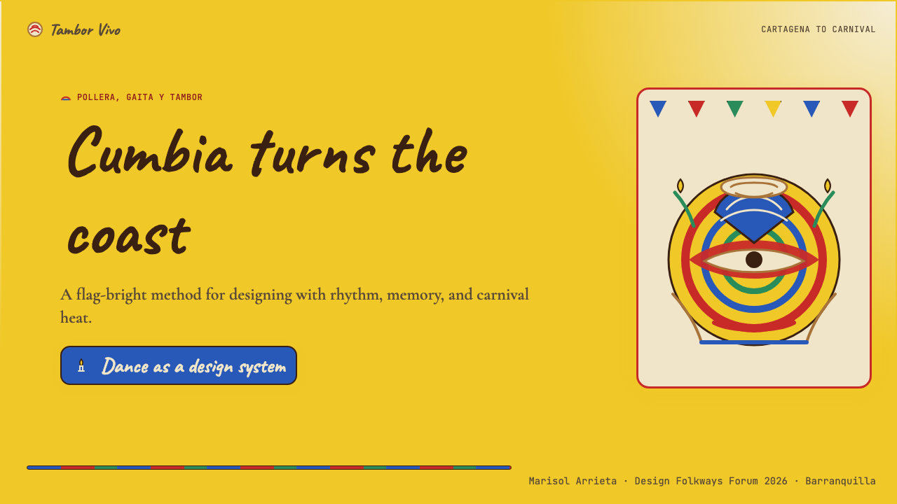
For presentation slides, the style is particularly effective on event covers and section dividers where energy and identity need to be communicated immediately. A cover page built on a deep saffron ground with hand-lettered title type and a diagonal vermilion stripe creates a carnival-strength visual statement without requiring illustration. Content slides benefit from the style's stripe logic: horizontal bands of color establish section rhythm without decorative fuss, and color-coded data columns feel native to the system rather than grafted on. The challenge in data-heavy slides is restraint — the style's natural tendency toward saturation and repetition needs to be moderated so that data remains readable above the decorative ground.
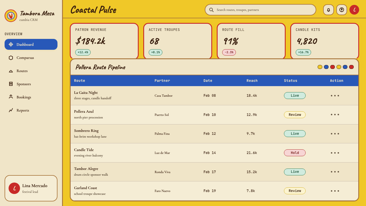
For web interfaces, the cumbia pollera style suits event microsites, cultural institution landing pages, tourism promotion, and Latin American brand identities where authenticity and joy are the primary signals. Dashboard applications should apply the style selectively: use the saffron ground as a background for hero sections and the cobalt as a structural accent color for interactive elements, while keeping data areas light and typographically clean. The hand-lettered display type works at hero headline scale; for navigation and interface labels, choose rounded or slightly informal type that echoes the warmth of the display letterforms without the irregularity that would reduce readability at small sizes.
For editorial and marketing work, the style's poster heritage makes it immediately legible at full-page magazine spreads, outdoor advertising, and social media banner formats where a single image must communicate across physical or digital distance. An event poster structured around the pollera stripe — bands of color running diagonally across the composition, title anchored at the top in oversized hand-lettered display type, date and venue in a contrasting ground panel — follows the style's own parade-banner logic and will read as culturally grounded rather than generically festive. Book cover applications work well when the illustration or photograph is treated as a shape within the stripe system rather than as a full-bleed image competing with the graphic pattern.
The most common mistake when applying this style outside its cultural context is treating the saffron-yellow-and-cobalt combination as a simple 'Colombian color scheme' and applying it flatly, without the layering, asymmetry, and kinetic motion that give the palette its meaning. The colors alone do not produce cumbia — it is the rotational composition, the tiered stripe logic, and the handmade warmth of the lettering that make the palette feel alive rather than merely bright. A second common error is scaling down the style's natural exuberance too far in the name of 'modernity,' producing work that is timid where the source material is bold. The style rewards designers who trust its energy rather than editing it into polite approximation.
Colombian Cumbia (Pollera Carnival) — FAQ
How is Colombian cumbia different from other Latin carnival design styles, such as Brazilian samba or Trinidadian carnival?
The three traditions share the festive energy and saturated color common to carnival culture, but their visual languages diverge significantly. Brazilian samba carnival — particularly Rio's Sambódromo tradition — leans toward gold, emerald, and crimson in highly symmetrical, feathered, and rhinestone-encrusted compositions that prioritize spectacle at extreme scale. Trinidadian carnival mas costumes favor a more bodywork-forward, sculptural approach with iridescent materials. Colombian cumbia pollera, by contrast, is grounded in woven textile craft — the stripe, the cotton weave, the palm-fiber braid — and operates with a warmer, more domestically scaled palette. The asymmetric rotational energy of cumbia composition also sets it apart from both the bilateral symmetry of Brazilian samba float design and the radial symmetry of Trinidadian mas costumes.
Can this style work effectively in a light, airy layout, or does it require the bold density of carnival-scale composition?
The style adapts well to lighter applications when the core visual logic — rotational asymmetry, stripe layering, warm yellow ground — is preserved even at reduced density. A single bold diagonal stripe across a cream field, anchored by hand-lettered type in one corner, reads as cumbia-derived without requiring full carnival saturation. The key is that the style's energy should still feel kinetic: static, centered, or rigidly symmetrical arrangements will feel like they are borrowing the color palette without understanding the style's compositional philosophy. Lightened applications work best in print contexts — invitations, program booklets, packaging — where the reduced saturation reads as considered restraint rather than dilution.
Is it appropriate for non-Colombian brands or designers to use this visual language, or does that risk cultural appropriation?
The question is less about origin than about intent and execution. Colombian cumbia is a publicly celebrated, internationally recognized living tradition — Barranquilla carnival is a UNESCO heritage event, and cumbia music has spread voluntarily across Latin America and the world. Using the style in genuine celebration of or engagement with that cultural tradition is different from extracting its visual markers for unrelated commercial contexts with no acknowledgment of their source. Practically, the distinction often shows in the quality of research: work that understands the pollera's three-culture history, the role of the gaita flute, and the significance of the Vueltiao hat produces visual outcomes that feel culturally informed. Work that simply picks up the yellow-and-cobalt palette without that context tends to produce generic 'festive tropical' output that is neither accurate to the source nor particularly interesting as design.
How does the style handle dark-mode or dark-background applications?
The canonical cumbia pollera palette is light-ground — the saffron yellow ground is the style's defining quality, and most of its visual logic depends on that luminous expansive warmth. A dark inversion is possible but requires thoughtful recalibration. On a deep navy or near-black ground, the saffron yellow becomes a vivid accent rather than a field color, which changes the compositional dynamic significantly — instead of a warm open space with colored stripes, the composition becomes a luminous set of marks on darkness, closer to the effect of carnival string lights at night. This darker reading can be effective for evening event promotion, nightlife contexts, or digital interfaces where a light ground would feel too energetic. The candlelight warmth of the amber tones works particularly well in dark-ground applications, as it preserves the festive intimacy of nighttime carnival even without the full saffron ground.
What distinguishes authentic cumbia visual design from work that is merely 'Latin American festive' in a generic sense?
Authentic cumbia design is specific where generic work is vague. It references the pollera's actual constructional logic — tiered stripes of different widths, not random colorful bands — and the rotational asymmetry of the dance rather than symmetric festive composition. The typography draws on hand-lettered carnival signage traditions rather than generic script fonts. The color palette is grounded in the three-culture historical synthesis — African rhythm, Indigenous craft, Spanish pageantry — rather than simply 'tropical brights.' Perhaps most importantly, cumbia design has a distinctive tempo: it is not relentlessly maximalist. Like the dance itself, which alternates between the slow circling of the candle-carry and the burst of the drum break, the visual system knows when to hold back and when to release energy. Work that is simply loud and colorful all the time is festive; work that builds and releases like a tambor rhythm is cumbia.
Related design styles
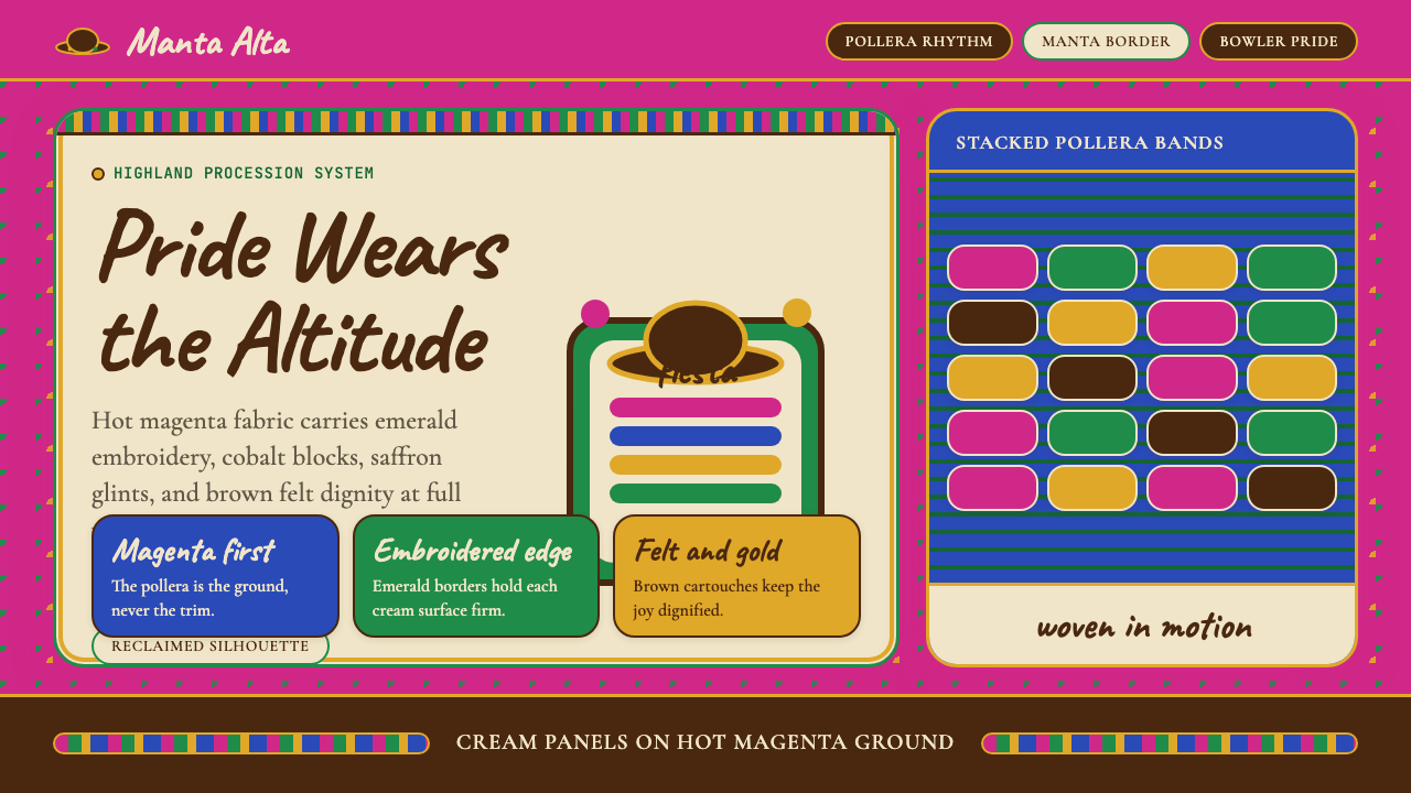 Bolivian Cholita (Bowler-Hat Fiesta)Loud pride, fully reclaimed. Magenta pollera bands, emerald borders, bowler c…
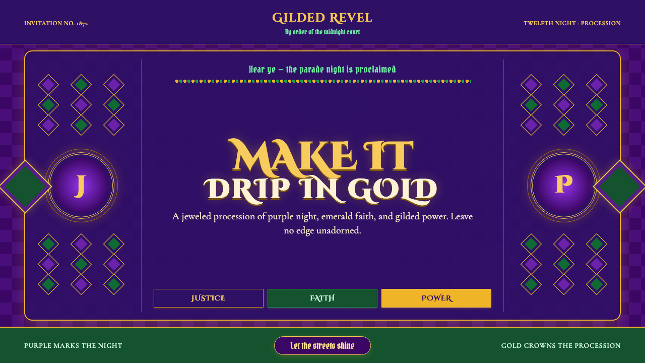 Mardi Gras New OrleansJoyfully excessive. Gilded type, jewel purple, emerald, and bead-strand borde…
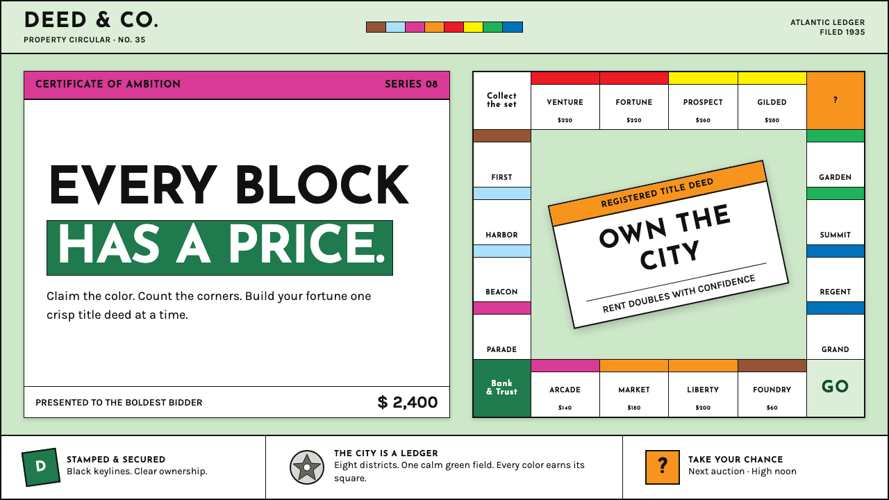 Monopoly (1935)Everything is ownable. Candy-bright deed bands snap across a calm sage board.
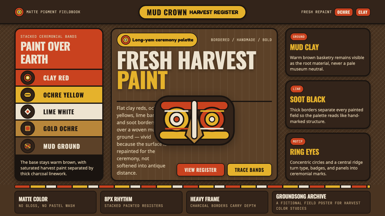 Sepik Yam Mask AbelamFresh harvest power. Clay red and ochre bands strike over warm mud-brown grou…
 Chinese New Year Spring FestivalThe new year arrives at full volume. Lantern red glows through lacquer night…
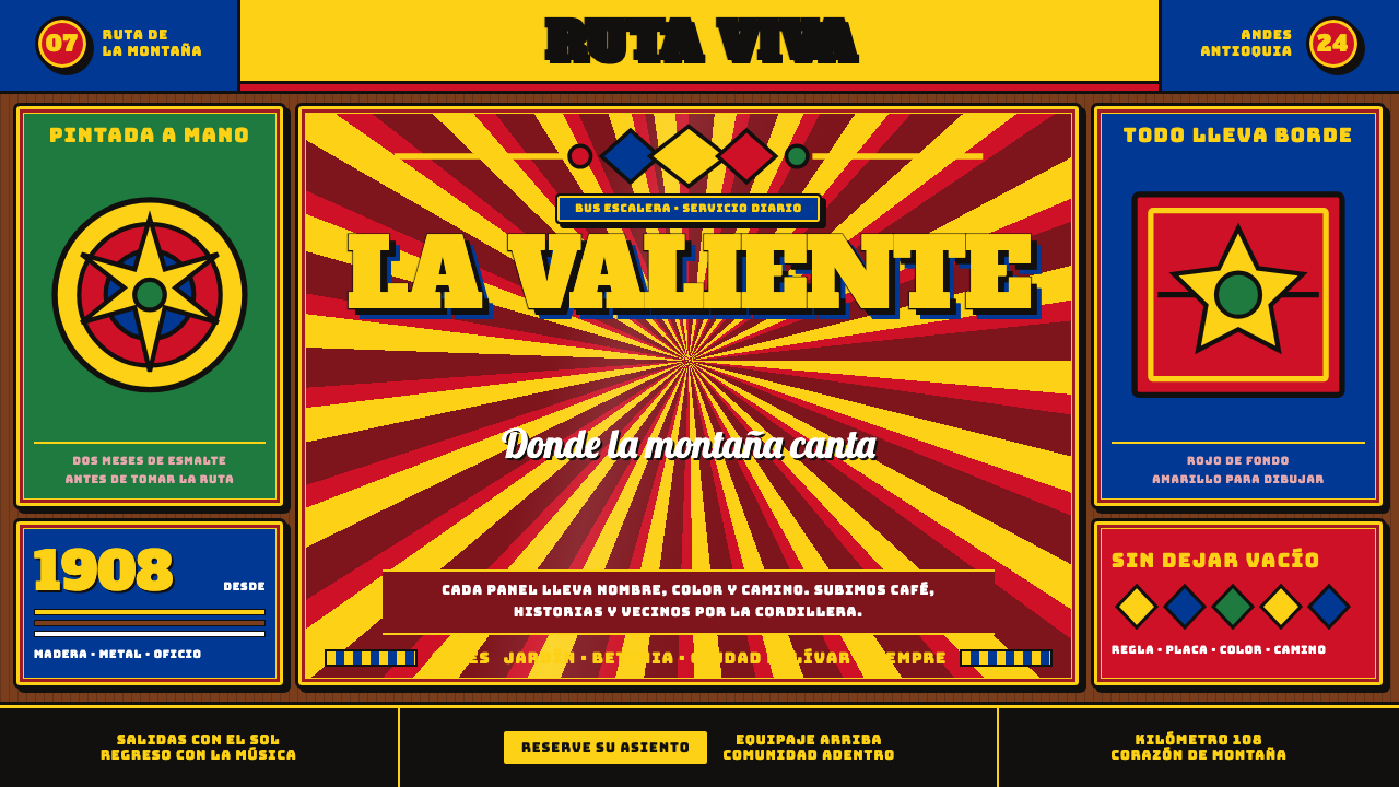 Colombian Chiva BusNothing is left unpainted. Flag-yellow rules, slab lettering and black keylin…