What is Mexican Papel Picado Tissue?什么是 Mexican Papel Picado Tissue?
Papel picado transforms humble tissue into a riot of perforated color — hot pink, turquoise, magenta, and yellow banners strung across plazas and churches, making every Mexican fiesta feel alive with movement and light.剪纸花将普通薄纸化为穿孔色彩的狂欢——热粉、绿松石、品红与明黄的旗帜悬挂于广场与教堂之间,让每一场墨西哥庆典都在律动与光影中鲜活起来。
Mexican Papel Picado Tissue in briefMexican Papel Picado Tissue 速览
Papel picado — literally 'perforated paper' — is the Mexican folk tradition of cutting elaborate designs into stacked layers of brightly colored tissue paper using mallets, chisels, and specialized cutting tools. The finished banners are strung into garlands and draped across plazas, churches, market stalls, and home altars for festivals ranging from Día de Muertos to weddings, quinceañeras, and Christmas posadas. The visual effect is electric: dozens of translucent banners in four or more saturated colors overlap and shift in the breeze, filtering light and casting colored shadows across everything beneath them.剪纸花(papel picado)——字面意思是「穿孔纸」——是墨西哥民间纸艺传统:工匠用木槌、凿子和专用切割工具,在层叠的彩色薄纸上凿出精美图案。成品旗帜被串成彩带,悬挂于广场、教堂、市集摊位和家庭祭坛,用于从亡灵节到婚礼、成人礼、圣诞巡游等各类庆典。视觉效果极具冲击力:数十幅半透明旗帜以四种以上饱和色相互叠压,在微风中晃动,滤过光线,在其下方的一切事物上投下彩色光影。
As a design system, papel picado captures that layered, celebratory visual energy — the saturated palette of tissue colors against sky and stone, the geometric rhythm of rectangular banner shapes, the intricate lace-like perforations that define motifs of skulls, flowers, animals, and geometric patterns. Unlike many folk-art traditions that exist primarily in museums, this one has been in continuous everyday practice for well over a century, still made by hand in the same Puebla village where it was codified.作为一套设计语言,剪纸花捕捉了这种层叠而喜庆的视觉能量——薄纸色彩在天空与石墙之间的饱和张力,矩形旗帜形状的几何韵律,以及勾勒出骷髅、花卉、动物与几何纹样的蕾丝般穿孔细节。与许多主要存在于博物馆的民间艺术传统不同,剪纸花至今仍在日常生活中持续实践,超过一个世纪以来从未中断,依然在普埃布拉州同一个村庄由双手制作完成。
What distinguishes papel picado from surface decoration is its structural character: the design is created by what is removed, not what is added. Negative space is the medium. Perforations that form a skull or a marigold are defined by absence, and the color of the tissue — the ground itself — becomes the image. This reversal of figure and ground gives the aesthetic its particular visual depth and its conceptual richness as a design language.剪纸花区别于表面装饰之处在于其结构性本质:设计由去除的部分创造,而非添加的部分。负空间才是媒介。构成骷髅或金盏花的穿孔由缺席定义,薄纸的颜色——底面本身——成为图像。这种图底关系的反转赋予了这一美学特有的视觉深度,也使其作为设计语言具有了概念上的丰富性。
See the Mexican Papel Picado Tissue design system查看 Mexican Papel Picado Tissue 完整设计系统
Where does Mexican Papel Picado Tissue come from?Mexican Papel Picado Tissue 从何而来?
The village of San Salvador Huixcolotla, in the state of Puebla, Mexico, is considered the world capital of papel picado. Though perforated and cut-paper traditions existed throughout Mesoamerica long before European contact — the Aztecs used bark paper amate in religious ceremony, and cut-paper offerings called papeles were central to pre-Hispanic ritual — the specific form of tissue-paper banner art as practiced today took its definitive shape in the late nineteenth and early twentieth centuries, as commercially produced tissue paper from Europe and later Mexico replaced handmade amate.墨西哥普埃布拉州的圣萨尔瓦多·维斯科洛特拉村被视为世界剪纸花之都。尽管穿孔与剪纸传统在欧洲人到来之前的中美洲早已存在——阿兹特克人在宗教仪式中使用树皮纸(amate),剪纸供品(papeles)也是前哥伦布时期仪式的核心——但今日所见的薄纸旗帜艺术的具体形态,在十九世纪末至二十世纪初随欧洲进而墨西哥本土生产的商业薄纸取代手工树皮纸之后,才获得了其决定性的面貌。
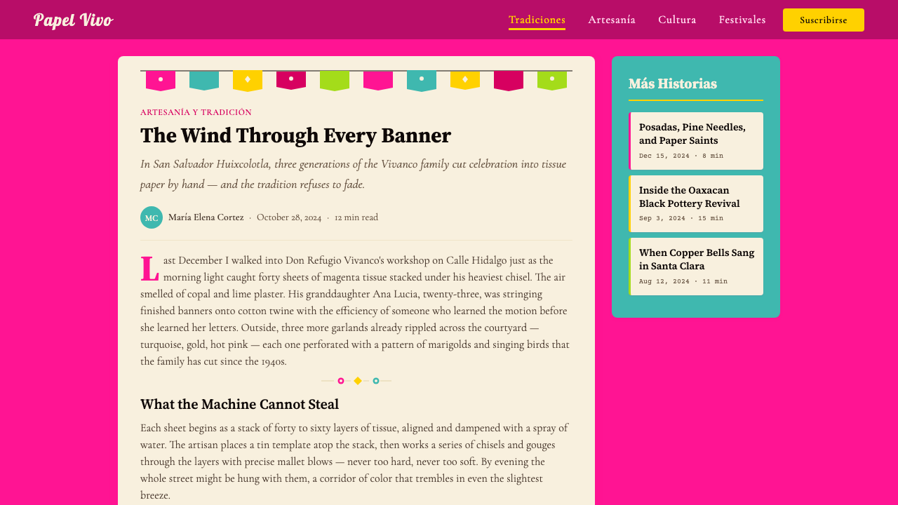
The Vivanco family of San Salvador Huixcolotla stands at the center of this tradition's modern history. Margarito Vivanco is widely credited with systematizing and expanding the craft in the early twentieth century, developing both the vocabulary of motifs — skulls, flowers, birds, geometric borders — and the production techniques that allowed many banners to be cut simultaneously from stacked sheets. The family's workshop became the model for the village's broader artisan economy, and the Vivanco name remains synonymous with master-level papel picado internationally. Maria Vivanco and subsequent generations carried the tradition forward, maintaining the hand-chisel technique even as demand grew for machine-cut versions.圣萨尔瓦多·维斯科洛特拉的维万科家族处于这一传统现代史的中心。马尔加里托·维万科被普遍认为是二十世纪初系统化并拓展这门技艺的关键人物——他既发展了图案词汇(骷髅、花卉、鸟类、几何边框),也完善了从叠层纸张同时切割多幅旗帜的生产技术。维万科家族的工坊成为全村工匠经济的范本,维万科之名至今在国际上仍是剪纸花大师级水准的代名词。玛丽亚·维万科及此后数代人延续了这一传统,即便机器裁切版本的需求持续增长,手工凿刻技法依然得以保存。
The post-revolutionary Mexican period of the 1920s and 1930s saw papel picado elevated from a local craft to a symbol of national identity. The muralist movement and the broader cultural project of post-revolutionary Mexico, which sought to valorize indigenous and mestizo folk traditions against the Eurocentric aesthetics of the Porfirian era, brought papel picado into the same cultural conversation as Diego Rivera's murals and Frida Kahlo's embroidered tehuana dress. The craft became a visual shorthand for Mexicanidad — Mexican-ness — and its imagery, particularly the calavera skull motif associated with Día de Muertos, entered the global visual vocabulary of Mexican culture.1920至30年代墨西哥革命后的文化重建时期,剪纸花从地方工艺跃升为民族身份的象征。壁画运动与后革命墨西哥更广泛的文化工程——旨在将本土与混血民间传统从波菲里奥时代的欧洲中心美学中解放出来并加以礼赞——将剪纸花带入与迭戈·里维拉壁画、弗里达·卡洛刺绣特瓦纳服饰同一层面的文化对话之中。这门技艺成为「墨西哥性」(Mexicanidad)的视觉速记符号,尤其是与亡灵节相关的骷髅图案,进入了全球对于墨西哥文化的视觉想象。
In 1998, UNESCO recognized Día de Muertos — and by extension the visual culture surrounding it, including papel picado — as part of the Intangible Cultural Heritage of Humanity. This recognition amplified international interest in the tradition while also raising ongoing questions about authenticity and mass reproduction: commercially printed plastic 'papel picado' has proliferated globally, and distinguishing genuine hand-cut tissue work from its industrial simulacra has become a point of advocacy for Huixcolotla artisans. Through 2024, the village's master craftspeople continue to produce both traditional ceremonial banners and commissioned decorative work for international clients, sustaining a living tradition now well into its second century.1998年,联合国教科文组织将亡灵节——连同其周边视觉文化,包括剪纸花——列为人类非物质文化遗产。这一认定放大了国际社会对这一传统的关注,同时也引发了关于真实性与大规模复制的持续讨论:商业印刷的塑料版「剪纸花」已在全球泛滥,区分真正手工凿刻的薄纸作品与其工业仿制品,已成为维斯科洛特拉工匠积极倡导的议题。直至2024年,该村的大师级手艺人仍在持续制作传统礼仪旗帜与面向国际客户的委托装饰作品,维系着一项已延续逾百年的活态传统。
What defines the Mexican Papel Picado Tissue look?Mexican Papel Picado Tissue 的视觉特征是什么?
Color Palette色彩
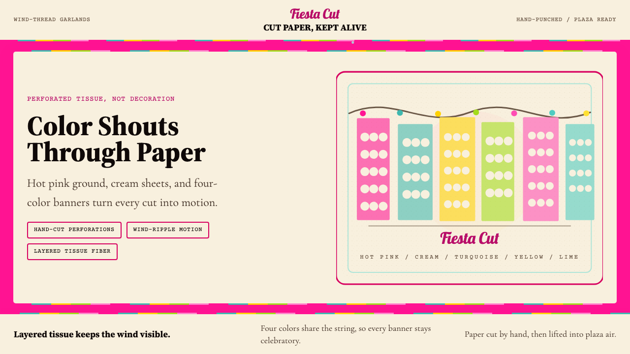
The palette is built from the full spectrum of saturated tissue-paper colors — hot pink, turquoise, magenta, acid yellow, vivid orange, lime green, cobalt, and deep violet — used simultaneously and without hierarchy. Unlike restrained design systems that limit color to two or three hues, papel picado embraces four, six, or eight colors in a single composition, relying on the translucency of tissue and the visual rhythm of repetition to prevent chaos. The resulting effect is not polychromatic excess but jubilant abundance: every color at full intensity, every color present at once.色板由薄纸全光谱饱和色构成——热粉、绿松石、品红、荧光黄、亮橙、石灰绿、钴蓝与深紫——同时使用,不分主次。不同于将色彩限定在两三种色调的克制设计体系,剪纸花在单一构图中拥抱四种、六种乃至八种色彩,依靠薄纸的半透明性与重复的视觉节奏防止混乱。最终效果并非多色的过量,而是欢腾的丰盈:每一种颜色都以全强度呈现,所有颜色同时在场。
Negative Space and Perforation负空间与穿孔
The defining visual characteristic of papel picado is its relationship to negative space. Motifs are not drawn or painted onto a surface — they are cut away from it. The perforations create lace-like patterns of extreme intricacy: a single banner might contain dozens of individual cuts forming skulls, marigolds, birds in flight, or interlocking geometric borders. This structural inversion — where the image lives in what is removed — gives every composition an airy, layered quality that no painted surface can replicate. Light passes through the perforations, and as banners overlap, colors mix and shift.剪纸花最具决定性的视觉特征是其与负空间的关系。图案并非描绘或绘制在表面上——而是从表面切除出来的。穿孔形成了极为精细的蕾丝状纹样:单幅旗帜可能包含数十个独立切口,构成骷髅、金盏花、飞鸟或相互咬合的几何边框。这种结构性反转——图像存在于被去除之处——赋予每幅构图一种通透而层叠的品质,这是任何绘制表面都无法复制的。光线穿过穿孔,旗帜相互叠压时色彩混合流转。
Banner Geometry旗帜几何
Individual papel picado banners are rectangular, with a simple scalloped or notched lower edge that softens the formal boundary. This rectangular module — repeated dozens of times in alternating colors along a string — creates a strict geometric rhythm: a horizontal grid of color blocks interrupted by perforated decoration. The regularity of the format is essential; it is what allows the wild variation of colors and motifs to cohere as a unified visual system. The banner shape functions like a typographic measure: a containing form that gives the interior detail its legibility.单幅剪纸花旗帜为矩形,下缘带有简单的扇形或锯齿状边缘,软化了形式边界。这一矩形模块——沿绳索以交替色彩重复数十次——创造出严格的几何韵律:由穿孔装饰打断的横向色块网格。这种格式的规律性是关键所在;正是它使色彩与图案的丰富变化得以凝聚为统一的视觉系统。旗帜形状如同排版中的行宽:一种包容性形式,赋予内部细节以可读性。
Tissue Texture and Translucency薄纸质感与半透明性
The material — thin, almost weightless tissue paper — is not incidental to the aesthetic; it is constitutive of it. Tissue transmits rather than reflects light, so colors appear luminous rather than opaque. When multiple layers overlap — as they always do in a garland — the overlapping regions produce new mixed colors and tonal gradations that were never explicitly designed. The surface also carries the faint fiber texture of the paper itself, visible on close inspection, which grounds the digital abstraction of the style in something handmade and tactile. Applying this aesthetic means embracing a similar quality of translucency and layering rather than solid, opaque fills.这种材料——轻薄、近乎失重的薄纸——对美学而言并非偶然,而是构成性的。薄纸传导而非反射光线,因此色彩呈现出发光而非不透明的质感。当多层旗帜叠压——在彩带中这是常态——重叠区域产生从未被明确设计的新混合色与色调渐变。表面还带有纸张本身淡淡的纤维质感,近观可辨,这使该风格的数字抽象扎根于某种手工制作的、触觉性的现实。应用这一美学意味着拥抱类似的半透明与叠压品质,而非实心不透明的填充。
Celebratory Motif Vocabulary庆典图案词汇
Papel picado has a defined iconographic vocabulary drawn from Mexican folk and ritual tradition. Calaveras (decorated skulls) are the most internationally recognized motif, closely associated with Día de Muertos. Alongside them appear marigold flowers (cempasúchil), birds, butterflies, deer, maguey plants, and geometric border patterns derived from pre-Hispanic textile traditions. Religious imagery — crosses, doves, sacred hearts — appears in pieces made for baptisms, weddings, and feast days. The motifs are never photorealistic; they are always stylized, simplified, and compressed into the constraints of the cutting tool, producing forms that are simultaneously bold in silhouette and intricate in detail.剪纸花拥有一套源自墨西哥民间与仪式传统的固定图像词汇。卡拉韦拉(装饰性骷髅)是国际上最广为认知的图案,与亡灵节密切相关。与之并存的还有金盏花(cempasúchil)、鸟类、蝴蝶、鹿、龙舌兰植物,以及源自前哥伦布时期纺织传统的几何边框纹样。用于洗礼、婚礼与节日弥撒的作品则出现宗教图像——十字架、鸽子、圣心。这些图案从不追求写实;它们始终是风格化的、简化的,并压缩在切割工具的约束之内,产生出轮廓大胆而细节精密的形态。
Movement and Wind律动与风
Papel picado is not a static art form. The banners are designed to move — to sway and flutter in the breeze, catching and releasing light, overlapping and separating. This kinetic quality is inseparable from its visual identity. The tissue is light enough that even indoor air currents cause visible motion. Translating this into digital and print design means building in a sense of layering, rhythm, and visual flux — compositions that feel active rather than settled, where overlapping elements create depth and where no single focal point holds the eye too long. The aesthetic resists the fixed and the permanent.剪纸花并非静态艺术。旗帜被设计为运动的——在微风中摇曳与飘动,捕捉并释放光线,相互叠压又分开。这种动态品质与其视觉身份不可分割。薄纸之轻使室内气流也足以引发可见的运动。将这一特质转化为数字与印刷设计,意味着建立一种层叠感、韵律感与视觉流动感——构图感觉是活跃的而非沉静的,重叠的元素创造深度,没有任何单一焦点过久地牵住视线。这一美学抗拒固定与永恒。
Imperfection as Authenticity不完美即真实
Hand-cut papel picado carries the marks of its making: slight irregularities in cut edges, minor variations in the spacing of identical motifs across stacked sheets, the particular compression of a chisel that gives each cut a slightly different character. These imperfections are not flaws to be corrected — they are the aesthetic's proof of life. A design system that draws from this tradition should deliberately incorporate similar qualities: slightly uneven treatments, textured grounds, elements that echo handcraft rather than mechanical perfection. The worst misapplication of the style is a version so precisely rendered that it loses the warmth and vitality that are its entire point.手工凿刻的剪纸花携带着制作的痕迹:切割边缘轻微的不规则,叠层纸张中相同图案间距的微小变化,每次凿击赋予每个切口略有不同特性的力道压缩。这些不完美并非需要纠正的缺陷——它们是这一美学的生命证明。从这一传统汲取灵感的设计系统应当刻意融入类似的品质:略显不均匀的处理、带质感的底面、呼应手工制作而非机械精准的元素。对这种风格最糟糕的误用,是一个精准到失去手工温度与生命活力的版本——而那恰恰是这一美学存在的全部意义。
See the Mexican Papel Picado Tissue design system查看 Mexican Papel Picado Tissue 完整设计系统
Who shaped Mexican Papel Picado Tissue?谁塑造了 Mexican Papel Picado Tissue?
Margarito Vivanco of San Salvador Huixcolotla is the figure most responsible for transforming papel picado from a local seasonal practice into a systematized, exportable craft tradition in the early twentieth century. He developed and codified the primary motif vocabulary — particularly the calavera skull, floral, and geometric border designs — and refined the stacking-and-cutting technique that allows a single artisan to produce dozens of identical banners in a session. His workshop became the seed of Huixcolotla's identity as the global center of the craft, and his name is invoked by contemporary artisans as the standard of master-level work.圣萨尔瓦多·维斯科洛特拉的马尔加里托·维万科是二十世纪初将剪纸花从地方性季节实践转化为系统化、可出口手工艺传统的核心人物。他发展并规范了主要图案词汇——尤其是骷髅、花卉与几何边框设计——并完善了叠层切割技术,使单个工匠在一次工作中能够制作数十幅相同旗帜。他的工坊成为维斯科洛特拉作为该技艺全球中心的起点,当代工匠们至今仍以他的名字作为大师级水准的标准。
Maria Vivanco carried the family tradition forward across the middle decades of the twentieth century, maintaining the hand-chisel technique during a period when commercially cut and printed alternatives were becoming available. Her role was as much curatorial as creative: sustaining the integrity of the hand-cut method, training apprentices within the family and village system, and resisting the dilution of the craft into purely decorative souvenir production. She represents the continuity function that keeps living craft traditions alive between their moments of wider recognition.玛丽亚·维万科在二十世纪中叶延续了家族传统,在商业裁切与印刷替代品开始普及的时期坚持维护手工凿刻技法。她的角色与其说是创作性的,不如说是守护性的:维持手工切割方法的完整性,在家族与村庄体系内培训学徒,抵制将这门技艺稀释为纯粹装饰性纪念品生产的倾向。她代表了使活态手工艺传统在更广泛认可的时刻之间延续不断的连续性功能。
Spanning multiple generations from the 1920s through the present, the Vivanco family workshop functions less as a single biography and more as an institution — the primary site where the aesthetics, techniques, and iconographic vocabulary of master-level papel picado were developed, tested, and transmitted. The workshop's continued operation into the 2020s means that the tradition it represents is not a historical artifact but a living practice, with artisans who learned directly from those who codified the form. International collectors, festivals, and design clients continue to commission work from the workshop, sustaining both its economic viability and its cultural authority.从1920年代延续至今,维万科家族工坊更像是一个机构,而非单一传记——它是大师级剪纸花的美学、技术与图像词汇被发展、检验和传授的首要场所。工坊延续至2020年代的持续运营意味着,它所代表的传统并非历史文物,而是活态实践,从业工匠直接师承规范这一形式的前辈。国际收藏家、节庆活动与设计客户持续委托工坊制作作品,同时维系着其经济可行性与文化权威性。
While not an individual artisan, UNESCO's 1998 recognition of Día de Muertos — and by extension the visual culture surrounding it — as Intangible Cultural Heritage of Humanity had a defining effect on how papel picado is understood and valued internationally. The recognition elevated the craft from folk decoration to world heritage, brought it into serious design and cultural conversation, and also created new tensions: the UNESCO designation increased demand for papel picado-adjacent aesthetics globally, accelerating the proliferation of machine-cut plastic imitations that Huixcolotla artisans have had to actively distinguish their work from. The designation thus both honored and complicated the tradition.虽非个人工匠,联合国教科文组织1998年对亡灵节——连同其周边视觉文化——的非物质文化遗产认定,对剪纸花在国际上被理解与评价的方式产生了决定性影响。这一认定将这门技艺从民间装饰提升至世界遗产,使其进入严肃的设计与文化对话,同时也带来新的张力:联合国教科文组织的认定在全球范围内放大了对剪纸花相关美学的需求,加速了机器裁切塑料仿制品的泛滥——维斯科洛特拉工匠不得不积极区分自己的作品与这些仿制品。这一认定因此既荣耀又复杂化了这一传统。
How do you use Mexican Papel Picado Tissue today?今天怎么用 Mexican Papel Picado Tissue?
Applying papel picado as a design system requires understanding what makes it work at the source: it is not merely a bright color palette but a system of layered translucency, geometric rhythm, and celebratory excess operating within a strict modular container. The rectangular banner format is the key structural constraint — it is what prevents the abundant color and intricate detail from becoming visual noise. Any application of this style that loses the containing geometry loses the tradition's organizational logic along with it.将剪纸花作为设计系统应用,需要理解它在源头之所以有效的原因:它不仅仅是一套明亮的色板,而是在严格模块化容器内运作的层叠半透明性、几何韵律与庆典式过剩的系统。矩形旗帜格式是关键的结构性约束——正是它防止了丰富的色彩与精细的细节沦为视觉噪音。任何丢失了这种包容性几何的应用,都会同时丢失这一传统的组织逻辑。
For presentation slides, papel picado works powerfully on cover pages and section dividers. A cover using this system builds the background from layered, slightly translucent color fields in three or four tissue-paper hues — hot pink, turquoise, yellow, magenta — overlapping at their edges to create mixed-color regions, with title type reversed in cream or white against the richest color zone. Section dividers can employ a horizontal band of banner-like rectangles in alternating colors, each containing a simplified perforation-style motif. Content slides should pull back: a cream or white ground with one tissue color used as accent for pull quotes, section labels, and data callouts. Data visualizations benefit from the full palette — bar charts and categorical legends in the saturated tissue colors, clearly differentiated and jubilantly distinct.在演示文稿中,剪纸花在封面页与章节分隔页上效果强劲。使用这套系统的封面,以三到四种薄纸色调——热粉、绿松石、明黄、品红——的层叠半透明色域构建背景,边缘相互叠压形成混色区域,标题文字以奶油或白色反白置于最浓郁的色彩区域。章节分隔页可运用交替色彩的旗帜状矩形横带,每个矩形内含简化的穿孔风格图案。内容页应当退一步:以奶油或白色为底,仅用一种薄纸色作为引用语、章节标签与数据标注的强调色。数据可视化受益于完整色板——以饱和薄纸色制作的柱状图与分类图例,清晰区分,欢快醒目。
For web interfaces, papel picado is well-suited to event pages, festival marketing sites, cultural institution portals, and any context where celebration, cultural richness, and visual energy are desired brand values. The approach: use a near-white or warm cream ground for readability, deploy the saturated palette in banner-like horizontal strips, header regions, and interactive states. Navigation and card components can incorporate subtle perforation-style border patterns. Avoid using all saturated colors at full intensity in body content areas — reserve the maximum saturation for hero sections, calls to action, and festive highlights. Pricing and dashboard pages using this style should use one or two tissue colors to differentiate tiers, with the remaining palette appearing in illustration or decorative elements only.在网页界面中,剪纸花适合活动页面、节庆营销网站、文化机构门户,以及任何将庆典、文化丰富性与视觉活力作为期望品牌价值的场景。方法如下:以接近白色或暖奶油色为底确保可读性,在旗帜状横向色带、页头区域与交互状态中部署饱和色板。导航与卡片组件可融入细微的穿孔风格边框纹样。避免在正文内容区域将所有饱和色同时以全强度使用——将最大饱和度保留给主视觉区、行动号召与节庆性亮点。使用该风格的定价页与仪表板应使用一到两种薄纸色区分层级,其余色板仅出现在插图或装饰性元素中。
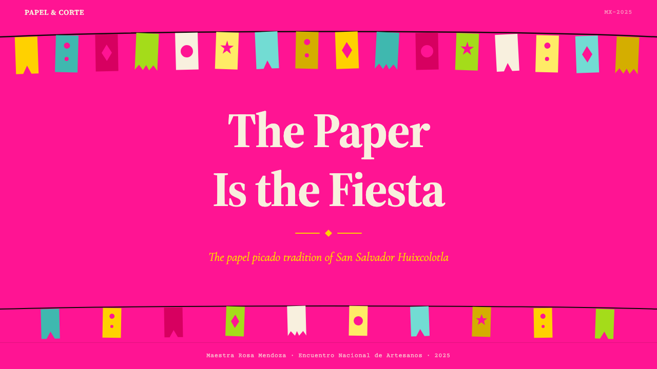
For editorial and marketing work, the style excels in contexts that want to signal warmth, festivity, and cultural connection — food brands, hospitality, cultural events, community organizations. A papel picado-inspired editorial layout uses wide, layered color bands across the top of the page to echo the garland format, body text on a cream ground, and chapter or section markers that echo the banner's rectangular module. Marketing materials — posters, social cards, event invitations — can embrace the full palette at high saturation, layering color fields with open perforation-style motifs in white or cream to create the characteristic visual depth. The style is especially strong for Día de Muertos-adjacent and Latino cultural marketing, where it carries genuine resonance rather than decorative borrowing.在编辑与营销内容中,该风格在希望传递温暖、节庆感与文化联结的场景中尤为出色——食品品牌、酒店餐饮、文化活动、社区组织。受剪纸花启发的编辑版面在页面顶部使用宽阔的层叠色带呼应彩带格式,正文置于奶油底面,章节标记呼应旗帜的矩形模块。营销材料——海报、社交卡片、活动邀请函——可在高饱和度下拥抱完整色板,以白色或奶油色的开放穿孔风格图案叠加于色域之上,创造出标志性的视觉深度。该风格对亡灵节相关内容与拉丁文化营销尤为有力,在那些场景中它承载的是真实的文化共鸣,而非装饰性借用。
A common mistake when applying this style is mistaking its abundance for permission to use all colors simultaneously at equal intensity across all elements. Authentic papel picado has hierarchy within its richness: the banner format contains the color, the perforations create breathing room within each banner, and the sky or wall behind provides the neutral foil that makes the saturation legible. In digital application, this translates to maintaining neutral zones — white, cream, or off-white backgrounds — where the eye can rest between encounters with the saturated palette. A composition where everything is simultaneously at maximum saturation reads as overwhelming rather than celebratory. The goal is abundance with rhythm, not chaos.应用这种风格时最常见的错误,是将它的丰盛误读为在所有元素上同时以等量强度使用所有色彩的许可。真实的剪纸花在其丰富性中具有层级:旗帜格式包容着色彩,穿孔在每幅旗帜内部创造呼吸空间,旗帜后方的天空或墙壁提供使饱和度得以清晰辨读的中性衬托。在数字应用中,这转化为维持中性地带——白色、奶油色或近白背景——让眼睛在每次与饱和色板的相遇之间得以休息。一个所有元素同时处于最大饱和度的构图,读来是压倒性的,而非庆典性的。目标是有韵律的丰盛,而非混乱。
See the Mexican Papel Picado Tissue design system查看 Mexican Papel Picado Tissue 完整设计系统
Mexican Papel Picado Tissue — FAQMexican Papel Picado Tissue · 常见问题
Is papel picado only appropriate for Mexican or Day of the Dead themed projects?剪纸花只适合墨西哥主题或亡灵节相关项目吗?
The cultural specificity of papel picado is real and should be taken seriously — this is not a style to apply carelessly to unrelated contexts. That said, its core visual logic — layered translucent color, geometric banner rhythm, perforated negative space, celebratory saturation — is transferable to any project where festivity, warmth, and visual richness are appropriate values. Wedding and event design, food and hospitality brands, community and cultural institutions, and festival marketing across many cultures can all draw from this system authentically. The test is not whether the project is explicitly Mexican but whether the values of celebration, craft, and joyful abundance are genuine to the product's purpose. Superficial application that treats the style as exotic decoration without engaging its structural logic is both aesthetically weak and culturally disrespectful.剪纸花的文化特殊性是真实存在的,应当认真对待——这不是一种可以随意应用于无关场景的风格。话虽如此,其核心视觉逻辑——层叠的半透明色彩、几何旗帜韵律、穿孔负空间、庆典式饱和度——可以迁移至任何庆典感、温暖感与视觉丰富性是适当价值观的项目中。婚礼与活动设计、食品与酒店品牌、社区与文化机构、以及各种文化背景下的节庆营销,都可以真实地从这套系统汲取灵感。判断标准不在于项目是否明确与墨西哥相关,而在于庆典、手工艺与欢乐丰盛的价值观是否真实地属于该产品的目的。将这种风格作为异域装饰而不介入其结构逻辑的表面化应用,在美学上是软弱的,在文化上是不尊重的。
How do you handle the translucency effect in digital design where elements are opaque by default?在元素默认不透明的数字设计中,如何处理半透明效果?
The translucency of tissue paper is one of papel picado's defining qualities, but it can be approximated in digital work through several approaches that do not require literal transparency. Layering slightly lighter or more muted versions of adjacent colors in overlap zones — so that where a pink banner and a yellow banner cross, the overlapping region reads as a warm peach — simulates the optical mixing of light through tissue. Another approach is to use genuinely semi-transparent color fills in overlap regions, which works well in both screen and print contexts. The key is that the overlap must be visible and intentional, not hidden or smoothed away. In contexts where transparency is not practical, a graphic pattern of the same hue family used in the overlap zone achieves a similar reading.薄纸的半透明性是剪纸花的决定性品质之一,但在数字设计中可以通过几种不要求字面透明度的方法来近似实现。在重叠区域叠加相邻色彩略浅或略淡的版本——使粉旗与黄旗交叉处呈现温暖的桃色——模拟光线穿过薄纸的光学混合。另一种方法是在重叠区域使用真正半透明的色彩填充,在屏幕与印刷场景中都效果良好。关键在于重叠必须是可见且有意为之的,而非被隐藏或消弭。在透明度不实际可行的场景中,在重叠区域使用同色系的图形纹样可以达到类似的视觉效果。
What is the difference between authentic papel picado and the machine-cut plastic versions?正宗剪纸花与机器裁切塑料版本有什么区别?
The distinction is both material and aesthetic. Authentic hand-cut papel picado is made from tissue paper — thin, translucent, biodegradable — using mallets and chisels operated by trained artisans who can cut dozens of layers simultaneously. Machine-cut plastic versions replicate the silhouette of the motifs but lose the tissue's translucency, the slight irregularities of hand work, the way the paper catches and diffuses light, and the material softness that makes hand-cut banners flutter rather than flap. From a design standpoint, the plastic version is a logo compared to a painting — technically derived from the same source but missing the qualities that made the source meaningful. For design applications drawing from this tradition, the hand-cut tissue qualities — translucency, slight imperfection, luminous color — are the ones worth emulating, not the harder, more mechanical character of the plastic imitations.这种区别既是材料层面的,也是美学层面的。正宗的手工剪纸花由薄纸制成——轻薄、半透明、可生物降解——由训练有素的工匠使用木槌和凿子操作,可同时切割数十层。机器裁切的塑料版本复制了图案的轮廓,但失去了薄纸的半透明性、手工的轻微不规则感、纸张捕捉并漫射光线的方式,以及使手工旗帜飘扬而非拍打的材料柔软性。从设计角度看,塑料版本相对于原作,如同商标相对于绘画——技术上源自同一来源,却缺失了使来源有意义的那些品质。对于从这一传统汲取灵感的设计应用而言,值得效仿的是手工薄纸的品质——半透明性、轻微不完美、发光的色彩——而非塑料仿制品更为坚硬、更为机械的特性。
Can this style work in a restrained or minimal context, or does it require full festive intensity?这种风格能在克制或简约的场景中使用吗,还是必须全情投入节庆式的强烈感?
Papel picado can absolutely be applied at reduced intensity without losing its identity, but the reduction must be systematic rather than arbitrary. The most successful restrained applications retain the structural elements — the rectangular banner module, the perforation-style patterning, the layered-color logic — while pulling back the number of simultaneous hues to two or three and increasing the proportion of neutral ground. A cream background with one vivid tissue-pink accent and a single perforation-pattern detail border reads as papel picado-derived without overwhelming. What cannot be reduced is the quality of the color itself: a muted, desaturated version of the palette produces something that reads as vaguely ethnic and decorative rather than specifically grounded in this tradition. The saturation is not optional — it is the tradition's visual voice. Reduce the quantity of color, but never its quality.剪纸花完全可以以降低的强度应用而不失去其身份,但这种降低必须是系统性的,而非任意的。最成功的克制应用保留了结构性元素——矩形旗帜模块、穿孔风格图案、层叠色彩逻辑——同时将同时出现的色调数量减少至两三种,并增加中性底面的比例。奶油底面配以一种鲜亮的薄纸粉作为强调色,再加一条单一的穿孔图案细节边框,读来具有剪纸花的衍生感而不至压倒一切。不能削减的是色彩本身的品质:一个柔和、去饱和的色板版本,读来像是模糊的民族装饰感,而非具体植根于这一传统。饱和度不是可选项——它是这一传统的视觉声音。减少色彩的数量,但永远不要降低色彩的质量。
How does papel picado relate to other perforated or cut-paper traditions around the world?剪纸花与世界其他地方的穿孔或剪纸传统有什么关系?
Cut-paper and perforated-paper traditions appear across many cultures — Chinese jiǎnzhǐ, Polish wycinanki, German Scherenschnitte, Japanese kirigami, Indian rangoli border patterns translated into paper, and the amate bark-paper offerings of pre-Hispanic Mesoamerica that are among papel picado's own ancestors. What distinguishes the Mexican tissue-banner tradition is its specific combination of features: the sequential banner format designed for garland stringing, the tissue-paper material with its particular translucency and luminosity, the saturated multi-color palette that uses four or more hues simultaneously, and the specific iconographic vocabulary of Día de Muertos and Catholic folk-festival imagery. Other cut-paper traditions tend toward single-color or two-color work, or toward framed individual compositions rather than repeating garland modules. The combination of all these features together — material, format, palette, iconography, and ritual context — is what makes papel picado visually and culturally distinct.剪纸与穿孔纸艺传统出现于许多文化之中——中国剪纸、波兰wycinanki、德国Scherenschnitte、日本切り紙、印度rangoli边框纹样的纸质转译,以及作为剪纸花自身祖先之一的前哥伦布时期中美洲树皮纸供品。墨西哥薄纸旗帜传统的独特之处在于其特定的特征组合:为串联彩带而设计的序列旗帜格式,具有特定半透明性与发光品质的薄纸材料,同时使用四种以上色调的饱和多色色板,以及亡灵节与天主教民间节庆图像的特定图像词汇。其他剪纸传统倾向于单色或双色作品,或倾向于框架式的独立构图而非重复的彩带模块。所有这些特征的组合——材料、格式、色板、图像志与仪式语境——共同构成了剪纸花在视觉上与文化上的独特性。
Related design styles相关设计风格
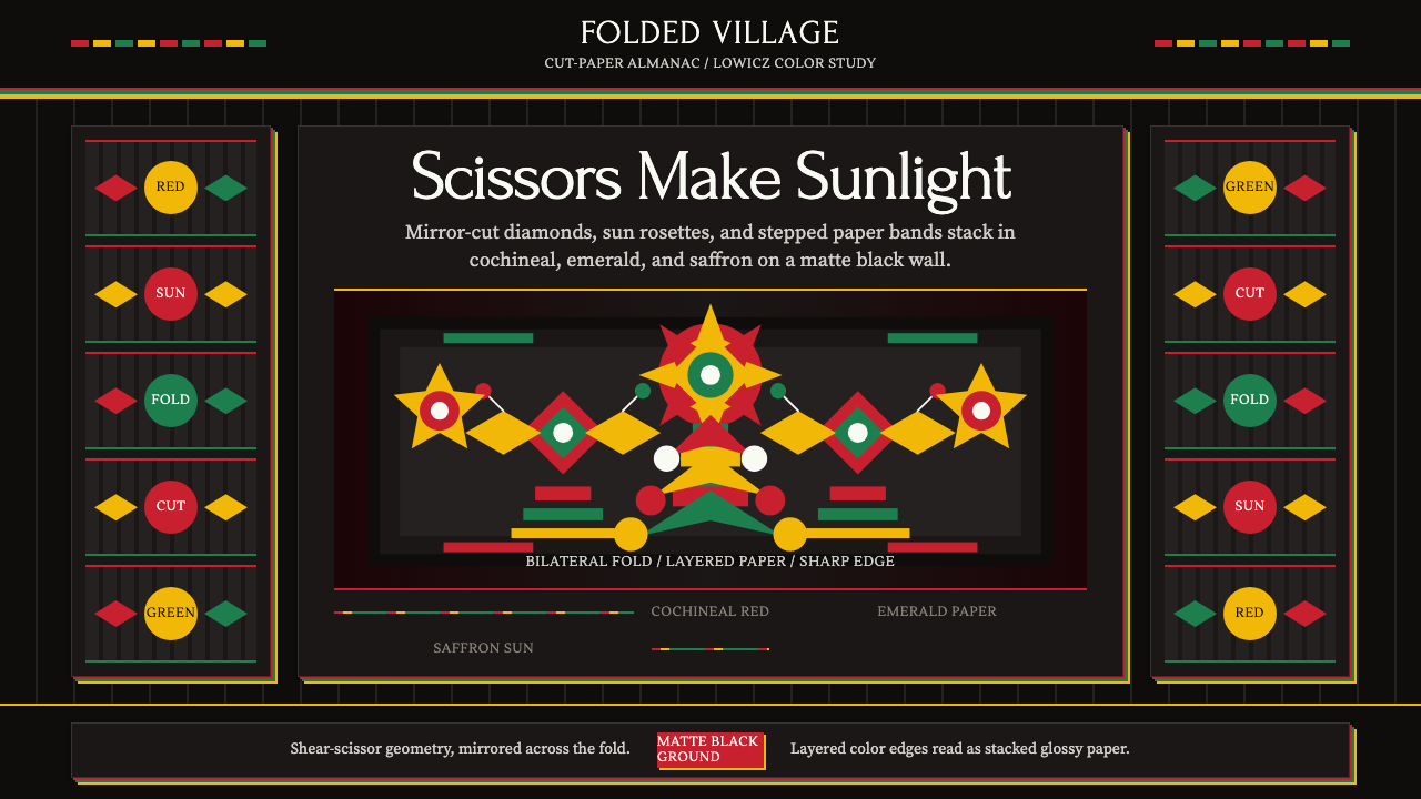 Polish Wycinanki (paper-cut folk art)Cuts sing in symmetry. Cochineal, emerald, and saffron layers blaze on black.剪纸以对称歌唱:胭脂红、翡翠绿、藏红花黄叠在黑底上。
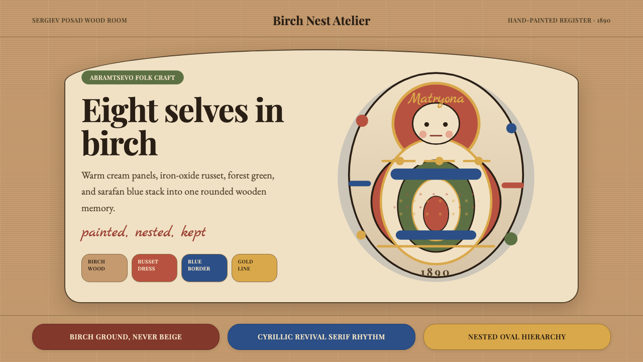 Russian Matryoshka 1890Warmth nests inward. Birch, cream, russet, and egg-oval type stage handmade d…温暖层层内嵌。白桦木、奶油色与赭红蛋形排版构成手绘深度。
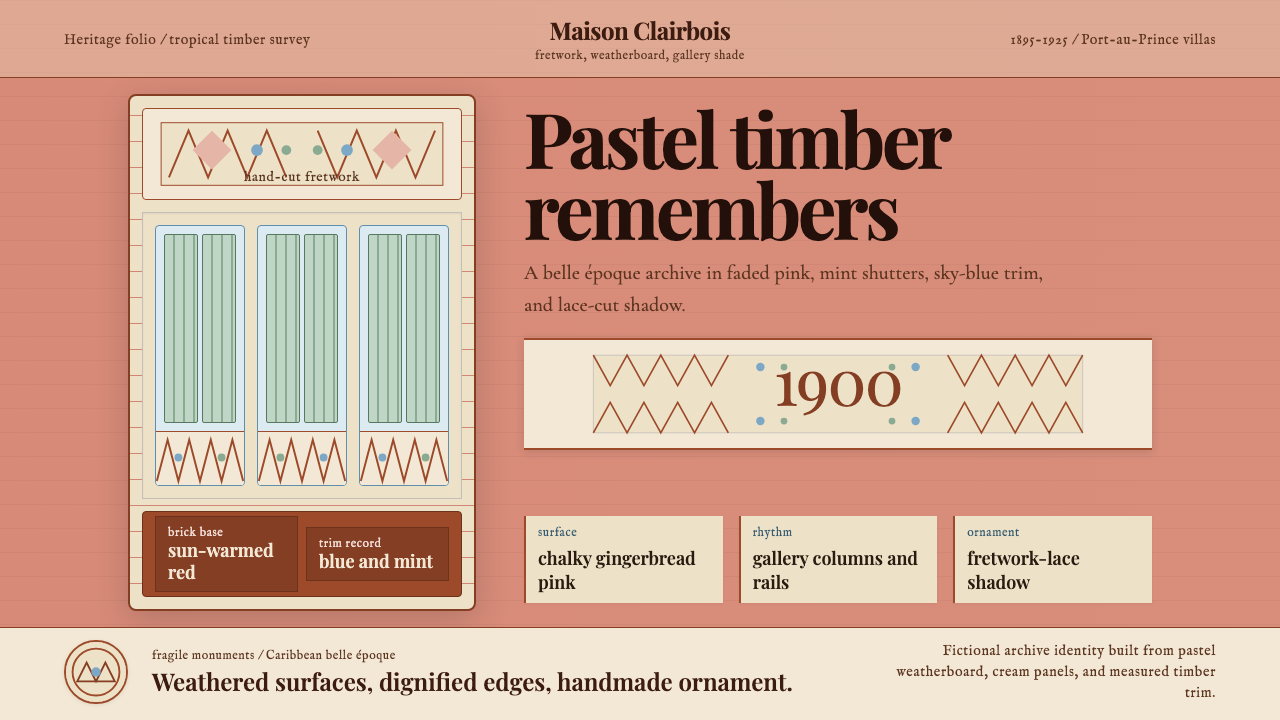 Haitian Gingerbread House (1900)Fragile elegance endures. Faded pink walls carry mint shutters and fretwork-l…脆弱而优雅:褪粉墙面承载薄荷百叶与镂花节奏。
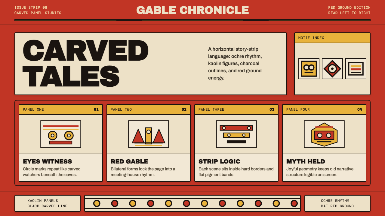 Palauan Bai StoryboardNarrative hits like carved wood. Bai red, ochre bands, kaolin panels, black o…叙事如木刻般鲜明:拜屋红、赭黄带、白陶土面板与黑色刻线。
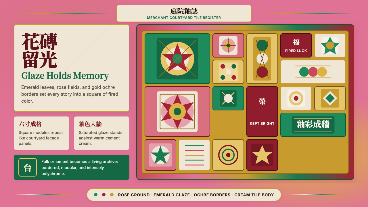 Taiwanese Painted Tile VernacularGlaze refuses to fade. Rose ground, emerald modules, ochre borders form a til…釉色不褪。玫瑰粉底、翠綠方格與金赭邊框砌成花磚牆。
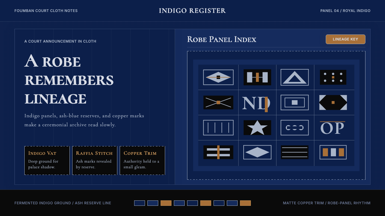 Cameroonian Ndop Royal IndigoReads like court cloth. Indigo panels, ash stitch grids, and matte copper kee…宫廷布幅般庄重。靛蓝面板、灰白针脚与哑铜放慢阅读。