Design style guide设计风格指南
What is Polish Wycinanki (paper-cut folk art)?什么是 Polish Wycinanki (paper-cut folk art)?
Polish Wycinanki turns the humble act of cutting paper into a blazing ritual of symmetry, roosters, and layered color that transforms any surface it touches.波兰维齐南基将剪纸这件朴素的事,变成一场由对称、公鸡和叠层色彩构成的炽烈仪式,让它所触及的每一个平面都焕然一新。
Polish Wycinanki (paper-cut folk art) in briefPolish Wycinanki (paper-cut folk art) 速览
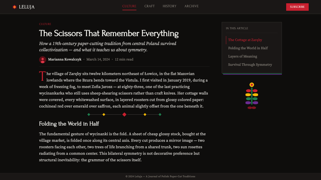
Wycinanki (pronounced roughly vee-chee-NAHN-kee) is the Polish folk art of cutting colored paper into elaborate symmetrical compositions. Peasant women in the Łowicz and Kurpie regions of central Poland developed this tradition using nothing more than sheep-shearing scissors — the same heavy, curved blades used to clip wool — and sheets of brightly dyed paper. The results were intricate layered compositions of roosters, flowers, sun rosettes, trees of life, and abstract geometric medallions, displayed on the freshly whitewashed walls of rural cottages.维齐南基(Wycinanki)是波兰民间剪纸艺术,用彩色纸张剪出精细的对称构图。波兰中部沃维奇和库尔皮耶地区的农村妇女,仅凭剪羊毛用的大剪刀——那种沉甸甸的弯刃——和几张染色的彩纸,发展出了这一传统。她们剪出公鸡、花朵、太阳花饰、生命之树和抽象几何徽章,张贴在农舍刚刷白的墙上。
What distinguishes Wycinanki from other paper-cutting traditions worldwide is its specific combination of bilateral mirror symmetry, saturated color layering, and a dark display ground. The artist works by folding paper and cutting through multiple layers at once, so that a single snip creates matching forms on both sides of the fold. Multiple cuts of differently colored paper are then layered atop one another, building up compositions in which cochineal reds, emerald greens, saffron yellows, and ultramarine blues compete and harmonize against a matte black backing.维齐南基有别于世界其他剪纸传统的,正是它特有的三重组合:双侧镜像对称、饱和叠层色彩,以及深色展陈底面。艺术家将纸折叠后一刀剪透多层,使同一剪口在折痕两侧同时产生对称图形。然后,不同颜色的纸层层叠压,把胭脂红、翡翠绿、藏红花黄和群青蓝层叠在哑光黑底之上,既相互竞争又彼此和谐。
Visually, Wycinanki is immediately recognizable — and almost paradoxically bold for an art made with scissors and paper. The black ground throws every color forward, creating an effect closer to stained glass or illuminated manuscript than to anything we ordinarily associate with rural handicraft. Every edge is crisp and absolute; there is no blending, no shading, no gradation. Pure saturated hues sit side by side in hard-edged silhouette, producing a visual energy that is festive, forceful, and deeply geometric.维齐南基在视觉上几乎一眼可辨——对于一门用剪刀和纸完成的手工艺来说,它的大胆程度近乎矛盾。黑色底面将每一种颜色都向前推,产生的效果更接近彩色玻璃窗或泥金手稿,而非人们通常联想到的乡村工艺品。每一条边都锐利而绝对,没有晕染,没有阴影,没有渐变——纯粹的饱和色并排而列,以硬边剪影的方式呈现,迸发出欢腾、有力而深具几何感的视觉张力。
Where does Polish Wycinanki (paper-cut folk art) come from?Polish Wycinanki (paper-cut folk art) 从何而来?
The precise origins of Wycinanki are difficult to pin down, because paper-cutting as a domestic practice almost certainly predates the first documentary records of it. Ethnographers began seriously cataloguing the tradition in the 1880s, when Maria Znamierowska-Prüfferowa and other Polish folklorists visited villages in the Mazowsze and Łowicz regions and found the practice already well established. By then, the tradition likely stretched back several generations — to roughly the 1820s or 1830s — when imported colored paper became affordable enough for village households to use decoratively.维齐南基的确切起源难以追溯,因为作为一种家庭手工艺,剪纸实践的历史几乎必然早于最初的文字记录。民俗学家从19世纪80年代开始认真整理这一传统——玛丽亚·兹纳米耶罗夫斯卡-普律费罗娃等波兰民俗研究者走访马佐夫舍和沃维奇地区的村庄时,发现这一习俗已十分成熟。彼时,这一传统可能已传承了数代,其源头大约可追溯至19世纪20至30年代——当进口彩色纸张变得足够廉价,普通农家才开始将其用于装饰。
Two regional styles emerged as the most distinctive. The Łowicz style (from the plains south-west of Warsaw) is characterized by multi-layered, multi-colored compositions of extreme chromatic richness. A single Łowicz piece might layer six or seven differently colored sheets, one atop another, with each layer contributing a different element — a red rooster, a green leafy branch, a yellow floral wreath — to the final composite image. The Kurpie style (from the forested region north-east of Warsaw) tends toward single-color or two-color silhouettes — typically black on white or white on color — favoring spindly tree-of-life compositions with branching forms of great linear delicacy. Both traditions rely on bilateral symmetry as an organizing principle, but Łowicz pushes toward chromatic maximalism while Kurpie leans toward graphic economy.两种地域风格最为鲜明。沃维奇风格(来自华沙西南平原)以极度丰富的多层多色构图为特征——一件沃维奇作品可能叠压六七层不同颜色的纸,每一层贡献不同的元素:红色公鸡、绿色枝叶、黄色花环,共同构成最终的复合图像。库尔皮耶风格(来自华沙东北的森林地带)则倾向于单色或双色剪影,通常是黑底白图或彩底白图,偏爱线条纤细、枝桠蔓延的生命之树构图。两种传统都以双侧对称为组织原则,但沃维奇走向色彩的极致繁复,库尔皮耶则追求图形的简洁。
The social function of Wycinanki was intimately tied to seasonal renewal and domestic ritual. Cottage walls were re-whitewashed before Easter each year, and the fresh paper-cuts were applied to the new white surface as part of the preparation for the holiday. Wycinanki also appeared at weddings and other festive occasions. The motifs were not arbitrary: roosters symbolized fertility and protection from evil; the sun rosette marked the transition of seasons; the tree of life connected the household to ancestral continuity. The art was transmitted from mother to daughter, with individual families developing recognizable personal styles within the shared regional vocabulary.维齐南基的社会功能与季节更替和家庭仪式密不可分。农舍墙壁每年复活节前都会重新刷白,新剪的纸饰便贴在新白的墙面上,作为节日准备的一部分。维齐南基也出现在婚礼和其他节庆场合。图案并非随意为之:公鸡象征生育力与驱邪护宅;太阳花饰标志季节更迭;生命之树将家庭与祖先血脉相连。这门艺术由母亲传授给女儿,各家各户在共同的地域图式中发展出各自可辨识的个人风格。
The twentieth century brought both threat and revival. The disruptions of two world wars and the mass migration of rural populations to industrial cities put the tradition at risk of extinction. The Cepelia folk cooperative, established in Poland after World War II, played a decisive role in preserving and commercializing Wycinanki alongside other Polish folk crafts. Artists such as Apolonia Nowak and Jadwiga Wojtczak became celebrated practitioners whose work was collected by museums and exhibited internationally, transforming what had been a domestic wall decoration into a recognized fine-art medium. Today, Wycinanki is taught in regional cultural centers, featured in Polish design exports, and recognized by UNESCO as a form of intangible cultural heritage.二十世纪既带来了威胁,也带来了复兴。两次世界大战的冲击,加上农村人口大规模向工业城市迁徙,令这一传统濒于失传。战后在波兰成立的切佩利亚民间合作社(Cepelia),在保护和推广维齐南基及其他波兰民间手工艺方面发挥了决定性作用。阿波罗尼亚·诺娃克和亚德维加·沃伊茨扎克等艺术家成为享誉国际的名家,她们的作品被博物馆收藏,在海外展出,将原本的家居装饰品提升为获得承认的艺术媒介。今天,维齐南基在各地区文化中心被列入教学课程,跻身波兰设计出口产品,并被联合国教科文组织列为非物质文化遗产。
What defines the Polish Wycinanki (paper-cut folk art) look?Polish Wycinanki (paper-cut folk art) 的视觉特征是什么?
Bilateral Mirror Symmetry双侧镜像对称
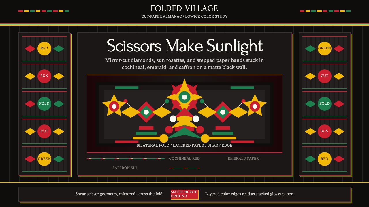
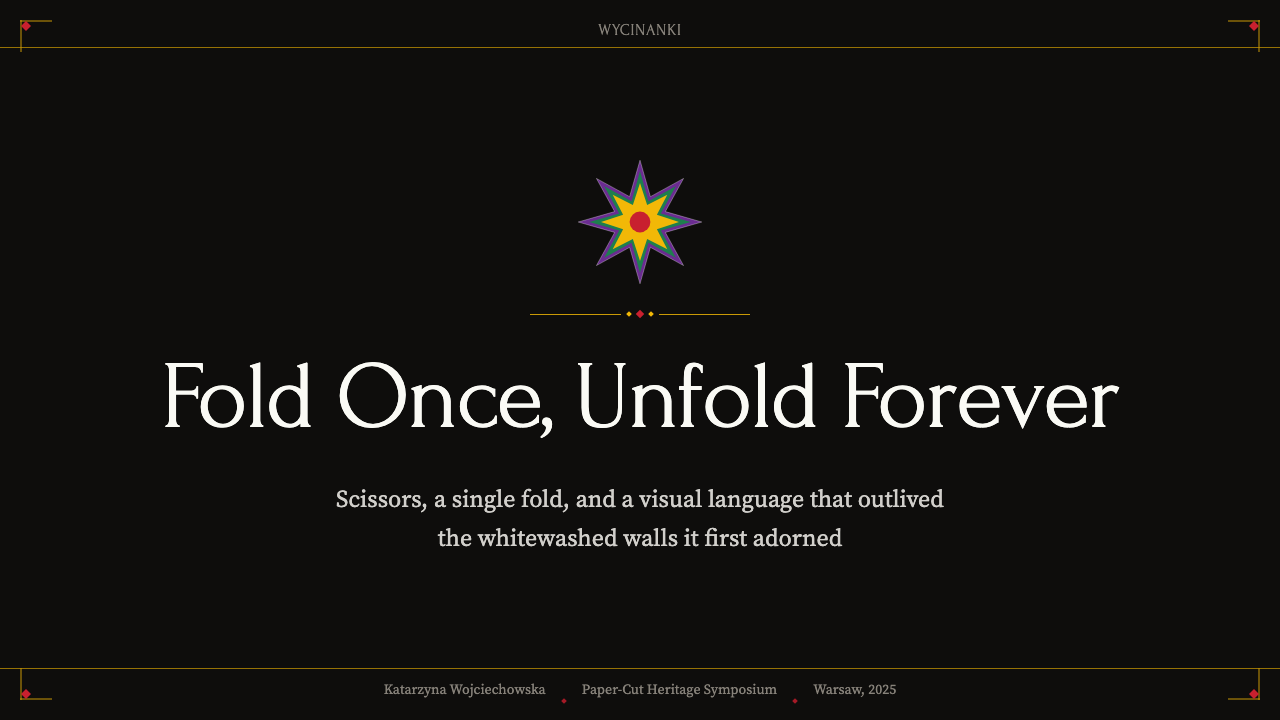
Every Wycinanki composition is organized around an axis of bilateral symmetry — what appears on the left is exactly mirrored on the right, and often what appears on the top is mirrored on the bottom as well. This symmetry is not an aesthetic choice imposed from outside; it is a mechanical consequence of the folding-and-cutting technique. The fold creates the mirror line, and the scissors cut through both halves at once, guaranteeing absolute precision. The result is a visual rhythm of paired forms — two roosters, two blossoms, four identical petals radiating from a center — that feels simultaneously archaic and almost hypnotic.每一件维齐南基构图都以双侧对称轴为核心——左侧与右侧完全镜像,上下往往也互为呼应。这种对称并非外加的美学选择,而是折叠剪切技法的必然结果:折叠形成镜像轴,剪刀同时穿透两层,保证了绝对的精准。最终呈现的是成对图形的视觉律动——两只公鸡、两朵花、四片从中心放射的等同花瓣——给人一种既古老又近乎催眠的感受。
Saturated Chromatic Layering饱和叠层色彩
The signature color logic of Łowicz Wycinanki is additive layering: individual sheets of deeply saturated color are stacked one atop another, each contributing a distinct hue to the composition. The palette typically draws from a set of intensely saturated warm and cool tones — deep reds and pinks, vivid greens, bright yellows, and strong blues or purples — used at full chromatic intensity with no softening or mixing. Unlike painting, where colors can be blended or muted, each paper layer retains its pure hue. The complexity of the composition emerges not from blending but from the contrast and juxtaposition of pure color zones.沃维奇维齐南基的标志性色彩逻辑是叠加分层:每张高饱和彩纸依次叠压,各自为构图贡献一种独立的色相。色板通常取自一组极度饱和的冷暖色调——深红与粉红、鲜艳的绿、明亮的黄、浓郁的蓝或紫——以全色度强度呈现,无任何柔化或混合。不同于绘画可以调色或降饱和,每层纸都保持其纯粹色相。构图的复杂性不来自混合,而来自纯色区域的对比与并置。
Matte Black Ground哑光黑色底面
The display convention for Łowicz Wycinanki sets the multi-colored paper-cut against a matte black backing, and this choice is fundamental to how the colors behave. On a white ground, saturated colors would compete with the brightness of the background; on black, every hue is thrown forward with maximum vividness, and the contrast between the dark ground and the brilliantly colored forms becomes the primary visual event. The black ground also serves a compositional function: the uncut black areas become part of the design, creating shadow-like negative space that gives the overall composition depth and structure.沃维奇维齐南基的展陈惯例是将多彩剪纸置于哑光黑色底面上,这一选择从根本上决定了色彩的呈现方式。在白色底面上,饱和色会与背景的亮度相互竞争;而在黑底上,每种色相都以最大的鲜亮度向前跃出,深色底面与炽烈有色形态之间的对比,成为最主要的视觉事件。黑色底面同时承担构图功能:未被剪去的黑色区域本身成为设计的一部分,形成类似阴影的负形空间,赋予整体构图深度与结构。
Archetypal Folk Motifs原型民间图案
Wycinanki's vocabulary is not open-ended: it draws from a finite set of archetypal motifs that recur across generations and regions. The dominant figures are the rooster (a symbol of protection, vitality, and the warding off of evil), the peacock (associated with pride and beauty), the tree of life (connecting earthly and spiritual realms), the sun rosette (marking cyclical time and harvest), and the stylized floral bouquet. These motifs are not depicted realistically — the rooster is not a naturalistic bird but a highly geometrized form built from layered semicircles, pointed tail feathers, and bold comb shapes. All representation is absorbed into geometric rhythm.维齐南基的图像词汇并非无限开放,而是取自一套在历代地区间反复出现的原型图案。主导图形包括:公鸡(象征保护、活力和驱邪),孔雀(与骄傲和美丽相关),生命之树(连接尘世与灵性领域),太阳花饰(标志循环时间与丰收),以及程式化的花束。这些图案并非写实描绘——公鸡不是自然主义的飞禽,而是由叠压的半圆、尖形尾羽和粗犷鸡冠构成的高度几何化形态。一切具象描绘都被吸纳进几何律动之中。
Hard-Edge Precision硬边精准
Because the medium is cut paper rather than painted or drawn line, every edge in Wycinanki is absolutely clean. There is no equivalent of a brushstroke wobble, no pencil smear, no gradual transition between figure and ground. The edge of a cut paper form is as precise as the blade that made it — sharp, decisive, and unambiguous. This hard-edge quality means that Wycinanki forms translate with unusual fidelity to digital contexts: they can be reproduced at any scale without loss, and vector interpretations preserve the original quality of the cuts in a way that is impossible with softer, more textured folk art forms.由于媒介是剪纸而非绘制的线条,维齐南基的每一条边都绝对干净。没有笔触的抖动,没有铅笔的蹭痕,没有图形与底面之间的渐变过渡。剪纸边缘的精准度与剪出它的刀刃一样——锐利、果断、毫无歧义。这种硬边特质意味着维齐南基图形在数字语境中具有异乎寻常的可移植性:可以在任何尺寸下复制而不失真,矢量化诠释能以更柔和的民间艺术形式无法企及的方式,完整保留剪切的原始品质。
Festive Density and Abundance节庆的密度与丰盛
Unlike modernist traditions that prize negative space and compositional restraint, Wycinanki deliberately fills its frame. A finished piece is dense with form — leaves, petals, birds, and geometric borders accumulate until the composition reaches a state of controlled abundance that reads as celebratory excess. The compositional logic is centrifugal: motifs radiate outward from a central axis or medallion, branching and proliferating as they move toward the edges. White space is not a virtue here; fullness is. This density is central to the aesthetic's festive charge and is what makes it immediately recognizable as folk art rather than fine-art minimalism.不同于推崇留白与构图克制的现代主义传统,维齐南基刻意填满画面。一件完成的作品密布形态——叶片、花瓣、飞禽、几何边框层层累积,直至构图达到一种有节制的丰盛状态,呈现出欢庆的饱胀感。构图逻辑是离心式的:图案从中心轴或中心徽章向外辐射,向边缘延伸时不断分枝、增殖。留白在这里不是美德,丰满才是。这种密度是这一美学节庆感的核心,也是让它一眼就被辨认为民间艺术而非精英极简主义的关键所在。
Regional Dialect Variations地域方言变体
Although all Wycinanki shares the core technique of folded-and-cut paper, distinct regional styles constitute genuine visual dialects. Łowicz Wycinanki is the most internationally recognized variant, defined by its multi-color layering and the matte black ground. Kurpie Wycinanki tends to work in a single strong color against white, favoring spindly tree-of-life forms and a more linear, graphic quality. Lublin-region Wycinanki may incorporate additional narrative elements and a broader range of figurative subjects. These are not superficial variations — the regional styles encode different aesthetic priorities, different symbolic vocabularies, and different relationships between the figure and its ground.尽管所有维齐南基都共享折叠剪纸的核心技法,不同地区的风格构成了真正的视觉方言。沃维奇维齐南基是国际上最广为人知的变体,以多色叠层和哑光黑色底面为特征。库尔皮耶维齐南基倾向于以单一的强烈色彩对白色底面,偏爱纤细的生命之树形态,呈现出更具线条感的图形品质。卢布林地区的维齐南基可能包含更多叙事元素和更宽泛的具象题材。这些并非表面上的变体——各地区风格编码着不同的美学优先级、不同的象征词汇,以及图形与底面之间不同的关系。
Who shaped Polish Wycinanki (paper-cut folk art)?谁塑造了 Polish Wycinanki (paper-cut folk art)?
Among the most celebrated Łowicz Wycinanki artists of the twentieth century, Nowak's work exemplifies the tradition at its most chromatic and compositionally complex. Her multi-layered roosters and floral medallions were collected by Polish state institutions and exhibited abroad, helping elevate the tradition from anonymous domestic craft to individually attributed folk art. Her career, spanning most of the latter half of the twentieth century, represents the period when Cepelia's institutional support gave professional legitimacy to master practitioners.诺娃克是二十世纪最受推崇的沃维奇维齐南基艺术家之一,其作品代表了这一传统在色彩和构图复杂性上的极致。她的多层公鸡与花卉徽章被波兰国家机构收藏,并在海外展出,推动这一传统从无名家庭手工艺提升为有个人署名的民间艺术。她的创作生涯跨越二十世纪后半叶大部分时光,正是切佩利亚民间合作社的制度支持赋予了杰出从业者职业认可的时期。
Wojtczak is another major figure in the Łowicz tradition whose work demonstrates the extraordinary range of compositional invention possible within the tradition's fixed motif vocabulary. Working with rooster, peacock, and tree-of-life forms that any Łowicz practitioner would recognize, she developed arrangements of such visual density and color orchestration that her pieces approach the formal complexity of tapestry. Her work was central to international museum presentations of Polish folk art and has become a reference point for contemporary designers drawing on the Wycinanki aesthetic.沃伊茨扎克是沃维奇传统中的另一位重要人物,其作品展示了在固定图案词汇内能够实现的惊人构图创造力。她使用任何沃维奇艺术家都熟悉的公鸡、孔雀和生命之树图形,发展出视觉密度和色彩编排极为精湛的布局,使其作品在形式复杂性上接近挂毯的水准。她的作品是国际博物馆波兰民间艺术展示的核心内容,也成为当代设计师汲取维齐南基美学的重要参照。
An ethnographer and museum curator rather than a practitioner, Znamierowska-Prüfferowa was nevertheless one of the most important figures in the history of Wycinanki as a recognized cultural form. Her systematic fieldwork in the 1880s and beyond, documenting the distribution of regional paper-cutting styles across Poland, established the scholarly foundation on which all subsequent preservation and promotion efforts rested. The Łowicz Museum collections that preserve historical examples of the tradition owe their scope largely to her early collecting and cataloguing work.兹纳米耶罗夫斯卡-普律费罗娃是民俗学家和博物馆馆长,而非从业者,但她仍是维齐南基作为公认文化形式的历史上最重要的人物之一。她从19世纪80年代开始的系统性田野调查,记录了波兰各地区剪纸风格的分布,为此后所有保护与推广工作奠定了学术基础。收藏历史剪纸作品的沃维奇博物馆馆藏,其规模在很大程度上归功于她早期的收集与整理工作。
A major nineteenth-century Polish Realist painter, Chełmoński is not a Wycinanki practitioner but his paintings of rural Polish life — cottage interiors, peasant figures, village celebrations — provide the most vivid visual documentation of the social context in which Wycinanki was created and displayed. His depictions of cottage walls decorated with paper-cuts, done at a time when the tradition was at its peak of domestic vitality, constitute an invaluable historical record. For designers approaching Wycinanki, Chełmoński's paintings offer a sense of how the art functioned in its original environment: not as isolated artifact but as one element of a richly decorated domestic world.切尔莫尼斯基是十九世纪波兰重要的现实主义画家,他本人并非维齐南基从业者,但他描绘波兰农村生活的画作——农舍室内、农民形象、乡村庆典——为维齐南基的创作与展示语境提供了最为生动的视觉文献。他在这一传统处于家庭活力顶峰时期绘制的、装饰着剪纸的农舍墙壁画作,构成了不可多得的历史记录。对于研究维齐南基的设计师来说,切尔莫尼斯基的画作能让人感受到这门艺术在原生环境中的功能:它不是孤立的物件,而是一个丰富装饰的家居世界中的一个组成元素。
How do you use Polish Wycinanki (paper-cut folk art) today?今天怎么用 Polish Wycinanki (paper-cut folk art)?
Wycinanki is one of the most visually distinctive folk-art systems available to contemporary designers, and its core properties — bilateral symmetry, hard-edged form, saturated color on dark ground — translate with unusual clarity into digital work. Unlike many historical styles that require either literal reproduction or extensive abstraction before they become usable, Wycinanki's inherent geometry and vector-compatible edge quality make it naturally at home in screens, slides, and print without mediation.维齐南基是当代设计师所能调用的视觉最鲜明的民间艺术体系之一,其核心特质——双侧对称、硬边形态、深色底面上的饱和色彩——在数字作品中的转化异常清晰。不同于许多需要原样复制或大量抽象才能进入设计实践的历史风格,维齐南基固有的几何性与矢量兼容的边缘品质,使它在屏幕、幻灯片和印刷品中都能自然落地,无需过多转译。
For presentation slides, Wycinanki offers an immediately striking visual language for cover pages and section dividers. A cover slide in this mode works best with a near-black or deep charcoal background field, a large central motif in the tradition's characteristic rooster or radial floral form rendered as a vector silhouette, and the title set in a clean, generous typeface that lets the folk imagery carry the decorative weight. Avoid competing visual elements — the motif should be allowed to read as a complete statement. For content slides, restraint is essential: a single Wycinanki-derived border or medallion accent in the corner or header zone can anchor a slide in the aesthetic without overwhelming information.在演示文稿中,维齐南基为封面页和章节分隔页提供了极具冲击力的视觉语言。这种模式下的封面幻灯片最适合以近黑或深炭灰为背景底色,以传统公鸡或放射状花卉造型的大型矢量中心图案为主体,标题选用干净、舒朗的字体,让民间图案承担装饰的重量。避免引入相互竞争的视觉元素——图案应被允许作为一个完整陈述来阅读。对于内容幻灯片,克制至关重要:一条维齐南基风格的边框或角落位置的徽章点缀,足以将幻灯片锚定在这一美学之中,而不至于淹没信息。
For web interfaces, Wycinanki works best as a bold accentual layer rather than an all-over system. A dark-ground hero section with a large bilateral symmetry motif as a background element can establish the visual tone of a brand or campaign page immediately. In UI contexts — product cards, navigation elements, pricing tiers — translating the saturated palette into a careful set of accent colors used against near-black surfaces creates richness without visual chaos. The folk-art associations make this system particularly apt for products in cultural, artisanal, festive, or heritage-adjacent categories. It reads less well in purely technical or enterprise contexts where the ornamental density may conflict with clarity.在网页界面中,维齐南基更适合作为大胆的点睛层,而非铺满全局的系统。一个以近黑底面和大型双侧对称图案为背景元素的英雄区块,能立即确立品牌或活动页面的视觉基调。在产品卡片、导航元素、定价等级等具体界面场景中,将饱和色板转化为一组精心选取的强调色,搭配近黑底面使用,能营造丰富感而不至于产生视觉混乱。民间艺术的文化联想使这套体系特别适合文化、手工艺、节庆或传统类产品——在纯粹的技术性或企业语境中,装饰密度可能与清晰度产生冲突,效果则相对有限。
For editorial and marketing work, Wycinanki's festive density is one of its greatest assets. A full-bleed feature image built from a large symmetrical paper-cut composition against black makes a vivid editorial opening; smaller medallion motifs work as ornamental chapter or section markers in long-form content. In event marketing — concert posters, festival branding, seasonal campaigns — the style's connection to celebration and ritual gives it immediate emotional resonance. The palette's intensity also photographs well and maintains impact in both digital and physical print contexts.在编辑和营销设计中,维齐南基的节庆密度是其最大的资产之一。一幅以大型对称剪纸图案为主体、黑色底面出血的特写图,是一个生动的编辑开篇;较小的徽章图案可用作长篇内容的章节或段落装饰标记。在活动营销——音乐会海报、节日品牌、季节性活动——中,这种风格与庆典和仪式的天然连接赋予它即时的情感共鸣。这套色板的浓烈度在摄影中同样出色,在数字和实体印刷两种语境中都能保持视觉冲击力。
A common mistake when applying Wycinanki is reducing the tradition to its color palette alone — using saturated red, green, and yellow on dark backgrounds without the structural symmetry that gives those colors their coherence. The palette without the symmetry reads as generic folk decoration. Equally problematic is attempting to use Wycinanki as an all-over texture in complex information-dense layouts: the tradition's characteristic density, which is an asset in decorative or hero contexts, becomes a liability when it competes with body text, data tables, or interactive UI elements. Use the aesthetic to frame and establish tone; clear functional zones should remain visually quiet.应用维齐南基时最常见的错误,是把这一传统简化为单纯的色板——在深色背景上使用饱和红绿黄,却丢失了赋予这些色彩内聚力的结构对称性。色板离开对称,只会呈现为泛泛的民间装饰感。同样值得警惕的是,试图在复杂的信息密集型版面中把维齐南基作为全铺纹理使用:这一传统标志性的密度,在装饰性或英雄区块中是优势,一旦与正文、数据表格或交互界面元素竞争,便会成为负担。用这套美学来框定和确立基调,功能性清晰区域应保持视觉安静。
Polish Wycinanki (paper-cut folk art) — FAQPolish Wycinanki (paper-cut folk art) · 常见问题
How does Wycinanki differ from other paper-cutting traditions like Chinese jiǎnzhǐ or Japanese kirigami?维齐南基与中国剪纸或日本切り紙等其他剪纸传统有何不同?
All three traditions share the basic technique of cutting paper to create decorative forms, but the visual outcomes are quite different. Chinese jiǎnzhǐ typically works in a single color — most iconically red — and prioritizes intricate figurative cutting within a unified field. Japanese kirigami tends toward geometric abstraction and three-dimensional folded forms. Wycinanki's distinguishing feature is its multi-color layering system: rather than creating complexity through the intricacy of a single cut, it builds up chromatic richness by stacking multiple sheets of differently colored paper, with each layer adding a new hue and a new element to the composition. The matte black display ground is also a specifically Polish convention not found in the same form in other traditions.三者都以剪纸创造装饰图形为基本技法,但视觉结果差异显著。中国剪纸通常以单色呈现——最具代表性的是红色——在统一色域内追求精细的具象剪刻。日本切り紙倾向于几何抽象和立体折叠造型。维齐南基的独特之处在于其多色叠层体系:它不靠单张剪纸的繁复程度制造复杂性,而是通过叠压多层不同颜色的纸张来积累色彩丰富性,每一层都为构图增添新的色相和新的元素。哑光黑色展陈底面也是一个特定的波兰惯例,在其他传统中并无完全相同的形式。
Is Wycinanki strictly symmetrical, or is there room for asymmetric compositions?维齐南基是严格对称的吗?有没有非对称构图的空间?
The traditional Wycinanki produced by the folding technique is structurally symmetric because the fold itself enforces mirror duplication. However, asymmetric compositions do exist within the tradition — some pieces involve carefully placed single figures or narrative arrangements that do not depend on folding — and contemporary designers working in a Wycinanki-inspired mode have explored asymmetric applications of the palette and motifs. The key distinction is that symmetry in traditional Wycinanki is not just an aesthetic preference but a consequence of the process itself. When designers depart from bilateral symmetry, they move away from the tradition's deepest formal logic, even if they retain its color and motif vocabulary.传统维齐南基依折叠技法制作,在结构上是对称的,因为折叠本身就强制产生镜像复制。然而这一传统中确实存在非对称构图——有些作品包含精心放置的单独图形或叙事性排列,并不依赖折叠技法——当代以维齐南基为灵感的设计师也探索过色板和图案的非对称应用。关键的区别在于:传统维齐南基中的对称性不仅仅是美学偏好,而是工艺流程本身的结果。当设计师偏离双侧对称时,即便保留了色彩和图案词汇,也已偏离了这一传统最深层的形式逻辑。
How do you use Wycinanki's saturated palette without making a design feel garish?如何运用维齐南基的饱和色板,同时避免设计流于俗艳?
The key is the dark ground. In traditional Wycinanki, the saturated colors are not experienced in isolation — they are always read against matte black, which absorbs competing ambient energy and allows the colors to assert themselves without visual collision. On a white or light background, the same hues would likely feel overwhelming or discordant. When adapting the palette for design work, maintaining a strong dark anchor — whether as a background field, a framing element, or a dominant structural block — allows the bright accents to read as bold and festive rather than chaotic. A second discipline is restraint in the number of colors used simultaneously in any given zone: the traditional pieces can carry many colors because each one is contained in a distinct form. In UI or layout contexts, letting each color occupy its own territory is what keeps the composition legible.关键在于深色底面。在传统维齐南基中,饱和色并非孤立地被感知——它们始终映衬在哑光黑底之上,黑色吸收了竞争性的环境干扰,让每种颜色在不产生视觉碰撞的情况下充分彰显自身。在白色或浅色背景上,同样的色相很可能显得压迫或不协调。将这套色板移植到设计工作中时,保持一个强烈的深色锚点——无论是背景底色、框架元素还是主导结构色块——能让明亮的点睛色读来大胆而欢腾,而非混乱无序。第二条自律是克制同一区域内同时使用的颜色数量:传统作品之所以能承载众多颜色,是因为每一种色彩都被限定在独立的形态中。在界面或版面语境中,让每种颜色占据各自领地,才能保持构图的可读性。
Can Wycinanki work for digital brands that are not traditionally folk-oriented?维齐南基能用于没有民间艺术背景的数字品牌吗?
Yes, but the translation requires intention. Wycinanki's formal properties — radial symmetry, high-contrast saturated color, hard-edged geometric silhouette — are strong enough to function as a visual system independently of their folkloric associations, in the same way that Bauhaus geometry can be used without invoking the specific political history of 1920s Germany. A brand seeking boldness, festivity, and strong visual identity can draw on Wycinanki's structural vocabulary without presenting itself as a Polish folk arts brand. The risk to manage is inadvertent kitsch: if the folkloric associations are half-evoked and half-abandoned, the result can feel theme-park rather than principled. Commitment to the formal system — the symmetry, the dark ground, the pure-color zones — while leaving the specific iconographic motifs behind produces more successful adaptations.可以,但需要有意识地转化。维齐南基的形式特质——放射对称、高对比饱和色、硬边几何剪影——足够强大,可以独立于其民间联想而作为视觉系统运作,就像包豪斯的几何图形可以在不唤起1920年代德国特定政治历史的情况下被使用一样。一个追求大胆、欢腾和强烈视觉识别度的品牌,可以借鉴维齐南基的结构词汇,而无需将自己呈现为波兰民间艺术品牌。需要管控的风险是无意中落入庸俗感:如果民间联想被半唤醒又半抛弃,结果会显得像主题公园而非有原则的设计。专注于形式系统——对称性、深色底面、纯色区域——同时舍弃特定的图像学母题,往往能产生更成功的当代转化。
What is the difference between Łowicz and Kurpie Wycinanki, and which is more commonly referenced in design work?沃维奇维齐南基和库尔皮耶维齐南基有什么区别?哪一种在设计中更常被引用?
Łowicz Wycinanki is the style most commonly associated with the name internationally and most frequently referenced in design work. It is defined by its multi-layered, multi-colored compositions displayed against black, featuring roosters, peacocks, and floral medallions built up from stacked sheets of different saturated hues. Kurpie Wycinanki, by contrast, typically works in a single color against white or a light ground, favoring tall, branching tree-of-life compositions with a spindly, linear graphic quality. Łowicz's chromatic maximalism photographs more dramatically and translates more immediately into bold brand or campaign imagery, which is why it dominates the international design reference. Kurpie's single-color silhouette style, however, may be more useful in design contexts where clarity and graphic economy are paramount — it functions almost like an elaborate illustrative icon system.沃维奇维齐南基是国际上与这一名称最常关联、在设计中最频繁被引用的风格。它以黑底多层多色构图为特征,展示由不同饱和色纸张叠压而成的公鸡、孔雀和花卉徽章。库尔皮耶维齐南基则通常以单色对白色或浅色底面呈现,偏爱高挑蔓延的生命之树构图,具有纤细的线性图形品质。沃维奇的色彩极致感在摄影中更为戏剧化,也更能直接转化为大胆的品牌或活动视觉,这是它主导国际设计引用的原因。然而,库尔皮耶的单色剪影风格在追求清晰度和图形简洁性的设计语境中可能更为实用——它的功能几乎类似于一套精心设计的插图图标体系。
Related design styles相关设计风格
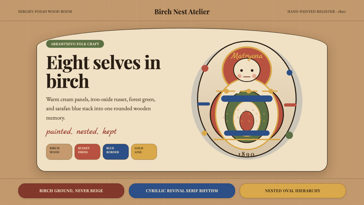 Russian Matryoshka 1890Warmth nests inward. Birch, cream, russet, and egg-oval type stage handmade d…温暖层层内嵌。白桦木、奶油色与赭红蛋形排版构成手绘深度。
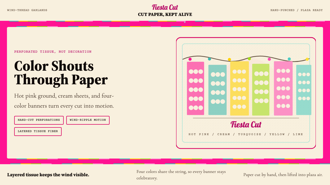 Mexican Papel Picado TissueFiesta cut paper. Hot pink, turquoise, yellow banners and hand-cut perforatio…节庆剪纸:热粉、绿松石、明黄横幅与手工穿孔。
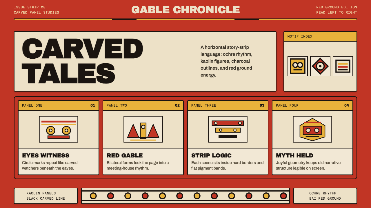 Palauan Bai StoryboardNarrative hits like carved wood. Bai red, ochre bands, kaolin panels, black o…叙事如木刻般鲜明:拜屋红、赭黄带、白陶土面板与黑色刻线。
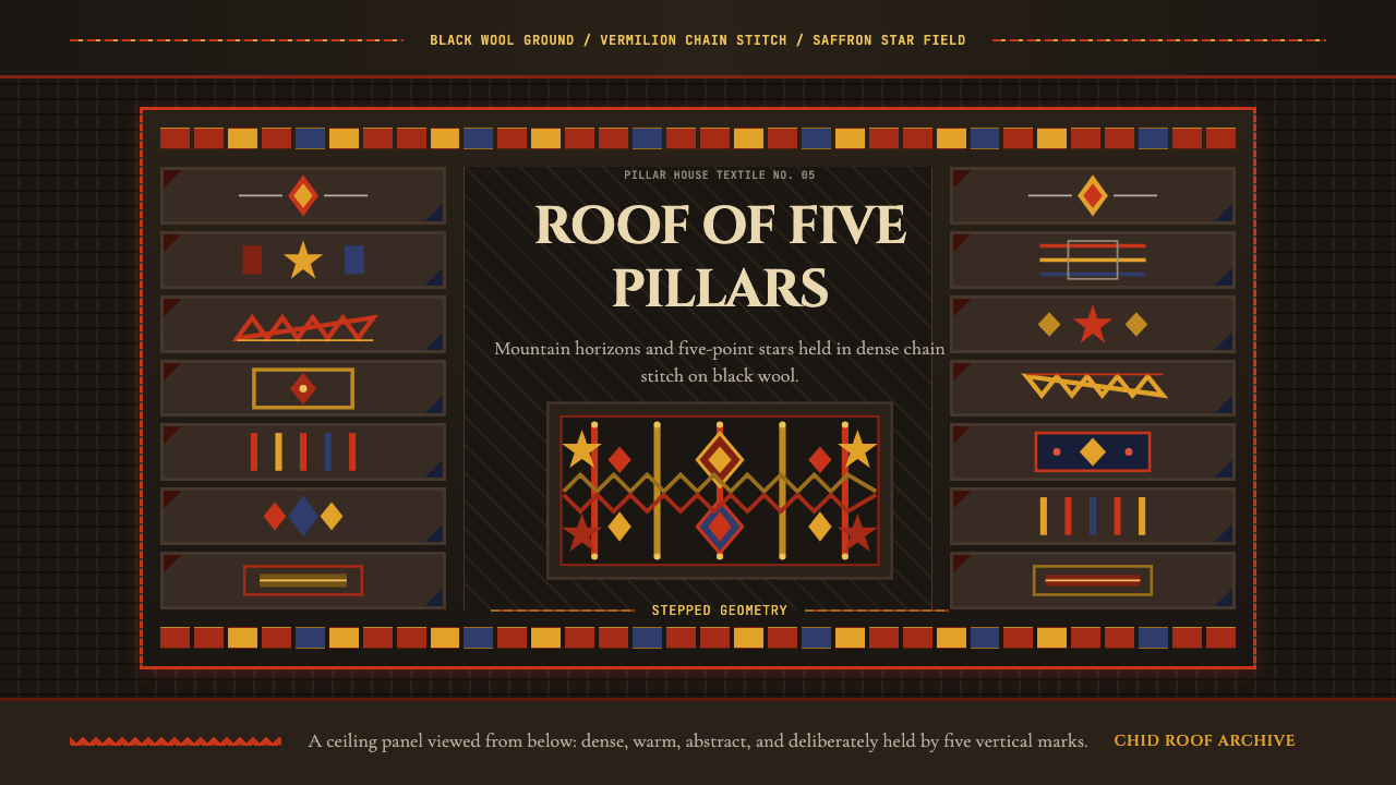 Tajik Pamir Needlework (Chid Roof)Cosmos stitched into wool. Vermilion diamonds and saffron stars hold a five-p…羊毛上的宇宙:朱砂菱形与藏红花星纹撑起五柱网格。
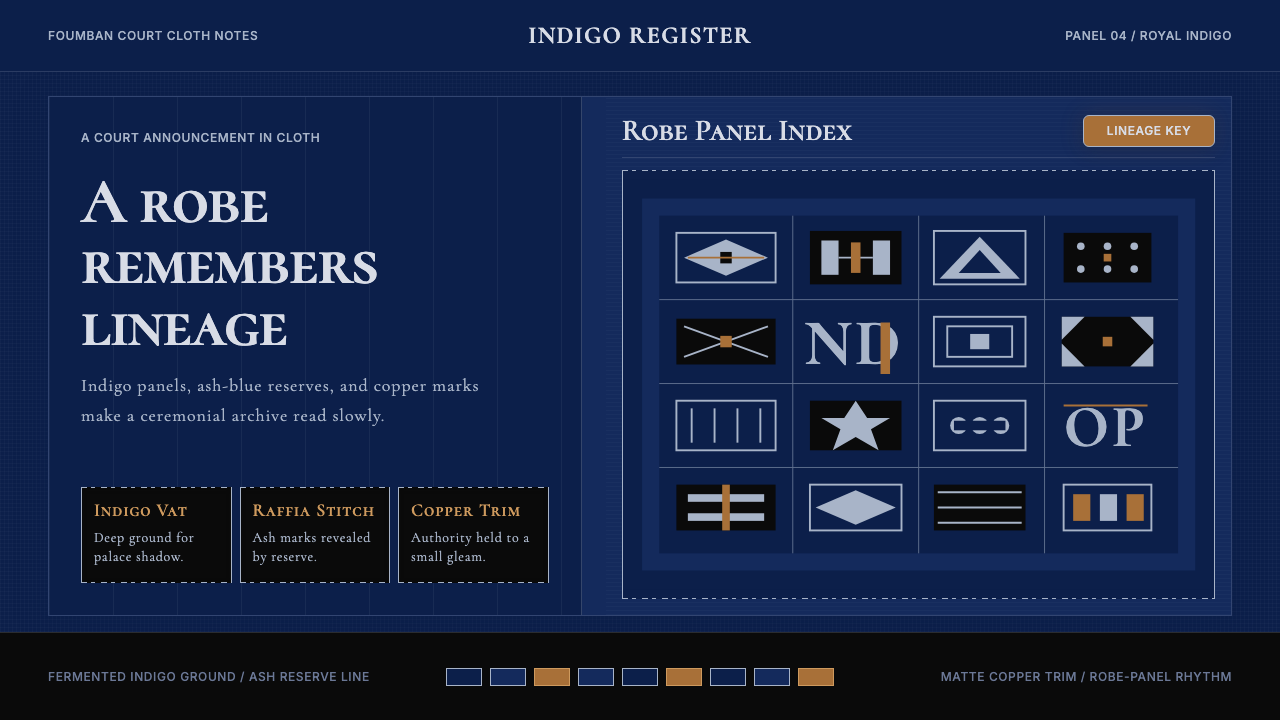 Cameroonian Ndop Royal IndigoReads like court cloth. Indigo panels, ash stitch grids, and matte copper kee…宫廷布幅般庄重。靛蓝面板、灰白针脚与哑铜放慢阅读。
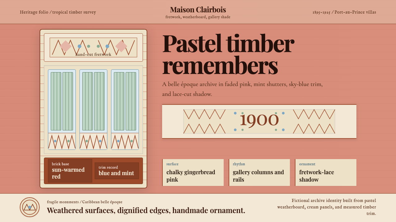 Haitian Gingerbread House (1900)Fragile elegance endures. Faded pink walls carry mint shutters and fretwork-l…脆弱而优雅:褪粉墙面承载薄荷百叶与镂花节奏。