Design style guide设计风格指南
What is Palauan Bai Storyboard?什么是 Palauan Bai Storyboard?
Palauan bai storyboards turn architecture into sequential myth — carved friezes beneath men's meeting-house eaves that read like comic strips rendered in wood, ochre, and kaolin white.帕劳拜屋故事板将建筑化为连环神话——屋檐下的彩绘浮雕横带,宛如刻在木头、赭土与白陶土上的连环画。
Palauan Bai Storyboard in briefPalauan Bai Storyboard 速览
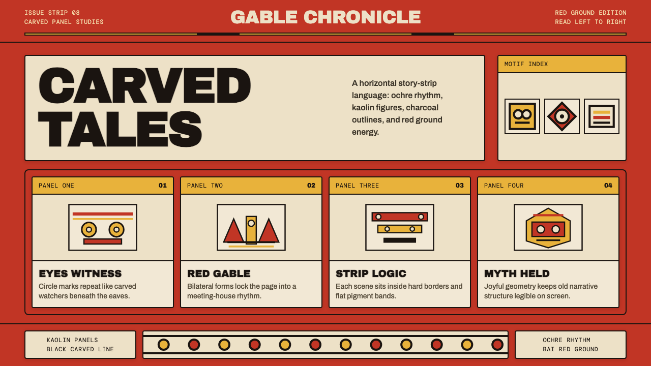
Palauan Bai Storyboard is a design language drawn from the carved and painted narrative friezes of the bai — the men's meeting houses that served as the political and ceremonial heart of Palauan village life. These friezes ran beneath the eaves in repeating panel sequences, each panel depicting a scene from clan mythology, a fishing episode, a moral fable, or a record of tribute and warfare. The palette was severe and intentional: a deep bai red ground, bands of warm ochre yellow, passages of kaolin white, and hard black outlines that separated every figure and form.帕劳拜屋故事板是一套源自拜屋雕绘叙事横带的设计语言。拜屋是帕劳村落的男性集会所,是政治与仪式生活的中心。横带沿屋檐下方展开,以重复的面板序列呈现氏族神话、捕鱼场景、道德寓言或贡赋战争的记录。色板严峻而刻意:深沉的集会所红色底板、暖赭黄色横带、白陶土色块面,以及将每个人物与形态隔开的硬黑轮廓线。
What makes the tradition visually distinctive is the combination of bilateral symmetry and sequential rhythm. Each panel is internally balanced — figures mirrored across a central axis — yet the frieze as a whole reads left to right like a story unfolding in time. The human figures within these panels are rendered in a stylized shorthand: round circle eyes, simplified limbs, and flattened bodies that prioritize graphic legibility over anatomical accuracy. The result is a system that is simultaneously monumental and immediate, the way a good diagram is both explanatory and striking.这一传统在视觉上之所以与众不同,在于双侧对称与序列节奏的结合。每块面板内部平衡——人物沿中央轴线镜像排列——而整条横带却如同故事在时间中展开一般从左向右阅读。面板中的人物以程式化速记语言呈现:圆形眼睛、简化四肢、扁平身体,优先考虑图形可读性而非解剖准确性。结果是一套既宏伟又直接的系统,正如一幅优秀的示意图既具说明性又令人印象深刻。
As a contemporary design system, Palauan Bai Storyboard channels this graphic energy into digital and print contexts. Its defining qualities are the warm bai red ground, the repeating panel structure, the hard outline aesthetic, and a restrained four-color palette that feels archaic and commanding at once. Used well, it communicates narrative weight and cultural rootedness without requiring any literal reference to Pacific imagery.作为当代设计系统,帕劳拜屋故事板将这种图形能量引入数字与印刷场景。其核心特质是暖调的集会所红色底板、重复的面板结构、硬轮廓美学,以及一套既有古朴感又显威严的四色色板。运用得当,它能传达叙事分量与文化根基感,而无需任何对太平洋意象的字面引用。
See the Palauan Bai Storyboard design system →查看 Palauan Bai Storyboard 完整设计系统 →
Where does Palauan Bai Storyboard come from?Palauan Bai Storyboard 从何而来?
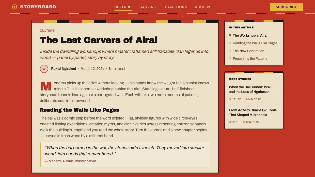
The bai as an architectural form is ancient in Palau, with oral traditions placing the earliest men's meeting houses on Babeldaob island many centuries before European contact. These structures were distinguished by elaborately carved gable boards and, later, by painted horizontal friezes along their exterior beam faces. The iconographic program of a bai was not decorative in the Western sense — each scene was a record, a statement of clan identity, and a mnemonic device for stories that might otherwise require hours of oral transmission to convey.拜屋作为建筑形式在帕劳历史悠久,口传传统将最早的男性集会所追溯至欧洲人接触之前数百年的巴伯尔道布岛。这些建筑以精心雕刻的山墙板为特征,后来又在外部横梁表面增添了彩绘横带。拜屋的图像程序并非西方意义上的装饰——每一幕景象都是一份记录、一份氏族身份的声明,以及若以口头传述需要数小时才能讲完的故事的记忆辅助工具。
The tradition entered the historical record through the observations of German ethnographer Augustin Krämer, whose late-nineteenth and early-twentieth century fieldwork documented bai structures across Koror and the neighboring islands of the Palauan archipelago. Krämer recorded the layout, symbolism, and narrative content of the friezes in systematic detail, establishing the scholarly foundation for understanding them as a coherent visual language rather than naive decoration. His documentation proved invaluable after the Second World War, when many original bai structures were damaged or destroyed.这一传统通过德国民族学家奥古斯丁·克雷默的记录进入历史文献。克雷默在十九世纪末至二十世纪初对科罗尔及帕劳群岛邻近岛屿的拜屋建筑进行了系统的田野调查,详细记录了横带的布局、象征含义与叙事内容,为将其理解为一套连贯视觉语言(而非素朴装饰)奠定了学术基础。第二次世界大战后,许多原始拜屋建筑遭到损毁或摧毁,他的记录因此弥足珍贵。
The post-war period, when Palau came under United States trusteeship beginning in 1945, produced an unexpected flowering of the storyboard form. Palauan carvers — working in wood and adapting the traditional frieze into portable, saleable objects — began producing storyboard panels for the military and civilian audiences now present on the islands. This was not mere tourist craft: carvers like Charlie Gibbons became recognized as serious practitioners who maintained the iconographic canon while adapting the format. Sue Rosoff and Robert Owen documented and supported this revival through institutional channels, helping to preserve the tradition's integrity as it navigated the pressures of a commercial market.1945年帕劳进入美国托管时期后,故事板形式迎来了一次意外的繁荣。帕劳雕刻者在木材上劳作,将传统横带改编为可携带、可销售的物件,开始为岛上的军事与平民观众制作故事板面板。这并非单纯的旅游工艺品:查理·吉本斯等雕刻者被公认为严肃的实践者,他们在适应新格式的同时维护着图像规范。苏·罗索夫与罗伯特·欧文通过机构渠道记录并支持这一复兴,在传统面对商业市场压力之际帮助维护了其完整性。
The storyboard panels that emerged from this period established what is now recognized as the canonical form: a rectangular wooden board, landscape-oriented, divided into three to six horizontal registers, each register containing a narrative scene bounded above and below by painted bands. The palette remained anchored to the original bai colors — the red, ochre, white, and black that had defined the architectural friezes for generations. This fidelity to the source palette was not conservatism for its own sake; it was the continuation of a system in which color itself carried meaning, marking the sacred and the secular, the living and the ancestral.这一时期涌现的故事板面板确立了如今被视为经典形式的样貌:一块矩形木板,横向摆放,分成三至六个水平区格,每个区格包含一幕叙事场景,上下以彩绘横带为界。色板始终锚定于拜屋的原始色彩——红、赭、白、黑——那套数代以来定义建筑横带的颜色。对源色板的这份忠诚并非保守主义本身;而是一套系统的延续——在这套系统中,色彩本身承载着意义,标示着神圣与世俗、生者与祖灵。
What defines the Palauan Bai Storyboard look?Palauan Bai Storyboard 的视觉特征是什么?
Color Palette色板
The palette is anchored to four colors derived directly from the bai architectural tradition: a deep, warm red that saturates the ground plane; a band of ochre yellow used for framing strips and secondary fills; kaolin white reserved for highlighted figure areas and graphic accents; and a matte black that outlines every form with decisive clarity. No gradients soften these boundaries. The four colors work through contrast and adjacency, not blending — each hue holds its own territory, making even complex narrative scenes immediately readable from a distance.色板锚定于直接源自拜屋建筑传统的四种色彩:一种深沉温暖的红色铺满底平面;赭黄色用于框线条带与次要填充;白陶土白色保留给人物高光区域与图形点缀;哑光黑色以决断性的清晰勾勒每一个形态的轮廓。没有渐变柔化这些边界。四色通过对比与邻接发挥作用,而非融合——每种色相守住自己的领地,使即便复杂的叙事场景也能从远处立即读清。
Panel Rhythm面板节奏
The most architecturally distinctive feature of the system is its register structure: content is organized into horizontal bands stacked vertically, each band a self-contained scene that nevertheless participates in a larger sequential reading. This rhythm is not merely decorative — it encodes the logic of narrative time. A layout that adopts this panel rhythm immediately acquires a sense of deliberate pacing, as if each section were a frame in a story that the viewer moves through rather than a field of information that competes for attention simultaneously.这套系统在建筑上最具特色的元素是其区格结构:内容被组织成水平横带,垂直叠加,每条横带是一幕自足的场景,同时又参与更大的序列阅读。这种节奏并非单纯装饰性的——它编码了叙事时间的逻辑。采用这种面板节奏的版面立即获得一种刻意节拍的感觉,仿佛每个部分都是故事中的一帧,观者依次穿越,而非同时竞争注意力的信息场。
Bilateral Symmetry双侧对称
Individual panels within the frieze tradition are composed around a vertical central axis, with figures and objects mirrored or balanced across it. This is not the rigid mathematical symmetry of neoclassical architecture — it allows for variation in figure pose, scale, and placement — but it consistently produces a sense of ceremonial composure. In digital application, this compositional logic translates to centered page structures, mirrored icon systems, and layout grids where content elements are weighted equally on either side of a strong central spine.横带传统中的单块面板围绕垂直中轴构图,人物与物体在其两侧镜像或平衡排列。这不是新古典建筑那种严格的数学对称——它允许人物姿势、比例与位置上的变化——但始终产生一种仪式性的沉静感。在数字应用中,这种构图逻辑转化为居中的页面结构、镜像图标系统,以及内容元素在强劲中轴两侧均等分配权重的版面网格。
Stylized Figure Language程式化人物语言
The human figures in bai friezes are not portraits — they are glyphs. Large circle eyes dominate simplified heads; limbs are elongated or abbreviated to clarify action rather than render anatomy; bodies are flattened to present the most legible profile view. This is a system optimized for communication at a distance, in variable light, by an observer who may be walking past. The design principle it encodes — maximum legibility through maximum simplification — is equally applicable to icon design, pictogram systems, and any interface element that must be read quickly and reliably.拜屋横带中的人物形象并非肖像——它们是象形符号。大圆眼睛主导简化的头部;四肢被拉长或省略以阐明动作而非描绘解剖;身体被压平以呈现最易读的侧面轮廓。这是一套为在变化光线下、从远处、被路过的观者阅读而优化的系统。它所编码的设计原则——通过最大限度简化实现最大限度易读性——同样适用于图标设计、象形符号系统,以及任何必须被快速可靠读取的界面元素。
Hard Outline Construction硬轮廓构造
Every figure, band, and shape in the bai frieze is bounded by a black outline of consistent weight. This outline is not a shadow or a glow — it is a structural separator, the visual equivalent of the carved groove that defined each form in the original woodwork. In design application, this translates to components with strong, defined edges: bordered containers, outlined icons, and typographic treatments that favor stroke over fill. The outline logic also enforces a kind of visual democracy — all elements are equally present, separated from their neighbors by the same firm boundary.拜屋横带中的每个人物、横带与形态都被等重的黑色轮廓线所界定。这条轮廓线不是投影或光晕——它是结构性分隔符,是原始木雕中定义每个形态的刻槽的视觉对应物。在设计应用中,这转化为具有强劲、清晰边缘的组件:有框容器、轮廓图标,以及偏重描边而非填充的排版处理。轮廓逻辑还强制推行一种视觉上的民主性——所有元素同等清晰地存在,被相同坚定的边界与邻近元素分隔开来。
Warm Ground Dominance暖色底板主导
The bai red that saturates the ground of the traditional frieze is the system's most recognizable signature. It is not a neutral surface — it is an active chromatic field that pushes every figure placed on it forward and charges the entire composition with a sense of heat and ceremony. Contemporary applications that commit to this warm red ground find that it unifies disparate content elements, creates an unmistakable visual signature, and communicates cultural weight without historical overstatement.饱满浸透传统横带底面的集会所红色是这套系统最具辨识度的标志。它不是中性的表面——它是一个主动的色彩场,将置于其上的每个人物向前推,并用热度与仪式感充满整个构图。投入使用这种暖红色底板的当代应用发现,它能统一各异的内容元素,创造无可混淆的视觉签名,并在不过度援引历史的前提下传达文化分量。
Sequential Narrative Logic序列叙事逻辑
The frieze format imposes a discipline of sequencing that is unusual in static visual media: information must be organized not just spatially but temporally, with a beginning, middle, and directed conclusion. This narrative constraint is a feature, not a limitation. Applied to contemporary content, it encourages designers to think about the order in which information is encountered and to give each section a distinct role in a larger argument — rather than presenting all information as equally weighted and simultaneously available.横带格式强制推行一种在静态视觉媒介中不寻常的序列纪律:信息必须不只是空间性地组织,而是时间性地组织,有起点、中段与定向的结尾。这种叙事约束是一种特性,而非局限。应用于当代内容时,它促使设计者思考信息被遭遇的顺序,并赋予每个部分在更大论证中的独特角色——而非将所有信息呈现为等权重且同时可及的。
See the Palauan Bai Storyboard design system →查看 Palauan Bai Storyboard 完整设计系统 →
Who shaped Palauan Bai Storyboard?谁塑造了 Palauan Bai Storyboard?
Gibbons was one of the most accomplished Palauan storyboard carvers of the post-war revival period, whose work helped establish the canonical form of the portable storyboard panel as a serious artistic medium rather than a tourist souvenir. His compositions maintained the iconographic discipline of the traditional bai frieze — the circle-eye figures, the register structure, the red-ochre-white-black palette — while adapting the scale and format to objects that could travel, be collected, and be studied outside of their original architectural context.吉本斯是战后复兴时期最杰出的帕劳故事板雕刻者之一。他的作品帮助确立了便携式故事板面板作为严肃艺术媒介而非旅游纪念品的经典形式。他的构图维持了传统拜屋横带的图像纪律——圆眼人物、区格结构、红赭白黑色板——同时将比例与格式调整为可被携带、收藏、并在原始建筑语境之外加以研究的物件。
The German ethnographer whose late-nineteenth and early-twentieth century fieldwork produced the most systematic early documentation of Palauan bai architecture and iconography. Krämer's detailed recordings of frieze layouts, narrative content, and color usage established the scholarly record from which later researchers, carvers, and cultural preservation efforts would draw. His work sits at the junction of colonial-era ethnography and genuine curatorial care — imperfect in its framing, invaluable in its detail.这位德国民族学家在十九世纪末至二十世纪初的田野工作产生了对帕劳拜屋建筑与图像学最系统的早期记录。克雷默对横带布局、叙事内容与色彩用法的详细记录建立了学术档案,后来的研究者、雕刻者与文化保护工作将从中汲取资源。他的工作处于殖民时代民族志与真诚的策展关怀的交汇处——框架上不完美,细节上弥足珍贵。
Rosoff worked to document and support the storyboard carving tradition during the American trusteeship era, contributing to the institutional recognition of the form as an art practice with a continuous tradition rather than a recent commercial invention. Her work helped contextualize the post-war storyboard revival within the longer history of bai iconography, countering the tendency to treat the tourist-market panels as a degraded or inauthentic version of the original tradition.罗索夫在美国托管时期致力于记录并支持故事板雕刻传统,为这一形式作为具有连续传统的艺术实践(而非近代商业发明)获得机构认可作出了贡献。她的工作帮助将战后故事板复兴置于拜屋图像学更长历史的脉络中,反驳了将旅游市场面板视为原始传统之退化或不真实版本的倾向。
Owen engaged with the storyboard tradition in the context of Pacific arts advocacy and documentation, contributing to the broader scholarly and institutional framework that helped protect the tradition's cultural standing during a period when it was at risk of being reduced to commercial novelty. His work exemplifies the role that outside scholars and advocates have played in maintaining the integrity of indigenous visual traditions as they navigate contact with global markets.欧文在太平洋艺术倡导与记录的背景下参与故事板传统,为更广泛的学术与机构框架作出贡献,帮助保护了这一传统的文化地位——在一个它有被简化为商业新奇品之风险的时期。他的工作体现了外部学者与倡导者在维护原住民视觉传统完整性方面所扮演的角色,尤其是当这些传统在应对全球市场接触时。
How do you use Palauan Bai Storyboard today?今天怎么用 Palauan Bai Storyboard?
Palauan Bai Storyboard is a high-signal style — its palette and panel structure are visually distinctive enough that even a partial application reads clearly. This creates both an opportunity and a responsibility: used with fidelity to its organizing principles, it communicates narrative authority and cultural depth; used superficially, it risks looking like a costume rather than a language. The key is to adopt the structural logic — the panel rhythm, the bilateral balance, the hard outline, the warm ground — rather than simply borrowing the color palette.帕劳拜屋故事板是一种高信号风格——其色板与面板结构在视觉上足够独特,即使部分应用也能被清晰辨认。这既是机遇也是责任:忠实于其组织原则来使用,它能传达叙事权威与文化深度;表面化地使用,则有沦为服装而非语言的风险。关键是采纳其结构逻辑——面板节奏、双侧平衡、硬轮廓、暖色底板——而不仅仅是借用色板。
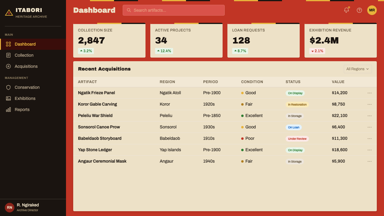
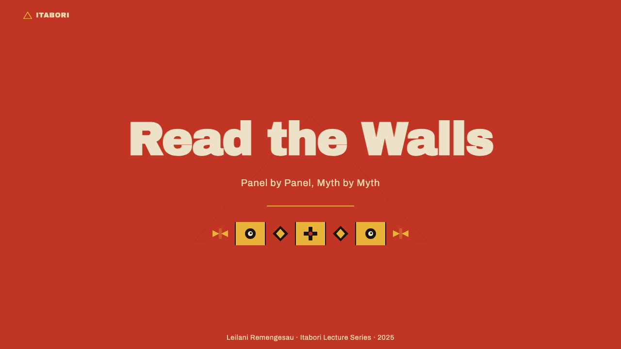
For presentation slides, the style is particularly effective on cover pages and section dividers where strong visual identity is required. A cover framed by a deep warm-red ground, a centered title in high-contrast type, and horizontal banding at the top and bottom edges immediately establishes the register-panel logic without requiring any figurative imagery. Content slides work well when organized as distinct horizontal zones — a title band, a content register, a caption band — each separated by the characteristic black outline strip rather than whitespace alone. Data visualizations take on an iconic quality when charts and graphs are rendered in the four-color palette with hard outlines replacing soft-shadow conventions.在演示文稿中,这种风格对需要强烈视觉身份的封面页与章节分隔页尤为有效。一张以深暖红色底板为框架、居中高对比度标题、顶底各有水平横带的封面,无需任何具象图像即可立即确立区格-面板逻辑。内容页面在组织为明确的水平区块时效果最佳——标题横带、内容区格、说明横带——每个区块以标志性的黑色轮廓条带而非单纯留白相互分隔。当图表以四色色板渲染、用硬轮廓取代软阴影惯例时,数据可视化呈现出图像符号般的品质。
For web and dashboard interfaces, the system suits contexts where strong wayfinding and clear hierarchy are priorities. A dark warm-red header band, a near-white content field, and ochre-highlighted interactive elements create a navigation system with unmistakable visual hierarchy. Pricing pages benefit from the panel-rhythm logic: tier columns read as distinct registers, each self-contained yet part of a horizontal sequence. The hard-outline card treatment — a defining edge rather than a soft shadow — works especially well at this scale, giving each content block a presence appropriate to the style's monumental origins.对于网页与仪表板界面,这套系统适合强导航与清晰层级是首要任务的场景。深暖红色标题横带、接近白色的内容区域,以及赭黄色高亮的交互元素,共同创造出具有无可混淆视觉层级的导航系统。定价页面得益于面板节奏逻辑:等级列被读作独立的区格,各自自足却又是水平序列的组成部分。硬轮廓卡片处理——以清晰边缘而非柔和阴影定义——在这一比例下尤为有效,赋予每个内容块与该风格宏伟起源相称的存在感。
For editorial and marketing contexts, the style's boldness makes it well-suited to feature moments: section breaks, pull quotes, and campaign headers where visual impact must compete with surrounding content. A full-width bai-red band with reversed white type creates an interruption as commanding as a carved gable board. Marketing pages organized in stacked horizontal registers — alternating red, ochre, and near-white fields — naturally inherit the frieze's sequential narrative logic, guiding a reader through a story rather than presenting undifferentiated information.对于编辑与营销场景,这种风格的大胆感使其非常适合需要视觉冲击力与周围内容竞争的关键时刻:章节分隔、引用语、活动标题。一条全宽的集会所红色横带配以反白文字,制造出如同雕刻山墙板一般强劲的打断感。以叠加水平区格组织的营销页面——交替的红色、赭黄与接近白色的色块——自然继承了横带的序列叙事逻辑,引导读者穿越故事而非呈现无差别的信息。
A common mistake is applying the palette without the structural commitment. Bai red used as an accent color in an otherwise neutral layout loses its semantic charge — it looks borrowed rather than systemic. The palette only achieves its full effect when the warm red functions as the dominant ground against which other elements are placed, not as a highlight applied selectively. Similarly, soft shadows and gradient fills directly contradict the hard-outline logic that gives the style its carved-object clarity; a layout that mixes these conventions will look unresolved rather than layered.最常见的错误是在没有结构承诺的情况下应用色板。在其他方面中性的版面中作为强调色使用的集会所红色,会失去其语义张力——看起来是借来的而非系统性的。色板只有在暖红色作为主导底面、其他元素置于其上时才能发挥全部效力,而不是被选择性地作为高亮涂抹。同样,柔和阴影与渐变填充直接与硬轮廓逻辑相悖——正是后者赋予这种风格雕刻物般的清晰感;混合这些惯例的版面看起来将是未完成的,而非层次丰富的。
See the Palauan Bai Storyboard design system →查看 Palauan Bai Storyboard 完整设计系统 →
Palauan Bai Storyboard — FAQPalauan Bai Storyboard · 常见问题
Is this style culturally appropriate to use outside of Pacific contexts?在太平洋文化语境之外使用这种风格是否在文化上合适?
The question deserves a considered answer rather than a reflexive yes or no. The Palauan bai storyboard tradition is a living practice with specific cultural meanings attached to its iconography, its color symbolism, and its narrative content. Using the abstract design language — the panel structure, the palette, the hard-outline construction — as a formal system is different from reproducing the specific figures, myths, or ceremonial symbols of the tradition. The former borrows a visual grammar; the latter risks appropriating sacred content. When applying this style, the responsible approach is to adopt the structural and chromatic logic while avoiding direct reproduction of traditional figures or scenes, and to be transparent about the style's origins when context requires it.这个问题值得审慎回答,而非反射性地简单说是或否。帕劳拜屋故事板传统是一种活态实践,其图像、色彩象征与叙事内容附带特定的文化含义。将抽象的设计语言——面板结构、色板、硬轮廓构造——作为形式系统加以使用,不同于复制这一传统的具体人物、神话或仪式符号。前者是借用视觉语法;后者则有挪用神圣内容的风险。应用这种风格时,负责任的做法是采纳结构与色彩逻辑,同时避免直接复制传统人物或场景,并在语境要求时对风格的起源保持透明。
How does this style differ from other Pacific or Oceanic design traditions?这种风格与其他太平洋或大洋洲设计传统有何不同?
Oceanic design traditions are extraordinarily diverse — the bark cloth patterns of Tonga, the spiral tattoo systems of the Maori, the geometric weaving of Samoa, and the bai friezes of Palau share a Pacific geography but draw on entirely different visual grammars. The Palauan tradition is distinguished by its sequential narrative logic (the panel-frieze structure that encodes stories in time), its specific four-color palette derived from architectural pigments, and its bilateral symmetry within each register. These qualities make it quite distinct from, say, Polynesian traditions where radial symmetry and interlocking geometric motifs dominate, or Melanesian traditions where figural carving takes on very different formal qualities.大洋洲设计传统极为多元——汤加的树皮布图案、毛利人的螺旋纹身体系、萨摩亚的几何织物,以及帕劳的拜屋横带,共享太平洋地理空间,却各自建立在截然不同的视觉语法上。帕劳传统的特征在于其序列叙事逻辑(将故事编码于时间中的面板-横带结构)、源自建筑颜料的特定四色色板,以及每个区格内的双侧对称。这些品质使其与其他传统明显区别——例如以放射对称与互锁几何母题为主导的波利尼西亚传统,或具象雕刻呈现出截然不同形式品质的美拉尼西亚传统。
Can the style work effectively in a light or white-ground application?这种风格能在浅色或白色底面的应用中有效发挥吗?
The traditional form is explicitly a warm-ground system — the red field is the foundation, not a choice among equals. A white-ground inversion is possible but requires significant recalibration. On a light ground, the bai red and ochre yellow must shift from background to foreground roles, functioning as bold fills within contained shapes rather than as ambient fields. The hard-outline logic becomes even more important in this inversion, because it is the outline, not the ground color, that will carry the system's graphic clarity. Light-ground applications also tend to read as more contemporary and less ceremonial — which may be desirable depending on the context, but represents a genuine departure from the tradition's original register.传统形式明确是一套暖色底面系统——红色色场是基础,而非与其他选项平等的一种选择。浅色底面的反转版本是可能的,但需要大幅重新校准。在浅色底面上,集会所红色与赭黄色必须从背景角色转变为前景角色,在封闭形态内作为大胆填充色发挥作用,而非作为弥漫性色场。在这种反转中,硬轮廓逻辑变得更加重要——因为承载系统图形清晰感的将是轮廓线而非底色。浅色底面应用往往显得更为当代、仪式感更弱——这取决于语境可能是可取的,但代表着与传统原始腔调的真实偏离。
How should typography be handled within this style?在这种风格中应如何处理字体排印?
The bai tradition itself has no typographic component — the communication system is entirely visual and pictographic. Contemporary application therefore requires a typographic approach that complements rather than competes with the frieze's visual logic. Typefaces with strong geometric character — without excessive calligraphic variation in stroke weight — read most compatibly within the panel structure. Type should be set in high contrast against its ground: white on red, black on ochre, or red on near-white. Scale contrast is more effective than weight variation alone as a hierarchy signal. One crucial consideration: avoid typefaces with delicate serifs or fine-stroke details, as these will be visually overwhelmed by the bold palette and outline-heavy composition that surrounds them.拜屋传统本身没有文字排印成分——其传播系统完全是视觉性与象形符号性的。因此,当代应用需要一种能与横带视觉逻辑互补而非竞争的排印方式。具有强烈几何特征的字体——笔画粗细变化不过于书法化——在面板结构中读起来最为协调。字体应在底面上以高对比度设置:红底白字、赭黄底黑字,或近白底红字。尺度对比作为层级信号比单独的字重变化更为有效。一个关键考量:避免使用有精巧衬线或细笔画细节的字体,因为这些特征会被环绕它们的大胆色板与重轮廓构图在视觉上压制。
Does the sequential panel logic only work for narrative content, or can it be applied to non-narrative layouts?序列面板逻辑是否只适用于叙事内容,还是也能应用于非叙事版面?
The panel-register structure works for non-narrative content equally well — it is, at its core, a system for organizing information into discrete, hierarchically equivalent zones. A pricing comparison table, a features list, a timeline, a portfolio grid: all of these can be organized using register logic without implying a narrative sequence. What the structure provides in non-narrative contexts is not story but clarity of segmentation — each band declares its content category as clearly as a chapter heading, and the consistent visual treatment across bands communicates that the information within each is of comparable importance. The key is to maintain the visual discipline of the panel boundary: if the bands blur into one another through soft transitions or overlapping elements, the organizational logic collapses.面板-区格结构同样适用于非叙事内容——在其核心处,它是一套将信息组织为离散的、层级上等价的区块的系统。定价对比表、功能列表、时间轴、作品集网格:所有这些都可以使用区格逻辑组织,而无需暗示叙事序列。这种结构在非叙事语境中提供的不是故事而是分段的清晰性——每条横带如同章节标题一样清晰地声明其内容类别,而横带之间一致的视觉处理传达出每条横带内的信息具有可比的重要性。关键是维持面板边界的视觉纪律:如果横带通过柔和过渡或重叠元素相互模糊,组织逻辑就会崩溃。
Related design styles相关设计风格
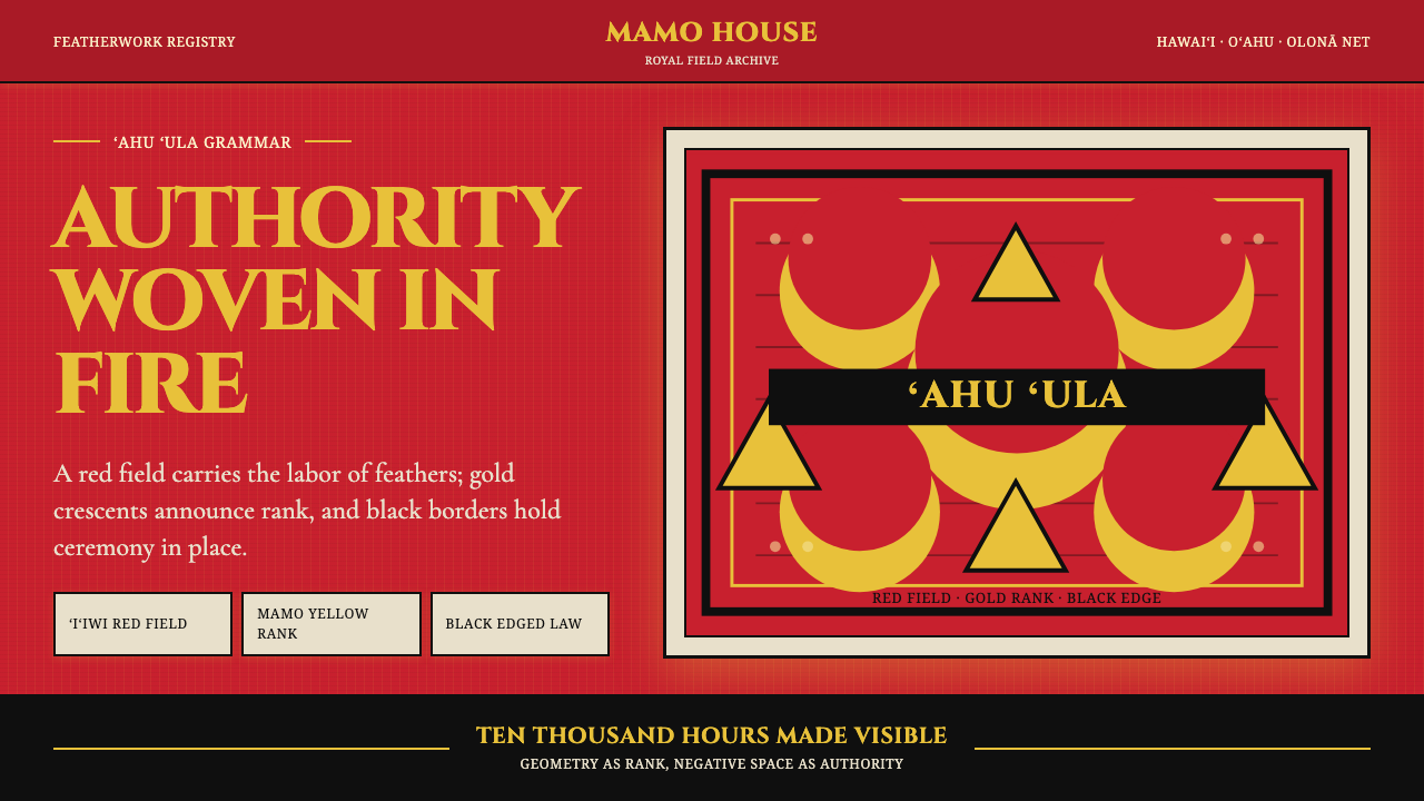 Hawaiian Feather Cape (ʻAhu ʻUla)Ceremony has weight. Red feather fields, mamo yellow crescents, black borders.仪典自有重量:红羽场、mamo金新月与黑边界。
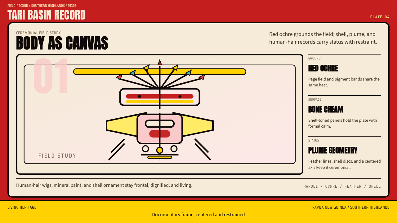 PNG Huli WigmanBody as ceremony. Red ochre, cream bone, and feathered geometry hold a fronta…身体即仪式。红赭石、骨白与羽状几何托起正面肖像。
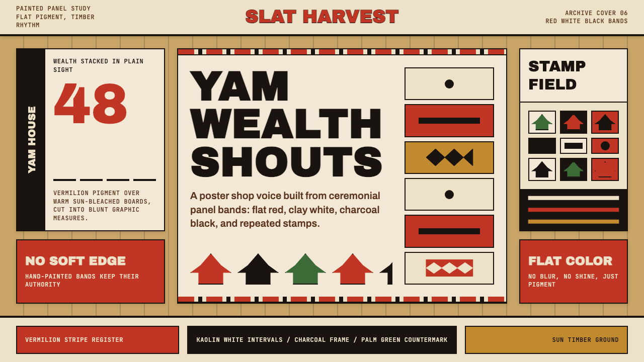 Trobriand Yam House PaintPainted wealth speaks loud. Vermilion bands and black stamp silhouettes hit t…彩绘财富直接发声:木色底上朱红条带与黑色印章剪影。
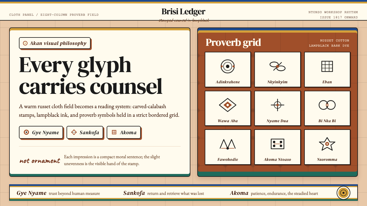 Akan Adinkra (Ghana)Proverbs become cloth. Russet grids, lampblack serif marks, and gold-edge ban…箴言化为布面:赭红网格、灯烟黑印纹与金边带盖出意义。
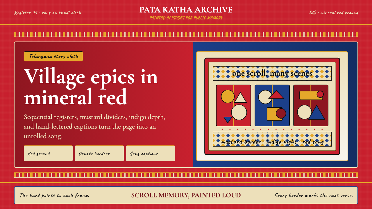 Andhra Cheriyal Scroll PaintingSaturated oral memory. Mineral red registers, mustard diamonds, and serif son…饱和的口述记忆:矿物红分格、芥末黄菱纹与衬线唱词。
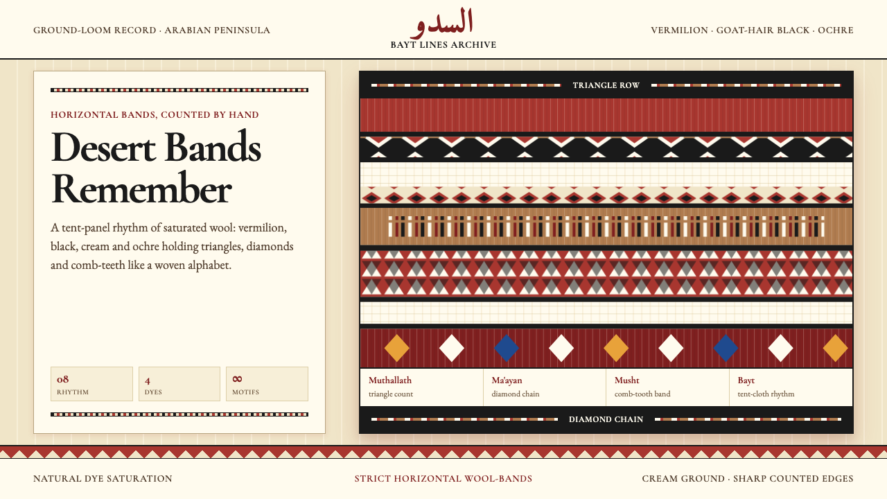 Bedouin Desert Textile (Sadu)Woven memory, not ornament. Vermilion-black bands count triangles and diamond…记忆被织成条带:朱砂与黑色在奶油羊毛上数出三角与菱形。