What is Hawaiian Feather Cape (ʻAhu ʻUla)?
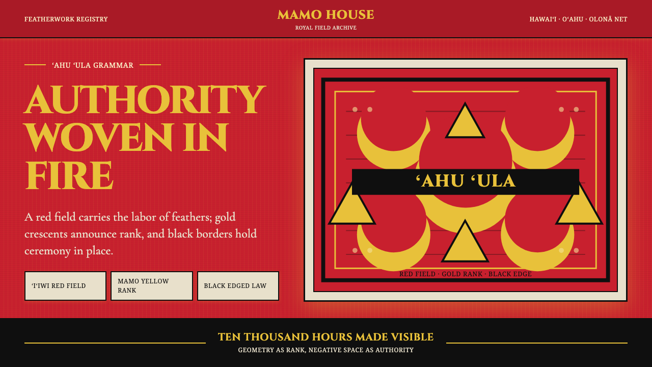
The ʻahu ʻula — Hawaiian feather capes worn only by royalty — translate a millennium of ceremonial authority into a visual system built from saturated crimson fields, golden heraldic crescents, and the absolute weight of black borders.
Hawaiian Feather Cape (ʻAhu ʻUla) in brief
Hawaiian Feather Cape (ʻAhu ʻula) is a design system rooted in one of the most labor-intensive textile traditions in human history. The ʻahu ʻula were capes and full-length cloaks worn exclusively by Hawaiian aliʻi — the chiefly class — whose visual authority was expressed not through inscription or heraldry in the European sense, but through the sheer accumulated density of featherwork: hundreds of thousands of individual plumes knotted by hand into olonā fiber nets to form bold geometric patterns.
The visual grammar of the ʻahu ʻula is strikingly legible: a deep, saturated red ground — supplied by the ʻiʻiwi honeycreeper — carries bold crescent and triangle motifs rendered in bright yellow mamo feathers, the rarest and most costly material in the Hawaiian archipelago. Black feathers border the entire composition, framing the design with an authority that reads as both heraldic and absolute. The result is a chromatic system of exceptional clarity: three colors, each with a distinct structural role, in a compositional language that declares rank without ambiguity.
As a design system, ʻahu ʻula translates this vocabulary into digital and print surfaces. The saturated red field grounds every composition. The golden crescent and chevron motifs function as heraldic accents — used sparingly, placed with deliberate symbolic intent. Black borders and framing devices carry the same absolute weight they did in the original cloaks, defining edges not as decoration but as declaration. The resulting aesthetic is ceremonial without being archaic: it conveys authority, rarity, and the gravity of craft accumulated over generations.
Where does Hawaiian Feather Cape (ʻAhu ʻUla) come from?
The tradition of Hawaiian featherwork extends back at least to the early centuries of Polynesian settlement in the Hawaiian archipelago, likely pre-dating 1500 CE, though the most celebrated surviving examples were produced in the period of consolidated chiefdom from roughly the seventeenth through the early nineteenth century. The craft reached its apex under the great aliʻi nui — paramount chiefs — whose authority was expressed through increasingly elaborate and massive feather garments. A full-length mahiole-and-cloak ensemble could represent decades of collective labor: kāhili featherworkers called hulu manu would spend years accumulating and knotting feathers, with entire communities participating in the harvest.
The specific color hierarchy of the ʻahu ʻula was not arbitrary. Red ʻiʻiwi feathers were plentiful relative to other species and provided the saturated field, but yellow mamo feathers — each bird yielding only a handful of usable plumes — were extraordinarily precious. A single cloak might require the plumage of thousands of mamo birds, which were caught, plucked, and released — or sometimes sacrificed entirely. This scarcity meant that the golden crescents and patterns on an ʻahu ʻula were literally woven from concentrated wealth and labor, making the garment itself an object of economic as well as symbolic magnitude.
The first sustained contact with European culture came in 1778, when Captain James Cook arrived at the Hawaiian islands. This encounter is significant for design history because Cook's officers recorded detailed observations of Hawaiian regalia — including the famous cloak presented to Cook himself, now housed in Te Papa Tongarewa in Wellington, New Zealand — and brought several pieces back to Europe, where they entered museum collections and became touchstones for Western understanding of Pacific material culture. The encounter also accelerated changes in Hawaiian society that would, within a generation, transform the political context in which the capes were made.
King Kamehameha I, who unified the Hawaiian islands between 1795 and 1810, is closely associated with the apex of ʻahu ʻula production and prestige. His famous cloak — composed almost entirely of mamo feathers and said to have taken generations to accumulate — represents the tradition at its most extraordinary concentration of material and symbolic power. After unification and increasing contact with foreign traders and missionaries through the early nineteenth century, the tradition of large-scale featherwork declined as the aliʻi system itself was reorganized under Western-influenced governance. Queen Liliʻuokalani, the last reigning monarch of the Hawaiian Kingdom before the 1893 overthrow, represents a later period in which Hawaiian royal identity was increasingly articulated through tension with colonial pressure rather than through the production of new regalia.
The scholarly study of Hawaiian featherwork was significantly advanced by anthropologist Adrienne Kaeppler, whose research on the collections held by Bishop Museum in Honolulu and museums worldwide systematized the understanding of feather type, construction technique, and symbolic vocabulary. Contemporary practitioners such as Marques Hanalei Marzan have revived and extended featherwork traditions, creating new pieces that maintain technical fidelity to pre-contact methods while participating in the broader Hawaiian cultural renaissance of the late twentieth and early twenty-first centuries.
What defines the Hawaiian Feather Cape (ʻAhu ʻUla) look?
Color Field
The dominant ground is a deep, fully saturated crimson — not a warm red or a brick tone, but the concentrated, almost luminous red of densely packed ʻiʻiwi feathers. This red is not used as an accent; it is the atmosphere. Everything else sits on top of it or against it. The psychological effect is one of enveloping intensity: the color commands attention before any pattern is perceived.
Heraldic Accent
The golden yellow of mamo feathers appears exclusively as crescent, chevron, and triangle motifs arranged across the red field. These forms are bold and architecturally precise — not decorative flourishes but heraldic marks that carry rank information. The yellow is warm and luminous against the red, creating a contrast that reads as ceremonial rather than simply chromatic. Its placement is always intentional and never casual.
Framing Borders
Black feathers frame the entire composition along the hem and edges, providing a definitive boundary that gives the design its sense of finality and completeness. This border is not decorative trim — it functions as an authoritative frame in the heraldic sense, containing and completing the composition. In digital application, the black border carries the same structural weight: it closes compositions, prevents visual leakage, and signals that what is inside is complete and intentional.
Geometric Formality
The motifs of the ʻahu ʻula — crescents, chevrons, triangles, and stepped forms — are strictly geometric, with no organic or flowing shapes. This geometry is not the cold geometry of modernism; it is the geometry of ceremony, where each angle and arc carries cumulative meaning from its long use in the Hawaiian chiefly tradition. Compositions built from this vocabulary feel simultaneously ancient and architecturally precise.
Density and Weight
Authentic ʻahu ʻula have a visual density that comes from the physical reality of thousands of feathers packed surface to surface with no ground showing through. In digital translation, this translates to a preference for fully saturated fields over flat washes, and for compositional weight that fills space rather than leaving it tentative. The aesthetic values mass over airiness — it is the opposite of negative-space-led minimal design.
Ceremonial Restraint
Despite its chromatic intensity, the ʻahu ʻula system is highly restrained in its color count: three colors, each with a fixed role, never used interchangeably. This restraint is what separates the tradition from mere visual excess — the density and saturation are contained within a rigid structural logic. Any application that introduces a fourth color or allows the three to drift from their assigned roles will lose this quality immediately.
Bilateral Symmetry
The ʻahu ʻula, when laid flat, reveals compositions that are largely bilaterally symmetric along a central vertical axis — appropriate for a garment worn on the body. This symmetry is not mechanical; variations and slight irregularities are present within the handmade nature of the work. In design application, strict symmetry signals the ceremonial register, while intentional minor asymmetries within a symmetric frame can humanize and deepen the effect.
Who shaped Hawaiian Feather Cape (ʻAhu ʻUla)?
Kamehameha I unified the Hawaiian islands between 1795 and 1810 and is the figure most closely associated with ʻahu ʻula at its apex of cultural prestige. His famous mamo-feather cloak — said to have been accumulated across generations and composed almost entirely of the most precious yellow feathers — represents the tradition at its most concentrated expression of power and material wealth. His court established the political context in which featherwork carried its greatest symbolic charge, and the garments associated with his reign anchor the iconographic vocabulary that this design system draws upon.
The last reigning monarch of the Hawaiian Kingdom before the 1893 overthrow, Queen Liliʻuokalani represents a later phase in which Hawaiian royal identity was increasingly articulated in tension with colonial pressure. Her life and legacy are inseparable from questions of cultural preservation and political sovereignty. In the context of this design system, she marks the historical threshold at which ʻahu ʻula shifted from active regalia to a preserved symbol of a suppressed sovereignty — a shift that gives the style its particular quality of dignity under pressure.
An anthropologist at the Smithsonian Institution, Kaeppler conducted systematic comparative research on Hawaiian featherwork held in collections around the world — particularly those assembled by Cook's expeditions and now held in European and American museums. Her scholarship established the analytical framework through which feather type, knotting technique, and symbolic pattern could be rigorously categorized and historically interpreted. Her work transformed ʻahu ʻula from admired curiosities into understood artifacts, giving designers and scholars a reliable reference for the system's authentic visual grammar.
A contemporary Hawaiian featherwork practitioner and educator associated with Bishop Museum in Honolulu, Marzan has been central to the revival of traditional hulu manu techniques in the late twentieth and early twenty-first centuries. His work demonstrates that the technical and aesthetic principles of the ʻahu ʻula tradition can be maintained with integrity while engaging with contemporary contexts. He represents the tradition's living continuation — not as a historical reproduction exercise but as an evolving practice rooted in deep cultural knowledge.
Cook's arrival at the Hawaiian islands in 1778 marks the moment at which ʻahu ʻula entered the global visual record. The cloak presented to Cook — now in Te Papa Tongarewa in Wellington — became one of the most studied and reproduced examples of Hawaiian featherwork in Western scholarship. Though Cook himself is a deeply complicated historical figure in the context of Pacific colonialism, his arrival functioned as the event through which the ʻahu ʻula tradition became legible to the outside world, initiating the chain of documentation and collection that makes scholarly reconstruction of the tradition possible.
How do you use Hawaiian Feather Cape (ʻAhu ʻUla) today?
The ʻahu ʻula system is among the most distinctive and historically charged design vocabularies available for contemporary application. Its visual authority comes from a chromatic logic that is both extremely simple — three colors, fixed roles — and extremely demanding: the moment the proportional relationships between the crimson field, the golden accents, and the black borders are compromised, the ceremonial register collapses into something that reads merely as tropical or festive. Correct application requires understanding the system's structural logic before reaching for its surface palette.
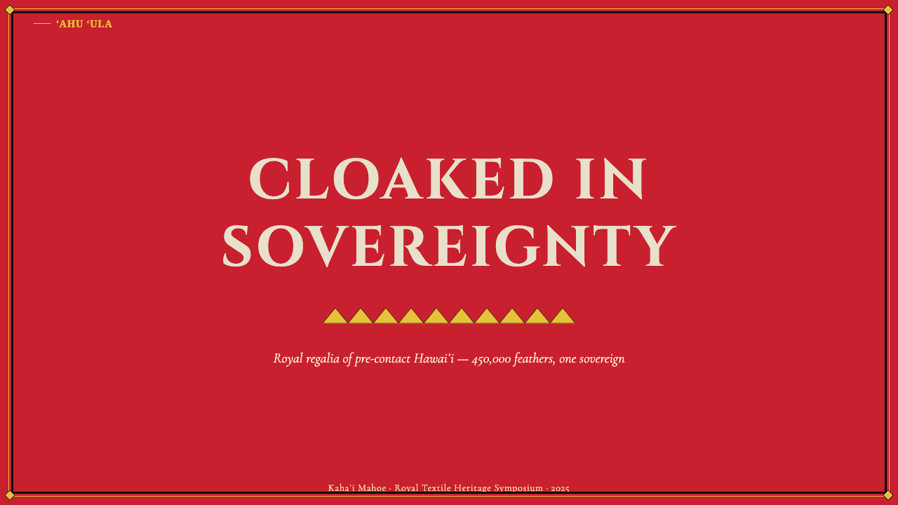
For presentation slides, the style is best deployed for high-stakes or ceremonial contexts: keynote addresses, executive summaries, cultural institution presentations, or any situation where gravitas and distinctiveness are primary values. A cover page works well with the deep crimson field occupying the full bleed, a golden crescent or geometric motif placed in one deliberate quadrant, and the title in clean white or near-white type with a black border or rule separating the title zone from the motif zone. Content slides should preserve the chromatic discipline: crimson as background or strong header treatment, golden accents only at hierarchically significant moments, black for all structural lines and borders. Data visualizations can map the three-color system directly to categorical distinctions — using each color once and only once per chart — producing a visual language that feels authoritative rather than decorative.
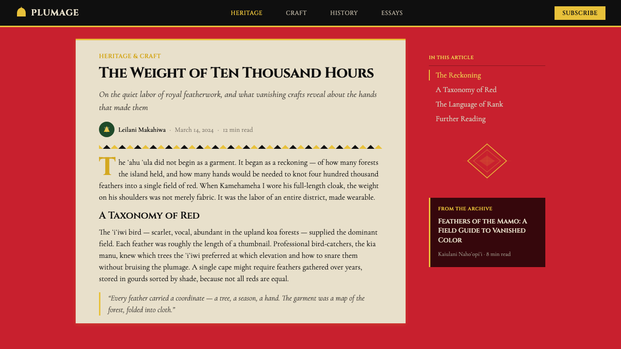
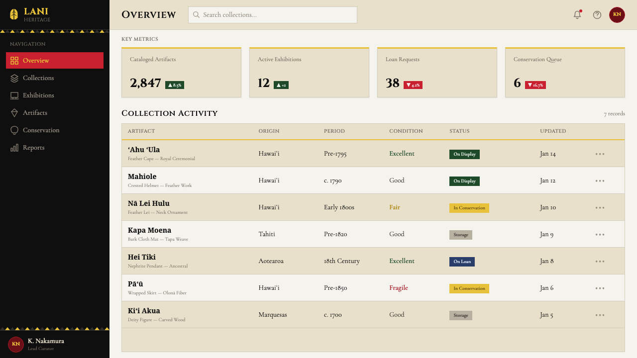
For web interfaces and dashboards, the style suits applications requiring a sense of institutional weight: cultural heritage platforms, premium membership portals, ceremonial event sites, or brand experiences where rarity and authority are the desired message. The approach requires a willingness to commit: the crimson field should occupy meaningful screen real estate — headers, hero sections, sidebar bands — not be diluted into a single accent color among many. Navigation and structural elements carry the black border logic. Interactive states can use the golden accent carefully, reserving it for primary calls to action so that its appearance always signals significance.
For editorial and marketing work, the system excels at producing covers, feature headers, and section dividers that command attention without visual noise. A full-bleed crimson header with a golden geometric device centered or anchored to one side, framed by a black rule above and below, achieves the visual weight of the original capes while remaining legible at any reproduction scale. Marketing copy should be set in clean, unornamented type — the chromatic intensity of the palette makes any additional typographic decoration redundant and distracting. The style is well-suited to product launches, cultural announcements, or limited-edition campaigns where exclusivity and ceremonial weight are the core message.
A common mistake when applying this system is treating the crimson as merely a bold background color and adding additional colors — often a neutral warm tone or a secondary accent — to soften or modernize the palette. This instinct should be resisted. The three-color constraint is the entire system: it is what gives the ʻahu ʻula aesthetic its authority and its historical coherence. A fourth color, however muted, breaks the structural logic and produces something that reads as a loosely Hawaiian-inspired palette rather than a rigorous design system. Similarly, using the golden crescent motifs as general-purpose decorations — scattered across the composition without structural intent — misreads the heraldic function they serve. They should appear rarely, placed with deliberate purpose, always anchored by surrounding negative space that lets their symbolic weight register.
Hawaiian Feather Cape (ʻAhu ʻUla) — FAQ
Is the ʻahu ʻula palette appropriate for non-Hawaiian cultural contexts?
The visual system is available for broad application, but it should be used with awareness of its origins. The ʻahu ʻula carries deep cultural meaning within Hawaiian society — it is not a neutral historical style like many European decorative traditions. Appropriate use means engaging with the system's formal properties — its color logic, geometric discipline, and structural weight — rather than using its surface as costume or tropical decoration. Applications that treat the style as merely exotic will read as superficial; applications that engage with its formal authority, and acknowledge the tradition that produced it, will be more credible and more effective.
How does the crimson in this system differ from generic bold red palettes?
The specific quality of the ʻahu ʻula red is one of depth and saturation rather than brightness or warmth. ʻiʻiwi feathers produce a red that is fully chromatic but tends toward the cooler, slightly darker end of the red spectrum — not a fire-engine red or a coral, but a concentrated, almost jewel-like crimson. In digital application, this distinction matters: a hot or orange-tinted red will read as energetic and modern, while the deeper, more saturated red reads as weighty and ceremonial. The field quality — the sense of texture and density that comes from the original feathers — can be approximated through careful attention to the saturation and value of the color rather than through literal texture effects.
Can the ʻahu ʻula system work effectively for digital dark-mode interfaces?
The system is inherently a dark-ground system — the crimson field is deep and saturated, not a light or pastel ground. In this sense, it already occupies what contemporary designers would call a dark-mode register. The challenge for true dark-mode (near-black ground) adaptation is that removing the crimson entirely changes the fundamental character: without the red field, the golden and black elements alone do not maintain the same authority. A workable approach is to treat the crimson as a deep background rather than the default, and to use near-black as a secondary structural layer — for modals, cards, or navigation — so that the crimson reads as the primary chromatic presence against a darker substrate rather than as a mere accent.
How should the geometric motifs from ʻahu ʻula be adapted for digital contexts without becoming decorative pastiche?
The key distinction is structural versus decorative intent. In the original cloaks, the crescent and chevron motifs carry heraldic meaning — they are rank markers and identity declarations, not background texture. In digital adaptation, they should function similarly: used at moments of structural significance (hero sections, section dividers, cover compositions, primary call-to-action zones) rather than scattered as surface pattern. A single bold crescent used deliberately at large scale carries more authority than multiple small motifs repeated across a background. The motifs should feel placed, not printed — they mark specific compositional moments rather than filling visual space.
What kinds of brands or institutions is this style least appropriate for?
The ʻahu ʻula system is poorly suited to contexts requiring approachability, playfulness, or organic warmth. The style's ceremonial weight and chromatic intensity read as serious and authoritative — which is an asset in some contexts but a significant liability in others. Consumer-facing brands in food, children's products, casual lifestyle categories, or wellness applications will find the system too imposing and its palette too charged. Similarly, contexts that rely on soft gradients, naturalistic imagery, and rounded approachable forms — common in contemporary consumer product design — are structurally incompatible with a system that is built on saturated flat color fields, hard geometric edges, and absolute chromatic discipline. The style rewards restraint and commitment; brands that prefer visual flexibility and tonal range will find it constraining.
Related design styles
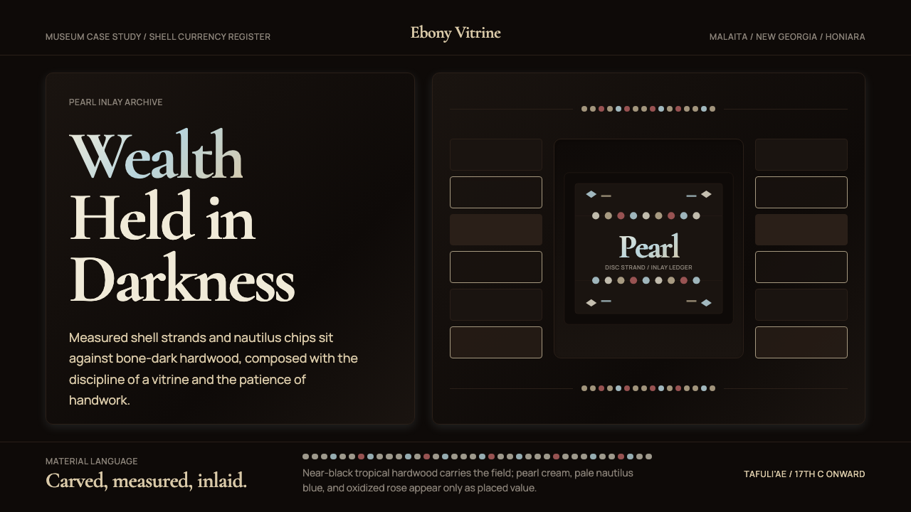 Solomon Shell Money & Pearl InlayDignity inlaid in darkness. Pearl cream and nautilus blue form strict shell-s…
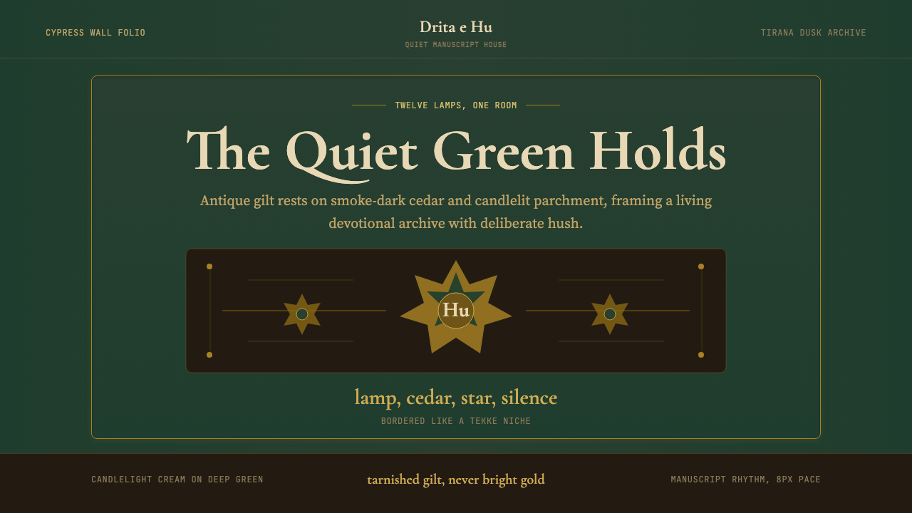 Albanian Bektashi Sufi (Tekke)Sacred quiet in cypress green. Gilt stars and Cormorant type frame a dusk tek…
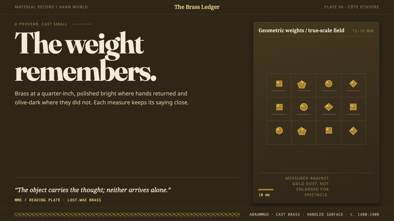 Baule GoldweightWear is the ornament. Burnished brass and olive recesses make every small wei…
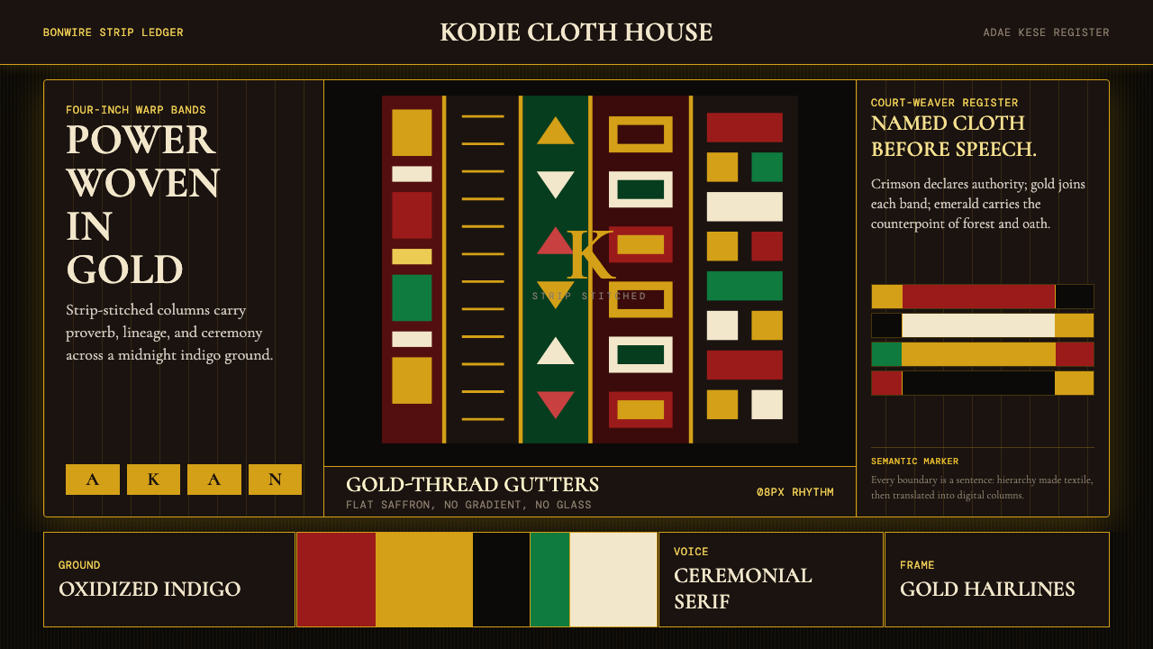 Ghanaian Kente (Asante Royal Gold)Royal authority, woven dark. Gold gutters stitch crimson and indigo strips in…
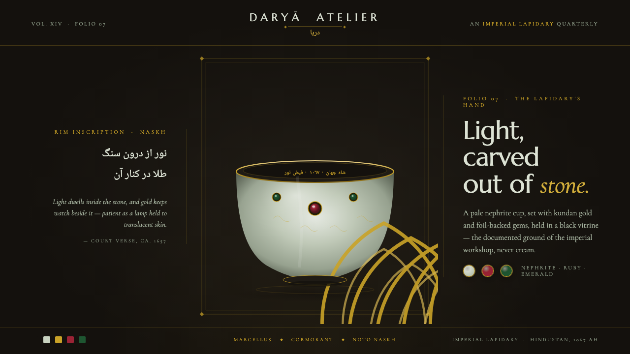 Mughal Jade CarvingImperial luxury, lit from inside. Pale nephrite glows on black, kundan gold f…
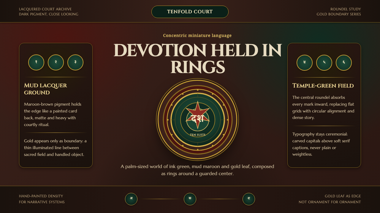 Mysore Ganjifa Playing CardsDevotion held in rings. Ink green centers, mud-maroon lacquer and gold bounda…