What is Cameroonian Ndop Royal Indigo?
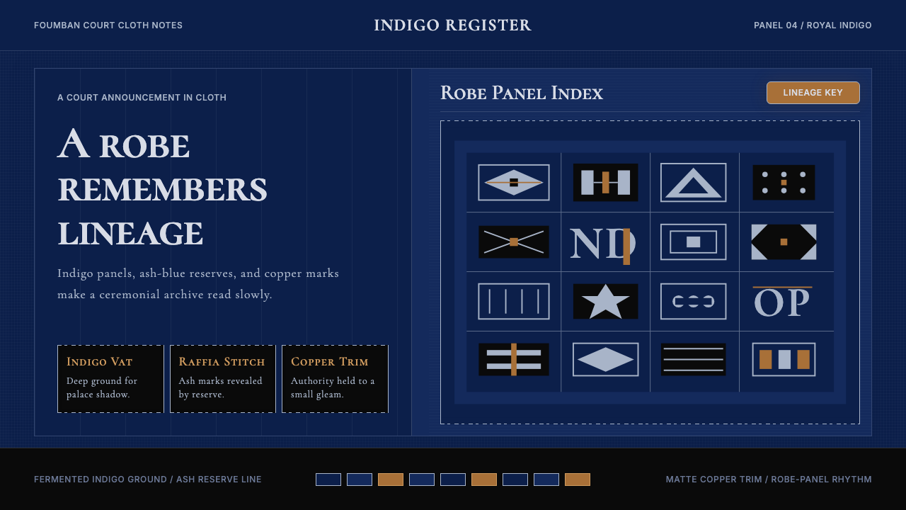
Ndop cloth — the resist-dyed indigo textile of Cameroon's Grassfields courts — translates five centuries of royal ceremony into a visual language of deep blue fields, ash-white reserve patterns, and restrained copper accents that slows every composition to the pace of a royal procession.
Cameroonian Ndop Royal Indigo in brief
Cameroonian Ndop Royal Indigo is a design language rooted in the resist-dyed ceremonial cloth of the Bamum and Bamileke fon courts in Cameroon's Grassfields region. The cloth itself — produced by strip-looming cotton, hand-stitching it with raffia in symbolic motifs, and submerging it in fermented indigo vats — yields a surface where deep navy grounds and pale ash-blue reserves exist in solemn, high-contrast conversation. This textile tradition is not background texture: it is the primary visual vocabulary of court authority, worn at funerals, enthronements, and diplomatic receptions.
Translated into a design system, Ndop Royal Indigo channels the aesthetic of the Foumban Royal Palace in the Bamum heartland. The palette is narrow and deliberate: a saturated, near-black indigo as the dominant field, ash-reserve off-whites and pale mid-blues as pattern surfaces, smoke-black for structural shadow, and restrained copper drawn from the trim of royal palanquins and ceremonial vessels as the sole warm accent. Together these four tones construct a visual atmosphere that is simultaneously ancient and austere — ceremonial without being loud.
The style sits in an unusual position among African design traditions: it is aristocratic rather than populist, geometric rather than representational, and restrained rather than exuberant. Unlike the bright chromatic traditions of West African kente or the dense pictorial vocabulary of Kuba cloth, Ndop works through absence and reserve — the pattern emerges from what the dye does not reach, and the power of the image lies in that careful withholding.
Where does Cameroonian Ndop Royal Indigo come from?
The Grassfields of western and northwestern Cameroon are a high plateau of volcanic soil and dense chieftaincies, where more than a hundred distinct fon courts have maintained unbroken traditions of court art and regalia for centuries. Among the most significant of these traditions is the production of ndop cloth — the term itself derives from the Bamum language — which serves as both a mark of royal identity and a medium for encoding cosmological knowledge in durable textile form. The tradition is believed to date back at least to the seventeenth century, though the forms it takes today were substantially shaped during the reign of Bamum King Ibrahim Njoya (r. 1889–1933), one of the most remarkable rulers in African history.
Njoya was an intellectual sovereign who, among other achievements, invented the Shu Mom script — a writing system for the Bamum language that he developed around 1896 and refined over subsequent decades — and founded a museum in Foumban to house the material culture of his court. His reign coincided with the German colonial presence in Cameroon and later the French and British division of the territory, and he navigated these pressures by simultaneously modernizing his administration and deepening his court's investment in Bamum cultural production. Ndop cloth thrived under his patronage, and the Foumban Royal Palace — still standing and still active — remains the institutional center of Bamum artistic production today.
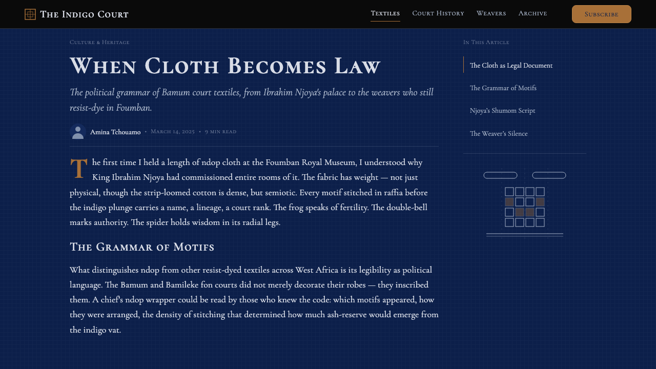
The resist-dye process that produces ndop is technically demanding and socially embedded. Strip-loomed cotton panels are sewn together, then raffia fiber is used to bind portions of the cloth in tight stitched patterns — frog motifs, double bells, spider forms, and geometric interlaces that carry specific dynastic and cosmological meanings. The bound cloth is submerged repeatedly in fermented indigo pots, each immersion deepening the ground color, until the unbound areas emerge on removal as pale reserves against the saturated field. The stitching is then removed to reveal the full pattern. The entire process, from weaving to final dye, can take weeks and requires specialized knowledge passed within family workshops or court-affiliated guilds.
Among the Bamileke chieftaincies to the south of the Bamum kingdom, ndop cloth carries comparable ceremonial weight. Fon Fotue II of Bandjoun — a major Bamileke chieftaincy — was among the figures who helped preserve and transmit these traditions into the late twentieth century. The scholar Christraud Geary conducted foundational documentation of Bamum court arts in the 1970s and 1980s, and her photographic and ethnographic records remain among the most important references for understanding how ndop cloth was produced and displayed in active court settings. The motifs she documented — particularly the royal frog, the spider as wisdom symbol, and the double-bell as authority marker — became the symbolic vocabulary from which the Ndop Royal Indigo design system draws its iconographic sensibility.
What defines the Cameroonian Ndop Royal Indigo look?
Color Field
The dominant surface is a saturated, deep indigo that reads as nearly black in dim light but opens into a rich blue under direct illumination. This depth is not a flat digital color but a quality of surface: the layered immersions of the dye process produce a tone with perceptible variation, so the background is understood as inhabited rather than inert. Against this field, pale ash-blue and off-white reserves carry the pattern, and copper appears only as a narrow accent — never as a field color in its own right.
Pattern Logic
Ndop patterns arise from a subtractive process: the design is defined by what the dye does not reach. This means all motifs have a quality of relief or emergence — they read as pale forms surfacing from a deep ground, rather than dark marks applied to a light surface. The geometric interlaces, frog forms, and bell shapes that appear in the reserves carry a sense of restrained revelation, as though the pattern has always been present within the cloth and the dye process only made it legible.
Geometric Restraint
The motifs of ndop are not free-form: they are grid-derived, repeat-structured, and governed by the modular logic of the woven strip. Frogs are rendered as symmetrical geometric units rather than naturalistic creatures; double bells appear as paired rounded rectangles with strict bilateral symmetry; spider forms reduce to a central square with eight equal projections. Every motif can be described as a geometric rule rather than an image, and this rule-governed quality gives the system its capacity for endless variation within a stable visual grammar.
Copper as Ceremony
Copper and bronze recur throughout Bamum and Bamileke royal arts in the form of lost-wax cast figures, ceremonial vessels, and the trim on royal regalia. In the Ndop design system, copper is the accent that signals ceremony, hierarchy, and occasion — it appears on borders, on icon highlights, and on typographic emphasis marks, but always in small quantities. Its warmth against the indigo-and-ash palette is deliberate contrast: cold field, warm accent, the visual equivalent of a single candle in a stone hall.
Structural Silence
Ndop cloth includes significant areas of plain dyed ground between motif zones, and these unmarked fields are not empty: they are the visual equivalent of the pauses in a royal protocol or the unadorned stretches between carved posts in a palace compound. In the design system, this principle translates into generous negative space that is not minimalism for its own sake but the deliberate use of absence to amplify presence. A motif surrounded by deep indigo silence reads as more significant, more charged, than the same motif crowded by activity.
Strip Panel Rhythm
Because ndop is woven in narrow strips that are sewn together to form the full cloth, the finished textile retains a subtle vertical panel structure — seam lines run at regular intervals across the surface, dividing it into columns that the pattern must navigate across or align with. This strip logic underlies the grid sensibility of Ndop Royal Indigo as a design system: layouts tend toward vertical columns, content blocks respect panel boundaries, and horizontal continuity is achieved through deliberate crossing of those boundaries rather than ignoring them.
Dark Authority
The deep indigo ground is not merely a color choice — it is a culturally encoded signal of authority and solemnity. In Grassfields court tradition, ndop is worn at the most grave and significant occasions: funerals of titleholders, accession ceremonies, and diplomatic receptions where the fon must appear at his most authoritative. The darkness of the cloth is part of that authority. A Ndop Royal Indigo interface does not feel playful or approachable at first contact; it feels considered and deliberate, as though access to it must be earned.
Who shaped Cameroonian Ndop Royal Indigo?
Njoya ruled the Bamum kingdom from 1889 to 1933 and is the central figure in the modern history of Grassfields court culture. His invention of the Shu Mom script — one of the few indigenous African writing systems developed in the modern era — was accompanied by a parallel deepening of court arts including ndop production. He commissioned extensive documentation of Bamum history, established the Foumban Palace museum, and navigated the German and subsequently French colonial presence with a degree of cultural confidence that allowed Bamum material traditions to survive and even flourish under external pressure. His reign defined the visual register that the Ndop Royal Indigo design system inherits.
As the paramount ruler of one of the most significant Bamileke chieftaincies, Fon Fotue II was instrumental in maintaining and transmitting the ndop traditions of the Bamileke courts into the contemporary period. The Bamileke variant of ndop shares the deep indigo field and raffia-stitched reserve patterns of the Bamum tradition but employs a somewhat different set of motifs and a court protocol in which the cloth appears in specific combinations with other regalia. His stewardship ensured that the southern Grassfields strand of the tradition remained distinct and documented.
An art historian and curator who conducted landmark fieldwork in the Bamum kingdom during the 1970s and 1980s, Geary produced photographic documentation and scholarly analysis of Bamum court arts that remain foundational references. Her work on ndop cloth, royal regalia, and the visual culture of the Foumban Palace provided the material record without which the design vocabulary of this tradition would be inaccessible to those outside the Grassfields. Her publications translated court aesthetic principles into documented visual form, making them available to the wider world of design and material culture scholarship.
Among the master weavers and dye specialists associated with the Bamum court, Foyo represents the lineage of craft knowledge that sustains ndop production as a living practice rather than a museum artifact. The technical knowledge embedded in ndop — the specific motif grammar, the calculation of repeat patterns across strip-sewn panels, the management of fermented indigo vats — is transmitted through practitioners like Foyo whose workshops maintain the chain of expertise. The design system's claim to authenticity rests ultimately on this unbroken thread of material knowledge.
How do you use Cameroonian Ndop Royal Indigo today?
Ndop Royal Indigo functions best when the product it is applied to shares some of its core values: solemnity, authority, ceremony, and depth. It is not a style for products that want to feel approachable on first contact, and it is not a style for contexts where speed and informality are virtues. Applied with understanding, it produces interfaces and materials that feel considered and significant — qualities that map well onto premium credentials, institutional communication, cultural and heritage organizations, and any product that genuinely earns the right to ask for sustained attention.
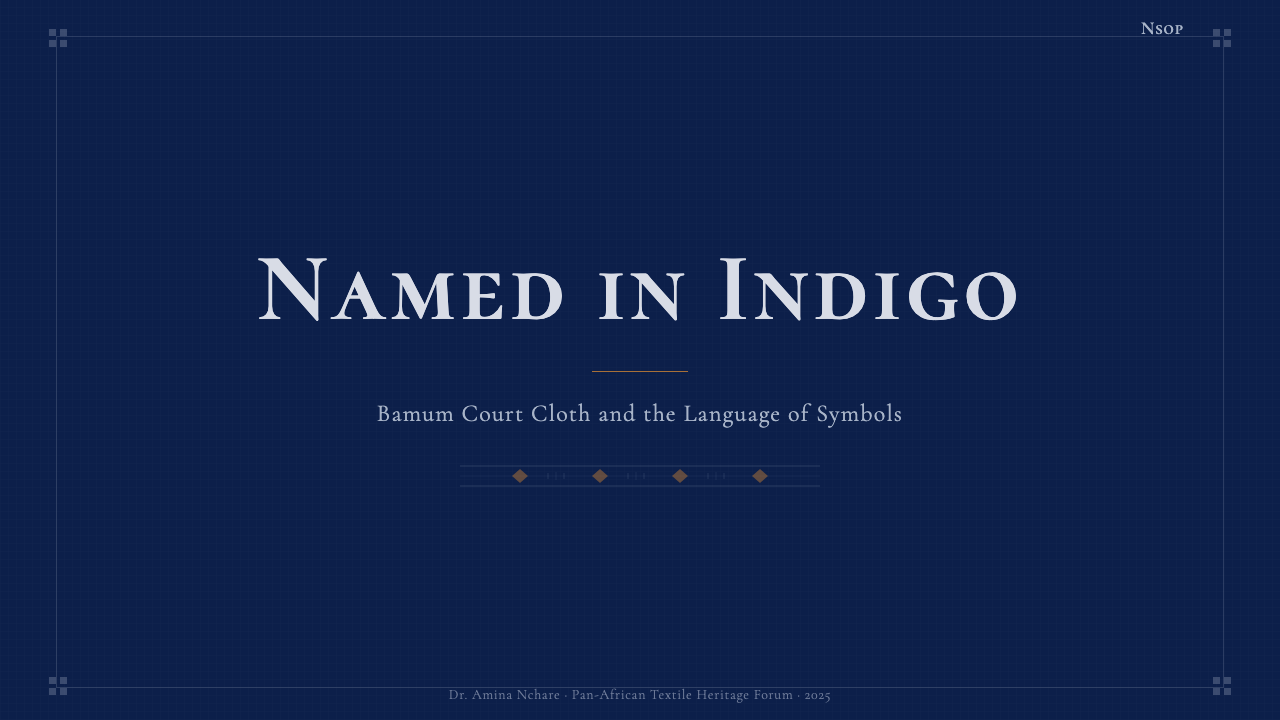
For presentation slides, the style works most powerfully as a contrast system: deep indigo slides alternate with near-white ash-reserve slides in a rhythm that mirrors the pattern logic of the cloth itself. Cover slides benefit from placing a single large geometric motif — drawn from the frog, bell, or spider vocabulary of ndop — in a pale reserve against the deep ground, with the title in a restrained typeface at a scale that honors the silence around it. Content slides should use the deep ground sparingly; most content is more legible on an ash-ground page with indigo structural accents. Data visualizations in this palette take on a diagrammatic, almost cartographic quality — bars and segments rendered in ash-blue and copper against the dark field read as charted territory rather than merely compared quantities.
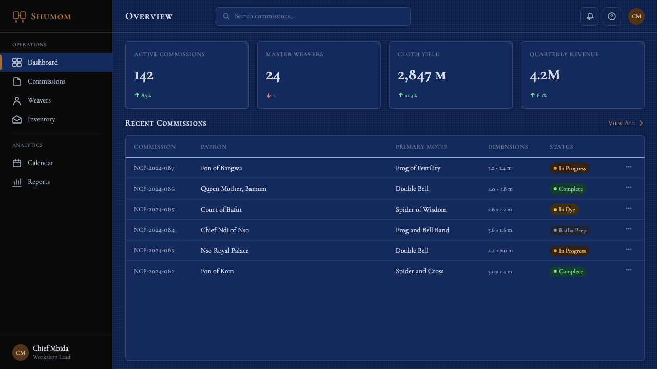
For web interfaces, the system suits products where a premium, considered aesthetic communicates value more effectively than friendliness. Account dashboards, membership portals, cultural institution websites, and high-end editorial platforms all benefit from the palette's depth and restraint. The practical approach: establish the deep indigo as a primary brand surface used in headers, hero sections, and navigation; use the ash and near-white palette for content areas where extended reading occurs; reserve copper for calls to action, active states, and the handful of moments where the interface needs to direct attention with warmth rather than contrast. Avoid using copper as a background — it belongs at the edge of things, not at their center.
For editorial and marketing applications, Ndop Royal Indigo supports a kind of slowed, ceremonial pacing that is increasingly rare in contemporary design. An editorial layout in this system uses wide margins and generous inter-block spacing not as waste but as the visual equivalent of the blank ground between ndop motifs — space that gives the content weight and intention. Marketing pages work well with a strict alternating rhythm: deep indigo feature blocks for statements of principle or identity, ash-ground blocks for detailed content or testimonial, copper used only at the moments of transition or call to action. The effect is closer to a legal document or a program for a state ceremony than to a startup landing page, and that is precisely its value for certain audiences.
A common mistake when applying this system is over-saturating the copper accent, using it as a general-purpose highlight color across the entire interface. Authentic ndop contains copper as a trim detail — a narrow border, a clasp, a decorative finial — not as a broad surface. When copper appears everywhere, the ceremonial hierarchy collapses and the palette reads as generic dark-with-gold, losing the specific solemn authority that makes Ndop Royal Indigo distinctive. Use copper at the edges and at the apex of attention hierarchies; let the indigo and ash carry everything else.
Cameroonian Ndop Royal Indigo — FAQ
Is Ndop Royal Indigo appropriate for consumer-facing products, or is it primarily suited to institutional use?
It can work in consumer contexts, but only where the product earns the authority the palette implies. Luxury goods, collector platforms, heritage cultural products, and premium membership services have successfully used deep indigo palettes derived from ceremonial traditions because their users expect and value a sense of serious consideration. Where it struggles is in consumer products where friendliness, speed, and low friction are the primary experience values — food delivery, social media, casual gaming, or any product that wants to feel like a conversation rather than an audience with a dignitary. The palette does not perform warmth by default; it must be earned through tone of voice, imagery, and the warmth of copper accents.
How does this style differ from other African design traditions?
African design traditions are extraordinarily diverse, and Ndop Royal Indigo occupies a specific and unusual position within that diversity. Unlike the polychrome chromatic exuberance of West African kente cloth, with its interleaved strips of saturated red, gold, green, and blue, ndop operates through depth and restraint — a single deep ground, a limited set of pale reserves, and almost no chromatic variety. Unlike the dense pictorial vocabulary of Central African Kuba cloth, with its labyrinthine geometric interlace in warm terracottas and black, ndop motifs are fewer, simpler, and spaced with more visual silence. Ndop is closer in spirit to certain Japanese dyeing traditions — katazome or shibori — than to other African textiles: it shares the emphasis on negative space, the reverence for the resist process itself, and the sense that restraint is a form of mastery.
Can the motifs — frogs, bells, spiders — be used as decorative elements without their cultural meaning?
They can be used as geometric forms without deep knowledge of their symbolic meanings, but the most powerful applications are those that honor the logic behind them. The frog in Bamum court culture is associated with fertility and transformation; the spider with wisdom and the interconnection of fate; the double bell with the voice of authority and the summoning of attention. A design that uses these forms in contexts consistent with those meanings — a platform for acquired knowledge using a spider-derived motif, a notification system using the bell form — achieves a resonance that purely decorative use cannot. That said, the geometric logic of the motifs is robust enough to work even when the cultural meaning is not consciously invoked: the forms carry their own visual weight.
Does this style work in light mode, or is it fundamentally a dark-background system?
Ndop cloth is fundamentally a dark-ground tradition: the deep indigo field is not a stylistic preference but the structural core of the aesthetic, the surface from which patterns emerge. A full inversion — pale ground with dark motifs — breaks the core logic of the style and produces something that resembles printed block fabric rather than resist-dyed cloth. However, a practical light-mode variant is possible for extended reading contexts: use the ash-reserve color as the ground, deep indigo as heading and structural elements, and copper as accent. This reads as ndop-influenced rather than ndop proper, but it maintains the palette's tonal identity while achieving the legibility that sustained reading requires. Navigation, headers, and brand surfaces should retain the deep indigo even in a predominantly light-mode interface.
How should typography behave in a Ndop Royal Indigo system?
The typography should evoke the quality of court announcements: measured, authoritative, and unhurried. This means favoring relatively wide letter-spacing in headings to give the text the quality of an inscription rather than a headline, and using generous line-height in body text to match the spacious pacing of the overall system. Typeface personality matters more than specific category: look for faces that carry a sense of ceremony and considered construction — whether that leans toward the geometric or the humanist serif end of the spectrum depends on the specific product. What to avoid is anything that feels casual, rushed, or informally expressive: condensed display faces, informal handwriting-influenced styles, and the aggressive contrast extremes of certain contemporary display type all undermine the solemn authority that the palette establishes. Type color follows the palette logic: pale ash or near-white on deep indigo grounds, near-black on ash grounds, copper only for titles or emphasis on specific ceremonial moments.
Related design styles
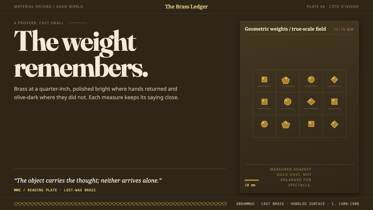 Baule GoldweightWear is the ornament. Burnished brass and olive recesses make every small wei…
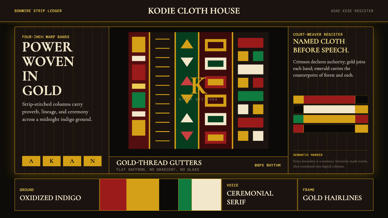 Ghanaian Kente (Asante Royal Gold)Royal authority, woven dark. Gold gutters stitch crimson and indigo strips in…
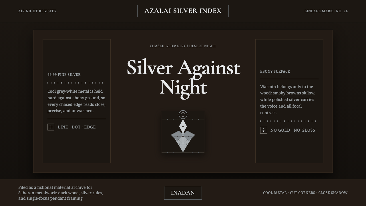 Tuareg Agadez Cross SilverSilver refuses warmth. Cool chased geometry cuts across ebony-dark surfaces.
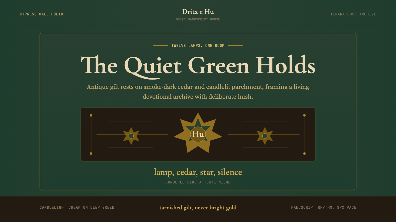 Albanian Bektashi Sufi (Tekke)Sacred quiet in cypress green. Gilt stars and Cormorant type frame a dusk tek…
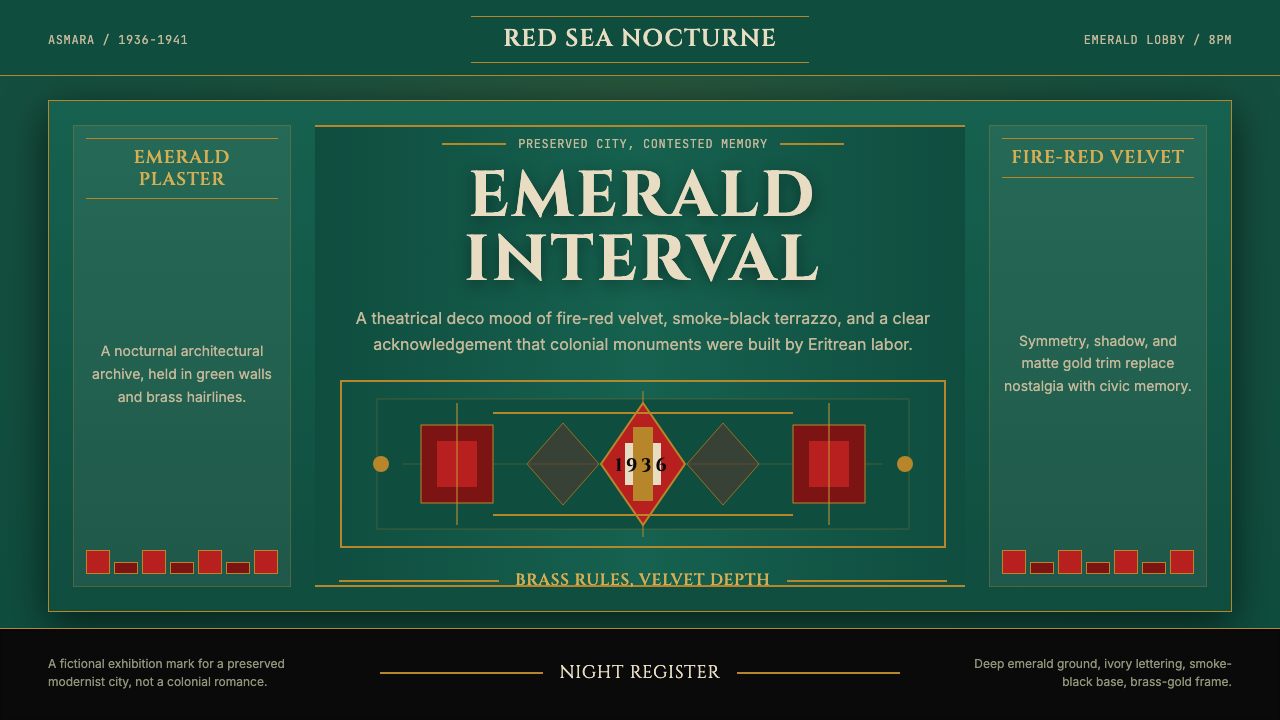 Eritrean Asmara Art Deco Cinema (1936)Nocturnal deco, critically lit. Emerald walls, fire red velvet, and brass rul…
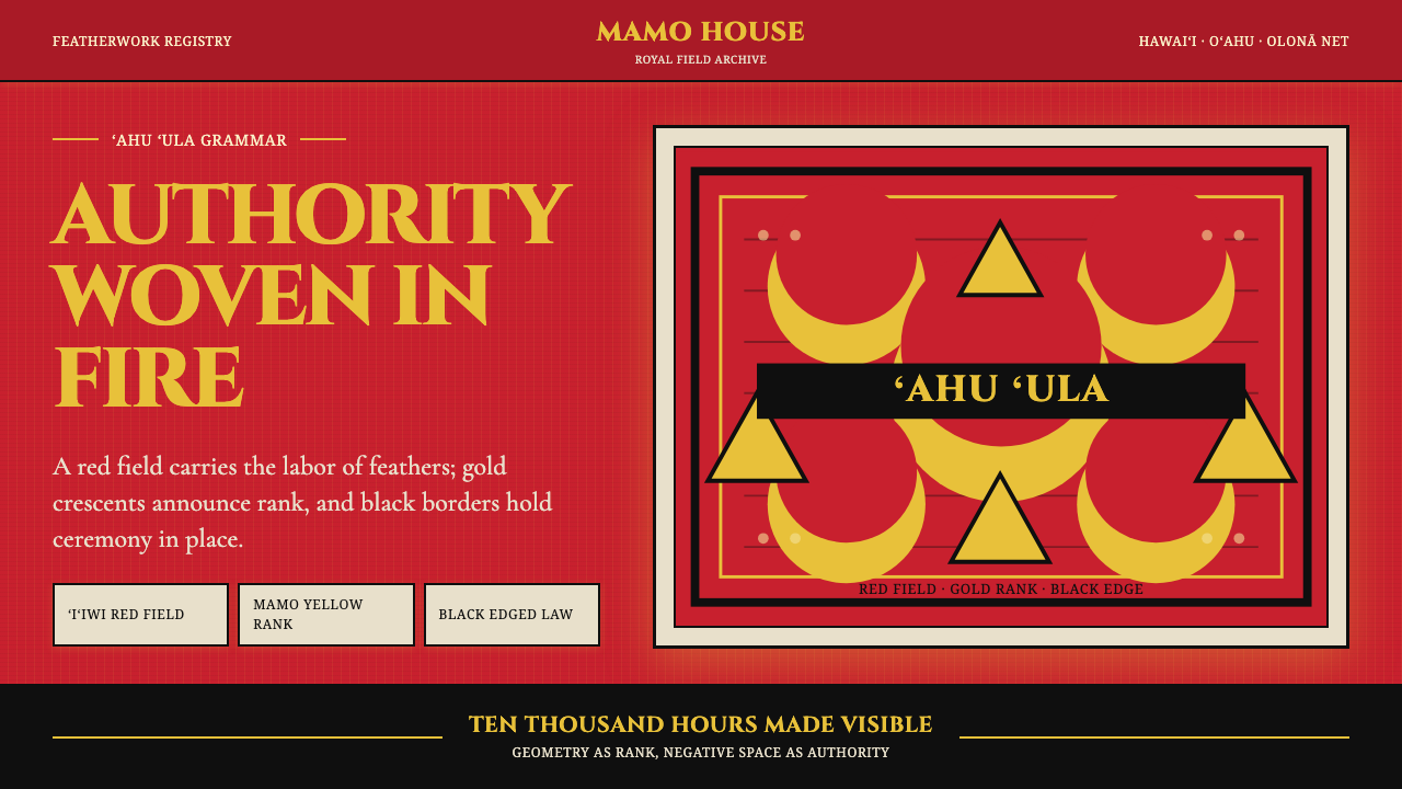 Hawaiian Feather Cape (ʻAhu ʻUla)Ceremony has weight. Red feather fields, mamo yellow crescents, black borders.