What is South African Shweshwe Indigo?什么是 South African Shweshwe Indigo?
South African Shweshwe cloth turns a single saturated ground and a field of bleached geometric repeats into one of the most disciplined and ceremonially charged textile aesthetics in the world.南非 Shweshwe 布料以单色饱和底与漂白几何纹样的密集铺陈,构建出世界上最严谨、最具仪式感的纺织美学之一。
South African Shweshwe Indigo in briefSouth African Shweshwe Indigo 速览
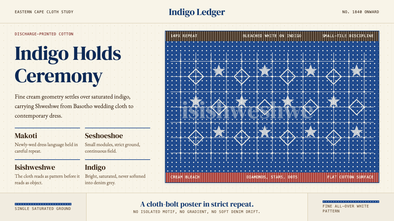
Shweshwe is South Africa's discharge-printed indigo cotton — a textile defined by a single deep-saturated ground, typically indigo blue, chocolate brown, or iron-rust red, onto which fine all-over geometric patterns have been bleached or printed in white or cream. The motifs — stars, diamonds, paisleys, leaf-vines, interlocking lozenges — are small and relentlessly repeated, so that the eye reads the fabric not as a collection of individual shapes but as a continuous, shimmering field. From a distance, a bolt of Shweshwe looks almost like a woven texture; up close it reveals an intricate hand-drawn geometry.Shweshwe 是南非的褪色印花靛蓝棉布——以一种深度饱和的底色为核心,通常是靛蓝、巧克力棕或铁锈红,布面上以白色或奶油色漂印出细密的全覆盖几何纹样。母题包括星点、菱形、佩斯利、藤蔓花叶、连锁菱块,尺寸细小且密布不断,使视线不会将其读作一个个孤立的图形,而是一片连续的、闪烁着光感的图案场域。从远处望去,一匹 Shweshwe 布接近于编织纹理;走近细看才发现那是极为精细的手绘几何体系。
The discipline of the aesthetic is precise and unyielding: one saturated ground, one fine pattern field, small tile modules, no isolated large motif, no competing colors. This is not minimalism in the contemporary sense but rather a form of textile grammar — every rule serves the cloth's ceremonial purpose. Shweshwe is worn at weddings, initiation rites, and community celebrations, and its visual density communicates importance, belonging, and cultural continuity. The cloth is meant to be read by communities who know the codes, and its restraint is a form of richness.这套美学的纪律精准而不可妥协:一种饱和底色、一个细密图案场、小模块重复单元、无孤立大型母题、无竞争性色彩。这不是当代意义上的极简主义,而是一种纺织语法——每一条规则都服务于布料的仪式用途。Shweshwe 穿戴于婚礼、成年礼与社区庆典,其视觉密度传达着重要性、归属感与文化延续。这块布料是为知晓规则的群体所设计的,它的克制本身就是一种丰盛。
Translated into graphic design and digital interfaces, the Shweshwe aesthetic offers a rare combination: bold chromatic presence through the saturated ground, intricate visual texture through the repeating pattern, and an underlying sense of order through the grid. It is a style that rewards attention — layouts built in this language reveal more detail the closer a viewer looks, which makes it particularly effective for contexts where sustained engagement matters.转译为平面设计与数字界面时,Shweshwe 美学提供了一种罕见的组合:饱和底色带来的大胆色彩存在感、重复纹样带来的细腻视觉肌理,以及网格底层带来的秩序感。这是一种回报注意力的风格——以此语言构建的版面,越细看越能发现更多层次,这使它对需要持续参与感的场景尤为有效。
See the South African Shweshwe Indigo design system查看 South African Shweshwe Indigo 完整设计系统
Where does South African Shweshwe Indigo come from?South African Shweshwe Indigo 从何而来?
The story of Shweshwe begins not in South Africa but in Europe. In the early nineteenth century, European textile mills — particularly those in Germany, Alsace, and Britain — were producing discharge-printed cotton fabrics for export to colonial markets across Africa and Asia. These cloths used an acid or bleach printing process to remove dye from a pre-dyed ground, leaving fine geometric patterns in the original or treated color. The technique produced a distinctive visual effect that could not easily be achieved by conventional block or screen printing: the pattern appears to emerge from within the cloth itself rather than being applied on top.Shweshwe 的故事并非始于南非,而是始于欧洲。十九世纪初,欧洲纺织厂——尤其是德国、阿尔萨斯和英国的工厂——正在为非洲和亚洲的殖民市场大量生产褪色印花棉布。这些布料采用酸液或漂白剂印花工艺,在预染底布上局部去除染料,留下细密几何纹样,颜色或为原始底色,或为处理后的新色。这种工艺产生了一种独特的视觉效果,是普通木版或丝网印花难以实现的:纹样看起来仿佛从布料内部生长出来,而非被施加在表面。
These printed cottons reached the Cape Colony and the interior of southern Africa by the 1840s, arriving via missionary and trading networks. Among the Basotho people of what is now Lesotho and the eastern Free State, the cloth was rapidly adopted for ceremonial dress and became associated with the court of King Moshoeshoe I — the founder and paramount chief of the Basotho nation. The cloth took its name from him: in some accounts, the stiff, starched rustle of the cotton was said to sound like 'shweshwe,' an onomatopoeic rendering of the king's name as pronounced by his subjects. Other southern African communities — the Xhosa, Sotho, and Tswana — also adopted the cloth, each developing regional conventions for how it was worn, folded, and combined.这些印花棉布在 1840 年代经由传教士与贸易网络抵达开普殖民地和南部非洲内陆。在今日莱索托和自由邦东部的巴索托人中,这种布料迅速被纳入仪式服装,并与巴索托民族创始人兼最高酋长 Moshoeshoe I 国王的宫廷产生了关联。布料的名字由此而来:据某些说法,棉布上浆后发出的硬挺摩擦声被认为听起来像「shweshwe」——一种臣民对国王名字的拟声表达。科萨、索托、茨瓦纳等其他南部非洲族群也相继采用这种布料,各自发展出关于穿法、折叠方式与搭配组合的地域惯例。
For much of the twentieth century, Shweshwe fabric was imported from European mills, making it both culturally central and economically dependent on foreign production. This changed in 1992 when Da Gama Textiles, a South African textile manufacturer operating in Zwelitsha in the Eastern Cape, began producing the cloth domestically under the Three Cats brand mark — named after the three cats on its logo. Da Gama's production became the only authentic local source of Shweshwe, and its Three Cats branding became a mark of quality and cultural legitimacy recognized across southern Africa.二十世纪大部分时间里,Shweshwe 布料依赖从欧洲工厂进口,使其在文化上居于核心地位的同时,经济上却依附于海外生产。1992 年,这一局面发生改变——南非纺织制造商 Da Gama Textiles 在东开普省的 Zwelitsha 开始在本土生产这种布料,品牌名为「Three Cats」(三只猫),得名于其商标上的三只猫图案。Da Gama 的生产线成为 Shweshwe 唯一正宗的本土来源,「三只猫」商标也因此成为南部非洲公认的质量与文化正统性标志。
In the post-apartheid decades, Shweshwe underwent a significant cultural reappraisal. What had been worn primarily in rural and ceremonial contexts began appearing on fashion runways and in contemporary design. Designers like Bongiwe Walaza and Laduma Ngxokolo of MaXhosa Africa brought the fabric into international fashion, working with its visual grammar — the dense geometric field, the saturated ground, the white repeat — as a sophisticated design language rather than a historical artifact. This elevation did not sever the cloth from its ceremonial roots; rather, it extended those roots into new soil, establishing Shweshwe as a living textile tradition with both deep historical grounding and ongoing creative evolution.后种族隔离时代的数十年间,Shweshwe 经历了深刻的文化再评价。原本主要出现在乡村与仪式语境中的布料,开始登上时装秀台和当代设计舞台。Bongiwe Walaza 和 Laduma Ngxokolo(MaXhosa Africa)等设计师将这种面料带入国际时尚,将其视觉语法——密集几何场、饱和底色、白色重复纹样——作为精密的设计语言而非历史遗物加以运用。这种提升并未切断布料与仪式根源的联结,而是将这些根源延伸进了新的土壤,使 Shweshwe 成为一种既有深厚历史根基、又持续生长演化的活态纺织传统。
What defines the South African Shweshwe Indigo look?South African Shweshwe Indigo 的视觉特征是什么?
Saturated Ground饱和底色
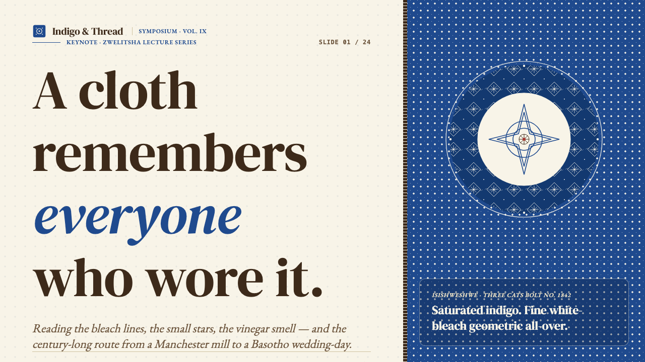
The foundation of every Shweshwe composition is a single deep-saturated ground color — most canonically a rich indigo that reads almost as a dark, luminous blue, but also produced in chocolate brown and iron rust. The ground is never neutral or pastel; its depth is what gives the fine white pattern its visual punch. The saturation is structural: it creates the contrast ratio that allows tiny geometric details to remain legible even in small tiles. Lightening or softening the ground immediately weakens the entire system.每一幅 Shweshwe 构图的基础都是一种深度饱和的单色底——最经典的是浓郁靛蓝,呈现出一种深沉而发光的蓝,同时也有巧克力棕和铁锈红版本。底色从不中性,也从不柔和;正是底色的深度赋予了细白纹样视觉冲击力。饱和度在这里是结构性的:它创造了使微小几何细节即便在小模块中也保持清晰可辨的对比度。一旦底色变浅或变柔,整套系统就随之失效。
All-Over Geometric Repeat全覆盖几何重复
The pattern field covers the entire ground without margin or interruption. Motifs — stars, diamonds, paisleys, interlocking lozenges, leaf-vine tracery — are arranged in strict tile repeats, each unit small enough that the individual shape nearly dissolves into texture when viewed at a normal distance. There are no focal points, no central medallion, no isolated large motif. The visual experience is one of total surface animation: the cloth moves as a whole rather than directing the eye to any particular element.图案场铺满整块底色,无边距,无间断。母题——星点、菱形、佩斯利、连锁菱块、藤蔓花叶描线——以严格的格子方式排列重复,每个单元都足够细小,使得在正常观看距离下,个别形状几乎消融为纹理。没有焦点,没有中心徽章,没有孤立的大型母题。视觉体验是整块布面的全面生动:布料作为整体在运动,而非将目光引向某个特定元素。
Bleached White Line Work漂白白色线描
The pattern is not printed on top of the ground but discharged out of it — acid or bleach removes dye from selected areas, leaving the geometric forms in a clean cream or white that is almost luminous against the deep ground. This discharge technique means the pattern and ground share the same fiber; there is no surface layer that can crack or peel. The white reads as an internal light source within the cloth, giving Shweshwe its characteristic glow. In digital applications, replicating this quality requires treating the light elements as slightly warm rather than pure cool white.图案并非印在底色上方,而是从底色中漂出——酸液或漂白剂去除选定区域的染料,将几何形留在干净的奶油色或白色中,在深色底面上几乎发出荧光。这种褪色工艺意味着纹样与底色共享同一纤维,没有可能开裂或剥落的表面涂层。白色在布料内部读作一个光源,赋予 Shweshwe 其标志性的光晕感。在数字应用中,复现这种质感需要将明亮元素处理为略带暖调,而非纯粹的冷白。
Single-Color Discipline单色纪律
Authentic Shweshwe uses exactly two values: the saturated ground and the bleached pattern. There is no second accent color, no gradient, no color variation within the pattern field. This strict two-value system is what makes the fabric legible at scale — worn in gathered folds, the pattern reads consistently because there are no competing colors to create visual confusion. In design work that draws on this aesthetic, introducing a third color is possible but should be treated as an expansion of the system rather than an addition, used only when it serves a specific communicative function.正宗的 Shweshwe 只使用两个色值:饱和底色和漂白纹样。没有第二种强调色,没有渐变,图案场内部没有色彩变化。这种严格的双色值体系使布料在大面积展示时保持清晰——穿在身上形成褶皱时,图案依然连贯易读,因为没有竞争性色彩制造视觉混乱。在借鉴这种美学的设计作品中,引入第三种色彩是可能的,但应被视为对系统的扩展而非添加,只在服务于具体传达功能时使用。
Ceremonial Density仪式性密度
The density of the Shweshwe pattern — the fact that no area of ground is left undecorated — is not arbitrary; it is an expression of the cloth's ceremonial weight. In the cultural contexts where Shweshwe is worn, visual fullness communicates investment, care, and significance. Empty space in such a context would read as unfinished or unworthy. For design applications, this means the aesthetic is inherently generous with visual information: it suits contexts where richness and detail signal quality, and it resists applications that require large areas of visual rest.Shweshwe 图案的密度——没有任何底色区域被留空的事实——并非随意为之,而是布料仪式分量的外化表达。在 Shweshwe 被穿戴的文化语境中,视觉上的丰满传达着投入、用心与重要性。空白在这种语境中会被解读为未完成或不值得。对于设计应用而言,这意味着这种美学本质上是视觉信息丰富的:它适合细节与丰富感传达品质的场景,并抵制需要大面积视觉留白的应用。
Textile Grid Rhythm纺织网格节奏
Beneath the variety of Shweshwe motifs lies an invariant tile grid. The repeat unit is small and consistent, creating a rhythmic regularity that unifies the surface regardless of which motif is used. This grid quality is one of the aesthetic's most transferable properties: layouts built on a strict modular grid, where the column and row system is as important as the content it organizes, share the same underlying logic. The pattern's geometry may vary; the underlying beat does not.在 Shweshwe 各种母题的变化之下,隐藏着一个不变的格子网格。重复单元细小而一致,创造出节律性的规则感,无论使用哪种母题都能统一整个表面。这种网格特质是这套美学最可移植的属性之一:建立在严格模块网格上的版面——其中列与行的体系和它所组织的内容同样重要——与之共享相同的底层逻辑。图案的几何形态可以变化,底层的节奏则不会。
Starch and Structure浆硬与结构感
Traditional Shweshwe is heavily starched, giving the cloth a crisp, architectural quality — garments hold their form, pleats stay sharp, edges remain defined. This physical property has an aesthetic analogue: Shweshwe compositions are not soft or fluid. Lines are hard, edges are clean, shapes are decisive. In digital contexts, this translates to a preference for sharp boundaries over blurred edges, defined shapes over amorphous forms, and consistent line weights over expressive variation.传统 Shweshwe 经过重度上浆处理,赋予布料挺括的建筑感——服装保持形态,褶皱保持锐利,边缘保持清晰。这种物理属性在美学上有其对应物:Shweshwe 构图不柔软,不流动。线条硬朗,边缘干净,形态果断。在数字语境中,这转化为对硬边的偏好而非模糊边缘,对明确形态的偏好而非无定形,以及对一致线条粗细的偏好而非表现性的粗细变化。
See the South African Shweshwe Indigo design system查看 South African Shweshwe Indigo 完整设计系统
Who shaped South African Shweshwe Indigo?谁塑造了 South African Shweshwe Indigo?
Founder and paramount chief of the Basotho nation, Moshoeshoe I ruled from approximately 1822 until his death in 1870, consolidating Basotho identity and sovereignty during a period of intense regional upheaval. His court's adoption of the imported discharge-printed cotton gave the cloth its name and elevated it from a trade commodity to a marker of political and cultural prestige. The association between Shweshwe and Moshoeshoe transformed the fabric into something that carried genealogical and national meaning, a significance that has persisted through subsequent generations of Basotho and other southern African communities.巴索托民族的创始人兼最高酋长,Moshoeshoe I 约自 1822 年起执政直至 1870 年辞世,在剧烈的地区动荡中整合了巴索托的民族认同与主权。他宫廷对这种进口褪色印花棉布的采纳赋予了布料其名,并将其从贸易商品提升为政治与文化威望的标志。Shweshwe 与 Moshoeshoe 之间的关联使这种布料承载了谱系与民族意义,这一重要性在此后数代巴索托人及其他南部非洲族群中延续至今。
The Eastern Cape manufacturer Da Gama Textiles became, from 1992, the sole domestic producer of authentic Shweshwe cloth in South Africa, operating under its Three Cats brand mark from its Zwelitsha facility. Da Gama's production was significant not only economically but culturally: it transferred ownership of the textile tradition from European mills to South African manufacturing at a moment of post-apartheid national reconstruction. The Three Cats label is recognized as a mark of quality and authenticity across southern Africa, and the company's ongoing production sustains both the commercial availability and the cultural continuity of the cloth.东开普省制造商 Da Gama Textiles 自 1992 年起成为南非唯一正宗 Shweshwe 布料的本土生产商,在其 Zwelitsha 工厂以「三只猫」商标运营。Da Gama 的生产不仅在经济上具有重要意义,在文化上同样如此:它在后种族隔离时代的民族重建时刻,将这种纺织传统的所有权从欧洲工厂转移到了南非制造业。「三只猫」标签在南部非洲被广泛认定为质量与正统性的标志,公司持续生产维系了这种布料的商业可及性与文化连续性。
The founder of MaXhosa Africa, Laduma Ngxokolo is one of the most internationally recognized South African fashion designers to have built a sustained body of work around Xhosa textile traditions. His collections draw on Shweshwe's geometric visual language alongside beadwork, initiation symbolism, and Xhosa color traditions, translating them into knitwear and garments worn on global runways. Ngxokolo's work demonstrates that Shweshwe's visual grammar is expansive enough to support contemporary innovation while remaining anchored to specific cultural meanings — a model for how historically grounded design languages can evolve without being diluted.MaXhosa Africa 的创始人 Laduma Ngxokolo 是国际上最受认可的南非时装设计师之一,其持续性的创作体系建立在科萨纺织传统之上。他的系列作品将 Shweshwe 的几何视觉语法与珠绣、成年礼符号学及科萨色彩传统相结合,转化为出现在全球秀场的针织服装。Ngxokolo 的工作证明,Shweshwe 的视觉语法足够宽广,能够支撑当代创新,同时保持对特定文化意涵的锚定——这为具有历史根基的设计语言如何在不被稀释的情况下演化提供了范本。
One of the pioneering South African designers to bring Shweshwe fabric into high fashion contexts, Bongiwe Walaza worked extensively with the cloth's geometric language in her Cape Town-based practice. Her designs used Shweshwe not as a surface decoration applied to conventional garment shapes but as the formal and structural logic of the garments themselves — allowing the cloth's visual rhythm to drive silhouette and cut. Walaza's approach helped establish the principle that Shweshwe is not costume or cultural pastiche but a living design language capable of generating original contemporary forms.Bongiwe Walaza 是最早将 Shweshwe 布料带入高级时装语境的南非先驱设计师之一,她在开普敦的工作室大量运用这种布料的几何语法。她的设计并非将 Shweshwe 作为表面装饰施加于常规服装版型之上,而是将布料的形式与结构逻辑作为服装本身的驱动力——让布料的视觉节奏主导廓形与裁剪。Walaza 的方法有助于确立这样一条原则:Shweshwe 不是戏服,也不是文化摹仿,而是一种有能力生成原创当代形态的活态设计语言。
How do you use South African Shweshwe Indigo today?今天怎么用 South African Shweshwe Indigo?
Applying Shweshwe Indigo in design work requires understanding that its power comes from the relationship between ground and pattern, not from either element alone. The deep saturated field creates presence and gravity; the fine white geometric repeat creates life and movement. Strip away either and you are left with something that looks like a reference to Shweshwe rather than a genuine application of its logic. The first decision — choosing which ground color to lead with, and ensuring it is deep enough to do its job — sets the entire direction of a composition.在设计工作中运用 Shweshwe 靛蓝风格,需要理解其力量来自底色与纹样之间的关系,而非任何单一元素。深度饱和的底色场创造存在感与重力感;细密的白色几何重复创造生命力与运动感。去掉其中任何一方,留下的不过是对 Shweshwe 的参照,而非对其逻辑的真正应用。首要决策——选择以哪种底色为主导,并确保其深度足以完成它的工作——决定了整个构图的方向。
For presentation slides, the Shweshwe aesthetic produces memorable covers and section dividers. A cover slide works well with the full pattern treatment: a rich indigo or chocolate ground tiled with a fine geometric repeat, title text set in clean cream or white serif type that sits within the pattern field rather than fighting it. The key is scale — the tile repeat should be small enough that it reads as texture at the slide's viewing distance, allowing the type to dominate while the pattern provides depth. Content slides should transition to a near-white or cream ground with only a fragment of the pattern used as a border strip or corner element, preserving the aesthetic language without competing with data or text. Data visualization benefits from the style's geometry: charts, timelines, and tables can adopt the Shweshwe grid as an organizational armature, with the saturated ground color used for highlighted or primary data series.在演示文稿中,Shweshwe 美学能制作出令人印象深刻的封面和章节分隔页。封面幻灯片适合使用完整图案处理:浓郁的靛蓝或巧克力棕底色上铺设细密几何重复纹样,标题文字以干净的奶油色或白色衬线字排列于图案场之中而非与之对抗。关键在于尺度——格子重复应小到在幻灯片观看距离上读作纹理,使文字主导视觉的同时,图案提供深度感。内容页应过渡至接近白色或奶油色的底面,仅将图案片段用作边框条或角落元素,在不与数据或文字竞争的同时保留美学语言。数据可视化能从这种风格的几何感中获益:图表、时间轴和表格可以将 Shweshwe 网格作为组织骨架,用饱和底色标记高亮或主要数据系列。
For web interfaces, the style is most effective in contexts that benefit from a sense of occasion — brand landing pages, cultural institution sites, heritage product pages, and portfolio headers. A full-bleed hero section with the pattern at an appropriately fine repeat scale establishes the aesthetic register immediately. For dashboard or application interfaces, the pattern is best used as a structural element — a sidebar background, a header band, a card accent — rather than as the primary surface, which would create visual fatigue over extended use. The saturated ground color can be used consistently for primary calls to action, active navigation states, and key data highlights, creating a clear hierarchy while honoring the source aesthetic. Pricing pages work well with the style's sense of weight and ceremony: tiered cards that use the ground color for the recommended tier communicate value through chromatic depth rather than simple labels.对于网页界面,这种风格在能从仪式感中获益的场景中最为有效——品牌落地页、文化机构网站、传统工艺产品页面以及作品集页头。使用适当细密重复尺度的全出血主视觉区块能立即建立美学基调。对于仪表板或应用界面,图案最好用作结构性元素——侧边栏背景、页头色带、卡片点缀——而非主要表面,后者在长时间使用中会造成视觉疲劳。饱和底色可以一致性地用于主要行动号召、激活导航状态和关键数据高亮,在遵循源美学的同时创造清晰层级。定价页面适合这种风格的分量感与仪式感:将底色用于推荐套餐层级的分级卡片,通过色彩深度而非简单标签传达价值。
For editorial and marketing work, Shweshwe's visual grammar supports richly layered compositions. Magazine spreads and feature headers can use the pattern as a full-bleed background with the text treatment adjusted for legibility — cream or white type at generous scale, with the pattern's intricate geometry providing a sense of texture and craft that stock photography rarely achieves. Marketing materials aimed at cultural, luxury, or artisan audiences particularly benefit from the style's ceremonial register: the density and precision of the geometric field signals care and intentionality. Print applications can lean into the discharge-print quality — designs that treat light elements as emerging from a deep ground, rather than being placed on top of it, will feel more authentic to the source material.对于编辑与营销内容,Shweshwe 的视觉语法支持层次丰富的构图。杂志跨页和专题页头可以将图案用作全出血背景,同时调整文字处理以确保可读性——奶油或白色大字号文字,以图案精密的几何底层提供质感与工艺感,这是图库摄影罕能实现的效果。面向文化、奢侈品或手工艺受众的营销材料尤其能从这种风格的仪式性基调中获益:几何场的密度与精准度传达着用心与意图。印刷应用可以充分发挥褪色印花的质感——将明亮元素处理为从深色底面中涌现而出,而非被放置其上,这样的设计将更接近源材料的真实感。
A common mistake when working with Shweshwe-inspired design is scaling the tile repeat too large. The aesthetic's power depends on the individual motif reading as texture rather than isolated ornament — when tiles are enlarged to the point where individual diamonds or stars become the dominant visual elements, the cloth-like continuity breaks down and the result looks more like a geometric pattern library than a textile tradition. Similarly, desaturating the ground to make the style feel more neutral or contemporary undermines the entire contrast logic on which the system depends. Shweshwe at half-saturation is not a quieter version of itself; it is a broken version. Work within the discipline or choose a different aesthetic — the style does not reward half-measures.运用 Shweshwe 风格时最常见的错误是将格子重复放得太大。这种美学的力量依赖于单个母题被读作纹理而非孤立装饰——当格子被放大到单个菱形或星形成为主导视觉元素时,布面般的连续感就会崩溃,结果看起来更像几何图案库而非纺织传统。同样,将底色降低饱和度以使风格看起来更中性或更当代,会破坏整套系统所依赖的对比逻辑。半饱和的 Shweshwe 不是一个更安静的版本,而是一个已经失效的版本。要么在纪律之内工作,要么选择其他美学——这种风格不奖励半途而废。
See the South African Shweshwe Indigo design system查看 South African Shweshwe Indigo 完整设计系统
South African Shweshwe Indigo — FAQSouth African Shweshwe Indigo · 常见问题
Is Shweshwe Indigo appropriate for non-African brands and contexts?Shweshwe 靛蓝风格适合非非洲品牌和场景使用吗?
The aesthetic can be used thoughtfully outside its origin culture, but it requires genuine engagement with what the style represents rather than superficial borrowing. Shweshwe is a living textile tradition connected to specific communities and ceremonies — not a neutral historical pattern. The most effective cross-cultural applications tend to be those that acknowledge the source explicitly, use the aesthetic's genuine visual logic rather than a simplified approximation, and have a clear reason why Shweshwe's particular qualities — its ceremonial weight, its geometric discipline, its deep chromatic presence — serve the project's actual communication goals. Contexts of cultural exchange, heritage celebration, and design education are natural fits. Consumer product work that applies the pattern as surface decoration without engaging its underlying logic risks reducing a cultural practice to a trend.这种美学可以在其起源文化之外被审慎地使用,但需要对这种风格所代表的东西有真实的理解,而非表面借用。Shweshwe 是一种与特定族群和仪式相连的活态纺织传统,而非中性的历史图案。最有效的跨文化应用往往是那些明确致意源头、运用美学真正的视觉逻辑而非简化近似,并有清晰理由说明为何 Shweshwe 的特定品质——其仪式分量、几何纪律、深度色彩存在感——服务于项目实际传达目标的应用。文化交流、遗产庆典和设计教育是自然契合的场景。将图案作为表面装饰应用而不参与其底层逻辑的消费品工作,有将文化实践简化为流行趋势的风险。
How does Shweshwe differ from other African geometric textile traditions?Shweshwe 与其他非洲几何纺织传统有何不同?
While many African textile traditions use geometric pattern and repetition — Kente's woven color bands, Kanga's bordered pictorial fields, Bogolan's earth-tone resist dyeing, Ndebele's painted wall geometry — Shweshwe has a distinctive combination of properties. Its discharge-print technique produces a pattern that appears to emerge from within the cloth rather than sitting on top, creating a particular luminosity. Its extremely fine tile repeat and all-over coverage without borders or framing bands are characteristic. And its strict two-value palette — deep saturated ground plus white — is more disciplined than many comparable traditions that incorporate multiple colors. Shweshwe is also unusual in having a specific documented origin moment and named historical association, giving it a traceable genealogy that informs how it is used in contemporary design.尽管许多非洲纺织传统都使用几何图案与重复——肯特布的编织色条、坎加布的边框图画场、泥布的大地色防染、恩德贝勒的墙绘几何——Shweshwe 拥有一种独特的属性组合。其褪色印花工艺产生一种看起来从布料内部涌现而非置于表面之上的图案,创造出特殊的发光感。其极细密的格子重复和无边框、无框带的全覆盖方式也是其特征。此外,其严格的双色值色板——深度饱和底色加白色——比许多融入多种颜色的同类传统更为严谨。Shweshwe 还有一个不寻常之处:它有具体记录的起源时刻和可命名的历史关联,赋予其可追溯的谱系,这一谱系深刻影响着它在当代设计中的使用方式。
Can the style work in light-background or white-ground layouts?这种风格能用于浅色底或白色底版面吗?
Light-ground inversion is possible but requires careful handling. The canonical Shweshwe experience is dark ground plus light pattern — the luminous effect depends on high contrast between a deep saturated field and fine bleached details. Inverting this to a cream or white ground with dark geometric repeats produces a legible result but loses the characteristic glow and ceremonial weight of the original. Such an inversion works better in contexts where the style's presence needs to be quieter — editorial body pages, interface backgrounds where sustained readability matters — but designers should be aware that it represents a significant departure from the source aesthetic. A hybrid approach — alternating deep-ground feature sections with light-ground content sections — preserves the full-saturation experience where it matters most while providing visual rest elsewhere.浅色底反转是可能的,但需要谨慎处理。Shweshwe 的标准体验是深色底加浅色纹样——发光效果依赖于深度饱和场与细密漂白细节之间的高对比度。将其反转为奶油色或白色底加深色几何重复,能产生清晰可读的结果,但会失去原本标志性的光晕感与仪式分量。这种反转在风格存在感需要更安静的场景中更为有效——编辑内文页面、持续可读性重要的界面背景——但设计师应意识到这是对源美学的重大偏离。一种混合方法——深底特性区块与浅底内容区块交替——能在最重要的地方保留全饱和度体验,同时在其他地方提供视觉休息。
What typography works best with Shweshwe Indigo?哪种字体排印与 Shweshwe 靛蓝最搭配?
Typography set against Shweshwe's pattern field must be legible without being so dominant that it kills the pattern's visual life. Serif typefaces — particularly those with high contrast between thick and thin strokes — work well because they carry their own visual rhythm that complements rather than fights the geometric repeat. The serifs echo the cloth's fine line work. Type should be set large enough to hold its own against the pattern, in cream or white that relates to the bleached pattern color. For display headings, generous scale and open tracking allow the pattern to breathe around the letters. For body text, the pattern should be suppressed or eliminated — reading long passages against a busy geometric field is fatiguing regardless of typeface. Sans-serif type is not incompatible with the style but requires more care with scale and contrast to avoid competing with the geometric pattern at similar visual weights.置于 Shweshwe 图案场之上的文字必须清晰可读,同时不能主导到扼杀图案视觉生命力的程度。衬线字体——尤其是粗细笔画对比强烈的款式——效果最好,因为它们自带视觉节奏,与几何重复形成互补而非对抗。衬线笔画呼应了布料的细线描。文字应设置足够大以在图案中站稳,颜色为奶油色或白色,与漂白图案色彩相呼应。展示性标题文字使用宽松字距和充裕的字号,让图案在字母周围呼吸。正文文字则应压制或消除图案——在繁忙的几何底面上阅读长段落,无论何种字体都会令人疲倦。无衬线字体与这种风格并非不相容,但在尺度和对比度上需要更多用心,以避免在相近视觉重量上与几何图案产生竞争。
Does Shweshwe Indigo suit digital dark-mode interfaces?Shweshwe 靛蓝适合数字深色模式界面吗?
Shweshwe is by nature a dark-mode aesthetic — the deep indigo ground is its canonical state, not an inversion of a light original. This makes it one of the few historical design languages that translates naturally into dark-mode digital interfaces without requiring the kind of careful adaptation that light-ground styles demand. The deep saturated ground serves the same function as a dark interface background, and the fine white pattern creates texture and life without disrupting readability. The main adjustment required for screen contexts is ensuring the white pattern elements carry slightly warm undertones rather than cool blue-white, which can read as harsh against deep blue grounds at screen brightness. Interface components — cards, modals, input fields — can use slightly lighter values of the ground color to create depth hierarchy while remaining within the saturated color family.Shweshwe 本质上就是一种深色模式美学——深靛蓝底色是其标准状态,而非对某种浅色原版的反转。这使它成为少数能够自然转化为深色模式数字界面的历史设计语言之一,无需浅色底面风格所要求的那种细心适配。深度饱和底色与深色界面背景发挥相同功能,细密白色图案在不干扰可读性的同时创造纹理与生命力。在屏幕语境中需要的主要调整是确保白色图案元素带有略微暖调而非冷蓝白,后者在屏幕亮度下对着深蓝底色可能显得刺眼。界面组件——卡片、模态框、输入框——可以使用底色稍浅的值来创造深度层级,同时保持在饱和色彩家族之内。
Related design styles相关设计风格
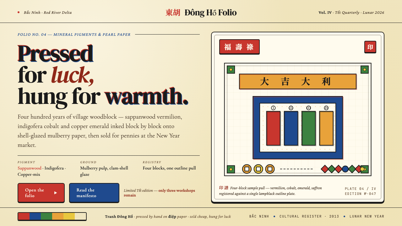 Vietnamese Đông Hồ WoodblockPressed for luck. Vermilion, cobalt, emerald and saffron blocks on pearl-shel…为讨吉利而压印:朱砂、靛蓝、翠绿、姜黄四色平涂于贝壳电纸,黑墨勾线——越南春节…
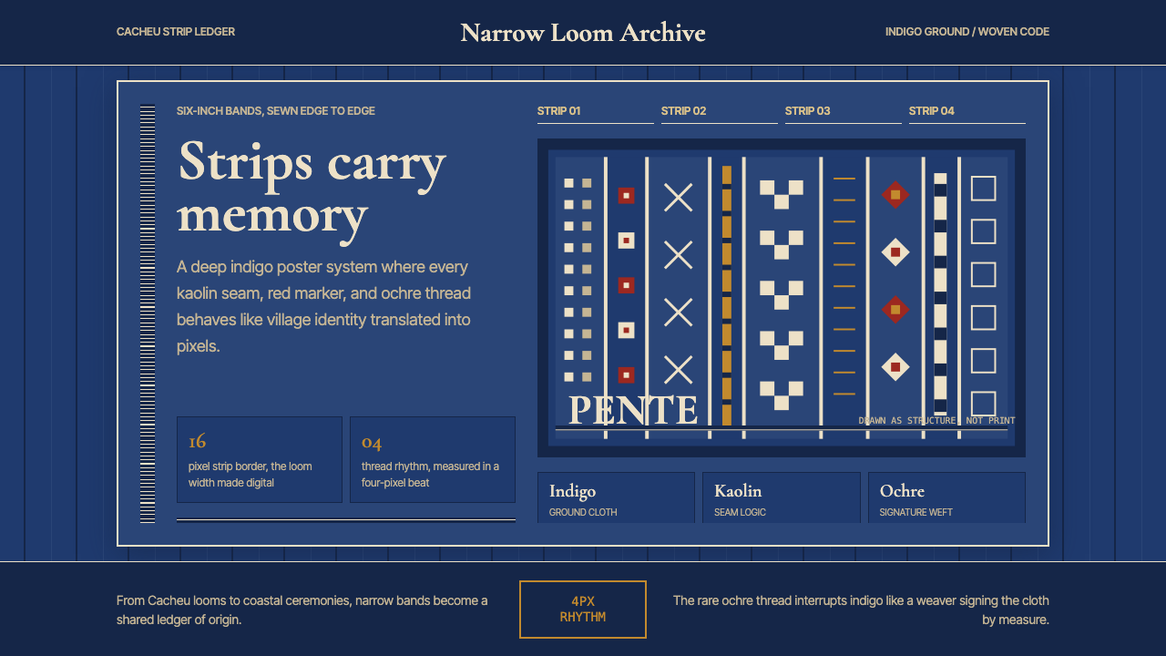 Bissau-Guinean Pano de PenteIndigo remembers. Narrow bands and kaolin seams turn weave grammar into pixel…靛蓝会记忆。窄幅竖带与瓷白缝线,把织纹语法变成像素。
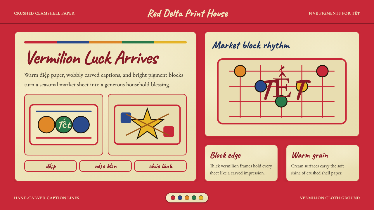 Vietnamese Đông Hồ Folk PrintFestive craft stays handmade. Vermilion frames, Caveat captions, cream paper…手作年节感:朱红边框、Caveat题字与蚌壳暖纸。
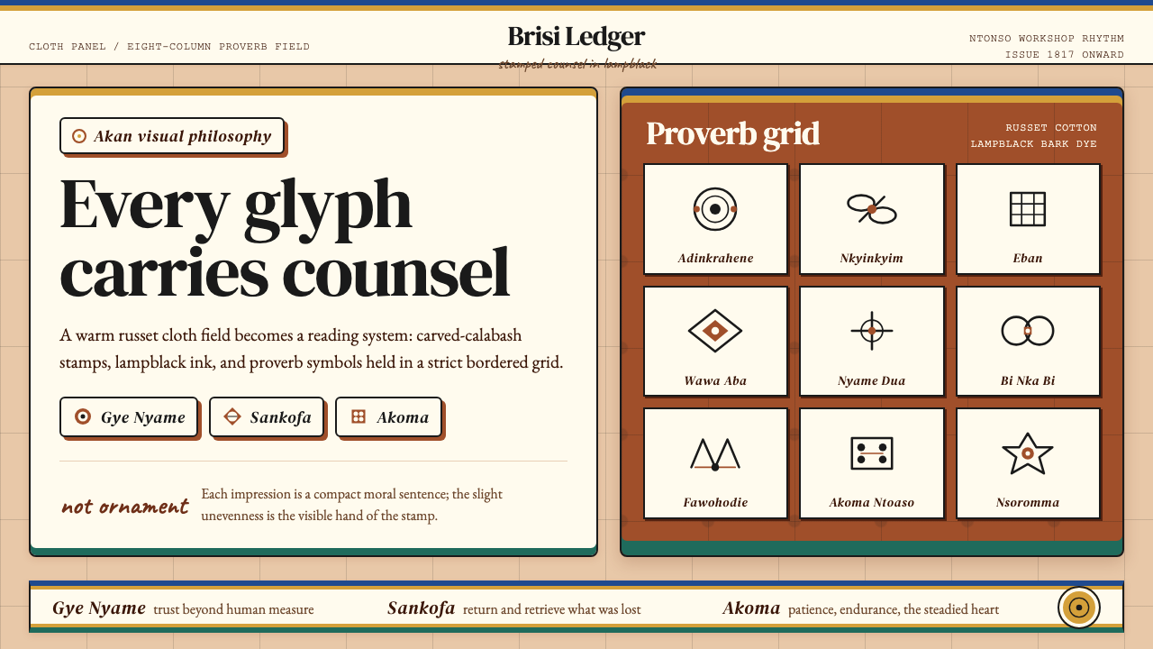 Akan Adinkra (Ghana)Proverbs become cloth. Russet grids, lampblack serif marks, and gold-edge ban…箴言化为布面:赭红网格、灯烟黑印纹与金边带盖出意义。
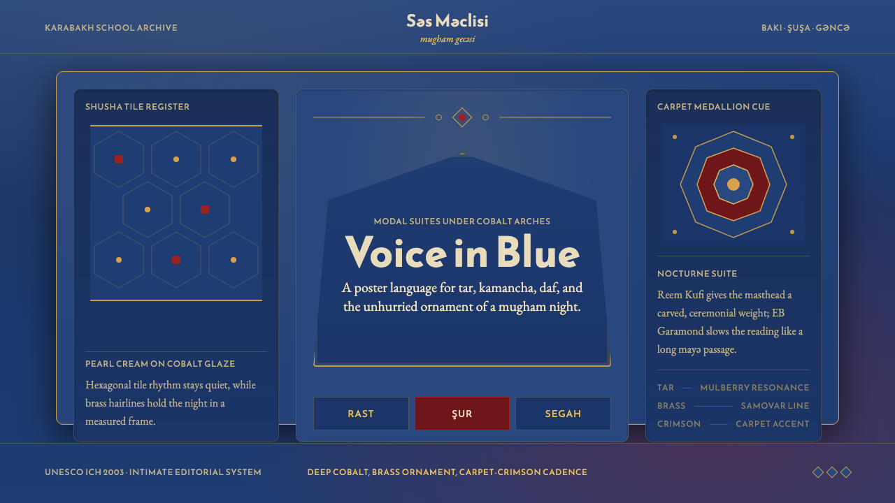 Azerbaijani Mugham Saz BlueMugham night, deeply tiled. Cobalt ground, brass hairlines, arched editorial…穆卡姆之夜深而温暖:钴蓝底、黄铜细线与拱形排版。
 Bambara Chi Wara AntelopeCarved memory in gold. Black serif silhouettes and brass-dot borders carry th…金色中的雕刻记忆。黑色衬线剪影与黄铜点边框承载田野仪式。