What is Vietnamese Đông Hồ Folk Print?
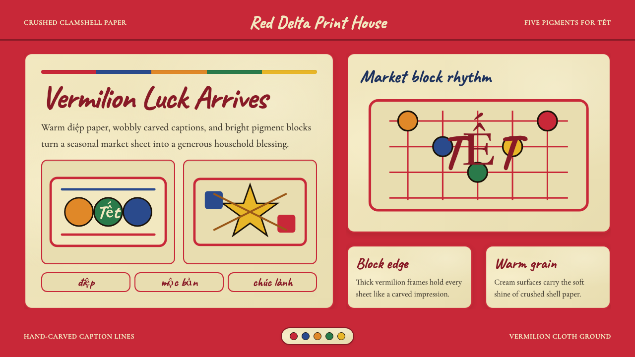
Đông Hồ folk prints are Vietnam's most beloved domestic art — vermilion woodblocks, crushed-clamshell paper, and five-color festivity that has decorated Tết altars for over four centuries.
Vietnamese Đông Hồ Folk Print in brief
Vietnamese Đông Hồ folk print (tranh Đông Hồ) is a woodblock printing tradition originating in Đông Hồ village, Bắc Ninh province, in the Red River Delta north of Hanoi. For more than four hundred years, artisan families have carved scenes of prosperity, morality, and celebration onto jackfruit-wood blocks, coated mulberry-bark paper with lustrous crushed-clamshell paste (điệp), and printed them in a fixed sequence of colors for the Lunar New Year market. The result is a visual language that is simultaneously humble and radiant — earthy yet luminous, naive yet compositionally assured.
The visual character of Đông Hồ prints is defined by a small, purposeful palette: warm vermilion anchors most compositions, accompanied by deep indigo, jackfruit-orange yellow, earthy brown, and the creamy luminescence of the điệp ground itself. Outlines are carved with bold, slightly uneven strokes that give figures an animated, hand-hewn quality. Forms are flattened and frontal, without perspective or cast shadows, resembling heraldic emblems more than naturalistic scenes. Text, when it appears, is rendered as wobbly woodblock caption lines that feel integral to the image rather than appended.
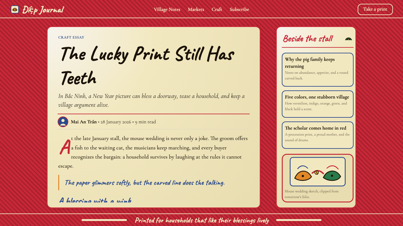
Each print carries symbolic weight derived from Vietnamese folk cosmology. Fish symbolize abundance, roosters herald new beginnings, pigs signal prosperity, and scholar-carp leaping waterfalls represent aspiration and examination success. Scenes of rat weddings, frog courts, and children playing are simultaneously satirical and celebratory — a gentle popular humor that distinguishes Đông Hồ from the more formal Hàng Trống prints made in urban Hanoi. This layered meaning is inseparable from the aesthetic: the composition is designed to be read as well as seen.
Where does Vietnamese Đông Hồ Folk Print come from?
The precise origin of Đông Hồ printing is difficult to date, but artisan genealogies and surviving blocks point to at least the late Lê dynasty, placing its establishment in the seventeenth century. The village of Đông Hồ — situated on a tributary of the Đuống River, itself a branch of the Red River — was ideally positioned to supply Tết markets in the surrounding agricultural lowlands. Families passed block-carving skills from father to son, with different households specializing in different subject categories: one family might own the rooster composition, another the fishpond scene, and another the morality tale of the scholar's return.
The distinctive điệp paper — the material foundation of the style's luminosity — was prepared by coating sheets of dó (mulberry-bark) paper with a paste ground from the shells of river clamshells. The crushed shell created a subtly iridescent, warm-cream surface that absorbed woodblock ink in a way that linen or cotton paper could not replicate. The light played differently on điệp: colors appeared warmer and more saturated, and the prints seemed to glow faintly from within. This material quality was not incidental to the aesthetic — it was the aesthetic.
At the height of the tradition, in the decades before and after 1900, Đông Hồ village produced millions of prints per year for the Tết season. Every household in the Red River Delta, from wealthy merchant families to rice farmers, bought at least a few prints to decorate their ancestral altars and doorways for the New Year. The prints were cheap, seasonal, and disposable — each year's prints were burned at the end of Tết and replaced the following year, which paradoxically preserved the market and kept the blocks in continuous production.
French colonization, two devastating wars, and the collectivization of agricultural villages in the mid-twentieth century all took their toll on the tradition. By the 1980s, only a handful of families continued to produce prints, and cheap factory-printed imitations — printed on standard paper without điệp coating — had flooded the market. The revival that began in the late 1980s as part of broader Đổi Mới economic and cultural reform brought renewed interest from scholars, tourists, and Vietnamese urban consumers. Today, key figures like Nguyễn Đăng Chế have rebuilt workshops and trained new apprentices, and Đông Hồ prints are undergoing UNESCO Intangible Cultural Heritage nomination processes (as of 2023), signaling global recognition of their significance.
What defines the Vietnamese Đông Hồ Folk Print look?
Color Palette
Đông Hồ prints use a small, fixed palette derived from natural pigments: vermilion (from cinnabar or synthetic iron oxide), deep indigo (from indigo plant), jackfruit-orange yellow (from roasted jackfruit wood), earthy brown (from mud or roasted rice husks), and black (from soot). White is not printed — it is the luminous điệp ground itself. This five-color logic is not arbitrary: each color carries festive or cosmological significance, and the palette as a whole reads as warm, celebratory, and vitally alive. No color is used to create depth through gradation; each block prints a flat field of pure hue.
Line and Outline
The defining mark of Đông Hồ aesthetic is the carved woodblock line — slightly uneven, occasionally burred at the edges, never mechanically perfect. This imperfection is not a defect but a quality: the wobble in a rooster's tail feathers or the slight thickening of a child's arm carries proof of human hands at work. Outlines are bold and closed, enclosing flat color fields without modeling or shading. The figure-ground relationship is always clearly stated — forms are legible at a glance, even in complex multi-figure compositions.
Flatness and Frontality
Like most folk woodblock traditions worldwide, Đông Hồ prints are radically flat. Figures face the viewer directly or in profile, with no cast shadows, no vanishing-point perspective, and no atmospheric recession. The picture plane is treated as a decorated surface rather than an illusory window. Multiple figures are arranged hierarchically by size and placement — more important figures are often larger — rather than by spatial logic. This flatness gives the prints an iconic, almost heraldic quality that transfers naturally into contemporary graphic contexts.
Symbolism and Narrative
Every element in a Đông Hồ composition is chosen for its symbolic load. Subject matter falls into recognizable categories: auspicious animals (carp, rooster, pig), scenes of family harmony and scholarly success, satirical inversions (frogs judging humans, rats parading in wedding procession), and protective images placed at doorways. The text, when present, is a couplet or caption that completes the image's meaning rather than describing it. Viewers familiar with the tradition do not just see a painting of a fish — they read a wish for abundance addressed to the household.
Material Luminosity
The điệp paper ground is perhaps the most untranslatable quality of authentic Đông Hồ prints. The crushed clamshell coating scatters light differently from any manufactured paper, creating a warm, iridescent shimmer that makes colors appear to float above the surface rather than sit on it. Digital and screen-based interpretations of this style must find other ways to suggest this quality — through warm-toned backgrounds, subtle paper-grain overlays, or slight luminosity gradients that respect the color blocks without betraying the print's essential flatness.
Folk Humor and Populist Spirit
Unlike court art or formal religious painting, Đông Hồ prints carry a distinctly populist wit. Satirical subjects — rats staging a wedding parade while the cat is distracted, frogs presiding over a court of humans — delivered social commentary safely through the medium of festive folk art. This humor is not ironic in the contemporary sense; it is warm and communal, inviting shared laughter rather than critical distance. Designs derived from this tradition should preserve that sense of levity: a slight exaggeration of form, an extra flourish on a rooster's tail, a slight widening of a figure's grin.
Who shaped Vietnamese Đông Hồ Folk Print?
The most prominent living inheritor of the Đông Hồ tradition, Nguyễn Đăng Chế dedicated his career to reviving the craft after the devastation of the twentieth century. He re-established a working atelier in Đông Hồ village, rebuilt hundreds of original carved blocks from surviving prints, and trained a new generation of artisans. His workshop became the de facto school and museum of the tradition, and his advocacy was central to Vietnam's efforts to secure UNESCO Intangible Cultural Heritage designation. He is credited with transforming Đông Hồ printing from a near-extinct craft into a living practice capable of attracting both domestic and international interest.
The French scholar and Hanoi-based collector Maurice Durand assembled the most comprehensive archive of Đông Hồ and Hàng Trống prints during the colonial period, preserving hundreds of works that might otherwise have been lost during the upheavals of the mid-twentieth century. His collection, now largely held in European institutions, has been the primary scholarly reference for researchers seeking to understand the iconographic tradition and original color systems of both print schools. Without his documentation, much of what is known about the full range of subjects and compositions would have been irretrievably lost.
A researcher at the Bắc Ninh Museum, Phạm Đức Thành Dũng has been instrumental in the scholarly documentation and cultural policy advocacy surrounding Đông Hồ prints. His work on cataloguing surviving blocks, authenticating historical pieces, and advising the Vietnamese government's nomination dossier for UNESCO ICH listing has helped translate an oral and craft tradition into a form recognizable to international heritage institutions. His research bridges the gap between living practitioners and the archival and bureaucratic systems that govern formal cultural preservation.
Not a person but a composition, the iconic rooster print is effectively the signature work of the entire Đông Hồ tradition and deserves treatment as a landmark. The image of a single rooster — red comb, five-colored plumage, feet planted on solid ground — is the most widely reproduced of all Đông Hồ subjects and the one most likely to be recognized by Vietnamese people of all generations. Its composition — centrally placed subject, bold outline, flat color fields, a couplet text at top right — encapsulates the visual grammar of the tradition in a single image and has become the reference point for anyone seeking to understand or apply the Đông Hồ aesthetic.
How do you use Vietnamese Đông Hồ Folk Print today?
Đông Hồ is one of the most immediately recognizable folk visual systems available to contemporary designers — its warm palette, hand-carved character, and festive density make it especially powerful for contexts that need to signal celebration, craft, cultural rootedness, or Lunar New Year. Applying it well requires understanding what the system is actually doing: using a constrained warm palette to achieve maximum festive impact, using bold closed outlines to create legibility at any scale, and using symbolic subject matter to load images with meaning that goes beyond decoration.
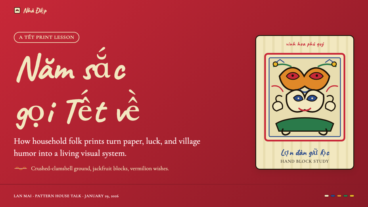
For presentation slides, the Đông Hồ aesthetic is best used in full commitment rather than as a subtle accent. A cover slide should establish the warm cream ground immediately, with a centrally composed motif — a stylized carp, a rooster silhouette, a circular floral arrangement — executed in the five-color palette against the luminous background. Titles should be set in a brush-influenced or slightly irregular typeface that echoes the woodblock caption tradition; mechanical precision reads as tonally wrong against the folk warmth. Content slides work well with a simplified approach: warm cream background, vermilion or indigo accent bars for section titles, and black body text. Data visualizations can take on a woodcut quality by using the five-color palette for chart elements and avoiding any gradients or drop shadows.
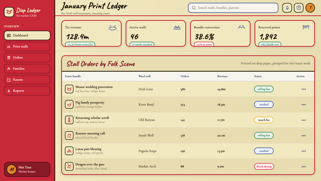
For web interfaces and digital products, the style is most at home in cultural, editorial, and heritage contexts: museum microsites, Lunar New Year campaign pages, artisan marketplace platforms, food and beverage brands with East or Southeast Asian cultural positioning, or any product that wants to claim an aesthetic lineage rooted in handcraft. The approach for UI: a warm off-white or cream background, bold vermilion or indigo as interactive accent colors, generous use of illustrative elements drawn in the flat-outline folk style, and typography that leans warm and slightly irregular. Navigation and system UI elements should be simplified — the rich illustrative language belongs in hero and feature sections, not in functional chrome.
For editorial and marketing work, Đông Hồ works exceptionally well for seasonal campaigns (Tết, Lunar New Year, harvest themes), cultural brand identity, and premium packaging that wants to signal artisanal provenance. A marketing page structured on this visual language should use the woodblock color sequence as its color hierarchy: vermilion for primary calls to action, indigo for secondary emphasis, orange-yellow for highlights and accent details. Illustrative elements should be flat and bold, with visible hand-hewn imperfection rather than vector-clean curves. Pattern borders — derived from the decorative frames used in traditional prints — add authenticity at edges without cluttering central content.
The most common mistake when applying Đông Hồ is softening it into generic 'Asian folk' pastiche — blurring outlines, adding gradients, swapping the specific five-color palette for any warm combination of reds and golds. Authentic Đông Hồ work has nothing soft about it: outlines are definitive, color fields are flat and fully saturated within their range, and the composition is front-weighted and hierarchically explicit. A second common error is losing the warmth of the điệp ground by using a stark white background — the creamy, slightly warm neutral is not decorative but structural to the palette's character.
Vietnamese Đông Hồ Folk Print — FAQ
How is Đông Hồ different from other Vietnamese folk print traditions?
The most significant competing tradition is Hàng Trống, produced in Hanoi's Old Quarter. Where Đông Hồ prints are made entirely from woodblocks with natural pigments and printed on điệp paper, Hàng Trống prints use a combination of woodblock outlines and hand-applied watercolor washes on standard paper, producing a softer, more fluid effect aimed at a more urban, literati audience. Đông Hồ has a bolder, more graphic character — flatter colors, harder edges, more symbolic subject matter — while Hàng Trống leans toward atmospheric washes and decorative refinement. A third regional tradition, Kim Hoàng (Hanoi outskirts), used red paper and was largely lost by the mid-twentieth century, though revival efforts have begun.
Can Đông Hồ aesthetics work for non-festive, serious contexts?
It can, but requires deliberate restraint. The Đông Hồ palette and line quality carry inherent festive warmth, so deploying the full five-color system in a legal, financial, or corporate context will create tonal dissonance. The most successful sober applications extract a specific subset of the tradition: the warm điệp-toned background quality, the bold closed-outline approach to illustration, and the flat color field logic, while limiting the palette to one or two colors rather than the full five-color complement. The symbolic subject matter should be avoided or abstracted entirely — a rooster or carp is culturally legible as festive, regardless of context, and will undermine a serious register.
How should digital type choices relate to the Đông Hồ tradition?
Đông Hồ text in original prints is always carved into the block alongside the image — it shares the same slightly uneven, hand-pressed quality as the pictorial lines. In digital applications, the closest equivalent is a brush calligraphy typeface or a slightly irregular serif face rather than mechanical geometric sans-serifs. For Latin text used alongside Đông Hồ-inspired Vietnamese or Chinese, a typeface with warmth and slight stroke contrast — humanist serif rather than neo-grotesque — maintains tonal alignment. Avoid ultra-thin weights and ultra-high-contrast serifs; both read as contemporary cool, which is the opposite register of Đông Hồ's folk warmth.
Is Đông Hồ appropriate for brands targeting international audiences unfamiliar with the tradition?
Yes, and the unfamiliarity can work in the brand's favor. To an audience that does not know the tradition, Đông Hồ reads as a bold, warm, handcrafted folk aesthetic with a distinct visual personality — which is itself valuable positioning. The danger is surface-level appropriation without understanding the symbolic vocabulary: randomly placing a carp or rooster as decoration, without understanding what these images mean to their culture of origin, risks tokenism. The most durable approach for international brands is to abstract the style's formal properties — the palette, the line quality, the flat color field logic — and create new compositions in that idiom rather than directly borrowing traditional imagery.
How does Đông Hồ handle dark or night-mode interfaces?
The tradition is inherently light-ground: the điệp paper's warm luminosity is the baseline from which all colors are read. A dark inversion is possible but requires reconceiving the palette logic. On a deep neutral background, the vermilion can feel aggressive and the indigo can nearly disappear, losing its distinctness from the dark ground. A successful dark variant typically shifts the background toward deep warm brown or very dark indigo rather than neutral black, which preserves the warmth of the original system. The key colors can then be remapped: cream or ivory for primary text and linework, vermilion and orange-yellow retained as accent colors, with full-saturation indigo reserved for secondary elements against the non-black ground.
Related design styles
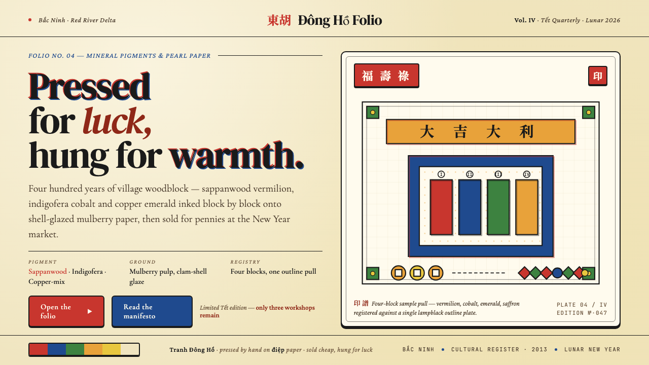 Vietnamese Đông Hồ WoodblockPressed for luck. Vermilion, cobalt, emerald and saffron blocks on pearl-shel…
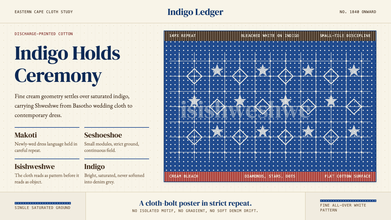 South African Shweshwe IndigoCeremony in indigo. Cream serif type and tiny bleached repeats tile a saturat…
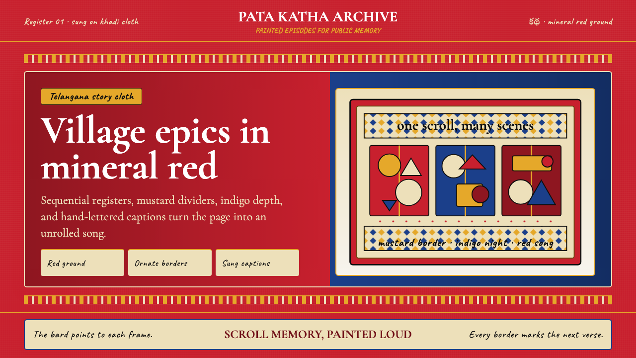 Andhra Cheriyal Scroll PaintingSaturated oral memory. Mineral red registers, mustard diamonds, and serif son…
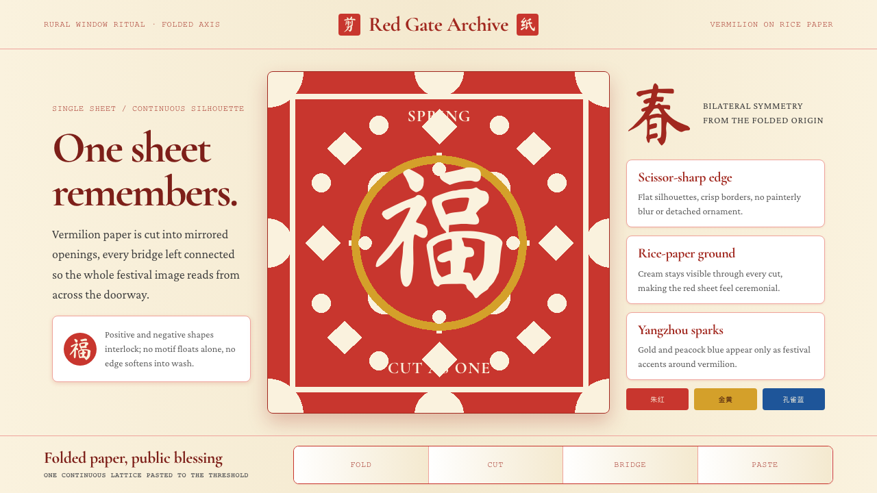 Chinese Jianzhi Paper-CuttingRitual red, cut as one. Vermilion lacework on rice-paper cream locks every sh…
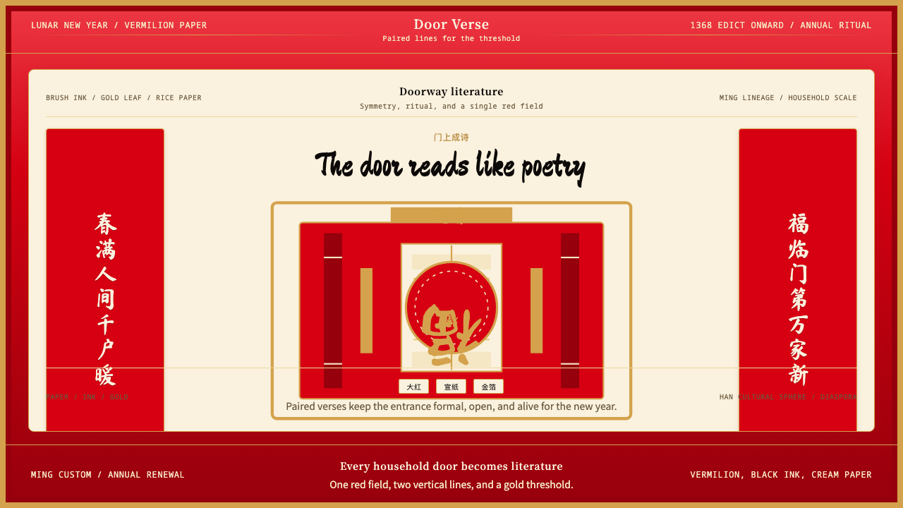 Chinese Spring Festival Red CoupletLiterature on the door. Vermilion paper, vertical pairs, and gold calligraphy.
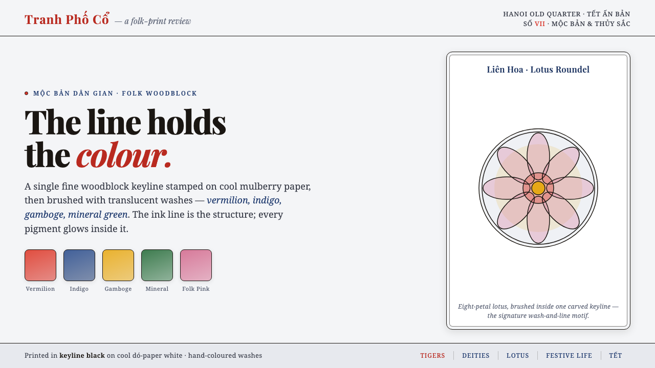 Hàng Trống Folk PrintBright folk colour, never loud. Translucent vermilion-indigo washes held insi…