What is Vietnamese Đông Hồ Woodblock?什么是 Vietnamese Đông Hồ Woodblock?
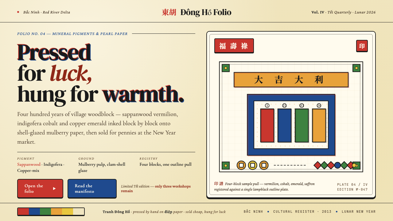
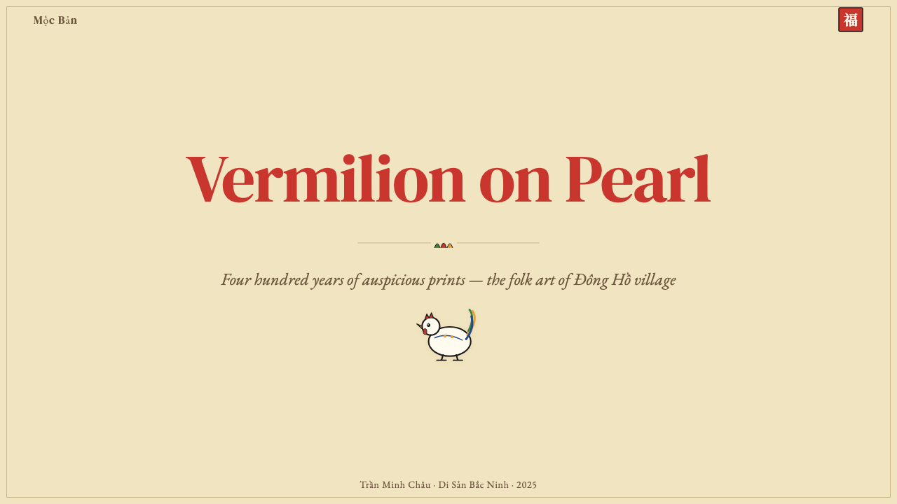
Four mineral pigments pressed onto pearl-shell paper — Đông Hồ's four-hundred-year tradition of folk woodblock prints turned luck, laughter, and Lunar New Year warmth into a visual language that is as saturated and unashamed today as it was in any Bắc Ninh village workshop.四色矿物颜料压印于贝壳电纸之上——东胡四百年民间木版年画,将吉祥、幽默与越南春节的烟火气,凝练成一套至今仍饱满、坦荡的视觉语言。
Vietnamese Đông Hồ Woodblock in briefVietnamese Đông Hồ Woodblock 速览
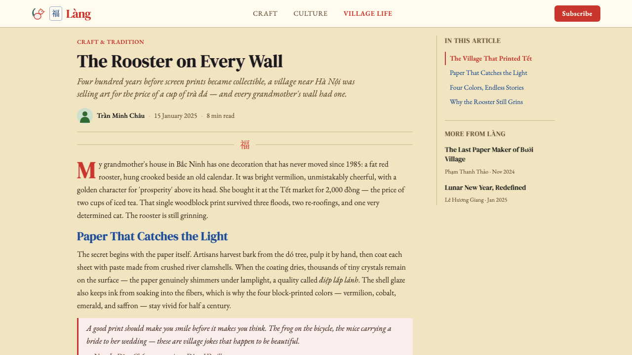
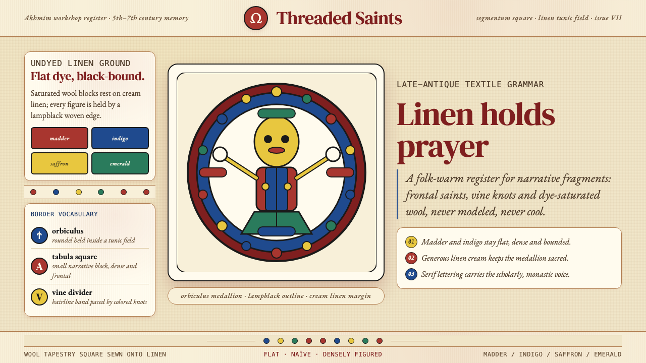
Đông Hồ painting — Tranh Đông Hồ — is Vietnam's oldest and most beloved folk woodblock-print tradition, produced in Đông Hồ village, Bắc Ninh province, north of Hanoi. For four centuries these prints were the wallpaper of the Vietnamese Tết festival: bright, naïve, gently satirical images of fat roosters announcing the new year, mother pigs surrounded by piglets, mice staging an elaborate wedding procession, and national heroes riding war elephants. They were cheap to buy, cheerful to hang, and understood by everyone from the scholar to the farmer.东胡画(Tranh Đông Hồ)是越南历史最悠久、最广为人知的民间木版年画传统,产自河内以北北宁省东胡村。四百年来,这些年画是越南春节(Tết)的「壁纸」:肥鸡报晓、母猪带崽、老鼠娶亲的盛大游行、骑象出征的民族英雄——图案明朗、笔触憨厚、带着温柔的讽刺意味,价格低廉,人人看得懂,从学者到农民皆可会心一笑。
The visual character of Đông Hồ work is immediately distinctive. Color is applied in flat, saturated mineral-pigment blocks — a deep brick vermilion, a rich indigo cobalt, a warm copper emerald, a glowing saffron yellow — separated and bounded by crisp lampblack outlines printed last to unify the composition. The background is not plain paper but điệp paper: mulberry-bark sheets sized with a glaze of crushed river-mussel shell, giving the surface a soft pearlescent luminosity that makes every color appear lit from within. Chinese-character cartouches carrying good-luck phrases or titles float above the main figures, and the composition is always anchored, centered, and generously open — never crowded.东胡画的视觉特征极为鲜明。色彩以饱满的矿物颜料色块平涂——砖红的朱砂、浓郁的靛蓝、温暖的铜绿、明亮的姜黄——各色块之间以最后压印的黑墨轮廓线收紧、统一画面。底纸并非普通白纸,而是「电纸」:以桑皮纸刷上一层碾碎的河蚌贝壳粉浆,纸面因此泛着柔和的珍珠光泽,令每一种颜色看起来都像从内部发光。画面主体上方浮着题写吉语或画题的汉字题款,构图始终居中、稳定、留白阔气,从不显得逼仄。
What distinguishes Đông Hồ from other East Asian woodblock traditions — Chinese niánhuà New Year prints, Japanese ukiyo-e, Korean minhwa — is its irreverent folk humor. The mouse-wedding satires, for instance, were gentle jibes at Confucian ceremony; the fertility-pig images were not merely decorative but carried specific wishes for large and prosperous families. The prints were not fine art hung in galleries but vernacular objects made to be replaced each Tết, which gave the craftsmen freedom to be witty, warm, and direct in a way that court or commercial art rarely permitted.东胡画与其他东亚木版画传统——中国年画、日本浮世绘、朝鲜民画——最大的区别,在于其不拘礼数的民间幽默感。老鼠娶亲的系列画,便是对儒家繁文缛节的温柔调侃;母猪带崽的图像,不仅是装饰,更承载着对家族兴旺的具体祈愿。这些年画不是陈列于厅堂的高雅艺术,而是每年春节必换的日用之物——正是这种一次性特质,给了匠人们在幽默、温情与直白上的自由,这在宫廷艺术或商业艺术中几乎从未出现过。
See the Vietnamese Đông Hồ Woodblock design system查看 Vietnamese Đông Hồ Woodblock 完整设计系统
Where does Vietnamese Đông Hồ Woodblock come from?Vietnamese Đông Hồ Woodblock 从何而来?
The precise founding of Đông Hồ's woodblock-printing industry is difficult to pin to a single year, but historical records and craft genealogies suggest the village workshops were producing New Year prints by at least the sixteenth century, with the tradition likely maturing through the seventeenth century as Lê dynasty patronage of folk craft expanded. The village of Đông Hồ — formally part of Thuận Thành district, Bắc Ninh province — sits on the Đuống River, a tributary of the Red River, giving it easy access to the paper, pigments, and timber that the industry required. By the eighteenth century, the Đông Hồ market, held six times a year in the months leading up to Tết, had become the primary distribution point for New Year prints across the Red River Delta.东胡木版年画的确切创始年代难以精确考证,但工艺谱系与历史文献表明,东胡村的年画作坊至迟在十六世纪已有规模生产,传统在十七世纪黎朝扶持民间工艺的背景下进一步成熟。东胡村隶属北宁省顺城县,坐落于红河支流垆江沿岸,水运之便使村民得以便捷取得造纸、颜料与木材等所需原料。十八世纪时,每年春节前举行六次的东胡年画集市,已成为整个红河三角洲地区年画的主要集散地。
The craft is organized around a system of wooden relief blocks, one for each color plus one for the final outline. A single print might require four or five separate pressings, each perfectly registered to the last. The pigments were traditionally derived from natural mineral and plant sources: vermilion from cinnabar ore, cobalt from indigo plants and mineral sources, the warm green from copper compounds, saffron from botanical dyes, and the deep lampblack outline from burned bamboo or rice straw. The điệp paper was made locally, with mussel shells collected from the river and ground to a fine paste mixed with tapioca starch as a sizing medium. The entire production chain — paper making, pigment grinding, block carving, printing — took place within the village, making Đông Hồ one of the most self-contained craft economies in Vietnamese history.东胡画的工艺以木质浮雕版为核心,每种颜色各一块版,最后再压一块黑墨轮廓版。一张成品年画往往需要四至五次分版套印,每次都须与上一版精准对齐。传统颜料均取自天然矿物与植物来源:朱砂取自辰砂矿石,靛蓝来自蓼蓝植物及矿物,铜绿源于铜化合物,姜黄来自草木染料,最后压印的黑色轮廓线则以炭化竹子或稻草制成的烟黑调制。电纸在村内自制:从垆江捞取河蚌壳,研磨成细粉,与木薯淀粉调成糊状涂刷桑皮纸。造纸、研颜料、刻版、印刷,整条生产链均在村内完成,使东胡形成越南历史上最为自给自足的手工艺经济体之一。
The tradition reached its commercial peak in the late nineteenth and early twentieth centuries, when some villages in the Đông Hồ area had dozens of workshop families each printing hundreds of sheets per season. French colonial ethnographer Maurice Durand documented the prints extensively in the mid-twentieth century, producing one of the earliest systematic scholarly records of the imagery, themes, and production methods. His work helped bring Đông Hồ art to international attention outside Vietnam. During the First and Second Indochina Wars, the village workshops were severely disrupted, and many of the older woodblocks — some of which represented centuries of accumulated carving — were lost or destroyed.东胡年画的商业鼎盛期在十九世纪末至二十世纪初,彼时东胡地区数十户作坊家庭每季各自印制数百张年画。法国殖民地民族志学者莫里斯·迪朗(Maurice Durand)于二十世纪中叶对东胡版画进行了系统整理,留下了关于图像主题与制作工艺最早的学术文献之一,也让东胡艺术首次进入国际视野。第一次和第二次印度支那战争期间,村内作坊遭受严重冲击,许多承载数百年雕刻积累的老版块或流失、或损毁。
The postwar decades brought near-extinction. By the 1980s, cheap factory-produced decorations and printed calendars had displaced the traditional Tết market almost entirely. At the nadir, fewer than five workshop families remained active. A sustained revival effort, led principally by craftsmen Nguyễn Đăng Chế and Nguyễn Hữu Sam, began in the 1990s and gathered momentum into the 2000s. Nguyễn Đăng Chế in particular committed to reconstructing lost blocks from archival photographs and museum specimens, re-establishing the full traditional supply chain, and opening the Đông Hồ workshop to visitors and researchers. UNESCO added Đông Hồ painting to its List of Intangible Cultural Heritage in Need of Urgent Safeguarding in 2013, providing international recognition and some funding support. Today approximately three workshop families maintain full traditional production, with a wider circle of practitioners producing for the cultural tourism and art-collector markets.战后数十年,东胡画濒临消亡。1980年代,廉价的工厂装饰品与印刷挂历几乎将传统春节年画市场全面取代,存活的作坊家庭一度不足五户。1990年代,以匠人阮登制(Nguyễn Đăng Chế)和阮友三(Nguyễn Hữu Sam)为核心,一场持续性的复兴运动逐渐兴起。阮登制尤为投入:依据档案照片与博物馆藏品重刻失传版块,重建完整的传统供应链,并将东胡作坊向参观者和研究者开放。2013年,联合国教科文组织将东胡画列入《急需保护的非物质文化遗产名录》,为其提供了国际认可与部分资金支持。时至今日,仍有约三户作坊家庭坚守完整的传统生产,另有更多从业者面向文化旅游与艺术收藏市场制作年画。
What defines the Vietnamese Đông Hồ Woodblock look?Vietnamese Đông Hồ Woodblock 的视觉特征是什么?
Saturated Flat Color饱满平涂色彩
Đông Hồ's color is applied in solid, unmodulated blocks with no shading, no tonal graduation, and no blending at the edges. Each hue occupies its own territory and meets adjacent colors at a clean boundary reinforced by the final black outline. The palette is anchored by four dominant pigments — a warm brick vermilion, a deep blue-indigo, a copper-tinged green, and a warm golden saffron — with white preserved as the pearlescent ground. The effect is vivid and immediate, like a signal rather than a painting.东胡画的色彩以实色平涂,无阴影、无渐变、无边缘晕染。每种颜色独占一块领域,与相邻色块在清晰的边界处相接,并由最终压印的黑色轮廓线进一步收紧。主调色彩锚定于四种核心颜料——温暖的砖红朱砂、深沉的靛蓝、带铜质感的翠绿、暖金色的姜黄——以贝壳电纸的珍珠白作底。整体效果鲜明直接,像信号而非绘画。
Điệp Paper Ground电纸底面
The distinctive substrate of Đông Hồ prints is điệp paper — mulberry-bark sheets coated with a paste of finely ground river-mussel shell mixed with a natural binder. When dry, this shell-glaze gives the paper surface a warm, off-white luminosity with a faint iridescent shimmer, quite unlike the flat matte of European printing papers. Every color laid over this ground picks up a slight inner glow. In digital applications that reference Đông Hồ, this quality translates as a warm, slightly warm neutral background — never a stark cold white — that makes saturated foreground colors feel richer and more grounded.东胡版画的独特底材是「电纸」——桑皮纸涂刷一层碾碎的河蚌贝壳粉与天然黏合剂调成的糊浆。干燥后,这层贝壳釉赋予纸面温润的米白光泽,带着隐约的虹彩闪光,与欧洲印刷纸平哑的质感截然不同。印在这张底面上的每一种颜色,都因此带有一丝内在的发光感。在参照东胡风格的数字设计中,这一特质转化为温暖的米白背景——绝非冷白——使前景的饱和色彩显得更为丰沛、更有根基。
Lampblack Outline烟黑勾线
The final printing pass lays down a crisp black outline in lampblack ink — traditionally made from burned bamboo or rice straw — that simultaneously defines form, separates colors, and gives the composition its graphic authority. This outline is not a timid contour but a confident, slightly variable line that thickens at corners and junctions. It performs the same structural role as the lead lines in stained glass: holding disparate color fields together into a coherent whole. Without it, the flat color blocks would risk reading as chaotic; with it, the composition is instantly readable.最后一道印刷以烟黑墨(传统以竹炭或稻草炭制成)压出清晰的黑色轮廓线,同时界定形体、分隔色块,并赋予整个构图以图形力量。这条轮廓线并非怯懦的描边,而是一条自信、略带粗细变化的线迹,在转角与交汇处略加粗重。它扮演着与彩色玻璃中铅条相同的结构角色:将互不相连的色域凝聚成一个整体。没有它,平涂色块可能显得零散杂乱;有了它,画面立刻变得清晰可读。
Centered, Open Composition居中、开阔的构图
Đông Hồ compositions are typically frontal and centered, with the principal subject — a rooster, a pair of pigs, a wedding procession — placed at or near the visual center of the sheet and surrounded by generous negative space. There is no complex spatial recession, no overlapping depth illusion: figures occupy the same flat plane. This directness gives the prints an emblematic quality, like seals or icons, that reads clearly even at small scale. Chinese-character text cartouches above the central figure complete the composition without crowding it.东胡画的构图通常正面朝向、主体居中——雄鸡、母猪与仔猪、婚礼游行队伍——置于画幅视觉中心或其附近,四周留白宽阔。画面没有复杂的空间退远,没有叠压形成的深度幻觉,各图形处于同一平面。这种正面直白感赋予年画一种徽记或图标式的品质,即使缩小尺寸也依然清晰。主体上方的汉字题款在完成构图的同时,并不压缩画面空间。
Folk Humor and Narrative民间幽默与叙事性
Unlike decorative prints that exist purely as pattern or surface, Đông Hồ images carry stories. The mouse-wedding scene depicts a procession in which mice carry gifts to a cat — widely read as satire of corvée obligations to local officials. Jealousy scenes, hero tales, and fertility wishes are all rendered with a warmth and playfulness entirely absent from court or religious art. This narrative dimension means individual figures are not generic symbols but particular characters in legible situations, giving the prints a kind of folk-illustrated-narrative quality that still communicates across language barriers.与纯粹作为图案或表面装饰的版画不同,东胡画的图像承载着故事。老鼠娶亲描绘的游行队伍中,老鼠向猫咪进献礼物——被普遍解读为对向地方官员缴纳徭役义务的讽刺。妒妇图、英雄故事、祈福多子的画面,无不以一种宫廷艺术或宗教艺术中从未有过的温情与顽皮来呈现。这种叙事维度意味着画中人物不是泛泛的符号,而是处于可辨认情境中的特定角色,赋予年画一种民间图画叙事的质感,时至今日仍能跨越语言障碍传递意涵。
Warm Mineral Palette, No Cool Neutrals温暖矿物色调,无冷色中性
Every color in the Đông Hồ system carries warmth. Even the blue-indigo, which in other contexts might read as cool, is a deep fermented indigo with underlying warmth rather than a cool sky blue or icy cyan. The greens tend toward warm copper-tinged emerald rather than cool lime or mint. White is the warm pearl of the shell-glaze ground. The overall thermal register of the palette is consistently warm, which contributes to the emotional character — festive, welcoming, auspicious — that distinguishes the tradition from the more austere palette of East Asian literati painting.东胡色系中的每一种颜色都带有暖意。即便是靛蓝,在其他语境下或许偏冷,在东胡画中也是一种深沉、经过发酵的靛青,底色温暖,而非凉意明显的天蓝或冰青。绿色偏向温暖的铜绿翠,而非清凉的嫩绿或薄荷绿。白色是贝壳电纸底面的温润珍珠色。整套色盘的温度感始终偏暖,这正是其情感特质——节庆感、亲切感、喜庆感——有别于东亚文人画更为清冷色调的根本所在。
Multi-Block Registration多版套印
Each color in a Đông Hồ print is printed from its own carved wooden block, with every successive block precisely registered to the previous impression. The number of blocks required — typically four color blocks plus one outline block — determines the maximum color complexity of the image. Slight registration shifts, which appear as thin halos of one color peeking out from behind another, are a characteristic feature of authentic hand-printed work and are considered part of the print's visual texture rather than defects. This layered-impression quality, visible in original prints as a slight embossed relief, distinguishes woodblock printing from flat digital reproduction.东胡画的每种颜色由独立的一块刻版压印,每块版须与前一次印迹精准套准。所需版块数量——通常为四块色版加一块轮廓版——决定了画面色彩的最大复杂程度。套版时产生的轻微偏位,即某色从另一色边缘微微露出的细线,是手工压印作品的典型特征,被视为版画视觉质感的一部分,而非瑕疵。这种层叠印压的质感,在原版实物中可见的轻微凸凹浮雕,正是木版印刷有别于平面数字复制的所在。
See the Vietnamese Đông Hồ Woodblock design system查看 Vietnamese Đông Hồ Woodblock 完整设计系统
Who shaped Vietnamese Đông Hồ Woodblock?谁塑造了 Vietnamese Đông Hồ Woodblock?
The single most important figure in the contemporary survival of Đông Hồ painting, Nguyễn Đăng Chế dedicated decades to reconstructing lost woodblocks from archival photographs, museum specimens, and collective memory. He transformed his family compound into an open workshop-museum, rebuilt the entire production chain from điệp paper to final print, and trained apprentices at a time when the tradition had nearly disappeared entirely. His insistence on using only historically accurate natural pigments and shell-glaze paper — rather than the synthetic substitutes that cheaper revival workshops sometimes adopted — preserved the visual character of the tradition rather than merely its outward forms.阮登制是东胡画当代存续中最重要的人物。他数十年如一日,依据档案照片、博物馆藏品与集体记忆重刻失传版块,将自家院落改建为开放式工坊博物馆,从电纸制作到成品印刷重建完整生产链,并在传统几近消亡之际培养学徒。他坚持只使用历史考证的天然颜料与贝壳电纸——而非部分廉价复兴作坊采用的合成替代品——从而保住的不仅是传统的外在形式,更是其内在的视觉品质。
Nguyễn Hữu Sam was among the last craftsmen to have learned the full Đông Hồ process during the tradition's mid-century flowering, before the disruptions of war and economic change. His workshops served as a living archive of technique — the correct consistency of shell-glaze paste, the proper carving angle for relief blocks, the sequence and pressure of multi-block printing — at a time when these methods existed only in the hands of a few aging practitioners. His documentation of process, carried out in cooperation with cultural researchers and filmmakers, became foundational reference material for the revival movement.阮友三是为数不多在二十世纪中叶东胡画盛期便已习得完整工艺的匠人之一,彼时传统尚未受到战争与经济变迁的冲击。他的作坊是活的技艺档案库——贝壳电纸糊的正确稠度、浮雕版块的正确刻角、多版套印的顺序与力道——在那个这些技法仅存于少数老工匠手中的年代,弥足珍贵。他与文化研究者和纪录片人合作留下的工艺文献,成为复兴运动最重要的参考资料之一。
A French colonial-era scholar and administrator who devoted much of his career to documenting Vietnamese folk art, Maurice Durand produced in the mid-twentieth century the most comprehensive early Western scholarly account of Đông Hồ painting. His field surveys, photographic documentation, and systematic cataloguing of imagery, themes, and iconographic programs gave both Vietnamese cultural authorities and international researchers a baseline record that proved invaluable when revival efforts began decades later. Durand's work represents an instance of colonial-era scholarship that, whatever its political context, produced genuinely useful preservation documentation.莫里斯·迪朗是法国殖民时期的学者兼行政官员,毕生大量精力致力于记录越南民间艺术。他于二十世纪中叶留下的田野调查、照片文献与图像主题系统性编目,是西方学界对东胡画最早也最全面的学术记录。对越南文化主管机构和国际研究者而言,这些资料在数十年后的复兴运动中具有无可替代的参考价值。迪朗的工作代表了殖民时期学术研究的一个特殊案例——无论其政治背景如何,留下的保护性文献是真实而有益的。
Trưng Trắc and Trưng Nhị — the Trưng Sisters — are Vietnam's most revered historical heroines, who led the first major revolt against Chinese Han dynasty rule in 40 CE and briefly established an independent Vietnamese kingdom before being defeated in 43 CE. They appear in Đông Hồ prints as recurring subjects: typically depicted riding war elephants, commanding troops, or enthroned as queens. Their appearance in New Year prints was not purely patriotic decoration but carried a specific symbolic function — invoking female courage, national continuity, and ancestral protection at the threshold of the new year. Their iconography in Đông Hồ work represents the tradition's capacity to hold together the festive, the historical, and the spiritual simultaneously.征侧与征贰——征氏姐妹——是越南最受崇敬的历史英雄人物,于公元40年领导了反抗中国汉朝统治的第一次大规模起义,短暂建立独立的越南王国,43年后兵败。她们作为东胡画的常见画题反复出现:通常骑象出征、统领兵马,或端坐王位。她们出现在春节年画中,并非纯粹的爱国装饰,而承载着具体的象征功能——在新年门槛上召唤女性的勇气、民族的延续与祖先的庇护。征氏姐妹在东胡画中的图像,体现了这一传统将节庆、历史与精神信仰同时并举的能力。
General Trần Hưng Đạo is Vietnam's most celebrated military commander, credited with defeating the Mongol invasions of the thirteenth century three times and regarded as a near-divine protector figure in Vietnamese folk religion. His appearance in Đông Hồ prints typically shows him in full military regalia, often with divine or supernatural attributes. Like the Trưng Sisters, he functions in the New Year print context not merely as a historical portrait but as a protective talisman: hanging his image at the beginning of the year was understood as inviting his guardianship over the household for the months ahead. His Đông Hồ iconography demonstrates how the tradition served simultaneously as popular history, religious practice, and seasonal decoration.陈兴道将军是越南最受推崇的军事统帅,以三次击退十三世纪蒙古入侵而名垂青史,在越南民间信仰中被尊为近神的守护者。他在东胡画中的形象通常身着全套军装,往往带有神圣或超自然的属性。与征氏姐妹一样,他在春节年画语境中的功能不仅是历史画像,更是护宅符咒——在年初悬挂其画像,意为邀请他在此后数月庇佑家宅。陈兴道在东胡画中的图像形制,展示了这一传统如何将通俗史教、宗教实践与节令装饰同时融于一体。
How do you use Vietnamese Đông Hồ Woodblock today?今天怎么用 Vietnamese Đông Hồ Woodblock?
Đông Hồ's visual system is built on a small number of very strong moves: saturated flat color on a warm neutral ground, bold black outline, centered composition, and an overall warmth that reads as welcoming rather than aggressive. Applying the style successfully means committing to all of these simultaneously — the palette without the outline becomes garish, the outline without the warm ground becomes stark, the warmth without the saturation becomes muddy. The system only fully coheres when its components work together.东胡的视觉系统建立在几个极强的视觉动作之上:温暖中性底面上的饱和平涂色块、粗重黑色轮廓线、居中构图,以及整体令人感到亲切而非压迫的暖意。成功运用这种风格,意味着同时承诺上述全部要素——只有色板而没有轮廓线,会显得俗气;只有轮廓线而没有暖色底面,会显得生硬;只有暖意而没有饱和度,会显得浑浊。这套系统只有在各部分协同工作时,才能完整地凝聚成型。
For presentation slides, Đông Hồ works most powerfully on cover and section-break pages where a single bold image can carry the full visual weight. A cover built in this style uses the warm pearl ground as the base, places one or two primary-palette color shapes as the dominant visual, and uses a strong black rule or outlined typographic treatment for the title. Content slides should be simpler: the palette reduced to one accent color against the warm neutral, with body text in near-black rather than pure black to maintain the warm temperature of the system. Data slides benefit from treating charts as flat color-block compositions — bars and segments in the four core hues, no gradients, no drop shadows.在演示文稿中,东胡风格在封面与章节分隔页上最为有力——这些位置允许单一醒目的图像承担全部视觉重量。以这种风格制作的封面以温润的珍珠底面为基底,以一两个主调色块作为主视觉,标题采用粗重黑色线条或轮廓化排印处理。内容页应当更简洁:色板收缩为温暖中性底面上的单一强调色,正文用近黑色而非纯黑,以维持整套系统的暖色温度。数据页可将图表处理为平涂色块构图——以四种核心颜色填充柱条与扇区,无渐变,无投影。
For web interfaces, Đông Hồ translates best into contexts with festive, cultural, or artisan positioning: landing pages for cultural platforms, event sites, craft marketplaces, or heritage brands. The approach is to reserve the full saturated palette for hero sections and calls to action, keeping interior pages on the warm neutral ground with black text and a single accent color for links and interactive elements. Navigation and card components can use the lampblack-outline approach — visible borders rather than shadows, giving UI elements a woodblock-printed feel without being literally illustrative. Dashboard contexts are more challenging: the palette's warmth works, but the illustrative quality of the tradition should be dialed back in favor of typographic clarity.在网页界面中,东胡风格最适合具有节庆感、文化感或手工艺定位的场景:文化平台落地页、活动网站、手工艺品集市、非遗品牌。方法是将完整的饱和色板保留给首屏英雄区和行动号召区,内页保持温暖中性底面加黑色文字,仅以单一强调色用于链接与交互元素。导航与卡片组件可借鉴烟黑勾线的思路——以可见边框代替阴影,赋予界面元素木版印刷的质感,而不必真的使用插图。仪表板场景更具挑战性:色板的暖意是优势,但传统的插图性应当退位,让排印清晰度占主导。
For editorial and marketing work, Đông Hồ's poster-like boldness suits campaign imagery, event promotion, and cultural storytelling. A full-page spread in this mode uses the warm pearl as the background, a single large figure or motif rendered in the four-color flat style as the dominant visual, and the title or headline in a style that references the Chinese-character cartouche tradition — bold, centered above the image, with significant scale contrast between headline and subhead. Marketing pages can alternate between warm-ground sections and sections where one of the primary colors becomes the full background, keeping the rest of the palette as foreground elements.在编辑与营销内容中,东胡的海报式大胆感适合活动宣传、品牌推广与文化叙事。以这种风格制作的整版展开页,以温润珍珠色作底,以单一大尺寸人物或图案以四色平涂风格作主视觉,标题或大标以参照汉字题款传统的方式处理——粗重、居中、位于图像上方,标题与副标题之间形成显著的尺寸对比。营销页面可以在温暖底面区块与以某一主色作为整块背景的区块之间交替,其余色彩作为前景元素出现。
A common mistake when applying Đông Hồ outside its original context is treating it as a 'folk pattern' style — using the color palette to create repeating surface textures or decorative borders while ignoring the tradition's compositional logic. Authentic Đông Hồ work is not about pattern repetition; it is about a centered, emblematic image with narrative content. A second common error is using the palette at reduced saturation in an attempt to make it more refined or modern — the system loses its character when the colors become pastel or muted. If the full saturation reads as too intense for a given context, the better solution is to restrict the palette to one or two of the four hues rather than desaturating all of them.在将东胡风格移植到原生语境之外时,最常见的错误是将其理解为「民俗花样」风格——用这套色板制作重复铺底的纹样或装饰边框,却忽略了这一传统的构图逻辑。真正的东胡画从不以图案重复为核心,而是以一个具有叙事内容的居中徽记式图像为核心。第二个常见错误是将色板降低饱和度,试图让它显得更精致或更现代——当颜色变成粉彩或暗哑色,整套系统便失去了它的性格。如果完整饱和度在特定场景中显得过于强烈,更好的解决方案是将色板限制为四种颜色中的一两种,而不是将所有颜色一律去饱和。
See the Vietnamese Đông Hồ Woodblock design system查看 Vietnamese Đông Hồ Woodblock 完整设计系统
Vietnamese Đông Hồ Woodblock — FAQVietnamese Đông Hồ Woodblock · 常见问题
How does Đông Hồ differ from Chinese New Year prints (niánhuà)?东胡画与中国年画(年画)有何不同?
The two traditions share a common ancestor in the broader East Asian New Year woodblock print culture and likely developed in parallel influence, but they diverged significantly in palette, substrate, and subject matter. Chinese niánhuà — particularly the Yangliuqing and Mianzhu varieties — typically uses a broader color range including pinks, purples, and gold; portrays gods, door gods, and mythological subjects with formal frontality; and often employs more complex spatial recession. Đông Hồ is more restricted in palette (four core hues), more grounded in folk humor and social satire, and uniquely identified by the điệp shell-glaze paper. The two look related at a glance but feel quite different in register: Chinese niánhuà tends toward the ceremonial, Đông Hồ toward the vernacular and playful.两种传统有着共同的东亚春节木版年画文化渊源,彼此在发展中也可能存在相互影响,但在色板、底材与题材上均已产生显著分歧。中国年画——尤其是杨柳青与绵竹年画——通常使用更宽泛的色彩范围,包括粉红、紫色与金色;以正面肃立的形式描绘神灵、门神与神话人物;空间退远往往更为复杂。东胡画色板更为简约(四种核心颜色),更植根于民间幽默与社会讽刺,并以独一无二的贝壳电纸作为标识。两者乍看相近,实则气质迥异:中国年画偏向仪式性,东胡画偏向日常性与趣味性。
Can Đông Hồ work in a dark-background digital design?东胡风格能用于深色背景的数字设计吗?
With care, yes — but it requires rethinking the system's logic rather than simply inverting it. The điệp ground is intrinsic to the tradition's warmth; a dark inversion loses this immediately. If a dark variant is needed, the most coherent approach is to use a very deep warm charcoal or near-black with brown undertones as the ground (never a cold blue-black), to preserve the four saturated hues as foreground elements, and to allow the black outline to become a slightly lighter dark rule rather than disappearing entirely. The palette's four core hues — vermilion, indigo, green, and saffron — all have enough intrinsic warmth to read well against a warm dark ground. What tends to fail is importing the style into a cold, desaturated dark environment: the palette loses its festive character and looks merely antique.谨慎操作的话,是可以的——但需要重新理解这套系统的逻辑,而非简单地颠倒。电纸底面是这一传统暖意的根本来源,简单的深色翻转会立刻丧失这种特质。如果确实需要深色版本,最连贯的做法是以带棕色底调的深炭色或近黑色作底(绝非冷调的蓝黑色),保留四种饱和颜色作为前景元素,并让原本的黑色轮廓线变为略浅一些的深色线,而非完全消失。朱红、靛蓝、铜绿、姜黄四色本身都有足够的暖调,在温暖的深色底面上依然能够清晰呈现。容易失败的情况是将这套风格置入冷调、去饱和的深色环境中:色板便会失去节庆感,仅剩陈旧的古物感。
Is the black outline strictly necessary, or can Đông Hồ work without it?黑色轮廓线是必不可少的,还是东胡风格可以没有它?
The black outline is structurally load-bearing in the Đông Hồ system, not decorative. Without it, the flat saturated color blocks float against each other without a unifying structure, and the composition risks reading as chaotic or naïve in the wrong way. In the original craft, the outline is always the final block pressed — it is what locks the image together. In digital applications, this principle translates as: every distinct color region should have a visible boundary, either a literal dark stroke or a background that creates sufficient contrast. Eliminating outline entirely and relying on color-field adjacency alone produces a result that looks like a failed attempt at Matisse rather than Đông Hồ. The outline can be made slightly softer or vary in weight to suit a contemporary context, but removing it fundamentally changes the tradition's visual character.黑色轮廓线在东胡系统中承担结构性功能,而非装饰功能。没有它,饱和平涂色块彼此漂浮,缺乏统一的结构支撑,构图容易显得混乱,或以错误的方式显得稚拙。在原始工艺中,轮廓版始终是最后压印的一块,正是它将整幅画锁定成型。在数字应用中,这一原则可转化为:每个独立色域都应有清晰可见的边界,无论是字面意义上的深色描边,还是能产生足够对比的底色处理。完全取消轮廓线、单靠色域相邻来界定形体,得到的结果看起来像是一次失败的马蒂斯模仿,而非东胡画。轮廓线可以略微柔化或调整粗细以适应当代语境,但彻底去除它会从根本上改变这一传统的视觉性格。
How do I avoid making Đông Hồ-inspired design look like generic 'Asian folk art'?如何避免让以东胡为灵感的设计看起来像泛化的「亚洲民间艺术」?
The risk of generic 'Asian folk art' aesthetics arises when only the surface features — red and gold color, decorative patterns, vague 'oriental' motifs — are borrowed without engagement with the specific tradition's logic. Đông Hồ has a precise visual grammar: warm pearl ground (not red, not gold), four specific hues (not any saturated colors), lampblack outline (not decorative flourishes), centered emblematic composition (not repeating pattern). Working within these specific constraints rather than freely mixing 'folk' signals produces work that is culturally specific rather than generic. It also helps to engage with the tradition's narrative and humorous dimensions — Đông Hồ's humor and social commentary are as distinctive as its palette, and design that references them, even abstractly, reads differently from surface borrowing.「泛化亚洲民间艺术」的风险,来自于只借用表面特征——红色与金色、装饰花纹、模糊的「东方」图案——而不深入这一具体传统内在逻辑的做法。东胡有一套精确的视觉语法:温润珍珠底面(不是红色,不是金色)、四种特定颜色(不是任意饱和色)、烟黑勾线(不是装饰花饰)、居中的徽记式构图(不是重复铺底的纹样)。在这些具体约束内工作,而非随意混搭「民俗」信号,产出的作品才能具有文化特定性而非泛化感。同时,关注这一传统的叙事性与幽默感也很重要——东胡画的幽默与社会评论和它的色板一样独特,哪怕是抽象地参照这些维度,呈现出来的作品也会与单纯借取表面形式的作品截然不同。
Is Đông Hồ suitable for brands that need to project modernity or technological sophistication?东胡风格适合需要传递现代感或科技感的品牌吗?
Not as a primary visual system. Đông Hồ's power comes from its folk warmth, handcraft legibility, and festive cultural specificity — qualities that actively conflict with the cool precision that technology brands typically seek. Forcing the style into a fintech dashboard or SaaS interface tends to produce confusion: the palette and composition language signal 'traditional and warm' while the product context demands 'efficient and trustworthy.' Where Đông Hồ does work in proximity to technology is in cultural platforms, creative tools, or heritage-focused applications where the technology is positioned as serving human creativity and cultural continuity rather than automation or efficiency. In these contexts, the style's warmth becomes a differentiator rather than a liability.作为主视觉系统,不适合。东胡画的力量来自其民间温情、手工制作的易读感与节庆性的文化特殊性——这些特质与科技品牌通常追求的冷静精准感存在主动冲突。将这套风格强行植入金融科技仪表板或SaaS界面,往往会造成信息混乱:色板与构图语言传递的是「传统与温暖」,而产品场景要求的是「高效与可信赖」。东胡风格与科技场景能够接近的地方,是文化平台、创意工具或以非遗为核心的应用——在那里,技术被定位为服务于人类创造力与文化延续,而非自动化或效率提升。在这类场景中,这套风格的暖意会成为差异化优势,而非负担。
Related design styles相关设计风格
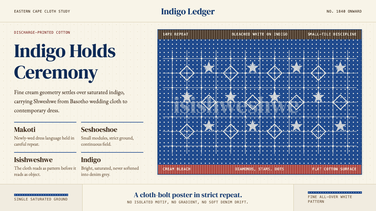 South African Shweshwe IndigoCeremony in indigo. Cream serif type and tiny bleached repeats tile a saturat…靛蓝里的仪式感:奶油衬线与细密漂白纹样铺成布面网格。
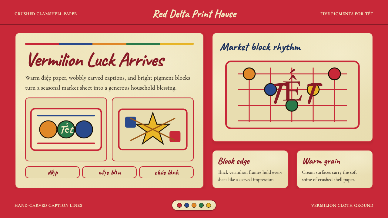 Vietnamese Đông Hồ Folk PrintFestive craft stays handmade. Vermilion frames, Caveat captions, cream paper…手作年节感:朱红边框、Caveat题字与蚌壳暖纸。
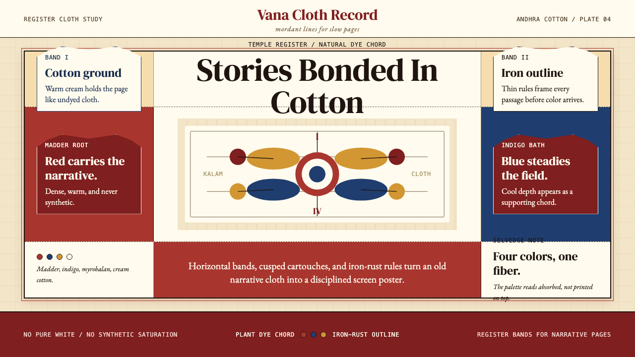 Kalamkari (Andhra Pradesh)Cloth becomes narrative. Madder bands, indigo panels, and iron rules stack li…棉布化为叙事:茜草红条带、靛蓝面板与铁锈线层层如庙布。
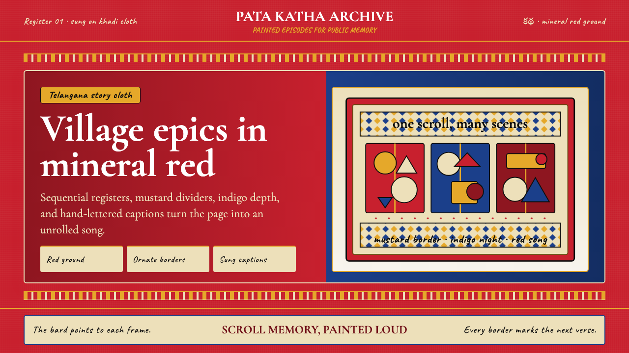 Andhra Cheriyal Scroll PaintingSaturated oral memory. Mineral red registers, mustard diamonds, and serif son…饱和的口述记忆:矿物红分格、芥末黄菱纹与衬线唱词。
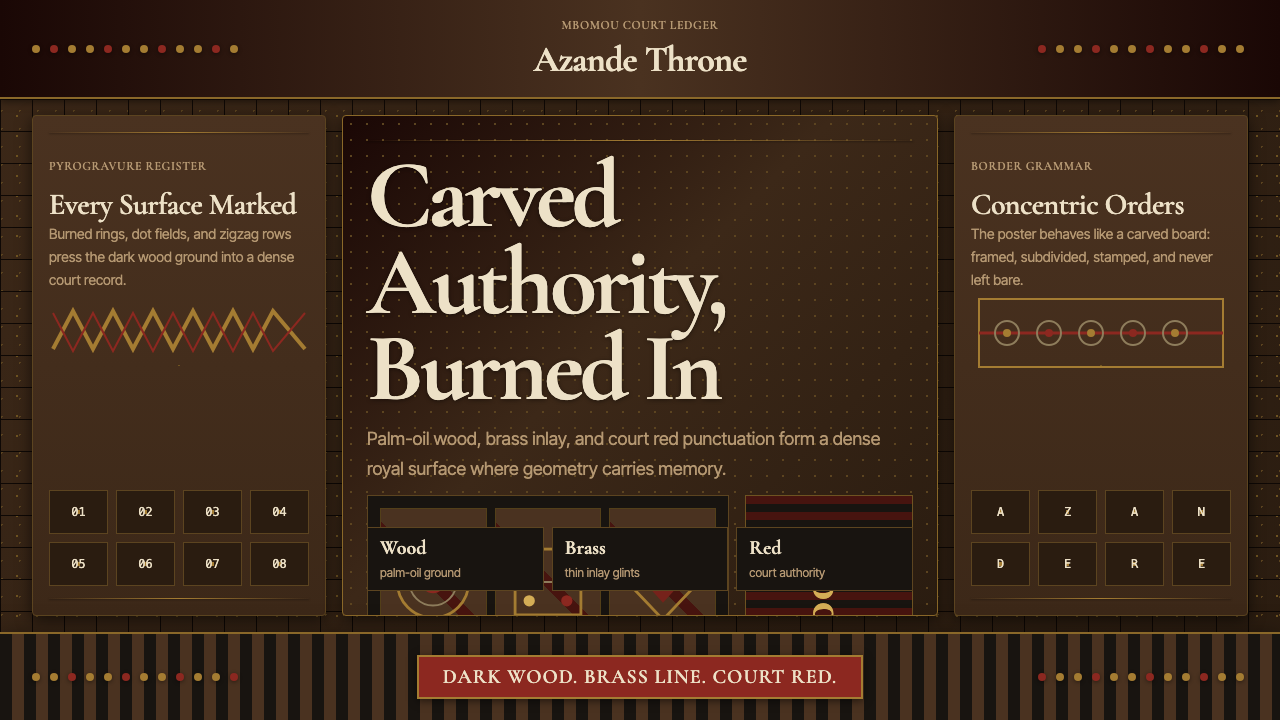 Central African Azande ThroneDense court gravity. Dark wood grids, brass dots, and court red cover every s…宫廷感厚重:深木网格、黄铜点阵与宫廷红铺满表面。
 Egyptian Coptic TextileWarmth woven flat. Madder, indigo and saffron medallions sit on linen cream.温暖被织成平面:茜草红、靛蓝与藏红花圆章落在亚麻乳白上。