What is Surrealism (Dalí / Magritte)?什么是 Surrealism (Dalí / Magritte)?
Surrealism makes the impossible feel inevitable — dream skies, melting time, and uncanny juxtapositions rendered with the precision of a classical oil painting.超现实主义让不可能显得理所当然——梦境天幕、融化的时间与诡异并置,以古典油画的精准笔触一一呈现。
Surrealism (Dalí / Magritte) in briefSurrealism (Dalí / Magritte) 速览
Surrealism is the visual language of the unconscious made tangible. It places familiar objects in impossible relationships — a locomotive emerging from a fireplace, a clock draped over a branch like wet cloth, a bowler-hatted man whose face is obscured by a floating apple — and renders each element with the meticulous detail of academic painting. The result is an image that feels simultaneously rational and irrational, familiar and deeply foreign.超现实主义是无意识的视觉化——它将熟悉的事物置于不可能的关系之中:一列火车从壁炉驶出,一只钟表像湿布一样垂挂于树枝,一位礼帽绅士的脸被漂浮的苹果遮住——每一个元素都以学院派绘画的精细笔触呈现。最终的图像同时令人感到理性与非理性,熟悉而又深度陌生。
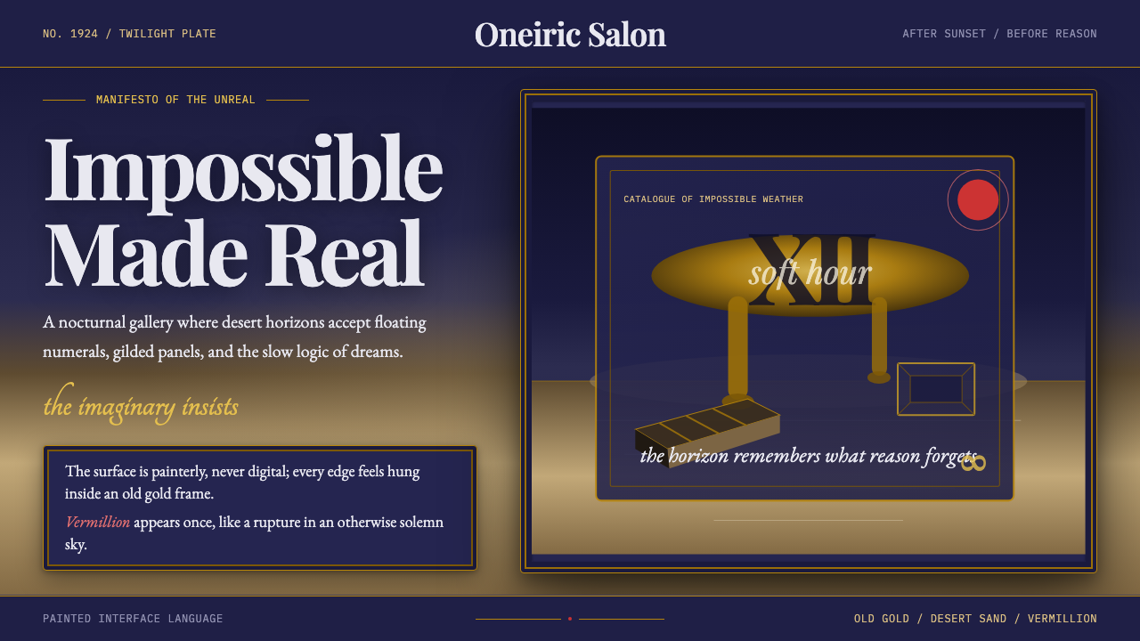
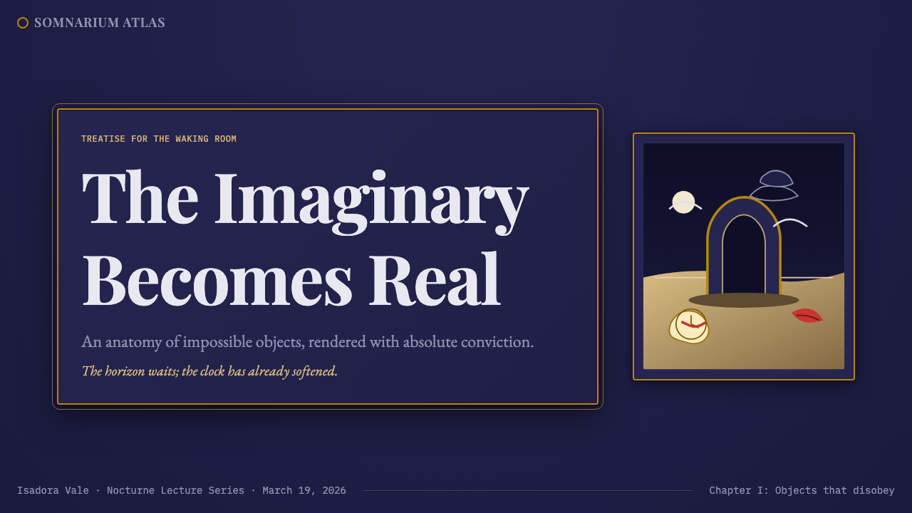
As a design aesthetic, Surrealism draws on the movement's most enduring visual signatures: twilight skies in deep indigo and violet, desert horizons in warm ochre and sand, the richness of old gold ornament, and serif typography that recalls the printed pages of early-twentieth-century Paris. Surfaces have a painterly quality — never clinical or digital — and compositions favor theatrical staging over functional minimalism. The atmosphere is uncanny, elegiac, and slightly unsettling.作为设计美学,超现实主义汲取了该运动最持久的视觉特征:深靛蓝与紫罗兰色的暮色天幕,温暖赭石与沙漠色调的地平线,旧金装饰的华美质感,以及令人联想到二十世纪初巴黎印刷页面的衬线字体。表面具有绘画性质——绝非临床或数字化的——构图倾向于戏剧性舞台感,而非功能性极简主义。整体氛围诡谲、悲叹,带有一丝令人不安的意味。
What distinguishes the Surrealist aesthetic from mere strangeness is its internal consistency. Each impossible element is rendered with conviction. The dreamlike quality comes not from vagueness or blur but from the juxtaposition of hyper-real objects in contexts where they have no logical right to appear. Applied to design, this means every visual choice must be deliberate: the twilight gradient that reads as infinite sky, the gold frame that signals gravitas, the serif headline that whispers of another era.将超现实主义美学与单纯的怪诞区别开来的,是其内在的一致性。每一个不可能的元素都以信念渲染。梦幻品质并非来自模糊或朦胧,而是来自超真实对象置于它们毫无逻辑立足之处的语境中所产生的并置。应用于设计,这意味着每一个视觉选择都必须是深思熟虑的:被解读为无限天空的暮色渐变,传递庄重感的金色画框,低语着另一个时代的衬线标题。
See the Surrealism (Dalí / Magritte) design system查看 Surrealism (Dalí / Magritte) 完整设计系统
Where does Surrealism (Dalí / Magritte) come from?Surrealism (Dalí / Magritte) 从何而来?
Surrealism was formally launched in Paris on October 15, 1924, when the poet and critic André Breton published the first Manifesto of Surrealism. Breton defined the movement as 'pure psychic automatism' — a method for expressing the true functioning of thought, free from the control of reason and any aesthetic or moral preoccupation. The manifesto drew heavily on Sigmund Freud's theories of the unconscious, dream interpretation, and free association, translating psychoanalytic method into an artistic program. Surrealism emerged from the wreckage of Dadaism, inheriting its anti-rationalist spirit but redirecting it from pure negation toward a positive exploration of the subconscious mind.超现实主义于1924年10月15日在巴黎正式诞生,诗人兼批评家安德烈·布勒东在这一天发表了第一份《超现实主义宣言》。布勒东将该运动定义为「纯粹的精神自动主义」——一种表达思想真实运作的方法,摆脱理性的控制与一切美学或道德的束缚。宣言大量借鉴西格蒙德·弗洛伊德关于无意识、梦的解析与自由联想的理论,将精神分析方法转化为艺术纲领。超现实主义从达达主义的废墟中诞生,继承了其反理性精神,但将其从纯粹的否定重新导向对潜意识的积极探索。
Salvador Dalí, born in Figueres, Catalonia, in 1904, joined the Paris Surrealist circle in 1929 and rapidly became its most recognizable figure. His contribution was the 'paranoiac-critical method' — a self-induced hallucinatory state that allowed him to generate irrational imagery while retaining enough rational control to execute it with photographic precision. Works such as The Persistence of Memory (1931), with its celebrated melting watches on a sun-baked Catalan landscape, exemplify this fusion: the imagery is dreamlike, but the execution — the cast shadows, the reflected surfaces, the precise rendering of the cliffs of Cap de Creus — is that of a trained academic painter. Dalí's visual world is characterized by infinite dream-skies, desert and coastal horizons, architectural impossibilities, and an obsessive attention to surface texture.萨尔瓦多·达利于1904年生于加泰罗尼亚的菲格雷斯,1929年加入巴黎超现实主义圈子,迅速成为该运动最具辨识度的人物。他的贡献是「偏执批判法」——一种自我诱导的幻觉状态,使他能够在保留足够理性控制以进行近乎摄影般精准执行的同时,生成非理性图像。《记忆的永恒》(1931年)等作品是这种融合的典范:图像是梦幻的,但执行——投影、反射表面、卡普德克鲁斯海崖的精准描绘——是训练有素的学院派画家的手笔。达利的视觉世界以无垠梦境天幕、荒漠与海岸地平线、建筑上的不可能性,以及对表面质感的强迫性关注为特征。
René Magritte, working in Brussels from the late 1920s onward, developed a parallel but distinct Surrealist sensibility. Where Dalí's images are florid, theatrical, and psychologically charged, Magritte's are quiet, deadpan, and philosophical. He favored the juxtaposition of ordinary objects rendered in flat, matte tones — a pipe accompanied by the caption 'This is not a pipe,' a man in a bowler hat replaced by a dove, an interior whose window opens onto a painted canvas of the same view. Magritte's work interrogates the relationship between representation and reality, image and word, interior and exterior. His palette leans toward overcast blues, grey-greens, and the warm ochres of domestic interiors, and his compositions have the stillness of an unanswered question.勒内·马格利特从1920年代末起在布鲁塞尔工作,发展出一种平行而截然不同的超现实主义感性。达利的图像繁复、戏剧化且心理张力充盈,马格利特的则宁静、朴实而富有哲思。他偏爱以平涂、哑光色调描绘普通物体并进行并置——一只烟斗旁附有「这不是一只烟斗」的说明,一位礼帽绅士被一只鸽子取代,一个室内空间的窗户打开到一幅描绘相同景色的画布上。马格利特的作品追问表现与现实、图像与文字、内部与外部之间的关系。他的色板倾向于阴云蓝、灰绿色以及居家内饰的温暖赭色,构图具有一个未被回答的问题的静寂感。
The movement reached its cultural peak during the 1930s and into the Second World War, when many of its figures — Dalí, Max Ernst, Yves Tanguy, and others — emigrated to the United States. New York became a secondary Surrealist capital, and the movement's visual vocabulary entered advertising, fashion photography, and window display. Salvador Dalí collaborated with Coco Chanel, designed a dream sequence for Alfred Hitchcock's Spellbound (1945), and worked with Walt Disney on the animated short Destino (conceived 1945). This commercial absorption did not dilute the aesthetic — it amplified it. The Surrealist image became one of the most widely reproduced visual languages of the twentieth century, and its influence on contemporary digital design, editorial illustration, and luxury branding remains direct and traceable.该运动在1930年代至二战期间达到文化巅峰,许多核心人物——达利、马克斯·恩斯特、伊夫·坦吉等——流亡美国,纽约由此成为超现实主义的第二首都,运动的视觉词汇渗入广告、时尚摄影与橱窗陈列。萨尔瓦多·达利与可可·香奈儿合作,为希区柯克的《爱德华大夫》(1945年)设计梦境段落,并与沃尔特·迪士尼合作动画短片《命运》(构思于1945年)。这种商业化吸收不但没有稀释这一美学,反而放大了它。超现实主义图像成为二十世纪传播最广的视觉语言之一,其对当代数字设计、编辑插图与奢侈品牌的影响至今清晰可溯。
What defines the Surrealism (Dalí / Magritte) look?Surrealism (Dalí / Magritte) 的视觉特征是什么?
Color — Twilight and Desert色彩——暮色与荒漠
The palette is organized around two dominant registers: a cool twilight range spanning deep indigo through violet and dusky blue, and a warm desert range of sand ochre, burnt sienna, and bleached bone. Against these grounds, old gold and deep crimson serve as accent tones — the gold of antique frames, the red of a rose or a pair of lips. The effect is neither cheerful nor neutral but emphatically atmospheric, evoking the hour between sunset and night when familiar forms begin to lose their certainty.色板围绕两组主导色域展开:从深靛蓝经紫罗兰到暮蓝的冷调暮色系,以及沙质赭石、焦赭与漂白骨色的暖调荒漠系。在这两组底色之上,旧金与深朱红充当点缀色——古画框的金色,玫瑰或双唇的红色。整体效果既非欢快亦非中性,而是鲜明的氛围性:唤起日落与夜晚之间那个熟悉形态开始失去确定性的时刻。
Painterly Texture绘画性质感
Surfaces in Surrealist design never read as digital. They carry the visual memory of oil paint — subtle tonal modulation, the suggestion of canvas grain, the warm imperfection of a varnished ground. This texture does not mean literal noise filters or photo effects; it means achieving a depth and warmth that distinguishes the image from flat vector output. The background feels like sky or earth, not a color fill. Shadows have weight; highlights glow rather than flash.超现实主义设计中的表面永远不会呈现数字感。它们携带着油画的视觉记忆——微妙的色调调制,画布纹理的暗示,上光底面的温暖不完美。这种质感并非指字面意义上的噪点滤镜或照片特效,而是指实现一种深度与温度,使图像区别于平面矢量输出。背景感觉像天空或大地,而非色彩填充。阴影有分量,高光是发光而非闪光。
Dreamlike Juxtaposition梦境式并置
The defining compositional logic of Surrealism is the encounter of unrelated or incompatible objects in a shared space, rendered with enough conviction that the combination feels inevitable rather than arbitrary. A teacup in a landscape, a door opening onto cloud, a word where an object should be — these juxtapositions generate meaning through friction. Applied to design, this principle manifests as unexpected scale relationships, objects placed outside their functional contexts, or visual metaphors that require a moment of pause to resolve.超现实主义的决定性构图逻辑是:将无关或不相容的对象置于共享空间,并以足够的信念渲染,使其组合感觉不可避免而非随意。一只茶杯出现在风景中,一扇门开向云层,文字出现在本应是物体的位置——这些并置通过摩擦生成意义。应用于设计,这一原则表现为意外的比例关系、被置于功能语境之外的对象,或需要停顿片刻才能解读的视觉隐喻。
Serif Typography衬线字体排印
Type in Surrealist design is always serif — not modern geometric serifs but old-style and transitional faces with bracketed serifs, moderate stroke contrast, and a sense of literary provenance. Headline type is set with grandeur and weight, often at large scale against the deep background. Body text, where it appears, favors a narrow, bookish measure. The underlying message is that Surrealism is a literary and philosophical movement, not a commercial or digital one; the typography should carry that cultural memory.超现实主义设计中的字体始终是衬线体——不是现代几何衬线,而是带有括弧型衬线、适中笔画对比度、具有文学渊源感的旧式或过渡型字面。标题字以宏伟的重量呈现,通常在深色背景上以大字号排列。正文(若出现)倾向于窄幅、书卷式的行宽。潜台词是:超现实主义是一种文学与哲学运动,而非商业或数字化的;字体应当承载这种文化记忆。
Classical Framing and Ornament古典画框与装饰
Gold frames, architectural moldings, and formally composed borders appear in Surrealist imagery as ironic or earnest signals of cultural weight. Dalí mounted his visions in the visual language of museum art; Magritte placed his philosophical provocations inside easel paintings. In applied design, this translates to bordered containers, formal compositional symmetry for specific elements, and the use of ornamental detail — a rule, a cartouche, a vignette — as deliberate quotation from the tradition of academic painting and fine-press printing.金色画框、建筑线脚与正式构图的边框在超现实主义图像中作为文化分量的反讽或认真的信号出现。达利将他的幻象镶嵌在博物馆艺术的视觉语言中;马格利特将他的哲学挑衅置于架上绘画的框架内。应用于设计,这体现为带边框的容器、特定元素的正式构图对称,以及将装饰性细节——一条直线、一个圆形装饰、一个晕影——作为对学院派绘画与精品印刷传统的刻意引用。
Infinite and Uncanny Space无垠与诡异的空间感
Surrealist space recedes to impossible distances. The horizon is always further than it should be; the sky is deeper, the desert wider, the architecture more maze-like than any real place. This spatial expansiveness is achieved through careful tonal recession — elements near the viewer are warmer and more detailed, while the background dissolves into cool blue haze. The psychological effect is vertigo — a sense of standing at the edge of something enormous — which in design translates to a feeling of scale and consequence beyond the ordinary.超现实主义的空间退向不可能的远处。地平线总是比它应该在的地方更远;天空更深邃,沙漠更宽广,建筑比任何真实场所都更像迷宫。这种空间延展性通过细心的色调退远实现——靠近观者的元素更温暖、更细致,而背景则消融于冷蓝雾气之中。心理效果是眩晕——站在某种巨大事物边缘的感觉——这在设计中转化为超越寻常的规模感与重要感。
Hyper-real Detail超真实细节
The impossible in Surrealist imagery is always rendered with absolute specificity. Dalí's melting clocks have visible numerals, accurate cast shadows, and the correct texture of oxidized metal. Magritte's pipe is painted with the care of a still-life study. This obsessive attention to detail is what distinguishes Surrealism from fantasy: fantasy accepts ambiguity; Surrealism insists on precision. In design, this means every element — a shadow, a reflection, a typographic detail — should be resolved, never approximate.超现实主义图像中的不可能总是以绝对的具体性呈现。达利融化的时钟有清晰可见的数字、精确的投影,以及氧化金属正确的质感。马格利特的烟斗以静物研究的精心描绘。这种对细节的强迫性关注正是超现实主义与幻想的区别所在:幻想接受模糊;超现实主义坚持精准。在设计中,这意味着每一个元素——阴影、反射、排版细节——都应当被解决,而非近似处理。

See the Surrealism (Dalí / Magritte) design system查看 Surrealism (Dalí / Magritte) 完整设计系统
Who shaped Surrealism (Dalí / Magritte)?谁塑造了 Surrealism (Dalí / Magritte)?
Born in Figueres, Catalonia, in 1904, Dalí trained at the Royal Academy of Fine Arts in Madrid before joining the Paris Surrealists in 1929. His paranoiac-critical method — a disciplined simulation of paranoid delusion used to generate images — produced the movement's most iconic works: The Persistence of Memory (1931), The Elephants (1948), and Dream Caused by the Flight of a Bee Around a Pomegranate a Second Before Awakening (1944). Dalí was also the movement's most prolific commercial figure, working with advertisers, fashion houses, filmmakers, and theater directors, and designing everything from jewelry to furniture to a telephone shaped like a lobster. His visual vocabulary — infinite dream-skies, desert landscapes, melting or morphing objects, architectural impossibilities, and meticulous academic technique — remains the most widely recognized shorthand for Surrealism in popular culture.萨尔瓦多·达利于1904年生于加泰罗尼亚的菲格雷斯,在马德里皇家美术学院接受训练后,于1929年加入巴黎超现实主义圈子。他的偏执批判法——一种用于生成图像的偏执妄想的有纪律模拟——产生了该运动最标志性的作品:《记忆的永恒》(1931年)、《大象》(1948年)与《被一只蜜蜂围绕着一颗石榴飞翔而引起的梦,在清醒前一秒》(1944年)。达利也是该运动最多产的商业人物,与广告商、时装屋、电影人和剧院导演合作,设计了从珠宝到家具再到龙虾电话的一切。他的视觉词汇——无垠梦境天幕、荒漠风景、融化或变形的对象、建筑上的不可能性以及精细的学院派技法——至今仍是流行文化中超现实主义最广为人知的简写。
Magritte was born in Lessines, Belgium, in 1898 and spent most of his career in Brussels, working in deliberate contrast to the flamboyant theatrical mode of Dalí. His paintings are quiet, deadpan, and philosophically rigorous: The Treachery of Images (1929), The Son of Man (1964), and Personal Values (1952) all interrogate how images represent — or fail to represent — the things they depict. Magritte painted in a flat, even technique that deliberately evacuated the expressive brushwork typical of fine art, giving his impossible scenes the matter-of-fact quality of a commercial illustration. His contribution to applied design has been enormous: the bowler hat, the apple, the cloud, the pipe — these recurring motifs have become a visual shorthand for intellectual wit and uncanny juxtaposition deployed across luxury advertising, book covers, and editorial design.马格利特于1898年生于比利时莱西讷,职业生涯的大部分时间在布鲁塞尔度过,刻意与达利的浮华戏剧模式形成对比。他的绘画安静、朴实且哲学上严谨:《图像的叛逆》(1929年)、《人之子》(1964年)与《个人价值观》(1952年)都追问图像如何再现——或未能再现——它所描绘的事物。马格利特以平涂均匀的技法绘画,刻意摒弃精致艺术中典型的表现性笔触,赋予他的不可能场景以商业插图般的事实性质感。他对应用设计的贡献是巨大的:礼帽、苹果、云朵、烟斗——这些反复出现的母题已成为智识机智与诡异并置的视觉简写,被广泛运用于奢侈品广告、书籍封面与编辑设计。
Breton was the movement's theorist, organizer, and self-appointed pope. His 1924 Manifesto of Surrealism defined the movement's intellectual program and declared its allegiance to Freudian psychoanalysis, automatic writing, and the liberation of the unconscious from rational control. A second manifesto followed in 1929. Breton was both tireless advocate and notoriously difficult collaborator — he excommunicated Dalí, Ernst, and others from the movement at various points. As a prose writer, his own work — particularly Nadja (1928) — demonstrates that Surrealist aesthetics could be applied as effectively in language as in paint, a principle that influenced a century of experimental fiction and advertising copy.布勒东是该运动的理论家、组织者与自封的教皇。他的1924年《超现实主义宣言》定义了运动的思想纲领,宣告其对弗洛伊德精神分析、自动写作以及将无意识从理性控制中解放出来的忠诚。第二份宣言于1929年跟进。布勒东既是不知疲倦的倡导者,也是出了名难以共事的合作者——他在不同时期将达利、恩斯特等人逐出了该运动。作为散文作家,他自己的作品——尤其是《娜嘉》(1928年)——证明了超现实主义美学在语言中与在绘画中一样有效,这一原则影响了一个世纪的实验小说与广告文案。
Ernst was the movement's most formally experimental figure, developing techniques — frottage, grattage, and decalcomania — that introduced chance and automatic processes into image-making. Frottage (rubbing pencil over paper laid on a textured surface) and grattage (scraping paint to reveal underlying layers) generated organic, unexpected textures that became characteristic of the movement's more abstract wing. Ernst's forest paintings and his novel in collage, Une Semaine de Bonté (1934), demonstrate how Surrealist imagery could be built from found imagery and material accident rather than purely from the imagination — a method that directly anticipates photomontage, collage-based editorial design, and contemporary algorithmic image generation.恩斯特是该运动形式上最具实验性的人物,他发展出拓印(frottage)、刮除(grattage)与转印(decalcomania)等技法,将偶然性与自动化过程引入图像创作。拓印法(将铅笔在铺于纹理表面的纸上摩擦)与刮除法(刮去颜料以显露底层)产生了有机的、出乎意料的质感,成为该运动更抽象一翼的特征。恩斯特的森林绘画系列与他的拼贴小说《慈悲周》(1934年)展示了超现实主义图像如何从发现的图像与材料偶然性而非纯粹想象中建构——这种方法直接预示了照片蒙太奇、拼贴式编辑设计与当代算法图像生成。
Oppenheim's Object (1936) — a teacup, saucer, and spoon covered in fur — is one of the most concise demonstrations of Surrealist object-making: an everyday item rendered useless and uncanny by the substitution of a single material property. Oppenheim was among the first prominent women in the Surrealist movement, and her work demonstrates that the movement's logic of juxtaposition could be applied to three-dimensional design objects with exactly the same conceptual force as painting. Her influence on product design, fashion, and accessory design — the deliberate collision of materials with incompatible cultural associations — runs from the 1930s directly to the present.奥本海姆的《物体》(1936年)——一只覆盖着毛皮的茶杯、茶碟与茶匙——是超现实主义物件创作最简洁的示范之一:一件日常物品通过替换单一材料属性而变得无用且诡异。奥本海姆是超现实主义运动中最早的杰出女性之一,她的作品证明了该运动的并置逻辑可以以与绘画完全相同的概念力量应用于三维设计对象。她对产品设计、时尚与配饰设计的影响——将拥有不相容文化联想的材料刻意碰撞——从1930年代直接延伸至今。
How do you use Surrealism (Dalí / Magritte) today?今天怎么用 Surrealism (Dalí / Magritte)?
Surrealism is among the most distinctive and high-commitment design aesthetics available for contemporary work. It is not a veneer to be applied lightly — the style carries strong cultural associations with dream, the unconscious, luxury, and intellectual gravity, and any application that undermines those associations will read as pastiche. The first question to ask is whether the content and audience warrant this level of atmospheric density. Surrealism works best for products and platforms positioning themselves as transformative, luxurious, or intellectually serious: high-end editorial, luxury brand campaigns, cultural institutions, or technology products that want to signal that they are doing something genuinely new.超现实主义是当代设计中最具辨识度、最需要全面投入的美学风格之一。它不是可以随意涂抹的表层——这种风格与梦境、无意识、奢华与智识分量有着强烈的文化关联,任何破坏这些关联的应用都会呈现为拙劣仿作。首先要问的问题是:内容与受众是否值得这种程度的氛围浓度。超现实主义最适合将自身定位为变革性、奢华性或智识严肃性的产品与平台:高端编辑内容、奢侈品牌推广、文化机构,或希望传达自己正在做真正新事物的科技产品。
For presentation slides, the Surrealist aesthetic excels at cover pages and section dividers but demands restraint on content slides. A cover benefits from the full visual vocabulary: a deep twilight sky as background, a gold-framed central image or headline, serif type set at commanding scale, and a single warm accent anchoring the composition. Content slides should be treated as calm successors to that cover — a cleaner field with the same serif typography, tonal backgrounds rather than flat fills, and data or bullet points given space to breathe. Data visualizations on Surrealist slides work best when they feel like scientific diagrams from another era: fine lines, labeled axes, a spare but considered palette drawn from the same warm-and-cool register as the rest of the deck.在演示文稿方面,超现实主义美学在封面页与章节分隔页上表现卓越,但在内容页上需要克制。封面适合完整的视觉词汇:深暮色天幕作为背景,金色画框的中心图像或标题,以宏伟尺度排列的衬线字体,以及一个温暖的点缀色锚定构图。内容页应被视为封面的平静继承者——相同的衬线字体,更简洁的底面,色调背景而非平面填充,数据或要点获得足够的呼吸空间。超现实主义幻灯片上的数据可视化在感觉像来自另一个时代的科学图表时效果最佳:细线、标注坐标轴、从与整套幻灯片相同的冷暖色域中提取的朴素而经过考量的色板。
For web interfaces and dashboards, the style suits contexts where the user is expected to linger and explore rather than process information rapidly. A Surrealist dashboard might use a deep indigo or violet ground for the primary background, with card components framed in subtle gold or warm ochre borders rather than the sharp hard shadows of Bauhaus-derived work. Navigation should be typographic and formal, with serif labels and generous spacing. Pricing pages in this aesthetic work well for premium or luxury tiers — the visual weight of the style communicates that the product is not a commodity. The key discipline is restraint: one or two Surrealist visual elements per screen are evocative; five are overwhelming.对于网页界面与仪表板,这种风格适合用户被期望停留与探索而非快速处理信息的场景。超现实主义风格的仪表板可以使用深靛蓝或紫罗兰色作为主背景,卡片组件以微妙的金色或温暖赭石色边框框定,而非包豪斯衍生作品中的硬边投影。导航应当是字体性与正式性的,采用衬线标签与充裕的间距。这种美学下的定价页面适用于溢价或奢华等级——这种风格的视觉重量传达出产品并非大宗商品。关键的自律是克制:每个屏幕一到两个超现实主义视觉元素是令人回味的;五个则是压倒性的。
For editorial and marketing work, the Surrealist aesthetic has a long and proven history. Magazine covers, book jackets, advertising campaigns, and cultural event posters have drawn on this vocabulary continuously since the 1930s. In contemporary editorial application, the style works best when the central image does the conceptual work — an unexpected object, a striking juxtaposition, a figure in an impossible setting — while typography and layout remain relatively controlled. Marketing pages in this style should commit to the atmospheric quality: large-format imagery, unhurried pacing, copy that reads as thoughtful rather than urgent, and a consistent color identity built from the twilight and desert palette.对于编辑与营销内容,超现实主义美学拥有悠久且经过验证的历史。杂志封面、书籍封套、广告推广与文化活动海报自1930年代以来持续借鉴这一词汇。在当代编辑应用中,当中心图像承担概念工作——一个意外对象、一个引人注目的并置、一个置身不可能环境中的人物——而字体与版面保持相对克制时,这种风格的效果最佳。这种风格下的营销页面应当致力于氛围品质:大幅图像、不紧迫的节奏、读来深思熟虑而非急迫的文案,以及从暮色与荒漠色板中构建的一致色彩识别。
A common mistake when applying the Surrealist aesthetic is confusing strangeness with quality. Arbitrary bizarre imagery — random objects superimposed on photographs, unexpected font choices for no conceptual reason, mismatched textures piled together — produces chaos rather than the productive unease that Surrealism aims for. The discipline that distinguishes authentic Surrealist-influenced design from visual noise is the same discipline that characterizes the paintings of Dalí and Magritte: every impossible element must be rendered with conviction and internal consistency. The impossible should feel inevitable, not accidental.应用超现实主义美学时最常见的错误是将奇异与质量混为一谈。随意的怪诞图像——随机对象叠加在照片上、毫无概念原因的意外字体选择、不协调的质感堆砌——产生的是混乱而非超现实主义所追求的富有成效的不安。将真正受超现实主义影响的设计与视觉噪音区别开来的自律,与达利和马格利特绘画的特征是同一种自律:每一个不可能的元素都必须以信念和内在一致性呈现。不可能应当感觉不可避免,而非偶然。
See the Surrealism (Dalí / Magritte) design system查看 Surrealism (Dalí / Magritte) 完整设计系统
Surrealism (Dalí / Magritte) — FAQSurrealism (Dalí / Magritte) · 常见问题
Is Surrealist design too niche for mainstream commercial use?超现实主义设计对于主流商业应用是否过于小众?
Not inherently, but it requires a product context that can carry the aesthetic weight. Surrealism has been used successfully in mainstream commercial work since the 1930s — it is the vocabulary of countless luxury perfume campaigns, high-fashion editorials, and technology brand launches. The constraint is that the style signals seriousness, transformation, and a certain refusal of the ordinary. Products that are genuinely premium, genuinely new, or genuinely concerned with the imagination align naturally with the aesthetic. Products that are primarily utilitarian, value-focused, or reassuringly familiar will find the style alienating rather than differentiating.并非天然如此,但需要一个能够承载其美学分量的产品语境。超现实主义自1930年代以来在主流商业作品中一直被成功运用——它是无数奢华香水推广、高级时尚编辑与科技品牌发布的词汇。限制在于:这种风格传递的是严肃性、变革性以及对寻常事物的某种拒绝。真正溢价、真正新颖或真正关注想象力的产品与这种美学自然契合。主要是功能性、注重性价比或令人放心地熟悉的产品则会发现这种风格带来的是疏离感而非差异化。
How do Dalí and Magritte differ as design references, and when should I favor one over the other?达利与马格利特作为设计参照有何不同,何时应偏向其中一位?
Dalí's visual mode is warm, theatrical, and psychologically charged — his imagery tends toward the baroque, with rich desert and coastal landscapes, organic morphing forms, and an overall feeling of overwhelming, hallucinatory detail. Magritte's mode is cool, spare, and philosophically quiet — his images are flatter, more controlled, and generate their uncanny quality from conceptual juxtaposition rather than painterly richness. For emotional, immersive, or luxury-brand contexts, Dalí's register is appropriate. For intellectual, editorial, or conceptually driven work — a think-tank, a publication, a technology platform exploring a new category — Magritte's stripped, questioning sensibility will serve better.达利的视觉模式是温暖、戏剧化且心理张力充盈的——他的图像趋向巴洛克风格,拥有丰富的荒漠与海岸风景、有机变形的形态,以及整体上令人不知所措的幻觉细节。马格利特的模式是冷静、简洁且哲学上安静的——他的图像更平涂、更克制,其诡异品质来自概念性并置而非绘画性丰富。对于情感性、沉浸式或奢侈品牌语境,达利的风格是合适的。对于智识性、编辑性或概念驱动的作品——智库、出版物、探索新类别的科技平台——马格利特剥离的、发问式的感性则更为适用。
Can Surrealism work in a light-background layout, or does it require dark backgrounds?超现实主义风格能用在浅色背景版面中吗,还是它必须要有深色背景?
Surrealism is not restricted to dark backgrounds, but dark or twilight grounds are its natural register. The movement's most characteristic images take place in the hour between dusk and night, in infinite desert space, or in dimly lit interiors — all of which favor the low-key end of the tonal range. A light-background Surrealist layout is possible, particularly drawing on Magritte's palette of overcast blues and domestic ochres, but it requires careful management: without the depth of a dark ground, the uncanny quality can flatten into mere quirk. The gold and warm accent tones should be used more sparingly on a light ground, and the typographic and compositional discipline becomes more important as the atmospheric depth decreases.超现实主义并不局限于深色背景,但深色或暮色底面是其自然的色调区间。该运动最具特征的图像发生在黄昏与黑夜之间的那个小时、无垠的荒漠空间中,或昏暗的室内——所有这些都偏向低调的色调范围。浅色背景的超现实主义版面是可能的,特别是借鉴马格利特的阴云蓝与居家赭色色板,但需要细心的管理:没有深色底面的深度,诡异品质可能会扁平化为单纯的怪癖。金色与暖调点缀色在浅色底面上应使用得更为克制,而随着氛围深度的降低,字体与构图上的自律变得更加重要。
How should photography be handled in a Surrealist design system?在超现实主义设计系统中,应如何处理摄影图像?
Photography in a Surrealist context works best when it participates in the movement's logic of juxtaposition and impossibility rather than functioning as straightforward documentary or lifestyle imagery. This means treating photography as raw material: compositing unexpected elements into a single scene, shifting the scale of objects relative to their surroundings, applying tonal treatments that echo the twilight palette, or cropping and framing in ways that remove the image from its original context. Straightforward portrait or product photography will feel incongruous unless it is treated — at minimum, desaturated and toned to sit within the palette. The historical Surrealists were themselves deeply interested in photography as a medium for making the real feel unreal; applying that same intention to sourced or commissioned photography is the most authentic approach.超现实主义语境中的摄影在参与该运动的并置与不可能逻辑时效果最佳,而非充当直白的纪录或生活方式图像。这意味着将摄影视为原材料:将意外元素合成到单一场景中,改变对象相对于其周围环境的比例,应用呼应暮色色板的色调处理,或以将图像从其原始语境中移除的方式进行裁切和取景。直白的肖像或产品摄影会感觉格格不入,除非经过处理——至少需要去饱和并调色以融入色板。历史上的超现实主义者本身对摄影作为使现实感觉不真实的媒介深感兴趣;将同样的意图应用于授权或委托的摄影是最真实的方式。
What are the most common mistakes that make Surrealist design fall flat?有哪些最常见的错误会让超现实主义设计显得苍白无力?
Three failures recur most often. The first is arbitrary strangeness — placing unusual objects together without the internal logic that makes the impossible feel inevitable. True Surrealist imagery has a reason, even if that reason is subconscious; randomly bizarre combinations simply read as incoherent. The second is imprecise execution — soft, vague, or digitally obvious surfaces undermine the hyper-real precision that the style requires; the impossible must be rendered with the conviction of documentary photography. The third is tonal inconsistency — mixing the Surrealist atmosphere with cheerful or contemporary visual idioms (flat illustration, bright UI color conventions, casual sans-serif type) breaks the spell immediately. The aesthetic is all-or-nothing: commit to the twilight palette, the classical typography, and the painterly surface, or choose a different style.三种失败最为常见。第一是随意的奇异——将不寻常的对象置于一起而没有使不可能感觉不可避免的内在逻辑。真正的超现实主义图像有其原因,即使那个原因是潜意识的;随机怪诞的组合只会读来不连贯。第二是不精确的执行——柔软、模糊或明显数字化的表面破坏了这种风格所需的超真实精准;不可能必须以纪录片摄影的信念来呈现。第三是色调不一致——将超现实主义氛围与欢快或当代视觉惯用语(平面插图、明亮的界面颜色惯例、随意的无衬线字体)混合会立即打破魔咒。这种美学是全或无的:致力于暮色色板、古典字体与绘画性表面,或者选择不同的风格。
Related design styles相关设计风格
 Cameroonian Ndop Royal IndigoReads like court cloth. Indigo panels, ash stitch grids, and matte copper kee…宫廷布幅般庄重。靛蓝面板、灰白针脚与哑铜放慢阅读。
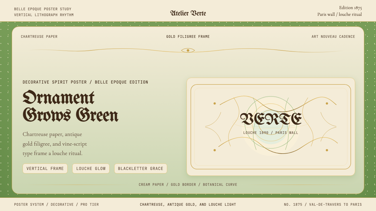 Absinthe Art Nouveau Green (1875)Ornate and verdant. Chartreuse field, gold filigree, vine-script type, and lo…华丽而青绿。黄绿色底、金丝花边与藤蔓字体托出浑浊光。
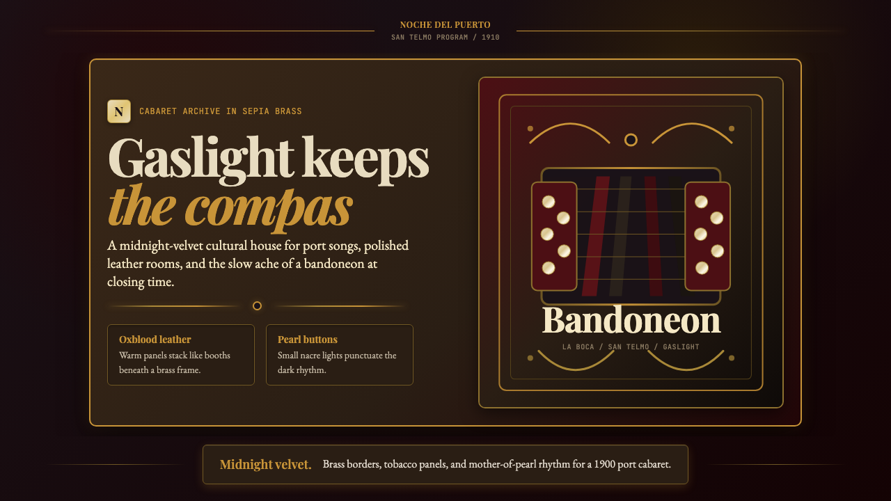 Argentine Bandoneón 1900 (Tango)Gaslit tango luxury. Midnight velvet, brass fileteado, and pearl-button geome…煤气灯下的探戈奢华:午夜绒底、黄铜卷草与珍珠琴键。
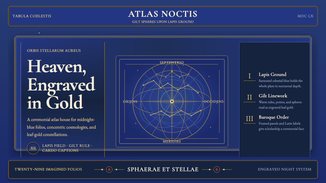 Cellarius Celestial AtlasCelestial luxury on lapis. Gilt serif type, star fields, and concentric chart…青金夜空里的天体奢华:鎏金衬线、星点与同心星图线。
 Disney Classic (1937)Fairy-tale warmth at night. Midnight blue, Cinzel serifs, arched gold stardus…夜色里的童话暖意:午夜蓝、Cinzel 衬线与金色拱门星尘。
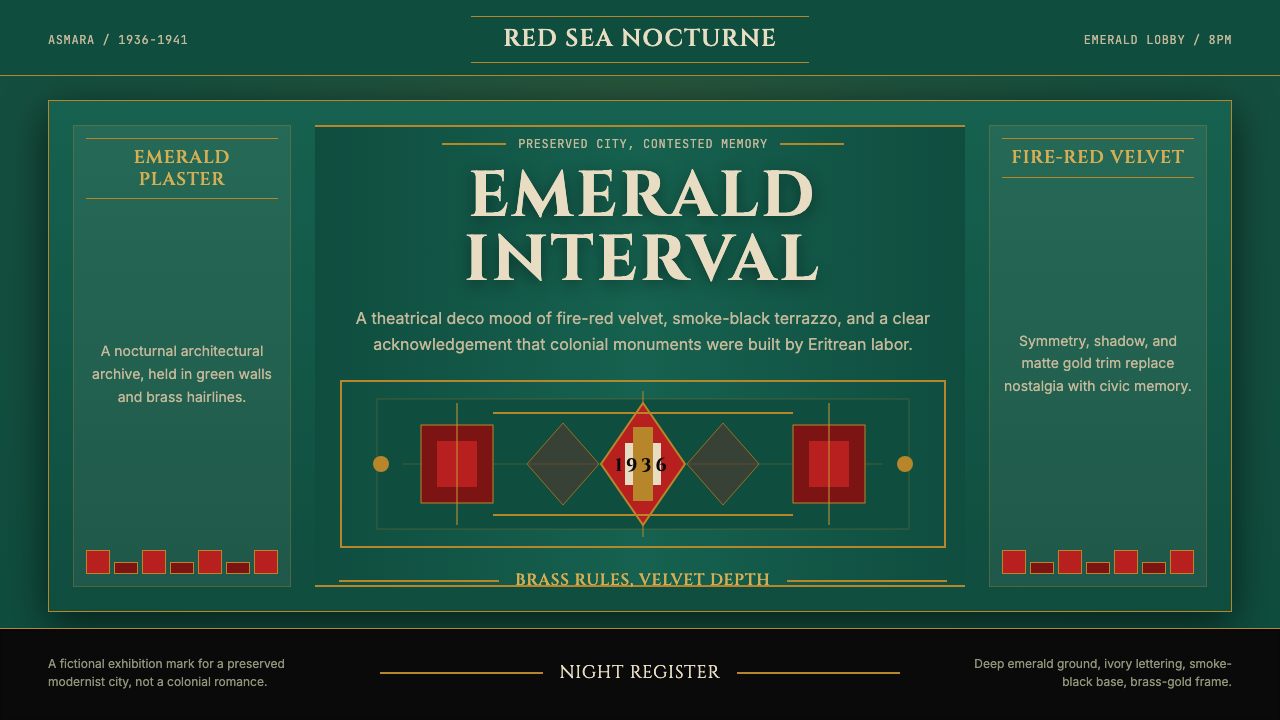 Eritrean Asmara Art Deco Cinema (1936)Nocturnal deco, critically lit. Emerald walls, fire red velvet, and brass rul…夜色装饰艺术保持克制:翡翠墙、火红绒面与黄铜线框住历史。