Design style guide设计风格指南
What is Russian Matryoshka 1890?什么是 Russian Matryoshka 1890?
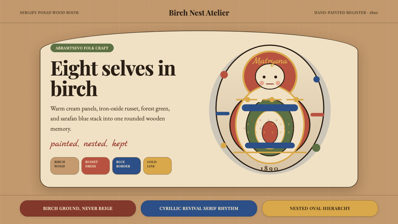
Warm birchwood, hand-painted russet and cream, and an egg-oval silhouette that nests seven smaller selves inside one — the Russian matryoshka is folk craft distilled into a visual system.温暖的白桦木、手绘赭红与奶油色,以及一个层层内嵌七个自身的蛋形轮廓——俄罗斯套娃是民间工艺提炼而成的视觉系统。
Russian Matryoshka 1890 in briefRussian Matryoshka 1890 速览
Russian Matryoshka 1890 is a design aesthetic rooted in the material and pictorial world of Russian folk craft at the turn of the twentieth century. Its defining qualities are warmth without sentimentality, handmade depth without roughness, and a sense of generous ornament that remains legible at any scale. The palette draws on the physical substance of the original dolls — the natural honey tone of birch, the deep russet of iron-oxide pigment, the cream of unpainted wood, the forest green of the peasant apron — with touches of cobalt and ivory used sparingly for highlight and contrast.俄罗斯套娃1890是一种根植于二十世纪之交俄罗斯民间工艺物质与图像世界的设计美学。它的核心特质是:温暖而不矫情,手工深度而不粗糙,以及一种在任何尺度下都保持清晰可读的慷慨装饰感。色板源自原始套娃的物质本体——白桦木天然的蜂蜜色调、铁氧化颜料的深赭红、未上漆木料的奶油白、农妇围裙的森林绿——以及少量点缀用于提亮与对比的钴蓝和象牙色。
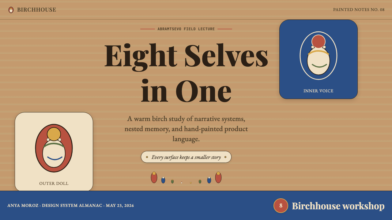
The aesthetic is organized around the oval and the nested figure. Where Bauhaus reaches for the circle and the square, matryoshka design reaches for the egg-oval — a form that suggests both biological origin and protected interiority. Decorative surface work is floral and figurative rather than geometric, recalling the embroidered patterns on Russian peasant dress. Lettering, where it appears, draws from Cyrillic types in use during the Russian Revival printing movement of the late nineteenth century: weighty, upright, with bracketed serifs that evoke the warmth of hand-setting.这套美学围绕椭圆与嵌套图形组织。包豪斯伸手触碰的是圆形与方形,套娃设计触碰的是蛋形——一种同时暗示生命起源与受庇护内在性的形态。表面装饰是花卉与具象的,而非几何的,令人想起俄罗斯农民服饰上的刺绣纹样。文字(若出现)借鉴十九世纪末俄罗斯复兴印刷运动中使用的西里尔字体:厚重、直立,带有托脚衬线,散发出手工排版的温度。
Unlike design systems rooted in abstraction, the matryoshka aesthetic is unapologetically representational. It celebrates the crafted object, the painted face, the turned wood grain. Applied to contemporary design work, it offers a counterweight to minimalism: a rich, layered visual field that communicates care, cultural rootedness, and the irreplaceable value of the hand-made.与根植于抽象的设计系统不同,套娃美学是毫无歉意的具象风格。它颂扬手工物件、描绘的面孔、车削的木纹。应用于当代设计实践,它为极简主义提供了一种对位:一个丰富、有层次的视觉场域,传递出用心、文化根性,以及手工制作无可替代的价值。
See the Russian Matryoshka 1890 design system →查看 Russian Matryoshka 1890 完整设计系统 →
Where does Russian Matryoshka 1890 come from?Russian Matryoshka 1890 从何而来?
The first matryoshka was created in 1890 at the Abramtsevo estate outside Moscow, the cultural colony funded by industrialist and arts patron Savva Mamontov. Abramtsevo had become the gathering point of the Russian Revival movement — an intellectual and artistic project that sought to recover pre-Petrine folk traditions in the face of rapid industrialization and Western cultural influence. Artists, architects, and craftspeople came to Abramtsevo to study traditional embroidery, ceramic tile work, woodcarving, and peasant dress, attempting to distill them into a consciously Russian visual identity.第一套套娃诞生于1890年,地点是莫斯科郊外的阿布拉姆采沃庄园——工业家兼艺术赞助人萨瓦·马蒙托夫出资建立的文化聚居地。阿布拉姆采沃已成为俄罗斯复兴运动的汇聚中心:这是一个试图在快速工业化与西方文化影响的冲击下,重新找回彼得大帝改革之前民间传统的知识与艺术计划。艺术家、建筑师与工匠聚集于此,研究传统刺绣、陶瓷砖工、木雕与农民服饰,试图将其提炼为一种自觉的俄罗斯视觉身份。
Painter Sergei Malyutin designed the form and the painted surface decoration of the first set; wood-turner Vasily Zvyozdochkin carved it on a lathe from blocks of linden and birch. The subject was a peasant girl named Matryona — a diminutive of Matrona, derived from the Latin for mother — holding a black rooster, with seven successively smaller figures nested inside, the innermost a swaddled infant. The choice of subject was deliberate: the nesting structure embodied the peasant matriarch, fertility, and the continuation of generations. There is also evidence that Malyutin and Mamontov were inspired by a Japanese kokeshi doll brought back from Japan, though the specific origin of this influence remains contested among scholars.画家谢尔盖·马柳京设计了第一套套娃的造型与彩绘图案;木匠瓦西里·兹维约兹多奇金用椴木和白桦木在车床上将其车削成形。主题是一个名叫玛特廖娜的农家少女——玛特廖娜是玛特罗娜的爱称,源自拉丁语的"母亲"——她怀抱一只黑公鸡,内部嵌套着七个依次缩小的人偶,最内层是一个襁褓中的婴儿。主题的选择是刻意为之:嵌套结构体现了农村家长、生育力与代代相传。另有证据显示,马柳京与马蒙托夫受到一只从日本带回的木芥子玩偶的启发,尽管这一影响的具体来源在学界至今仍有争议。
The set was exhibited at the Sergiev Posad toy workshops and entered commercial production almost immediately at the craft workshops of that town, which had been a center of wooden toy manufacture for centuries. When the first matryoshka won a bronze medal at the Paris Universal Exposition of 1900, international demand transformed a workshop craft into an industry. Production spread from Sergiev Posad to other towns — Semyonov in the Nizhny Novgorod region became a second major center, developing its own regional style characterized by bolder floral bouquets on the apron and a simpler face treatment.这套玩偶在谢尔吉耶夫镇的玩具工坊展出后,几乎立即进入了该镇手工艺工坊的商业生产——谢尔吉耶夫镇几百年来一直是木制玩具制造的中心。当第一套套娃在1900年巴黎世界博览会上斩获铜牌后,国际需求将一种工坊手艺转变为一个产业。生产从谢尔吉耶夫镇扩展到其他城镇——下诺夫哥罗德地区的谢苗诺夫成为第二个主要中心,发展出自己的地方风格:围裙上绘有更粗犷的花束,面部处理则更为简洁。
The matryoshka's ascent coincided with and was partly driven by the Russian Revival movement's broader agenda of Narodnost — a cultural nationalism that valorized peasant tradition as the authentic soul of Russia in contrast to cosmopolitan, Westernized urban culture. Elizaveta Mamontova, Savva's wife, ran the Abramtsevo workshop that produced the first dolls and oversaw the documentation of folk patterns that influenced their decoration. By the time of the 1917 Revolution, the matryoshka had already become the most internationally recognizable symbol of Russian visual culture — a position it has never relinquished.套娃的崛起与俄罗斯复兴运动更广泛的"民族性"(Narodnost)议程相互呼应,并部分受其驱动——这是一种将农民传统视为俄罗斯真实灵魂的文化民族主义,与世界主义、西化的都市文化相对立。萨瓦之妻叶利扎韦塔·马蒙托娃主持了制作第一批套娃的阿布拉姆采沃工坊,并监督了影响套娃装饰纹样的民间图案文献整理工作。到1917年革命爆发时,套娃已成为俄罗斯视觉文化中国际辨识度最高的符号——这一地位从未动摇。
What defines the Russian Matryoshka 1890 look?Russian Matryoshka 1890 的视觉特征是什么?
Color Palette色彩系统
The palette is warm and earthen: natural birchwood honey as the dominant ground, deep russet and burnt sienna for primary pictorial elements, forest green and leaf green for foliage and apron accents, and cream or ivory for unpainted wood and highlight areas. Cobalt and prussian blue appear as secondary accents. Black is used sparingly, mainly for facial features and outline reinforcement. The overall temperature is warm amber — there are no cool grays, no pure whites, no desaturated neutrals.色板温暖而质朴:天然白桦木蜂蜜色作为主导底色,深赭红与焦赭棕用于主要图案元素,森林绿与叶绿用于枝叶与围裙点缀,奶油色或象牙色用于未上漆木料与高光区域。钴蓝与普鲁士蓝作为次要强调色出现。黑色用量极少,主要用于面部特征与轮廓加强。整体色温为暖琥珀——无冷灰,无纯白,无去饱和的中性色。
Form and Silhouette形态与轮廓
The egg-oval is the governing form — rounded at the shoulders, widest at the hips, tapering gently toward a flat base and a rounded head. This silhouette reads as stable, grounded, and protective. In design applications, this preference for rounded, organic contours extends to layout containers, decorative borders, and pictorial frames. Hard corners and sharp angles are foreign to the system; even rectangular elements tend to carry generous border-radius equivalents.蛋形椭圆是主导形态——肩部圆润,臀部最宽,向扁平底部与圆头顶轻柔收拢。这一轮廓传递出稳定、扎根与庇护之感。在设计应用中,这种对圆润有机轮廓的偏好延伸至布局容器、装饰边框与图像框架。硬角与锐角在这套系统中是陌生的;即便是矩形元素也往往带有慷慨的圆角处理。
Decorative Surface and Ornament装饰表面与纹样
Surface decoration is rich and figurative: roses, rosebuds, leaves, and berries painted in a stylized folk manner rather than botanical realism. The painting style is confident and gestural — visible brushwork, slight irregularity of line — which communicates handmade authenticity rather than mechanical perfection. Decorative borders use repeating floral or geometric folk motifs drawn from traditional embroidery patterns. Nothing is left plain that could carry ornament without disrupting legibility.表面装饰丰富而具象:玫瑰、花苞、叶片与浆果以程式化民间笔法而非植物写实主义绘制。绘画风格自信而富有笔触感——可见的笔迹、线条轻微的不规则性——传递出手工真实性而非机械完美。装饰边框采用源自传统刺绣纹样的重复花卉或几何民间母题。凡是能承载装饰而不损害可读性的地方,都不会留白。
Typography and Lettering字体与手写体
Type in this system references the Cyrillic letterforms produced by Russian Revival printing in the late nineteenth century: upright serifs with bracketed terminals, moderate stroke contrast, and a weight that reads as solid without feeling heavy. Lettering is treated as a craft object in its own right — sometimes hand-rendered, sometimes set in Revival-era type — and tends to sit within decorative cartouches or bordered panels rather than floating freely on a white field. Latin equivalents would be humanist serifs with warm ink-trap details rather than cold geometric or transitional types.这套系统中的字体参照十九世纪末俄罗斯复兴印刷运动中使用的西里尔字形:直立衬线、带托脚的收笔、适度的笔画粗细对比,以及一种看起来厚实而不沉重的字重。文字被视为独立的工艺对象——有时手绘,有时以复兴时期活字排列——倾向于置于装饰框架或带边框的面板内,而非自由漂浮于白色底面上。拉丁字体的对应物是带有温暖墨水陷阱细节的人文主义衬线体,而非冰冷的几何或过渡型字体。
Layering and Depth层次与深度
Depth is achieved through layering rather than shadow. Foreground elements — the central figure, the primary decorative motif — sit visibly above middle-ground decorative bands, which in turn sit above the warm ground color. This spatial logic mirrors the nesting structure of the dolls themselves: each layer is self-contained and legible on its own, yet participates in a larger whole. Drop shadows, where used at all, are warm-toned and soft-edged rather than cool and hard — consistent with the effect of candlelight or diffuse interior light rather than outdoor sun.深度通过层叠而非阴影实现。前景元素——中心人物、主要装饰母题——明显浮于中景装饰带之上,中景又浮于温暖底色之上。这种空间逻辑正好映射了套娃本身的嵌套结构:每一层都自足且独立可读,同时又参与一个更大的整体。投影(若使用)是暖色调、柔边的,而非冷色调、硬边的——与烛光或漫射室内光的效果一致,而非户外阳光。
Pattern Density图案密度
The system operates at a higher pattern density than most contemporary design languages. Surfaces are expected to carry decoration; empty areas are used sparingly and intentionally, typically as breathing room between major pictorial elements rather than as a default state. This density is never chaotic because the decorative vocabulary is limited and internally consistent — the same rose forms, the same leaf profiles, the same border geometry repeat throughout, creating visual coherence within richness.这套系统的运作图案密度高于大多数当代设计语言。表面被期待承载装饰;空白区域的使用是克制而有意为之的,通常作为主要图像元素之间的呼吸空间,而非默认状态。这种密度从不混乱,因为装饰词汇是有限且内部一致的——同样的玫瑰形态、同样的叶片轮廓、同样的边框几何在整体中反复出现,在丰富中创造视觉连贯性。
Material Warmth材质温度
The entire visual system reads warm — a quality produced not by any single color choice but by the cumulative effect of honey-toned grounds, earthen pigments, and the visual implication of hand-applied surface. Even in digital contexts, matryoshka-derived design should feel as though it originated in physical material — painted, turned, or woven — rather than generated on a screen. Textures, where used, reference natural materials: wood grain, woven linen, hand-laid paper.整个视觉系统传递出温度——这种品质不是由任何单一色彩选择产生,而是由蜂蜜色调底面、泥土系颜料与手工上色表面的视觉暗示共同累积而成。即便在数字场景中,源自套娃的设计也应当让人感觉它起源于物质材料——绘制的、车削的或编织的——而非在屏幕上生成的。纹理(若使用)参照自然材料:木纹、亚麻布纹、手工铺设的纸张。

See the Russian Matryoshka 1890 design system →查看 Russian Matryoshka 1890 完整设计系统 →
Who shaped Russian Matryoshka 1890?谁塑造了 Russian Matryoshka 1890?
A painter associated with the Abramtsevo circle and a key figure in the Russian Revival movement, Malyutin designed both the form and the painted decoration of the original matryoshka set in 1890. His background was in easel painting and graphic illustration — evident in the confident figurative drawing of the first doll's face and costume — but his involvement with Abramtsevo had deepened his engagement with folk motifs and traditional craft objects. The first set he designed depicted eight figures, with the outermost a peasant girl holding a black rooster, and the innermost a swaddled infant. Malyutin later became known for his work on architectural ornament and book illustration in the Russian Revival style.马柳京是阿布拉姆采沃圈子的画家、俄罗斯复兴运动的重要人物,他于1890年设计了第一套套娃的造型与彩绘装饰。他的背景是架上绘画与图形插画——这在第一个套娃自信的具象面部与服饰绘制上清晰可见——而与阿布拉姆采沃的深度接触加深了他对民间母题与传统工艺品的理解。他设计的第一套共八个人偶,最外层是抱着黑公鸡的农家少女,最内层是一个襁褓中的婴儿。马柳京后来以俄罗斯复兴风格的建筑装饰与书籍插画而闻名。
The craftsman who physically carved the first matryoshka set, Zvyozdochkin was a skilled wood-turner based in the Sergiev Posad region, the historic center of Russian wooden toy manufacture. The technical challenge he solved was not trivial: carving a set of nested hollow figures from birch or linden wood requires precise calibration of wall thickness and interior diameter at each size so that each doll fits snugly inside the next without binding. Zvyozdochkin's solution established the technical template that craftspeople across Sergiev Posad and Semyonov would follow for decades. His contribution is often underrepresented in histories of the matryoshka that emphasize the painted surface over the carved form.亲手车削出第一套套娃的工匠,兹维约兹多奇金是谢尔吉耶夫镇地区——俄罗斯木制玩具制造的历史中心——的熟练木工。他解决的技术难题并不简单:从白桦木或椴木中车削出一套中空的嵌套人偶,要求对每个尺寸的壁厚和内径精确校准,使每个套娃都能紧密套入下一个而不卡顿。兹维约兹多奇金的解决方案建立了技术模板,谢尔吉耶夫镇和谢苗诺夫的工匠们在此后数十年都遵循这一模板。在强调彩绘表面而非雕刻形态的套娃历史叙述中,他的贡献常被低估。
The industrial magnate and arts patron who funded the Abramtsevo estate and made it a laboratory for Russian Revival art and craft, Mamontov was the enabling condition for the matryoshka's creation. He invited artists, architects, and craftspeople to Abramtsevo, funded their research into peasant traditions, and organized the workshops that produced the first doll set. His belief that Russian art needed to look inward — to its own folk traditions rather than outward to French and German academic painting — shaped the intellectual environment in which the matryoshka became possible. Mamontov was later convicted of financial crimes and lost his fortune, but the cultural institutions he built outlasted his personal ruin.出资建立阿布拉姆采沃庄园并使其成为俄罗斯复兴艺术与工艺实验室的工业大亨兼艺术赞助人,马蒙托夫是套娃得以诞生的先决条件。他邀请艺术家、建筑师与工匠到阿布拉姆采沃,资助他们对农民传统的研究,组织了制作第一套套娃的工坊。他认为俄罗斯艺术需要向内看——回归自身的民间传统,而非向外看向法国和德国的学院绘画——这一信念塑造了套娃得以诞生的思想环境。马蒙托夫后来因金融犯罪被定罪并破产,但他建立的文化机构在他个人的覆灭之后延续了下去。
Savva's wife and a significant figure in her own right, Elizaveta Mamontova managed the Abramtsevo craft workshop that produced the first matryoshka sets and oversaw the systematic documentation of folk embroidery patterns, wood-carving traditions, and peasant costume that fed into the workshop's decorative vocabulary. Where Savva was the patron and visionary, Elizaveta was the organizer and archivist — ensuring that the research into traditional craft was methodical and that its findings were applied consistently in the workshop's output. Her role in the matryoshka's origin is often credited only in passing.萨瓦之妻、本身也是重要人物的叶利扎韦塔·马蒙托娃主持了制作第一批套娃的阿布拉姆采沃工坊,并监督了对民间刺绣纹样、木雕传统与农民服饰的系统性文献整理工作——这些资料构成了工坊装饰语汇的来源。萨瓦是赞助人与梦想家,叶利扎韦塔则是组织者与档案保管者——确保传统工艺研究有条不紊地进行,并将研究成果一致地应用于工坊的产出。她在套娃起源中的角色在历史叙述中常常只被一笔带过。
One of the early master craftsmen at the Sergiev Posad workshops who helped establish the commercial matryoshka tradition in the years immediately following the Paris Exposition of 1900. Leonov's workshop refined the painting conventions that would define the Sergiev Posad regional style: a detailed, realistic face with fine brushwork, elaborate floral costume decoration, and careful attention to color layering. The Sergiev Posad style he helped codify — more pictorial and detailed than the later Semyonov style — became the benchmark against which other regional variants were measured and is the form most closely associated with the original Abramtsevo aesthetic.谢尔吉耶夫镇工坊的早期大师工匠之一,在1900年巴黎博览会之后的岁月里,他帮助建立了商业套娃传统。列昂诺夫的工坊完善了定义谢尔吉耶夫镇地方风格的彩绘规范:精细笔触描绘的写实面孔、精细的花卉服饰装饰,以及对色彩层叠的细心处理。他参与确立的谢尔吉耶夫镇风格——比后来的谢苗诺夫风格更具图像性与精细感——成为衡量其他地方变体的基准,也是与原始阿布拉姆采沃美学最为接近的形态。
How do you use Russian Matryoshka 1890 today?今天怎么用 Russian Matryoshka 1890?
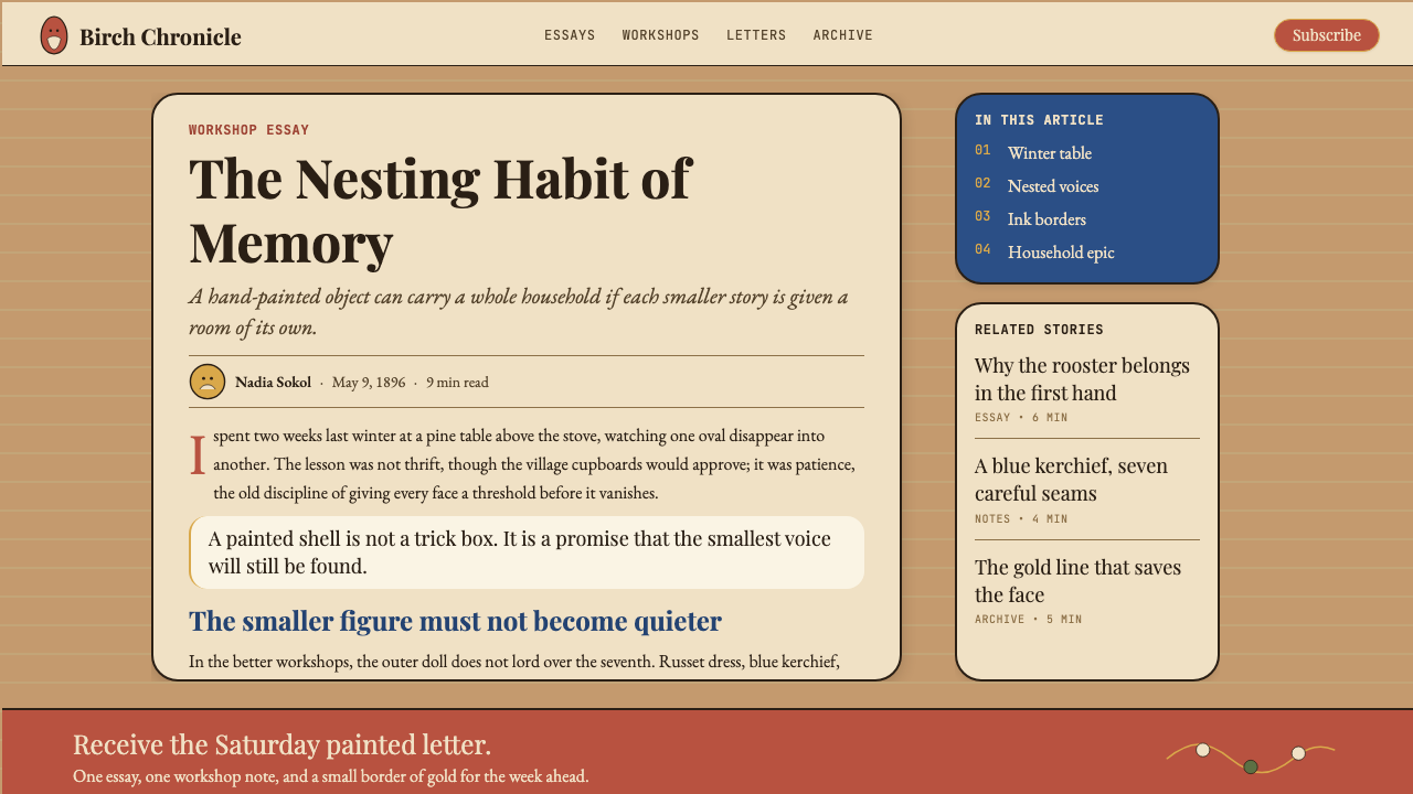
The matryoshka aesthetic is one of the warmest and most distinctive folk-derived design systems available for contemporary work, but it requires commitment to apply well. It is not a palette swap or a single texture applied to an otherwise neutral layout. The system works when all of its elements — color, form, ornament, lettering — operate together as a consistent cultural register. Applied selectively, it tends to look like decoration; applied comprehensively, it becomes a complete point of view.套娃美学是当代设计实践中可用的最温暖、最具辨识度的民间衍生设计系统之一,但需要全情投入才能用好。它不是一次调色板替换,也不是将单一纹理叠加在中性版面上。当这套系统的所有元素——色彩、形态、装饰、字体——作为一致的文化语域协同运作时,它才能真正发挥效力。选择性地应用,它看起来像装饰;全面应用,它成为一个完整的视角。
For presentation slides, the matryoshka style produces memorable cover pages and strong editorial layouts for storytelling decks. A cover slide benefits from a large egg-oval motif as the central anchor, surrounded by floral decorative borders, with the presentation title set in a weighty serif that references Revival-era letterforms. Section divider slides can use the nesting logic explicitly — a sequence of three or four oval frames of diminishing size, each containing a section title, visualizing the concept of layers within layers. Content slides should use the warm honey ground color, reserve decorative borders for headers only, and let body content sit on clean cream-white panels inset within the decorated field rather than trying to decorate every content zone.对于演示文稿,套娃风格为叙事性幻灯片制作出令人难忘的封面页与强劲的编辑版面。封面幻灯片适合以一个大蛋形椭圆母题作为中心锚点,周围环绕花卉装饰边框,演示标题以参照复兴时期字形的厚重衬线体排列。章节分隔幻灯片可以明确运用嵌套逻辑——三到四个依次缩小的椭圆框架序列,每个包含一个章节标题,视觉化层中层的概念。内容幻灯片应当使用温暖的蜂蜜底色,仅在标题区域保留装饰边框,让正文内容置于嵌入装饰底场中的干净奶油色面板上,而非试图装饰每一个内容区域。
For web interfaces, the matryoshka style is best suited to cultural institutions, craft e-commerce, food and hospitality brands, storytelling platforms, and any product where warmth, handmade quality, and cultural specificity are core values. Dashboard applications and data-heavy interfaces are poor matches — the visual richness competes with the need for scannability in information-dense contexts. In web UI, the practical approach is to concentrate the full decorative treatment on hero sections, navigation frames, and marketing components, while using a simplified warm palette with restrained ornament for interactive content zones, form fields, and data display areas.对于网页界面,套娃风格最适合文化机构、手工艺电商、食品与酒店品牌、叙事平台,以及任何以温度、手工品质与文化特殊性为核心价值的产品。仪表板应用与数据密集型界面是糟糕的匹配——丰富的视觉感在信息密集场景中与可扫描性需求相互竞争。在网页界面中,实用的做法是将完整装饰处理集中于英雄区、导航框架与营销组件,而在交互内容区域、表单字段与数据展示区使用克制装饰的简化暖色板。
For editorial and marketing work, the style excels in contexts that call for visual storytelling with cultural depth. Book covers, magazine spreads, campaign posters, and seasonal greeting materials all benefit from the rich surface and the nesting compositional logic. Marketing layouts work best when they adopt the system's principle of layered frames: an outer decorative border, an inner content panel, and a central featured element — each readable as its own zone while together forming a unified whole. Print and physical media are natural homes for this aesthetic; digital applications should prioritize texture and warmth over the crisp pixel-perfection that looks out of place in this visual language.对于编辑与营销内容,这种风格在需要带有文化深度的视觉叙事的场景中表现出色。书籍封面、杂志跨页、活动海报与季节性问候材料都受益于丰富的表面与嵌套构图逻辑。营销版面在采用系统的层叠框架原则时效果最佳:外层装饰边框、内层内容面板与中心特色元素——每个区域独立可读,合在一起构成统一整体。印刷与实体媒介是这套美学的天然栖居地;数字应用应当优先考虑质感与温度,而非与这种视觉语言格格不入的锐利像素完美感。
The most common mistake when applying the matryoshka aesthetic is treating the ornament as optional decoration rather than as structural communication. Stripping the floral borders from an otherwise matryoshka-styled layout does not produce a cleaner, more modern version of the style — it produces a layout that has lost its organizing logic and visual warmth without gaining the clarity that a genuinely minimal system provides. A second common error is importing the palette without the warmth: cool-toned photography, cool-gray UI surfaces, or desaturated stock images will immediately undercut the system's essential character. Every element in the visual field should read as warm, handmade, and considered.应用套娃美学时最常见的错误,是将装饰纹样视为可选的点缀,而非结构性传达。从一个本已具备套娃风格的版面中剥除花卉边框,并不会产生更干净、更现代的版本——它会产生一个在失去组织逻辑与视觉温度的同时,又未能获得真正极简系统所提供的清晰度的版面。第二个常见错误是引入色板而不引入温度:冷调摄影、冷灰色界面底面或去饱和的图库图片,会立即削弱这套系统的核心特质。视觉场域中的每个元素都应当传递出温暖、手工与用心的感受。
See the Russian Matryoshka 1890 design system →查看 Russian Matryoshka 1890 完整设计系统 →
Russian Matryoshka 1890 — FAQRussian Matryoshka 1890 · 常见问题
Is the matryoshka aesthetic too kitsch for serious design work?套娃美学对于严肃的设计工作来说太俗气了吗?
The accusation of kitsch is worth taking seriously, because there is a version of matryoshka-influenced design that has become genuinely kitsch — the mass-produced tourist souvenir, the airport gift-shop aesthetic. But the original matryoshka was not kitsch: it was a serious product of a rigorous cultural project, created by trained artists who were studying and systematizing authentic folk traditions. The distinction in application is between using the aesthetic as cultural costume — borrowing visual markers of Russianness without understanding what they mean — and using it as a genuine design system, where the warmth, the nesting logic, and the craft values are structurally integrated. The former is kitsch; the latter is a legitimate historical style with as much intellectual grounding as Art Nouveau or the Arts and Crafts movement."俗气"这个指控值得认真对待,因为的确存在一种已经变得真正俗气的套娃影响设计——大规模生产的旅游纪念品、机场礼品店美学。但原始套娃并不俗气:它是一个严肃文化计划的认真产物,由训练有素的艺术家创作,这些艺术家正在研究并系统化真实的民间传统。在应用上的区别在于:将这套美学当作文化服装——借用俄罗斯性的视觉标志而不理解其含义——还是将其当作真正的设计系统,其中温度、嵌套逻辑与工艺价值是结构性整合的。前者是俗气;后者是一种拥有与新艺术运动或工艺美术运动同等知识根基的合法历史风格。
How does the matryoshka aesthetic differ from other Russian folk art styles like Khokhloma or Palekh?套娃美学与霍赫洛马漆器或帕列赫微型画等其他俄罗斯民间艺术风格有何不同?
All three draw from the same broad tradition of Russian decorative folk art, but they differ significantly in palette, surface treatment, and pictorial approach. Khokhloma is characterized by its gold, black, and red palette on wooden objects — a lacquered, highly reflective surface treatment that gives it a richer, more opulent quality than the matte handpainted surface of the matryoshka. Palekh is a miniature painting tradition on lacquered papier-mache, with extremely fine brushwork, jewel-like colors, and a strong narrative figure tradition derived from medieval icon painting. The matryoshka style is warmer and more accessible than either: less opulent than Khokhloma, less technically demanding in its figuration than Palekh, and more broadly associated with peasant life and everyday warmth rather than courtly luxury or religious narrative.三者都源自同一广义的俄罗斯装饰民间艺术传统,但在色板、表面处理与图像方式上存在显著差异。霍赫洛马漆器以木器上的金色、黑色与红色为特征——一种涂漆的高反光表面处理,使其比套娃亚光手绘表面更为富丽堂皇。帕列赫是一种在涂漆纸浆上的微型绘画传统,极为精细的笔触、宝石般的色彩,以及源自中世纪圣像画的强烈叙事人物传统。套娃风格比两者都更温暖、更平易近人:比霍赫洛马少一分奢华,在人物描绘上比帕列赫少一分技术要求,与农民生活和日常温度的关联也更为广泛,而非宫廷奢靡或宗教叙事。
Can the matryoshka aesthetic work in dark-mode interfaces?套娃美学能在深色模式界面中运作吗?
With care, yes — but a dark-mode matryoshka requires rethinking the palette rather than simply inverting it. The natural analog is candlelit interior space rather than outdoor daylight: a very deep warm brown or mahogany as the ground rather than pure black, with the honey and russet tones lightened slightly to maintain their warmth against the dark field. The cream becomes a warm off-white; the forest green remains usable. The decorative ornament reads well against a dark warm ground because its primary function is contour and pattern rather than color contrast. Cold charcoal or blue-black grounds are not compatible with the system — they immediately extinguish the warmth that the aesthetic depends on.谨慎操作的话,可以——但深色模式套娃需要重新思考色板,而非简单地反转它。自然的类比是烛光内室空间,而非户外白昼:以极深的暖棕或桃花心木色作为底面,而非纯黑,将蜂蜜色与赭红色略微提亮以在深色底场上保持其温度。奶油色变为温暖的米白;森林绿仍可使用。装饰纹样在深色暖底上效果良好,因为其主要功能是轮廓与图案,而非色彩对比。冷炭灰或蓝黑色底面与这套系统不相容——它们会立即熄灭这套美学所依赖的温度。
The matryoshka originated in the Russian Revival movement, which had nationalist underpinnings. Is using this style politically charged?套娃起源于具有民族主义底色的俄罗斯复兴运动。使用这种风格有政治意涵吗?
The nationalist context of Narodnost is part of the historical record and worth understanding, but it does not make the aesthetic itself politically contentious in the way that, say, certain symbols from the twentieth century are. The matryoshka's visual language — warmth, craft, nesting, folk decoration — has been internationally adopted, reinterpreted, and culturally diffused over more than a century. It is used across cultures as a symbol of layered identity, hidden depth, and handmade value rather than as a specifically Russian nationalist statement. Design practitioners should understand the origin context, as with any historical style, but the aesthetic is not inherently freighted with political meaning in contemporary application."民族性"的民族主义背景是历史记录的一部分,值得了解,但它并不使这套美学本身像二十世纪某些符号那样具有政治争议性。套娃的视觉语言——温度、工艺、嵌套、民间装饰——一个多世纪以来已被国际社会采用、再诠释并广泛传播。它在各种文化中作为层叠身份、隐藏深度与手工价值的象征被使用,而非作为特定的俄罗斯民族主义表达。设计从业者应当像对待任何历史风格一样了解其起源背景,但这套美学在当代应用中并不本质上承载政治含义。
What makes the Sergiev Posad and Semyonov regional styles different, and does it matter for design application?谢尔吉耶夫镇和谢苗诺夫地方风格有何不同?这对设计应用有影响吗?
The Sergiev Posad style — associated with the original Abramtsevo aesthetic and the first commercial workshops — tends toward detailed, realistic facial rendering, elaborate and varied costume decoration, and a higher degree of pictorial complexity overall. The Semyonov style, which developed after 1900 in the Nizhny Novgorod region, simplified the facial treatment and concentrated decoration on a bold, centralized floral bouquet on the apron, with the upper body and head left relatively plain. For design application, Sergiev Posad offers a richer, more pictorially complex reference point suited to editorial and cultural contexts; Semyonov is more graphically bold and pattern-driven, better suited to packaging, print, and contexts where a strong repeating motif is the goal. Both are legitimate references within the matryoshka aesthetic; choosing between them is partly a question of visual complexity appropriate to the project.谢尔吉耶夫镇风格——与原始阿布拉姆采沃美学及第一批商业工坊相关——倾向于精细写实的面部描绘、精细多样的服饰装饰,以及整体更高的图像复杂度。谢苗诺夫风格在1900年后于下诺夫哥罗德地区发展起来,简化了面部处理,将装饰集中于围裙上一束大胆、居中的花束,上身与头部相对留白。在设计应用上,谢尔吉耶夫镇提供了更为丰富、图像复杂度更高的参照点,适合编辑与文化场景;谢苗诺夫在图形上更为大胆、图案驱动,更适合包装、印刷以及强烈重复母题为目标的场景。两者都是套娃美学中合法的参照;在两者之间选择,部分取决于项目所适合的视觉复杂度。
Related design styles相关设计风格
 Polish Wycinanki (paper-cut folk art)Cuts sing in symmetry. Cochineal, emerald, and saffron layers blaze on black.剪纸以对称歌唱:胭脂红、翡翠绿、藏红花黄叠在黑底上。
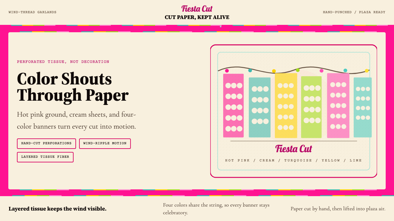 Mexican Papel Picado TissueFiesta cut paper. Hot pink, turquoise, yellow banners and hand-cut perforatio…节庆剪纸:热粉、绿松石、明黄横幅与手工穿孔。
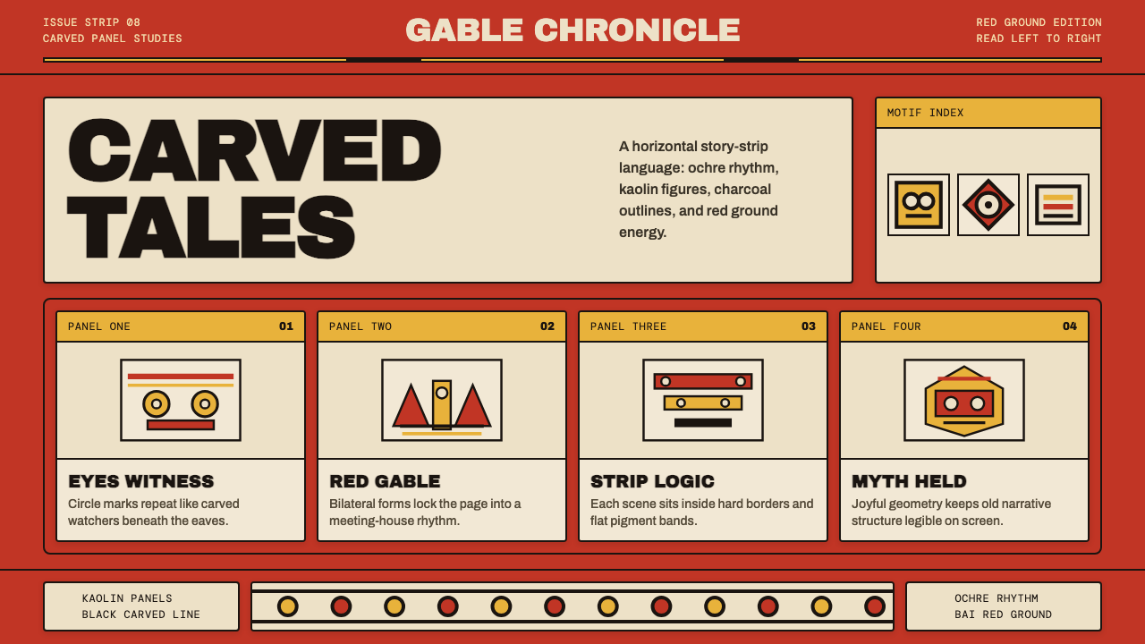 Palauan Bai StoryboardNarrative hits like carved wood. Bai red, ochre bands, kaolin panels, black o…叙事如木刻般鲜明:拜屋红、赭黄带、白陶土面板与黑色刻线。
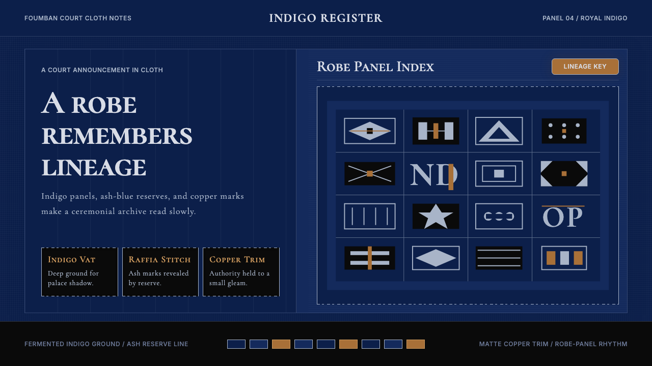 Cameroonian Ndop Royal IndigoReads like court cloth. Indigo panels, ash stitch grids, and matte copper kee…宫廷布幅般庄重。靛蓝面板、灰白针脚与哑铜放慢阅读。
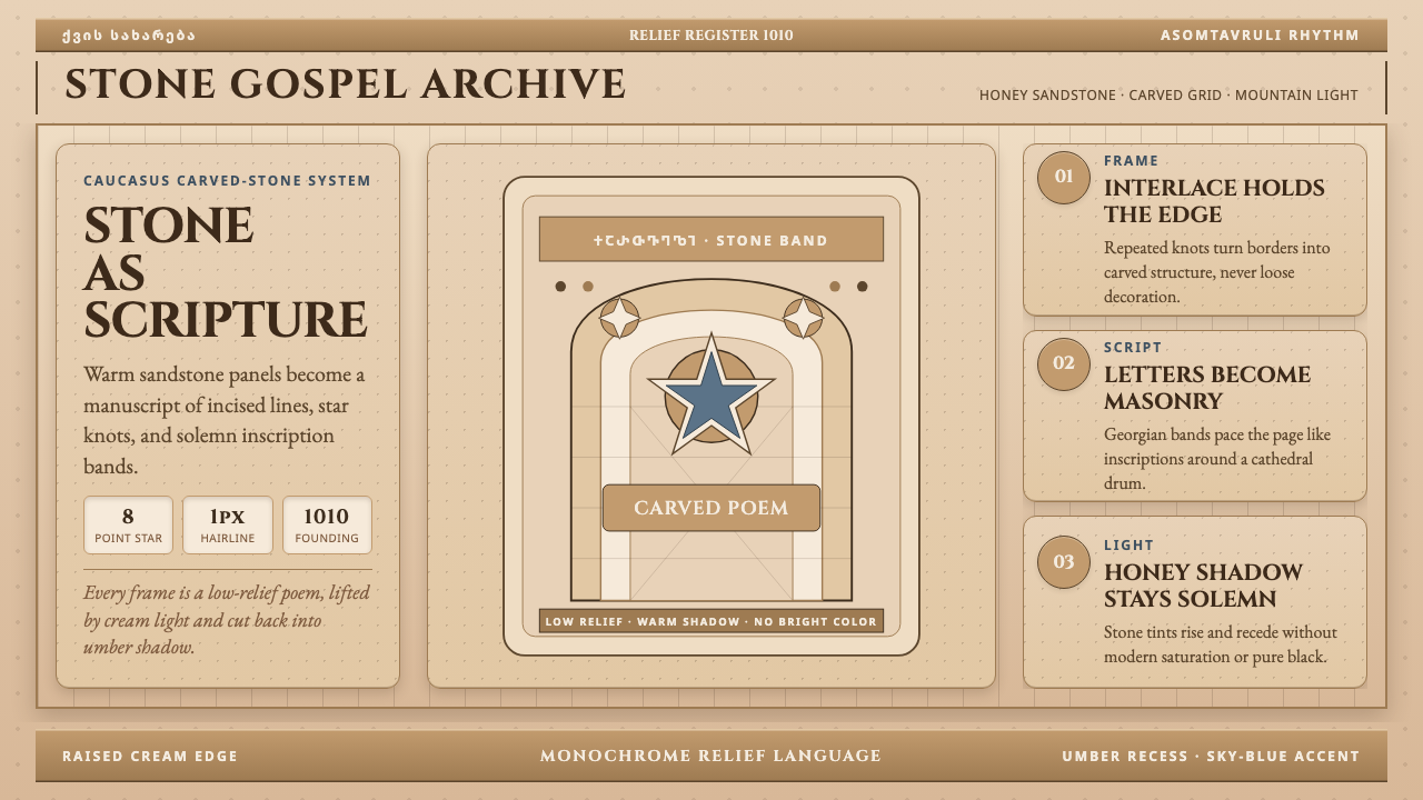 Georgian Nikortsminda Stone-CarvingStone becomes scripture. Cinzel caps and Georgian bands carve honey-sandstone…石如经卷。Cinzel大写与格鲁吉亚铭文刻出蜜砂岩网格。
 Haitian Gingerbread House (1900)Fragile elegance endures. Faded pink walls carry mint shutters and fretwork-l…脆弱而优雅:褪粉墙面承载薄荷百叶与镂花节奏。