Design style guide设计风格指南
What is Taiwanese Painted Tile Vernacular?什么是 Taiwanese Painted Tile Vernacular?
Fired in British and Japanese kilns but glazed in Taiwan's soul, the painted tile vernacular turned every merchant courtyard into a riotous garden of peonies, phoenixes, and folk-deity panels.台灣花磚燒自英日窯場,卻以台灣的靈魂上釉——它讓每一座商家宅院都成為牡丹、鳳凰與神像彩繪的喧鬧花園。
Taiwanese Painted Tile Vernacular in briefTaiwanese Painted Tile Vernacular 速览
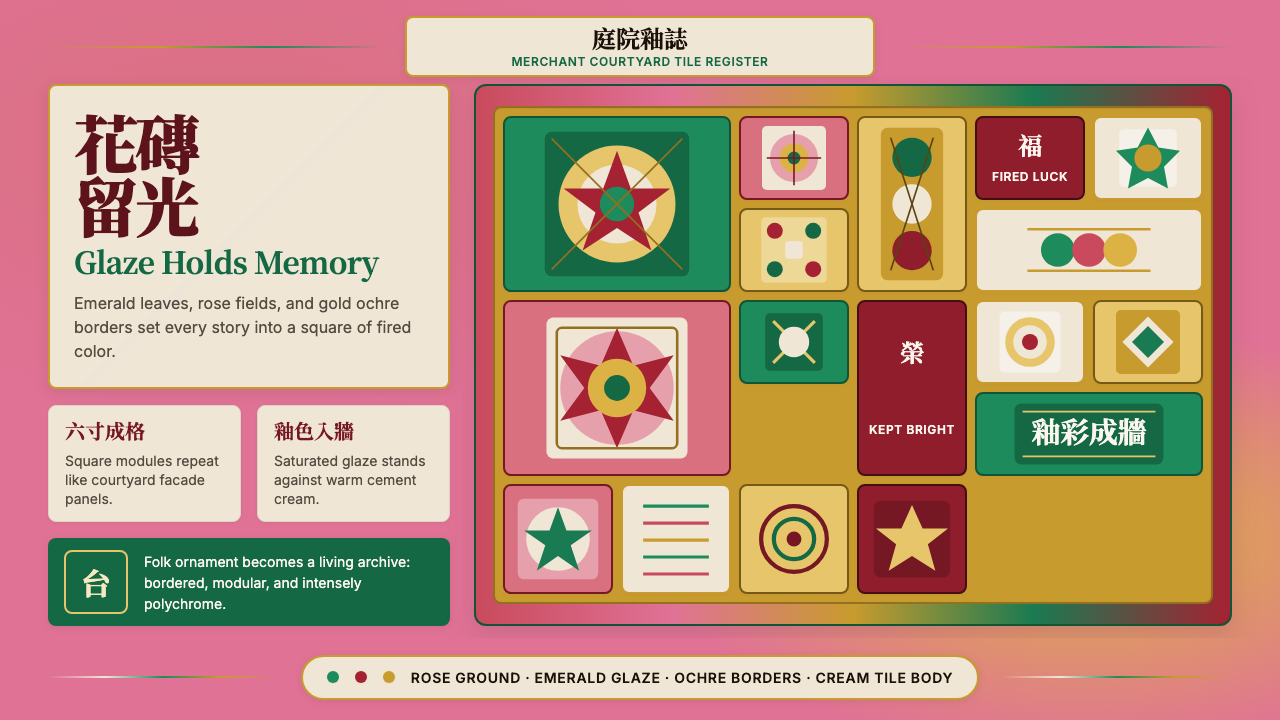
The Taiwanese Painted Tile Vernacular is a folk-decorative design language rooted in the majolica glazed tiles that merchants and landowners embedded into the facades of their courtyard houses across western Taiwan from the 1870s through the 1940s. Each tile functions as a self-contained painting: saturated emerald greens, rose pinks, and warm gold-ochres fill compositions of garden flowers, mythological birds, auspicious deity figures, and interlocking geometric borders. The cumulative effect of dozens of tiles set into white-plastered cement render is at once encyclopedic and exuberant — a wall that tells stories.台灣花磚民俗裝飾風格是一套源自馬約利卡釉面磚的設計語言。自清末至日治時代,台灣西部的商人與地主將這些磚片鑲嵌在宅院的立面上。每片花磚都是一幅完整的彩繪:飽和的翠綠、玫瑰粉與溫暖的金赭色填滿了庭院花卉、神話鳥禽、吉祥神像與幾何邊框的構圖。數十片花磚拼嵌於白灰泥牆,效果既宏觀如百科全書,又激昂如節慶歡騰——那是一道會說故事的牆。
Unlike the spare, monochromatic tile traditions found in Portuguese azulejo or Dutch Delft, the Taiwanese painted tile is unapologetically polychromatic. Color is not a supporting element; it is the primary communication. The richness of the glaze signals prosperity and abundance, the figurative imagery carries protective or congratulatory meaning, and the modular grid of individual tiles creates an architectural rhythm that organizes complexity without imposing silence. Every surface is populated; empty space is not a value here.不同於葡萄牙阿茲勒霍瓦(azulejo)或荷蘭代爾夫特(Delft)的素淡單色磚飾傳統,台灣花磚的多彩是毫不妥協的。顏色不是輔助元素,而是主要語言。釉色的飽和象徵財富豐裕,圖像紋樣承載祈福或祝賀的意義,而獨立磚片的模組化方格創造出一種建築節奏——在不強加靜默的前提下為複雜組織秩序。每個表面都是熱鬧的;空白在這裡並不是一種美德。
As a digital design language, this vernacular translates the tile's core qualities — vivid saturated palette, modular grid logic, figuration within a frame, and the tension between individual pictorial completeness and collective pattern — into interfaces that feel both culturally grounded and visually generous. It is a style suited to contexts where warmth, heritage, and decorative confidence are desirable, and where restraint would read as coldness.作為數位設計語言,這種民俗風格將花磚的核心品質——鮮豔飽和的色板、模組化方格邏輯、框架之內的具象圖案,以及個體圖像完整性與整體圖案感之間的張力——轉化為既有文化根基又視覺慷慨的介面語言。它適合那些需要溫度、文化傳承與裝飾自信的場景,在那裡,克制只會被讀作冷漠。
Where does Taiwanese Painted Tile Vernacular come from?Taiwanese Painted Tile Vernacular 从何而来?
The story of the Taiwanese painted tile begins not in Taiwan but in England and Japan. From the 1870s onward, Staffordshire potteries — particularly firms based in Stoke-on-Trent — were exporting majolica-style tin-glazed tiles to Southeast Asia and the China coast as part of the broader commerce accompanying British industrial expansion. Japanese manufacturers, especially those centered in Aichi and later Mino, observed the demand and began producing competing tiles in the 1910s and 1920s with designs recalibrated to East Asian taste: more peonies, more auspicious birds, more deity imagery, and border motifs drawn from Chinese paper-cutting and embroidery traditions. Taiwan, under Japanese colonial administration from 1895, became a major destination for this Japanese-made tile production.台灣花磚的故事,起點不在台灣,而在英國與日本。自1870年代起,斯塔福德郡(Staffordshire)的陶器廠——尤其是斯托克(Stoke-on-Trent)一帶的工廠——作為英國工業擴張所伴生的商貿活動之一,將馬約利卡風格的錫釉磚大量出口至東南亞與中國沿海。日本製造商,尤其是愛知縣及其後美濃地區的業者,察覺市場需求,於1910至1920年代開始生產競爭產品,其圖案設計更貼近東亞審美:更多牡丹、更多吉祥鳥禽、更多神像,以及取材自中國剪紙與刺繡傳統的邊框紋樣。1895年起進入日本殖民統治的台灣,成為這批日製花磚的主要輸入地。
The buyers were the merchant and landowning class of Hokkien-Taiwanese society, who were constructing or renovating the san-ho-yuan and si-he-yuan courtyard houses that signified their social standing. Tiled facades served multiple purposes: they were durable against the subtropical climate, they were conspicuously expensive in a period before domestic tile production existed in Taiwan, and they carried dense iconographic programs — the peony for wealth, the phoenix for virtue, the bat for good fortune, Mazu for maritime protection — that communicated the family's values and aspirations to visitors entering the courtyard gate. Towns with active merchant populations, particularly Lukang, Daxi, Sanxia, and the Penghu Islands, accumulated the densest concentrations of tiled buildings.購買者是閩南系台灣社會的商人與地主階層,他們正在建造或翻修能彰顯社會地位的三合院與四合院。磚飾立面有多重用途:耐得住亞熱帶氣候;在台灣本地尚無磚瓦生產的年代,它是顯眼的財富象徵;它也承載著密集的圖像語碼——牡丹代表富貴、鳳凰象徵德行、蝙蝠寓意福氣、媽祖護佑航海——向進入庭院大門的訪客訴說家族的價值與抱負。商業活動興盛的城鎮,尤其是鹿港、大溪、三峽與澎湖群島,積累了最密集的花磚建築群落。
The economic and political disruptions of the mid-twentieth century brought the tile era to an end. The Second World War interrupted imports; postwar reconstruction prioritized different materials; and successive decades of rapid modernization led many families to cover or demolish their tiled courtyard houses in favor of reinforced concrete buildings. By the late twentieth century, the tiles had been largely forgotten outside the scholarly community, and many remaining examples were in poor condition or had been sold off piece by piece to antique dealers.二十世紀中葉的經濟與政治動盪終結了花磚時代。二戰中斷了進口;戰後重建優先使用其他建材;此後數十年快速現代化,使許多家族選擇拆除或覆蓋花磚宅院,以鋼筋混凝土建築取而代之。至二十世紀晚期,花磚在學術圈以外幾乎已被遺忘,大量倖存實物或狀況不佳,或被一片一片賣給古董商。
The contemporary rescue of the Taiwanese painted tile is inseparable from the figure of Hsu Chia-rong, a former computer engineer from Tainan who spent more than twenty years — and a reported personal fortune — purchasing tiles from demolition sites and private collections and reassembling them into the Taiwan Tile Museum he founded in Chiayi. Hsu's effort, supported by researchers such as Hong Kun-fu, ceramics scholar Chen Tsuei-hua, and historian Lin Hsi-hsia, transformed the tile from a discarded architectural remnant into a recognized element of Taiwanese cultural identity. The 2010s old house renewal movement — a broader wave of civic interest in preserving Taiwanese vernacular architecture — amplified this rehabilitation, and the painted tile became one of its most visible symbols. Today the tile image appears on local craft goods, public murals, and digital design systems as an emblem of Taiwanese folk creativity.台灣花磚的當代搶救,與許嘉榮先生的名字密不可分。這位前台南電腦工程師花費二十餘年,耗盡個人積蓄,從拆遷工地與私人收藏中收購花磚,最終在嘉義創立台灣花磚博物館。許嘉榮的努力,輔以洪坤福、陶瓷學者陳翠花、歷史學者林錫霞等人的研究推動,使花磚從被丟棄的建築殘件,躍升為台灣文化認同的重要元素。2010年代的老屋欣力運動——一股更廣泛的台灣傳統建築保存公民浪潮——進一步放大了這一復興,花磚由此成為其中最鮮明可見的符號之一。如今,花磚圖像出現在本土工藝品、公共壁畫與數位設計系統之中,成為台灣民間創造力的徽記。
What defines the Taiwanese Painted Tile Vernacular look?Taiwanese Painted Tile Vernacular 的视觉特征是什么?
Color色彩
The palette is saturated and warm at its core: an emerald green derived from copper-based glazes, a rose pink verging on deep magenta, and a gold ochre that anchors the warmest register. These three hues carry the weight of the visual system, and together they read as unmistakably Taiwanese. Secondary accents — a deep cobalt blue, a soft ivory, a burnt orange — appear in figurative panels and border details. White is not a ground color in the Western minimalist sense; it is the plaster wall between tiles, a neutral separator that intensifies rather than dominates. Black outlines the figurative elements and border frames with ink-like precision, drawing on the same linear vocabulary as traditional Chinese painting and paper-cutting.這套色板的核心是飽和而溫暖的:源自銅基釉料的翠綠、趨近深洋紅的玫瑰粉,以及錨定最溫暖調性的金赭色。這三種色調承擔了視覺系統的主要重量,合在一起,那種辨識感是毫無疑問的台灣風格。次要的強調色——深鈷藍、柔象牙、焦橙——出現在具象圖像面板與邊框細節中。白色不是西方極簡意義上的底色,而是磚片之間的白灰泥牆——一種強化周圍色彩而非主導全局的中性分隔。黑色以如墨線描的精確感勾勒具象元素與邊框,與傳統中國繪畫和剪紙共用同一套線性語彙。
Modularity and the Grid模組化與方格
Each tile is a fixed square unit, and the design system's fundamental logic is the assembly of these units into larger compositions. This is not an arbitrary constraint but a structural principle inherited from the physical manufacturing process: tiles were produced in standardized dimensions, and facade compositions were planned around available inventory. In digital translation, this modular grid creates a natural rhythm — a predictable cadence of framed pictorial cells that carries the eye across a surface. Individual cells may contain single motifs; groups of four or nine tiles may complete a single large composition. The grid is always present, even when the imagery spans multiple cells.每片花磚是一個固定的正方形單元,而這套設計系統的基本邏輯就是將這些單元組合成更大的構圖。這不是任意的限制,而是繼承自實體製造工藝的結構原則:花磚以標準化尺寸生產,立面構圖圍繞現有庫存進行規劃。在數位轉譯中,這種模組化方格創造出一種自然的節奏——可預期的框架圖像格讓視線流暢地掃過整個表面。單個方格可包含單一紋樣,四塊或九塊磚可共同完成一幅大構圖。方格始終存在,即使圖像跨越多個格子。
Figuration and Iconography具象圖像與圖像志
The tile vocabulary is deeply figurative and iconographically coded. Peonies signal wealth and social standing; phoenixes signal virtue and renewal; mandarin ducks signal marital harmony; bats signal incoming fortune; Mazu and other folk deities signal protection. These are not decorative choices in an arbitrary sense — each figure was selected by the building owner for its specific meaning, and a literate Taiwanese viewer reading a facade would have decoded a deliberate program. In contemporary use, the figurative richness can be deployed literally (using the original motifs) or abstractly (extracting the compositional logic of a framed, centered, symmetrical motif without the specific imagery).花磚語彙是深度具象且圖像意涵精確的。牡丹象徵富貴地位,鳳凰象徵品德與再生,鴛鴦象徵婚姻和諧,蝙蝠象徵迎福納財,媽祖及其他民間神祇象徵庇護。這些並不是任意的裝飾選擇——每個圖像都由建物主人依其特定含意選定,一個懂得解讀的台灣觀者面對一座立面,可以破譯出一套深思熟慮的意義程式。在當代應用中,這種具象豐富性既可直白使用(沿用原始紋樣),也可以抽象方式運用(萃取出框景、置中、對稱的紋樣構圖邏輯,而不拘泥於具體圖像)。
Border and Frame邊框與框架
Every tile — and every group of tiles — is typically bounded by a decorative border. These borders range from simple geometric bands in alternating colors to elaborate interlaced meander patterns, stepped key-fret motifs, and floral scrollwork. The border does double duty: it contains and completes the individual pictorial unit, and it creates visual continuity between adjacent tiles, knitting the individual pieces into a unified surface. In digital use, the border system is one of the most transferable elements — it provides a ready-made vocabulary for component framing, section dividers, and decorative edge treatments without requiring the full figurative apparatus of the style.每片花磚——以及每組花磚——通常都被一道裝飾邊框圍繞。這些邊框從交替色彩的簡單幾何帶狀,到繁複交織的回紋、階梯式鑰匙紋,再到花卉卷草,形式不一而足。邊框承擔雙重功能:它圍合並完成單個圖像單元,同時在相鄰磚片之間創造視覺連續性,將個體磚片縫合成統一的表面。在數位應用中,邊框系統是可遷移性最強的元素之一——它提供了現成的元件框架、分區分隔線與裝飾性邊緣處理語彙,無需借助這種風格的完整具象圖像裝置。
Symmetry and Bilateral Balance對稱與雙側平衡
Unlike the deliberate asymmetry of modernist design traditions, the Taiwanese tile vernacular is fundamentally symmetrical at the level of individual tiles and compositional groups. A single tile depicting a peony spray is typically composed around a central vertical axis. A panel of four tiles showing a phoenix will balance the bird against mirroring foliage on both sides. This bilateral symmetry carries social meaning — symmetry in Chinese folk visual culture signals completeness, good fortune, and the balanced harmonies of heaven and earth. Asymmetric arrangements within the tile system tend to be the result of material constraints or adaptive composition rather than aesthetic preference.與現代主義設計傳統刻意追求的非對稱不同,台灣花磚民俗風格在單片磚與構圖組合的層面上,根本上是對稱的。描繪牡丹枝桠的單片磚,通常圍繞中央縱軸布局。展現鳳凰的四片磚面板,會讓鳥禽的兩側各有鏡像葉片加以平衡。這種雙側對稱承載著社會含意——在中國民間視覺文化中,對稱象徵完整、吉祥,以及天地間的平衡和諧。花磚體系中的非對稱排列,往往是材料限制或適應性構圖的結果,而非審美偏好的選擇。
Texture and Glaze Quality質感與釉面質感
The physical majolica tile has a surface quality that flat digital reproduction struggles to fully convey: a slight convexity and surface relief within the painted areas, a matte-to-satin glaze that shifts in sunlight, and the visible brushwork or mold-pressed texture beneath the glaze. In digital applications, acknowledging this material quality — through subtle surface variation, gentle highlight effects, or deliberate imperfection in pattern repetition — prevents the style from reading as purely graphic pastiche. The style works best when it retains some of the warmth and slight irregularity of handmade ceramics rather than becoming a perfectly clean vector pattern.實體馬約利卡磚擁有一種難以被平面數位複製完整捕捉的表面質感:彩繪區域內輕微的凸弧與浮雕感、在陽光下微妙流轉的啞光至緞光釉面,以及釉色下可見的手繪筆觸或模具壓紋肌理。在數位應用中,承認這種材質品質——透過微妙的表面變化、輕柔的高光效果,或紋樣重複中有意為之的些微不規整——能防止這種風格被讀成純粹的平面仿作。當它保留手作陶瓷的溫度與輕微的不完美,而非成為一套過度乾淨的向量圖案時,才是最理想的呈現狀態。
Density and Generosity密度與慷慨
The tile tradition does not aestheticize emptiness. Compositions fill their frames; surfaces fill their walls; borders fill the space between compositions. This is a design philosophy of abundance rather than restraint, and it has genuine cultural grounding: in Hokkien-Taiwanese folk aesthetics, a full and busy surface signals prosperity and vitality, while bare surfaces can read as lack or neglect. In digital contexts, this means the style actively resists minimal layouts. It is at home on rich landing pages, dense gallery views, and ornament-positive branding contexts, and it needs adaptation — considered reduction without losing character — when forced into the sparse UI conventions of productivity software.這個磚飾傳統不以空白為美。構圖填滿框格,表面填滿牆面,邊框填滿構圖之間的空間。這是一種以豐盛而非克制為美學哲學的設計傳統,且有真實的文化依據:在閩南系台灣民間美學中,飽滿熱鬧的表面象徵繁盛與活力,而空曠的表面可能被解讀為匱乏或疏忽。在數位語境中,這意味著這種風格主動抵抗極簡化版面。它在豐富的著陸頁、密集的圖庫視圖與正視裝飾性的品牌語境中如魚得水;當它必須被置入生產力軟體的稀疏介面規範時,則需要審慎地減量——在不失去性格的前提下精簡。
Who shaped Taiwanese Painted Tile Vernacular?谁塑造了 Taiwanese Painted Tile Vernacular?
A former software engineer from Tainan, Hsu Chia-rong spent more than two decades buying painted tiles from demolition sites and private collectors across Taiwan, reportedly at considerable personal expense. He founded the Taiwan Tile Museum in Chiayi, which houses one of the world's most significant collections of early twentieth-century majolica tiles made for the Taiwanese market. His advocacy transformed the tile from an overlooked relic into a recognized symbol of Taiwanese folk culture, and the museum's educational programs have introduced the tile aesthetic to a generation of designers, craft workers, and students who encountered it as a living reference rather than an archival curiosity.台南出身的前軟體工程師許嘉榮,耗費二十餘年,在全台各地的拆遷工地與私人收藏家手中搶購花磚,據說耗盡了相當可觀的個人財富。他在嘉義創立台灣花磚博物館,館藏是世界上最重要的二十世紀初台灣市場馬約利卡磚收藏之一。他的倡議將花磚從被忽視的遺物,轉變為台灣民間文化的代表符號,而博物館的教育推廣項目,也讓新一代設計師、工藝從業者和學生以鮮活參考而非檔案奇珍的姿態,重新接觸到花磚美學。
Hong Kun-fu is among the most prominent researchers of Taiwanese vernacular architecture and the decorative traditions embedded within it. His fieldwork documenting tiled buildings across Taiwan — from the dense courtyard houses of Lukang to the wind-wall residences of the Penghu Islands — produced the most comprehensive geographic survey of surviving painted tile facades, and his analysis of the iconographic programs visible in different regional concentrations helped establish which motifs carried which meanings in which social contexts. His scholarship provided the academic foundation on which the preservation movement and the design revival both built.洪坤福是台灣傳統建築及其裝飾傳統研究領域最具代表性的學者之一。他在全台各地——從鹿港密集的合院建築到澎湖群島的風牆聚落——對花磚建物進行田野記錄,生產出現存花磚立面最全面的地理調查,而他對不同地區聚落中可見圖像程式的分析,則有助於釐清哪些紋樣在哪種社會語境下承載何種意義。他的學術研究為保存運動與設計復興提供了共同仰賴的學術基礎。
Chen Tsuei-hua approached the painted tile tradition from the perspective of ceramics scholarship, tracing the production histories of the British and Japanese factories whose output ended up on Taiwanese facades. Her research clarified the previously confused attribution of many tile designs — distinguishing English Staffordshire pieces from Japanese Aichi and Mino products, identifying approximate production dates from glaze chemistry and mold characteristics, and tracing the distribution networks through which specific designs traveled from kilns in Japan to courtyard walls in Lukang or Daxi. This production-side scholarship complemented the architectural and iconographic work and gave the preservation movement a clearer picture of the tile's transregional origins.陳翠花從陶瓷學的角度切入花磚傳統,追溯那些產品最終落腳台灣立面的英、日工廠之生產歷史。她的研究釐清了以往對許多磚片設計來源的混亂歸屬——辨別英國斯塔福德郡與日本愛知、美濃產品的差異,從釉藥化學與模具特徵判斷大致生產年代,並追蹤特定設計從日本窯場流向鹿港或大溪宅院的流通路徑。這種生產端的學術研究,與建築及圖像志研究形成互補,讓保存運動對花磚的跨地域源流有了更清晰的認識。
Lin Hsi-hsia contributed to the historical framing of the tile tradition within the broader context of Taiwanese social history, examining how the tile-buying practices of Hokkien-Taiwanese merchants and landowners during the Japanese colonial period intersected with questions of identity, status display, and the negotiation of Taiwanese folk culture under colonial modernity. Her work highlighted the tile not merely as an aesthetic object but as a social artifact whose accumulated meanings — about prosperity, piety, community, and belonging — were as important as its visual qualities. This contextualizing scholarship helped the revival movement articulate why the tile mattered, not only what it looked like.林錫霞為花磚傳統提供了更廣泛的台灣社會史框架,探討日治時期閩南系台灣商人與地主的購磚行為,如何與認同、地位展示以及殖民現代性下台灣民間文化的協商等議題相互交織。她的研究將花磚定位不僅是一件美學物件,更是一件社會文物——其積累的意涵(關於財富、虔誠、社群與歸屬感)與其視覺品質同等重要。這種脈絡化學術工作,幫助復興運動清楚表達花磚的重要性所在,而不只是它的外觀樣貌。
How do you use Taiwanese Painted Tile Vernacular today?今天怎么用 Taiwanese Painted Tile Vernacular?
The Taiwanese Painted Tile Vernacular is a high-saturation, figuration-positive, and pattern-dense style. Using it effectively means embracing its logic of abundance rather than trying to strip it back into something that resembles contemporary minimalism. The first question to ask is whether the context genuinely calls for warmth, cultural depth, and decorative richness — if yes, commit fully; if not, a different style will serve better.台灣花磚民俗風格是高飽和度、具象圖案豐富且花紋密集的設計語言。有效運用它,意味著擁抱它的豐盛邏輯,而非試圖將其剝除成類似當代極簡主義的東西。第一個要問的問題是:這個語境是否真的需要溫度、文化深度與裝飾豐富性——如果答案是肯定的,就全力投入;如果不是,換一種風格會更合適。
For presentation slides, the tile vernacular works best as an immersive frame rather than a neutral container. Cover slides benefit from a rich background treatment: a full-bleed tile pattern or a centered panel-style composition with a bold figurative motif at center, bordered and framed, with the title text set in a clean contrasting weight that reads clearly against the decorated ground. Content slides work differently — they should lighten the approach significantly, using tile-derived color accents and border elements on white grounds to maintain the design language without overwhelming the information. Data slides can use the saturated palette strategically: the rich greens and pinks work well for categorical differentiation in charts, provided the palette is applied consistently.在簡報文稿中,花磚風格最適合作為沉浸式框架而非中性容器。封面頁適合豐富的背景處理:滿版花磚圖案,或以居中面板式構圖呈現一個置中的具象紋樣、加以邊框與框架,標題文字則以乾淨的對比字重設定,在裝飾底面上保持清晰可讀。內容頁需要截然不同的處理——應大幅減輕裝飾程度,以白色底面搭配花磚衍生的色彩強調與邊框元素,在不淹沒資訊的前提下維持設計語言。數據頁可策略性地運用飽和色板:豐富的翠綠與玫瑰粉很適合圖表的類別分區,前提是色板應用需保持一致。
For web interfaces, the style is at its strongest on landing pages, cultural institution sites, and brand identity contexts where the audience expects richness. A tile-vernacular home page works with a mosaic or grid-of-panels structure, each panel carrying a self-contained visual composition — saturated color field, centered motif, bordered frame. Navigation and utility elements should be relatively restrained (dark text on neutral ground) to create contrast with the richly decorated content areas. E-commerce and gallery interfaces can use tile-pattern borders and panel frames as product card backgrounds, though individual card layouts should be clean enough that product imagery reads clearly.在網頁介面中,這種風格在著陸頁、文化機構網站與品牌識別語境中最為出色——這些場合的受眾期待視覺豐富性。花磚風格的首頁採用馬賽克或面板方格結構,每個面板承載一個完整的視覺構圖——飽和色場、居中紋樣、邊框框架。導航與功能性元素應相對克制(中性底面搭配深色文字),與裝飾豐富的內容區形成對比。電商與圖庫介面可以磚飾邊框與面板框架作為商品卡片背景,但個別卡片版面應足夠乾淨,使商品圖像能夠清晰閱讀。
For editorial and marketing work, the most successful applications draw on the tile's poster-like boldness: full-width banner sections with centered, symmetrical compositions in the tile color palette; section dividers using geometric border strip motifs; pull-quote treatments that borrow the tile's framing logic (a short, complete, ornamentally bordered text block). The style is exceptionally strong for cultural, food, travel, and heritage brands, and for event materials, packaging, and social media graphics where high visual impact is the priority.在編輯與行銷工作中,最成功的應用借鑒了花磚海報式的大膽感:以花磚色板呈現居中、對稱構圖的全幅橫幅版塊;以幾何邊框條紋作區段分隔;以借用花磚框景邏輯的引文處理(一個簡短、完整、裝飾性邊框圍繞的文字區塊)。這種風格對文化、美食、旅遊與遺產品牌,以及活動物料、包裝與以高視覺衝擊力為優先的社群媒體圖像,都有特別強的表現力。
A common mistake when applying this style is using the palette but ignoring the compositional logic. The tile vernacular is not simply a color palette — it is a system of frames, borders, symmetry, and pictorial completeness. A design that uses rose pink and emerald green but arranges them in loose, unframed, asymmetric layouts will miss what makes this style distinctive. Similarly, mixing the saturated tile colors with large areas of flat white negative space will neutralize the style's character; the vocabulary is generous, not sparse, and it reads most authentically when the surface is populated rather than empty.應用這種風格時最常見的錯誤,是使用了色板卻忽略了構圖邏輯。花磚民俗風格不只是一套色板——它是一套框架、邊框、對稱與圖像完整性的系統。一個使用玫瑰粉與翠綠色、卻以鬆散、無框架、非對稱方式排列的設計,會錯失這種風格的獨特性。同樣,將飽和的花磚色彩與大面積的空白負空間混用,會中和這種風格的性格;它的語彙是慷慨的,不是稀疏的——當表面是熱鬧的而非空曠的,它才最道地。

Taiwanese Painted Tile Vernacular — FAQTaiwanese Painted Tile Vernacular · 常见问题
Is the Taiwanese Painted Tile Vernacular the same as the broader majolica tile tradition?台灣花磚民俗風格與更廣泛的馬約利卡磚傳統是同一回事嗎?
Majolica tile refers to the production method — tin-glazed earthenware with painted decoration — used by British, Italian, Japanese, and other manufacturers from the nineteenth century onward. The Taiwanese painted tile is a regional tradition within that broader family: tiles produced primarily by English and Japanese factories specifically for export to Southeast Asia and the China coast, selected and arranged by Taiwanese building owners according to Hokkien-Taiwanese folk iconographic programs. The shapes, glazing technique, and industrial production method are shared with the broader majolica tradition; the iconographic content, the compositional programs, and the cultural meanings are distinctly Taiwanese.馬約利卡磚指的是一種生產工法——以含錫釉彩繪陶器燒製——十九世紀以來為英國、義大利、日本及其他地區製造商所採用。台灣花磚是這個更廣泛家族中的地域性傳統:主要由英、日工廠專為出口東南亞與中國沿海而生產的磚片,由台灣建物主人依照閩南民間圖像程式進行選擇與排列。形狀、施釉工法與工業生產方式是與廣義馬約利卡傳統共享的;圖像內容、構圖程式與文化意涵則是鮮明的台灣特色。
How does the style handle dark or night-mode interfaces?這種風格如何處理深色或夜間模式介面?
The tile tradition is fundamentally a light-condition aesthetic: the original tiles were designed to catch Taiwan's subtropical sunlight and the saturated colors were calibrated for bright outdoor surfaces. A dark-mode interpretation is possible but requires recalibration. On a very dark ground, the saturated emerald and rose will retain their character, but the gold ochre can read as muddy unless lightened. More importantly, the white mortar lines and plaster ground between tiles — which provide structural breathing room in the original — need a substitute in dark mode, typically a deep warm gray rather than pure black. The most successful dark-mode applications of this style tend to treat the dark ground as analogous to a lacquered panel rather than a neutral digital background, treating the tile motifs as inlaid decoration against a rich, non-neutral field.花磚傳統從根本上是一種適應光明環境的美學:原始花磚的設計是為了捕捉台灣亞熱帶陽光,飽和色彩是以明亮戶外表面為校準對象的。深色模式的詮釋是可行的,但需要重新校準。在非常深的底面上,飽和的翠綠與玫瑰粉會保持其特性,但金赭色若不調亮,容易顯得混濁。更重要的是,原始磚面中提供結構性呼吸空間的白色灰縫與白灰泥底——在深色模式中需要替代品,通常是深暖灰而非純黑。這種風格在深色模式下最成功的應用,往往將深色底面視為類似漆板,而非中性數位背景,把花磚紋樣當作嵌入豐富非中性底面的裝飾。
Can this style work for technology or SaaS products, or is it too culturally specific?這種風格能用於科技或 SaaS 產品嗎,還是文化特殊性過強?
The style's cultural specificity is both its strength and its limitation. For products that are intentionally rooted in Taiwanese, East Asian, or Southeast Asian cultural identity, the specificity is a feature — it signals genuine provenance rather than generic global design. For international or culturally neutral technology products, full deployment of the style risks reading as costume rather than design language. The practical middle ground is to use the style's structural vocabulary — modular grid, panel framing, border system, saturated color palette — while keeping the specific figurative iconography (the peonies, phoenixes, deity panels) as optional accent rather than primary visual content. This abstracted approach retains the style's warmth and organizational character without requiring the audience to be familiar with the iconographic tradition.這種風格的文化特殊性既是它的優勢,也是它的限制。對於刻意植根於台灣、東亞或東南亞文化認同的產品,這種特殊性是一個功能——它傳達的是真實淵源,而非泛化的全球設計。對於國際化或文化中性的科技產品,全面部署這種風格可能會被讀成服裝裝扮而非設計語言。務實的中間路線是使用這種風格的結構性語彙——模組化方格、面板框景、邊框系統、飽和色板——同時將特定的具象圖像(牡丹、鳳凰、神像面板)保留為可選強調而非主要視覺內容。這種抽象化的取用方式,在不要求受眾熟悉圖像傳統的前提下,保留了這種風格的溫度與組織性格。
What is the relationship between this style and other Taiwanese or Chinese folk design traditions?這種風格與其他台灣或中國民間設計傳統之間的關係是什麼?
The painted tile vernacular draws from the same iconographic pool as several related traditions: Hokkien paper-cutting and embroidery share the same motif vocabulary (peonies, phoenixes, bats, auspicious geometry); traditional Taiwanese temple architecture uses similar figure programs in painted beams and ceramic ridge ornaments; and the broader Chinese folk decorative tradition encompasses the same symbolic coding of color, flora, and fauna. What distinguishes the tile is its material origin (industrially produced, imported) and its architectural function (facade cladding rather than portable craft or sacred decoration). The tile's particular visual character — bright, slightly raised, glaze-rich surfaces in a modular grid — distinguishes it from hand-embroidered or wood-carved folk traditions even when the iconographic content overlaps.花磚民俗風格汲取自幾個相關傳統共用的圖像資源庫:閩南剪紙與刺繡共享同一套紋樣語彙(牡丹、鳳凰、蝙蝠、吉祥幾何);台灣傳統廟宇建築在彩繪棟梁與陶瓷脊飾上使用相似的圖像程式;更廣泛的中國民間裝飾傳統也包含同樣的色彩、花卉與鳥禽象徵體系。區別花磚的是它的材質起源(工業生產、進口)及其建築功能(立面貼飾,而非可攜帶工藝品或神聖裝飾)。花磚特有的視覺性格——明亮、略微凸起、釉色豐富的表面,以模組方格排列——即使在圖像內容重疊時,也使它與手繡或木雕民間傳統顯得截然不同。
How should this style be adapted for accessibility, given its density and high saturation?考慮到這種風格的密集性與高飽和度,應如何調整以符合無障礙標準?
The tile vernacular's density and saturation create real accessibility challenges, particularly for text legibility and color differentiation. The most important adaptation is to separate the decorative layer from the informational layer clearly: tile-pattern backgrounds and decorative borders should never compete with text for attention, and any text placed over a patterned ground needs either a legible panel or a generous semi-transparent overlay. The color palette's richness is an asset for categorical data (where the distinct hues make categories memorable) but a liability if used to convey critical status information without an additional non-color signal (shape, icon, or label). The pattern density is best contained to section backgrounds, border elements, and accent panels, with content areas using the palette's cleaner, less complex end to maintain legibility.花磚風格的密集性與飽和度在無障礙方面帶來真實挑戰,尤其是文字可讀性與色彩辨別。最重要的調整是清楚地將裝飾層與資訊層分離:磚飾圖案背景與裝飾邊框不應與文字競爭注意力,任何置於圖案底面上的文字都需要一個可讀的面板或寬裕的半透明遮罩。這套色板的豐富性對類別數據是優勢(不同色相使類別易於記憶),但若用於傳達關鍵狀態資訊而缺乏額外的非色彩信號(形狀、圖示或標籤),則是劣勢。圖案密度最好限定在區段背景、邊框元素與強調面板,內容區則使用色板中較乾淨、較不複雜的一端,以維持可讀性。
Related design styles相关设计风格
 Haitian Gingerbread House (1900)Fragile elegance endures. Faded pink walls carry mint shutters and fretwork-l…脆弱而优雅:褪粉墙面承载薄荷百叶与镂花节奏。
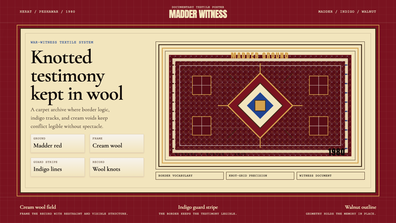 Afghan War Rug (1980)Witness in wool. Madder red, indigo, and cream borders knot testimony into a…羊毛中的见证。茜草红、靛蓝与奶油边框编出结网证词。
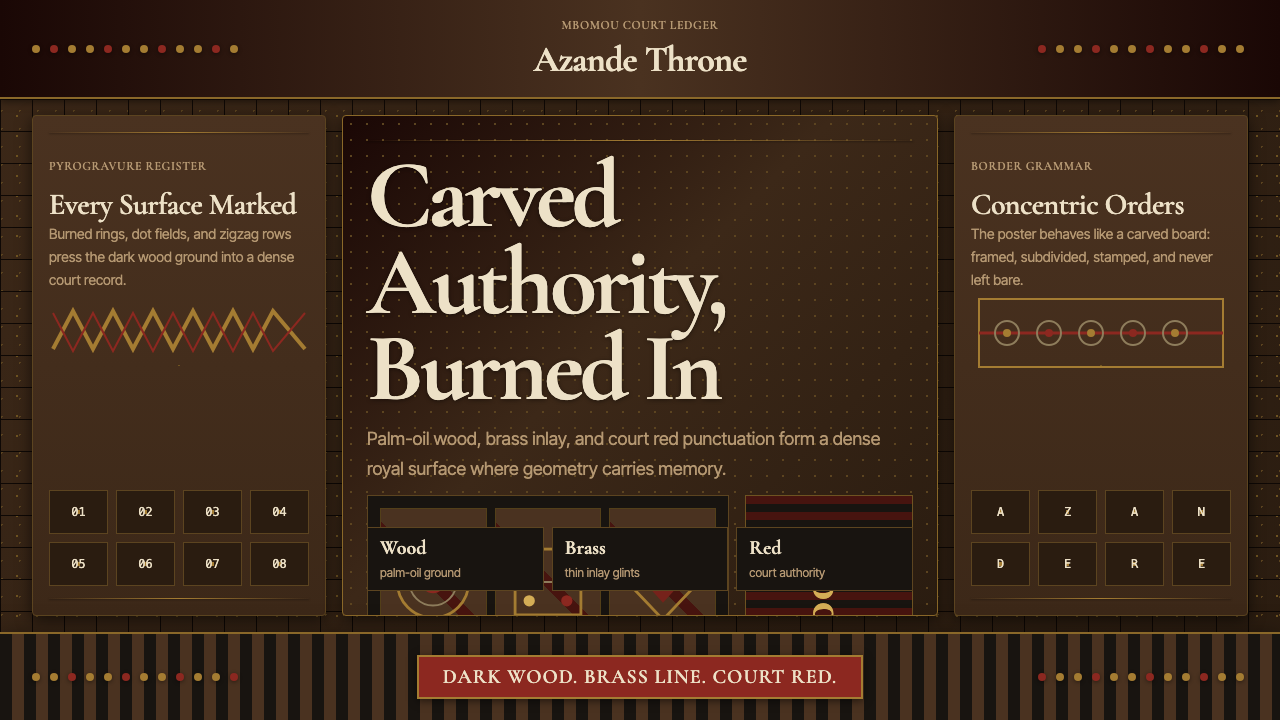 Central African Azande ThroneDense court gravity. Dark wood grids, brass dots, and court red cover every s…宫廷感厚重:深木网格、黄铜点阵与宫廷红铺满表面。
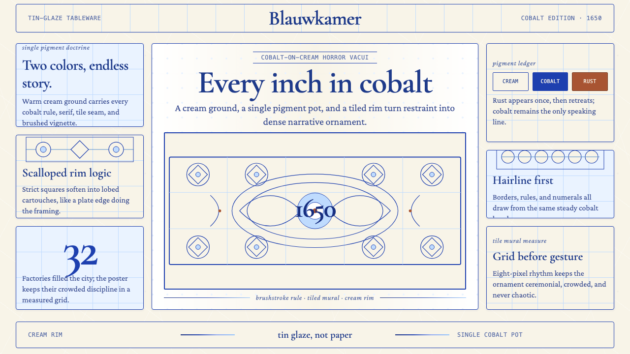 Delft Blue PotteryRestrained, yet every inch speaks. Cobalt hairlines crowd a cream tile grid.克制却寸土必描。钴蓝细线铺满米白瓷砖网格。
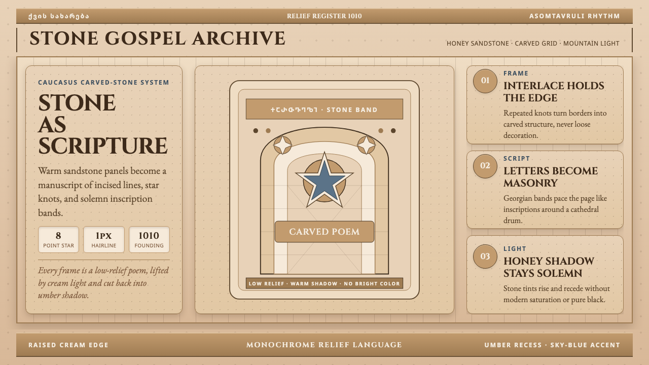 Georgian Nikortsminda Stone-CarvingStone becomes scripture. Cinzel caps and Georgian bands carve honey-sandstone…石如经卷。Cinzel大写与格鲁吉亚铭文刻出蜜砂岩网格。
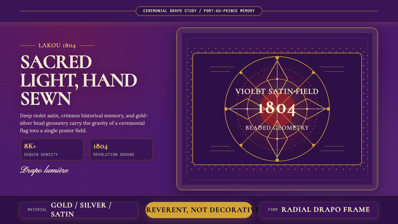 Haitian Vèvè Sequin Drapo 1804Sacred density. Violet satin, gold sequins, and radial geometry hold 1804 gra…神圣而厚重:紫缎、金色亮片与放射几何承载1804的庄严。