What is Jardin Majorelle Blue?
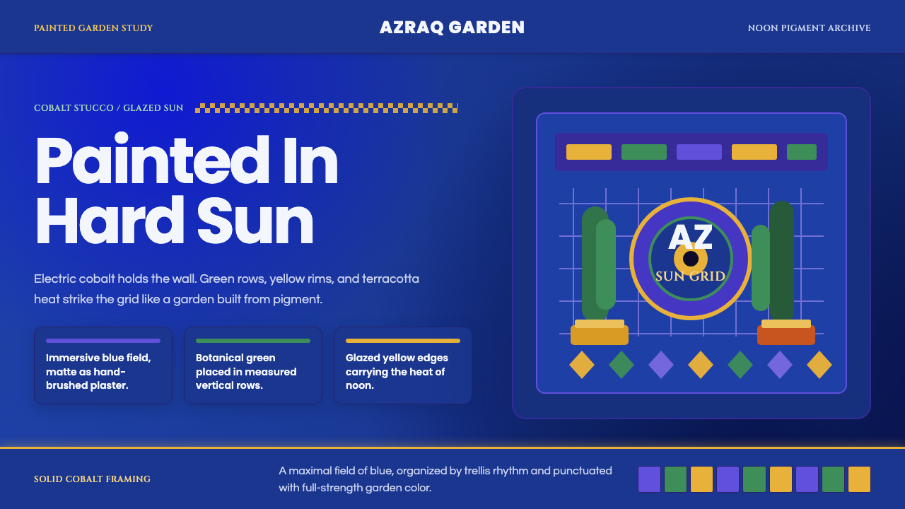
Majorelle Blue is a single cobalt so saturated it turned a private garden wall into a color with its own name.
Jardin Majorelle Blue in brief
Jardin Majorelle Blue is the design language of a specific painted place: the villa and botanical garden that French painter Jacques Majorelle built for himself in Marrakech across the 1920s and 1930s, and later saturated in an electric cobalt he mixed and eventually had associated with his own name. The style takes that one act — painting an entire architectural surface in an almost unnaturally intense blue — and builds a full visual system around it.
The palette is not subtle. Majorelle Blue anchors walls, planters, fountains, and trellis structures, and everything else in the garden is chosen to detonate against it: acid cactus green, glazed ochre-yellow terracotta, and the raw orange-red of bare Saharan earth. There is no attempt at harmony in the pastel sense. The effect depends on contrast pushed to its limit, the way stained glass depends on strong light passing through saturated color.
Surfaces are matte and chalky rather than glossy — closer to hand-applied lime-wash stucco than to lacquer or enamel. This matters visually: the blue reads as pigment absorbed into a wall, not as a coating sitting on top of one. Combined with the hard, high-angle light of a desert climate, the finish produces deep, almost velvety shadow within an otherwise blazing field of color, and it is this pairing — chalky matte pigment plus fierce sun — that gives the style its particular intensity rather than a decorative or garish quality.
Where does Jardin Majorelle Blue come from?
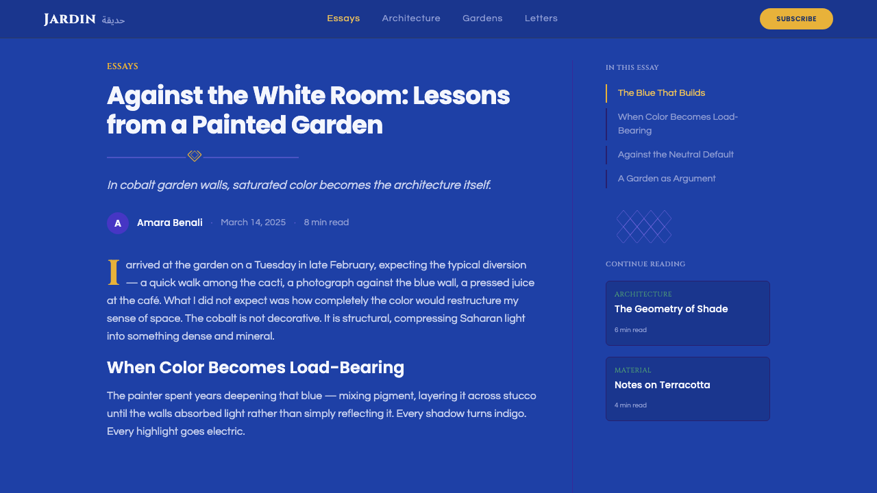
Jacques Majorelle was the son of Louis Majorelle, one of the leading furniture designers of the Nancy School and the French Art Nouveau movement — a background steeped in decorative craft and material invention. Jacques trained as a painter and initially worked in a more conventional Orientalist tradition, traveling through North Africa in the 1910s to paint landscapes and scenes of daily life. In 1917 he settled permanently in Marrakech, drawn partly by health reasons and partly by a fascination with the quality of Moroccan light that he felt no European studio could replicate.
In 1923 Majorelle bought a plot of land on the edge of the city and began developing it into a garden, and in 1931 he commissioned the French architect Paul Sinoir to design a studio-villa on the property in a Cubist-influenced Art Deco style. It was here, sometime in the following years, that Majorelle mixed and applied the intense cobalt blue that would eventually bear his name — a color he is said to have arrived at through experimentation rather than any single traditional source, though it echoes the depth of Moroccan zellige tilework and the indigo-dipped textiles long associated with Berber and Tuareg dress. He had the shade registered, and Majorelle Blue became legally and popularly his.
The garden itself functioned as a living plant collection as much as a painted stage set: Majorelle traveled to gather cacti, bamboo, water lilies, and palms from across the world, arranging them along cobalt-edged walkways and pools. He opened the garden to the public in 1947, but after his death in 1962 — following a car accident — the property fell into decline through subsequent decades of neglect and subdivision pressure from developers eager to build on the land.
The garden's second life began in 1980, when the fashion designer Yves Saint Laurent and his partner Pierre Bergé purchased the property specifically to save it from demolition, restoring the villa, replanting the grounds, and reopening it to visitors. Saint Laurent, who had a long personal relationship with Marrakech as a source of color and creative refuge, considered the garden one of his most important influences; after his death in 2008 his ashes were scattered there, and a memorial to him stands among the plantings. The site today also houses a museum dedicated to Berber culture, cementing the garden's status as both an artist's private obsession and a shared cultural landmark.
What defines the Jardin Majorelle Blue look?
Color
A single saturated cobalt blue dominates every surface it touches, functioning less as a background hue and more as the entire architectural material. Against it sit acid cactus green, glazed egg-yolk yellow, and the raw orange-red of exposed earth — a small palette used at full intensity rather than a broad palette used at moderate intensity. Restraint here means using very few colors, not using muted ones.
Surface Finish
Every painted surface reads as chalky and matte, evoking hand-applied lime-wash or stucco rather than lacquer, enamel, or glass. This matte quality is what keeps the intense color from feeling synthetic — it behaves like pigment soaked into a porous wall rather than a coating reflecting light off a hard shell.
Light and Shadow
The style assumes hard, high-angle desert sunlight striking the painted surfaces directly, producing deep, sharply defined shadow pools rather than soft ambient gradients. Shade reads as a near-black void set against blazing color, not as a gentle darkening — the contrast between light and shadow is as extreme as the contrast between hues.
Botanical Texture
Green in this system is not a single flat tone but an accumulation of plant textures — spiky cactus silhouettes, bamboo verticals, broad palm fronds, water-lily pads — treated as living ornament layered against the painted architecture. The plants provide the only organic, irregular forms in a system otherwise built from flat color and hard geometry.
Ornament and Geometry
Architectural detail draws on Art Deco and Cubist-inflected forms — stepped planters, angular fountain basins, and geometric trellis frameworks — rather than the flowing curvilinear ornament of earlier Orientalist decoration. Ornament here is architectural and structural, giving the garden its stagey, composed quality rather than a purely naturalistic one.
Composed Maximalism
The overall mood is decorative, confident, and deliberately unrestrained — closer to a painted stage set than a subdued residential palette. Every element is chosen for maximum visual impact rather than blended harmony, and this confidence is itself part of the style's character: nothing apologizes for being loud.
Layering Over Flatness
Rather than a single flat wash, the visual field is built from layered planes — a blue wall behind a yellow pot behind a green cactus behind a shadow — so depth is created through overlapping saturated color blocks rather than through gradient, texture mapping, or perspective drawing.
Who shaped Jardin Majorelle Blue?
The painter who bought the land, built the villa and studio, and mixed the cobalt blue that now carries his name. Trained in a more conventional Orientalist painting tradition, he settled in Marrakech in 1917 and spent decades developing the garden as both a botanical collection and a painted architectural composition, opening it to the public in 1947.
Jacques Majorelle's father and a leading furniture designer of the Nancy School within French Art Nouveau. His decorative-craft background is a plausible root of Jacques's confidence in bold, unified surface treatment, even though the two worked in different media and eras.
The French architect commissioned by Majorelle in 1931 to design the studio-villa on the property, working in a Cubist-influenced Art Deco idiom. The building's geometric massing gave Majorelle the architectural canvas onto which the blue was eventually applied.
The fashion designer who, with his partner Pierre Bergé, purchased the garden in 1980 to save it from demolition and restored it to public access. He considered Marrakech and the garden lasting influences on his sense of color, and his ashes were scattered there after his death in 2008.
Saint Laurent's business and life partner, who co-led the 1980 rescue and restoration of the Jardin Majorelle and its subsequent stewardship as a cultural institution, including the later addition of a museum dedicated to Berber culture on the grounds.
How do you use Jardin Majorelle Blue today?
Majorelle Blue works because it commits to a single overwhelming color decision rather than a balanced palette, and that principle transfers cleanly once a designer understands what it depends on: a dominant saturated blue, matte rather than glossy application, and just two or three sharply contrasting accents used at full strength.
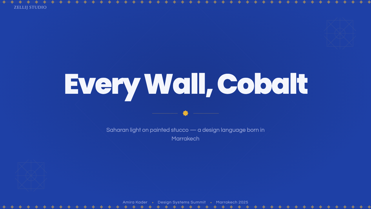
For presentation slides, this style is strongest on cover pages and section dividers, where a full-bleed cobalt field with a single yellow or terracotta accent shape creates immediate visual authority. Content slides should keep the blue as ground rather than foreground — body text and data belong on cream or white insets set against the blue field, so the color reads as architecture around the content rather than competing with it.
For web interfaces, the style suits marketing and brand pages more naturally than dense dashboards, because its strength is emotional impact rather than fine-grained legibility. A hero section with saturated blue and a single warm accent color for the primary call-to-action button reproduces the garden's own logic: one dominant hue, one detonating contrast. Dashboards and data-heavy screens should borrow only the accent logic — a cobalt sidebar or header against a lighter working surface — rather than saturating the entire interface.
For editorial and marketing work, the style rewards large photographic or illustrative blocks of the blue itself, used the way a magazine might use a full-bleed color spread, with typography kept simple and high-contrast so it survives against such an intense ground. Product or event pages built around a single strong seasonal color story — one dominant hue plus a couple of accents — borrow this logic well.
A common mistake is diluting the blue into a pastel or desaturating it for a subtler, more corporate look — this removes exactly the quality that makes the style recognizable. Another is adding too many accent colors at once; the garden's power comes from restraint in color count paired with maximum intensity in color strength, and diluting either half of that equation collapses the effect into ordinary color-blocking.
Jardin Majorelle Blue — FAQ
Is Majorelle Blue an official, registered color?
The shade is closely associated with Jacques Majorelle, who is said to have developed it through his own experimentation and had it registered under his name, which is why it is popularly called Majorelle Blue rather than by a generic paint-catalog name. It functions less like a single fixed formula and more like a recognizable family of intense cobalt-to-ultramarine blues used consistently across the garden's walls and structures.
Is this the same visual language as other Moroccan design styles like zellige tilework or riad interiors?
They share a regional root but express it differently. Jardin Majorelle Blue is essentially a single-artist, twentieth-century painted-garden aesthetic built around one dominant color; zellige-based styles are older, tile-based, and organized around intricate geometric tessellation rather than large flat color fields. Both draw on the same intensity of Moroccan light and color confidence, but Majorelle's version is architectural and painterly rather than mosaic and pattern-based.
Why does the style avoid glossy or reflective finishes?
The garden's walls were painted with lime-wash and stucco techniques that dry to a chalky, light-absorbing matte finish rather than a reflective sheen. Under strong desert sun, a glossy surface would bounce hard specular highlights and wash out the color; a matte surface instead absorbs and holds the saturation, which is precisely why the blue reads as so deep and immersive rather than shiny or plastic.
Does this style require a lot of green plant imagery to work?
Plant texture is an important accent but not the load-bearing element — the blue and its high-contrast accents can carry a composition on their own, as they do on many of the garden's bare architectural surfaces. Green foliage works best as a secondary layer that adds organic irregularity against the flat, geometric confidence of the painted architecture, rather than as the dominant note.
What kind of products or brands does this style suit, and where does it struggle?
It suits travel, hospitality, garden and lifestyle brands, art and design institutions, and any product seeking a confident, warm, maximalist identity distinct from cool corporate minimalism. It struggles in contexts demanding restraint, neutrality, or fast information scanning — financial dashboards, enterprise software, or dense data tools — where an overwhelming single color field competes with rather than supports the user's task.
Related design styles
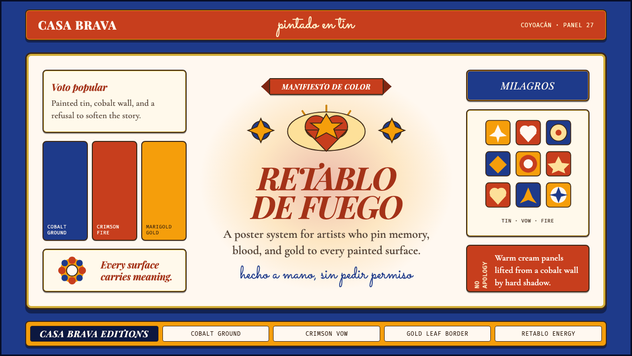 Mexican Folk Art (Frida-era)Defiance painted on tin. Cobalt ground, crimson vows, marigold borders, hard…
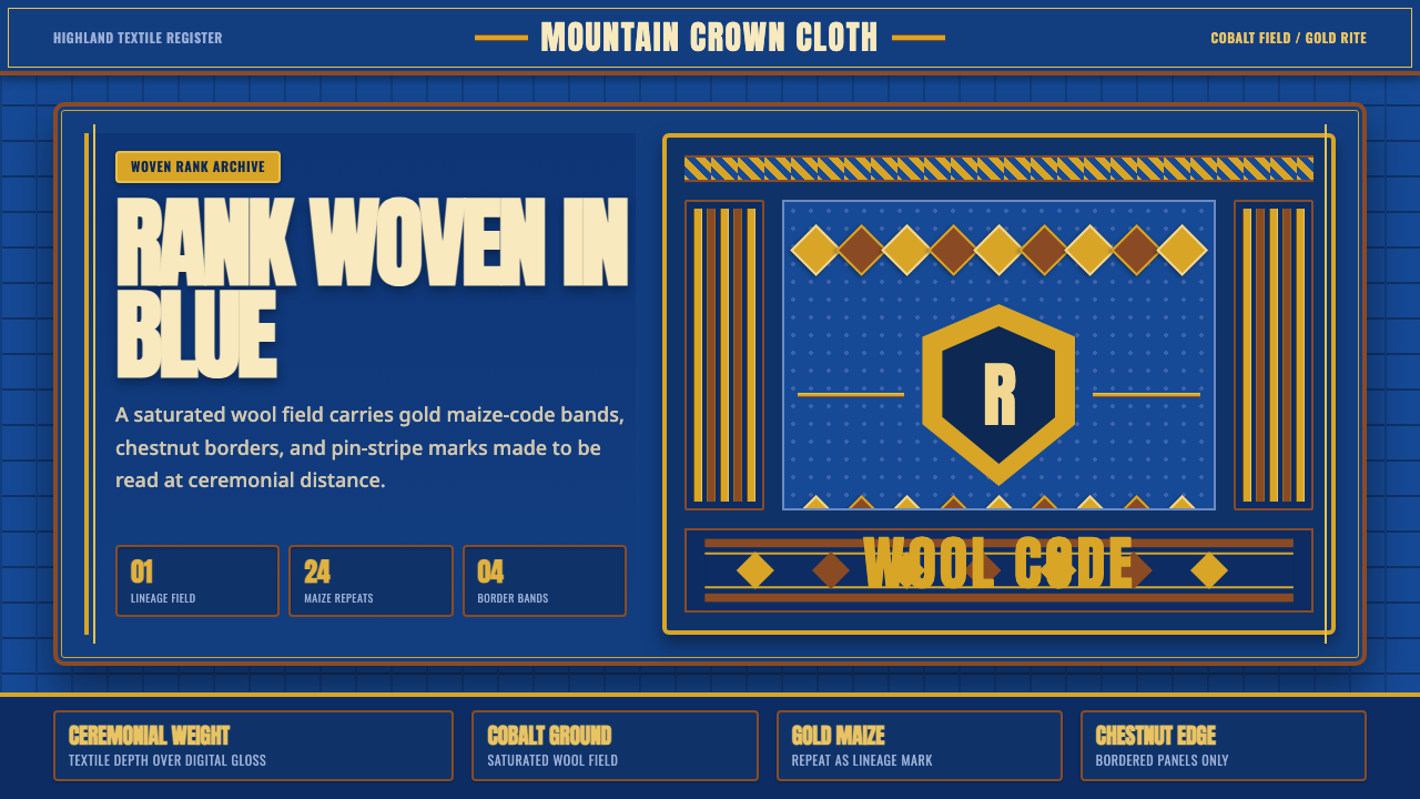 Basotho Seanamarena BlanketRank made visible. Cobalt wool, gold maize diamonds, and chestnut borders rea…
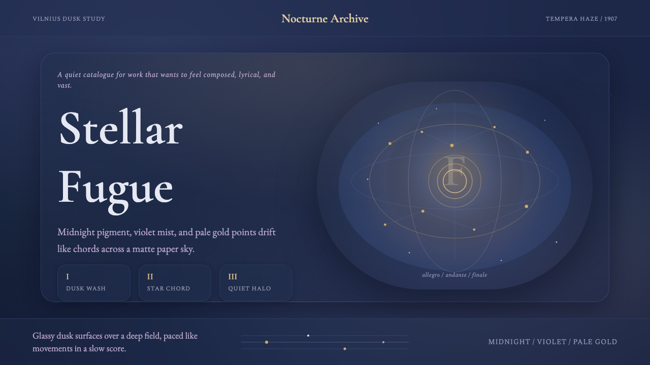 Čiurlionis SymbolismCosmos becomes music. Midnight blue-violet washes and pale gold stars drift i…
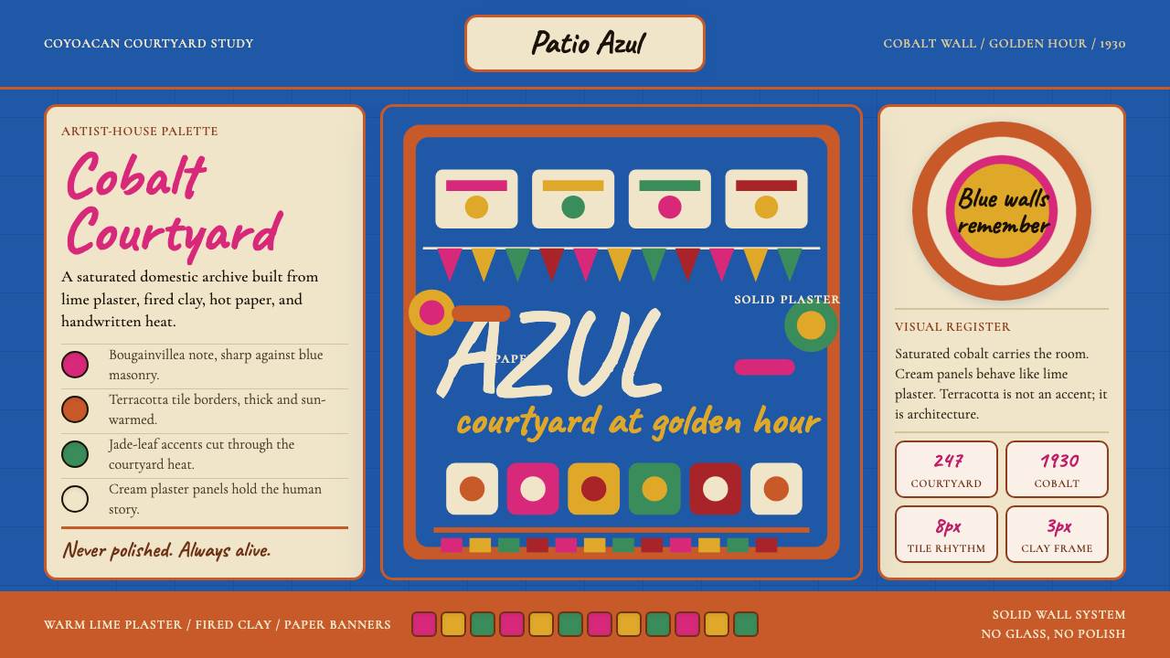 Mexican Frida Blue House (Coyoacán 1930)Maximum color, intimate walls. Cobalt, cream panels, terracotta grid, cut-pap…
 Toblerone Matterhorn (1908)A mountain compressed into a mark. Foil gold, alpine red and strict triangles…
 Bulgarian Rose Attar (Valley of Roses)Quietly precious craft. Moss green, dusty rose and brass borders frame a dawn…