What is Čiurlionis Symbolism?
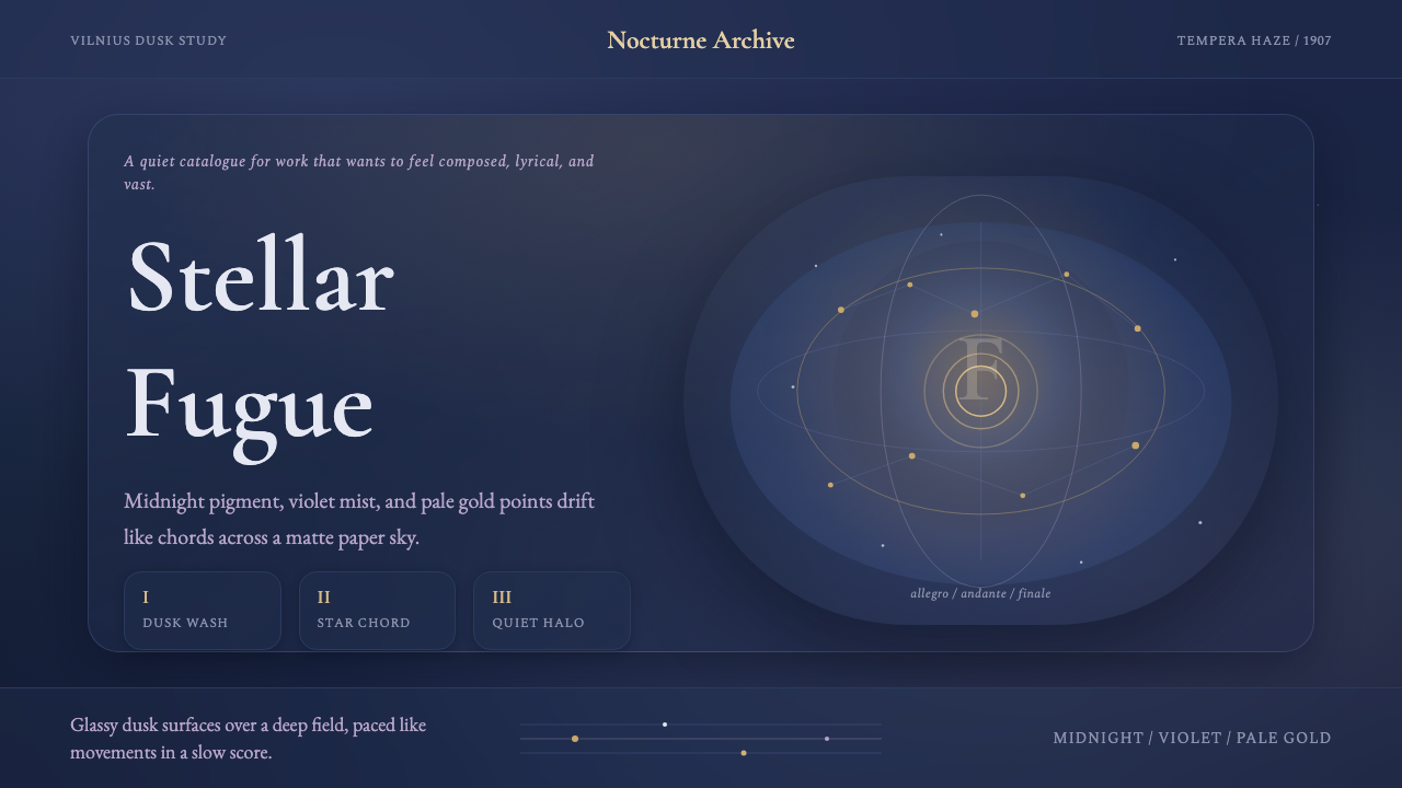
Čiurlionis Symbolism turns the screen into a night sky heard as music — bruised twilight grounds, drifting pale stars, and a hush where color behaves like a slow chord rather than a flat fill.
Čiurlionis Symbolism in brief
Čiurlionis Symbolism takes its name and its entire visual grammar from a single artist: Mikalojus Konstantinas Čiurlionis, a Lithuanian painter and composer working in the first decade of the twentieth century who treated canvases the way other artists treated scores — as sequences with movements, recurring motifs, and a governing key. The style translates his painted-music sensibility into a design system built on deep midnight grounds, dusk-blue and twilight-violet passages, and a soft, aged gold that behaves like a distant star rather than a highlight.
What distinguishes this system from other dark or cosmic palettes is its refusal of hard edges. Nothing in a Čiurlionis-derived interface reads as a flat, decisively bounded shape. Colors are treated as washes that bleed into one another the way tempera pigment bleeds into paper — a deep blue-violet ground softening toward violet at its margins, a gold accent that seems to glow rather than sit on top. The aesthetic is atmospheric and painterly rather than graphic; it asks to be felt as a mood before it is read as a layout.
Serif type reinforces the sense of an older, more contemplative visual world — letterforms with quiet, human proportions rather than the geometric bluntness of a grotesque sans. Combined with generous dark space and stars that seem to drift rather than sit fixed, the overall effect is less a page and more a slow-moving nocturne: composed, lyrical, and deliberately vast.
Where does Čiurlionis Symbolism come from?
Mikalojus Konstantinas Čiurlionis was born in 1875 in what was then part of the Russian Empire's northwestern provinces, in a region that would become independent Lithuania only after the First World War. He trained first as a musician — studying composition in Warsaw and Leipzig — before turning seriously to painting in his late twenties, a sequencing that shaped everything about how he made images. He did not learn to paint and then discover music as a metaphor; he already thought in movements, keys, and recapitulations, and painting became a second notation system for the same musical intuition.
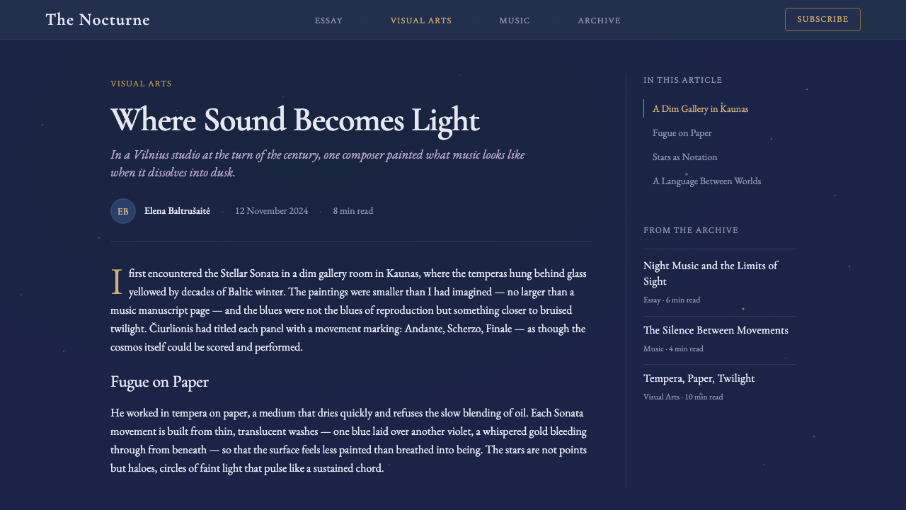
His most significant body of work, produced in a concentrated burst between roughly 1903 and 1909, consists of cycles explicitly modeled on musical forms: Sonatas named for the sun, the sea, the stars, the pyramids, and the serpent, each divided into movements — Allegro, Andante, Scherzo, Finale — exactly as a musical sonata would be. The Sonata of the Stars, in particular, dissolves the night sky into a fugue-like sequence of overlapping translucent forms: pale stars, veiled figures, architectural fragments, all painted in thin, layered washes of matte tempera on paper rather than the opaque, built-up oil surfaces typical of academic painting at the time.
This working method placed Čiurlionis at the edge of European Symbolism but also ahead of it in one crucial respect: art historians now regard his cosmic, non-representational compositions from this period as among the earliest instances of proto-abstraction in European painting, emerging in parallel with — and in some cases slightly before — better-known pioneers of abstract art elsewhere on the continent. He worked in relative isolation, in Vilnius and in the spa town of Druskininkai, largely outside the gallery networks of Paris, Vienna, or Munich, which is a significant reason his contribution remained under-recognized outside Lithuania for much of the twentieth century.
Čiurlionis died in 1911 at the age of thirty-five, after a period of declining mental health, leaving behind several hundred paintings and a substantial body of musical composition. His work was gathered and preserved through the efforts of Lithuanian cultural institutions in the decades that followed, and today he is regarded as Lithuania's foundational modern artist — a single figure who fused the era's Symbolist preoccupation with dream, myth, and the cosmos with a structural, almost mathematical sense of composition borrowed directly from music.
What defines the Čiurlionis Symbolism look?
Color
The palette centers on deep midnight blue-violet grounds — dark enough to read as night sky rather than a neutral dark mode — accented by a soft, muted gold that never reaches the brightness of a true highlight. Dusk blue and twilight violet act as secondary tones, always slightly desaturated, as if seen through haze. Pure black and pure white are avoided; even the darkest passages carry a trace of blue, and the lightest accents are closer to candlelight than to paper white.
Typography
Serif letterforms carry the system's voice, chosen for a quiet, literary register rather than for display drama. Headlines are set with generous space around them rather than aggressive scale contrast — the hierarchy comes from air and placement as much as from size. Body text favors a comfortable, unhurried measure, reinforcing the sense that the reader is meant to linger rather than scan quickly.
Wash and Gradient
Where most digital systems use flat fills or sharp gradients with defined stops, this style uses soft, slow gradients that mimic pigment bleeding into damp paper — transitions with no visible seam, color shifting gradually enough that the eye cannot locate exactly where one hue ends and the next begins. This is the single most defining technical trait of the system, and the one most often lost when the palette is copied without the underlying softness.
Star and Field Motifs
Small pale points of light, scattered irregularly rather than in any grid or constellation pattern, evoke the drifting stars of the Sonata paintings. They are used sparingly — as texture and atmosphere in large background fields — never as a repeating decorative pattern with obvious symmetry. Their irregular, non-mechanical placement is what keeps them feeling painted rather than generated.
Layered Translucency
Surfaces and panels in this system read as layered veils rather than opaque cards. An element sitting above the background should feel like it is suspended within the same atmosphere as everything behind it, not cut out and placed on top of it. This favors translucent or softly blurred panel treatments over the crisp, fully opaque card patterns common in flat digital design.
Restrained Ornament
Ornament, where it appears, is drawn from architectural and celestial motifs — arches, faint radiating lines suggesting starlight, subtle veil-like forms — rather than from geometric or floral decoration. It is used rarely and always at low contrast, so that it registers as texture within the atmosphere rather than as a distinct decorative layer competing with the content.
Motion as Drift
Where the system includes motion, it favors slow, continuous drift over snappy mechanical transitions — stars that move at a barely perceptible pace, washes that shift almost imperceptibly over time. Sudden, sharp animation breaks the illusion of a suspended, musical atmosphere and should be avoided in favor of long, gentle easing.

Who shaped Čiurlionis Symbolism?
The sole originator of this visual language. A composer before he was a painter, Čiurlionis structured his Sonata cycles — Sun, Sea, Stars, Pyramids, Serpent — as literal musical movements rendered in paint, working in thin, translucent tempera washes on paper rather than opaque oil. His cosmic, dissolving forms from 1903 to 1909 are now recognized as among the earliest proto-abstract compositions in European art, produced largely in isolation in Vilnius and Druskininkai and gathered into lasting recognition only after his early death in 1911.
The broader European current, active from the late nineteenth into the early twentieth century, that Čiurlionis's work belongs to. Symbolism rejected naturalistic representation in favor of imagery drawn from dream, myth, and inner psychological states, using suggestion and atmosphere rather than direct depiction. Čiurlionis shared Symbolism's preoccupation with the mystical and the cosmic but pushed further into abstraction than most of his Symbolist contemporaries, who largely retained recognizable figures and settings.
The late nineteenth and early twentieth century cultural and political movement toward Lithuanian national identity and, eventually, independence, achieved in 1918. Čiurlionis worked during the heart of this revival and is now regarded as its foremost artistic figure — a status that has made his imagery central to Lithuanian cultural identity, appearing on currency, in the national art museum that bears his name in Kaunas, and across the country's cultural self-presentation abroad.
A near-exact contemporary working slightly later on parallel ground: Kandinsky's move toward pure abstraction and his theoretical writing on the correspondence between color, form, and musical sensation (Concerning the Spiritual in Art, 1911) are frequently discussed alongside Čiurlionis's earlier, independently developed synaesthetic painting. The comparison is useful context rather than direct influence — the two artists worked without significant contact, arriving at related conclusions about art and music from different starting points.
How do you use Čiurlionis Symbolism today?
Čiurlionis Symbolism is a mood-first style: it works best where the goal is to make an audience feel absorbed, contemplative, or slightly awed, rather than where the goal is rapid scanning or transactional clarity. Applying it well means preserving the softness of its washes and the irregularity of its star fields — a common failure mode is to keep the color palette but flatten every gradient into a hard-edged fill, which produces something that looks merely 'dark purple' rather than genuinely atmospheric.
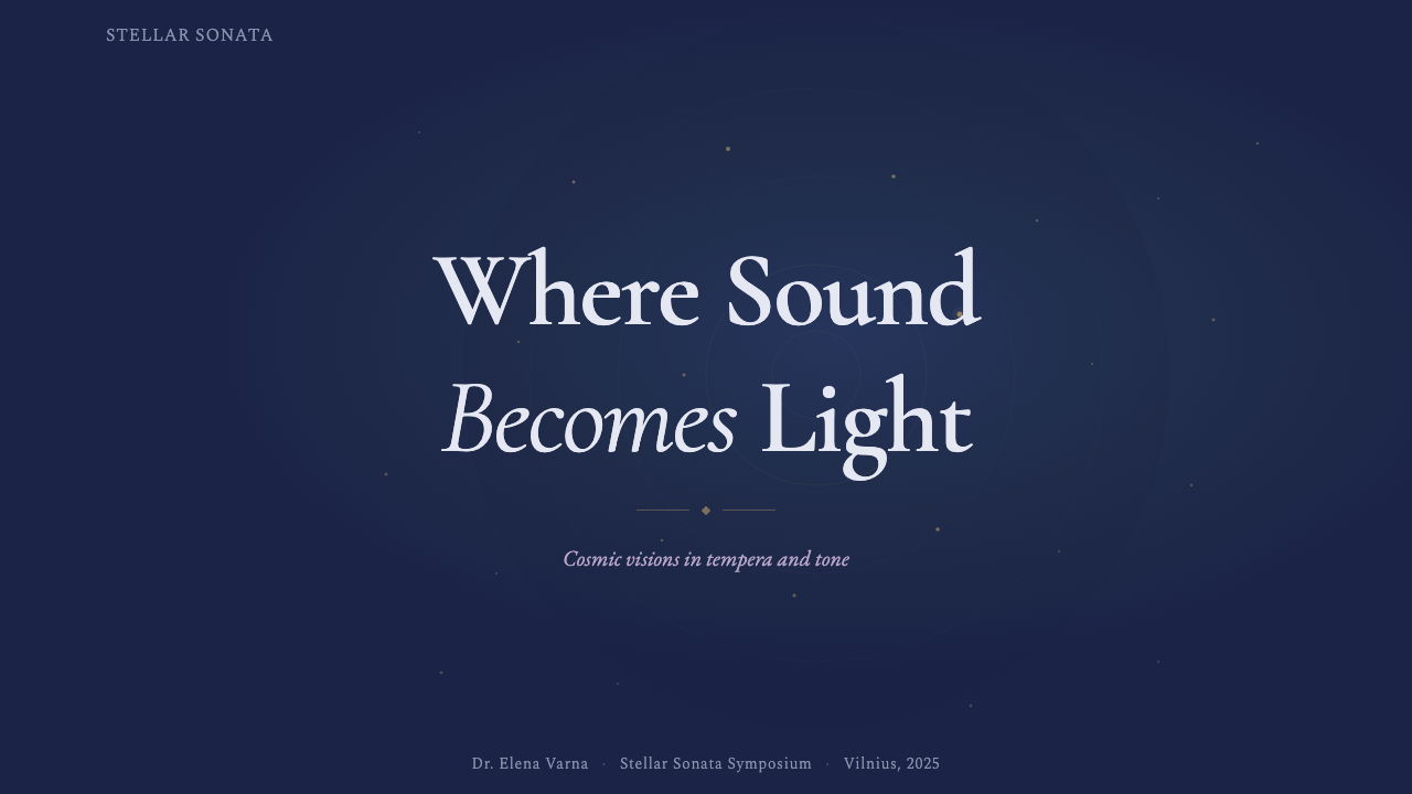
For presentation slides, the style is strongest on cover slides and section dividers, where a full-bleed midnight-to-violet wash with a scatter of soft stars can carry a title in serif type with almost no other ornament — the atmosphere does the work a bold graphic would otherwise do. Content and data slides need more restraint: keep chart backgrounds close to the darkest end of the palette so data marks in gold or pale blue read clearly, and resist letting the wash run behind dense text, where it quietly reduces legibility. Reserve the full painterly wash for cover and closing slides; use a calmer, more uniform dark ground for the analytical middle of a deck.
For web interfaces, the style suits dashboards and pricing pages that want to feel premium and considered rather than brisk — a stargazing app, a music or writing tool, a meditative product, a cultural institution's site. Panels should read as translucent layers within the same atmosphere rather than opaque cards with hard borders; pricing tiers can be differentiated with the muted gold reserved for the recommended plan, used sparingly enough that it still reads as a highlight rather than a decoration. Navigation and controls should stay quiet — serif or restrained labels, minimal iconography — so they don't compete with the background.
For editorial and marketing work, the style rewards long-form, narrative content — essays, cultural features, album or exhibition pages — where a reader is expected to spend time rather than skim. A hero section with a slow-drifting star field behind a serif headline sets a contemplative tone before a word is read; pull quotes and section breaks can borrow the wash treatment at lower intensity to keep the piece feeling unified rather than segmented into hard blocks.
The most common mistake is treating this as simply 'a purple dark mode.' Without the layered translucency, the soft gradient transitions, and the irregular, non-grid star placement, the palette alone reads as a generic dark theme rather than as the painterly, musical atmosphere the style is built on. A second frequent error is overusing the gold accent at high saturation across many elements at once — in the source paintings, gold is rare and precious precisely because it appears sparingly against so much blue-violet dark.
Čiurlionis Symbolism — FAQ
Is this the same thing as a generic 'dark mode with purple accents'?
No, though it is easy to mistake for one at a glance. A generic dark-purple theme uses flat fills and hard-edged gradients; Čiurlionis Symbolism depends on soft, seamless color washes that mimic pigment bleeding into paper, irregular star placement rather than decorative patterning, and layered translucency rather than opaque cards. Strip away those qualities and keep only the hue, and the result loses the painterly, musical quality that defines the style — it becomes just another dark theme with a purple tint.
Who was Čiurlionis, and why does a design style carry his name?
Mikalojus Konstantinas Čiurlionis (1875–1911) was a Lithuanian painter and composer whose Sonata paintings — cosmic, music-structured compositions made between roughly 1903 and 1909 — are now recognized as among the earliest proto-abstract works in European art. Because the style's every defining trait (the wash technique, the color logic, the drifting star motifs) originates specifically in his paintings rather than in a broader movement, it is named after him directly, the way a color-shape theory might be named after Kandinsky.
What kind of products or brands does this style fit well?
It suits products where a contemplative, premium, slightly mystical mood is an asset: astronomy and stargazing apps, music composition or listening tools, meditation and wellness products, arts and culture institutions, poetry or essay publishing, and luxury or editorial brands that want to feel unhurried rather than efficient. It is a poor fit for high-density transactional interfaces, children's products, or anything that needs to communicate speed, urgency, or playfulness — the atmosphere works against those goals.
How is this different from generic 'space' or 'galaxy' themes common in design tools?
Generic space themes typically borrow photographic or rendered nebula imagery and scatter sharp, uniform-sized stars in a grid-like or symmetric pattern. Čiurlionis Symbolism instead derives its atmosphere from painting technique — matte, hand-painted washes rather than photographic gradients — and its stars are irregular, varied in softness, and sparse, echoing brushwork rather than a starfield generator. The serif typography and the restrained, architectural ornament also mark it as coming from early-twentieth-century Symbolist painting rather than from science-fiction or astronomy imagery.
Does the style work in a light or high-brightness context, or does it require a dark ground?
The style is conceived for dark grounds — the midnight blue-violet base is essential to both the historical source material and the sense of depth the washes depend on. A light adaptation is possible in principle, using pale dawn-toned washes instead of midnight ones, but it loses much of the cosmic, nocturnal quality that makes the style recognizable. If a lighter context is unavoidable, it is more faithful to reserve the full painterly treatment for a hero or feature section and let surrounding content use a calmer, more neutral light background, rather than attempting a wholesale light-mode inversion of the palette.
Related design styles
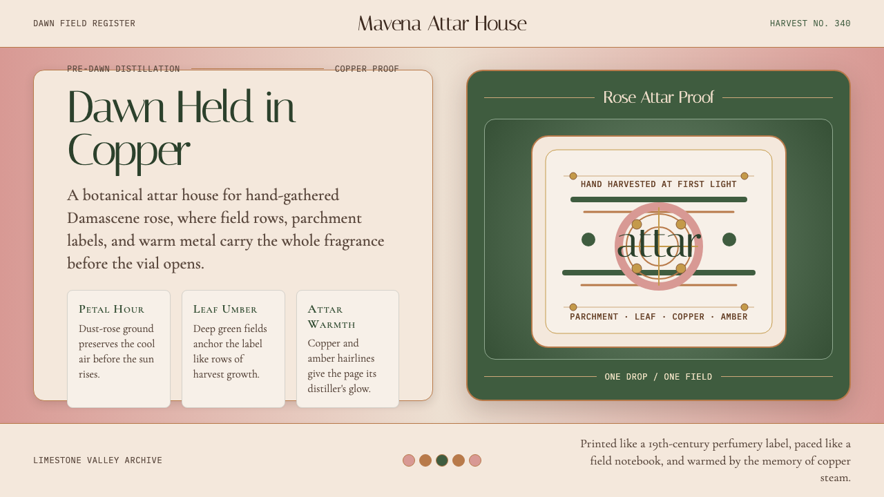 Bulgarian Kazanlak Rose ValleyDawn feels distilled. Dust-rose ground, leaf green, and copper label geometry…
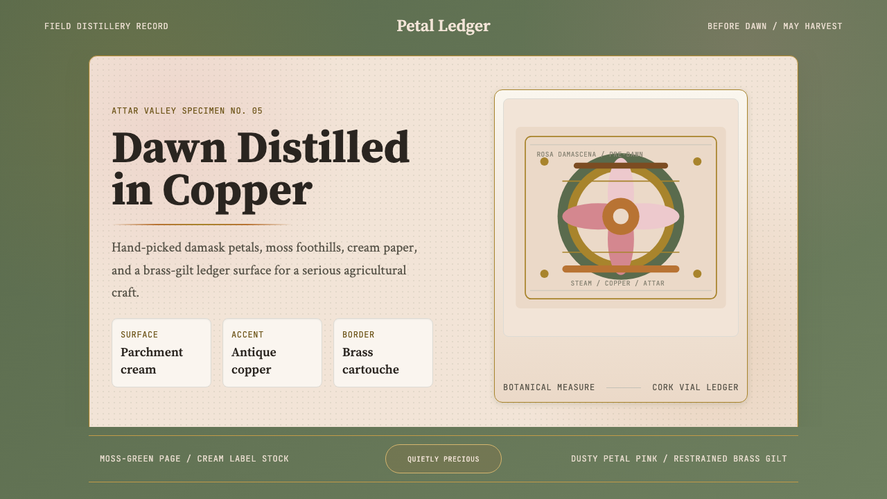 Bulgarian Rose Attar (Valley of Roses)Quietly precious craft. Moss green, dusty rose and brass borders frame a dawn…
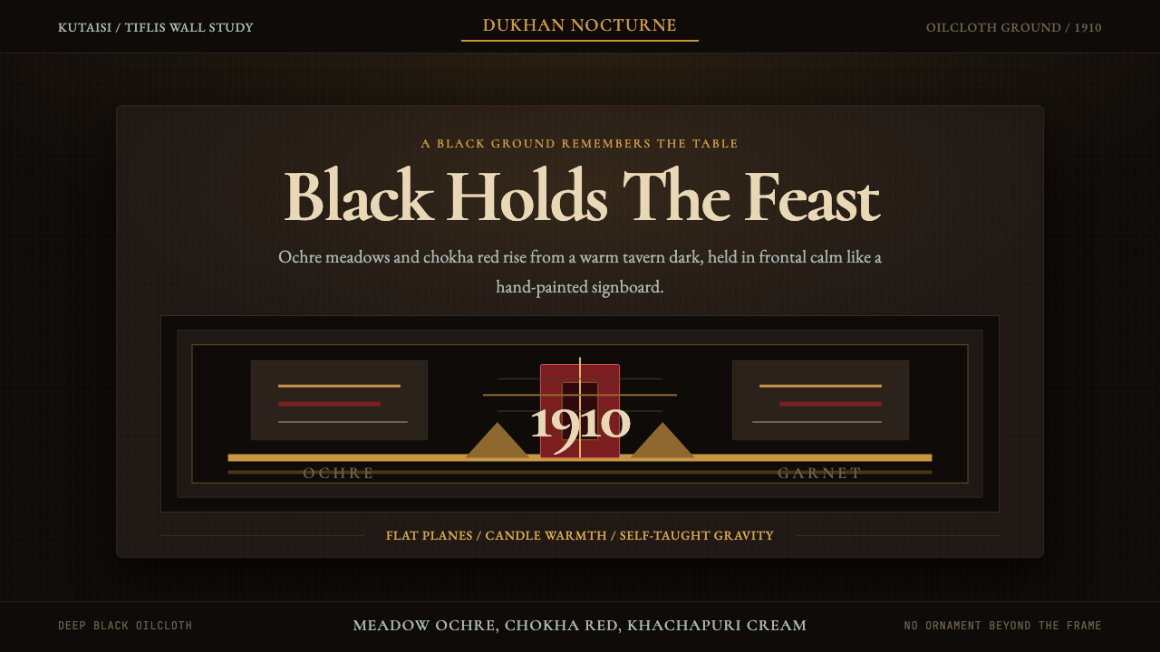 Georgian Pirosmani 1910Oilcloth black turns memory ceremonial. Ochre panels and Cormorant type hold…
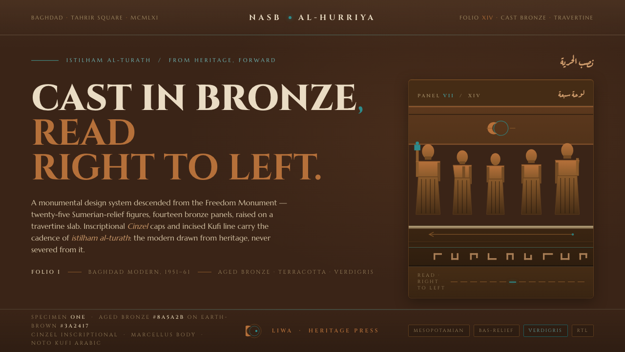 Jewad Selim Baghdad ModernCast in bronze, read right to left. Aged-bronze grounds, incised Kufi line, v…
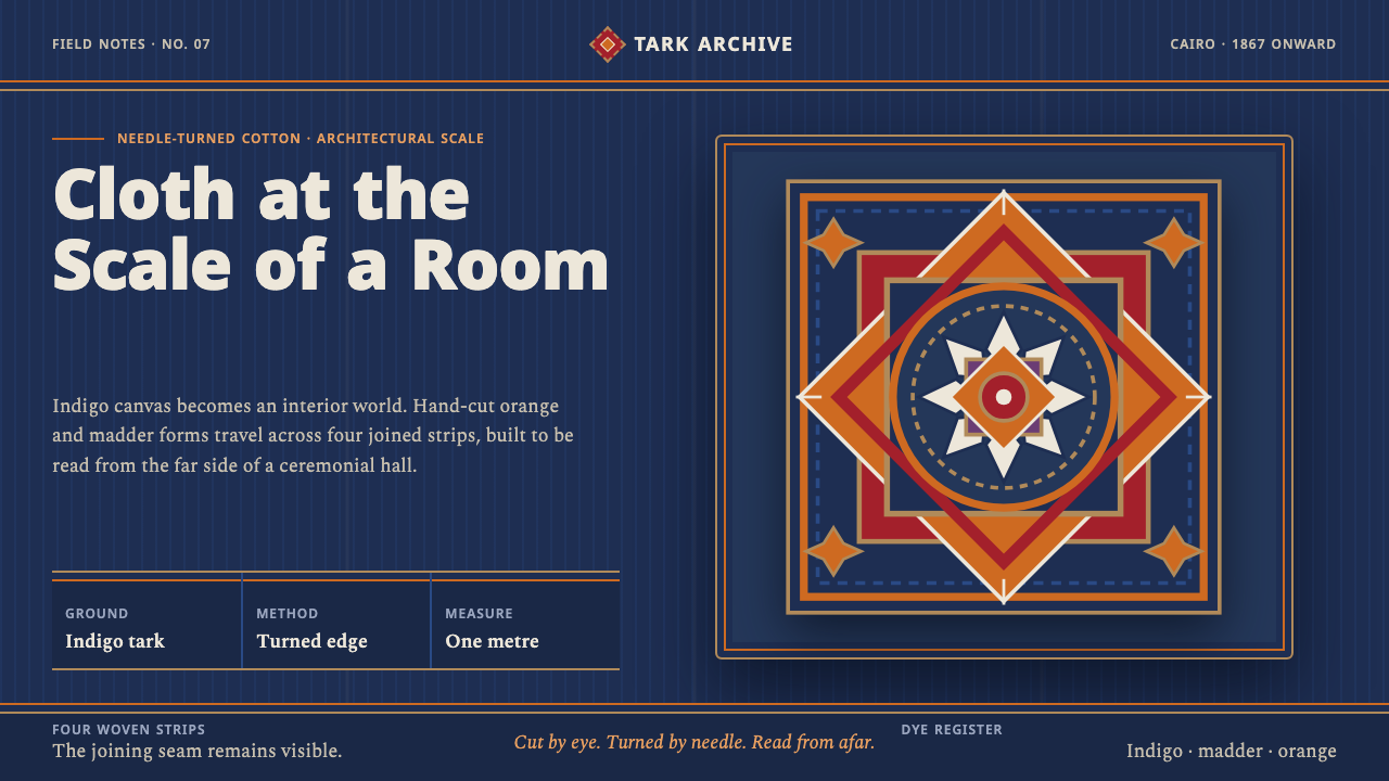 Khayamiya Tentmaker AppliquéCloth becomes architecture. Indigo canvas holds monumental orange and madder…
 Santeria Altar BembeBaroque Afro-Cuban orisha throne. Saturated hues and white cloth glow on indi…