What is Maya Glyph Codex?
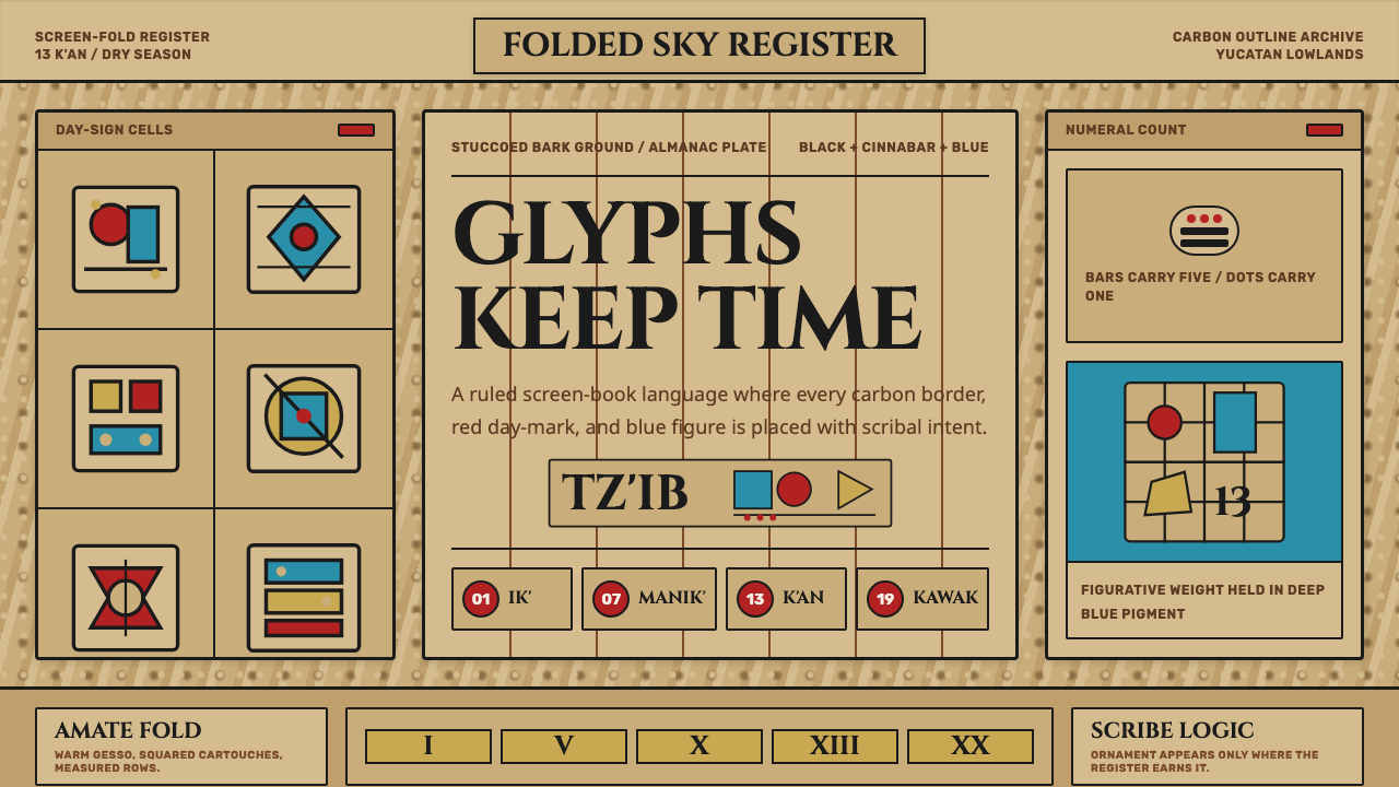
Maya Glyph Codex rebuilds the scribal authority of the surviving Maya bark-paper manuscripts — cinnabar red, deep Maya Blue, and carbon-black outline locked into disciplined almanac panels.
Maya Glyph Codex in brief
Maya Glyph Codex is the design system built around the four surviving pre-Columbian Maya screen-fold manuscripts — known today as the Dresden, Madrid, Paris, and Grolier codices — the only original Maya books to escape destruction after European contact. These manuscripts are almanacs and astronomical tables, written and painted by trained scribes on long strips of amate fig-bark paper, folded accordion-style into pages, and the visual system reconstructs the specific material logic of those pages: a stuccoed, warm buff-tan ground, thick confident black outlines, and a disciplined three-color palette dominated by cinnabar red and a striking blue-green pigment now called Maya Blue.
What distinguishes this system from a generic 'ancient manuscript' aesthetic is its precision about function. Maya codices were not decorative objects; they were working reference tools used by scribes and priests to track ritual calendars, agricultural cycles, and astronomical events, and their layout reflects that purpose — content is organized into gridded panels, each holding a glyph block, a numeral, and an image, arranged the way a modern reference table arranges rows and columns. Ornament in this tradition is never free-floating decoration; every mark serves the almanac's structure.
The palette itself carries semantic weight rather than being merely decorative. Carbon-black outline does the structural work of defining every glyph and figure. Cinnabar red is reserved for day-signs and points of emphasis — the equivalent of a highlighted cell in a modern table. Maya Blue, a remarkably stable pigment produced by combining indigo dye with a specific clay mineral, carries the figurative and narrative passages, the deities and scenes rather than the numerals. This disciplined division of color labor is what gives the system its sense of scribal authority: nothing is placed by accident.
Where does Maya Glyph Codex come from?
The surviving Maya codices date from the Postclassic period, roughly 1200 to the 1500s CE, though they likely preserve conventions and content that extend back centuries earlier into the Classic Maya period. They were produced by an anonymous scribal class known as the aj tz'ib — a title that translates roughly to 'he of the writing' — trained specialists whose profession combined the roles of astronomer, priest, and artist. Scribal training was rigorous and closely guarded knowledge, and the consistency of style across surviving pages suggests a codified visual training system passed down through generations of practitioners rather than individual artistic improvisation.
The physical construction of a codex began with amate, paper beaten from the inner bark of fig trees, a technology used across Mesoamerica for both ritual and administrative documents. Long strips of this bark paper were coated with a thin lime-based gesso to create a smooth, receptive painting surface, then folded accordion-style so the finished object opened like a screen rather than being bound like a modern book. Over centuries, the once-white gesso ground aged to the warm buff-tan color now associated with the surviving manuscripts, though this patina is a product of age rather than an original design choice.
The catastrophic loss of Maya manuscripts came with Spanish colonization. Colonial authorities, and most infamously Bishop Diego de Landa in Yucatán in 1562, ordered the mass burning of Maya books as part of a campaign against what colonial authorities viewed as idolatrous religious practice. The vast majority of Maya written material was destroyed in this and similar campaigns, leaving only the four codices that survive today — the Dresden Codex in Germany, the Madrid and Paris codices in their namesake cities, and the more recently authenticated Grolier Codex — as windows into a literary and scientific tradition that was otherwise almost entirely erased.
Modern understanding of these surviving pages owes an enormous debt to twentieth-century decipherment work, particularly that of Soviet epigrapher Yuri Knorozov, who in the 1950s demonstrated that Maya glyphs functioned as a genuine writing system combining logographic and syllabic signs — a breakthrough that overturned decades of prior scholarly assumptions that the glyphs were purely symbolic or calendrical rather than a full written language. This decipherment work transformed the codices from beautiful but largely unreadable artifacts into genuinely legible texts, revealing the precise almanac structure, day-sign sequences, and astronomical tables the visual system draws upon.
What defines the Maya Glyph Codex look?
Color
The palette is a disciplined trio: carbon black for outline and structure, cinnabar red reserved for day-signs and emphasis, and Maya Blue — a striking, stable blue-green — carrying figurative and narrative passages. Colors are not blended or gradated; each hue is applied as a flat, confident fill within an outlined boundary, and the palette's restraint to essentially three colors against a warm buff ground is itself a defining feature.
Outline and Linework
Every glyph and figure is defined by a thick, confident carbon-black outline rather than by shading or modeling. This linework is deliberate and unhesitating — the visual signature of a trained hand working from memorized conventions rather than improvised sketching. Interior details are indicated with additional black line rather than tonal variation, keeping every form flat and legible.
Typography and Glyph Blocks
Text is inscriptional and blocky, built from glyph blocks rather than a linear alphabet — each block a compact square-ish unit that can combine a main sign with smaller affix signs, echoing the way Maya hieroglyphic writing itself was structured. Any modern lettering paired with this system should carry the same blocky, carved, deliberate quality rather than the flowing look of a handwritten script.
Almanac Grid Structure
Pages are organized into gridded panels, each combining a numeral, a glyph block, and a small image into a single cell — the format functions as a working reference table rather than a continuous narrative page. This grid discipline is functional rather than decorative: it is what allowed a scribe or priest to locate a specific day-sign or ritual instruction quickly within a dense page.
Stuccoed Bark Ground
The base surface reads as lime-gessoed amate bark paper aged to a warm buff-tan — not pure white, and not artificially aged to look damaged, but the specific warm neutral that surviving codices have taken on over centuries. This ground provides the neutral field against which the black, red, and blue palette reads with maximum clarity.
Earned Ornament
Decorative flourish is present but always tied to specific figures — deity headdresses, ceremonial regalia, symbolic attributes — never applied as generic border pattern or free filler. Every decorative mark identifies something specific: which deity is depicted, which ritual is referenced, which day-sign is meant. This is decoration in service of information, not decoration for its own sake.
Scribal Confidence
The overall visual impression is one of trained authority — every mark looks deliberate, every proportion looks memorized rather than measured on the spot. This quality separates authentic codex-derived design from a loosely 'ancient' or 'tribal' pastiche; the system should always read as the product of a disciplined scribal tradition, not as free-form primitivist decoration.
Who shaped Maya Glyph Codex?
The aj tz'ib were a trained professional class combining the roles of scribe, priest, and astronomer, responsible for producing the codices and maintaining the calendrical and ritual knowledge they recorded. Their identities are almost entirely lost to history, but the consistency of visual convention across surviving pages testifies to a rigorous, codified training tradition passed down through generations rather than individual artistic invention.
The Soviet epigrapher demonstrated in the 1950s that Maya hieroglyphic writing was a genuine mixed logographic-syllabic script rather than a purely symbolic or calendrical notation, a breakthrough that overturned prior scholarly consensus. His decipherment method laid the groundwork for later scholars to fully read the surviving codices, transforming them from beautiful but largely opaque artifacts into legible historical and scientific texts.
The Spanish colonial bishop in Yucatán ordered the mass burning of Maya manuscripts in 1562 as part of a campaign against indigenous religious practice, an act responsible for the near-total destruction of Maya written literature. Paradoxically, de Landa also authored an account of Maya culture and script that, centuries later, provided some of the earliest clues used in the eventual decipherment effort.
How do you use Maya Glyph Codex today?
Maya Glyph Codex works best wherever a design needs to signal disciplined, earned authority rooted in a specific written tradition rather than generic 'ancient' or 'tribal' decoration. Because its structure is functional — a working almanac grid, a semantic division of color labor, a blocky inscriptional typography — applying it correctly means preserving that functional logic rather than treating the codex aesthetic as a purely decorative skin.
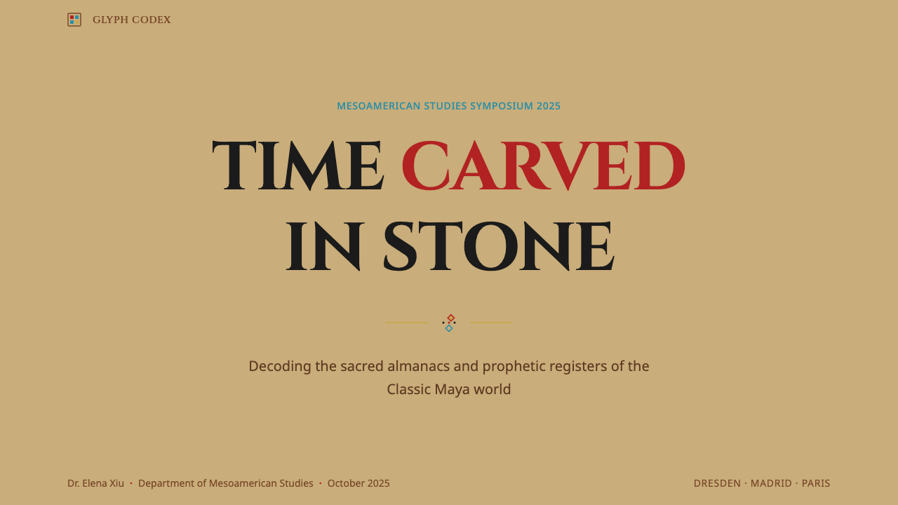
For presentation slides, the system suits a cover page built around the stuccoed buff-tan ground with a single strong glyph-block motif rendered in carbon-black outline, cinnabar red reserved for the title's key emphasis word. Content slides should adopt the almanac-panel logic directly: organize data into gridded cells, each holding a numeral, a label, and where appropriate a small iconographic figure, rather than defaulting to a conventional bulleted list, which would abandon the system's most distinctive structural feature.
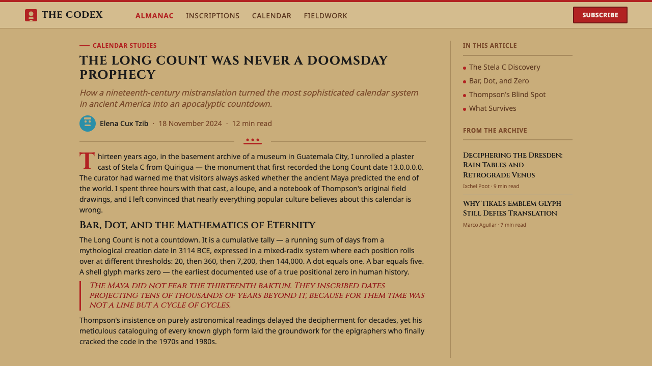
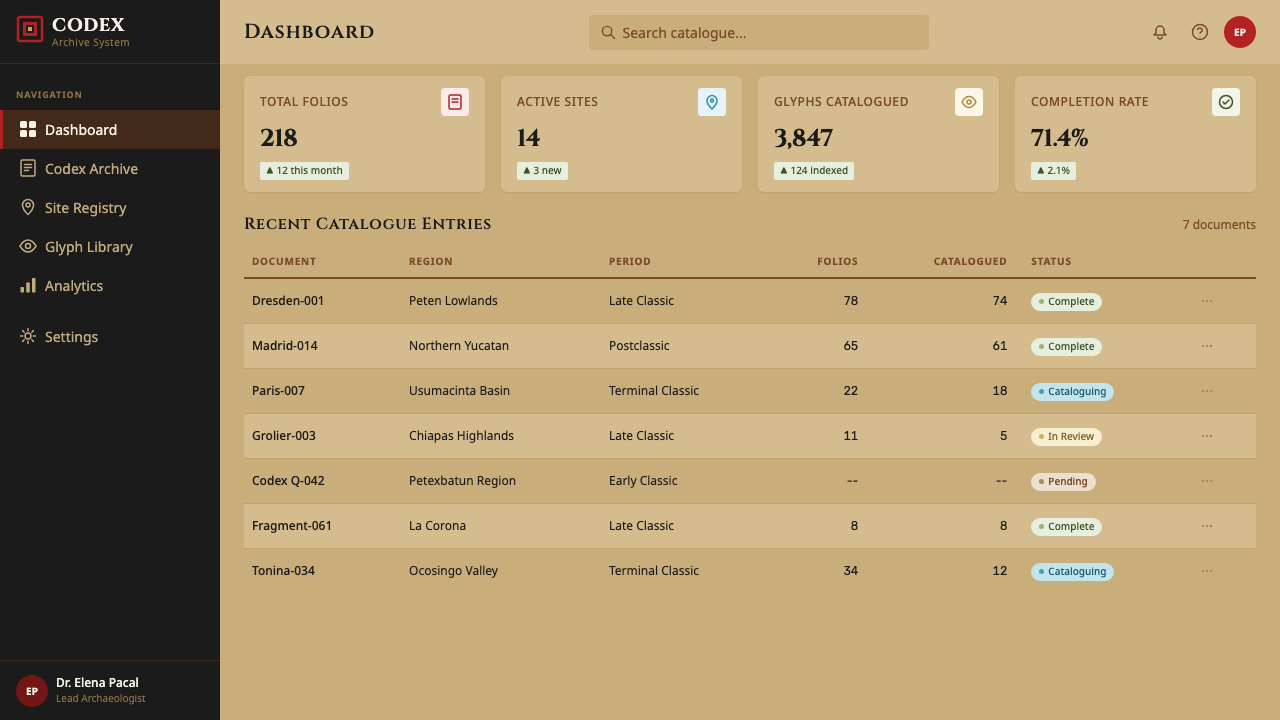
For web interfaces, the palette and grid logic suit reference-heavy products — documentation sites, educational platforms, cultural or museum digital experiences — where information genuinely needs to be looked up rather than read start to finish. Cinnabar red works well reserved for a single interactive accent (a highlighted state, a call-to-action), while Maya Blue can carry illustrative or narrative content areas, echoing its historical role carrying figurative passages rather than numerals.
For editorial and marketing work, the system is well suited to cultural heritage storytelling, educational content about Mesoamerican history, or any brand wanting to signal deep, earned scholarly authority rather than superficial exoticism. Layouts benefit from the same almanac-panel discipline used digitally: gridded sections, blocky inscriptional headers, and cinnabar accents used only at genuine points of emphasis.
A common mistake is treating this system as generic 'tribal' or 'jungle' decoration — adding unrelated stone-texture borders, jaguar-print patterns, or vague pre-Columbian pastiche elements that have no basis in the actual codex tradition. A second common mistake is using cinnabar red as a general accent color throughout a layout rather than reserving it specifically for day-signs and points of emphasis, which dilutes the semantic color logic that gives the original manuscripts their scribal precision.
Maya Glyph Codex — FAQ
How many original Maya codices actually survive today?
Only four are widely recognized: the Dresden Codex, the Madrid Codex, the Paris Codex, and the more recently authenticated Grolier Codex. All other Maya written manuscripts were lost, most catastrophically through deliberate burning campaigns carried out by Spanish colonial authorities in the sixteenth century. These four surviving books are the sole direct window into a much larger written tradition that otherwise exists only in stone inscriptions and painted ceramics.
Is Maya Blue a natural pigment or a synthetic invention?
It is neither purely natural nor synthetic in the modern chemical sense — it is a remarkable engineered composite, produced by combining natural indigo dye with a specific type of clay mineral (palygorskite) through a heating process. The resulting pigment is unusually stable and resistant to fading, acid, and even biological degradation, which is a major reason the blue passages in the surviving codices remain so vivid after many centuries while other organic pigments have faded badly.
Were the codices meant to be read start to finish, like a modern book?
No — they functioned more like reference tables than narrative books. A scribe or priest would consult a specific panel to check a day-sign, a ritual instruction, or an astronomical calculation relevant to a particular moment, much as one might look up a single row in a modern data table rather than reading the whole document sequentially. This functional, lookup-oriented structure is why the grid-panel format is such a defining structural feature of the visual system.
Why is red reserved specifically for day-signs rather than used more broadly?
Because Maya scribal convention used color as a functional signal, not a decorative choice. Reserving cinnabar red specifically for day-signs and emphasis meant a reader's eye could immediately locate the calendrical anchor point on a dense page without having to parse every glyph block individually. Diluting that convention by using red as a generic accent everywhere would undermine the exact quality — instant functional legibility — that made the color choice meaningful in the original manuscripts.
Does this style risk being disrespectful or appropriative if used outside a cultural or educational context?
The style carries real cultural specificity and historical weight, so it works best when applied thoughtfully rather than as generic exotic decoration — treating it as a functional design system rooted in a documented scribal tradition, rather than a loose 'ancient civilization' costume, is the respectful approach. It is particularly well suited to educational, cultural heritage, and museum contexts where the underlying tradition is being genuinely represented, and less suited to contexts that would reduce it to superficial pattern with no connection to its actual content or history.
Related design styles
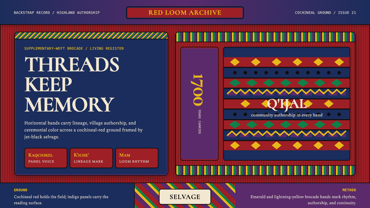 Guatemalan Huipil Maya WeaveMemory is woven dense. Cochineal red, black selvage, and brocade bands hold t…
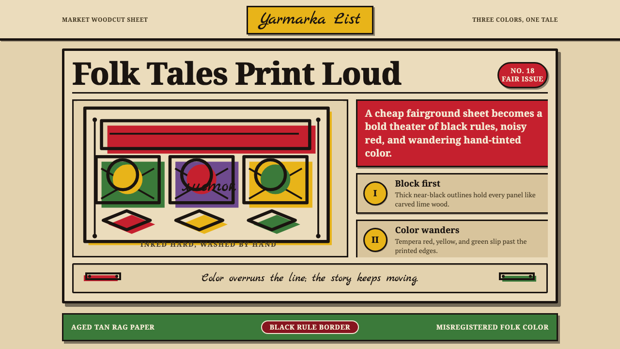 Russian LubokFolk print sings. Tan rag paper, black woodcut rules, red and green fills mis…
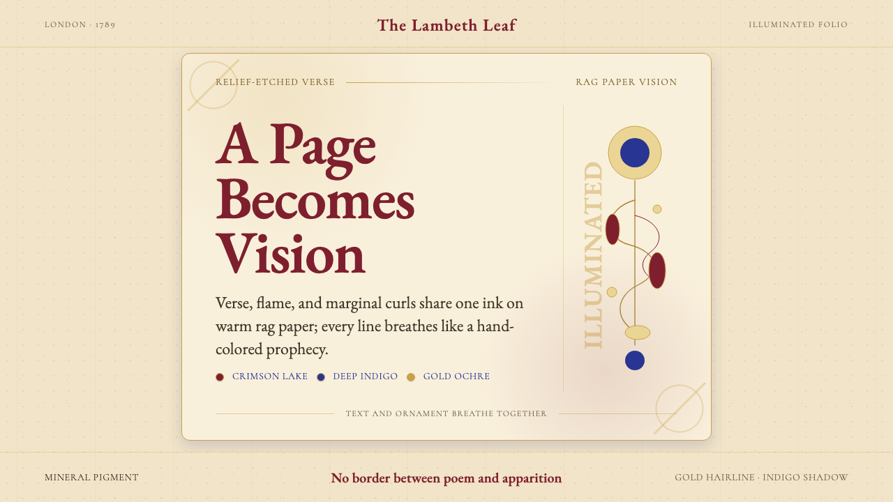 William Blake IlluminatedThe page becomes a vision. Crimson, indigo, and gold ornament breathe on rag…
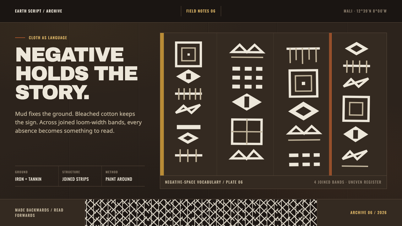 Bogolanfini MudclothAbsence becomes language. Warm iron-black bands hold uneven bleached-cotton s…
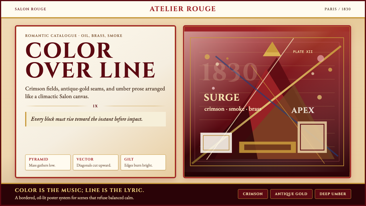 Delacroix French RomanticismOperatic color erupts. Crimson parchment, gilt borders, and diagonal pyramids…
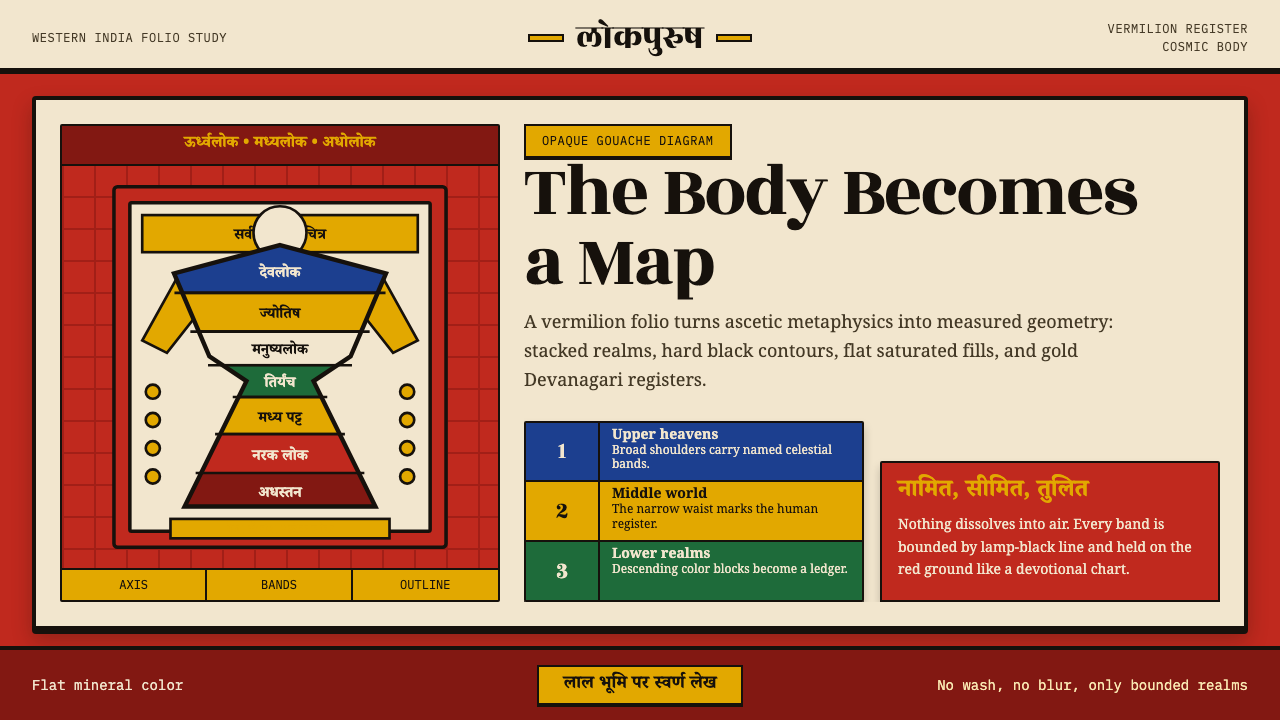 Jain CosmologyAscetic geometry, made visible. Vermilion ground, black contours, gold Devana…