What is Jain Cosmology?
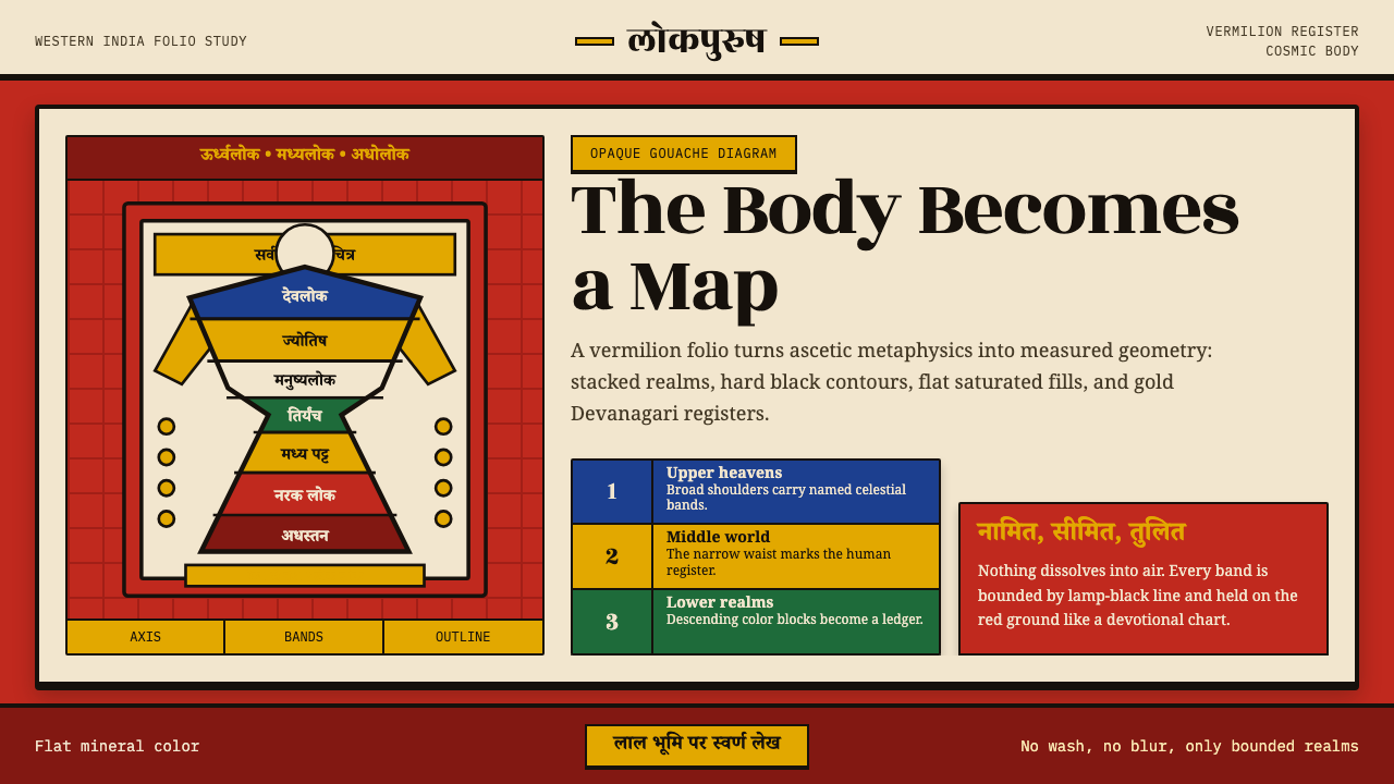
Jain Cosmology takes the entire universe and folds it into the shape of a standing man — every heaven, hell, and human realm assigned its own band of vivid color and bounded by an unyielding black line.
Jain Cosmology in brief
Jain Cosmology is a manuscript and cloth-painting tradition from Svetambara Jain communities of western India, built around a single recurring diagram: the Lokapurusha, or Cosmic Man. The universe, in Jain metaphysics, is not infinite and formless — it has a fixed shape: a human body standing with legs apart and arms akimbo, an hourglass silhouette in which the waist is the middle world of humans and animals, the legs descend through a stack of hells, and the torso and head rise through the heavens toward final liberation. Painters rendered this cosmic anatomy as a flat, sectioned chart, closer to a map than to a picture of a person.
The visual language built to serve that idea is unmistakable. A saturated vermilion ground — the red-orange of Gujarat and Rajasthan manuscript painting — carries flat, opaque fields of color, each one fenced in by a heavy black outline. Nothing is shaded, nothing dissolves into atmosphere; every zone of the cosmos is a discrete, named, countable compartment. Gold bands of Devanagari script run across or beside the image, captioning each realm the way a legend captions a map. The effect is didactic and devotional at once — a picture built to be read, and a diagram built to be venerated.
This is a style with no interest in illusion. It does not model light falling across a form or suggest depth through soft transition; it states, in flat color and hard edge, that the universe has an exact structure and that structure can be counted, labeled, and held in a single frame. That confidence — geometry standing in for cosmology — is what makes the style transferable far outside its original devotional context.
Where does Jain Cosmology come from?
The Lokapurusha diagram belongs to a broader tradition of Jain cosmological illustration that flourished in western India from roughly the seventeenth through the nineteenth century, though the textual cosmology it depicts is far older, rooted in canonical scripture composed in the centuries after Mahavira, the last of the twenty-four Jain tirthankaras (ford-makers). Jain cosmology is famously precise: it counts continents, oceans, hells, and heavens with the same rigor a surveyor brings to land, and it insists the universe is eternal, uncreated, and self-sustaining — a position that put Jain cosmographers at odds with the creator-god cosmologies of neighboring traditions and gave their diagrams a distinctly measured, almost bureaucratic exactitude.
The paintings survive mainly as illustrations within illuminated manuscripts and as large cloth paintings (patas) meant for display and instruction, produced by anonymous Svetambara scribes and workshop painters attached to temples and merchant patrons across Gujarat and Rajasthan. Among the most important carriers of this visual tradition were illustrated copies of the Kalpasutra, the central Svetambara text recounting the lives of the tirthankaras, whose margins became a testing ground for the flat, sectioned, brilliantly colored style that later cosmological cloth paintings inherited wholesale.
Western Indian manuscript painting as a whole — of which the Lokapurusha is one recurring subject among many — developed under patronage from Jain merchant communities who commissioned lavishly illustrated religious texts as acts of piety and displays of status. The resulting style answered to different needs than contemporaneous Mughal court painting: it was not built for naturalistic likeness or perspectival depth, because its job was doctrinal clarity, not portraiture. A flat, compartmentalized, high-contrast idiom made complex cosmological information legible at a glance and durable across repeated copying by workshop hands.
By the eighteenth and nineteenth centuries, when large-format cosmological patas were being produced for temple and processional display, the visual conventions were fully standardized: vermilion or red grounds, black-outlined color fields, and gold-lettered captions naming each register of the Lokapurusha's body. The style functioned less like individual artistic expression and more like a technical notation passed down through generations of workshop painters — closer to a diagram convention than to a signed body of work, which is part of why its makers remain anonymous even as the visual system became instantly recognizable.
What defines the Jain Cosmology look?
Ground Color
The dominant field is a saturated vermilion or deep red-orange, used not as one hue among many but as the constant stage on which every other color performs. This ground is warm, opaque, and unvarying in intensity across a composition — there is no lightening toward a horizon or darkening toward a vignette. It reads immediately as ceremonial and devotional rather than naturalistic, closer to lacquer or pigment-on-cloth than to painted sky or water.
Color as Zoning
Beyond the vermilion ground, the palette is a set of flat, saturated secondary fields — deep blues, ochres, greens, and whites — each one assigned to a specific realm of the cosmic body rather than chosen for pictorial variety. Color here functions the way a mapmaker uses color: to distinguish one bounded territory from its neighbor at a glance. A viewer does not need to read the caption to sense that a change in fill color means a change in cosmological register.
Line and Contour
Every shape, from the outline of the cosmic body itself down to the smallest compartment within it, is fixed by a hard, continuous black contour of even weight. The line does the work that shading might do in another tradition: it separates, defines, and closes off each field so that flat color can sit inside it without bleeding into its neighbor. There is no broken, sketchy, or variable line quality — the contour is a firm decision, not a gesture.
Compartmentalized Composition
The Cosmic Man's body is not rendered as a continuous figure so much as a stacked sequence of horizontal registers, each one a self-contained band representing a distinct cosmological tier. The composition reads top to bottom the way a chart or a cutaway diagram reads: as an ordered sequence of discrete levels rather than a single unified scene. This banding logic is the structural backbone of the entire style — everything else (color, line, script) exists to make the bands legible.
Devanagari Caption Bands
Gold or dark script in the Devanagari alphabet runs in bands across or alongside the image, naming realms, counting distances, or citing scriptural sources. The script is treated as a visual element in its own right — its band has a shape and a weight in the composition, not merely a function as an appended label. This fusion of image and inscribed text is what gives the style its dual identity as both diagram and manuscript page.
Symmetry and the Human Silhouette
The overarching shape is a symmetrical standing figure — legs apart, arms akimbo — that gives the whole diagram a stable, hourglass-like frame within which the compartmentalized bands are organized. This outer symmetry is what allows an otherwise dense, chart-like accumulation of information to still register, at a glance, as a single coherent body. The figure is schematic rather than anatomical: proportion serves the cosmological map, not the study of the human form.
Absence of Atmosphere
There is no sky, no horizon, no cast shadow, and no attempt to place any element within a lit, three-dimensional space. Every figure, symbol, and inscription exists on the same flat plane as the vermilion ground itself. This refusal of atmospheric depth is not a limitation of the tradition but a deliberate feature: a cosmological diagram gains authority precisely by not pretending to be a window onto a naturalistic scene.
Who shaped Jain Cosmology?
Mahavira, the last of the twenty-four Jain tirthankaras and the historical figure most associated with codifying Jain doctrine in the centuries before the common era, is not a painter but the doctrinal source from which the cosmology depicted in the Lokapurusha ultimately descends. The precise, countable universe of hells, continents, and heavens that the diagram maps is a visual translation of teachings attributed to his lineage of spiritual authority, making him the unseen originating point behind every version of the image.
The painters and scribes who actually produced Lokapurusha manuscripts and cloth paintings across Gujarat and Rajasthan worked collectively and largely without individual attribution, embedded in scriptoria attached to temples and supported by merchant patronage. Their anonymity is itself characteristic of the tradition: the goal was accurate transmission of a fixed cosmological schema across generations, not individual artistic signature, which is part of why the visual conventions of the style remained so stable over centuries.
The workshop artists responsible for illustrating copies of the Kalpasutra — the central Svetambara scripture recounting the lives of the tirthankaras — established much of the flat, sectioned, high-contrast visual vocabulary that later cosmological paintings inherited. Their manuscript margins and folios functioned as a proving ground for the style, refining the balance of vermilion ground, black contour, and flat color field long before large-format cosmological patas standardized it for public display.
How do you use Jain Cosmology today?
Jain Cosmology's visual logic — zoned color, unyielding contour, and information arranged in stacked, labeled registers — transfers unusually well to any context where the goal is to make a hierarchy or a taxonomy instantly legible. Applying it convincingly means treating vermilion or a comparably saturated warm ground as the constant stage color, then using flat secondary fields purely to distinguish one zone of content from another, always fenced by a firm, continuous outline rather than a soft border or drop shadow.
For presentation covers and title slides, the style delivers real ceremonial weight: a bold warm ground with a single centered emblem, bordered by a firm contour, immediately signals gravity and structure. Content and data slides benefit even more directly — treat each block as a bounded, labeled compartment the way the Lokapurusha treats each cosmological realm, stack information in clear horizontal or vertical registers rather than free-floating cards, and use flat, saturated fills rather than gradients to distinguish categories. A tiered pricing table or stacked data comparison maps almost directly onto this banded-register logic.
For web interfaces, the approach suits dashboards and pricing pages needing firm visual hierarchy more than anything requiring subtlety: warm, saturated section backgrounds with hard-edged dividing lines communicate structure at a glance, and gold or brass-toned accents used sparingly for labels echo the caption-band role Devanagari script plays in the source material. Interactive states should shift between flat, named colors rather than softening into translucency — the style's authority comes from decisiveness, not blending.
For editorial and marketing work, the style rewards content that is genuinely hierarchical — buyer's guides, comparison charts, explainer diagrams, anything organized as ranked or nested categories. A vermilion-grounded feature block with gold caption text and hard-edged content panels reads as authoritative and slightly ceremonial, which suits brands wanting to project heritage, precision, or ritual seriousness rather than casual approachability.
The most common mistake is treating the style as merely 'red background plus gold text' and losing the compartmentalization that actually carries its meaning. Without the firm black contours separating each zone, and without genuinely distinct color fields marking distinct categories of content, the result is decorative rather than structural — a warm color scheme with none of the diagrammatic clarity that makes the original Lokapurusha paintings work as both art and information.
Jain Cosmology — FAQ
Is Jain Cosmology the same as generic 'Indian miniature painting'?
No — it is a specific subset with a specific purpose. Indian miniature painting spans many courts, regions, and centuries, including the naturalistic, perspectival work associated with Mughal court ateliers. Jain Cosmology belongs to a narrower western Indian manuscript tradition built explicitly for doctrinal diagramming rather than portraiture or courtly narrative. Its flatness, hard contour, and compartmentalized composition are a deliberate choice suited to mapping a fixed, countable universe, not a regional limitation.
Why does the style avoid any sense of three-dimensional depth?
Because the goal was never to depict a scene the viewer could imagine standing inside — it was to present a fixed, doctrinally precise structure that could be read like a chart. Atmospheric depth, cast shadow, and perspectival recession all belong to the logic of depicting a moment or a place. A cosmological diagram instead needs every element legible and comparable on the same plane, the way a map keeps every territory on the same flat page regardless of its real-world elevation. Flatness here is a claim to authority and precision, not a technical constraint.
What role does the gold Devanagari script actually play beyond labeling?
It operates as both information and composition. Functionally, the script names realms, records distances, and cites scriptural authority — the same job a map legend performs. Compositionally, its banded placement gives the eye a resting rhythm between passages of dense color and figure, and its gold or dark tone against the vermilion ground provides a third visual register beyond the ground color and the zoned fills. Losing the script entirely, or treating it as an afterthought, strips the image of the manuscript identity that makes it read as both diagram and devotional document.
Can this style work in a context that has nothing to do with religion or cosmology?
Yes, because what transfers is the structural logic — zoned color, hard contour, stacked labeled registers — not the religious content itself. Any context built around a fixed hierarchy or taxonomy that benefits from instant visual legibility can borrow the underlying discipline: tiered pricing, ranked comparison charts, layered data visualizations, or heritage-minded editorial content. What should not transfer, out of respect for the tradition's specific meaning, is the Lokapurusha figure itself or any of its specific cosmological iconography — those belong to their devotional context, not to generic decoration.
How does this style differ from other flat, high-contrast historical styles like Bauhaus?
Both reject atmospheric shading in favor of flat fields and firm edges, but the underlying logic differs. Bauhaus geometry serves an industrial, secular idea — form follows function, ornament is waste. Jain Cosmology's flatness serves a devotional and doctrinal idea — the universe has an exact, countable shape, and the image is both a diagram and an object of reverence. Practically, this means Jain Cosmology's palette centers on a single dominant warm ground rather than a restrained primary triad, and its compositions are organized around a symbolic human silhouette and inscribed script rather than an abstract asymmetric grid.
Related design styles
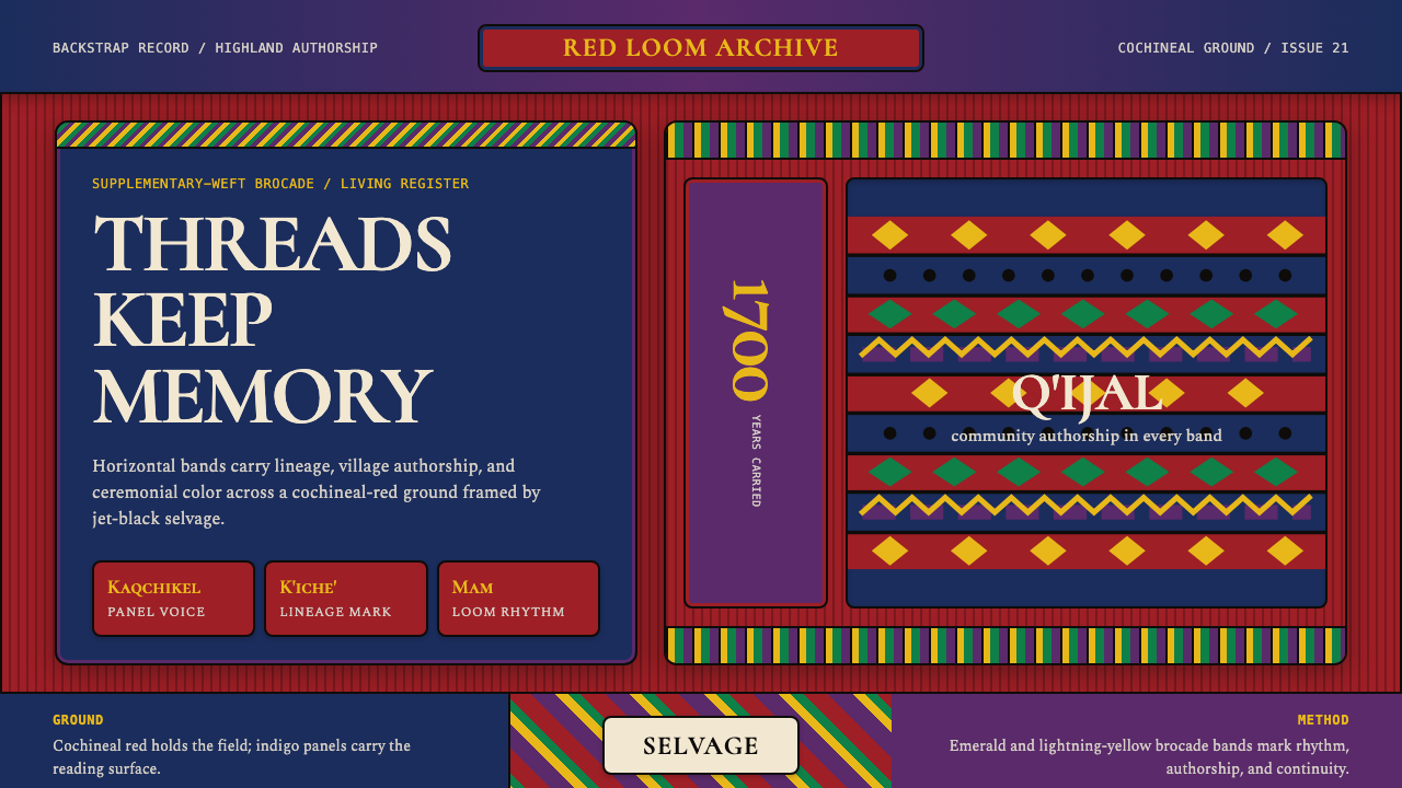 Guatemalan Huipil Maya WeaveMemory is woven dense. Cochineal red, black selvage, and brocade bands hold t…
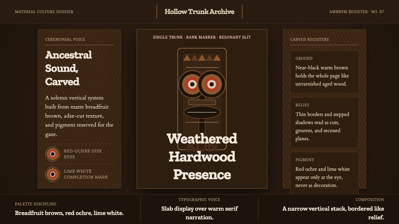 Ni-Vanuatu Slit Gong AmbrymSolemn wood made digital. Dark breadfruit brown, carved borders, red-ochre ey…
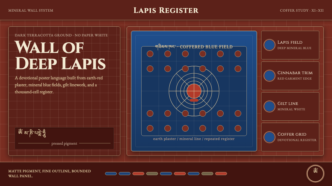 Alchi Monastery MuralDevotional depth. Lapis fields and coffered grids glow on terracotta plaster.
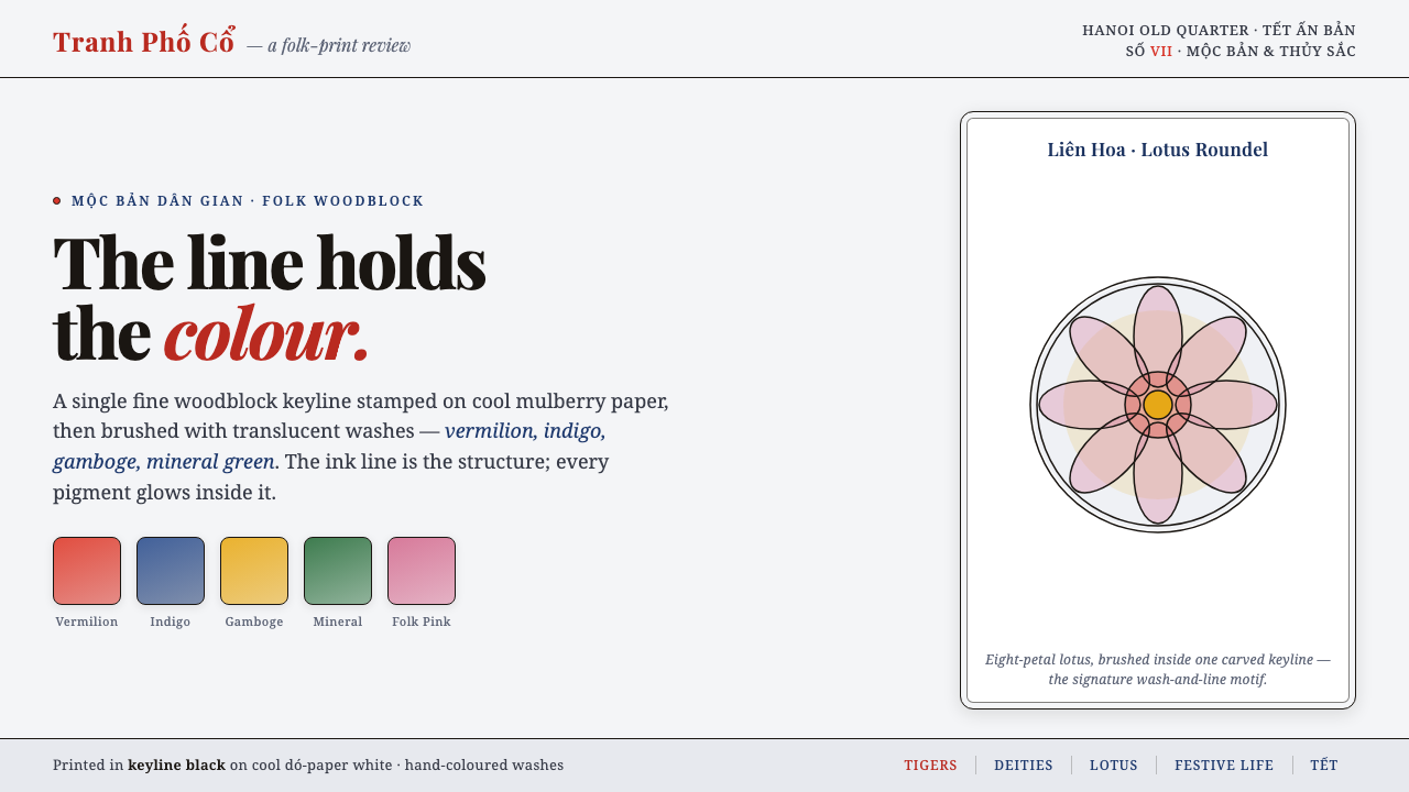 Hàng Trống Folk PrintBright folk colour, never loud. Translucent vermilion-indigo washes held insi…
 Kammavaca ManuscriptEvery surface worth gilding. Black tamarind-seed script and floating gold lea…
 Kandyan Temple Mural FriezeTemple-wall gravity. Red ochre, gold planes, black contours, white-dot regist…