What is Delacroix French Romanticism?什么是 Delacroix French Romanticism?
Delacroix turned the painted canvas into an opera — crimson banners, smoke-filled skies, and diagonal pyramids of surging bodies locked at the climactic instant of triumph or massacre.德拉克洛瓦将画布变成歌剧舞台——深红旗帜、硝烟弥漫的天空与斜向奔涌的人体金字塔,永远定格在胜利或屠戮最激烈的瞬间。
Delacroix French Romanticism in briefDelacroix French Romanticism 速览
Delacroix French Romanticism is the visual language codified by Eugène Delacroix (1798–1863) across his career at the Paris Salon, a language that placed color above line, emotional intensity above rational order, and the climactic instant above narrative sequence. Where his rival Jean-Auguste-Dominique Ingres upheld the cool contours of Neoclassicism, Delacroix made the brushstroke itself expressive — visible, energetic, at times turbulent — and organized his compositions around diagonal pyramids that drag the eye toward a single moment of maximum action.德拉克洛瓦式法国浪漫主义,是欧仁·德拉克洛瓦(1798—1863年)在巴黎沙龙的职业生涯中逐步锻造的视觉语言。这套语言将色彩置于线条之上,将情感强度置于理性秩序之上,将高潮瞬间置于叙事序列之上。他的对手安格尔坚守新古典主义的冷峻轮廓,而德拉克洛瓦则让笔触本身变得富有表现力——清晰可见、充满能量、有时甚至湍乱——并以斜向金字塔的构图牵引视线,逼向动作最激烈的单一瞬间。
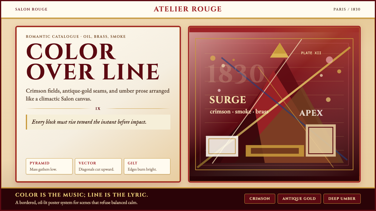
The palette is not decorative but dramatic: deep bordeaux and warm crimson anchor the darks, burnished golds and brass-tinged ochres catch the light, cool blue-greys fill the smoky middle distances, and creamy parchment tones ground the highlights. Nothing sits at polite, averaged equilibrium. Color relationships are chosen for maximum contrast and emotional resonance — the way the saturated crimson of a flag reads against smoke, or the way dull bronze glints against a figure draped in violet shadow.这套色彩体系并非装饰性的,而是戏剧性的:深玫红与暖深红锚定暗部,烧灼的金色与黄铜调赭石捕捉光线,冷蓝灰填满烟雾弥漫的中景,奶油羊皮纸色奠定高光的基底。没有任何东西安居于平静匀称的中庸状态。色彩关系的选择以最大对比度和情感共鸣为准则——正如一面饱和深红的旗帜如何在烟雾中跃然而出,或暗淡铜色如何在覆着紫罗兰阴影的人体旁微微闪光。
Equally defining is the style's relationship to ornament: not rejection (as in Bauhaus) but excess — gilded borders, intricate costumes, layered draperies, the sumptuous textile patterns of North Africa that Delacroix brought back from his 1832 Morocco journey. Applied to contemporary design, this becomes a system of rich material surfaces and editorial boldness: heavy gold filigree framing, parchment and vellum grounds, strong diagonal compositions, and type that carries the weight of a proclamation rather than the neutrality of information.同样决定性的,是这种风格与装饰之间的关系:不是拒绝(如包豪斯),而是丰盛过剩——镀金边框、繁复服饰、层叠帷幔,以及德拉克洛瓦1832年摩洛哥之行带回的北非织物图案。运用于当代设计,这演变为一套丰饶材质表面与编辑式大胆感的系统:厚重金色细工镶边、羊皮纸与牛皮纸底面、强劲斜向构图,以及承载宣言分量而非信息中性感的文字排布。
See the Delacroix French Romanticism design system查看 Delacroix French Romanticism 完整设计系统
Where does Delacroix French Romanticism come from?Delacroix French Romanticism 从何而来?
French Romanticism emerged in the 1820s as an explicit revolt against the Neoclassical doctrine enforced by the Académie des Beaux-Arts in Paris, which held that line was the supreme element of painting, that ancient Greco-Roman subjects were the only proper content for ambitious art, and that the painter's personal emotion was irrelevant to the work's quality. The Romantics disputed every one of these propositions. Influenced by the English painters John Constable and J. M. W. Turner — whose works Delacroix saw at the Paris Salon of 1824 — and animated by the political turbulence of post-Napoleonic France, they argued that color, not line, was painting's primary expressive instrument, and that contemporary history, literature, and the exotic East were as worthy of monumental treatment as any classical myth.法国浪漫主义兴起于19世纪20年代,是对巴黎美术学院所推行的新古典主义教条的公然反叛。该教条坚持:线条是绘画的最高元素,古希腊罗马题材是宏大艺术唯一正当的内容,画家的个人情感与作品质量无关。浪漫主义者对这三条主张逐一提出异议。受英国画家约翰·康斯太勃尔与约瑟夫·玛罗德·威廉·透纳的影响——德拉克洛瓦在1824年巴黎沙龙展上见到了他们的作品——又被拿破仑后时代法国的政治动荡所激活,他们主张:色彩而非线条才是绘画的首要表达工具;当代历史、文学与神秘的东方,同古典神话一样值得以纪念碑式的规格处理。
Delacroix's career was the movement's central drama. His first major Salon success, The Barque of Dante (1822), already showed the palette and compositional energy that would define him: turbulent dark water, writhing figures, a cold sky that makes the warm flesh tones strike like fire. His Massacre at Chios (1824) — depicting the Ottoman killing of Greek civilians — caused a scandal precisely because it brought contemporary atrocity into the grand-history format that Neoclassicism had reserved for elevated ancient subjects. When he reworked parts of the Massacre after seeing Constable's Hay Wain, critics were outraged; the new passages were looser, more broken, more openly brushed. He did not care.德拉克洛瓦的职业生涯是这场运动的核心戏剧。他在沙龙的第一次重大成功——《但丁之舟》(1822年)——已经呈现出日后定义他风格的色彩与构图能量:湍流的深暗水面,扭动的人体,令暖色皮肤对比如烈火般跃出的冰冷天空。《希阿岛的屠杀》(1824年)描绘了奥斯曼帝国屠杀希腊平民的暴行,引发轩然大波——正因为它将当代屠戮带入了新古典主义专为崇高古代题材保留的宏大历史格式。当他在看过康斯太勃尔的《干草车》之后重新处理《屠杀》的部分区域时,批评者勃然大怒:新的笔触更为松散、破碎、更公然外露。他不在乎。
The pivotal work is Liberty Leading the People (1830), painted in the aftermath of the July Revolution that ousted Charles X. It is not a document of historical realism — the allegorical figure of Liberty is bare-breasted and monumental, a classical goddess in a street scene — but a compression of political emotion into a single diagonal surge. Crimson, blue, and the dull white-grey of smoke organize the color; the pyramidal composition drives upward to Liberty's raised tricolor. The painting entered the Louvre, then was hidden for periods by governments that found it too inflammatory. It remains the defining image of a movement that understood spectacle as argument.转折性的作品是《自由引导人民》(1830年),创作于推翻查理十世的七月革命之后。它并非历史现实主义的文献——象征自由的寓言女神袒露上身、体态宏伟,是一位古典女神降临街头——而是将政治情感压缩进单一斜向冲势之中。深红、蓝与烟雾的暗白灰组织色彩;金字塔式构图向上驱进,直至自由女神高举的三色旗。这幅画进入卢浮宫,又因政治上被认为过于煽动性而数度被束之高阁。它至今仍是一场将奇观理解为论点的运动的决定性图像。
Delacroix's 1832 journey to Morocco and Algeria, accompanying a French diplomatic mission, transformed his palette and his archive of visual subjects permanently. He filled notebooks with drawings of markets, interiors, horses, and costume — the richly saturated textiles, the complex layering of pattern and shadow, the quality of North African light that was simultaneously harsh and warm. These sketches fed his work for the next three decades. The Orientalist strain in his output — Women of Algiers (1834), The Jewish Wedding in Morocco (1839) — brought an entirely new range of pigment relationships into French painting: acid yellows against deep ultramarine, warm saffron against cool marble-white, intricate geometric embroidery against pliant human flesh. This encounter with the visual complexity of another culture is what separates his chromatic ambition from merely theatrical excess.1832年德拉克洛瓦随法国外交使团前往摩洛哥与阿尔及利亚的旅程,永久性地改变了他的色彩库与视觉题材档案。他用速写本记录市集、室内、马匹与服饰——那些高度饱和的织物、图案与阴影的繁复叠合、北非光线同时兼具刺烈与温煦的独特品质。这些草图滋养了他此后三十年的创作。他作品中的东方主义脉络——《阿尔及利亚女人》(1834年)、《摩洛哥的犹太婚礼》(1839年)——为法国绘画引入了全新的颜料关系范畴:酸黄与深群青相对,暖藏红花色与冷大理石白相对,复杂几何刺绣与柔韧人体肌肤相对。正是这次与另一文化视觉复杂性的相遇,将他的色彩雄心与单纯的剧场式浮夸区别开来。
What defines the Delacroix French Romanticism look?Delacroix French Romanticism 的视觉特征是什么?
Dramatic Color Palette戏剧性色彩体系
The palette is built around the extremes of heat and shadow rather than harmonious middle tones. Deep bordeaux and warm crimson — the red of banners and blood — function as dominant anchors in the dark range. Burnished gold and brass-tinged ochre catch directional light and create the visual equivalent of a trumpet fanfare. Cool blue-grey fills the atmospheric middle distances — smoke, sky, shadow. Creamy parchment and warm ivory carry the highlights. The relationship is never placid: colors are chosen for their capacity to collide productively, to create the kind of sustained visual tension that Delacroix called 'the music of the painting'.这套色彩体系围绕热烈与阴暗两极构建,而非和谐的中间调。深玫红与暖深红——旗帜与血液之红——在暗部范围内充当主导锚点。烧灼的金色与黄铜调赭石捕捉定向光线,产生视觉上的铜管轰鸣感。冷蓝灰填满大气感的中景——烟雾、天空、阴影。奶油羊皮纸色与暖象牙色承载高光。这种关系从不平静:色彩的选择在于其产生碰撞的能力,在于制造那种德拉克洛瓦称之为「绘画的音乐」的持续视觉张力。
Diagonal and Pyramidal Composition斜向与金字塔构图
Where Neoclassical composition sought horizontal stability and frontal balance, Delacroix drives his compositions along steep diagonals that surge from corner to climax. Figures are stacked into pyramidal masses — bodies at the base, a dominant figure or symbol at the apex — and the whole structure tilts at an angle that creates forward momentum. This diagonal energy is the compositional signature of the style: nothing rests, everything ascends or collapses. Figures at the edges are often cropped by the frame, as if the action exceeds the canvas.新古典主义构图追求水平稳定与正面均衡,而德拉克洛瓦则沿着陡峭的对角线驱动构图,从画面一角奔涌至高潮顶点。人物被堆叠为金字塔式的块体——底部为众多身体,顶端为主导人物或象征——整个结构以某个角度倾斜,制造向前的动势。这种斜向能量是这种风格的构图签名:没有任何东西处于静止,一切都在上升或崩塌。边缘处的人物往往被画框截断,仿佛动作已溢出画布之外。
Visible, Expressive Brushwork可见而富有表现力的笔触
Unlike the smooth, almost photographic surfaces prized by the Académie, Delacroix left his marks visible. Brushstrokes are directional, energetic, and varied in width — short broken strokes describe turbulent water or churning crowd; long fluid strokes model drapery and flag. In the lighter passages, strokes of different hues are placed side by side rather than blended, creating optical color mixtures that shimmer. Charles Baudelaire, his most perceptive early critic, noted that Delacroix's works were best appreciated from a distance, where individual strokes fused into the total tonal drama rather than remaining discrete marks.有别于学院派推崇的光滑、近乎摄影式的画面,德拉克洛瓦保留了清晰可见的笔触痕迹。笔触具有方向感、充满能量、宽度各异——短促破碎的笔触描绘湍乱的水面或涌动的人群,长而流畅的笔触塑造帷幔与旗帜。在较亮的区域,不同色相的笔触被并置而非融合,创造出闪烁的光学色彩混合。他最有洞察力的早期批评者夏尔·波德莱尔指出,德拉克洛瓦的作品应从远处欣赏,在那里个别笔触融入整体的调子戏剧,而非作为孤立的标记停留于表面。
Rich Ornamental Layering丰饶的装饰叠层
Rather than stripping away ornament, the style embraces it as a carrier of emotional and cultural meaning. Gilded borders frame; intricate textile patterns — the geometric embroideries and striped silks of North Africa — assert material richness against the violence of the subject. Armor, bridles, tassels, headdresses, and the sumptuous drapery of classical costume all coexist within a single composition. The layering is never arbitrary: each decorative element creates a surface tension against which the primary action reads more starkly. Applied to design, this becomes a principle of deliberate material richness: parchment grounds, filigree rules, heavy editorial borders.这种风格不是剔除装饰,而是将其视为情感与文化意义的载体加以拥抱。镀金边框构成框架;繁复织物图案——北非的几何刺绣与条纹丝绸——在题材的暴力感中断言物质的丰盛。盔甲、马具、流苏、头饰与古典服饰的华丽帷幔,全部共存于同一构图之中。这种叠层从不是任意的:每一个装饰元素都制造一种表面张力,使主要动作在其衬托下读来更加鲜明。运用于设计,这演变为一项刻意追求物质丰饶的原则:羊皮纸底面、细工装饰线、厚重的编辑式边框。
Atmospheric Light and Shadow大气式光影
Delacroix did not use light to reveal form with clinical precision, as did Neoclassicism. He used it to create atmosphere — the hazy, smoke-diffused quality of a battlefield or the warm, oblique shaft of a North African interior. Shadows are rich in reflected color: the shadow side of warm flesh might carry cool violet, the shadow of a gold garment might hold deep olive. This treatment, which influenced the Impressionists directly, means that dark passages are never simply dark — they are chromatically alive. In design application, this translates to depth through layered tonal surfaces rather than uniform flat fields.德拉克洛瓦不像新古典主义那样用光线以临床式精确揭示形体。他用光创造大气——战场上朦胧弥漫的烟雾质感,或北非室内温暖斜射的光束。阴影中富含反射色:暖色皮肤的阴面可能承载冷紫罗兰,金色服饰的投影可能藏有深橄榄绿。这种处理直接影响了印象派,意味着暗部从不是单纯的暗——它们在色彩上是活跃的。运用于设计,这转化为通过叠层调子表面制造深度,而非依赖均匀的平面色块。
Climactic Figural Drama高潮式人体戏剧
The human body in Delacroix is never at rest. Figures strain, fall, reach upward, clutch weapons, or lie spent across the foreground. Musculature is shown at maximum exertion; drapery catches the wind of movement; faces express terror, ecstasy, or the blank abstraction of violent death. The style draws on Rubens and Michelangelo but amplifies the temperature of action — every figure is at the peak of effort or the depths of collapse, never midway. For contemporary design, this principle of 'climactic moment' becomes an argument for full-commitment editorial choices: the most striking image, the most urgent typographic weight, the most saturated color used at the single point of maximum emphasis.德拉克洛瓦笔下的人体从不处于静止之中。人物紧绷用力、跌落、向上伸展、握持武器,或力竭躺倒于前景。肌肉组织呈现于最大张力之下,帷幔在运动的风中飘扬,面孔表达恐惧、狂喜,或暴力死亡的空白茫然。这种风格借鉴鲁本斯与米开朗基罗,却将动作的温度进一步拔高——每个人物都处于努力的顶峰或崩塌的深渊,从不居于中途。对于当代设计,这种「高潮瞬间」的原则演变为全力以赴进行编辑选择的论据:最震撼的图像,最紧迫的字体分量,最饱和的色彩用于单一最大强调点。
Historical and Exotic Subject Matter历史与异域题材
Delacroix ranged across literary sources — Dante, Shakespeare, Byron, Walter Scott — and across historical periods from ancient Greece and Rome to contemporary Paris. His 1832 Morocco journey opened a sustained engagement with Islamic architecture, Berber costume, and the visual culture of the Maghreb. This breadth of reference is not decorative tourism but an argument: the Romantic movement held that all human experience, across time and geography, was legitimate artistic material. For design applications, this translates as a style that supports rich, documentary-style content: travel editorial, historical narrative, cultural exhibition branding, luxury goods that want to suggest a world larger than their category.德拉克洛瓦的创作跨越多种文学来源——但丁、莎士比亚、拜伦、沃尔特·司各特——以及从古希腊罗马到当代巴黎的各个历史时期。1832年的摩洛哥之行开启了他与伊斯兰建筑、柏柏尔服饰和马格里布视觉文化的持续对话。这种宽广的参照并非装饰性的猎奇,而是一种主张:浪漫主义运动认为,跨越时间与地域的一切人类经验,都是合法的艺术材料。运用于设计,这转化为一种支持丰富纪录式内容的风格:旅行编辑内容、历史叙事、文化展览品牌,以及意图暗示超越自身品类之宏大世界感的奢侈品。
See the Delacroix French Romanticism design system查看 Delacroix French Romanticism 完整设计系统
Who shaped Delacroix French Romanticism?谁塑造了 Delacroix French Romanticism?
The central figure of the movement, Delacroix (1798–1863) exhibited at every Paris Salon from 1822 onward, accumulating a body of work of extraordinary range — from Shakespearean subjects and Byronic Eastern tales to contemporary history and intimate Moroccan interior scenes. He was elected to the Institut de France only after seven unsuccessful attempts, a measure of how thoroughly the academic establishment resisted his methods. His late mural commissions — the ceiling of the Galerie d'Apollon at the Louvre, the Chapel of the Holy Angels at Saint-Sulpice — demonstrate that his energetic chromatic method was as capable of monumental architectural integration as of easel drama. His journals, published posthumously, remain the most sustained written account of Romantic painting theory in French.运动的核心人物,德拉克洛瓦(1798—1863年)自1822年起参加每一届巴黎沙龙,积累了范围非凡的创作——从莎士比亚题材、拜伦式东方故事到当代历史与亲密的摩洛哥室内场景。他在七次落选后才当选法兰西学院院士,足以衡量学院建制对其方法的全力抵制。他晚期的壁画委托作品——卢浮宫阿波罗画廊天顶画、圣叙尔皮斯教堂圣天使礼拜堂——证明他富有能量的色彩方法同样能够完成纪念碑式的建筑整合,而不只是架上绘画的戏剧性表达。他身后出版的日记,是法语中对浪漫主义绘画理论最为持续深入的书面阐述。
Géricault (1791–1824) was the elder by seven years and the movement's first explosive voice. His Raft of the Medusa (1819) — an enormous canvas depicting the survivors of a government shipwreck scandal — brought the Romantic temperament directly into grand-format history painting a decade before Delacroix's Liberty. The work's pyramidal composition of tangled bodies straining toward a distant ship, its grey-green deathly palette shot through with warm flesh tones, and its insistence on contemporary catastrophe as monumental subject are all elements Delacroix absorbed and intensified. Géricault died at thirty-two from a riding accident, and Delacroix — who had posed for the Raft and knew him well — inherited the movement's leadership.热里科(1791—1824年)年长七岁,是这场运动第一个爆炸性的声音。他的《梅杜萨之筏》(1819年)——一幅描绘政府船难丑闻幸存者的巨幅画作——在德拉克洛瓦的《自由》早十年,就将浪漫主义气质带入了宏大历史画格式。画作中扭结人体向远处船只伸张的金字塔式构图、贯穿着暖色皮肤调的灰绿死寂色彩,以及将当代灾难作为纪念碑式题材的坚持,都是德拉克洛瓦吸收并强化的元素。热里科因骑马事故在三十二岁英年早逝;曾为《筏》摆姿势且与他相识甚深的德拉克洛瓦,接过了运动的领导权。
Baudelaire (1821–1867) was not a painter but the critic who gave Delacroix's work its most penetrating theoretical framework. His Salon reviews of 1845 and 1846 articulated why Delacroix was 'the last great painter of the old world and the first of the new' — a figure whose obsessive relationship with color, whose ability to communicate states of feeling rather than merely depicting events, and whose visible brushwork anticipated the full break from academic tradition that Impressionism would complete. His essay 'The Painter of Modern Life' (1863) extended this argument into a general theory of Romantic art as the art of capturing the transient, the fleeting, and the contingent — against the academy's insistence on the timeless and the ideal.波德莱尔(1821—1867年)并非画家,而是赋予德拉克洛瓦作品最深刻理论框架的批评家。他1845年和1846年的沙龙评论阐明了为何德拉克洛瓦是「旧世界最后一位伟大画家,同时也是新世界第一位」——一个对色彩的痴迷性关系、传达情感状态而非仅仅描绘事件的能力,以及可见笔触,都预告了印象派将要完成的对学院传统的彻底决裂。他的文章《现代生活的画家》(1863年)将这一论点延伸为浪漫主义艺术的普遍理论:捕捉瞬息、流逝与偶然——以对抗学院对永恒与理想的坚持。
Ingres (1780–1867) is best understood in relation to Delacroix because the two men defined French painting by opposing each other for four decades. Where Delacroix made color primary and rendered it with broken, visible strokes, Ingres believed that drawing — precise, sculptural, contour-defining line — was the only true foundation of painting. Where Delacroix sought the moment of emotional maximum, Ingres constructed images of idealized, almost breathless calm. The debate between them — called the querelle du coloris in its eighteenth-century form, revived in the nineteenth — was not merely aesthetic but philosophical: a dispute about whether sensation or intellect, impulse or system, was the higher faculty in art. Contemporary designers who understand this opposition understand Romanticism better than those who approach it as a style catalog.安格尔(1780—1867年)与德拉克洛瓦的关系是理解两者的最佳方式,因为这两个人通过四十年的相互对立定义了法国绘画。德拉克洛瓦以色彩为首位,以破碎可见的笔触呈现之;而安格尔则相信,素描——精确的、雕塑感的、界定轮廓的线条——才是绘画唯一真正的基础。德拉克洛瓦追求情感极值的瞬间,而安格尔则构建理想化的、近乎屏息凝神的宁静图像。两人之间的争论——在十八世纪被称为「色彩之争」,在十九世纪再度燃起——不仅仅是美学层面,而是哲学层面的:一场关于感觉还是理智、冲动还是系统,究竟是艺术中更高官能的争论。理解这场对立的当代设计师,比那些将浪漫主义视为风格目录来对待的人,对这一运动有着远更深刻的把握。
Fromentin (1820–1876) was both a painter in the Romantic Orientalist tradition and the author of Les Maîtres d'autrefois (1876), one of the most lucid accounts of the Flemish and Dutch painting traditions that Delacroix himself drew on. As a painter, Fromentin traveled extensively in Algeria and brought back canvases depicting Arab horsemen, desert light, and the architectural textures of the Maghreb with a chromatic sensitivity that extended Delacroix's North African discoveries into a sustained documentary practice. His work demonstrates how the Romantic relationship with the exotic could become rigorous ethnographic observation rather than projective fantasy — a distinction that matters for designers who want to use this style's rich visual vocabulary without reducing it to theatrical surface.弗洛芒坦(1820—1876年)既是浪漫主义东方主义传统的画家,也是《昔日大师》(1876年)的作者——这是对德拉克洛瓦本人所借鉴的佛兰德斯与荷兰绘画传统最为清晰的阐述之一。作为画家,他广泛游历阿尔及利亚,带回描绘阿拉伯骑手、沙漠光线与马格里布建筑肌理的画作,以一种将德拉克洛瓦的北非发现延展为持续纪录实践的色彩敏感性。他的作品证明,浪漫主义与异域的关系可以成为严格的民族志观察,而非投射性幻想——这一区别,对于那些希望运用这种风格丰富视觉词汇而不将其简化为剧场表面的设计师,具有重要意义。
How do you use Delacroix French Romanticism today?今天怎么用 Delacroix French Romanticism?
Delacroix French Romanticism is among the most visually commanding historical styles available to contemporary designers, precisely because its organizing principle — the compressing of maximum emotion into a single, decisive compositional instant — translates directly into high-impact presentation and editorial work. Applying it well requires understanding that the style's power comes from tension and selectivity, not from indiscriminate richness. The parchment ground, the crimson accent, the gold filigree border: each element earns its place by making every other element read more clearly against it.德拉克洛瓦式法国浪漫主义是当代设计师可资调用的最具视觉统摄力的历史风格之一,恰恰因为其组织原则——将最大情感压缩进单一决定性构图瞬间——直接转化为高冲击力的演示与编辑作品。正确运用它,需要理解这种风格的力量来自张力与选择性,而非漫无节制的丰饶。羊皮纸底面、深红点缀、金色细工边框:每个元素因使其他所有元素在其衬托下读来更清晰,而赢得自己的位置。
For presentation slides, the style transforms both cover and content treatment. A cover in this mode uses a steeply diagonal compositional axis — the title block set low-left while a principal image or abstract form surges toward the upper-right — against a warm parchment or aged-vellum ground. Gold rule lines at the top and bottom edge complete the framing without overcrowding. Section dividers work best as near-full-bleed crimson or deep bordeaux fields with the section title in cream type: the color shift is announcement enough. Data slides should resist the temptation to introduce too many accent colors; choose one — crimson for emphasis, gold for callouts — and use deep charcoal rather than pure black for body text, to stay within the palette's warmth register.在演示文稿中,这种风格能同时改变封面与内容页的处理方式。这种模式下的封面采用陡峭斜向构图轴——标题块置于左下,主要图像或抽象形态向右上奔涌——底面使用暖羊皮纸或做旧牛皮纸质感。顶部与底部的金色细线完成框架而不至于过度拥挤。分节页最好处理为接近全出血的深红或暗玫红色块,节标题以奶油色文字呈现:色彩的转换本身就足以作为宣告。数据页应克制引入过多强调色的诱惑;选择一种——深红用于强调,金色用于标注——正文文字使用深炭灰而非纯黑,以保持在色板的暖调音域之内。
For web interfaces, the style is best suited to contexts where editorial authority and cultural depth are the primary brand signals: luxury goods landing pages, cultural institution sites, travel and hospitality platforms, high-end editorial publications. Dashboard and pricing applications are feasible but require discipline: the palette's warmth must be balanced against the neutral legibility demands of dense data. In practice, this means using the parchment-and-bordeaux palette for navigation, hero sections, and feature callouts, while reverting to near-white grounds and charcoal type for data-dense table and card regions. Hover and interactive states can carry a gold or crimson accent without overwhelming the information structure.对于网页界面,这种风格最适合编辑权威感与文化深度是首要品牌信号的场景:奢侈品落地页、文化机构网站、旅行与酒店平台、高端编辑出版物。仪表板与定价页面的应用是可行的,但需要严格自律:色板的温度感必须与密集数据对可读性的中性需求取得平衡。在实践中,这意味着将羊皮纸与玫红色板用于导航、主视觉区块与特性标注,而在数据密集的表格与卡片区域回归接近白色的底面与炭灰文字。悬浮与交互状态可以承载金色或深红强调而不至于压倒信息结构。
For editorial and marketing work, the style is at its most natural. A marketing page built on this system uses alternating full-width sections: warm parchment ground with deep-charcoal headline and bordeaux subhead, then a near-black ground with gold headline — the oscillation creates the visual rhythm of a broadsheet without requiring photographic content. Pull-quote treatments work especially well: oversized opening guillemets in gold, a single tight line of large warm-cream type, a thin gold rule beneath. Event posters and conference identity materials respond well to the diagonal compositional logic — title text angled slightly, supporting information arranged along the same axis, a crimson or gold bar running diagonally across a corner.对于编辑与营销内容,这种风格最为自然。基于这套系统构建的营销页面使用交替的全宽版块:暖羊皮纸底面配深炭灰标题与玫红副标,然后切换至近黑色底面配金色标题——这种振荡制造了报纸式的视觉节奏,无需依赖摄影内容。引用块处理效果尤佳:金色的超大开引号,一行紧凑的大字号暖奶油文字,下方一条细金线。活动海报与会议视觉识别材料对斜向构图逻辑反应良好——标题文字略微倾斜,辅助信息沿同一轴线排布,一条深红或金色色带在某个角落斜向穿越。
A common mistake when applying this style is confusing richness with excess. Delacroix's paintings are sumptuous but not chaotic — every composition has a clear spine, a dominant value structure, and a single point of maximum intensity. Designers often import the decorative vocabulary (gold borders, parchment grounds, ornate frames) without maintaining this underlying compositional discipline, producing work that reads as costume rather than character. The rule: before adding any ornamental element, identify the single strongest visual statement in the layout and ensure that every decorative addition serves to direct attention toward it, not away from it. If an element competes with the climactic center, it belongs elsewhere or not at all.运用这种风格时最常见的错误,是混淆丰饶与过剩。德拉克洛瓦的画作华美,但并不混乱——每一幅构图都有清晰的骨干、主导的明度结构,以及单一的最大强度点。设计师常常引入装饰词汇(金色边框、羊皮纸底面、繁复画框)却没有维护这种底层的构图自律,产出的作品读来像服装而非性格。规则是:在添加任何装饰元素之前,先识别版面中最强的单一视觉陈述,并确保每一处装饰性添加都服务于将注意力引导向它,而非偏离它。若某个元素与高潮中心形成竞争,它应当被置于别处,或干脆不出现。
See the Delacroix French Romanticism design system查看 Delacroix French Romanticism 完整设计系统
Delacroix French Romanticism — FAQDelacroix French Romanticism · 常见问题
How is French Romanticism different from Baroque, which also uses dramatic color and diagonal composition?法国浪漫主义与同样使用戏剧性色彩和斜向构图的巴洛克风格有何不同?
The confusion is understandable — Delacroix himself was deeply influenced by Rubens and admired Rembrandt. The key distinctions are subject matter, emotional register, and the role of the brushstroke. Baroque drama, especially in Rubens, is triumphalist and sensuous — it celebrates earthly power, religious glory, and the opulence of flesh. Romantic drama is shot through with melancholy, political urgency, and the consciousness of loss: Liberty Leading the People mourns and celebrates simultaneously. The brushstroke is also different in kind: Baroque surfaces, however energetic, are typically blended and polished; Romantic surfaces are explicitly worked, even rough. Applied to design, Baroque suggests ceremony and institutional authority, while Romanticism suggests urgency, emotional authenticity, and the individual human cost of historical events.这种混淆是可以理解的——德拉克洛瓦本人受鲁本斯深刻影响,也敬仰伦勃朗。关键区别在于题材、情感音域与笔触的功能。巴洛克的戏剧感,尤其在鲁本斯那里,是凯旋式与感官性的——它颂扬世俗权力、宗教荣耀与肉体的丰腴。浪漫主义的戏剧感贯穿着忧郁、政治紧迫感与失落的意识:《自由引导人民》同时在哀悼与庆祝。笔触也在性质上有所不同:巴洛克画面无论多么富有能量,通常经过融合与磨光;浪漫主义画面是外显地被处理过的,甚至是粗粝的。运用于设计,巴洛克暗示仪式感与制度权威,而浪漫主义则暗示紧迫性、情感真实性,以及历史事件的个体人类代价。
Can the Delacroix style work for digital product interfaces, or is it purely editorial?德拉克洛瓦风格能用于数字产品界面,还是纯粹适合编辑内容?
It works for digital interfaces in specific contexts, but requires careful translation. The style's emotional intensity and ornamental richness are best suited to contexts where slowness and savoring are part of the user experience — a luxury e-commerce site, a cultural institution's collection browser, a travel booking platform targeting the premium end of the market. It is poorly suited to utility-first interfaces: high-frequency trading dashboards, enterprise analytics tools, or any application where the user needs to extract information at speed with minimal friction. When adapting the style to digital UI, the practical approach is to preserve the palette and compositional principles — warm grounds, crimson or gold accent, diagonal editorial framing — while simplifying the ornamental density for the constraints of component-based layout systems.在特定场景下适用于数字界面,但需要谨慎转译。这种风格的情感强度与装饰丰富性,最适合慢节奏与细细品味是用户体验一部分的场景——奢侈品电商网站、文化机构的藏品浏览器、面向高端市场的旅行预订平台。它不适合以功能效率为首位的界面:高频交易仪表板、企业分析工具,或任何用户需要以最小摩擦快速提取信息的应用。将这种风格适配到数字UI时,实际的方法是保留色板与构图原则——暖色底面、深红或金色点缀、斜向编辑框架——同时为基于组件的布局系统的约束条件简化装饰密度。
What is the role of the parchment or aged-paper ground in this style, and can it be substituted?羊皮纸或做旧纸张底面在这种风格中扮演什么角色,可以替换吗?
The warm ground is not decorative but functional. Against a cream or parchment surface, the bordeaux and crimson accents read as warm-on-warm, creating a sensuous depth rather than the stark cold contrast of the same red on pure white. The gold tones integrate naturally rather than clashing. And the overall effect positions the work in a historical and material register — the impression of paper with age, of documents and manuscripts — that is central to the style's authority. It can be substituted: a very dark ground (deep olive, near-black charcoal) produces a 'dramatic night' variant that preserves the tension. What cannot be substituted without losing the style's character entirely is pure cool white or saturated digital blue — these belong to design languages with incompatible values.暖色底面并非装饰性的,而是功能性的。在奶油或羊皮纸表面衬托下,玫红与深红强调色呈现为暖调叠暖调,制造出感官性的深度,而非同样的红色在纯白底面上产生的冷峻对比。金色调自然融入而不产生冲突。整体效果将作品定位于历史与物质的音域——纸张随时间积淀的印象,文献与手稿的质感——这是这种风格权威性的核心。它可以被替换:非常深的底面(深橄榄绿、近黑炭灰)产生一种「戏剧夜色」变体,保留了张力。完全不能替换而不彻底失去这种风格性格的,是纯冷白或饱和数字蓝——这些属于价值观不相容的其他设计语言。
How does the Orientalist dimension of Delacroix's work bear on design applications today?德拉克洛瓦作品中的东方主义维度,对今天的设计应用有何影响?
The Orientalist strain in Delacroix is both the richest source of his chromatic complexity and the most historically contested aspect of his legacy. His Morocco notebooks and the paintings they generated introduced genuinely specific visual observation — the quality of North African light, the geometry of Islamic tilework, the layering of Berber textile patterns — into European painting. At the same time, scholars since Edward Said have analyzed how this encounter was filtered through projective Western assumptions about the 'exotic East'. For design, the practical implication is this: the palette innovations that came from Delacroix's North African encounter — the acid yellow-against-ultramarine, the warm saffron-against-cool-white, the complex layered pattern work — are available as visual resources. Using them in contemporary work is a matter of applying color and pattern intelligence, not of replicating or endorsing the colonial framework through which Delacroix originally encountered these traditions.德拉克洛瓦作品中的东方主义脉络,既是其色彩复杂性最丰富的来源,也是其遗产中历史上最具争议的方面。他的摩洛哥速写本及由此生发的画作,将真实具体的视觉观察——北非光线的品质、伊斯兰花砖的几何性、柏柏尔织物图案的叠层——引入了欧洲绘画。与此同时,爱德华·萨义德以降的学者分析了这次相遇如何被西方对「神秘东方」的投射性假设所过滤。对于设计,实际的含义是:德拉克洛瓦的北非相遇带来的色彩创新——酸黄对深群青,暖藏红花色对冷白,复杂叠层的图案工作——可作为视觉资源加以运用。在当代作品中使用它们,是运用色彩与图案智识的问题,而非复制或背书德拉克洛瓦最初接触这些传统时所依附的殖民框架。
What distinguishes an authentic application of this style from a generic 'vintage luxury' aesthetic?这种风格的真实运用与泛化「复古奢华」美学之间有何区别?
The generic 'vintage luxury' aesthetic borrows surface markers — warm grounds, gold accents, serif type, aged texture — without the compositional logic that gives those elements their force. Delacroix's style has a specific structural grammar: the diagonal compositional surge, the clear value hierarchy from dark base to light apex, the single point of maximum chromatic intensity, the strategic use of ornament to frame rather than fill. A piece that uses parchment grounds and gold rules but arranges its content in centered, symmetric, horizontally stable blocks is not Romantic — it is Victorian Revival or generic period pastiche. The test is whether the layout has a climactic center that everything else serves. If the design could be rotated ninety degrees without losing meaning, it lacks the directional energy that is the style's deepest principle.泛化的「复古奢华」美学借用了表面标志——暖底面、金色点缀、衬线字体、做旧质感——却没有赋予这些元素力量的构图逻辑。德拉克洛瓦风格有其具体的结构语法:斜向构图冲势,从暗色基底至亮色顶端的清晰明度层级,单一的最大色彩强度点,以框架而非填充为目的的装饰策略性运用。一件使用羊皮纸底面与金色细线,却将内容以居中、对称、水平稳定的方式排布的作品,不是浪漫主义——而是维多利亚复兴或泛化的时代风格仿制。检验标准是:版面是否有一个高潮中心,其他一切都服务于它。如果这个设计旋转九十度后意义不变,它就缺乏这种风格最深层原则所要求的方向性能量。
Related design styles相关设计风格
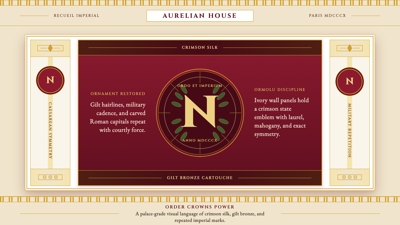 Napoleonic Empire StyleImperial order speaks. Crimson silk, gilt hairlines, and strict symmetry fram…帝国秩序发声:深红丝绸、鎏金细线与对称框架托起 N 印。
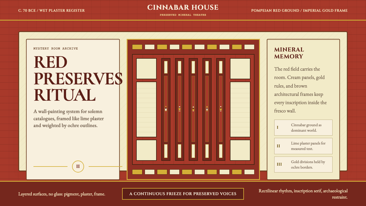 Pompeii Fresco Villa of MysteriesThe wall is the world. Pompeian red, cream plaster panels, and gold frames ho…墙面即世界。庞贝红、石灰奶油面板与金色框线托住仪式。
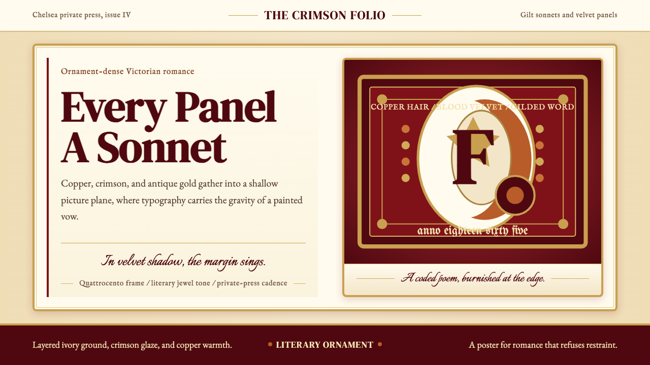 Rossetti — Pre-Raphaelite StunnerRomance refuses restraint. Crimson velvet, copper serif, and gilt frame turn…浪漫拒绝克制:血红天鹅绒、铜色衬线与鎏金画框让文字成诗。
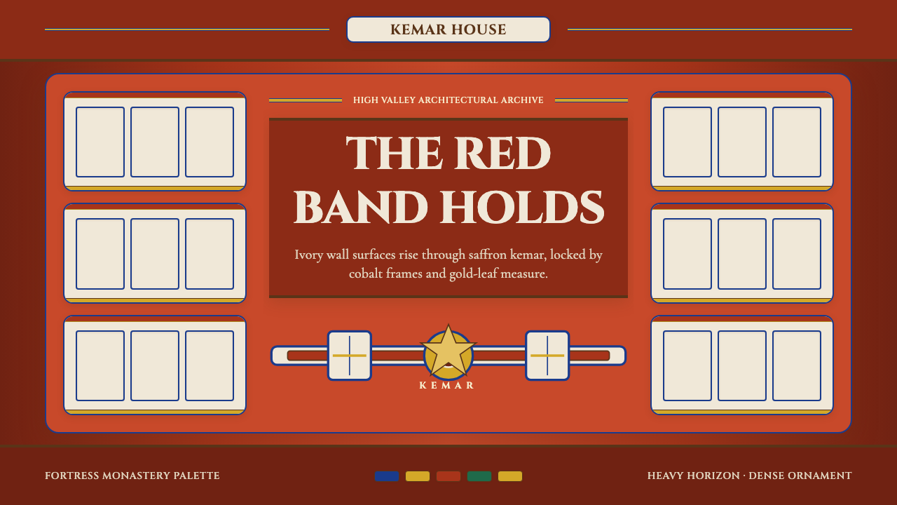 Bhutanese Dzong (Fortress Red)Monumental red holds the page. Cobalt frames and gold bands lock the fortress…厚重藏红掌控页面。钴蓝窗框与金色横带锁定宗堡节奏。
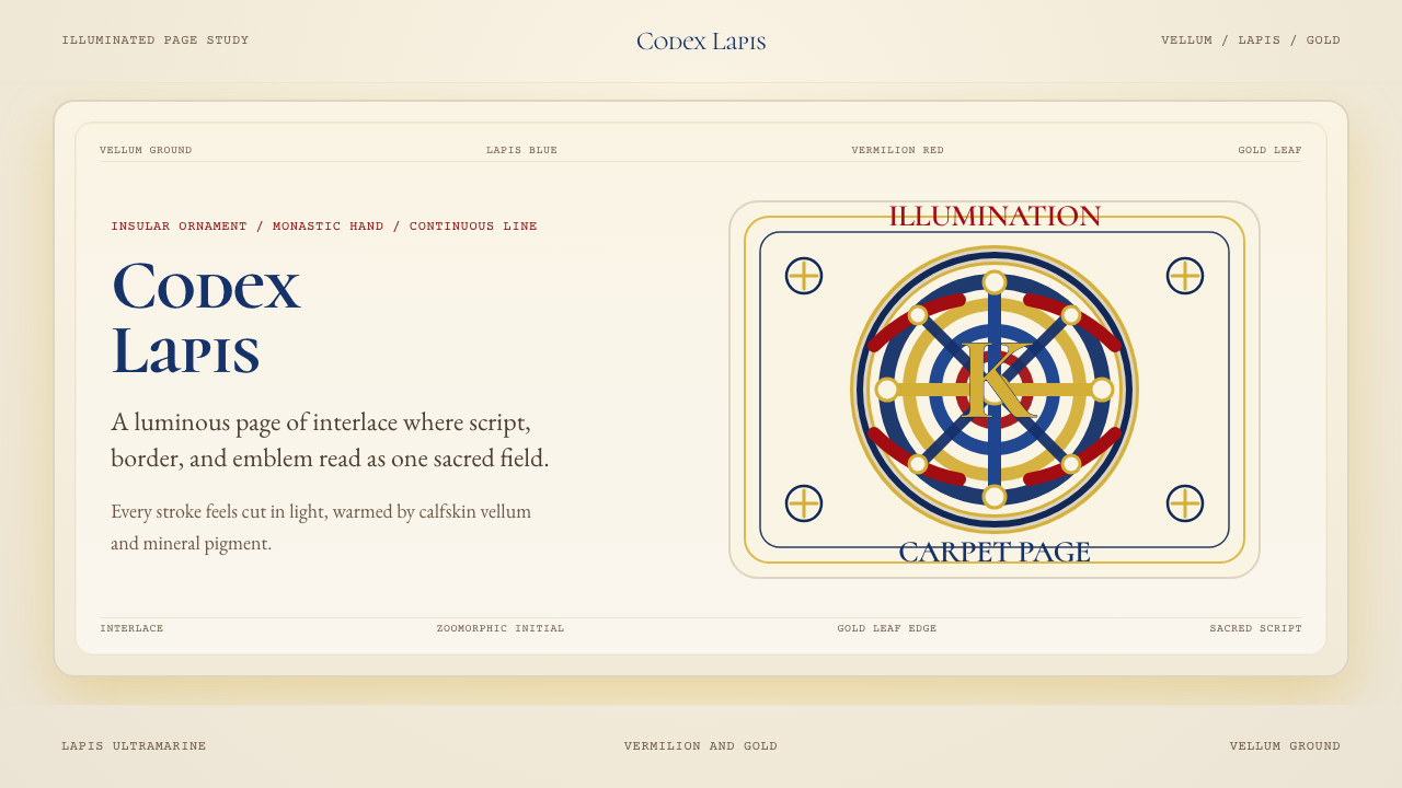 Book of Kells Celtic (800)Sacred and precise. Vellum cream, lapis, vermilion, and gold knotwork.神圣而精密。奶油羊皮底上铺陈青金石、朱砂与金色缠结纹。
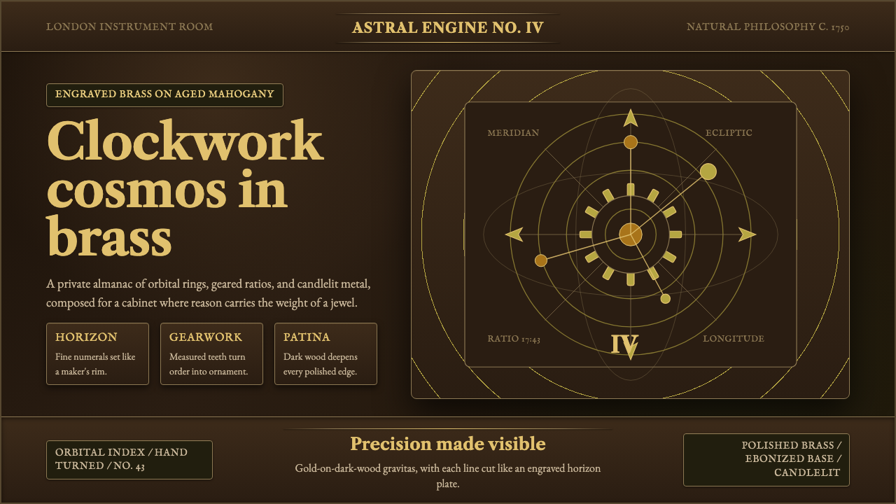 Brass OrreryTurns reason into gold. Brass rings and Caslon type glow over near-black maho…理性化作金色宇宙。黄铜轨环与卡斯隆字体在深桃花心木上发光。