What is Russian Lubok?
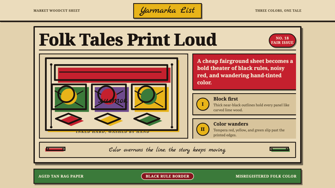
Russian Lubok sings like a folk broadsheet — bold black woodcut lines on tan rag paper, with red and green color happily overrunning the edges.
Russian Lubok in brief
The lubok is the Russian popular woodcut print — cheap, vivid folk broadsheets hawked at fairs and markets from the seventeenth century onward, aimed squarely at ordinary people rather than aristocratic patrons. A black block-printed outline was struck onto coarse rag paper, and then the sheet was hand-colored with tempera thinned to something close to watercolor, so the wash of color happily overruns the printed line rather than sitting neatly inside it.
Each sheet typically married a bold, legible narrative scene — a folk tale, a satirical episode, a religious story, a political jab — to looping Cyrillic captions rendered in a joyful, deliberately unrefined hand, so that image and text worked together as a single unit of storytelling rather than illustration paired with separate typeset copy. The color palette was restricted, usually to three or four hues, which forced every sheet toward bold, simplified shapes rather than naturalistic shading or subtle gradation.
The overall effect is folk storytelling made print: naive, direct figures, beasts, and ornamental borders, framed in caption banners, with color and line never quite in register with one another. That slight misalignment between the black outline and the hand-applied color is not a flaw to be corrected — it is the visible signature of a fast, cheap, hand-finished production process repeated across thousands of copies for a mass popular audience.
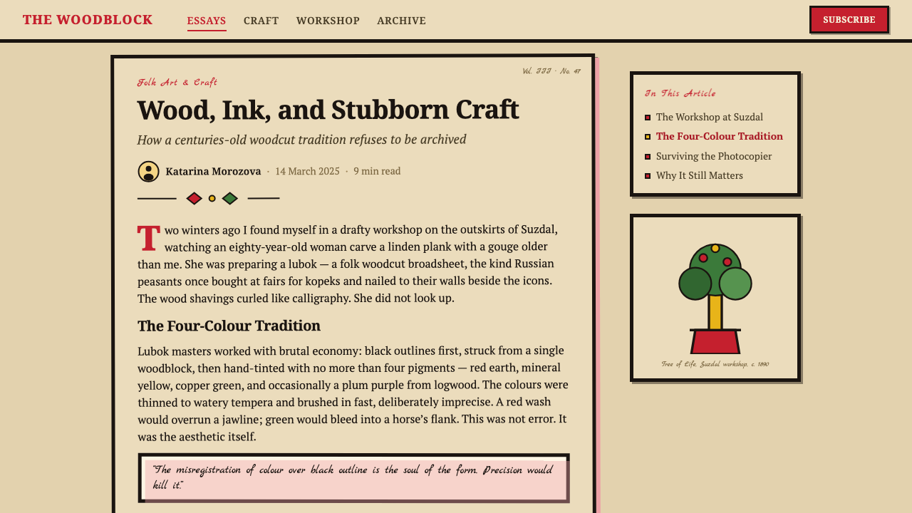
Where does Russian Lubok come from?
The lubok tradition emerged in Russia in the seventeenth century, drawing on woodblock printing techniques that had circulated through Europe for centuries but adapting them to a distinctly popular market — cheap sheets sold at fairs, markets, and by traveling peddlers known as ofeni, who carried folded prints alongside other small goods to villages far from any printing center. Unlike icon painting or aristocratic portraiture, which served the church and the court, the lubok served everyone else: literate and semi-literate townspeople and villagers who wanted stories, jokes, news, and moral instruction in an affordable, visually vivid form.
Subject matter ranged enormously: religious and biblical scenes, illustrations of folk tales and proverbs, satirical images mocking foreigners, officials, or social types, alongside sheets that functioned almost as broadsheet news, depicting battles, comets, or notable events for an audience that had no other easy access to imagery of them. Because the prints were cheap and produced in large runs from carved wooden blocks that wore down and were recut over time, individual sheets varied in quality, and hand-coloring by different colorists introduced further variation from copy to copy — no two hand-colored lubok prints were ever perfectly identical.
By the eighteenth and nineteenth centuries the tradition had become a genuinely mass medium, produced in print workshops around Moscow and other cities and distributed across the empire, reaching a peak of both popularity and stylistic confidence before industrial printing and, eventually, photography and mass media began to displace the hand-produced woodblock sheet. Bibliographer and historian Dmitry Rovinsky undertook the major nineteenth-century scholarly effort to catalog and preserve surviving lubok prints, and his multi-volume study remains a primary reference for understanding the tradition's full range of subjects and styles.
The lubok's bold, deliberately unrefined visual language became a direct inspiration for Russian avant-garde painters in the early twentieth century, who saw in its naive figures and flattened color a model for breaking with academic realism. Natalia Goncharova and Mikhail Larionov, key figures of Russian Neo-primitivism, drew explicitly on lubok imagery and folk print conventions in their own paintings, treating the humble popular woodcut as a legitimate and even radical artistic source rather than a merely decorative folk curiosity.
What defines the Russian Lubok look?
Color
A restricted palette of typically three or four hues — commonly black outline with red, green, and yellow washes — applied by hand over the printed line. Colors are flat and saturated rather than shaded or blended, forcing simplified, bold shapes rather than naturalistic modeling.
Misregistered Color
Hand-applied color washes rarely align precisely with the printed black outline beneath them — a red fill might spill a few millimeters past the line it is meant to fill, or fall slightly short of it. This misregistration is a defining, deliberate-feeling visual signature of the tradition, not an error to be corrected in any faithful rendering of the style.
Bold Black Outline
Every figure, animal, and ornamental element is defined first by a heavy, confident black outline printed from a carved wood block. The line carries the entire compositional structure; color is secondary and applied afterward, so the outline alone should read clearly even without any color present.
Cyrillic Caption Banners
Looping, hand-rendered Cyrillic text sits within its own banner or panel, integrated directly into the composition rather than set apart as separate typeset copy. The lettering has a deliberately unrefined, joyful quality, matching the naive energy of the figures it accompanies.
Naive Figuration
Human and animal figures are rendered directly and simply, without academic proportion or naturalistic anatomy — flattened poses, exaggerated gestures, and simplified facial features that prioritize legibility and narrative clarity over realistic depiction.
Aged Paper Ground
The printing surface is coarse, tan-toned rag paper rather than smooth white stock, giving every sheet a warm, slightly rough ground that the black line and color washes sit against. The paper's texture and tone are part of the visual identity, not a neutral backdrop.
Banner Framing
Compositions are frequently divided into panels or framed by decorative banner borders, separating a main narrative scene from its caption or from secondary vignettes. This framing gives even a single busy sheet a legible internal structure, guiding the eye through the story in sequence.
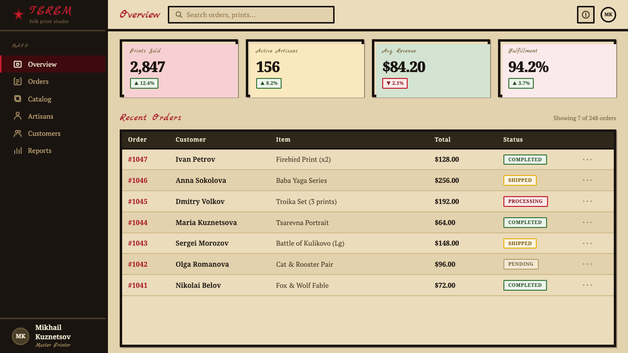
Who shaped Russian Lubok?
A leading figure of the Russian avant-garde and Neo-primitivism, Goncharova drew explicitly on lubok imagery and folk print conventions in her own paintings, treating the popular woodcut's naive figuration and flattened color as a legitimate foundation for radical modern art rather than a merely decorative folk curiosity.
Working alongside Goncharova, Larionov was a central figure of Russian Neo-primitivism who incorporated lubok-derived imagery, bold outline, and folk narrative structure into his paintings, helping establish the popular woodcut as a serious reference point for the Russian avant-garde.
A nineteenth-century bibliographer and historian, Rovinsky undertook the major scholarly effort to catalog and preserve surviving lubok prints in a multi-volume study, work that remains the primary reference for understanding the full historical range of lubok subjects, printing techniques, and regional variation.
How do you use Russian Lubok today?
Russian Lubok is a style for products that want to feel folk, narrative, and joyfully unrefined rather than polished or corporate — storytelling platforms, cultural and heritage content, children's or folk-tale publishing, or any brand that wants a sense of popular, hand-made mass communication rather than fine-art seriousness.
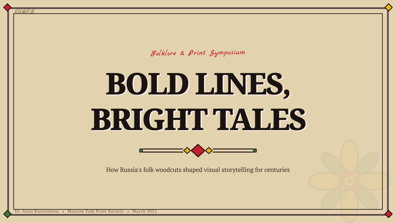
For presentation slides, a cover works well as a bold, single narrative image with a black-outlined figure and hand-colored wash, framed by a caption banner carrying the title in a slightly playful, hand-lettered feel. Content slides can use the panel-and-banner structure of a lubok sheet directly as a layout device — dividing information into framed sections the way a lubok separates scenes. Data slides should resist smooth, gradient-shaded charts in favor of flat, bold color blocks that deliberately overrun their outlines slightly, echoing the misregistered color of the original prints.
For web interfaces, the style suits cultural, educational, or entertainment products aimed at a broad, popular audience rather than a professional or enterprise one. Buttons and cards can use a heavy black outline with a flat color fill that slightly overshoots its border, and Cyrillic-inspired or folk-lettering display type can be reserved for headlines while body copy stays plain and legible.
For editorial and marketing work, the lubok's caption-banner structure makes an effective device for pull-quotes, section headers, or callout boxes — a bold black-outlined banner containing a short line of text, echoing the way a lubok sheet integrates caption directly into its composition. Marketing pages for folk, craft, or storytelling-driven brands benefit from the tan paper ground and restricted, flat color palette used throughout rather than confined to a single decorative element.
A common mistake is to render the color too cleanly registered with the black outline, which produces a generic 'folk clip art' look rather than the specific lubok signature — the color should overrun the line slightly and inconsistently, varying from element to element, the way hand-applied tempera actually behaved. Equally, using more than three or four colors across a composition dilutes the effect; the style's boldness depends on real restriction, not a full decorative rainbow.
Russian Lubok — FAQ
Is lubok the same as a generic 'folk illustration' style?
It shares folk subject matter with many traditions but is defined by a specific production logic: a black woodblock outline struck onto coarse tan paper, then hand-colored in a restricted three-or-four-color palette that deliberately misaligns with the printed line. A generic folk illustration with clean, well-registered color and unlimited hues misses the defining visual signature — the overrun, imperfect color wash — that makes lubok recognizable as lubok.
Can lubok's color palette be expanded beyond three or four hues?
It can, but doing so moves away from the historical constraint that gave the style its bold simplicity. The restricted palette forced every lubok printmaker to solve visual problems through shape, line, and composition rather than color variety, which is a large part of why the style reads as bold and confident rather than fussy. Expanding the palette significantly risks producing something closer to generic decorative folk art than an authentic lubok reference.
How does lubok relate to the Russian avant-garde, given it looks so much older and folk-oriented?
Despite its humble popular origins, lubok became a direct and explicit source for early-twentieth-century Russian avant-garde painters, particularly Natalia Goncharova and Mikhail Larionov, who saw in its naive figuration and flat color a way to break decisively with academic realism. This gives lubok an unusual dual identity: a centuries-old mass folk medium that also became foundational to Russian modern art.
Does lubok suit modern digital products, or is it too tied to print?
It translates well to digital contexts that want a folk, narrative, or popular-storytelling voice — children's content, cultural platforms, or brands built on approachable, communal storytelling rather than corporate polish. It is a poor fit for products needing to feel precise, technical, or high-end, since the style's entire appeal rests on its deliberate roughness and mass-popular, rather than refined, character.
What role does the caption banner play, and can it be dropped in a design that has no room for text?
The caption banner is central to lubok's identity as a medium that fused image and text into a single storytelling unit rather than treating them as separate elements — dropping it entirely removes an essential part of what makes the style recognizable. If a specific layout genuinely has no room for text, at minimum the banner shape itself — an empty framed panel integrated into the composition — should be preserved as a structural echo of the tradition, even without caption content inside it.
Related design styles
 Bogolanfini MudclothAbsence becomes language. Warm iron-black bands hold uneven bleached-cotton s…
 Angolan SonaA story closes in one stroke. A 45° furrow crosses visible dots on damp sand.
 Bulgarian Kukeri MummersRitual darkness hits first. Scarlet wool, brass bells, and bone type stomp ac…
 Bulgarian Shevitsa Folk EmbroideryVillage-bright code. Deep indigo carries shevitsa red crosses and gold-cord b…
 Gorodets Folk Panel PaintingFolk color moves at a gallop. Blue forms, red roses and white dots spark on i…
 Māori Tā Moko (Facial Tattoo)Ancestry feels carved. Blue-black spirals on tan ground carry a restrained Ga…