What is Mithila (Madhubani) Painting?
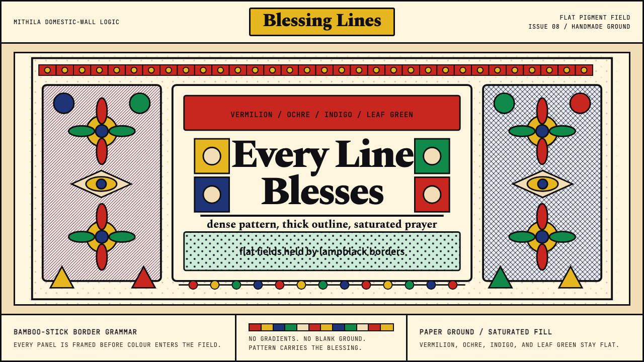
Born on clay walls and ritual floors across the Mithila belt, this ancient women's tradition of bold black outlines and luminous flat colour has become one of South Asia's most globally recognized indigenous art forms.
Mithila (Madhubani) Painting in brief
Mithila painting — widely known as Madhubani painting after the district in Bihar, India, where it first came to international attention — is a domestic visual tradition practiced primarily by women of the Mithila cultural region. The style is defined by dense black bamboo-stick outlines enclosing flat fields of saturated colour: vermilion, ochre, turmeric yellow, indigo, and leaf green applied with rags, twigs, or fingers onto whitewashed walls, handmade paper, and cloth.
What distinguishes Mithila painting from other folk traditions is its totality. Every square centimetre of the picture plane is filled — not with a single motif, but with interlocking layers of imagery and patterning. A central figure (a goddess, a bridal pair, a lotus pond) is surrounded by fish, birds, elephants, and creepers that in turn are surrounded by cross-hatch fills, dotted borders, and geometric edge patterns. The horror vacui is intentional: empty space is considered inauspicious, and the act of filling is itself a form of blessing.
The tradition encompasses multiple sub-styles tied to caste practice. The Brahmin and Kayastha communities developed the Kachni style, characterized by fine single-line hatching and minimal colour, while the Tatwa or Kohbar style uses bold flat colour fills with simple parallel-line textures. The Chamar community developed the Tantric-inflected Bharni style with vivid colour and symbolic animal imagery. These sub-styles have increasingly cross-pollinated since the 1960s revival, but experienced eyes can still read the lineage in the lineweight and filling conventions of individual artists.
Where does Mithila (Madhubani) Painting come from?
The practice of painting ritual images on interior and exterior walls of homes in the Mithila region — spanning northern Bihar and Nepal's Terai-Madhesh plains — is attested for at least a millennium, and oral tradition places its origins in the epic age of the Ramayana. The city of Janakpur in present-day Nepal is believed to be the birthplace of Sita, and the tradition holds that her father, the king Janaka, ordered homes decorated with auspicious paintings for her wedding to Rama. Whether or not this mythological founding is historical, it reflects the tradition's deep ritual function: Mithila painting was never decorative in a secular sense, but was tied to specific occasions — weddings, the birth of a child, the Chhath festival, and the installation of household shrines known as kohbar ghar.
The paintings remained largely invisible to the outside world until 1934, when a severe earthquake struck the region and left many homes roofless. A British colonial official named William Archer, assessing damage in the Bihar countryside, glimpsed freshly exposed interior walls covered in elaborate paintings. Archer wrote about what he saw and later acquired examples, but his observations remained in relative obscurity for over two decades. The tradition's definitive passage into wider public consciousness came after the catastrophic 1966-1967 drought in Bihar, when the Indian government, seeking to provide alternative income to women farmers, commissioned artist and educator Pupul Jayakar and All India Handicrafts Board officer Bhaskar Kulkarni to document and promote the wall-painting tradition. Women were encouraged to transfer their designs from walls to paper and cloth — a medium shift that fundamentally altered the art form's conditions of production and circulation.
The paper-transfer revival created both opportunities and tensions. On the positive side, Mithila paintings could now travel, be sold, and reach collectors outside the region. Artists like Sita Devi and Ganga Devi — both from Jitwarpur village, Madhubani district — became internationally recognized figures, exhibiting in Europe and North America and receiving India's Padma Shri honour. Sita Devi's dense, brilliantly coloured compositions of Hindu deities and festivals are credited with establishing the modern visual vocabulary of the style. Ganga Devi's later body of work, partly created during and after her cancer treatment in the United States, introduced autobiographical subject matter unprecedented in the tradition.
On the Nepal side of the Mithila cultural region, the Janakpur Women's Development Centre (established 1989) became a crucial institutional anchor for the tradition. The centre organized women artisans into a cooperative, formalized training in traditional motifs, and developed commercial channels for paper and cloth works. Contemporary practitioners like Bharti Dayal have pushed the tradition into urban India and contemporary art contexts, applying Mithila visual logic to cityscapes, environmental subjects, and abstract compositions, demonstrating that the style's formal vocabulary is generative rather than fixed.
What defines the Mithila (Madhubani) Painting look?
Outline Dominance
The defining visual gesture of Mithila painting is the thick black outline. Traditionally drawn with a bamboo stick dipped in lampblack or kajal, these borders are emphatically deliberate — neither delicate calligraphic lines nor mechanical uniform strokes, but expressive marks with slight variation in weight that give each form a sense of contained energy. The outline is not merely descriptive but constitutive: it is the drawing. Colour fills the shape the outline defines, but the image lives or dies by the authority of its contour.
Saturated Flat Colour
Colour in Mithila painting is applied flat and fully saturated, without shading, gradation, or modelling. Historically, pigments were derived from natural sources — turmeric for yellow, indigo plant for blue, powdered rice mixed with kajal for black, crushed leaves and bark for green — and the flatness was partly a consequence of these materials. The palette is warm-dominant: vermilion and ochre recur as ground tones, with leaf green, cobalt blue, and deep indigo used for foliage, water, and secondary figures. Flat colour fields force the eye to read pattern and boundary rather than volume, creating an image that is fundamentally two-dimensional and unambiguously graphic.
Horror Vacui and Fill Patterns
Mithila paintings permit no empty space. Every area between and around the primary subjects is filled with secondary imagery — fish, birds, lotus flowers, elephants, snakes — and every area between the secondary imagery is filled with geometric texture patterns: diagonal cross-hatch, parallel ruling, concentric curves, dotted grids, and chevron rows. These fill patterns are not afterthoughts but a vocabulary in their own right, each carrying symbolic associations (fish with fertility, lotus with purity, serpent with protection). The layering creates a visual density that rewards sustained attention: the longer one looks, the more distinct registers of meaning emerge.
Paired and Mirrored Symmetry
Bilateral symmetry is a structural principle of Mithila composition, particularly in its most ceremonial forms. Animals appear in facing pairs — two peacocks flanking a central tree, two fish framing a deity figure, elephants arranged trunk-to-trunk. This mirroring is not static or mechanical: individual animals within a pair will differ in internal patterning or posture, so the composition reads as balanced without being repetitive. The symmetry carries ritual significance — paired animals represent completeness, fertility, and auspiciousness — and it gives Mithila compositions their characteristic centred, altar-like quality even when rendered at small scales.
Warm Ground Tone
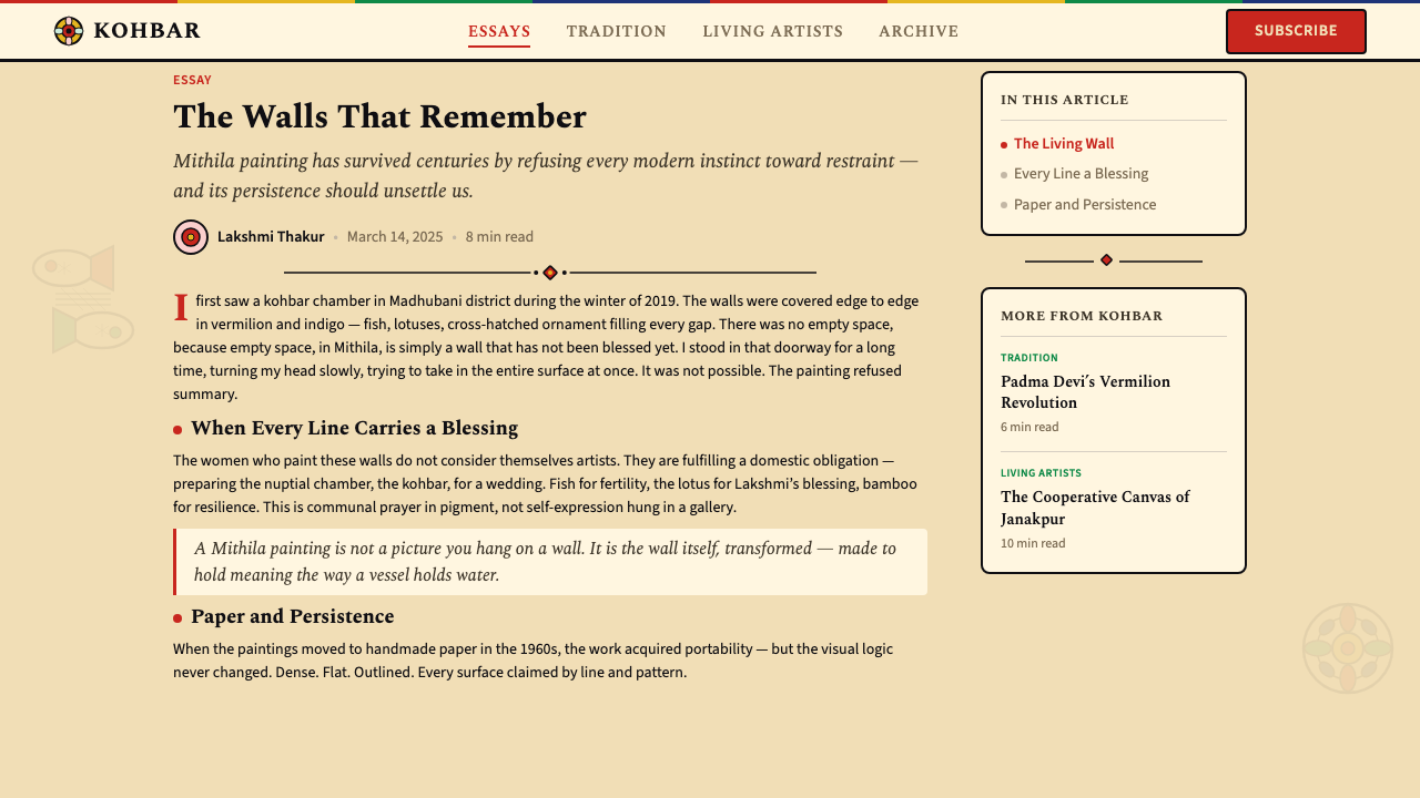
The ground of a Mithila painting is neither the stark white of a modern canvas nor a neutral grey. On walls, the support was traditionally a mud plaster surface coated with a thin wash of cow dung and then a white slip of powdered rice — producing a warm, slightly textured, off-white surface. On paper, handmade papers with natural warm fibres produce a similar quality. This ground gives the saturated colours a slightly muted quality and prevents the composition from reading as harsh or flat. Digital or print applications that use cold white or pure neutral backgrounds lose a subtle but meaningful characteristic of the original aesthetic.
Narrative Subject Matter
Mithila paintings draw their subject matter from Hindu mythological narratives — episodes from the Ramayana and Mahabharata, the exploits of Shiva and Parvati, Krishna's childhood, scenes from the Puranas — as well as from the domestic ritual calendar: the kohbar wedding chamber imagery, the Chhath sun-festival scenes, the birth of a child. This narrative content is not incidental but structural: the images are meant to invoke and embody the events they depict, not merely illustrate them. Contemporary practitioners have extended the subject range to include social commentary, environmental themes, and autobiography, but the same visual grammar carries both sacred and secular content without alteration.
Line Texture as Medium
Where Western decorative traditions often use colour variation or shading to create visual richness within a figure, Mithila painting achieves differentiation almost entirely through patterned line textures applied within flat colour fields. A fish's scales are evoked by overlapping curved lines, a peacock's feathers by overlapping eye-shapes, a sari's fabric by fine parallel ruling. This texture vocabulary gives each species and material type its own visual signature and creates variety across a composition that would otherwise read as a mosaic of flat colour patches. The result is a distinctive visual rhythm: bold at the level of the whole, intricate at the level of the detail.

Who shaped Mithila (Madhubani) Painting?
Sita Devi of Jitwarpur village in Madhubani district is widely regarded as the defining practitioner of the modern Mithila style. Working in the Bharni tradition with bold, densely layered colour and near-exhaustive figural programmes, she established the visual syntax that most people now associate with the term Madhubani painting. Her compositions of the Ramayana cycle, the Durga Puja, and the kohbar wedding chamber produced during the 1960s and 1970s were instrumental in bringing the tradition to national and international exhibitions. She was awarded the Padma Shri in 1981.
Ganga Devi, also from Jitwarpur, was Sita Devi's near-contemporary and an equally significant figure in the internationalization of the tradition. Her early work focused on the standard mythological repertoire, but her later paintings — particularly those created during treatment for colorectal cancer at a Washington D.C. hospital in the early 1980s — broke new ground by depicting her own experiences of illness, travel, and urban life in America. This autobiographical turn was unprecedented within the tradition and demonstrated that the Mithila visual grammar could absorb new subject matter without losing its formal coherence. She was awarded the Padma Shri in 1984.
Bharti Dayal represents the contemporary urban practice of Mithila painting. Based in Patna, the Bihar state capital, she has applied the tradition's formal vocabulary to subjects entirely outside its conventional scope: street life in Indian cities, architectural urban views, environmental destruction, and abstract meditations on modernization. Her work has been shown in galleries across India, Europe, and the United States, and she has collaborated with fashion designers and public art initiatives to bring Mithila visual logic into new contexts. She is also a documented teacher who has trained younger practitioners, helping to sustain the tradition without freezing it in its 1970s revival form.
Bua Devi is one of the principal masters of the Kachni sub-style, characterized by fine single-line hatching, minimal applied colour, and an emphasis on the expressive quality of the line itself. Where the Bharni style prizes visual density and chromatic impact, the Kachni tradition prizes restraint and the virtuosity of the artist's hand. Bua Devi's renderings of natural subjects — forests, water, animals — demonstrate the Mithila tradition's capacity for visual subtlety, and her work has been particularly influential in showing that the tradition is not reducible to its most colourful or commercially accessible forms.
Founded in 1989 in Janakpur, Nepal — the city traditionally identified as Sita's birthplace and the cultural heart of the Mithila region on the Nepali side — the Janakpur Women's Development Centre has functioned as a cooperative, training institution, and commercial enterprise simultaneously. It organized local women artists, standardized training in traditional motifs to ensure quality consistency, and created export channels for paintings and decorated household objects. The centre's work has been significant in maintaining the tradition within Nepal and in establishing the Nepali dimension of Mithila practice as distinct from but continuous with its Indian counterpart.
How do you use Mithila (Madhubani) Painting today?
Mithila painting is among the most visually distinctive of the world's living folk traditions, and its transfer into contemporary design contexts rewards careful attention to what gives it authority: the primacy of the outline, the density of patterned fill, the warmth of the ground, and the bilateral symmetry of its best compositions. Applying it well means understanding which of these elements are structural and which are superficial — and resisting the urge to sample only the easiest visual markers while losing the underlying logic.
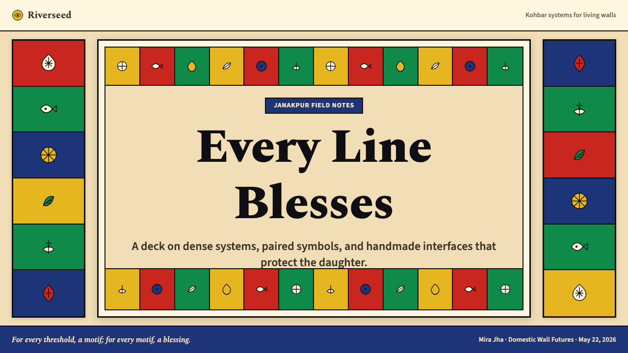
For presentation slides, Mithila works best as a framing and accent system rather than a full-surface treatment. A cover slide can use a large central motif — a stylized lotus, a paired peacock composition, a deity silhouette — rendered in the bold black outline style against a warm off-white ground, with the title set in a clean contrasting typeface beneath. Content slides should use the tradition sparingly: a thin black border with a fish or lotus-corner motif, geometric fill patterns as dividing elements between sections, and a warm ground rather than cold white for the background. Data slides can incorporate the geometric fill patterns as chart textures — using diagonal hatching or dotted grids within bar segments to distinguish categories without relying on colour alone.
For web interfaces, Mithila's palette and ornamental logic work particularly well for cultural platforms, festival landing pages, editorial contexts celebrating South Asian craft, and e-commerce interfaces for handmade goods. The approach should emphasize the warm ground tone throughout the base background, use the bold black border as a card and section-separator element, and draw from the tradition's geometric fill patterns for dividers, loading states, and empty-state illustrations. Avoid applying the full density of a Mithila painting to functional UI elements — the visual complexity that makes the original art powerful becomes noise in interactive contexts. Instead, treat the full-density composition as a hero image or illustration layer, and let the interface itself be more restrained.
For editorial and marketing work, the Mithila visual tradition offers strong credentials for authenticity and cultural depth. A magazine spread might use a full Mithila composition as a background wash — printed at reduced saturation — with editorial text overlaid in a clean grotesque, the combination communicating both craft heritage and contemporary readability. Marketing materials for festivals, cultural events, food brands rooted in South Asian tradition, or wellness contexts can use Mithila motifs as border and header elements without requiring a full-surface application. The tradition's characteristic warm palette photographs extremely well and translates readily to textiles, packaging, and physical merchandise.
A common mistake when applying Mithila aesthetics is treating it as a pattern library — extracting the fish, lotus, or peacock motifs and repeating them without the surrounding fill density that gives the originals their coherence. The motifs read as isolated decorative elements outside their context, losing the sense of purposeful completeness that defines the tradition. A related error is using cold white or digitally bright backgrounds: the tradition's colours are calibrated for the warm, slightly muted ground of mud plaster and handmade paper, and on a cold or pure white surface the palette shifts from luminous to harsh. To use the style authentically, commit to the warm off-white ground and to some version of the fill density — even a single layer of geometric hatching in the negative spaces changes the reading of a Mithila-derived composition entirely.
Mithila (Madhubani) Painting — FAQ
What is the difference between Mithila painting and Madhubani painting?
They refer to the same tradition. Madhubani is the name of the district in Bihar, India, where the tradition first attracted international attention in the 1960s, and it became the trade name by which the style is most widely marketed and recognized globally. Mithila is the name of the cultural and historical region that straddles northern Bihar and Nepal's Terai-Madhesh belt — the region from which the tradition actually originates. Art historians and practitioners typically prefer Mithila as a descriptor because it captures the trans-border geography of the tradition and avoids reducing it to a single Indian administrative district. The Nepal dimension of the tradition — centered on Janakpur and the Terai plains — is particularly important for this reason.
Is Mithila painting always religious in subject matter?
Historically, yes — the tradition's subjects were drawn from Hindu mythology, the ritual calendar, and specific domestic ceremonies. The kohbar wedding chamber paintings, for instance, were not decorative but sacramental: the images were understood to invoke fertility and divine blessing for the newly married couple. However, since the 1960s revival and especially since the 1980s, contemporary practitioners have increasingly used the visual grammar of Mithila painting to address entirely secular subjects: Ganga Devi's autobiographical paintings of her cancer treatment, urban street scenes, environmental commentary, and social-issue work by artists like Bharti Dayal. The formal vocabulary — outline, fill pattern, flat colour, warm ground — carries both sacred and secular content with equal authority. The tradition is not defined by what it depicts but by how it depicts.
Who traditionally makes Mithila paintings, and has that changed?
The tradition was historically a female practice: women of the household were responsible for painting the ritual spaces — the kohbar wedding chamber, the exterior walls for festivals, the interior walls of the puja room. Men were not conventionally part of this practice, and the knowledge was transmitted from mother to daughter within castes. After the 1960s revival and the shift to paper, male practitioners began entering the tradition, particularly for commercial production, and this remains somewhat contested within the communities. The craft's recognition and commercialization have also brought practitioners from outside the Mithila region, further complicating questions of authenticity and lineage. Organizations like the Janakpur Women's Development Centre have explicitly maintained the women-centered dimension of the tradition as part of their mission.
How does Mithila painting differ visually from other Indian folk painting traditions like Warli or Pattachitra?
The three traditions are distinct in colour approach, mark-making, and compositional logic. Warli painting, from Maharashtra, uses white natural pigment on an earthen terracotta or dark ground, renders figures as geometric stick-like forms built from circles and triangles, and tends toward narrative scenes set in a horizontal register. The palette is monochromatic — white on dark — and the figures are sparse against a visible ground. Pattachitra, from Odisha and West Bengal, uses bold, minutely detailed brushwork with bright lacquer-like colours and elaborate black outlines on cloth or dried palm leaf, with compositions organized around a clear central hierarchy. Mithila painting differs from both in its horror vacui principle — the compulsion to fill every area with secondary imagery and geometric texture — and in its broader, flatter colour palette that includes the warm ochre and indigo range. Each tradition has its own visual logic; they are not variations of a common style.
Does a Mithila-derived design need to include religious iconography to feel authentic?
No — the tradition's authenticity lies in its formal vocabulary, not its iconographic content. What makes a Mithila-derived composition recognizable is the bold black outline, the flat saturated colour, the geometric fill textures, the warm ground, and the bilateral compositional symmetry. These formal elements can be applied to entirely non-religious subject matter — botanical forms, architectural motifs, abstract pattern, contemporary illustration — without the work becoming a pastiche. The risk of inauthenticity arises not from choosing secular subjects but from borrowing the surface appearance of Mithila painting without its structural logic. A fish motif on a cold white background with no surrounding fill is a reference to the tradition, not an application of it.
Related design styles
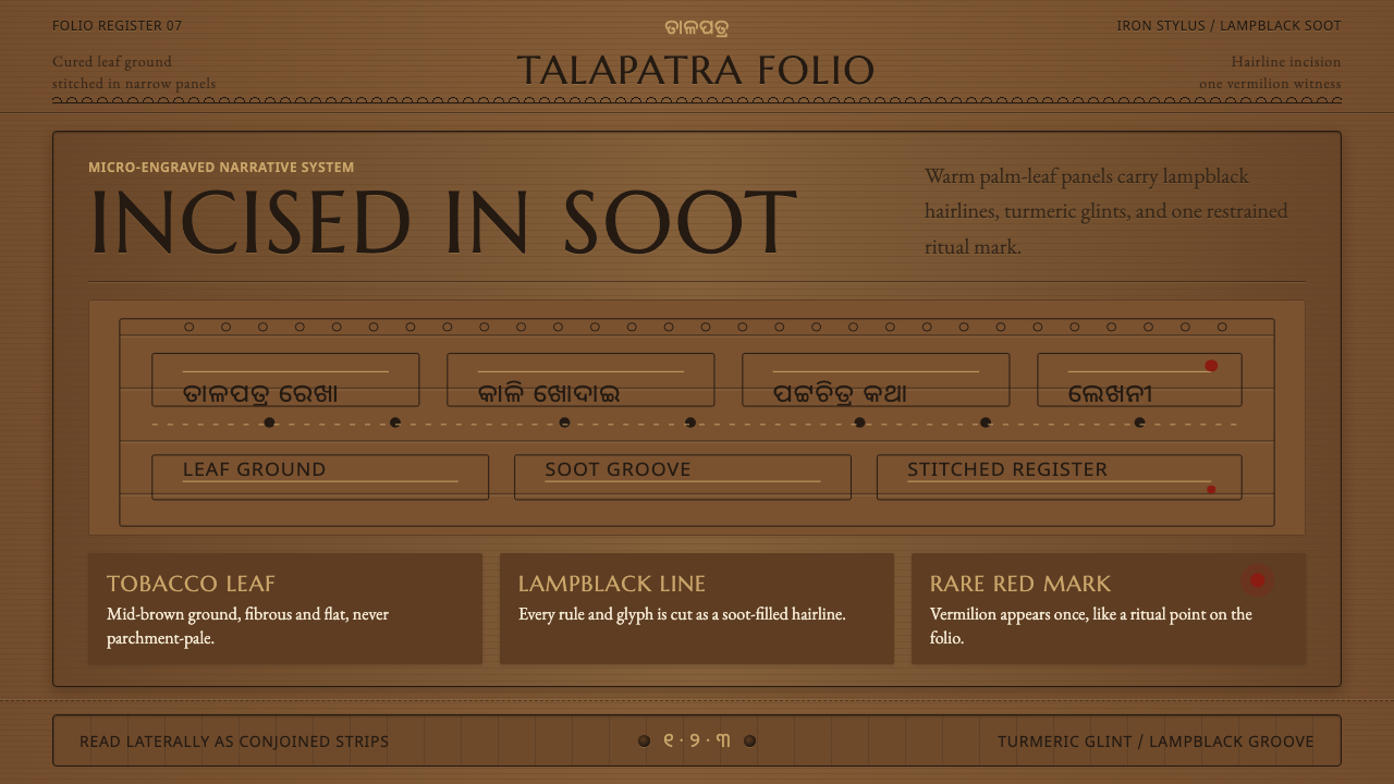 Odisha Palm-Leaf EtchingSacred narrative goes microscopic. Lampblack hairlines cut tobacco-brown leaf…
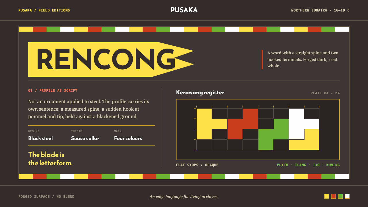 Acehnese Rencong MotifA blade that reads as a word. Flat kerawang red, white, green and yellow lock…
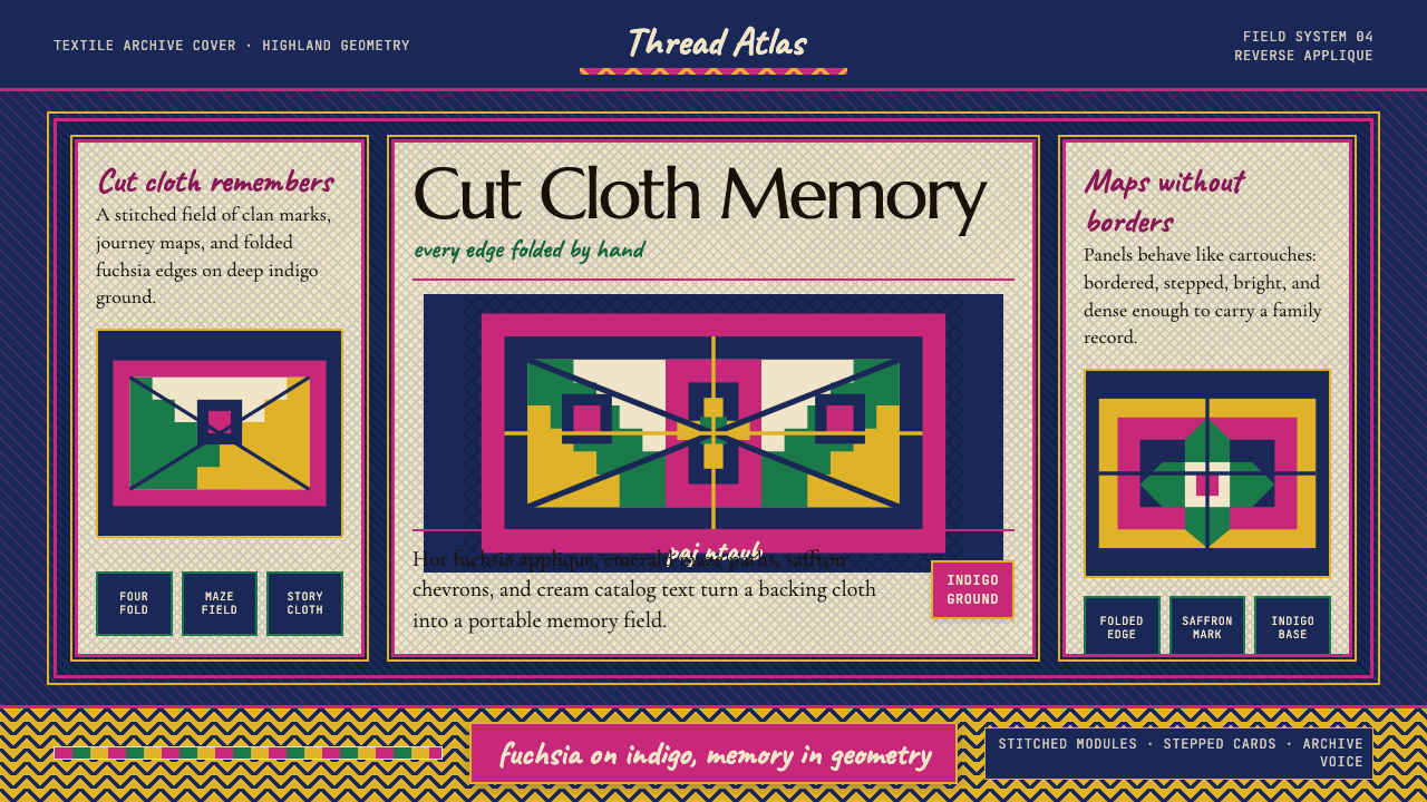 Hmong Paj Ntaub (Flower Cloth)Memory is geometric. Fuchsia applique on indigo forms stepped maze panels.
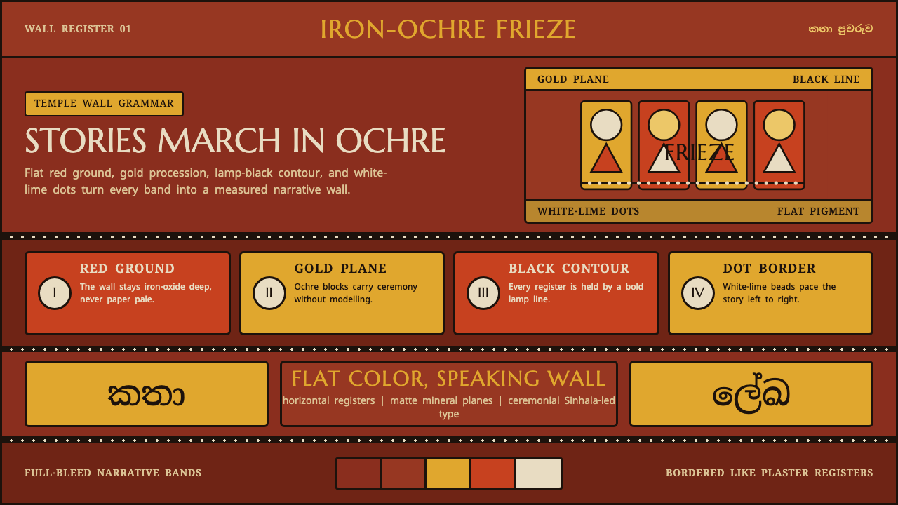 Kandyan Temple Mural FriezeTemple-wall gravity. Red ochre, gold planes, black contours, white-dot regist…
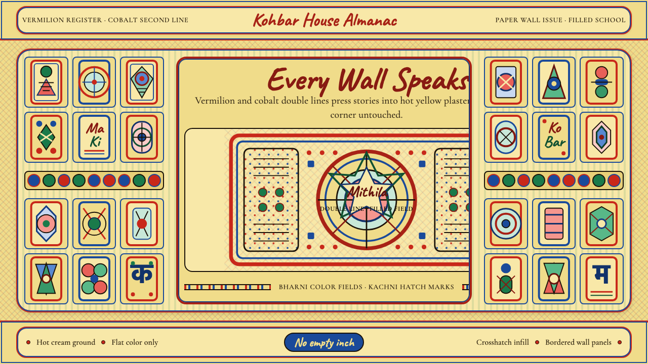 Madhubani Mithila (Bharni & Kachni)Refuses empty space. Hot cream-yellow, Caveat lettering, double cobalt-vermil…
 Māori Tā Moko (Facial Tattoo)Ancestry feels carved. Blue-black spirals on tan ground carry a restrained Ga…