Design style guide设计风格指南
What is Madhubani Mithila (Bharni & Kachni)?什么是 Madhubani Mithila (Bharni & Kachni)?
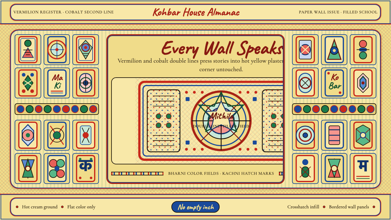
Madhubani Mithila painting refuses empty space — every surface erupts with double-outlined deities, peacocks, and lotuses packed so tightly that the ground itself disappears.密蒂拉绘画拒绝留白——每寸画面都爆发着双线勾勒的神祇、孔雀与莲花,紧密堆叠至底色消失不见。
Madhubani Mithila (Bharni & Kachni) in briefMadhubani Mithila (Bharni & Kachni) 速览
Madhubani Mithila painting is South Asia's most maximalist folk tradition — a visual system built on the absolute rejection of negative space. Practiced for centuries by village women in the Mithila region of Bihar, India, and across the border in Nepal's Janakpur, the art form covers every available surface with interlocking figures, geometric infill, and pattern fields so dense that the eye finds no resting point and no silence.密蒂拉绘画是南亚最大气磅礴的民间艺术传统——一套建立在彻底拒绝留白之上的视觉体系。数百年来,印度比哈尔邦密蒂拉地区和尼泊尔贾纳克布尔的村妇将每一寸可用的表面覆满相互咬合的人物形象、几何填充与致密纹样,令观者的目光找不到任何停歇之处。
The tradition divides into distinct sub-schools with different visual registers. The bharni (filling) school, practiced by Maithil Brahmin and Kayastha artists, fills outlined figures with flat, saturated color — bold vermilion, hot cobalt, deep turmeric yellow — until the composition becomes a solid field of competing hues. The kachni (line) school, associated with Kayastha artists, relies instead on obsessive crosshatching and fine parallel lines to build up tone within figures, creating a texture that reads as almost woven. Godna and gobar variants, practiced by Dalit artists, have their own traditions rooted in tattoo patterns and natural pigments respectively.这一传统分为各具风貌的流派。"巴尔尼"(填色)风格由婆罗门与迦耶斯塔种姓画师实践:在勾勒好的轮廓内平涂饱和色彩——浓烈的朱砂红、灼热的钴蓝、深沉的姜黄——直至画面成为竞相争鸣的色域。"卡奇尼"(线描)风格则依赖密集交叉线与细平行线在人物内部构建调子,形成近乎织物感的肌理。达利特画师实践的"戈德纳"与"戈巴尔"变体各有渊源,分别植根于文身图案与天然色素传统。
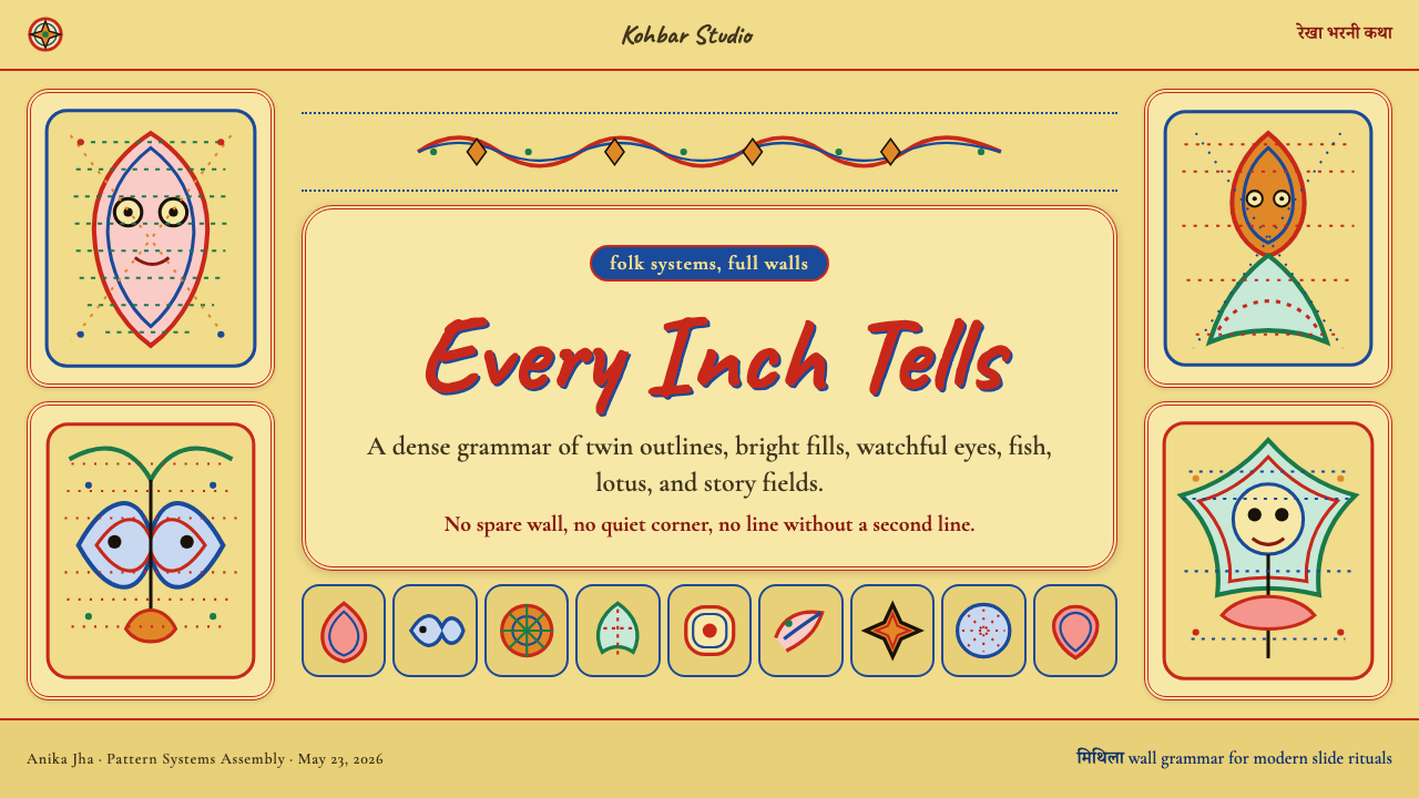
What unites all sub-schools is the double outline — every figure, from a fish to a goddess to a vine tendril, is traced with two concentric contour lines in contrasting colors, typically one vermilion and one cobalt. This double edge gives the style its characteristic thrumming quality, as if every form is vibrating slightly against its neighbor. Between and around the figures, no surface is left bare: crosshatch, dot grids, geometric patterning, and subsidiary motifs fill every gap until the composition reaches a state of total saturation.贯穿所有流派的共同特征是双轮廓线——每一个形象,从鱼到女神再到藤蔓须条,都以两条不同颜色的同心轮廓线描绘,通常一朱砂红、一钴蓝。这条双边赋予了这种风格特有的颤动质感,仿佛每个形体都在轻微振动,与邻近形体摩擦共鸣。人物之间与周围,没有任何表面留白:交叉线、圆点格、几何纹样和辅助母题将每一处缝隙填满,直至画面达到彻底饱和的状态。
Where does Madhubani Mithila (Bharni & Kachni) come from?Madhubani Mithila (Bharni & Kachni) 从何而来?
Madhubani painting's origins are inseparable from ritual. The tradition grew out of the practice of decorating the walls of the kohbar ghar — the wedding chamber — in which newly married couples spent their first days. The imagery was not decorative in any secular sense: fish signified fertility, bamboo represented procreation, lotuses evoked purity and the cosmos, and the full repertoire of Hindu deities — Krishna, Sita, Ram, Durga, Ganesha — populated the walls as protective presences. The act of painting was itself a religious observance performed by women, encoding knowledge passed from mother to daughter across generations. Some scholars trace mural traditions in the Mithila region back to the pre-seventh century, though continuous documentation is difficult.密蒂拉绘画的起源与仪式密不可分。这一传统生长于装饰"科巴尔间"——新婚夫妇共度最初数日的婚房——的习俗之中。画中的意象绝非世俗意义上的装饰:鱼象征生育,竹代表繁殖,莲花唤起纯洁与宇宙秩序,而印度教神祇全谱——克里希纳、悉多、罗摩、杜尔迦、象头神——则作为护佑之存在布满墙壁。绘画行为本身是一种宗教仪式,由女性实践,将代代相传的知识编码其中。部分学者将密蒂拉地区的壁画传统追溯至七世纪之前,尽管连续的文献记录难以为证。
The transformation from private ritual to public art form came abruptly in 1934, when the British civil servant and art historian William Archer, stationed in Bihar, documented surviving examples following a devastating earthquake that had stripped plaster from house walls across the region, exposing the painted surfaces beneath. Archer was struck by the work's formal sophistication and published accounts that brought it to wider scholarly attention, though commercialization did not follow immediately. The paintings remained a living household practice for another three decades.从私密仪式向公共艺术形式的转变来得突然。1934年,驻扎比哈尔的英国文官与艺术史家威廉·阿彻,在一场毁灭性地震剥落了当地大量房屋墙皮、将底层彩绘表面暴露于外之后,记录了留存的绘画案例。阿彻深为这些作品的形式精密程度所震动,发表了将其带入更广泛学术视野的文章——尽管商业化并未随即跟进。此后三十年间,这些绘画仍作为鲜活的家庭仪式实践延续着。
The 1965 Bihar drought was the decisive turning point. The All India Handicrafts Board, responding to economic crisis in the region, encouraged artists — most of whom were women who had never been paid for their work — to transfer their compositions from mud walls and floors onto paper and cloth. The craft became an income source, and within years, Madhubani paintings were appearing in urban galleries and being exported internationally. Artists such as Sita Devi, Ganga Devi, and Bhua Devi became nationally celebrated figures, their names attached to a tradition that had previously been communal and anonymous.1965年的比哈尔旱灾成为决定性转折点。全印手工艺局为应对地区经济危机,鼓励画师——其中大多是从未因此获得报酬的女性——将壁面与地面上的构图转移至纸张与布料之上。这门手艺由此成为谋生手段,数年之内,密蒂拉绘画开始出现在城市画廊并被出口至世界各地。悉多·黛维、甘加·黛维、巴娃·黛维等艺术家成为全国知名的人物,她们的名字附着于一个此前以集体匿名方式存在的传统。
Recognition brought complexity. Government certification, craft board classification, and the pressure of the export market all exerted influence on what was painted and how. Some artists expanded their subject matter beyond the traditional Hindu iconography to address contemporary themes — Ganga Devi's late work depicted her own cancer treatment in the Madhubani idiom. The tradition also spread geographically, with Janakpur in Nepal developing its own school, and urban Indian artists adopting the style in non-ritual contexts. Today the tradition is practiced by thousands of artists across Bihar and beyond, ranging from rural practitioners maintaining ritual contexts to internationally exhibited figures who have moved the form into conceptual and political territory.声誉带来了复杂性。政府认证、手工艺委员会分类以及出口市场的压力,都对画什么、怎么画施加了影响。一些艺术家将题材从传统印度教图像扩展至当代主题——甘加·黛维晚期的作品以密蒂拉风格描绘了她自己接受癌症治疗的经历。这一传统也在地理上扩散:尼泊尔贾纳克布尔发展出了自己的流派,印度城市艺术家在非仪式语境中采用了这种风格。如今,这一传统被数千名比哈尔及其以外的画师实践着,从在仪式语境中传承的农村从业者,到已将这一形式带入观念与政治领域的国际展览艺术家,不一而足。
What defines the Madhubani Mithila (Bharni & Kachni) look?Madhubani Mithila (Bharni & Kachni) 的视觉特征是什么?
Total Surface Coverage全面覆盖
The governing principle of Madhubani composition is horror vacui — fear of emptiness. No ground is left visible. Primary figures in the center are surrounded by secondary figures, which are surrounded by subsidiary motifs, which are surrounded by infill patterns until the entire surface is occupied. This is not merely decorative habit but a cosmological statement: the world is full, alive, and interconnected, and a blank surface is an absence of meaning.密蒂拉构图的支配原则是"空间恐惧症"——对空白的恐惧。没有任何底色被留白。中心的主要人物被次要人物环绕,次要人物被辅助母题环绕,辅助母题被填充纹样环绕,直至整个画面被占据殆尽。这不仅仅是装饰习惯,更是一种宇宙论表述:世界是充盈的、鲜活的、相互关联的,空白的表面即是意义的缺失。
Double Outline双轮廓线
Every form in Madhubani painting — human, animal, botanical, geometric — is traced with two parallel contour lines in contrasting hues, almost always one warm and one cool. The double edge creates a visual vibration at every boundary, making figures appear to pulse against their backgrounds and against each other. This technique has no counterpart in Western folk traditions and is the single most recognizable feature of the style.密蒂拉绘画中的每一个形体——人物、动物、植物、几何——都以两条对比色的平行轮廓线描绘,几乎总是一暖一冷。这条双边在每处边界制造视觉振动,使人物形象仿佛在底色与彼此之间悸动跳荡。这一技法在西方民间传统中没有对应物,是这种风格最具辨识度的单一特征。
Hot Flat Color灼热的平涂色彩
The bharni school fills outlined figures with flat, unmodulated color at maximum saturation — no shading, no gradation, no highlight. The dominant tones are a hot cream-yellow ground, vermilion, cobalt, turmeric, and black, drawn originally from natural sources including lampblack, indigo, turmeric, and red clay. Color is applied symbolically rather than naturalistically: a figure's skin may be vermilion, its garments cobalt, its jewelry turmeric, without any attempt at realistic rendering."巴尔尼"风格在勾好的轮廓内以最高饱和度平涂无调制的色彩——无明暗,无渐变,无高光。主导色调是灼热的奶黄色底、朱砂红、钴蓝、姜黄与黑色,最初分别取自灯黑、靛蓝、姜黄与红土等天然来源。色彩以象征性而非写实性方式使用:一个人物的皮肤可以是朱砂红,服饰是钴蓝,首饰是姜黄,完全不追求写实渲染。
Sacred Iconographic Vocabulary神圣图像词汇
Madhubani painting draws on a fixed repertoire of motifs with precise symbolic meanings. Peacocks represent beauty and the divine. Fish — always depicted in pairs — signify fertility and prosperity and appear in virtually every composition. Lotus flowers connect the earthly and cosmic realms. The sun and moon appear as protective presences flanking central figures. Bamboo, parrots, elephants, and the tulsi plant each carry specific ritual significance. Mastery of the tradition means mastering this vocabulary and its combinatorial logic, not inventing new symbols.密蒂拉绘画从一套具有精确象征含义的固定母题词汇中汲取素材。孔雀代表美丽与神圣;鱼——总是成双出现——象征生育与繁荣,几乎出现在每一幅构图中;莲花连接尘世与宇宙界域;太阳与月亮作为护佑之存在,侧翼守护中心人物;竹、鹦鹉、大象与圣罗勒植物各有特定的仪式含义。掌握这一传统意味着掌握这套词汇及其组合逻辑,而非发明新的符号。
Crosshatch and Dot Infill交叉线与圆点填充
Any surface not occupied by a primary or secondary figure is filled with pattern. The kachni school builds this infill from fine parallel lines and crosshatching that creates a halftone-like texture visible even at small scales. Both bharni and kachni compositions scatter precise dot grids across backgrounds and within figures. These infill patterns are not random but follow conventions: certain motifs belong in certain contexts, and their arrangement carries meaning legible to those who know the tradition.任何未被主要或次要人物占据的表面都以纹样填充。"卡奇尼"风格通过细平行线与交叉线构建这种填充,形成即使在小尺寸下也清晰可见的类似半调的肌理。"巴尔尼"与"卡奇尼"构图都在背景与人物内部散布精确的圆点格阵。这些填充纹样并非随机,而是遵循成规:特定母题属于特定语境,其排列对熟知传统的人而言承载着可读的意义。
Frontal and Profile Flatness正面与侧面的平面性
Madhubani figures exist entirely in two dimensions. Human faces appear almost universally in profile with a frontal eye — the same visual convention used in ancient Egyptian painting, arrived at independently. Bodies are shown frontally or in three-quarter view, never with foreshortening or perspective. There is no attempt to simulate three-dimensional space: the picture plane is frankly flat, and depth is indicated by vertical layering rather than recession.密蒂拉的人物形象完全存在于二维空间之中。人物面孔几乎普遍以侧面呈现,但眼睛却是正面的——与古埃及绘画使用的视觉惯例相同,且是独立发展而来。身体以正面或四分之三视角展示,从不进行透视缩短或空间透视处理。画面没有任何模拟三维空间的企图:画面平面坦率地保持平面,深度通过垂直叠加而非后退来暗示。
Rhythmic Repetition节律性重复
Madhubani compositions achieve their density not through variety alone but through repetition with slight variation. A border of fish may run around the entire periphery of a piece, each fish nearly identical to the last, with minute differences in the crosshatch angle or the position of the eye. This rhythmic iteration creates a meditative quality — the visual equivalent of a repeated mantra — that gives the most densely packed compositions a sense of coherence and breathing.密蒂拉构图的致密感不仅仅源自丰富的变化,更源自带有微小变奏的重复。一列鱼的边框可以环绕整幅作品的四周,每条鱼与前一条几乎相同,仅在交叉线角度或眼睛位置上有细微差异。这种节律性迭代创造出冥想般的品质——视觉上等同于一遍遍重复的咒语——赋予最为密集的构图以连贯感与呼吸空间。

Who shaped Madhubani Mithila (Bharni & Kachni)?谁塑造了 Madhubani Mithila (Bharni & Kachni)?
Sita Devi of Jitwarpur village was among the first artists to transfer Madhubani compositions from mud walls to paper and cloth when the All India Handicrafts Board initiated its commercialization effort after the 1965 drought. She received India's Padma Shri award in 1981 and became one of the most prominent faces of the tradition internationally, her work helping to establish Madhubani painting's legitimacy as a fine art form rather than merely a craft category.来自吉特瓦尔布尔村的悉多·黛维,是1965年旱灾后全印手工艺局推动商业化时最早将密蒂拉画作从泥墙转移至纸张与布料的画师之一。她于1981年荣获印度莲花勋章,成为这一传统在国际上最具代表性的面孔之一,她的作品帮助确立了密蒂拉绘画作为纯艺术形式而非单纯手工艺类别的合法性。
Ganga Devi was celebrated for the lyrical quality of her line work and her expansion of subject matter beyond traditional Hindu iconography. Her late series depicting her own cancer treatment — rendering chemotherapy sessions and hospital stays in the full Madhubani visual vocabulary — demonstrated the tradition's capacity to absorb and process contemporary experience. The series, begun in the 1980s, became some of the most discussed works in Indian folk art scholarship and was acquired by major international collections.甘加·黛维以其线描的抒情品质和将题材扩展至传统印度教图像之外而享誉。她晚年描绘自身癌症治疗经历的系列作品——以完整的密蒂拉视觉词汇呈现化疗疗程与住院生活——展示了这一传统吸收和处理当代经验的能力。这套始于1980年代的系列成为印度民间艺术研究中讨论最广泛的作品之一,并被多家国际重要机构收藏。
Bhua Devi was a master practitioner of the kachni (line) school, known for the extraordinary fineness of her parallel hatching and the density of her infill patterns. Her work demonstrates the full technical demands of the kachni approach, in which tone and texture must be built entirely through line rather than flat color fill. She was instrumental in establishing the kachni school's reputation as a distinct and technically demanding stream within the broader Madhubani tradition.巴娃·黛维是"卡奇尼"(线描)流派的大师级实践者,以其平行线描的极致精细度和填充纹样的密度而著称。她的作品展示了卡奇尼路径的全部技术要求——调子与质感必须完全通过线条而非平涂色彩来构建。她对于确立卡奇尼风格作为密蒂拉整体传统中一支独特且技术要求严苛的流派声誉,发挥了关键作用。
William Archer was a British civil servant and art historian stationed in Bihar who, in 1934, documented surviving Madhubani murals exposed by a major earthquake. His writings introduced the tradition to the broader scholarly and art world beyond its home region. Without his documentation, the commercialization effort of the 1960s would have lacked the scholarly foundation that helped position Madhubani painting as a tradition of historical depth rather than a craft novelty, and the international recognition that followed might have been significantly delayed.威廉·阿彻是驻扎比哈尔的英国文官与艺术史家,1934年一场重大地震将当地大量密蒂拉壁画暴露于外,他随即进行了记录与撰述。他的文章将这一传统引介给其发源地以外更广泛的学术与艺术界。若没有他的记录,1960年代的商业化努力将缺乏学术基础——而正是这一基础帮助将密蒂拉绘画定位为具有历史深度的传统,而非一种工艺新奇物,此后的国际认可也可能因此大幅推迟。
How do you use Madhubani Mithila (Bharni & Kachni) today?今天怎么用 Madhubani Mithila (Bharni & Kachni)?
Madhubani Mithila is one of the most distinctive and least generic historical styles available for contemporary design work. Its core visual logic — total coverage, hot saturated palette, double outlines, and rhythmic infill — produces work that is instantly recognizable and unlike any Western design tradition. Applying it well requires genuine engagement with the system's underlying principles rather than surface borrowing of a few decorative motifs.密蒂拉绘画是当代设计实践中最具辨识度、最不流于平庸的历史风格之一。其核心视觉逻辑——全面覆盖、灼热饱和的色板、双轮廓线与节律性填充——产生的作品一眼可辨,与任何西方设计传统都截然不同。要将其运用得当,需要真正参透这套系统的底层原则,而非浮于表面地借用几个装饰母题。
For presentation slides, the style works most powerfully as a full-bleed cover treatment. A Madhubani-derived cover uses the hot cream-yellow as the ground, fills the entire space with an interlocking figure composition — peacocks, fish, lotuses — framed by a double vermilion-cobalt border, and places the title in a clear zone within or beneath the central figure. The density of the imagery signals abundance and care. Content slides should be handled more sparingly: a narrow Madhubani border strip along the left or bottom edge, using the same double-outline motif at reduced scale, anchors the page to the style without competing with the information. Data slides can use the style's saturated palette for chart elements — each data series assigned one of the tradition's primary hues — while keeping backgrounds clean.在演示文稿中,这种风格最有力量的用法是作为满版出血的封面处理方案。一张密蒂拉衍生封面以灼热的奶黄色为底,用相互咬合的人物构图——孔雀、鱼、莲花——填满整个空间,以朱砂红与钴蓝双边框框定,并在中心人物内部或下方留出清晰的标题区域。图像的密度传递出丰盛与用心的信号。内容页应更为克制:沿左侧或底部边缘设一条窄幅的密蒂拉边框,以缩小比例的双轮廓母题将页面锚定在风格中,而不与信息内容争夺注意力。数据页可以使用这种风格的饱和色板为图表元素着色——每个数据系列分配一种传统主色——同时保持背景干净。
For web interfaces and dashboards, the style suits brand-heavy contexts where cultural richness and craft authenticity are part of the product identity — arts platforms, cultural institutions, premium handcraft marketplaces, and luxury consumer brands with an artisanal positioning. The approach: use the cream-yellow ground for hero sections and feature panels, deploy double-outline decorative borders at section breaks, and reserve the full compositional density for hero imagery and illustration. Navigation and body text should remain clean and highly legible; the maximalism works as punctuation rather than as the default state.对于网页界面与仪表板,这种风格适合品牌感强烈、文化丰富性与手工艺真实感是产品身份一部分的语境——艺术平台、文化机构、优质手工艺市集,以及具有匠人气质定位的高端消费品牌。方法如下:在英雄区与特色面板使用奶黄色底,在段落分隔处部署双轮廓装饰边框,将完整构图密度保留给英雄图像与插图。导航与正文应保持清晰易读;极繁主义作为标点而非默认状态出现。
For editorial and marketing work, Madhubani's poster-like saturation makes it exceptionally effective for full-page spreads, packaging, and event identity. A festival brand, a cultural publication, or a handcraft marketplace can build an entire visual identity around a simplified Madhubani vocabulary — double-outline motifs, flat saturated color blocks, dot-grid textures — without requiring full compositional density in every application. Marketing materials benefit from isolating one or two signature motifs (a single peacock, a pair of fish) and deploying them at large scale against the cream ground, with the infill pattern serving as a unifying texture across collateral.对于编辑与营销内容,密蒂拉海报式的饱和感使其在整版跨页、包装与活动视觉识别中格外有效。节庆品牌、文化出版物或手工艺市集可以围绕简化的密蒂拉词汇——双轮廓母题、平涂饱和色块、圆点纹理——建立完整的视觉识别体系,而不必在每一个应用场景中都追求完整的构图密度。营销物料适合提取一两个标志性母题(一只孔雀,一对鱼),在奶黄色底面上大比例展示,以填充纹样作为跨物料的统一质感。
A common and significant mistake when applying this style is treating it as a pattern library — lifting individual motifs (a lotus here, a fish there) and scattering them across an otherwise neutral design. This misses the fundamental logic of the tradition: Madhubani is a system of density and total coverage, and isolated motifs stripped of their context read as superficial decoration rather than as a coherent visual language. A second common error is substituting the hot, slightly orange-tinged cream ground with a pure white, which drains the warmth that makes the saturated colors vibrate. The ground color is not neutral — it is part of the palette, and its removal fundamentally changes the character of the work.应用这种风格时一个常见且严重的错误,是将其视为纹样素材库——从中提取单个母题(一朵莲花、一条鱼),散置于一个否则保持中性的设计中。这完全错失了这一传统的根本逻辑:密蒂拉是一套关于密度与全面覆盖的系统,脱离语境的孤立母题传递出的是表面装饰,而非连贯的视觉语言。另一个常见错误是以纯白替代那种带有轻微橙调的灼热奶黄底色——这会抽走让饱和色彩振动共鸣的暖意。底色并非中性:它是色板的组成部分,将其移除会从根本上改变作品的气质。
Madhubani Mithila (Bharni & Kachni) — FAQMadhubani Mithila (Bharni & Kachni) · 常见问题
What is the difference between bharni and kachni?"巴尔尼"与"卡奇尼"有什么区别?
Bharni and kachni are the two primary technical schools within the Madhubani tradition. Bharni, historically associated with Maithil Brahmin and Kayastha artists, fills outlined figures with flat, saturated color — the visual result is bold, hot, and richly chromatic. Kachni, associated with Kayastha artists, builds tone and texture through fine parallel lines and crosshatching rather than flat fill — the visual result is more tonal, almost monochromatic in its densest passages, and has a woven or engraved quality. Both schools share the same iconographic vocabulary, double-outline convention, and horror-vacui compositional logic; the difference is purely technical in how color and tone are rendered."巴尔尼"与"卡奇尼"是密蒂拉传统中两个主要的技法流派。"巴尔尼"历史上与婆罗门及迦耶斯塔种姓画师相关联,在轮廓线内平涂饱和色彩——视觉效果大胆、灼热、色彩浓郁。"卡奇尼"则通过细平行线与交叉线而非平涂来构建调子与质感——视觉效果更具调性,在最密集的段落近乎单色,带有织物或雕刻般的品质。两个流派共享相同的图像词汇、双轮廓线惯例与"空间恐惧症"构图逻辑;差异仅在于色彩与调子如何被渲染的技术层面。
Is Madhubani only appropriate for South Asian or Indian-themed content?密蒂拉风格只适合南亚或印度主题的内容吗?
The style's association with a specific cultural tradition means that context matters significantly, but the style is not limited to culturally specific content. The visual logic of total coverage, double outlines, flat hot color, and rhythmic infill can be applied to any subject matter — just as Art Nouveau's organic forms were applied to department stores and railway stations far from its Belgian origins. The critical question is intent and execution: using the style superficially as exotic decoration risks cultural reduction, whereas engaging seriously with its formal logic and subject matter conventions produces work that reads as genuinely informed rather than appropriative.这种风格与特定文化传统的关联意味着语境至关重要,但它并不局限于文化特定内容。全面覆盖、双轮廓线、平涂热色彩与节律填充的视觉逻辑可以应用于任何题材——就像新艺术运动的有机形态被应用于远离其比利时起源地的百货公司与火车站一样。关键问题在于意图与执行:将这种风格作为异域装饰浅表使用有文化简化之虞,而认真参与其形式逻辑与题材惯例,则会产生令人感到真正有所依据而非挪用的作品。
How can this style work in a digital product without feeling decorative or costume-like?这种风格如何在数字产品中运用而不显得仅是装饰性或像在穿戏服?
The key is applying the style's structural principles rather than its surface motifs. The double-outline convention translates to UI component borders with an inner and outer stroke. The hot cream-yellow ground translates to the base background color. The rhythm of dot-grid infill translates to texture patterns on loading states or section dividers. The flat saturated color with zero gradation translates to solid-fill UI elements with no soft shadows. When the structural principles drive the design rather than the figurative iconography being applied literally, the result is a digital UI that carries the visual character of the tradition without reading as costume.关键在于应用这种风格的结构原则,而非其表面母题。双轮廓线惯例转化为UI组件的内外双描边。灼热的奶黄底色转化为基础背景色。圆点填充的节律转化为加载状态或段落分隔上的纹理图案。零渐变的平涂饱和色彩转化为无柔和阴影的实心填充UI元素。当结构原则而非具象图像的字面应用驱动设计时,所得到的数字界面便承载了这一传统的视觉气质,而不会显得像是在穿戏服。
What motifs are central to the tradition and what do they mean?这一传统中有哪些核心母题,它们各自意味着什么?
The most central motifs carry specific ritual and cosmological meanings. Fish appear in pairs and represent fertility, prosperity, and good fortune — they are arguably the most universal symbol in Madhubani work. Peacocks represent beauty, divine grace, and the monsoon. Lotuses connect the earthly and divine realms and represent purity arising from muddy origins. Bamboo represents the cycle of life and procreation. The sun and moon appear as protective cosmic presences. Among deities, Krishna and Radha (divine love), Sita and Ram (duty and devotion), and Durga (protective power) recur most frequently. These motifs are not interchangeable — their placement, pairing, and context within a composition carry meaning that practitioners of the tradition read fluently.最核心的母题承载着特定的仪式与宇宙论含义。鱼总是成双出现,象征生育、繁荣与好运——可以说是密蒂拉作品中最具普遍性的符号。孔雀代表美丽、神圣恩典与季风。莲花连接尘世与神圣界域,象征从淤泥中生长的纯洁。竹代表生命的轮回与繁殖。太阳与月亮作为护佑性的宇宙存在出现。在神祇中,克里希纳与拉达(神圣之爱)、悉多与罗摩(责任与虔诚)、杜尔迦(护佑之力)出现频率最高。这些母题不可相互替换——它们在构图中的位置、配对与语境承载着这一传统实践者能够流利阅读的意义。
Does the style work in monochrome or is full color essential?这种风格能以单色呈现吗,还是必须使用全彩?
The kachni school demonstrates that Madhubani can function in a near-monochromatic register — its compositions built entirely from fine line work read as highly tonal even without flat color fill. A monochrome or two-color interpretation that retains the double-outline convention, the total surface coverage, and the rhythmic infill logic will preserve the style's essential character. What is lost in a reduced palette is the symbolic color system — the distinction between the hot assertive tones of vermilion and cobalt that carries meaning in the tradition. For contemporary applications, a reduced palette version works well as a texture or structural device, but the full saturated palette is necessary when color itself needs to carry the communicative weight of the style."卡奇尼"风格证明密蒂拉可以在近乎单色的维度中运作——其完全由精细线描构成的构图,即使没有平涂色彩,也呈现出高度调性的效果。一种保留了双轮廓线惯例、全面覆盖原则与节律填充逻辑的单色或双色诠释,能够保留这种风格的本质气质。色板简化后失去的,是象征性色彩系统——朱砂红与钴蓝那种灼热断然的色调对比所承载的传统含义。对于当代应用而言,简化色板版本作为质感或结构性元素运作良好;但当色彩本身需要承载这种风格的传达重量时,完整的饱和色板才是必要的。
Related design styles相关设计风格
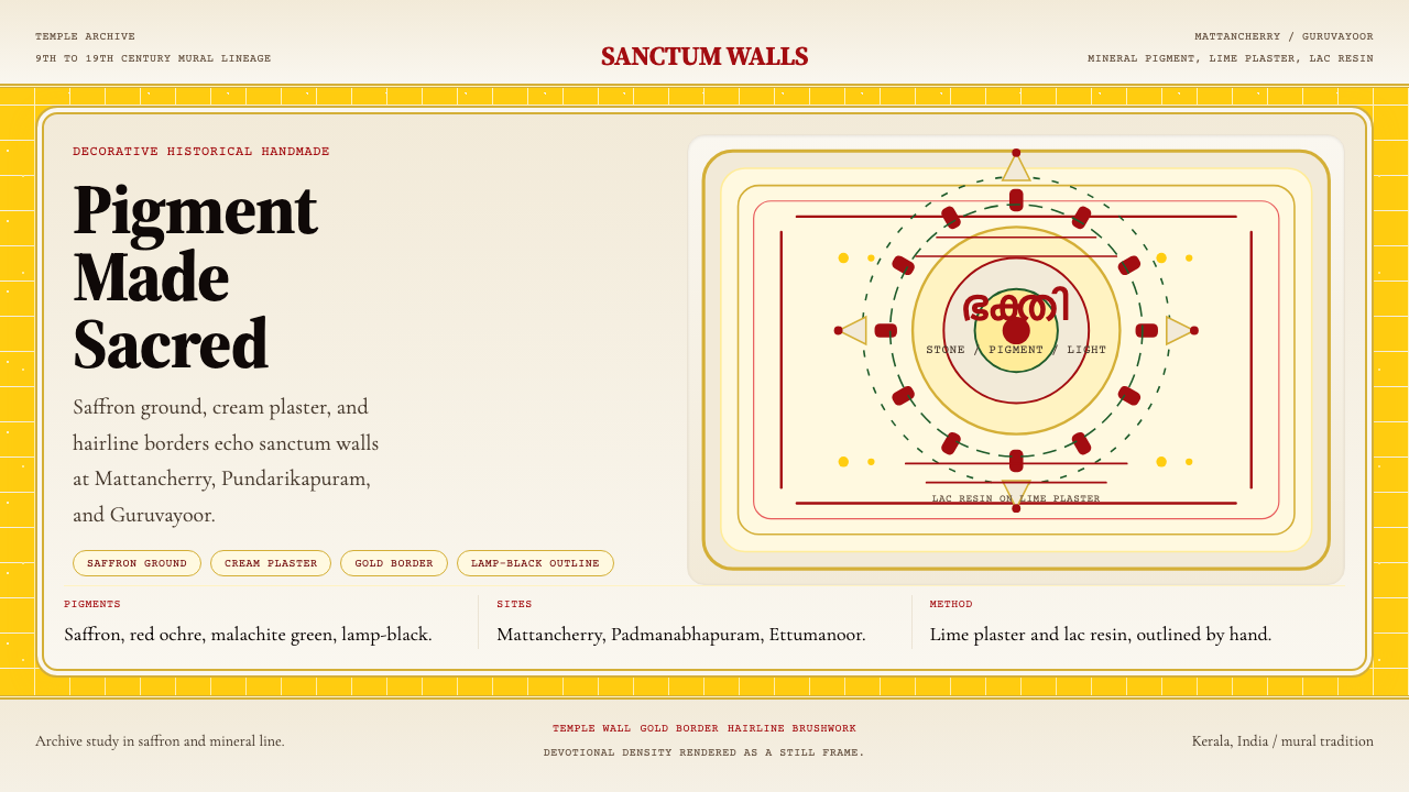 Kerala Mural TempleDevotional density over space. Saffron ground and cream panels, edged in gold.密而有敬意。藏红花底、奶油面板与金边发丝线。
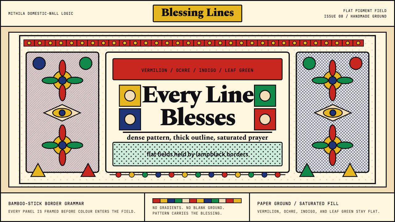 Mithila (Madhubani) PaintingEvery inch is blessed. Lampblack borders lock vermilion, ochre, indigo, and l…寸寸皆成祝福:黑线框住朱红、赭黄、靛蓝与叶绿。
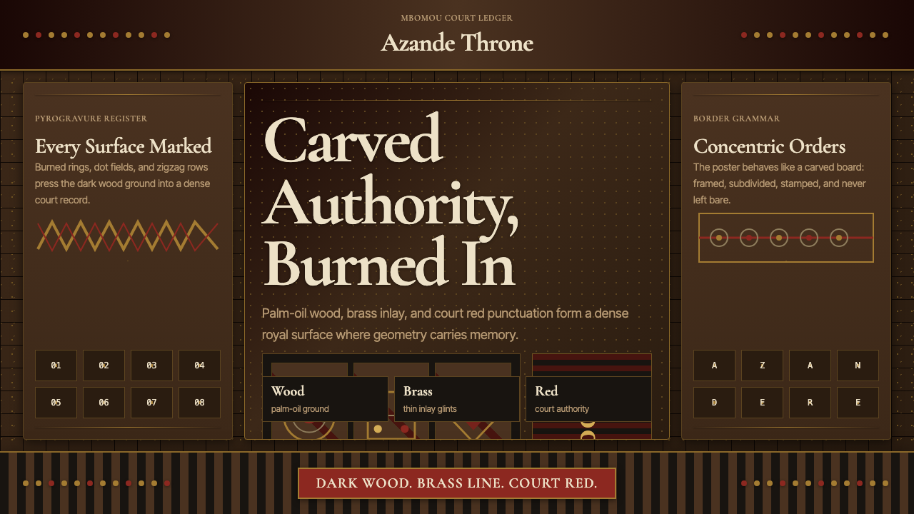 Central African Azande ThroneDense court gravity. Dark wood grids, brass dots, and court red cover every s…宫廷感厚重:深木网格、黄铜点阵与宫廷红铺满表面。
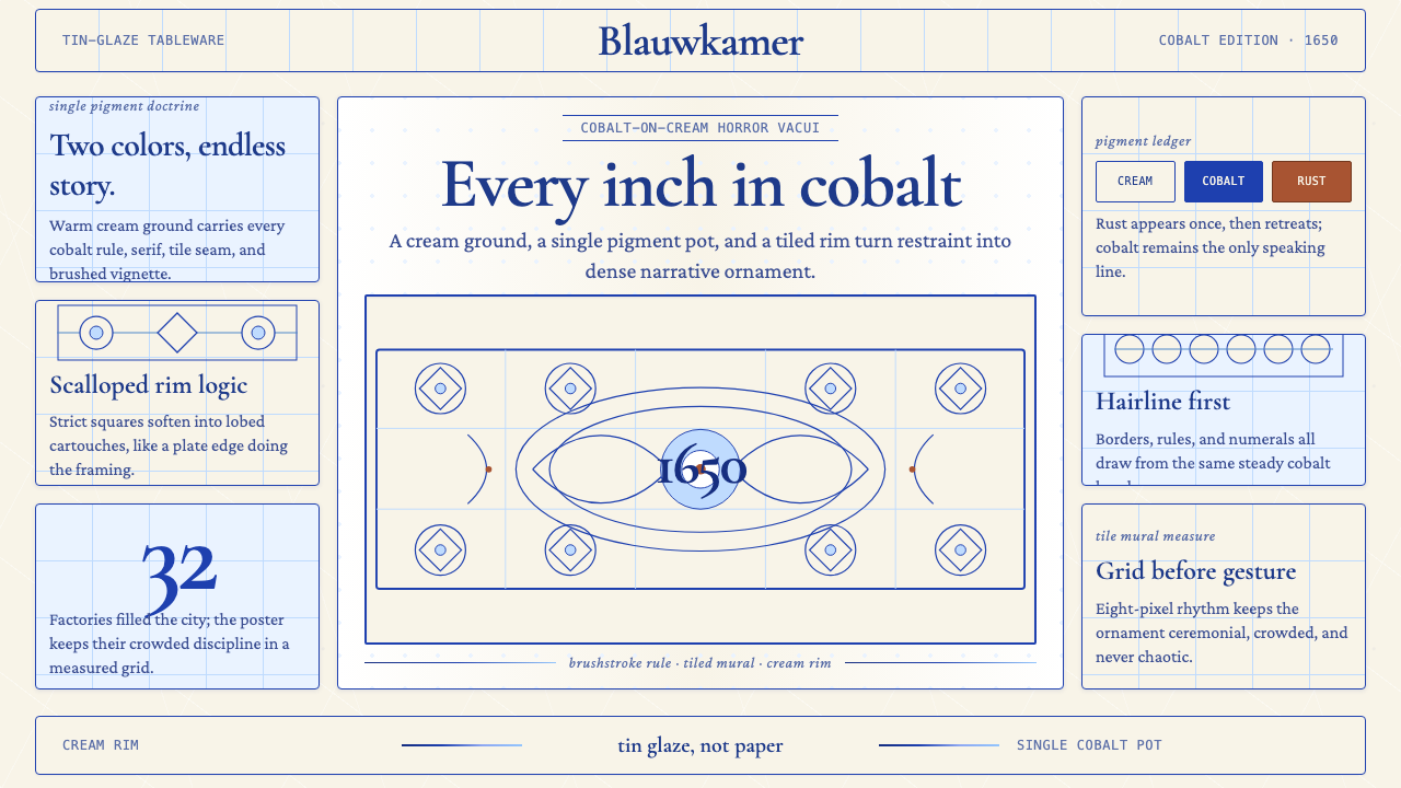 Delft Blue PotteryRestrained, yet every inch speaks. Cobalt hairlines crowd a cream tile grid.克制却寸土必描。钴蓝细线铺满米白瓷砖网格。
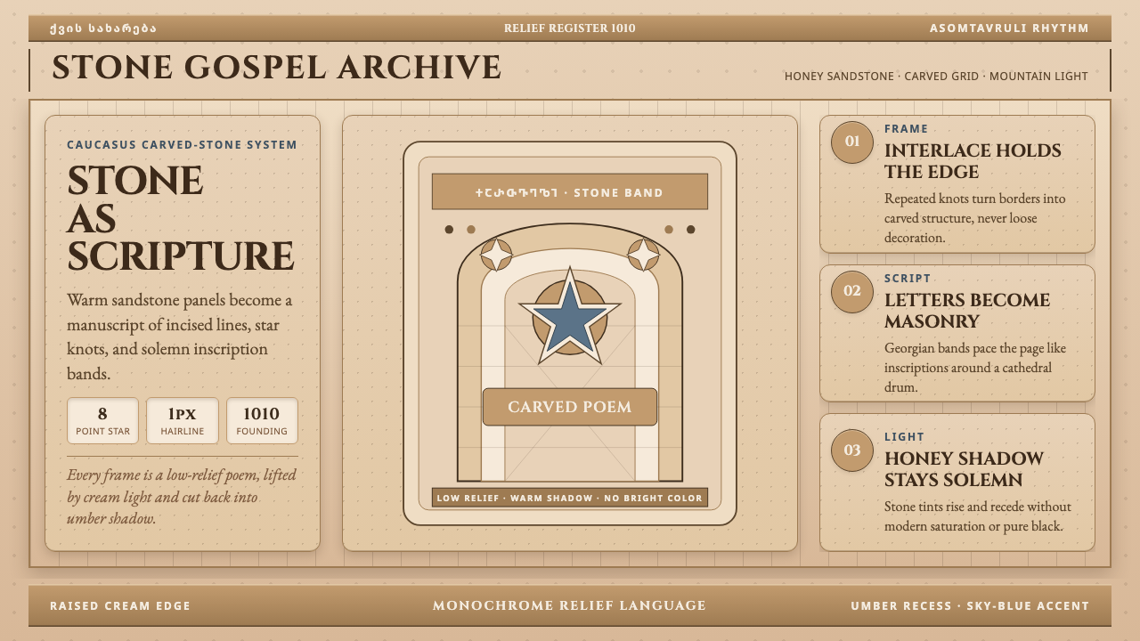 Georgian Nikortsminda Stone-CarvingStone becomes scripture. Cinzel caps and Georgian bands carve honey-sandstone…石如经卷。Cinzel大写与格鲁吉亚铭文刻出蜜砂岩网格。
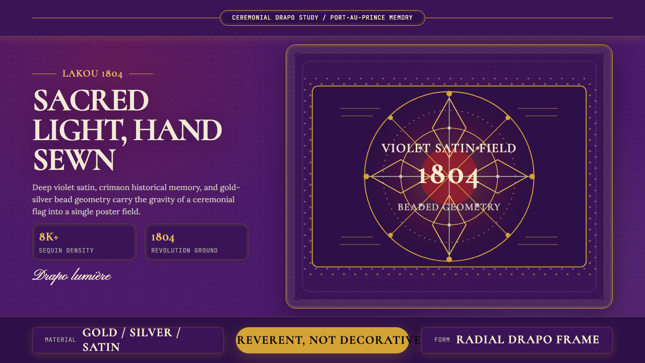 Haitian Vèvè Sequin Drapo 1804Sacred density. Violet satin, gold sequins, and radial geometry hold 1804 gra…神圣而厚重:紫缎、金色亮片与放射几何承载1804的庄严。