What is Amauta Magazine?
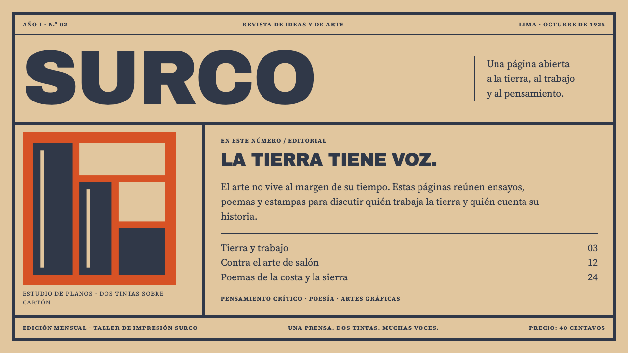
Amauta Magazine is print with a position: two inks on buff card, a hand-ruled frame, and colour that arrives as a flat block or not at all.
Amauta Magazine in brief
Amauta Magazine is a two-ink print system modelled on a Peruvian little magazine of the late 1920s. Its ground is buff cover card, always. Its frame is a heavy rule drawn by hand and never perfectly even. Its type, from the brush-cut masthead to the smallest line of text, is set in one dark slate-navy, and its only other voice is a flat block of colour, vermilion in the issue the design remembers best, which changed from number to number.
What makes it distinctive is economy held as a conviction. The magazine was printed on a Lima jobbing press, in one run with two inks, and the system keeps that limit as a rule rather than treating it as a handicap. Colour arrives only as a solid block of ink, never as a gradient, a glow or a drop shadow. Nothing is smoothed into the slick finish that later offset printing made normal.
The result is a surface with grain and consequence. The gouge of the woodcut, the fuzz where paper fibre shows at an edge, the way the impression bites into the card: none of these are defects to be retouched. They are the evidence that a page was made by hands, for a reason. This is a light system but not a pristine one. It looks like a page that a movement printed because it had something to say, and could afford only two inks to say it.
Where does Amauta Magazine come from?
Amauta appeared in Lima in September 1926 and ran for 32 issues until 1930. It was founded and edited by José Carlos Mariátegui, a Peruvian socialist thinker, and its title is a Quechua word usually rendered as sage or teacher. The name was already a statement. A magazine of the political left, published in a capital city that had long looked toward Europe for its models, put an Andean word on its masthead and let the rest of its pages argue from there.
The magazine sat at the meeting point of three currents that the source material names: Indigenismo, Latin American avant-garde print, and the socialist little magazine. Indigenismo was the cultural and political current that placed Andean peoples and their conditions at the centre of Peruvian art, literature and public debate. The avant-garde supplied new poetry, new images and a taste for sharp typographic statement. The little magazine supplied the form itself: small, committed, short of money, and edited as an argument rather than a product. Amauta mixed all three, so that an essay on politics could sit next to a poem and a woodcut without apology.
The physical object matters as much as the ideas. The magazine was printed on a jobbing press, the kind of shop that spent its week on handbills and forms, using two inks and a coloured cover card in a single press run. A dark slate-navy carried the rule frame, the brush-cut AMAUTA logotype and every line of type, while a second colour rotated with the issue. Number 2, from October 1926, ran vermilion behind José Sabogal's woodcut of an Andean head in a chullo, the knitted cap of the highlands. The image, the frame and the colour were all made to be printed in exactly the way the press allowed.
The design system built on it does not reproduce any of those woodcuts or copy the logotype. It inherits the logic of the press: the card is always the ground, the frame is always hand-ruled, and colour arrives as a flat block of ink, never as decoration. The run ended in 1930, the year of Mariátegui's death, and the magazine remains one of the clearest examples of Latin American avant-garde print, a reminder that a strong look can come from a hard limit rather than a large budget.
What defines the Amauta Magazine look?
Two inks on buff card
The whole palette is the card plus two inks. Slate-navy is constant and carries the frame, the masthead and every line of type. The second ink is a flat accent that changes from issue to issue; vermilion is the one the source remembers, but the system allows a different colour per edition. There is no third colour, no tint ladder and no gradient between them.
Card as the ground
The card is always the ground, never a background colour applied afterwards. Its warm buff tone is the lightest value in the composition, and everything else is ink laid on top of it. Large areas are left as bare card, which gives the page its rest. Where a flat colour block is used, it reads as ink pressed onto the paper, not as a panel floating over it.
The hand-ruled frame
A heavy frame encloses the page, and it is visibly made by hand: the thickness wavers slightly, the corners meet a little unevenly, and the line has the slight irregularity of a rule cut and inked rather than computed. The frame is structural, not decorative. It declares the page as a single printed sheet and holds the masthead, the image and the text in one boundary.
Flat blocks of ink
Colour is always a solid area with a crisp edge, sitting behind an image or under a heading. It never fades, glows or casts a shadow. This is the hardest rule to keep on screen, because every default tool wants to soften an edge. The discipline is what turns two colours into a confident look instead of a limited one.
Woodcut imagery
Images are built the way a woodcut is: a few solid areas of dark and light, edges that show the tool, and no continuous tone. A head in a chullo is reduced to planes and a handful of cuts, then printed against a block of the second colour. On a screen, this means high-contrast, two-value imagery with visible texture rather than photographic softness.
Brush-cut type
The masthead is brush-cut, with the weight and slight irregularity of a hand-made letter, and the rest of the type is sturdy and ink-heavy in the same navy. Hierarchy comes from size, position and the frame, not from changing colours or adding effects. Every line of type is one voice speaking in one ink.
Imperfection kept
Chisel marks, paper fibre and the bite of the impression are preserved, not retouched away. A small amount of grain on the card, slight roughness on an edge or a faint unevenness in a solid are all in keeping. What is excluded is anything that suggests a later technology: glossy highlights, soft shadows and the frictionless smoothness of offset printing.
Who shaped Amauta Magazine?
Mariátegui founded Amauta and led it as its editor until his death. A Peruvian socialist thinker, he used the magazine to bring politics, literature and art into one conversation, and chose an Andean word for its title as a deliberate position. His death in 1930 coincides with the end of the magazine, which is why the two are so closely tied in memory.
Sabogal was the painter and printmaker whose woodcut of an Andean head in a chullo stood against the vermilion block on number 2, from October 1926. He is the artist most closely associated with the magazine's look, and his woodcut method of solid planes and visible cuts is the image logic that the design system translates into flat, two-value imagery.
Codesido is named in the source among the key figures, an artist working in the same Indigenista current in Lima as Sabogal. Her inclusion is a reminder that the magazine's visual world was a collective effort by several hands, not a single signature, and that the style belongs to a circle of painters and printmakers as much as to one cover.
Blas is the fourth name listed among the key figures, another artist of the Indigenista circle around the magazine. Together with Sabogal and Codesido he stands for a generation of Peruvian artists who made Andean subjects the centre of their work, and whose pages shaped how a committed little magazine could look.
How do you use Amauta Magazine today?
Amauta Magazine rewards designers who accept its limits. The system is strongest when it uses exactly the vocabulary of the original object: a card ground, a navy ink, one accent block and a ruled frame. Before applying it, decide which colour is this edition's second ink, and hold to that choice across every page, in the way an issue held to its colour.
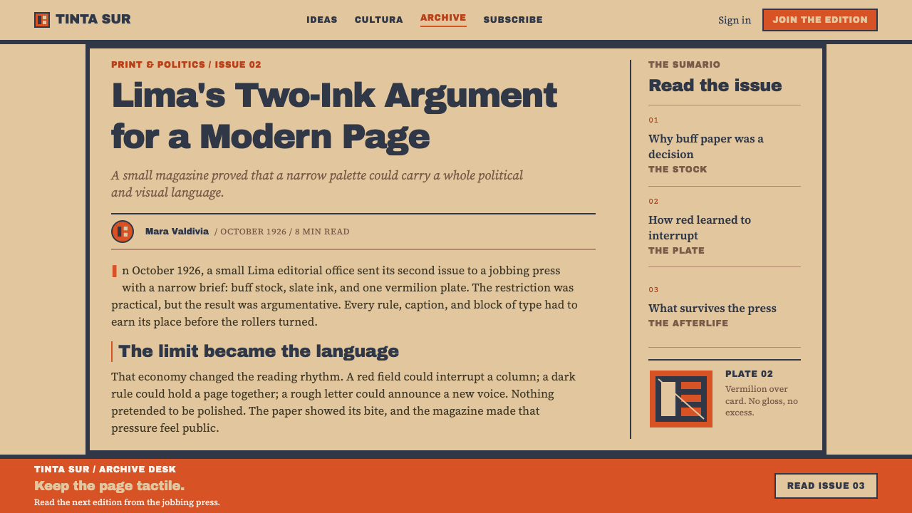
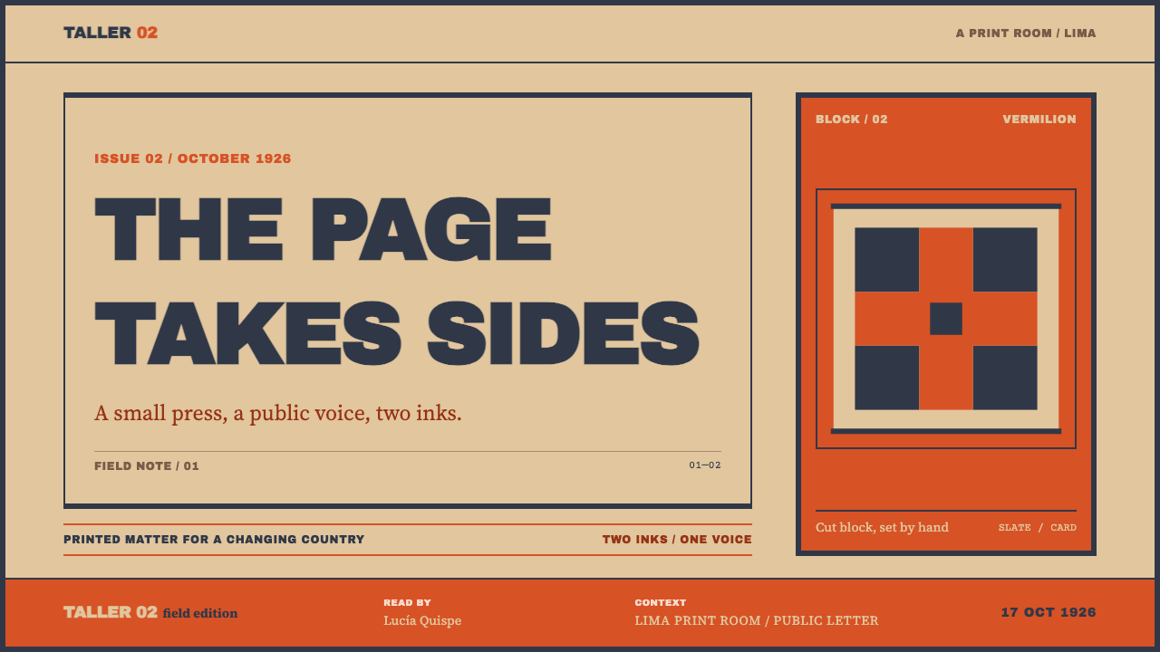
For presentation slides, a cover works as a miniature magazine cover: a buff field, a heavy hand-ruled navy frame, a large flat block of the accent colour behind a simple woodcut-like image, and the title set in the navy beneath or beside it. Content slides drop the colour block but keep the frame, with text in navy, a single column rule and generous empty card. Data slides suit flat bars and solid shapes in the two inks, with no shading or gradient. Where a chart needs emphasis, give one bar the accent colour and leave the rest in navy.
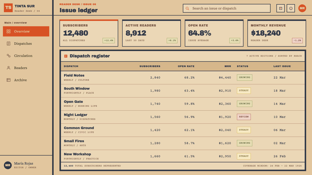
For web interfaces, the style fits publishing tools, cultural institutions, archives, newsletters, campaign sites and editorial dashboards. Buttons are flat accent blocks with navy text, inputs are framed by a heavy rule rather than a shadow, and cards are separated by ruled lines on bare card instead of floating panels. Navigation is typographic. Pricing pages work well because the two-ink system makes a plan comparison feel like a printed schedule, provided the columns are divided by rules and tone, never by shadow.
For editorial and marketing work, the system is at its best as a manifesto page, a zine-like issue, an event poster or a campaign that wants to feel committed rather than polished. Each campaign or edition can take its own second colour, which lets a series feel related without repeating itself. Images should be treated as woodcuts or high-contrast duotones with visible texture. Use Andean or Latin American references with care: draw on the printing logic and the magazine's convictions, not on tourist-style ornament or clip-art textiles.
The most common mistake is to treat the look as vintage and then add digital smoothing: perfect geometric rules, soft shadows, subtle gradients or a faux-paper texture laid over a clean layout. That removes the one thing the system depends on, which is that the page looks printed with real limits. The second mistake is adding a third colour. If the layout seems to need one, the layout is asking for more hierarchy, and the answer is size, position or a heavier frame, not another ink.
Amauta Magazine — FAQ
What was Amauta?
Amauta was a Peruvian magazine founded in Lima in September 1926 by José Carlos Mariátegui and published until 1930, across 32 issues. It joined Indigenismo, avant-garde art and socialist politics in one small, committed publication. Its covers were printed in two inks on coloured card, with a navy frame and masthead, which is the object this design system is modelled on.
What does the word amauta mean?
Amauta is a Quechua word usually translated as sage or teacher. Using it as the title was a deliberate choice for a magazine of the political left in Lima: an Andean word at the top of the page, in a city whose publications had often looked abroad for their names. The design system does not rely on the word, only on the physical page the magazine produced.
Why does the system use only two inks?
Because the original was printed that way: one press run, two inks, coloured cover card. The limit is not a stylistic pose but the reason the look exists. It forces flat colour, strong contrast and clear hierarchy, and it keeps the page honest. Adding a third colour would turn a printing economy into a decorative choice.
How should the changing second colour be handled?
Treat it as the edition colour. Pick one accent for a given campaign, deck or product release and hold it across every page, while the navy stays constant. When you start a new edition, change only the accent. Vermilion is the colour the source remembers, but any single flat colour that prints well against buff card and navy can play the role.
Is this a vintage style, and where does it not fit?
It reads as historical, but the logic is about printing limits and conviction, not nostalgia. It suits publishing, culture, advocacy and anything that wants to sound like an argument. It is a weaker fit for glossy luxury products, playful consumer apps or interfaces that rely on depth, animation and many accent colours, since those depend on exactly the softness the system refuses.
Related design styles
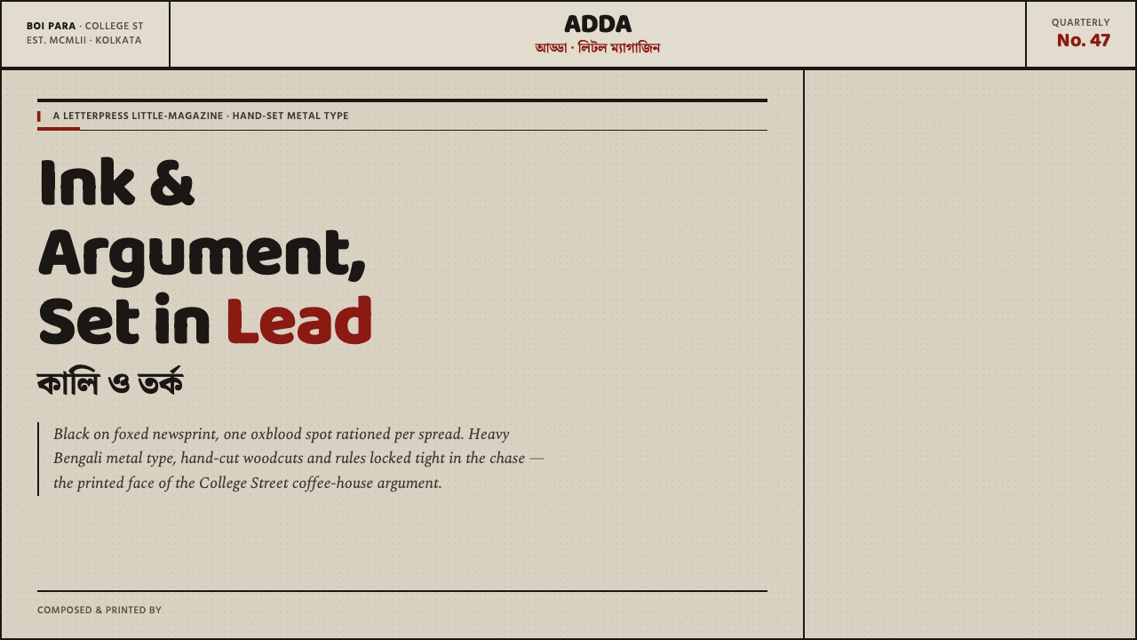 Kolkata Adda LetterpressAustere print, alive with argument. Baloo Bengali type and oxblood rules bite…
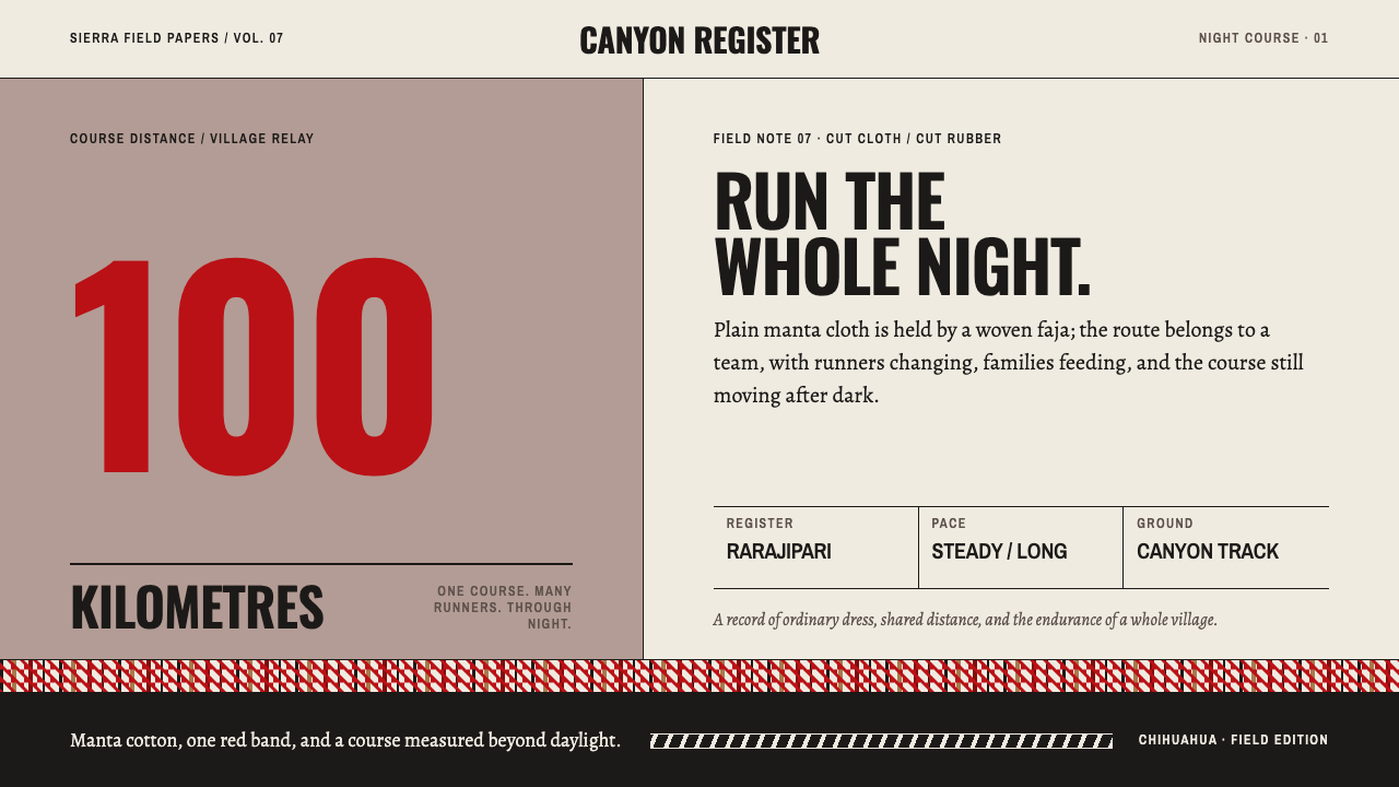 Rarámuri RunningEndurance belongs to the village. Manta planes and one red woven band carry t…
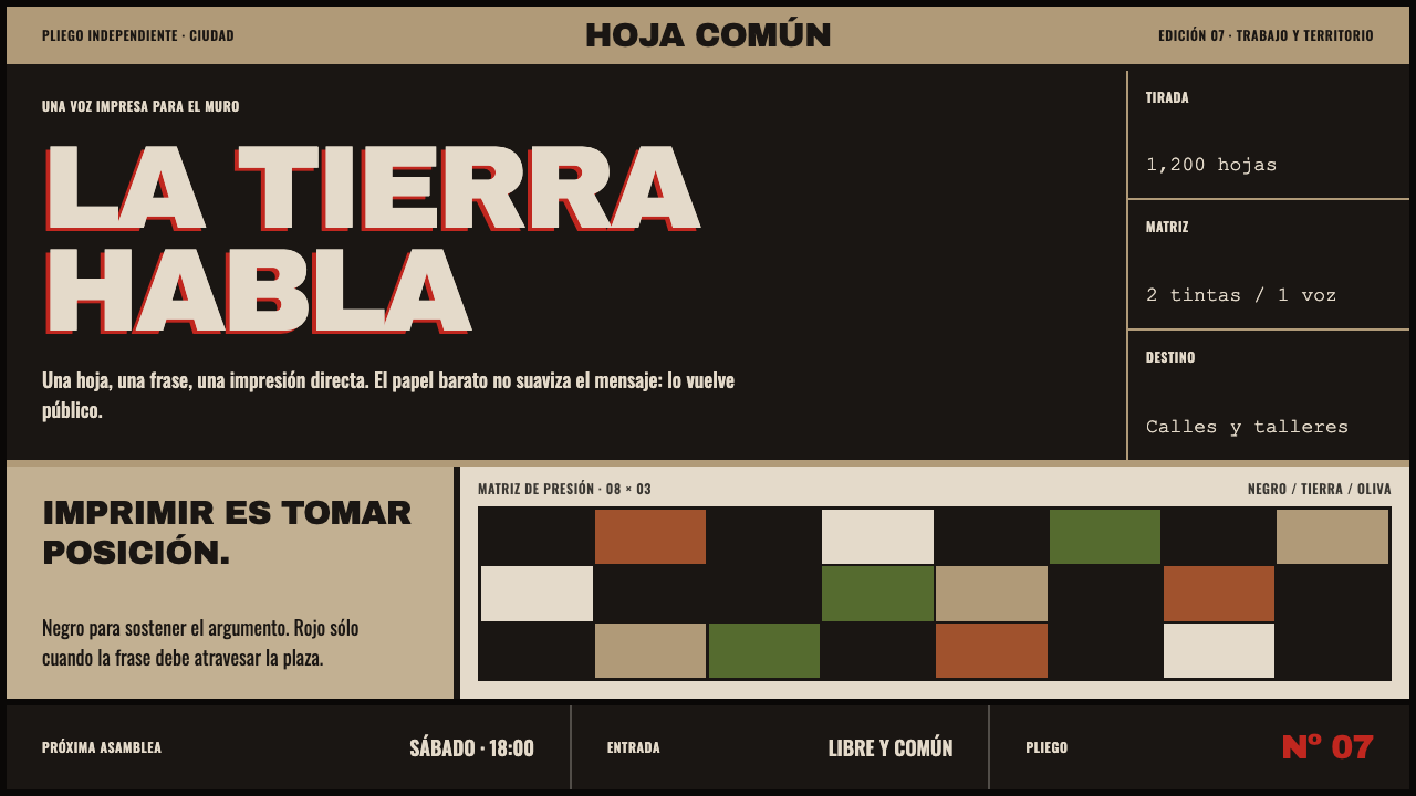 Taller de Gráfica PopularPrint that takes a side. Carbon-black blocks shout across acid-browned newspr…
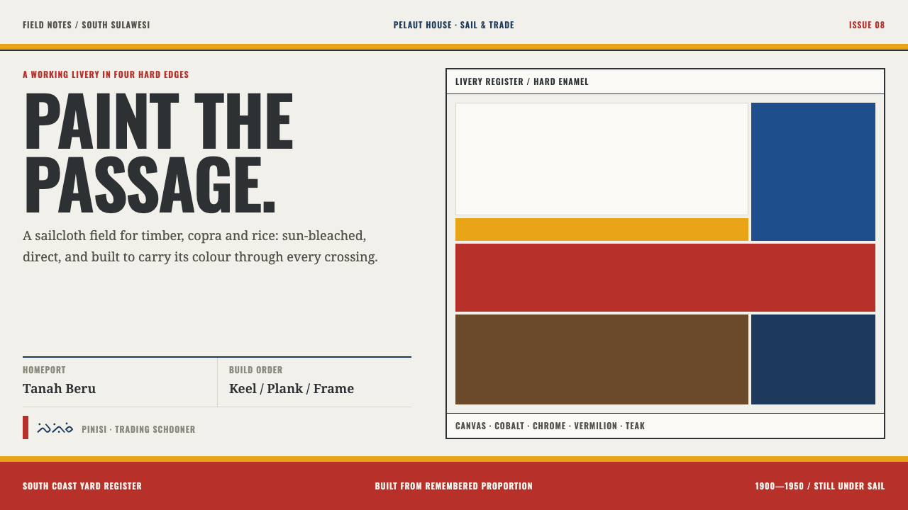 Bugis PinisiSailcloth made resolute. Vermilion, chrome and cobalt bands cut a warm white…
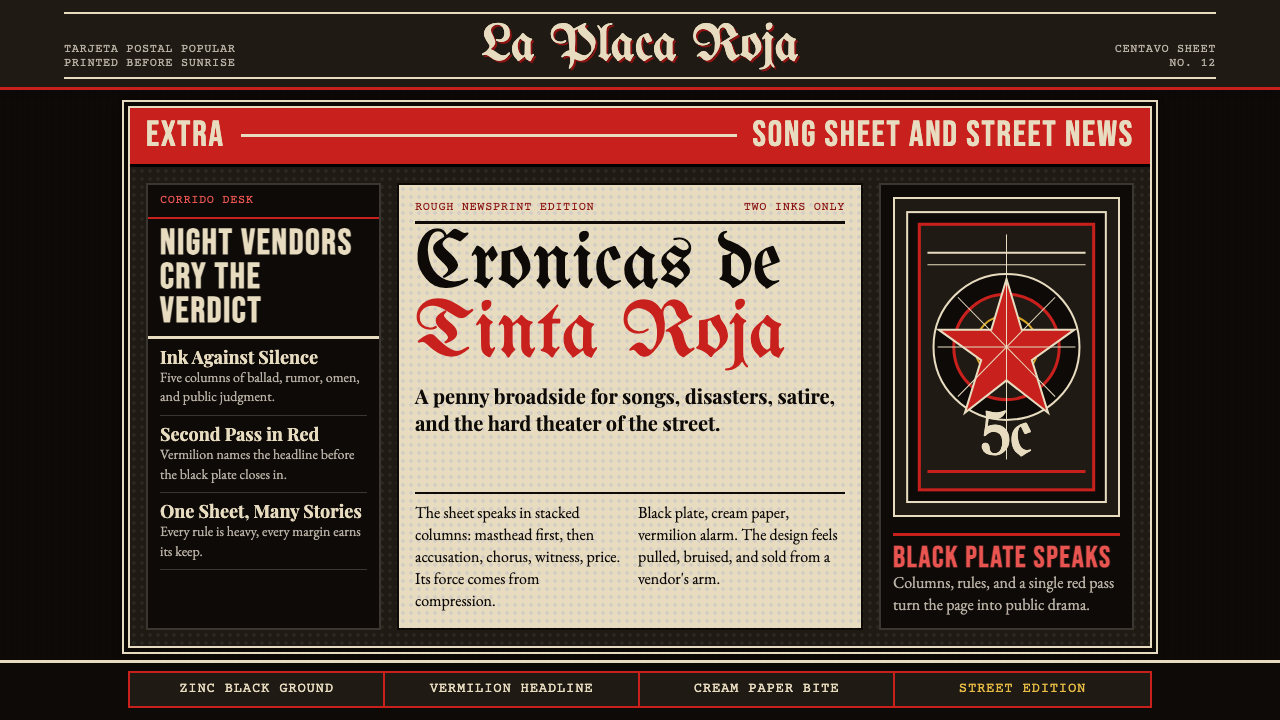 Mexican Tarjeta Postal (Posada Engraving 1900)Tabloid drama in two inks. Fraktur mastheads, vermilion rules, and cream news…
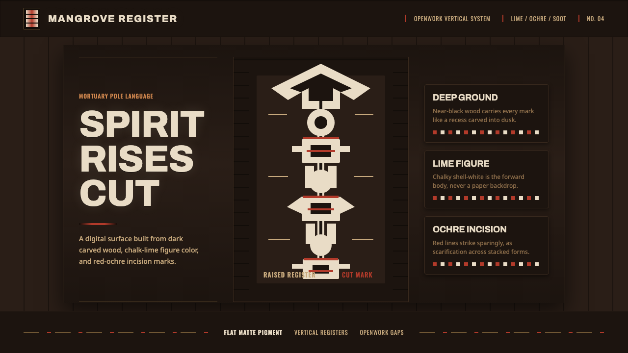 Asmat Bisj Ancestor PoleCeremonial vertical force. Lime-white figures rise from dark wood with red-oc…