What is Kolkata Adda Letterpress?
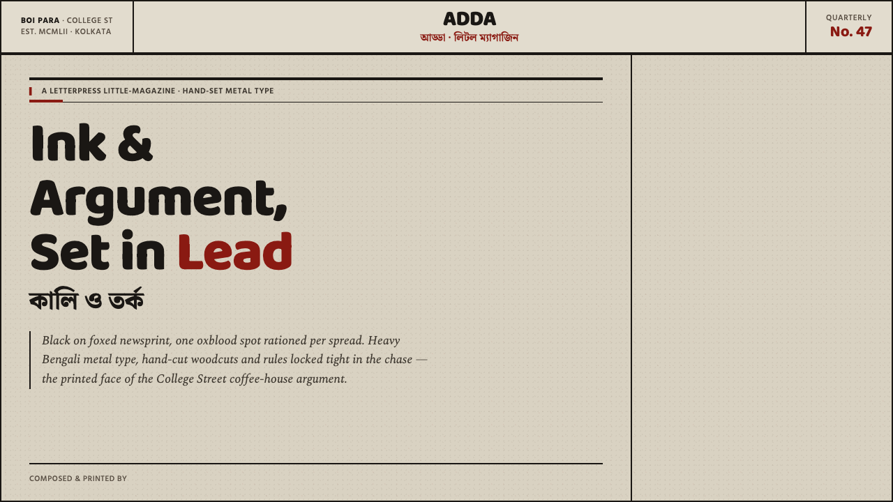
Kolkata Adda Letterpress turns cheap paper, heavy Bengali type, and one blood-dark accent into a visual language built for argument.
Kolkata Adda Letterpress in brief
Kolkata Adda Letterpress distills the mid-century little-magazine culture of College Street, Kolkata’s cramped book and press district, into a system of dense ink, blunt typography, hard rules, and aged pulp. Its reference point is not polished publishing but the inexpensive, urgent printed matter produced around Boi Para from 1950 through 1990.
The visual field is deliberately austere. Heavy Bengali metal type presses into toned newsprint; hand-cut woodcut and linocut imagery sits beside thick lines; black carries almost everything, while oxblood appears as a controlled spot of emphasis. The ground is foxed grey-tan, closer to aged paper than to a clean editorial backdrop, and explicitly never cream or pure white.
On screen, the system preserves the pressure of the press rather than imitating paper through decorative effects. Type should feel ink-heavy, images should feel cut, and structure should be announced by rules that bite into the page. The result is not nostalgic softness but an independent print culture translated into a compact, argumentative interface.
Where does Kolkata Adda Letterpress come from?
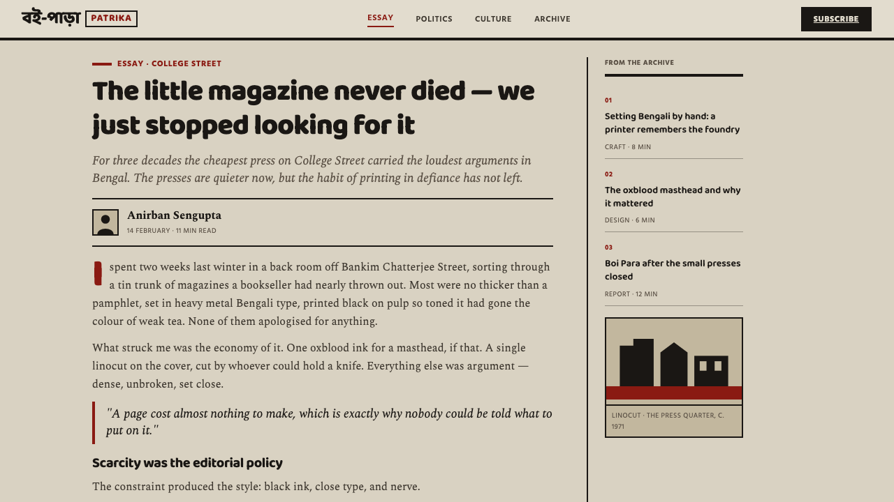
The system takes its name and spirit from adda, the culture of sitting together and talking at length, and from the little magazines associated with College Street and Boi Para. Its historical frame is the little-magazine and pulp book-cover heyday between 1950 and 1990, when inexpensive printed matter carried literary, political, and cultural energy through a dense press district.
The production world behind the style was materially direct. Anonymous compositors assembled heavy Bengali metal type by hand, while cover artists cut woodblocks and linocuts. The printed result was black ink on cheap toned newsprint, with no expectation of pristine reproduction. Uneven pressure, blunt forms, and the visible character of pulp were not defects to conceal; they were part of the medium’s authority.
Bengali little-magazine editors gave this material language a reason to exist. Their publications were small in scale but forceful in voice, and the surrounding print culture made austerity feel active rather than impoverished. A thick rule could separate competing arguments, a dark headline could occupy the page like a declaration, and a rough image could carry more immediacy than a polished illustration.
The Kolkata Little Magazine Library archivists preserve the memory of this culture as an encounter between matter and conversation. In the digital system, that memory becomes a set of disciplined choices: dark ink, foxed grey-tan paper, heavy Bengali type, hand-cut imagery, and a restrained oxblood accent. The aim is not to reproduce every historical imperfection, but to retain the independent pressure that made the original objects compelling.
What defines the Kolkata Adda Letterpress look?
Ink and Accent
Black is the governing ink, carrying type, rules, and most structural information. Oxblood is used sparingly as a spot accent, closer to a printer’s deliberate intervention than a general palette. It should mark importance, conflict, or direction without competing with the density of the black.
Foxed Pulp Ground
The background resembles aged, foxed grey-tan newsprint. It is neither clean white nor gentle cream, and its muted irregularity gives the dark ink something physical to press against. The ground should support the impression of inexpensive pulp without becoming a decorative paper texture.
Heavy Bengali Type
Baloo Bengali type supplies the system’s central voice: broad, weighty, and immediately present. Headlines should feel composed rather than airy, while supporting text remains dense and purposeful. Typography is not a neutral container here; its mass is part of the cultural and material reference.
Rules and Pressure
Rules are thick, decisive, and visibly structural. They divide, frame, and interrupt blocks of information with the blunt certainty of a printing form. Their role is closer to cutting a page into arguments than adding a refined border, so they should be used where the composition needs force.
Hand-Cut Imagery
Imagery draws from woodcut and linocut cover art: simplified, high-contrast, and shaped by the pressure of a blade. Pictures should read as printed marks rather than glossy windows. Cropping, silhouette, and rough edge are useful when they reinforce the sense that an image has been cut, inked, and pressed.
Argumentative Density
The composition is compact and text-forward, with little interest in ornamental breathing room. Density does not mean indiscriminate crowding: blocks must still be ordered, and hierarchy must remain legible. The desired feeling is a page alive with thought, where every dark mass appears to have something to say.
Who shaped Kolkata Adda Letterpress?
These anonymous compositors represent the material intelligence of the system. Their hand-assembled Bengali metal type establishes the style’s heavy rhythm, compressed authority, and respect for the physical act of printing.
The cover artists supply the image language: reduced forms, blunt contrast, and marks that retain the evidence of cutting. Their work keeps illustration close to the surface of the paper and away from polished naturalism.
The editors represent the argumentative life of the culture. Their small publications made dense typography and inexpensive production feel urgent, independent, and capable of carrying serious cultural conversation.
The archivists preserve the continuity of this print culture. Their presence in the system is a reminder that foxed paper, rough covers, and anonymous labor are not disposable remnants but part of a living design memory.
How do you use Kolkata Adda Letterpress today?
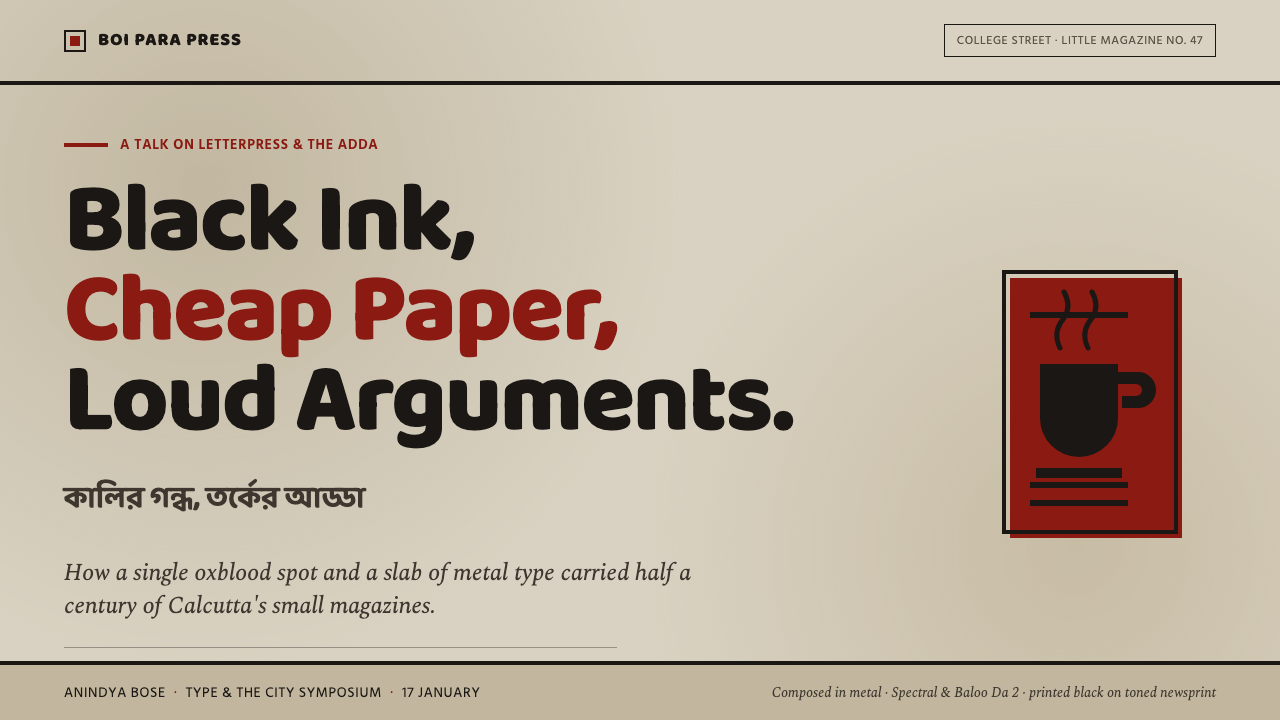
For presentation covers, use the foxed grey-tan ground as the full field and let a heavy Bengali title occupy the page with the directness of a pulp cover. A dark rule can establish the main division, while a small oxblood intervention gives the title or theme a single point of pressure. Content slides should remain dense but ordered: strong text blocks, firm separations, and hand-cut imagery that behaves like evidence rather than decoration.
For data slides, treat charts as printed arguments. Favor blunt shapes, dark marks, and rules that make comparison immediate; use oxblood only to identify the decisive series, change, or conclusion. The visual language should feel assembled from type, ink, and paper, not from a polished software interface. A chart becomes more convincing when its structure is visibly doing the explanatory work.
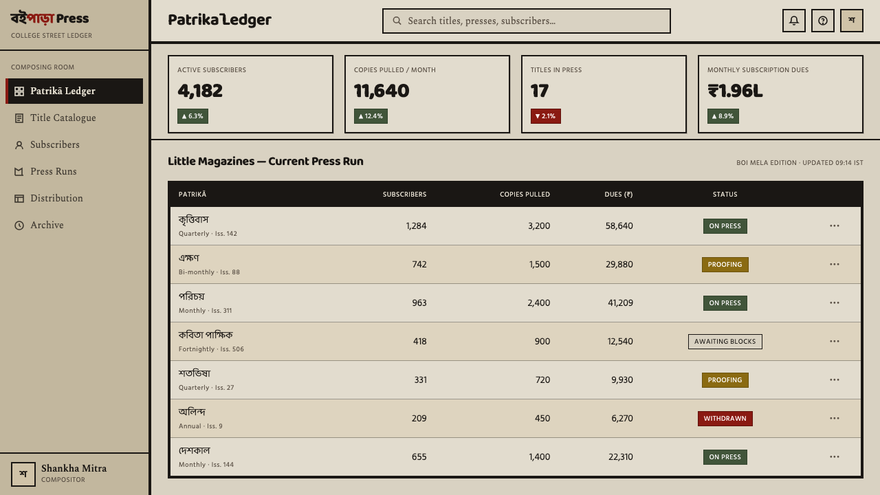
For web interfaces, the system suits dashboards, research tools, and pricing pages that want to feel independent, editorial, and intellectually alert. Keep the grey-tan pulp ground visible, use heavy type for section names, and make controls legible through dark borders and strong separation. Pricing tiers can use oxblood for the recommended or contested choice, while the rest of the interface remains governed by black ink and paper.
For editorial and marketing work, Kolkata Adda Letterpress is strongest when the page has something to declare. Articles can pair compact text columns with thick rules, clipped woodcut-like images, and short emphatic headings. Campaign pages can borrow the little-magazine cover logic: a dominant title, a small number of forceful visual marks, and a single oxblood accent repeated with discipline. The tone works especially well for cultural publishing, independent books, criticism, and projects that value conversation over polish.
The common mistake is to turn the style into generic vintage grunge. Random stains, excessive distress, decorative retro lettering, and many competing colors weaken its logic. The source material is austere, not chaotic: the paper is aged, the ink is dense, the imagery is cut, and the red is controlled. If every surface is made rough and every element is given equal emphasis, the page loses the editorial pressure and argumentative hierarchy that define the system.
Kolkata Adda Letterpress — FAQ
What is Kolkata Adda Letterpress?
It is a design system inspired by the little-magazine and pulp book-cover culture of College Street and Boi Para in Kolkata between 1950 and 1990. Its defining ingredients are dense black ink, heavy Bengali type, hand-cut imagery, thick rules, foxed grey-tan paper, and a restrained oxblood accent.
Why must the background avoid cream and white?
Because the system depends on the visual memory of cheap toned newsprint and aged pulp. A clean white or soft cream ground shifts the mood toward refined editorial publishing, while the foxed grey-tan field keeps the ink materially grounded and preserves the rough authority of the reference.
Does the style require Bengali language?
Bengali type is central to the reference because the system grows from Bengali metal type and College Street print culture. When the content uses another writing system, the important requirement is to preserve equivalent weight, density, and directness; substituting a light or overly polished type treatment would break the material logic.
How much oxblood should be used?
Use it as a controlled spot, not as a second governing ink. It can identify a decisive heading, rule, control, or conclusion, but the page should remain fundamentally black on toned paper. If oxblood becomes a broad decorative field, it loses the pressure and restraint that make the style distinctive.
Is this simply a distressed or vintage style?
No. Aged paper and rough marks are references to a specific print culture, not invitations to add random decay. The system is defined by editorial force: heavy type, cut imagery, structural rules, and disciplined contrast. Its historical character comes from the relationship between those elements, not from surface damage alone.
Related design styles
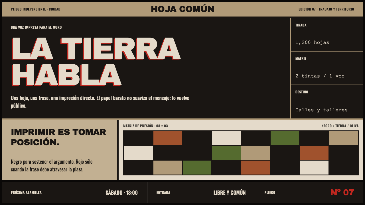 Taller de Gráfica PopularPrint that takes a side. Carbon-black blocks shout across acid-browned newspr…
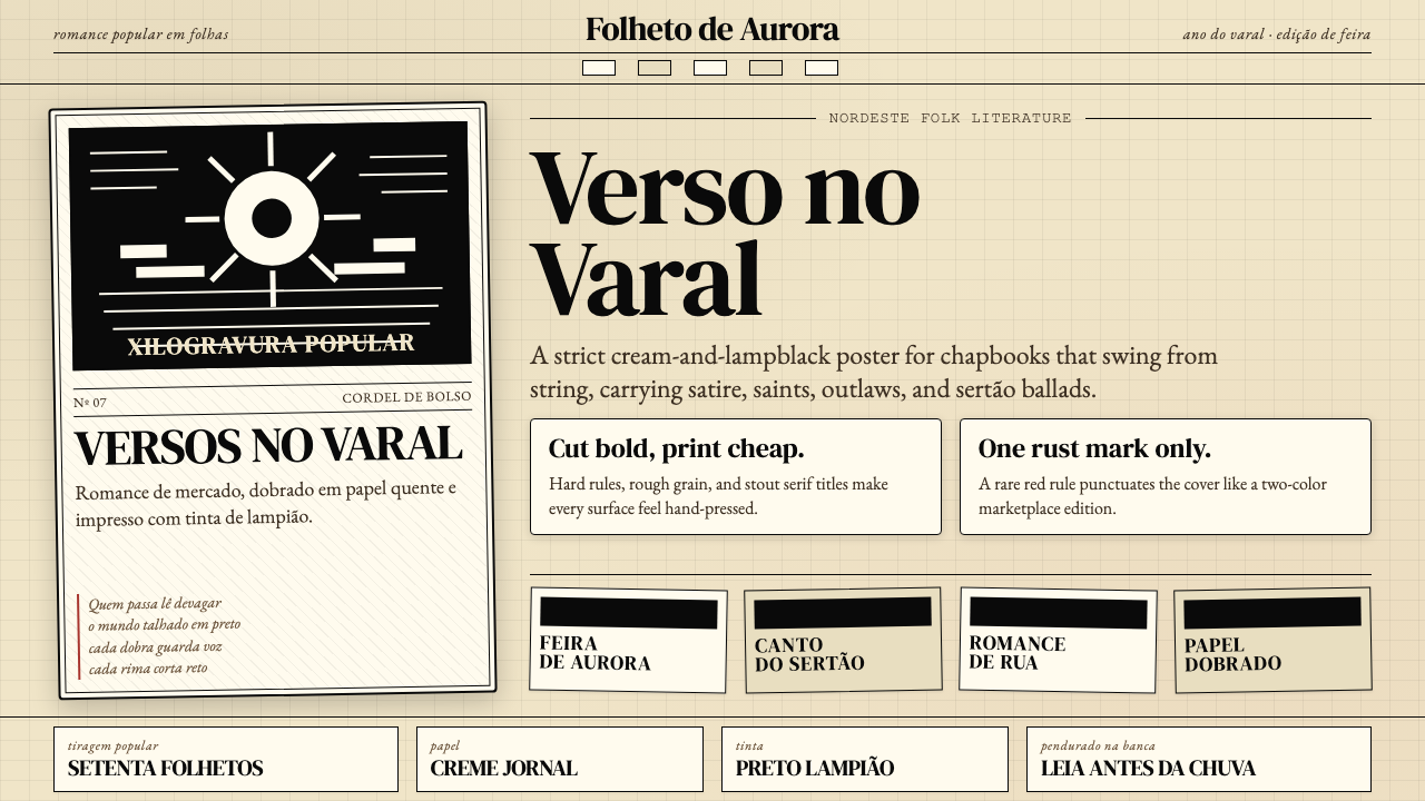 Brazilian Cordel (Northeast Folk Literature)Folk poetry, cut in lampblack. Cream newsprint, bordered chapbooks, one rust-…
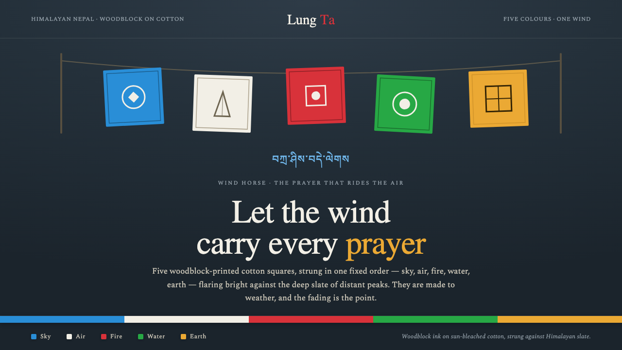 Nepali Lungta Prayer FlagsLet the wind carry the prayer. Five woodblock flags flare in fixed order agai…
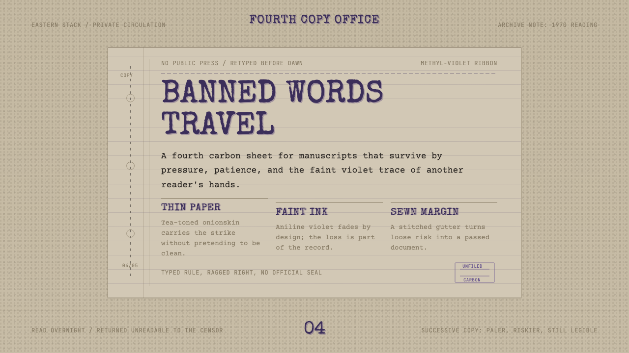 Samizdat TypewriterSecrecy leaves an imprint. Methyl-violet type on tea paper, narrow column, st…
 Timor-Leste Tais BunaWoven meaning, never blank cloth. Madder-red ground banded in black, ochre di…
 Chilean BRP Ramona Parra 1971Resistance stays alive. Blood red panels, black outlines, and stencil type re…