What is Samizdat Typewriter?
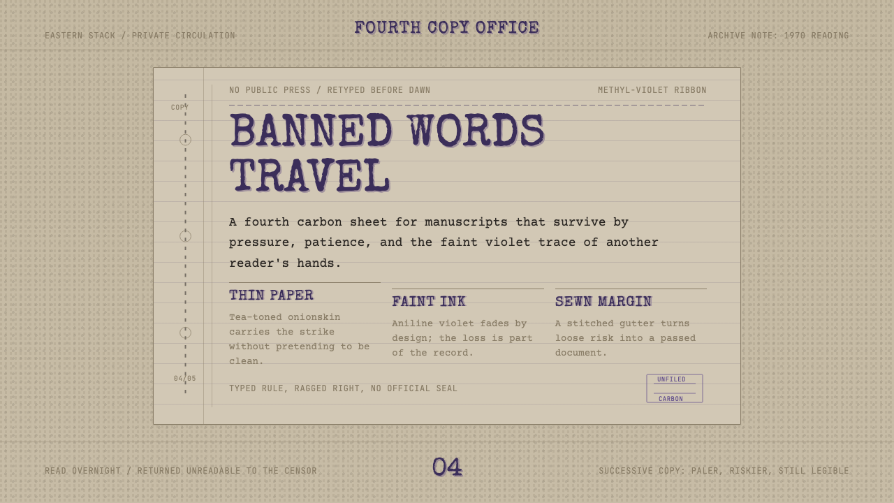
Every banned page was a carbon copy fading toward illegibility — this system reads like the third or fourth strike of that ribbon, tea-toned and stitched at the spine.
Samizdat Typewriter in brief
Samizdat — Russian for 'self-published' — describes the clandestine practice of retyping and circulating banned literature by hand across the Eastern Bloc and the Soviet Union during the Cold War. A single typist, often working at night with a manual typewriter and layers of thin onionskin paper interleaved with carbon paper, could produce several copies at once; each successive layer came out fainter than the one before it, and each copy was retyped again once it wore out. This system is built from the visual residue of that process.
Rather than reconstructing a single clean 'original' document, the system takes the character of a worn third or fourth carbon copy as its subject: aged, tea-toned paper standing in for cheap newsprint-grade stock, faded aniline-violet type standing in for a spent typewriter ribbon, and a narrow column width standing in for the physical constraints of a manual typewriter's carriage. A stitched or bound gutter running down the spine references the hand-assembly of these documents into pamphlets and books.
The overall effect is quiet rather than dramatic — samizdat was, by necessity, unglamorous. Its power came from persistence and multiplication, not visual spectacle, so this system favors restraint, worn texture, and a narrow, dense column of type over any single bold gesture.
Where does Samizdat Typewriter come from?
Samizdat emerged as a response to strict Soviet-era censorship, which controlled every official printing press, publishing house, and photocopier in the USSR and its satellite states. Anyone wanting to read or share a text the state had banned — a novel, a poem, a political essay, a religious tract, a piece of foreign journalism — had essentially one option outside state channels: copy it by hand or by typewriter and pass it along, reader to reader, at real personal risk.
The practice took its now-famous name from a play on Gosizdat, the State Publishing House; samizdat literally meant 'self-published' as opposed to state-published. Because photocopiers were tightly controlled and monitored precisely to prevent this kind of unauthorized reproduction, the typewriter and carbon paper became the actual infrastructure of underground publishing. A typist could usually manage four to seven legible carbon copies in a single pass before the ribbon and pressure gave out; each copy was expected to be retyped and passed on again once demand exceeded supply, producing an organic, decentralized distribution network with no central press to shut down.
Samizdat carried real danger. Producing or distributing it could mean interrogation, loss of employment, imprisonment, or exile under Soviet law, yet it became the primary channel through which banned or unpublishable literature circulated for decades — from literary fiction and poetry to human rights reporting and religious material. It thrived precisely because it required no permission and no infrastructure beyond what a private citizen could keep hidden in a drawer.
The practice produced and sustained some of the most consequential literary and political writing of the twentieth century, carried outside official channels by writers and dissidents whose work could not otherwise reach readers. By the time the Soviet Union began to loosen censorship in the late 1980s, samizdat had already built decades of underground reading culture, and its physical artifacts — worn, faint, carbon-typed pages — had become a kind of visual shorthand for intellectual dissent under authoritarian rule.
What defines the Samizdat Typewriter look?
Color
The signature color is a faded aniline violet — the characteristic tint of a worn carbon or typewriter ribbon — never a true black. Paired against an aged, warm tea-toned paper ground rather than clean white, the overall palette reads as worn and secondhand, closer to a document that has passed through many hands than one fresh off a press.
Typography
Lettering is monospaced and mechanically even, with the slightly irregular strike and occasional ghosting of a real typewriter rather than the crisp uniformity of digital type — some letters sit fractionally darker or lighter than their neighbors, echoing uneven key pressure and a fading ribbon.
Narrow Column
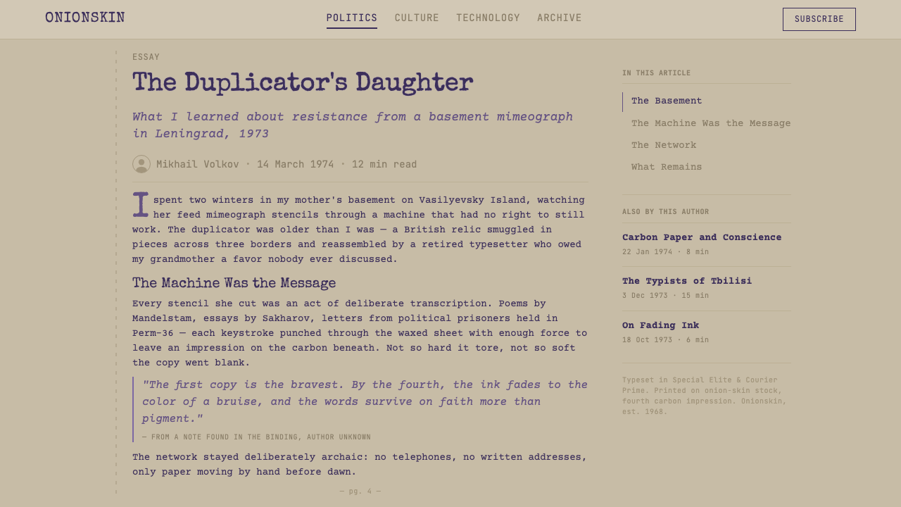
Text sits in a noticeably narrow measure, echoing the fixed carriage width of a manual typewriter rather than the wide flexible columns of professional typesetting. This constraint reads as authentic rather than limiting — it is a direct physical trace of the tool that produced the original document.
Stitched Gutter
A visible seam or stitched line runs along one edge, referencing the hand-binding of loose typewritten pages into a pamphlet or book. This detail marks the document as an object that was physically assembled by hand, not simply printed and bound by machine.
Fading and Wear
Rather than uniform ink coverage, type and texture vary in density across a page, as if reproduced several carbon-layers deep. This uneven, degraded quality is treated as the defining feature of the style, not a flaw to be smoothed away.
Restraint
There is no ornament, no illustration, and no bold color beyond the single faded violet. The style's entire visual force comes from texture, density, and the narrow, mechanical rhythm of the type — never from decoration layered on top.
Who shaped Samizdat Typewriter?
Solzhenitsyn's writing on the Soviet prison camp system, including work that circulated in samizdat form before and alongside official publication abroad, made him one of the most internationally recognized figures associated with underground Soviet literature and eventually led to his expulsion from the USSR.
A physicist who became one of the Soviet Union's most prominent human rights dissidents, Sakharov's essays and appeals circulated widely through samizdat networks, connecting the underground publishing tradition directly to the broader Soviet human rights movement of the 1960s and 1970s.
A poet whose work circulated in samizdat form in the Soviet Union before he was tried, sentenced to internal exile, and later forced to emigrate, Brodsky represents the way samizdat served as the only viable channel for literary work the state considered ideologically unacceptable.
A playwright and dissident in Czechoslovakia, Havel's essays and plays circulated through the region's own samizdat and underground publishing networks before he later became the country's president, illustrating how the practice extended across the Eastern Bloc beyond the Soviet Union itself.
How do you use Samizdat Typewriter today?
This is a quiet, texture-driven style best suited to work that wants to feel authentic, literary, or historically weighted rather than polished and contemporary. It works because of restraint — one faded color, worn paper, mechanical type — so it rewards subject matter that benefits from a sense of gravity, memory, or resistance rather than energy or novelty.
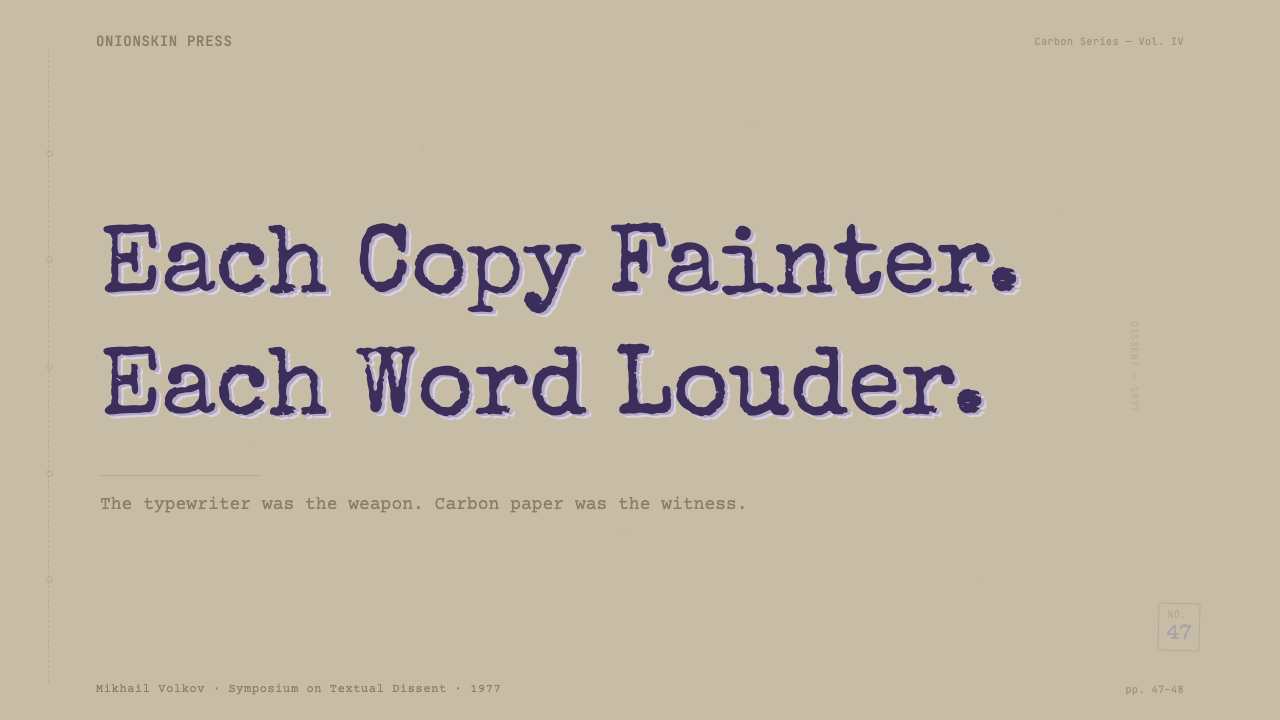
On a slide cover, the narrow column and stitched-gutter motif make an unusual but striking full-bleed treatment: a tea-toned field with a single block of dense, monospaced title text set off-center, as if photographed from an actual page. Content slides should keep the narrow-column discipline rather than stretching text to fill a widescreen frame — a deliberately underfilled slide, with generous margin on either side of a tight column, reinforces the reference rather than fighting it. Data on this kind of slide reads best as plain typewritten tables rather than colorful charts.
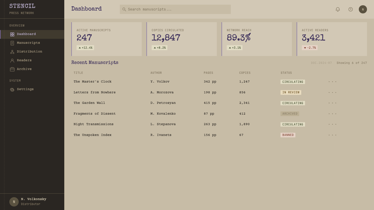
For web interfaces, the style suits long-form reading experiences — archives, essays, historical documentation, research repositories — more than transactional dashboards. A narrow content column against a tea-toned background, with the faded-violet accent reserved for links, active states, or small marginalia, keeps the reference legible without turning every interface element into a pastiche of an old document.
In editorial and marketing contexts, this system is strongest when the story itself concerns memory, censorship, resistance, or historical record — literary publishing, archives, documentary projects, human rights work. A pull-quote set in the faded violet against tea-toned paper can carry real weight precisely because the style does not announce itself loudly.
A common mistake is over-cleaning the texture — smoothing the fading into a uniform tint, or straightening the type until it looks like a modern monospaced webfont rather than an actual worn strike. The style depends on unevenness: letters that sit slightly off their baseline, ink that thins toward the edge of a page, a column that looks genuinely constrained rather than stylistically narrow. Removing that unevenness in the name of polish removes the entire point of the reference.
Samizdat Typewriter — FAQ
Does this style require an actual typewriter font to work?
It requires a monospaced, mechanically even letterform with visible signs of wear — uneven density, slight ghosting — rather than a specific named product. The point is the impression of a real strike on paper through several carbon layers, not a particular typeface; a clean, brand-new monospaced font without any texture or unevenness misses the reference entirely.
Why tea-toned paper instead of clean white?
Because samizdat documents were rarely printed on high-quality stock. Cheap, thin onionskin paper aged quickly, yellowing and browning over years of handling and storage. A clean white ground would misrepresent the object this style references — the tea tone is not a stylistic filter, it is the actual color of a document that has been read, folded, and passed along for years.
Is the faded violet color historically accurate, or an invented aesthetic choice?
It is historically grounded. Many manual typewriter ribbons of the era were aniline-dye based, and a common ribbon color produced a violet-to-purple strike rather than pure black, especially as the ribbon aged and was reused past its intended life — which was common practice given how scarce and controlled supplies were. The faded violet in this system reflects that real material constraint rather than an arbitrary color choice.
What kinds of products or stories does this style suit best?
It suits archival projects, literary and publishing platforms, historical documentation, journalism about censorship or dissent, and any brand or story that wants to feel earned and weighted with real history rather than trend-driven. It is a poor fit for consumer products that need to feel fast, cheerful, or frictionless, since the entire visual language is built around scarcity, constraint, and the passage of time.
Can this style work with a bright accent color instead of the faded violet?
Introducing a bright, fully saturated accent color undermines the reference. Samizdat documents were monochrome by necessity — a single ribbon, a single carbon layer — and that single faded hue is central to the style's authenticity. If a second accent is truly needed, it should stay muted and paper-adjacent (a dull red wax-stamp tone, for instance) rather than introducing contemporary saturated color into a deliberately worn, single-tone document.
Related design styles
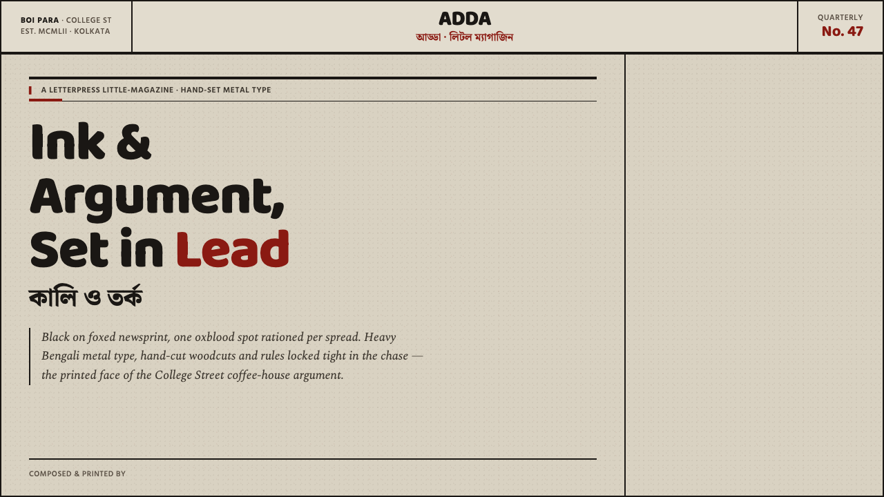 Kolkata Adda LetterpressAustere print, alive with argument. Baloo Bengali type and oxblood rules bite…
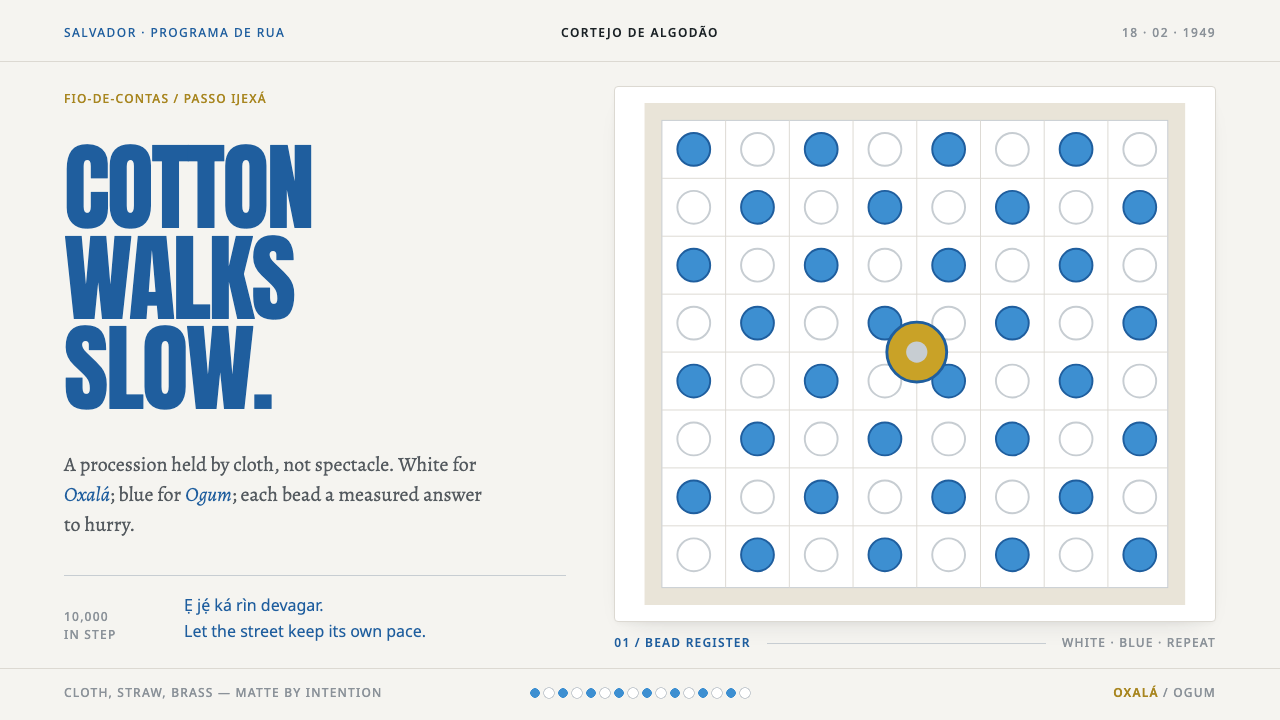 Afoxé Filhos de GandhyA procession that refuses to hurry. Cotton white and bead blue repeat in a me…
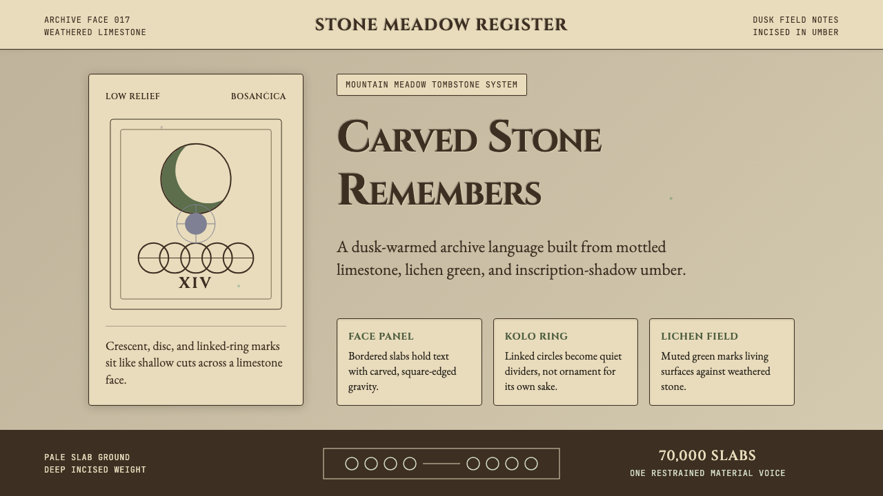 Bosnian Stećak Medieval TombstoneStone remembers quietly. Lichen green and Cinzel cuts sit on weathered limest…
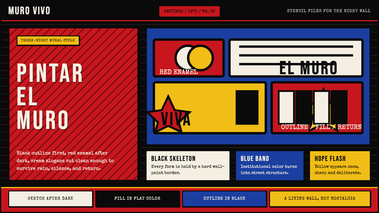 Chilean BRP Ramona Parra 1971Resistance stays alive. Blood red panels, black outlines, and stencil type re…
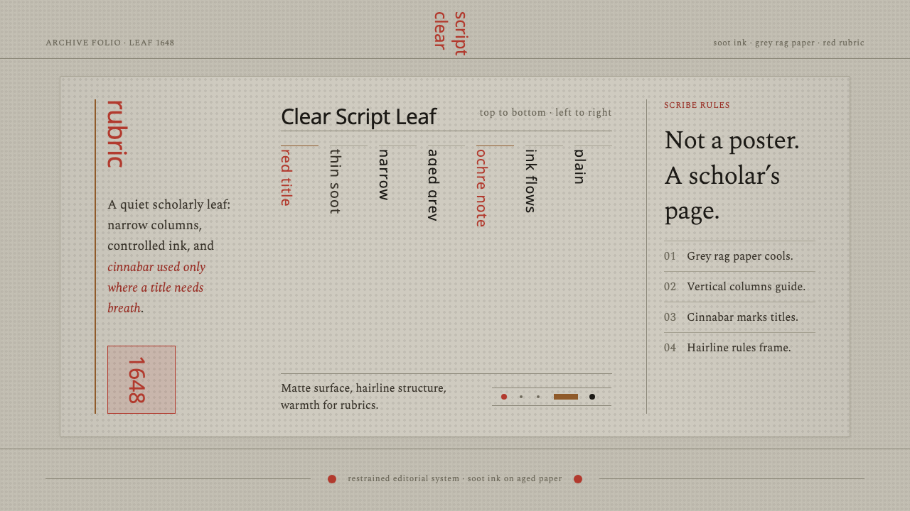 Kalmyk Todo Bichig Clear ScriptRestraint becomes script. Soot columns on grey rag paper, touched by cinnabar…
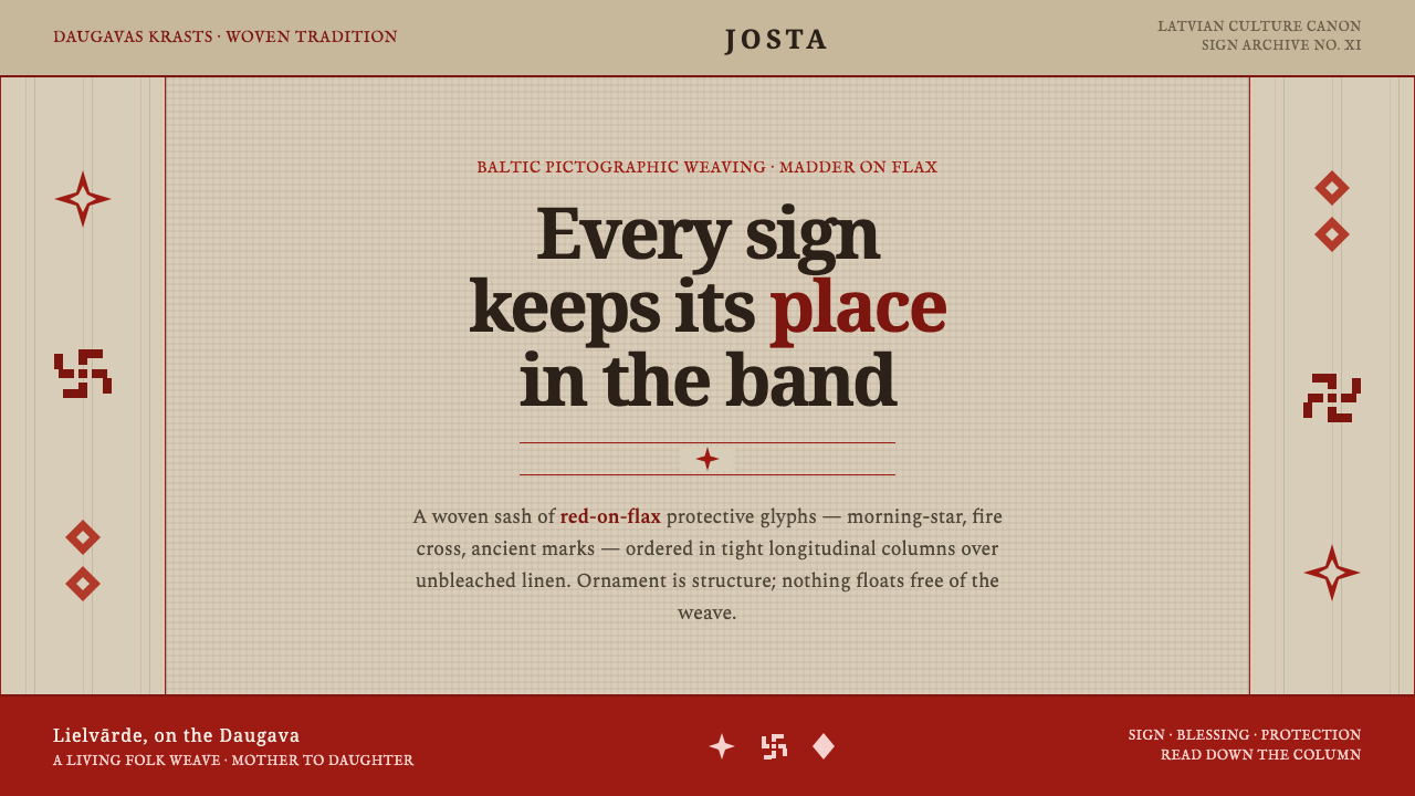 Latvian Lielvārde BeltOrnament is structure. Madder-red Baltic glyphs in tight longitudinal bands o…