What is Nepali Lungta Prayer Flags?
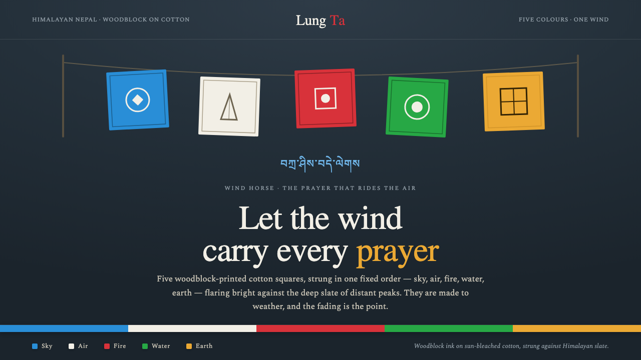
Nepali Lungta prayer flags turn wind into a visual medium: five printed colors, repeated in ritual order, carrying intention across a dark Himalayan field.
Nepali Lungta Prayer Flags in brief
Lung ta, meaning wind horse, refers to Tibetan-Buddhist prayer flags hung across Himalayan passes, bridges, and rooftops. Their visual system is inseparable from use: the flags are not static decoration but printed cotton surfaces activated by air, movement, weather, and gradual wear. Prayer is carried outward as the banners lift, pull, fray, and fade.
The composition follows a fixed five-color order: blue, white, red, green, and yellow. The colors correspond respectively to sky, air, fire, water, and earth. Repetition gives the sequence its force. Rather than presenting a single emblem or centered image, the style reads as a horizontal procession of related squares, each one distinct in color yet part of a continuous ritual rhythm.
In a contemporary visual system, Lungta is best understood through contrast: vivid printed banners against a deep Himalayan slate ground; weathered cotton against dense darkness; imperfect woodblock ink against orderly repetition. It should feel exposed to altitude and wind, never polished into a generic festival palette or a clean decorative pattern.
Where does Nepali Lungta Prayer Flags come from?
The source tradition is Tibetan-Buddhist lung ta prayer-flag practice in Himalayan Nepal and the wider Tibetan-Buddhist world. Prayer flags appear in places where passage, exposure, and landscape meet: mountain routes, bridges, rooftops, and other sites open to wind. Their placement makes the environment an active participant in the object’s meaning.
The flags are made as woodblock-printed cotton squares. This gives the tradition a material language as well as a symbolic one: ink is impressed rather than digitally drawn, fabric receives rather than perfectly contains the image, and repeated printing can retain slight irregularity. The visual character comes from this meeting of textile, block, ink, and weather.
The five-color sequence is fixed and cyclical. Blue, white, red, green, and yellow correspond to sky, air, fire, water, and earth, turning color order into a compact cosmology. The system does not treat colors as interchangeable accents; their sequence and elemental associations are central to the way the flags are read.
The pre-approved period of reference is 1950–1990, a living tradition spreading across Himalayan South Asia. Its key makers and carriers include Tibetan-Buddhist woodblock printers, Himalayan lay practitioners, and Buddhist lama-scribes. Any modern use should retain that sense of living transmission rather than presenting the flags as an anonymous mountain motif.
What defines the Nepali Lungta Prayer Flags look?
Five-Color Order
Blue, white, red, green, and yellow recur in one established sequence. The order matters as much as the colors themselves. Use it as a directional band or a sequence of connected panels, preserving the feeling of flags strung across space rather than scattering the palette as unrelated decorative accents.
Elemental Color
Each color carries an elemental association: sky, air, fire, water, and earth. The palette therefore has ritual structure, not merely visual energy. Color should identify a zone, state, or sequence with restraint, allowing the five hues to remain legible as an ordered system.
Himalayan Slate Ground
A deep slate-like ground gives the banners their flare. It suggests mountain shadow, exposed stone, and high-altitude distance without competing with the flags. The darkness should be dense and quiet, making the colored textiles feel suspended against terrain and sky.
Weathered Cotton
Cotton is not presented as pristine fabric. Its character comes from exposure: soft fading, worn edges, fraying fibers, and the sense that the material has spent time in wind and light. Texture should support impermanence and use, never read as luxurious upholstery or synthetic polish.
Woodblock Impression
Printed marks should feel transferred by a carved block: tactile, slightly uneven, and convincingly absorbent on cloth. The effect is graphic but not sterile. It favors visible pressure, ink variation, and edges that retain the human and material evidence of repeated making.
Horizontal Banner Rhythm
The defining spatial gesture is horizontal suspension. Repeated squares create a cadence of interval, color, and movement, like bunting pulled between distant anchors. Layouts should favor runs, rails, strips, and layered horizontal sequences over isolated centered emblems.
Who shaped Nepali Lungta Prayer Flags?
Woodblock printers are central to the visual identity of Lungta because the flags are printed rather than merely colored fabric. Their work joins carved image, ink, repetition, and cotton into a surface whose slight variation is part of its authenticity. In a design interpretation, their role is a reminder that the print should retain material evidence rather than becoming a perfectly uniform pattern.
Himalayan lay practitioners sustain the flags as a lived practice through hanging, renewing, and encountering them in everyday routes and domestic settings. Their role makes clear that Lungta is not only an image system. It is a public, environmental, and devotional form whose meaning unfolds through placement and exposure.
Buddhist lama-scribes represent the written and devotional dimension of the tradition. Their presence keeps language, prayer, and printed form connected. For contemporary work, this means text-like marks should be treated with seriousness and restraint, never as generic exotic ornament detached from the practice that gives them purpose.
How do you use Nepali Lungta Prayer Flags today?
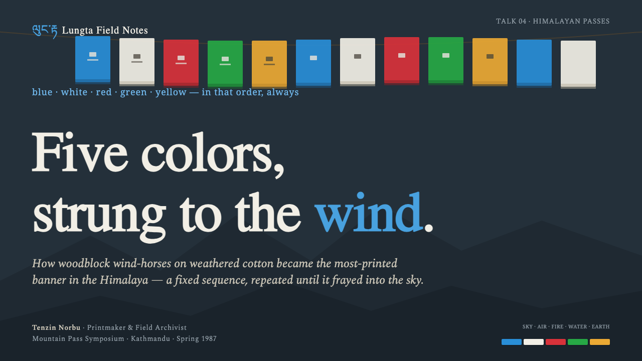
For presentation covers, use the deep slate ground as a quiet field and let a horizontal run of five cloth-like panels establish the title area. The strongest cover compositions feel stretched between unseen anchors, with the title placed as a calm counterweight rather than competing with every color. On content slides, retain the banner rhythm as a section marker or navigation device, while leaving the main reading area deliberately open.
For data slides, the five-color order can organize categories when the subject genuinely benefits from a fixed sequence. Treat color as an ordered legend, not as decoration added to every chart mark. Keep charts grounded and legible against the dark field, and use weathered or woodblock-like texture only in framing elements so that information remains easier to read than the atmosphere around it.
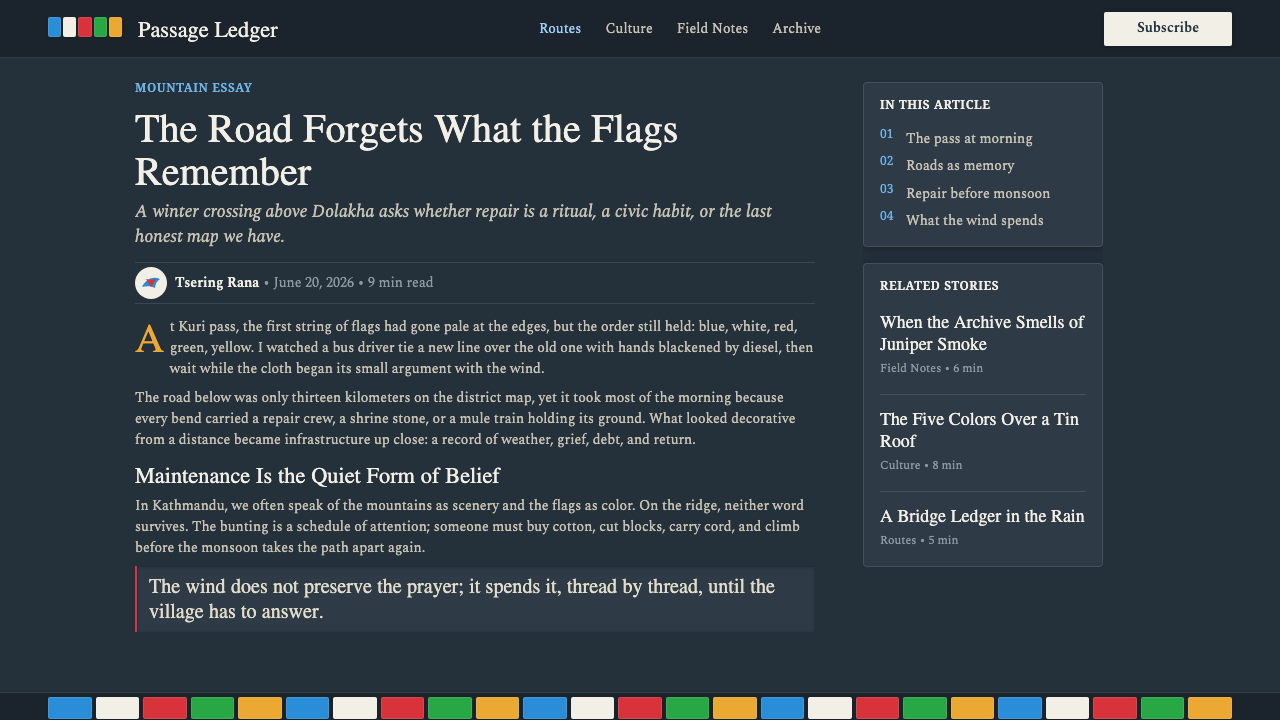
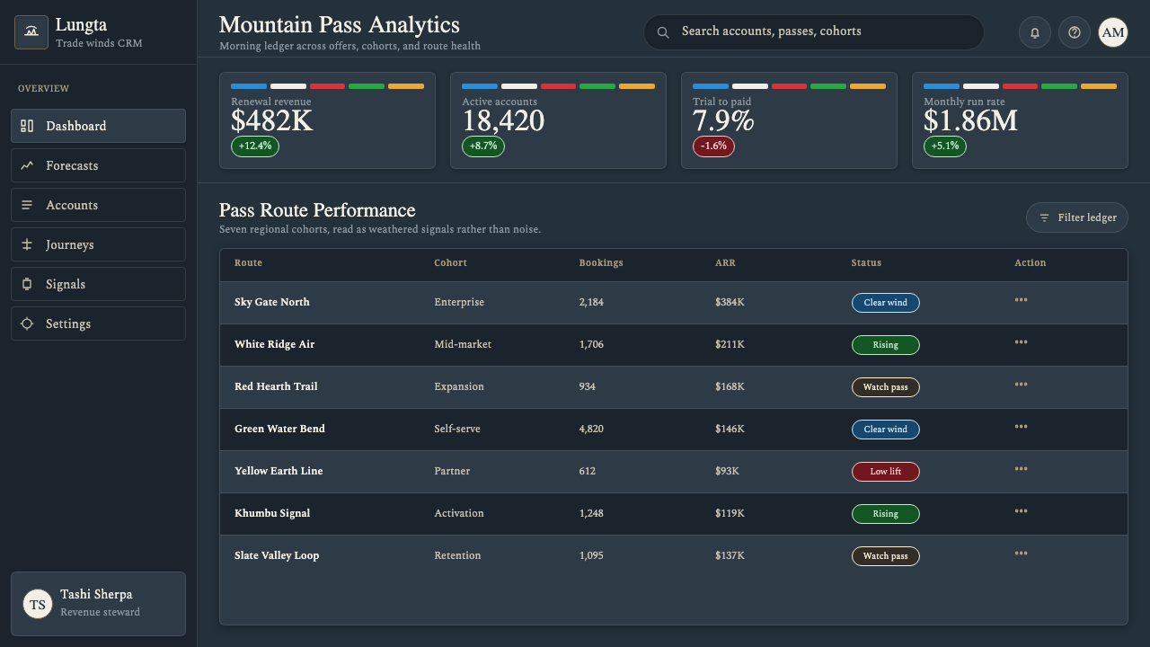
For web interfaces, this language suits editorial hubs, cultural archives, travel context pages, and dashboards that need a strong sense of place without becoming busy. A dark slate foundation can hold bright status markers, sectional tabs, or connected category bands. Pricing or comparison pages can use the five colors to distinguish a limited set of related options, provided the sequence remains comprehensible and text hierarchy stays independent of color alone.
For editorial and marketing work, use long horizontal modules, textile-like dividers, and printed panels to create continuity across a page. Photography, if present, should support mountain, wind, cloth, or material context rather than overwhelm the flags’ rhythm. Marketing should lead with the idea of transmission and exposure: color carried outward across dark space, not a loud collage of regional cues.
The common mistake is reducing Lungta to five saturated stripes plus distressed texture. That loses the system’s essential logic: fixed order, elemental association, woodblock print, cotton weathering, horizontal suspension, and a devotional relationship to wind. Do not scramble the sequence, turn sacred-looking writing into filler, or use the palette as a generic signal of Himalayan adventure.
Nepali Lungta Prayer Flags — FAQ
Why must the five colors stay in a fixed order?
Because the sequence is part of the Lungta system, not an optional palette arrangement. Blue, white, red, green, and yellow correspond to sky, air, fire, water, and earth. Preserving the order keeps the elemental structure readable and maintains the visual experience of linked prayer flags rather than unrelated colored panels.
Can this style use a light background?
It can, but the supplied system is defined by vivid flags flaring against deep Himalayan slate. A light ground changes the emotional balance and weakens the sense of banners seen against mountain shadow and open sky. If a lighter field is necessary, keep the weathered textile and woodblock character prominent so the result does not become a simple five-color graphic scheme.
How should woodblock texture be used in digital work?
Use it as evidence of transfer and material contact: slightly irregular marks, absorbent-looking ink, and edges that do not feel mechanically perfect. It should be concentrated in printed motifs, banner surfaces, or dividers. Applying the same distressed treatment to every interface element makes the system noisy and erases the contrast between ritual print and readable information.
Is it appropriate to use prayer-like writing as decoration?
No. The source material identifies Lungta as printed prayer flags, with Buddhist lama-scribes among the tradition’s key figures. Text-like or prayer-related marks should therefore be handled as meaningful devotional content, or omitted. Replacing them with invented sacred-looking filler disconnects the visual language from the practice that gives it significance.
Related design styles
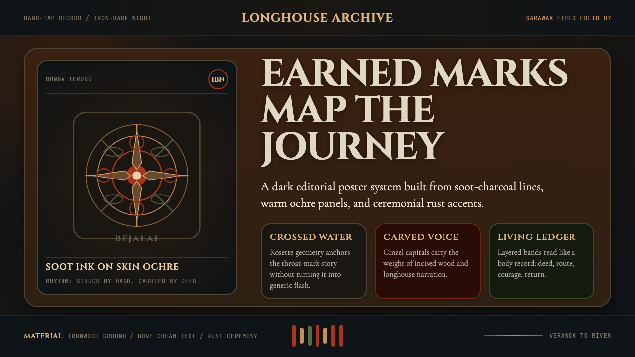 Dayak Borneo Tattoo (Iban)A living journey ledger. Soot lines, ochre panels, and rust rosettes feel han…
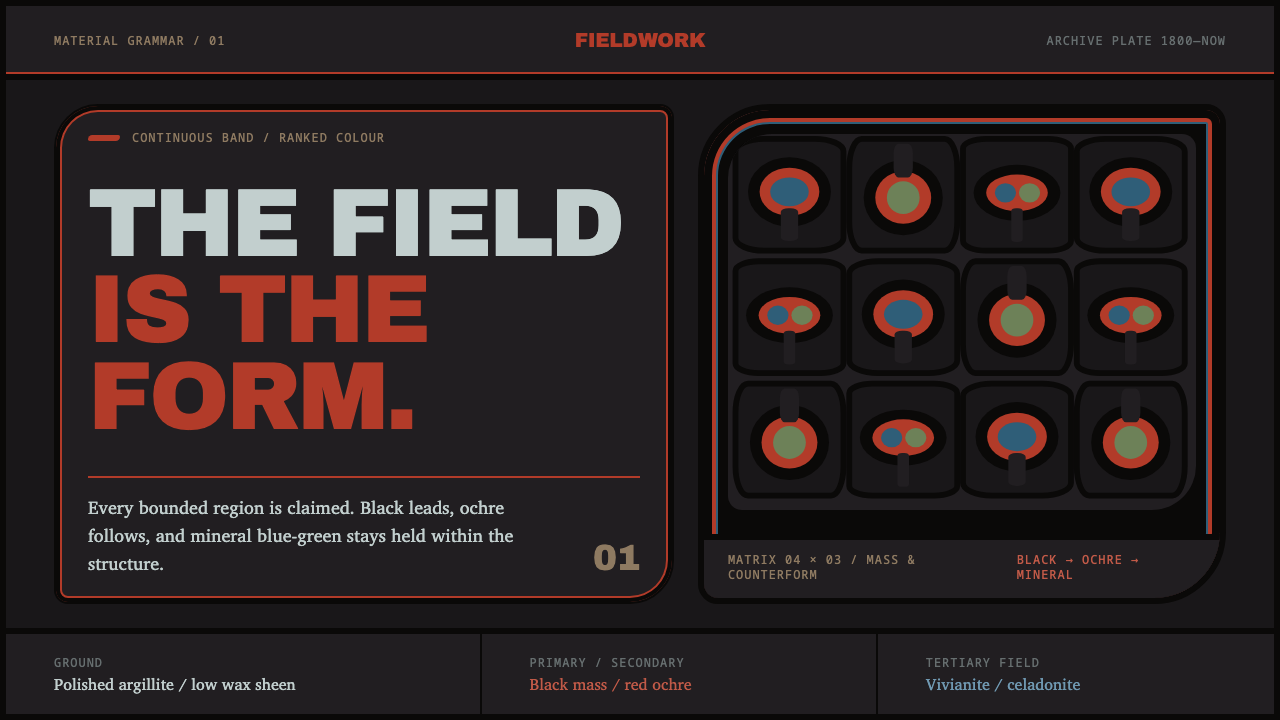 Haida FormlineEvery field is claimed. Black bands lead ochre and mineral blue-green through…
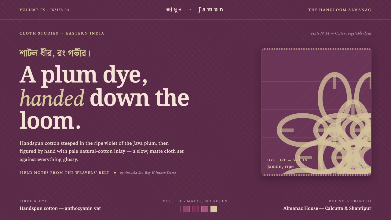 Indian Jamun Violet HandloomHandspun, never glossy. Jamun-violet dyed cotton figured with pale natural-th…
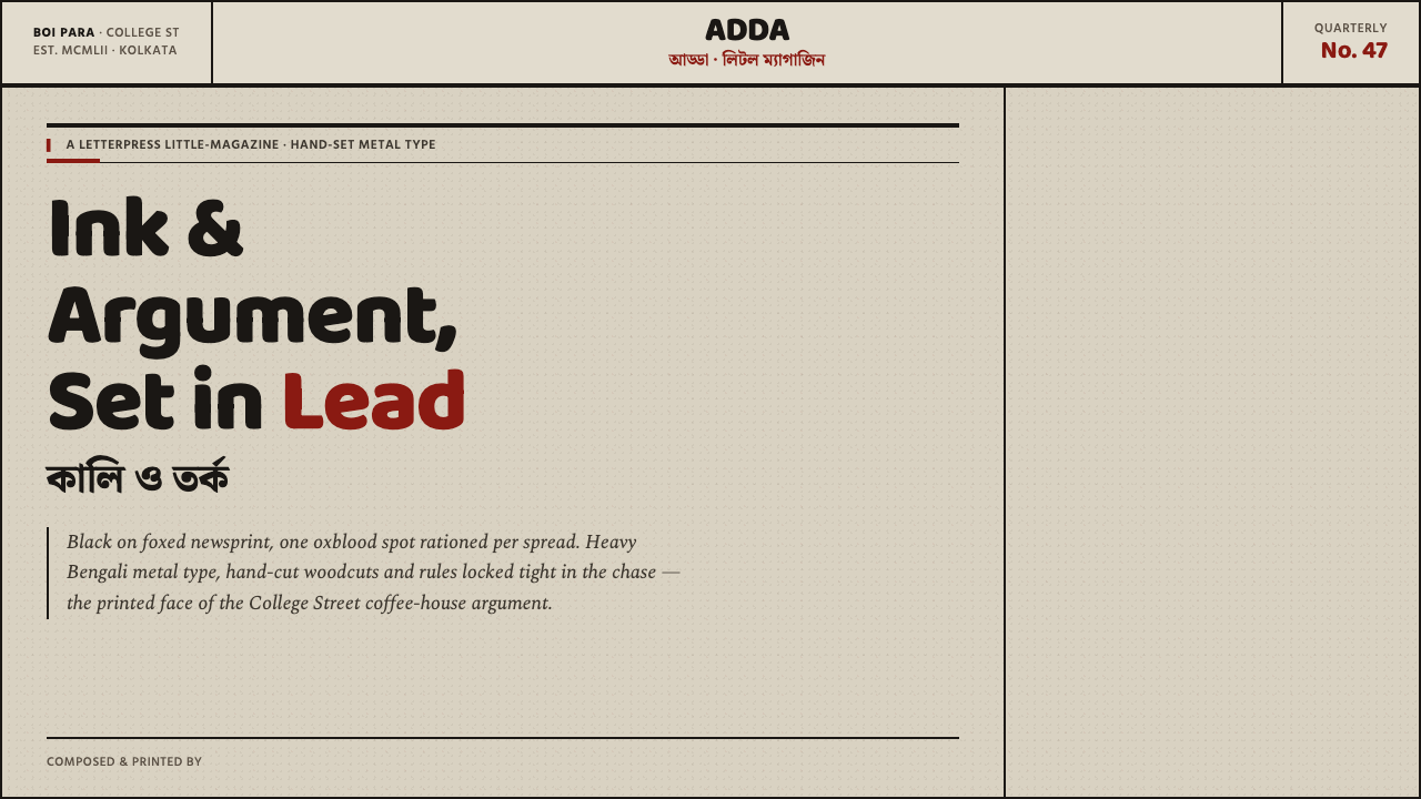 Kolkata Adda LetterpressAustere print, alive with argument. Baloo Bengali type and oxblood rules bite…
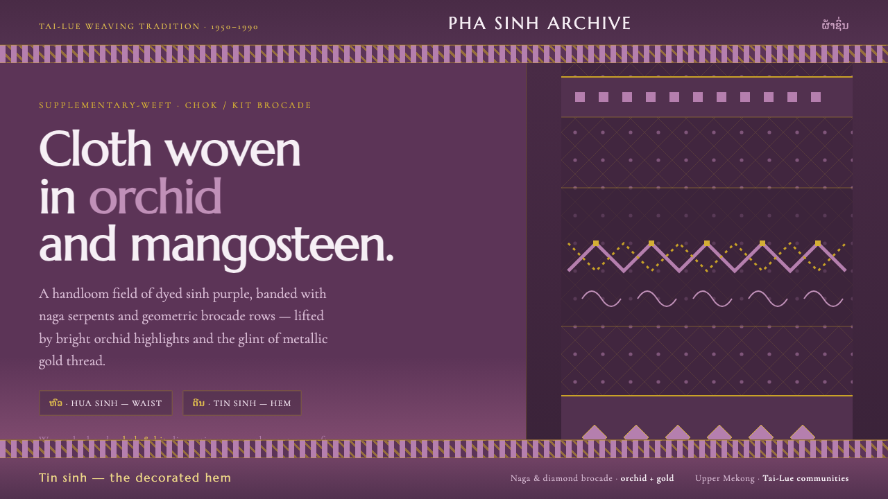 Lao Orchid Mauve TextileHandwoven sinh silk made digital. Orchid-mangosteen ground banded with naga b…
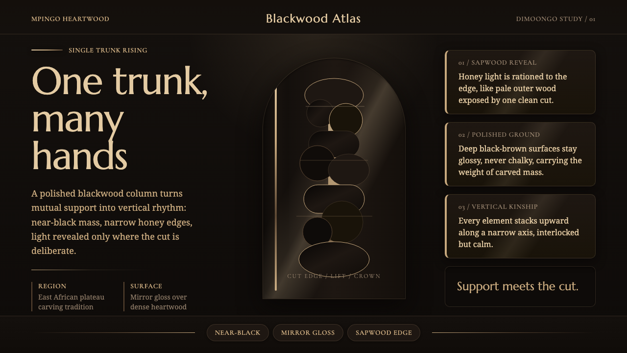 Makonde Ujamaa BlackwoodKinship carved upward. Near-black gloss climbs a sapwood-lit vertical column.