What is Indian Jamun Violet Handloom?
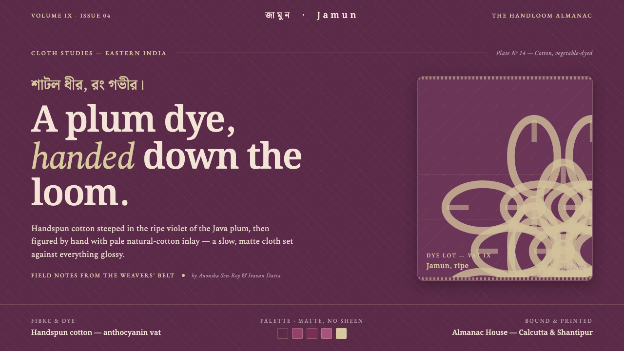
Indian Jamun Violet Handloom brings the depth of dyed cotton and the delicacy of hand-inlaid thread into a matte digital language.
Indian Jamun Violet Handloom in brief
Indian jamun handloom is a vernacular Bengali textile: handspun cotton dyed the ripe plum-violet of the jamun, or Java plum. The color belongs to the natural anthocyanin family associated with plum and blackcurrant, giving the cloth a deep, stained character rather than a polished or synthetic brilliance.
Its visual identity comes from contrast between ground and inlay. The cloth is dark and matte; fine supplementary-weft motifs are inserted by hand in pale natural cotton thread. These motifs do not cover the surface or compete with the dyed field. They sit within it like quiet brocade, making craft visible through restraint.
As a design system, Indian Jamun Violet Handloom should feel like woven panels translated to a screen. Jamun violet establishes the environment, plum-stain tones carry emphasis, and pale natural thread is reserved for motifs, labels, rules, and moments of contrast. The result is tactile without pretending to be glossy silk.
Where does Indian Jamun Violet Handloom come from?
The style belongs to Eastern India and the Bengal jamdani handloom belt, where fine muslin weaving provides its craft vocabulary. Jamdani is understood here not as a decorative surface treatment but as a method of placing supplementary-weft motifs into a woven ground, allowing pattern to remain delicate, localized, and visibly handmade.
Its historical frame is the Bengal natural-dye handloom revival from 1950 through 1990. This period connects the textile to a broader return to handspun fibers, vegetable dyes, and village-based production. The important distinction is material and process: the cloth carries evidence of spinning, dyeing, and weaving rather than the uniform sheen of industrial or silk-like fabrication.
The color source is central to the identity. Jamun violet is not merely a fashionable purple; it is the ripe, plum-like stain of a fruit-derived natural color family. That association gives the ground a sense of depth and seasonality. It feels absorbed into cotton, with variation implied by the dye, rather than laid on top as a luminous coating.
The tradition is sustained by Bengal jamdani weaver communities and village natural-dyers. Their roles are distinct but interdependent: dyers establish the saturated ground, while weavers build the pale motifs into it by hand. The digital translation preserves this relationship by separating atmosphere from detail and by allowing the secondary thread to remain precious, sparse, and legible.
What defines the Indian Jamun Violet Handloom look?
Dyed Ground
The ground is a deep jamun violet with a matte, absorbed quality. It should feel like cotton that has taken in dye, not like lacquer, satin, or illuminated glass. Large surfaces can remain quiet and nearly monochromatic, allowing the implied weave and the density of the violet to carry atmosphere.
Plum-Stain Accent
Accent color stays within the plum-stain family: warmer, redder, and more concentrated than the ground. It is used to create emphasis without breaking the textile mood. Because the palette is related rather than oppositional, hierarchy comes from saturation, placement, and amount instead of loud chromatic collision.
Pale Thread Inlay
Pale natural cotton acts as supplementary weft translated into a digital accent. It should appear in motifs, labels, separators, and carefully chosen contrast points, never as a general page field. Its power comes from scarcity: a small thread-like intervention can make a dark panel feel worked by hand.
Matte Surface
Surface treatment is quiet, dry, and tactile by implication. Gloss, glassy highlights, metallic reflections, and polished gradients work against the material story. Depth should come from layered panels, tonal shifts, and the relationship between ground and motif, not from simulated shine.
Handmade Irregularity
The system should suggest the slight variation of handspun cotton and hand-inlaid pattern. Motifs may feel precise but not mechanically cloned; repeated elements can carry subtle changes in spacing, density, or alignment. This is controlled irregularity, not visual noise, and it prevents the interface from becoming a sterile purple template.
Woven Panel Structure
Information is organized as panels with a clear relationship between field and inlay. A dark panel can hold a pale title, a plum-stain action, and a restrained motif that signals its purpose. Borders should feel like woven edges or deliberate seams, while generous empty areas preserve the sense of cloth around the pattern.
Who shaped Indian Jamun Violet Handloom?
Bengal jamdani weaver communities provide the central craft intelligence of the style. Their hand placement of supplementary-weft motifs explains why the digital system treats pattern as an inlay rather than a surface coating. The translation respects the motif as a localized act of making, surrounded by enough dyed ground to remain legible.
Village natural-dyers establish the emotional weight of the cloth through jamun-derived color. Their contribution is translated into a ground that feels absorbed, seasonal, and materially present. The color should carry depth before any motif or interface control is added.
Bengal jamdani fine muslin weaving supplies the balance between delicacy and density. It prevents the style from becoming merely dark: the deep ground gains refinement through fine, pale patterning, while the pattern remains subordinate to the cloth that holds it.
The Indian natural and vegetable-dye handloom revival provides the wider cultural frame. It anchors the system in a return to handspun fibers, natural color, and village production, giving the digital style an ethic of material restraint as well as a recognizable palette.
How do you use Indian Jamun Violet Handloom today?
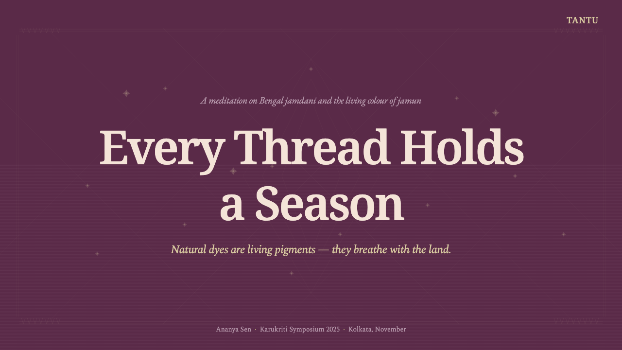
For presentation slides, use the jamun ground as a calm cover field and let a pale-thread motif or plum-stain block establish the visual entry point. Content slides should behave like separate woven panels: a quiet dark field, a clear pale title, and limited accent color. Data slides can treat charts as inlaid structures, with restrained marks emerging from the ground rather than floating above it.
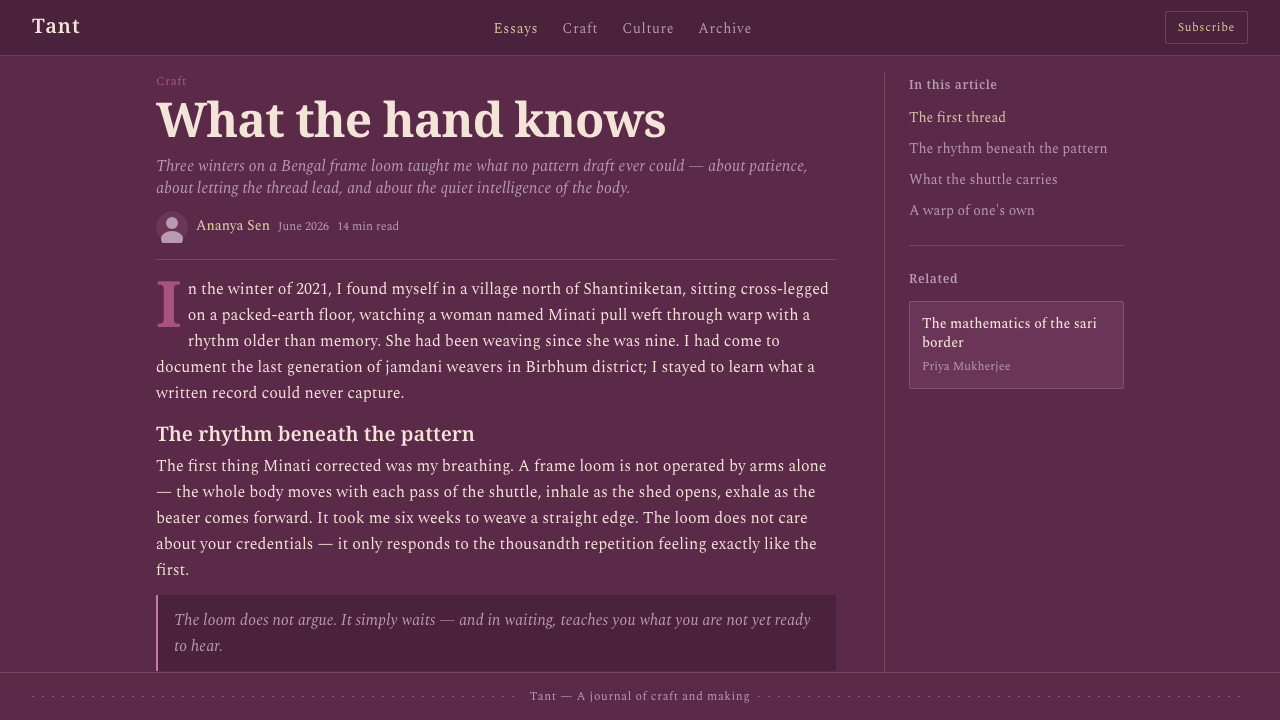
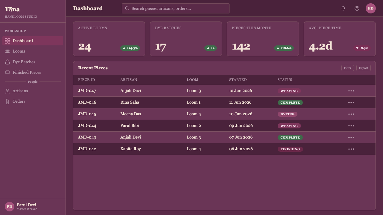
For web interfaces, the style suits dashboards and pricing pages that need a dark, crafted atmosphere. Use jamun violet for the primary environment, pale natural thread for essential text and selected boundaries, and plum-stain tones for active states or tier emphasis. Cards should feel like cloth panels with seams and edges, not glossy product tiles. Keep pattern subordinate to navigation, reading, and decision-making.
For editorial and marketing work, the system supports a strong contrast between a richly dyed field and small areas of pale information. Articles can place metadata, pull quotes, or section markers in thread-like light tones while preserving broad violet margins. Marketing pages can alternate dense dyed panels with quieter spaces, using a recurring woven motif to connect sections without resorting to ornamental clutter.
Imagery should reinforce the material story. Cropped views of cotton, dye, thread, and handloom pattern can work when treated as tactile evidence rather than glossy lifestyle decoration. Abstracted motifs should remain delicate and localized. If imagery becomes too bright, reflective, or photorealistically luxurious, it shifts the system toward silk and loses the grounded character of handspun cloth.
The common mistake is using pale natural thread as a general light background or spreading every violet and plum tone across every component. That reverses the hierarchy of the textile. The dyed ground must remain dominant, the pale thread must stay precious, and irregularity must be controlled. A successful application feels woven because of its relationships, not because a texture has been pasted over the interface.
Indian Jamun Violet Handloom — FAQ
Is this style meant to look like silk?
No. Its defining material reference is handspun cotton with a matte surface. The jamun ground should feel dyed into the fiber, while the pale natural-thread motif should feel inserted by hand. Glossy highlights, polished surfaces, and luxurious reflective effects weaken the distinction between this handloom language and silk.
Why must pale natural thread be used sparingly?
Because the contrast is meaningful only when the dyed ground remains dominant. In the textile, pale thread is the supplementary detail that reveals the labor of weaving. If it becomes the background or fills every surface, it stops reading as inlay and becomes an ordinary light palette. Scarcity preserves its role and its visual authority.
Can the style work with a light page background?
It can, but the translation becomes less faithful when the pale thread takes over the page. The strongest expression keeps the deep jamun field as the environmental ground and uses light tones inside panels, motifs, or selected information. A light surrounding area may frame the system, but it should not erase the sense of dyed cloth.
How should handmade irregularity be represented digitally?
Use restrained variation rather than random distortion. Repeated motifs can shift slightly in density or alignment, and panel boundaries can feel gently individualized. The purpose is to suggest hand placement and handspun fiber, not to make text or controls unstable. Legibility and interaction remain more important than visible imperfection.
Related design styles
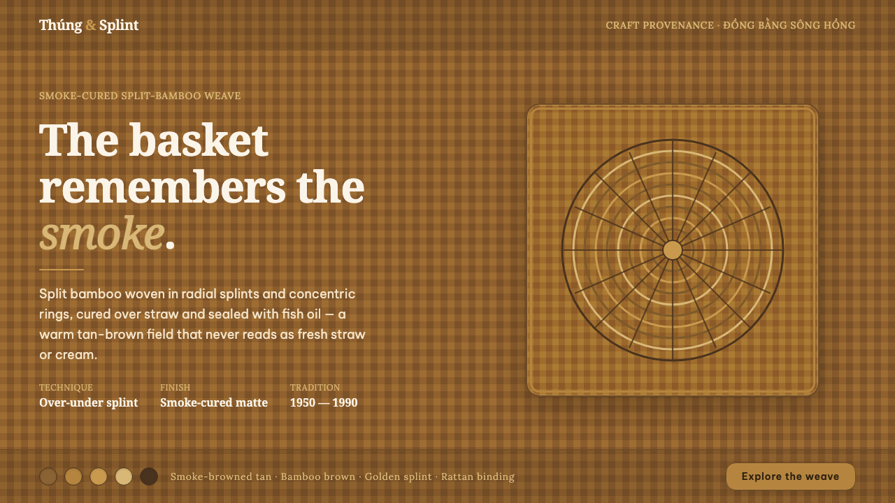 Vietnamese Bamboo BasketryThe basket remembers the smoke. Tan-brown woven ground, concentric splint rin…
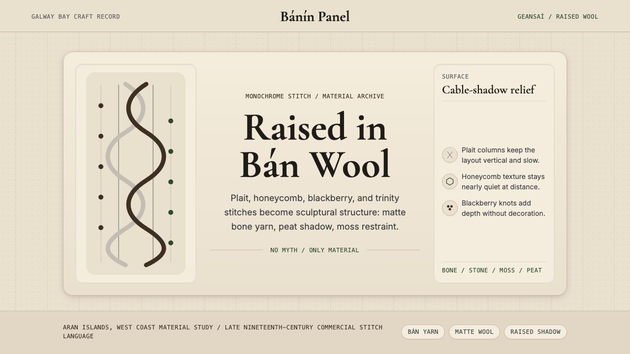 Irish Aran Island Cable KnitMaterial honesty raised in wool. Bone ground, moss ink, and cable columns cas…
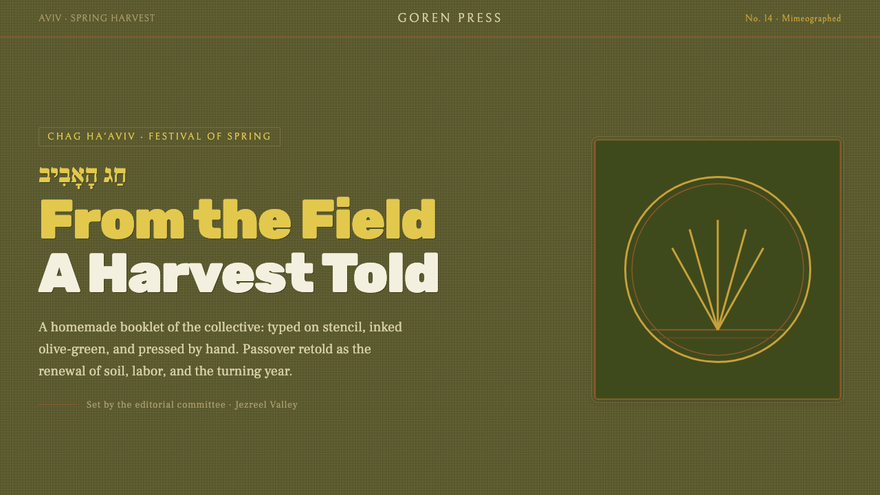 Kibbutz HaggadahHandmade harvest page. Olive stencil stock, wheat serif, deckled linocut geom…
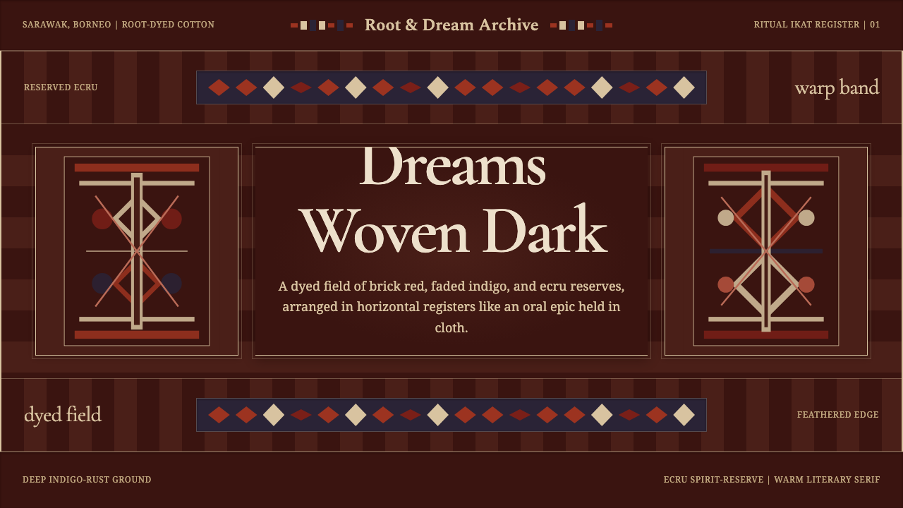 Iban Pua KumbuSacred cloth logic. Indigo-rust bands, ecru reserves, and blurred ikat edges…
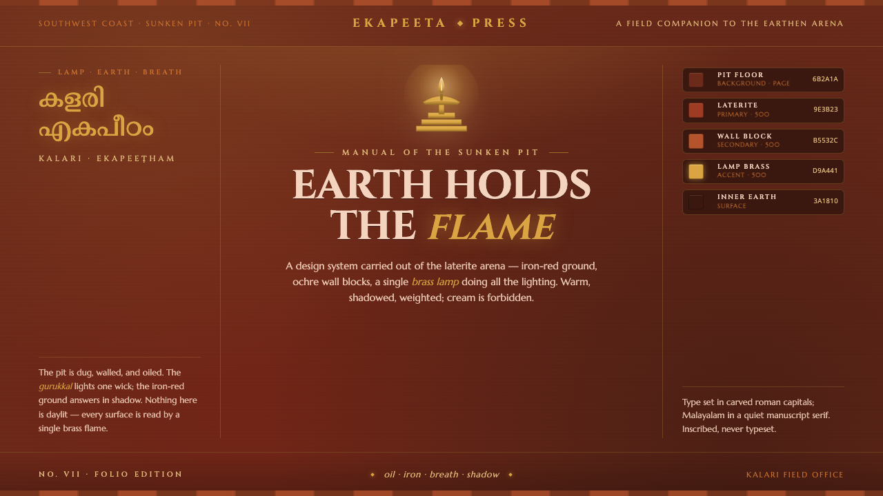 Kalaripayattu Kalari ArenaEarth holds the flame. Iron-red laterite, ochre wall blocks, a single brass l…
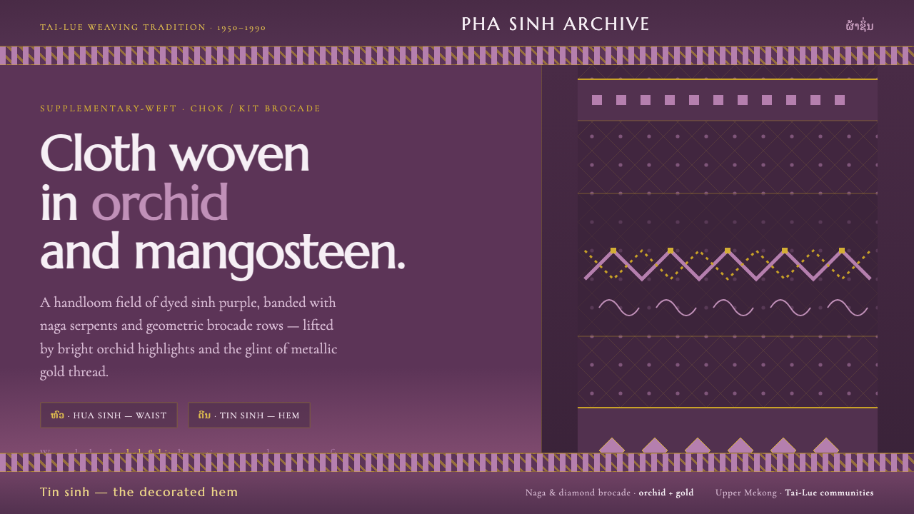 Lao Orchid Mauve TextileHandwoven sinh silk made digital. Orchid-mangosteen ground banded with naga b…