What is Kibbutz Haggadah?
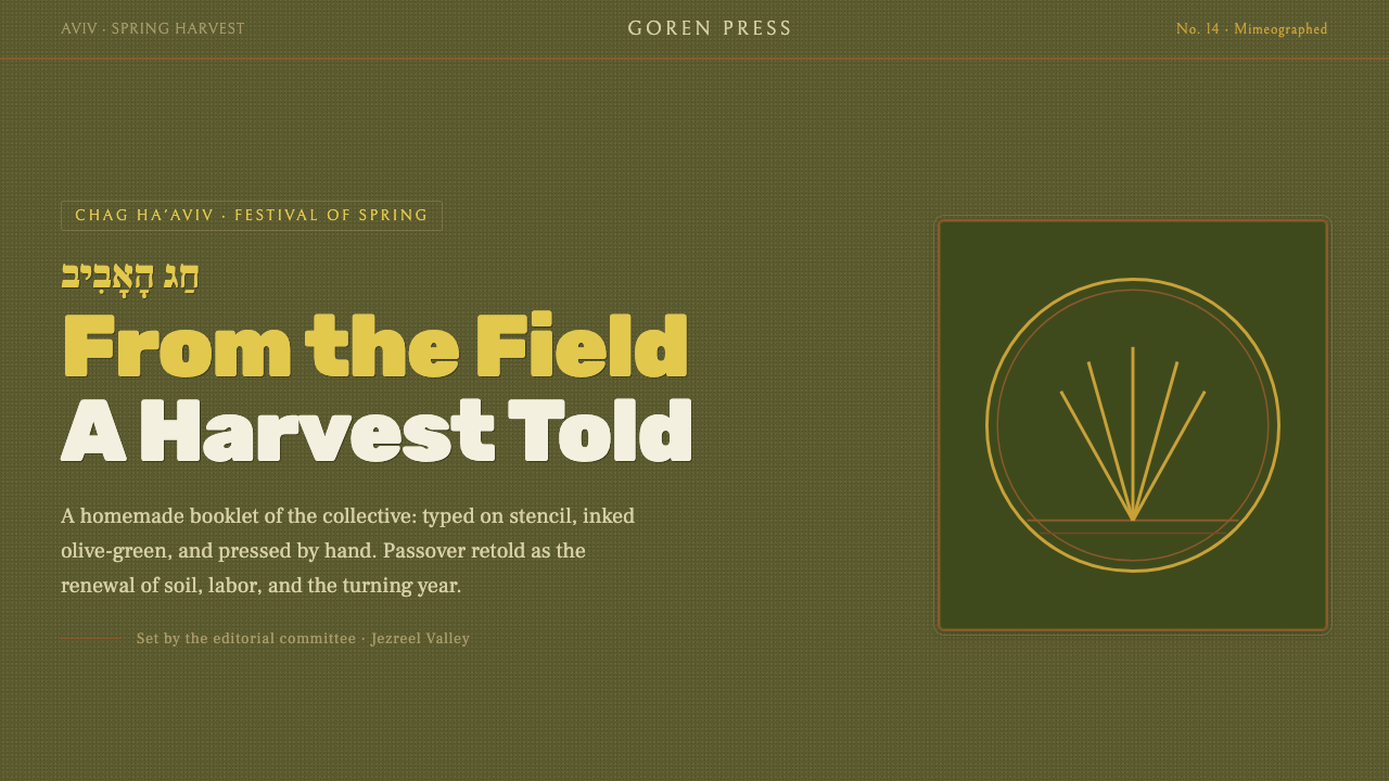
The Kibbutz Haggadah made Passover earthly again — olive ink, wheat-colored paper, carved geometry, and the rough dignity of a book made together.
Kibbutz Haggadah in brief
The Kibbutz Haggadah describes the homemade Passover books produced by secular socialist kibbutzim. Typed on stencil paper, mimeographed onto tinted kraft stock, and bound by hand, these books rejected the polished authority of commercial printing in favor of a communal, agricultural form of making. Their pages feel assembled from available tools, shared labor, and local conviction.
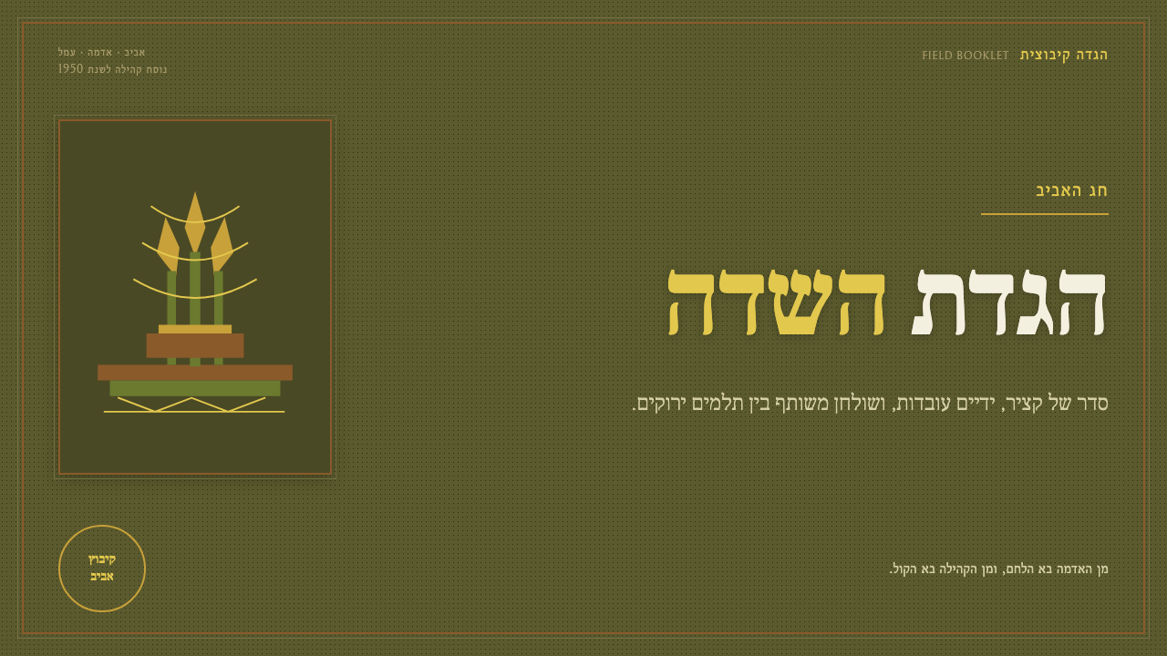
The visual language is earthy without becoming nostalgic. Olive and wheat tones establish the landscape; deep ink carries the text and image; linocut scenes reduce harvest life to blunt, legible forms. Wheat serif type, hand-lettered Hebrew, Song of Songs verses, deckled edges, and uneven ink grain make the page feel touched by its makers rather than finished by an anonymous production system.
At its center is a cultural reframing. The books stripped Passover of religious liturgy and presented it as chag ha'aviv, the spring harvest festival. Design therefore becomes part of the argument: the handmade page, the agricultural imagery, and the visible evidence of communal labor all turn a traditional book into a record of seasonal work, collective identity, and shared celebration.
Where does Kibbutz Haggadah come from?
The Kibbutz Haggadah emerged within the kibbutz movement from the 1930s through the 1950s, with its strongest postwar presence between 1948 and 1955. Its setting was the collective agricultural settlements of the Galilee and Jezreel Valley in Israel. The books belong to a culture shaped by Labor Zionism, secular socialism, and the practical demands of communal agricultural life.
Their production method was inseparable from their meaning. Kibbutz members typed onto stencil paper, prepared images by hand, and used mimeograph machines to reproduce the pages on tinted kraft stock. The sheets were then gathered and bound by hand. This process left evidence everywhere: ink could pool or thin, letterforms could wobble, margins could fray, and no two copies needed to feel entirely identical. Irregularity was not a defect added for effect; it was the visible result of collective self-publishing.
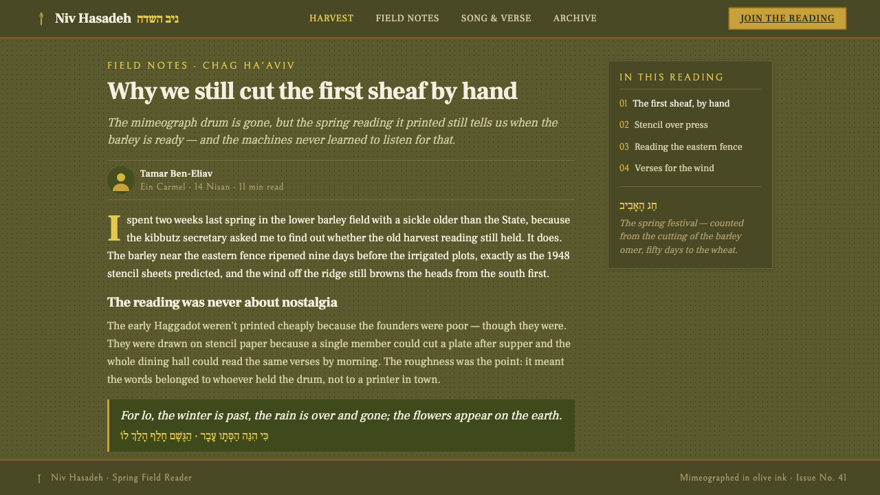
The books also changed what Passover was being asked to express. Rather than preserving a purely religious liturgy, the kibbutz Haggadah reframed the holiday as chag ha'aviv, the spring harvest festival. Seasonal work, communal identity, and the agricultural landscape moved toward the center. Song of Songs verses provided a poetic register, while olive branches, wheat, and carved harvest scenes gave the celebration a distinctly agrarian vocabulary.
The system's anonymous authorship is important. Its key makers were kibbutz members, communal editorial committees, and kibbutz cultural secretaries rather than a single celebrated designer. Editorial decisions, lettering, illustration, printing, and binding belonged to a shared cultural process. The resulting object therefore carries a different kind of authority: not the signature of an individual expert, but the accumulated marks of a community making its own text, images, and ceremony.
What defines the Kibbutz Haggadah look?
Olive and Wheat Palette
The palette draws from the agricultural landscape: olive for leaves, shadow, and durable ground; wheat for harvest, sunlight, and celebration; tinted kraft for the page itself; and deep ink for language and structure. Color feels material rather than ornamental. Contrast is strong enough for reading, but never polished into a glossy commercial brightness.
Wheat Serif and Hand Lettering
Typography combines a sturdy serif with hand-lettered Hebrew. The serif suggests the weight of a book and the continuity of a verse, while the handwritten forms keep the page close to its makers. Song of Songs passages should feel literary but not precious: text carries ritual memory, yet its setting remains communal, tactile, and agricultural.
Mimeograph Grain
The print surface is part of the image. Uneven ink density, softened edges, and slight registration shifts create a record of reproduction rather than an illusion of perfect pressing. Grain should be felt at the edge of perception, giving large shapes and letters a quiet physical presence without turning every surface into artificial distress.
Linocut Geometry
Olive branches, wheat, tools, and harvest scenes are reduced to carved silhouettes and blunt geometric masses. The forms are direct, often slightly awkward, and built from the logic of the cut rather than the logic of naturalistic drawing. Empty areas matter as much as marks: the image should feel printed from a block, not shaded with a brush.
Deckled Page Edges
Margins and edges should preserve the humble physicality of the handmade booklet. A deckled edge interrupts mechanical perfection and makes the page feel gathered, handled, and bound. The surrounding space is not a polished frame; it is the breathing room around a communal artifact, allowing the rough print to remain legible.
Communal Craft
The deepest principle is shared authorship. Design should show that many hands could have shaped the result: editorial blocks can sit beside illustrations, lettering can retain its human variation, and binding or page order can feel assembled rather than machine-perfect. The style gains its authority from participation, not from luxury finishing.
Who shaped Kibbutz Haggadah?
Kibbutz members were the makers closest to the object. They typed stencil pages, prepared hand-drawn images, ran mimeograph copies, and bound the finished books. Their collective labor is visible in the irregularities that define the style.
Communal editorial committees gave the books their shared voice. They helped organize the text and images around a secular, agricultural understanding of Passover, ensuring that the Haggadah belonged to the settlement rather than to an individual author.
Kibbutz cultural secretaries represent the organized cultural work behind the books. Their role connected seasonal celebration, communal publishing, and the visual language of harvest, helping turn a Passover booklet into a shared cultural object.
How do you use Kibbutz Haggadah today?
The Kibbutz Haggadah is most convincing when its material logic survives the translation into a new medium. Begin with a dark, earthen field; establish olive as the structural color and wheat as the warm accent; then let serif type, carved geometry, and restrained texture carry the rest. The goal is not to make a polished interface look old, but to make the act of making feel present.
For presentation slides, use the cover as a harvest page: a strong olive ground, a wheat-colored serif title, and a single linocut form positioned with deliberate imbalance. Content slides should leave generous breathing room around verses, statements, or photographs, with hand-lettered marks used as cultural punctuation. Data slides can treat bars, fields, or directional indicators as carved shapes, keeping the visual vocabulary sparse enough that the information remains clear.
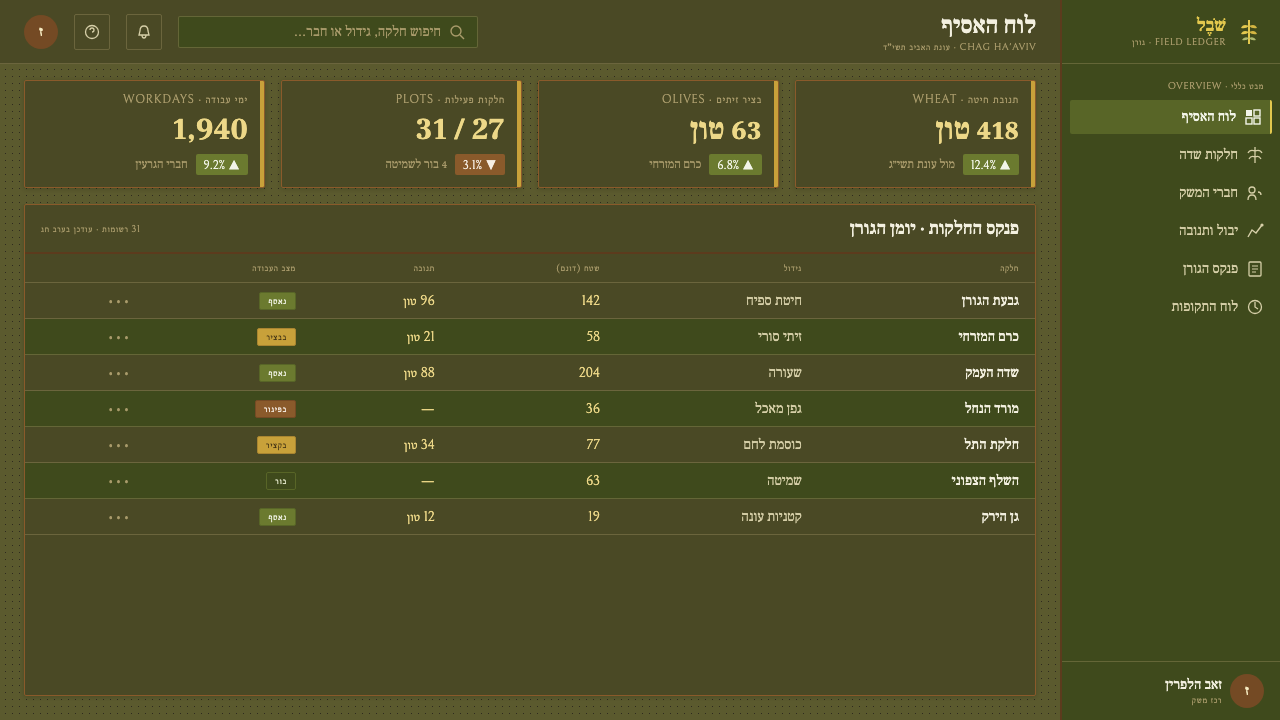
For web interfaces, the style can support dashboards and pricing pages that need authority without corporate gloss. Use dark agricultural surfaces, serif headings, olive interaction states, wheat highlights, and borders that feel printed rather than metallic. Dashboard panels should resemble gathered pages within a hand-bound volume; pricing tiers can be differentiated through paper tone, carved symbols, or restrained shifts in ink density instead of a crowded collection of badges and effects.
For editorial and marketing work, the system suits seasonal campaigns, cultural programs, agricultural stories, and brands that want to foreground making and community. Build narrow reading columns with broad surrounding margins, introduce Song of Songs passages as pull quotes, and use deckled edges or mimeograph grain at moments of emphasis. A campaign can alternate dark olive fields with wheat paper sections, allowing the linocut image to function as both illustration and emblem.
The common mistake is confusing handmade character with random distress. Excessive noise, repeated paper scratches, decorative rustic motifs, and overly bright harvest colors turn the style into generic vintage packaging. Another mistake is treating Hebrew lettering or agrarian imagery as exotic decoration. The system works when every rough edge supports the story of communal production, seasonal labor, and a secular spring festival.
Kibbutz Haggadah — FAQ
Is the Kibbutz Haggadah a religious style?
It comes from the Passover tradition, but the kibbutz version is explicitly secular and socialist. Its purpose was to strip away religious liturgy and reinterpret Passover as chag ha'aviv, the spring harvest festival. The visual language should therefore communicate seasonal work, shared culture, and agricultural belonging rather than devotional ceremony.
Can this style work without Hebrew lettering?
Yes, but the replacement should preserve the role of intimate, hand-made inscription. A local script can be lettered by hand and paired with a sturdy serif, while verses or short communal statements retain the literary function of Song of Songs passages. What matters is not borrowing Hebrew as a surface motif, but preserving the relationship between text, memory, and the makers hand.
How do you keep the dark palette from feeling gloomy?
Let wheat carry warmth and let tinted kraft remain visibly paper-like. Olive should organize the page, not swallow it; deep ink should establish contrast, not flatten every distinction. Open margins, readable serif type, and occasional linocut forms keep the composition grounded in harvest and celebration rather than turning it into an atmosphere of heaviness.
What separates this style from generic rustic or vintage design?
Its roughness has a specific origin: stencil typing, mimeograph reproduction, tinted kraft stock, linocut illustration, and hand binding within a communal agricultural setting. The style is not simply old-looking. It carries a cultural argument about secular celebration and collective making. Remove that relationship and the result becomes decorative rustic nostalgia.
Related design styles
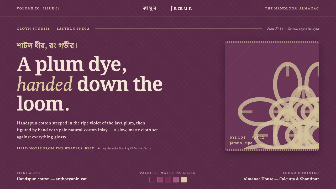 Indian Jamun Violet HandloomHandspun, never glossy. Jamun-violet dyed cotton figured with pale natural-th…
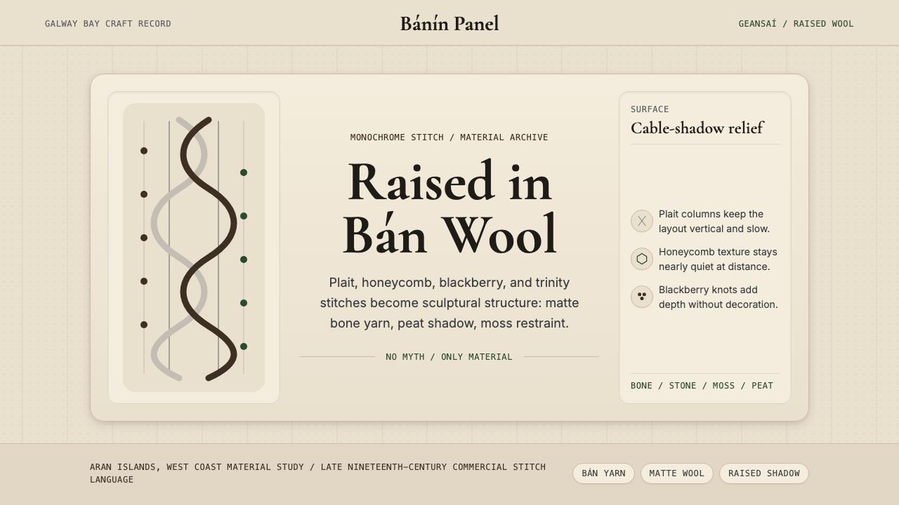 Irish Aran Island Cable KnitMaterial honesty raised in wool. Bone ground, moss ink, and cable columns cas…
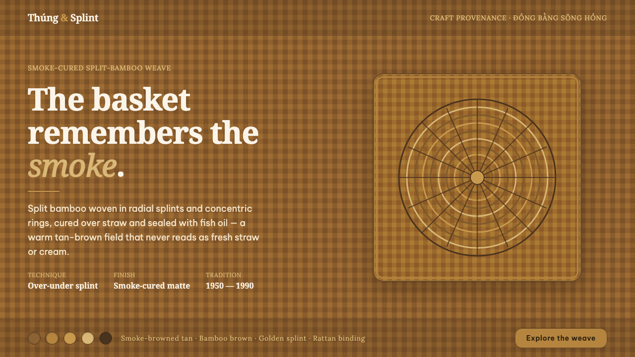 Vietnamese Bamboo BasketryThe basket remembers the smoke. Tan-brown woven ground, concentric splint rin…
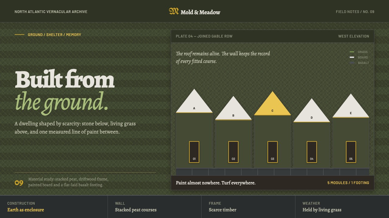 Icelandic Turf HouseThe hillside becomes shelter. Peat coursing surrounds one narrow line of yell…
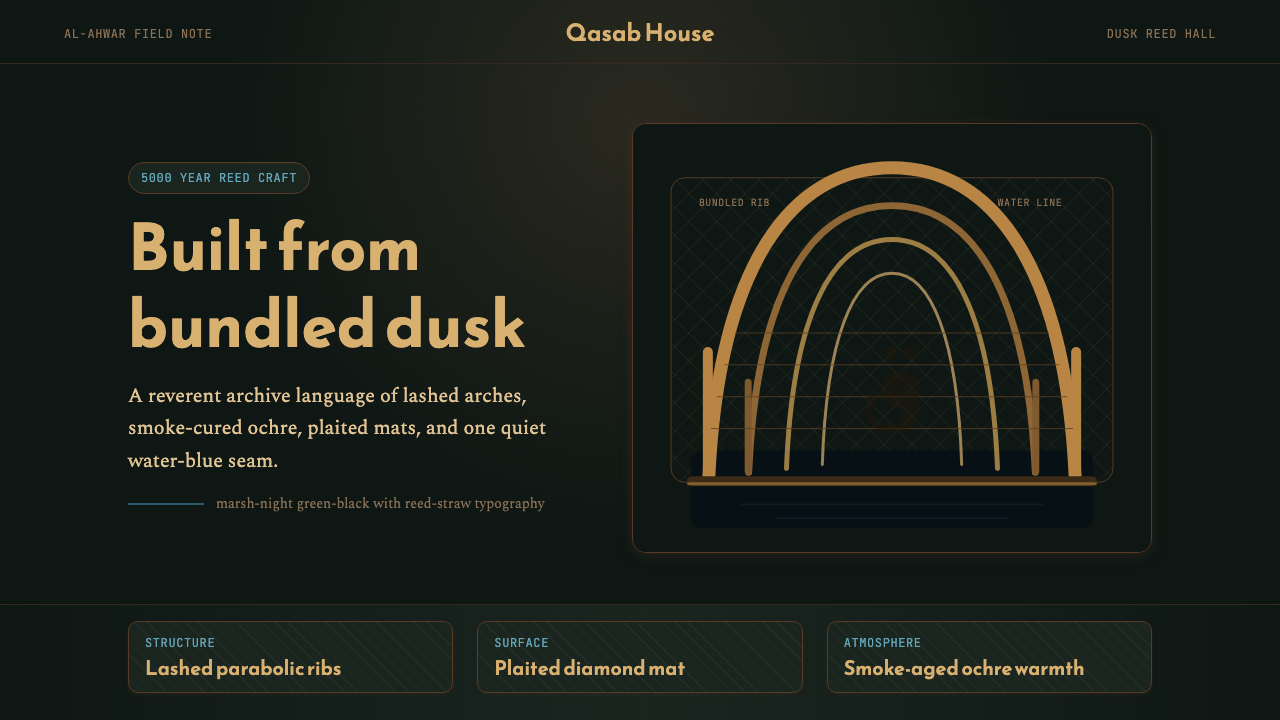 Iraqi Marsh Arab Mudhif ReedReverent reed darkness. Kufi arches, ochre lattice, and one water-blue line h…
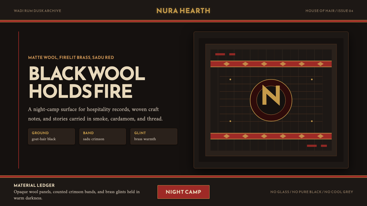 Jordanian Bedouin Black TentNight camp honesty. Goat-hair black, sadu crimson, brass lines.