What is Lao Orchid Mauve Textile?
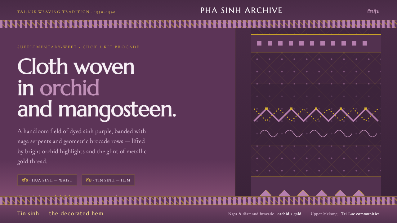
Lao Orchid Mauve Textile turns handwoven Tai-Lue sinh silk into a dark digital language of orchid-mangosteen color, naga brocade, horizontal registers, and patient metallic light.
Lao Orchid Mauve Textile in brief
Lao Orchid Mauve Textile distills the pha sinh skirt cloth of Tai-Lue weaving communities in Laos into a digital visual system. Its foundation is a dark orchid-mangosteen silk ground, enriched by discontinuous supplementary-weft brocade known as chok or kit. The result is not a generic purple interface, but a translation of a specific handwoven structure into screens, cards, panels, and editorial surfaces.
The visual language is built from contrast between a deep dyed ground and lifted surface detail. Naga serpents and geometric rows cross the cloth as woven motifs, while bright orchid highlights and the glint of metallic gold thread create moments of emphasis. Color is therefore layered rather than flat: the ground establishes depth, the brocade establishes pattern, and the highlights establish rhythm.
Everything is organized as a sinh laid flat. Horizontal registers divide the interface into waist, body, and hem, giving each section a distinct place within a continuous textile field. The overall mood is banded, ornate, and patient. It should feel assembled through repeated craft decisions, with motif and light gradually revealing themselves across the surface.
Where does Lao Orchid Mauve Textile come from?
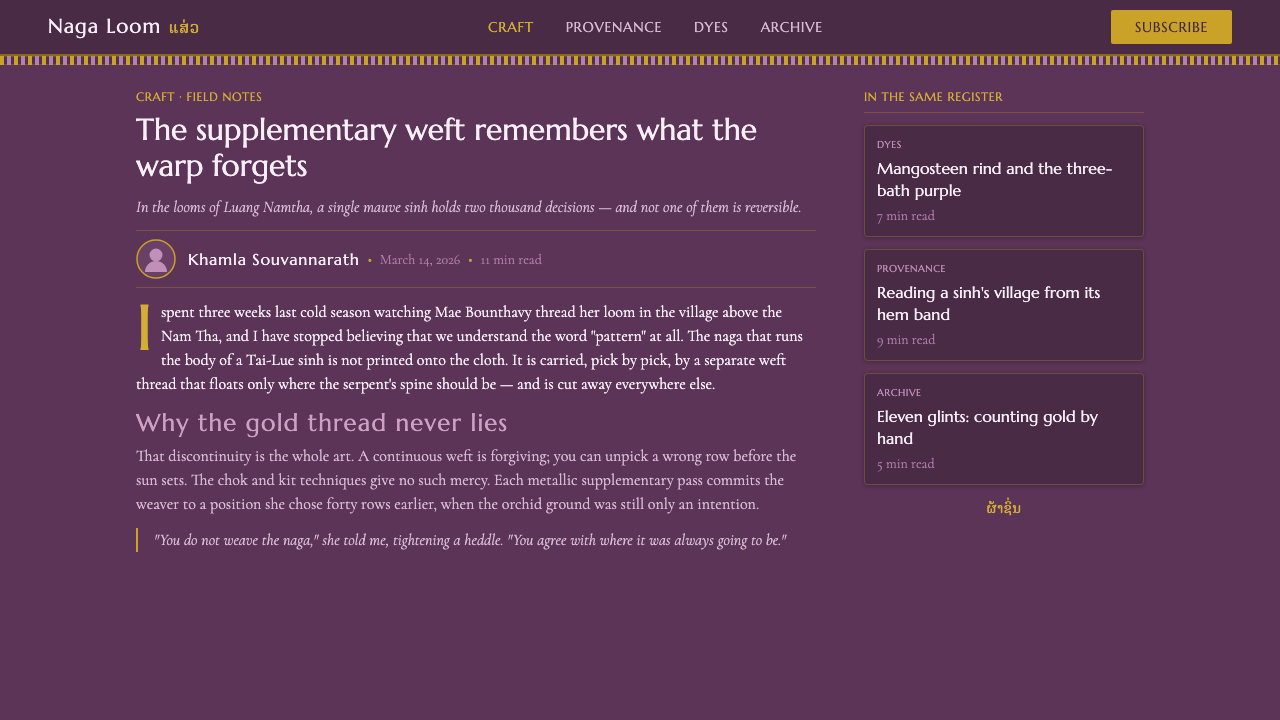
The source tradition is the pha sinh, a skirt cloth associated here with Tai-Lue weaving communities in Laos and the wider Southeast Asian region. The approved period is 1950–1990, understood as a living weaving tradition rather than a single historical style frozen in the past. The digital system takes its organizing logic from the cloth itself: a dyed silk ground, horizontal divisions, supplementary-weft ornament, and a concentrated relationship between pattern and light.
The human makers named by the tradition are Tai-Lue women weavers and Lao supplementary-weft brocade artisans. Their work is represented through the visible logic of chok or kit weaving, where discontinuous supplementary weft creates raised motifs across the base cloth. In this translation, the craft is not reduced to a decorative texture. The method becomes a structural model for arranging information in bands, repetitions, and carefully placed interruptions.
The palette begins with orchid-mangosteen mauve silk, a dark ground that gives the interface its nocturnal weight. Against it, bright orchid accents provide lift, while metallic gold thread contributes a narrow but vivid glint. These colors are not treated as interchangeable decoration. They describe different layers of the textile: dyed foundation, raised floral or patterned detail, and reflective thread that catches the eye.
The digital reinterpretation follows the way a sinh reads when laid flat. Waist, body, and hem become interface registers, allowing a page to move horizontally through zones of density and relief. A title area can act like a waist band, the main content like the body of the cloth, and a concluding region like the hem. This translation preserves the textile’s sense of continuity while giving digital content a clear, layered order.
What defines the Lao Orchid Mauve Textile look?
Color
The ground is a dark orchid-mangosteen mauve, closer to dyed silk than to a flat digital purple. Bright orchid appears as a selective lift within the darker field, while metallic gold is reserved for the glint of thread and the most important points of emphasis. The palette should feel concentrated and nocturnal, with each accent reading as a woven layer rather than a separate decorative color.
Typography
Typography should sit firmly within the textile bands, acting as an inscription carried by the weave. Headings can be confident and compact, while supporting text should remain quiet enough for the brocade to retain its presence. Contrast comes from scale, density, and placement rather than ornamental lettering. The type should clarify the registers of the page without competing with the naga motifs.
Horizontal Registers
The defining structure is horizontal banding modeled on the sinh’s waist, body, and hem. Each register may carry a different density of information or ornament, but the bands must remain visibly related through the shared ground and repeated motifs. The composition should feel continuous across divisions, as if separate interface sections were parts of one cloth rather than unrelated stacked containers.
Naga and Geometry
Naga serpents provide the system’s most distinctive figurative motif, while geometric rows supply repetition and order. Together they create a dialogue between organic movement and measured pattern. Naga forms work best as a continuous brocade presence across a band or as a carefully placed focal element. Geometric rows can organize secondary information, giving the page a rhythm that feels woven rather than mechanically tiled.
Metallic Light
Gold should read as thread catching light, not as a broad field of yellow decoration. Its strongest role is to pick out an edge, a motif, a divider, or a key point inside an otherwise dark register. Orchid highlights can widen the luminous range, but gold remains the rarer glint. This hierarchy keeps the surface rich without allowing reflective accents to flatten the composition.
Patient Density
The style is ornate, but its ornament is patient rather than frantic. Motifs may accumulate across a register, yet the dark silk ground must remain legible between them. Negative space functions like the intervals between woven rows: it allows the eye to rest and makes the next motif feel intentional. A successful composition alternates concentrated brocade with quieter stretches of mauve field.
Material Translation
The digital surface should suggest handwoven silk through layering, interruption, and controlled contrast rather than through literal imitation. Motifs need a sense of being placed across a ground, and highlights should feel lifted from the surface. The interface is successful when it communicates woven construction at a glance: not a purple backdrop with ornaments pasted on top, but a field in which color, pattern, and light belong to the same fabric.
Who shaped Lao Orchid Mauve Textile?
Tai-Lue women weavers are the principal human presence named in the source tradition. Their work is carried into the digital system through the logic of the pha sinh: a continuous cloth organized in registers, enriched by repeated motif, and made distinctive through patient surface decisions. The system honors that presence by treating weaving structure as the foundation of the interface rather than using textile imagery as a superficial skin.
Lao supplementary-weft brocade artisans represent the technical vocabulary behind the raised naga and geometric motifs. Chok or kit is treated here as a design principle: detail appears through selective addition, producing areas of relief against a stable ground. In digital form, that principle becomes selective emphasis, where ornament is introduced in deliberate passages instead of covering every surface with equal intensity.
The pha sinh weaving tradition is the larger figure that holds the system together. It supplies the relationship between waist, body, and hem, as well as the idea that a cloth can be read through continuous horizontal registers. In the digital interpretation, this tradition becomes a compositional grammar: pages are arranged as connected bands, and ornament is given a place within the whole rather than treated as an isolated embellishment.
How do you use Lao Orchid Mauve Textile today?
Lao Orchid Mauve Textile works best when the design begins with structure and lets ornament follow. Establish a dark silk-like ground, divide the composition into horizontal registers, then introduce naga brocade, geometric rows, orchid highlights, and gold-thread glints with clear hierarchy. The style is most convincing when every decorative passage feels woven into the information architecture rather than added after the page is already complete.
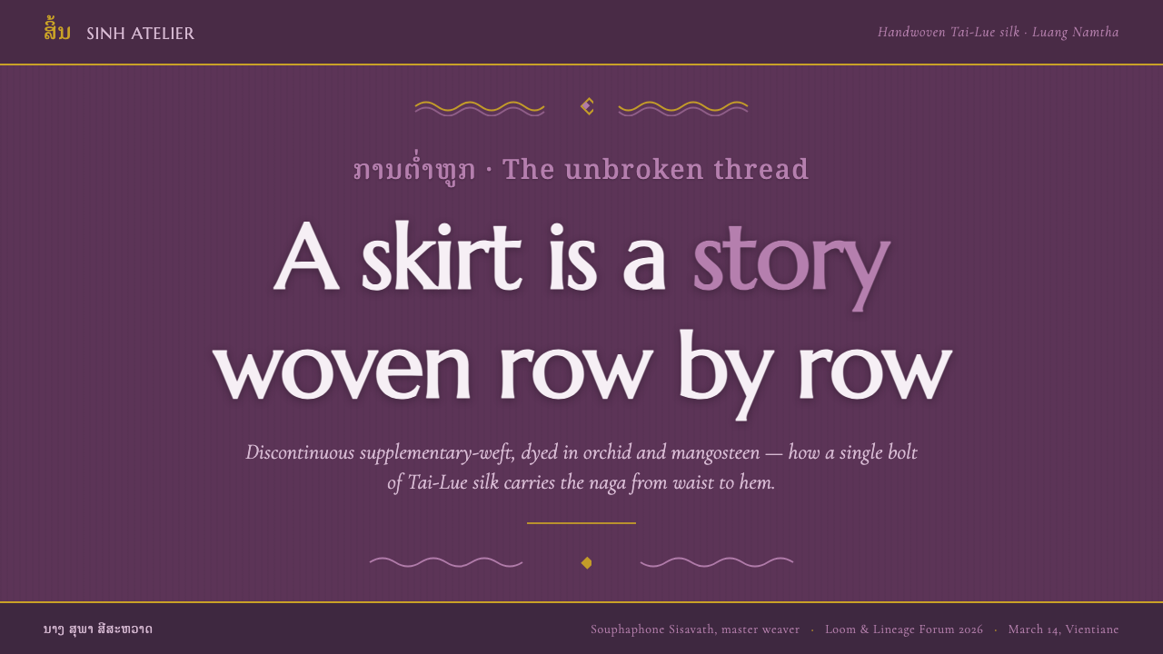
For presentation slides, the cover can behave like the waist register of a sinh: a concentrated band of title, identity, and luminous motif against the deep mauve ground. Content slides should use the body register, allowing text and diagrams to sit within broad horizontal fields organized by repeated geometric rows. Data slides can treat charts as woven bands, using orchid highlights and restrained gold to mark the most important values while keeping the overall field dark and continuous.
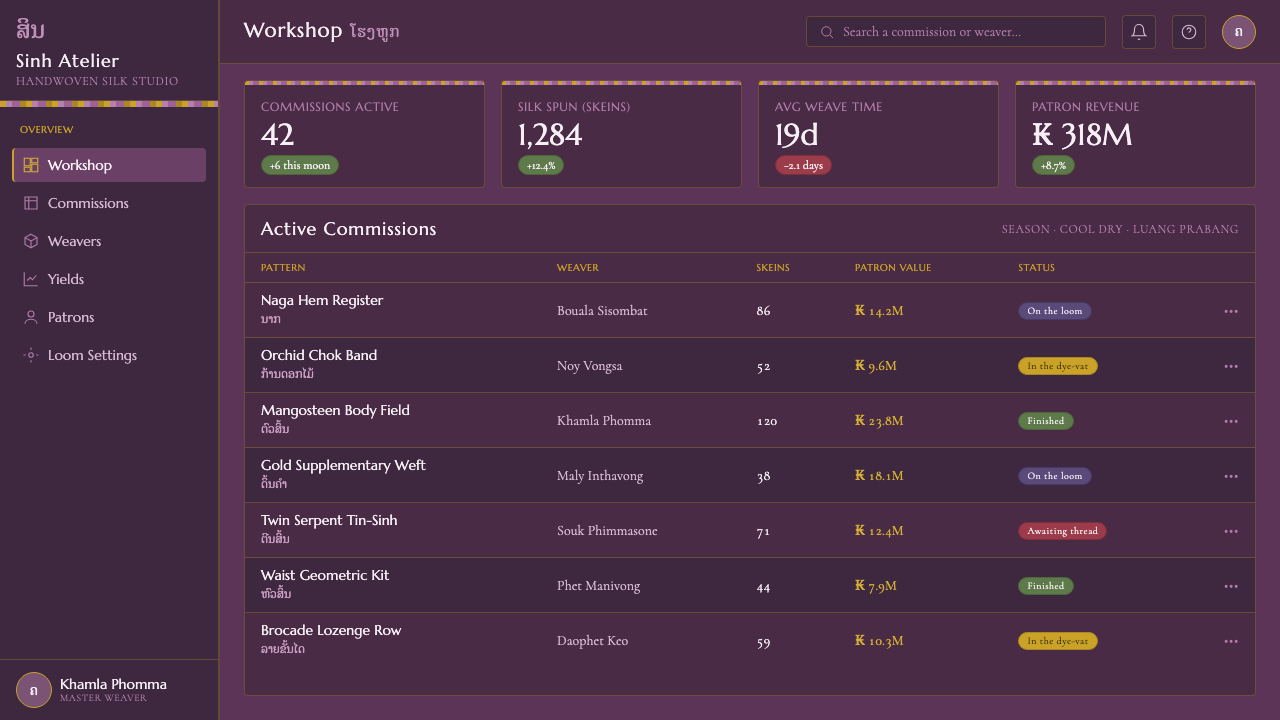
For web interfaces, the system suits dashboards and pricing pages that need strong grouping without losing atmosphere. A dashboard can separate navigation, overview, detail, and status into connected horizontal zones, with naga forms reserved for major transitions or featured states. A pricing page can give each tier its own register while maintaining the same mauve ground and shared geometric rhythm. Gold should identify priority or distinction, not become a universal action color.
For editorial and marketing work, the style supports immersive feature pages, cultural stories, product launches, and campaign material that benefits from a sense of crafted continuity. Use the dark ground as a field for titles, image treatment, and patterned section breaks. Let geometric rows carry metadata or supporting information, while a carefully placed naga motif gives the page a signature. Marketing emphasis should come from luminous contrast and placement, not from multiplying ornaments.
The common mistake is to treat the style as a flat purple background decorated with every available motif at once. That removes the essential relationship between ground, register, brocade, and light. Another mistake is to scatter naga forms randomly or use gold everywhere, which makes the surface noisy and erases hierarchy. Begin with the sinh structure, protect quiet mauve intervals, and let ornament accumulate only where it has a clear compositional role.
Lao Orchid Mauve Textile — FAQ
What is Lao Orchid Mauve Textile?
It is a digital design system distilled from the pha sinh skirt cloth of Tai-Lue weaving communities in Laos. Its defining ingredients are a dark orchid-mangosteen silk ground, discontinuous supplementary-weft chok or kit brocade, naga serpents, geometric rows, bright orchid highlights, and metallic gold-thread glints. Its layout is organized into horizontal registers modeled on the waist, body, and hem of the sinh.
Why is the system built on a dark ground?
The dark orchid-mangosteen ground is part of the textile identity supplied by the source material. It gives the interface a stable field against which brocade, orchid highlights, and gold thread can become visible as raised or reflective layers. A lighter inversion may be possible in a contemporary application, but it would change the system’s central relationship between dark silk, concentrated motif, and metallic light.
What do chok and kit mean in this design language?
Chok and kit refer here to discontinuous supplementary-weft brocade. The technique creates motifs across a base cloth by adding selected woven detail rather than treating the surface as a uniform field. In the digital system, it becomes a model for selective emphasis: pattern appears in deliberate passages, creating relief and rhythm while allowing the underlying mauve ground to remain visible.
How should naga motifs be used?
Naga serpents should function as a distinctive brocade motif, not as random illustration. They can travel continuously across a horizontal register or appear as a carefully placed focal element. Their organic movement is most effective when balanced by geometric rows and quiet mauve ground. Keeping their placement deliberate preserves the sense that the motif belongs to the weave and participates in the page’s larger structure.
What kind of digital work suits this style?
The system suits work that benefits from continuity, hierarchy, and a crafted surface: editorial features, cultural storytelling, product launches, dashboards, pricing pages, and presentation decks. It is especially useful when content can be grouped into connected bands. It is less convincing when the design requires a neutral, empty, or purely utilitarian surface, because its character depends on the visible relationship between register, motif, dyed ground, and light.
Related design styles
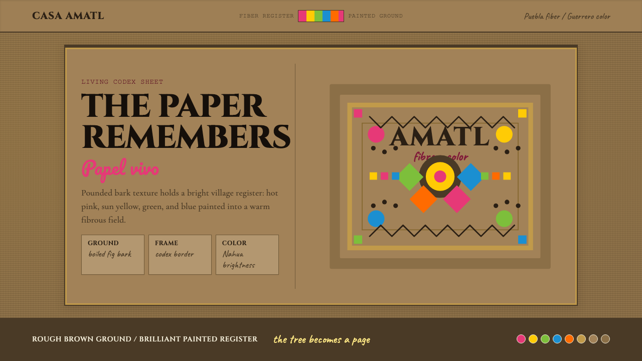 Mexican Amate Bark PaperLiving craft, not nostalgia. Bark-brown fiber carries hot pink and sun-yellow…
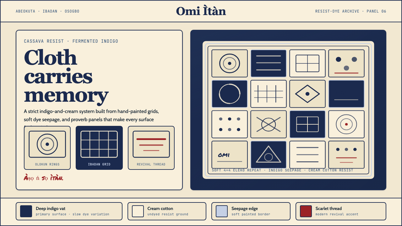 Yoruba Adire IndigoMemory lives in cloth. Deep indigo grids on cream cotton carry hand-painted p…
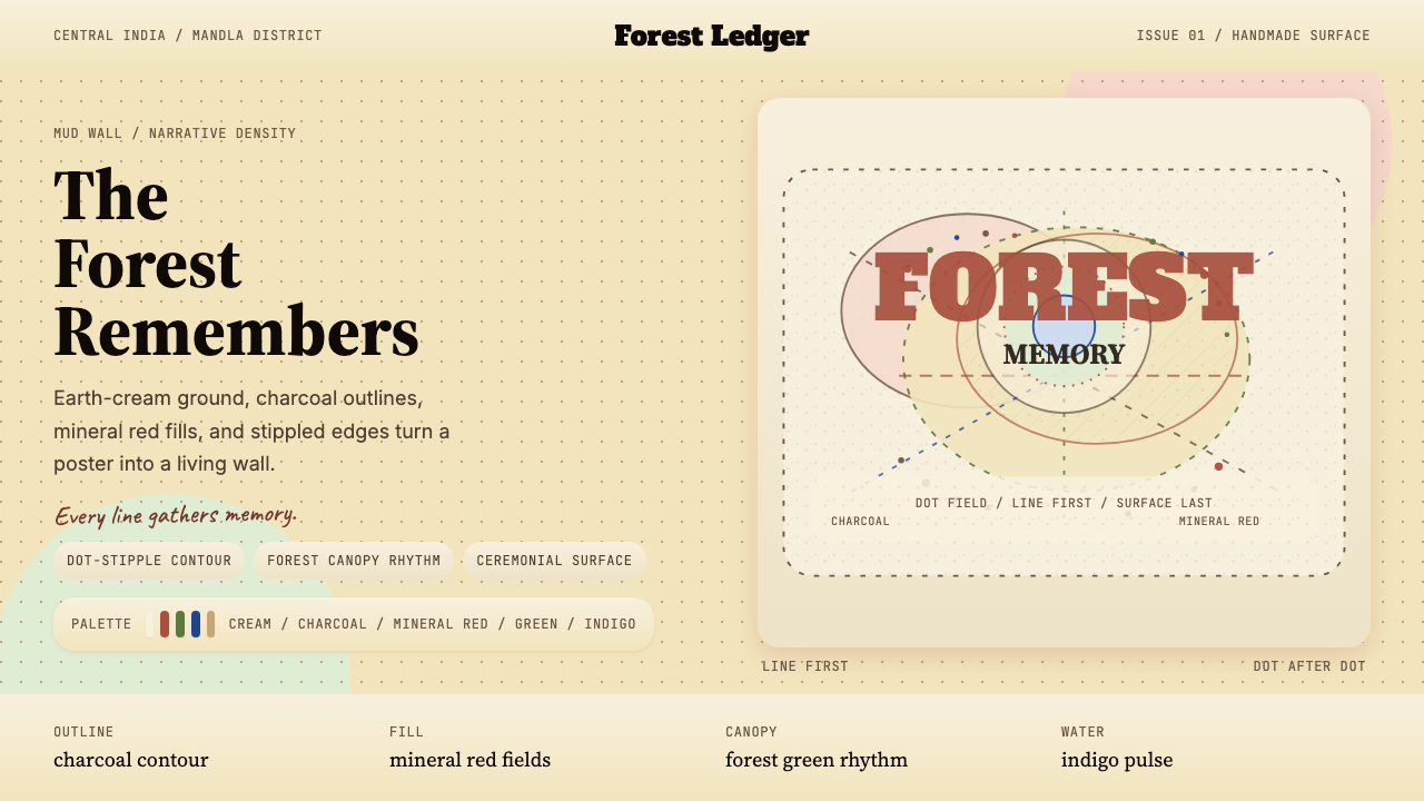 Gond Tribal Art (Madhya Pradesh)The wall becomes a forest. Earth-cream, charcoal, and stippled red make it ce…
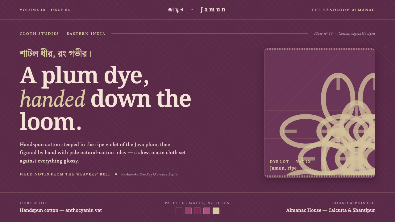 Indian Jamun Violet HandloomHandspun, never glossy. Jamun-violet dyed cotton figured with pale natural-th…
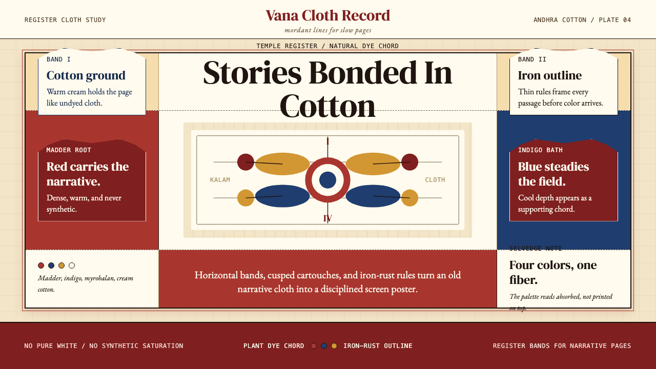 Kalamkari (Andhra Pradesh)Cloth becomes narrative. Madder bands, indigo panels, and iron rules stack li…
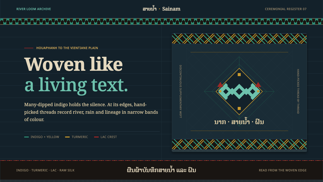 Lao Naga TextileDarkness becomes woven memory. Turquoise and turmeric bands speak across many…