What is Cham My Son Towers?
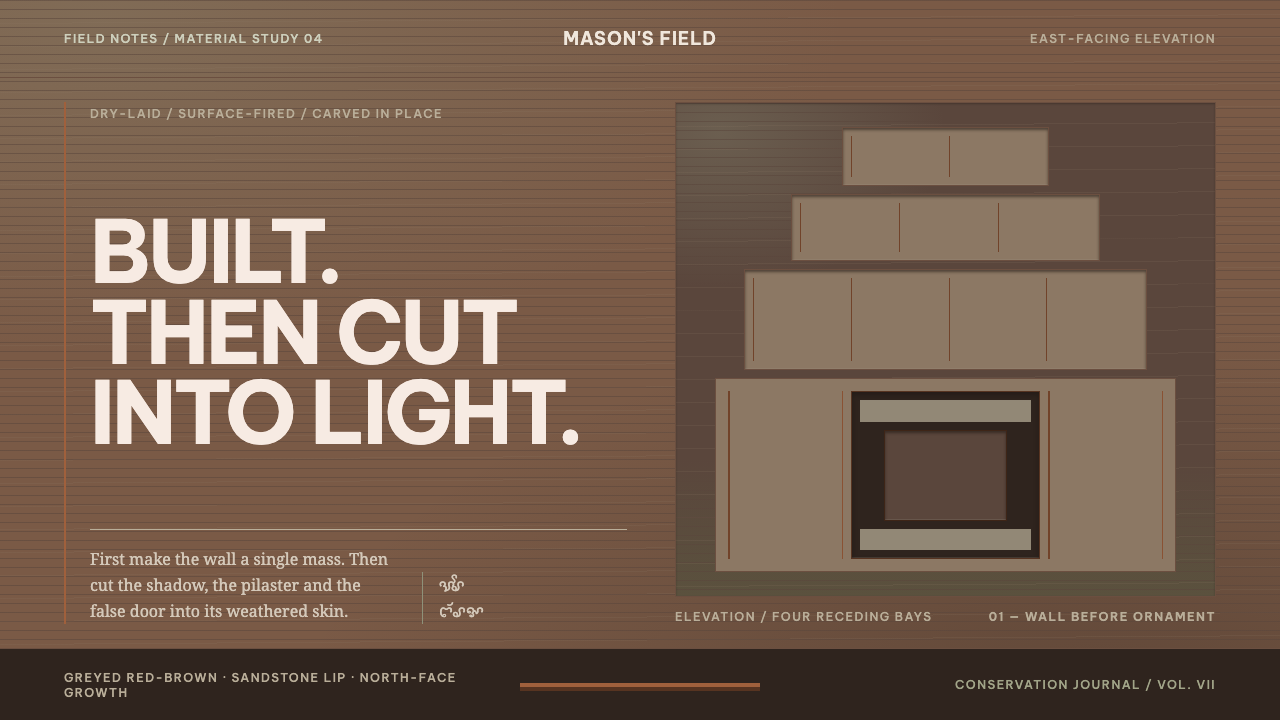
Mỹ Sơn's Cham towers were raised as solid brick walls first and carved second, and this style turns that sequence into a rule: surface before ornament, recess instead of application, one greyed red-brown family lit by a thin line of light.
Cham My Son Towers in brief
Cham My Son Towers is a dark, earth-toned design system drawn from the brick sanctuary towers at Mỹ Sơn in central Vietnam. Its palette stays inside one family of greyed red-browns, relieved only by pale sandstone and by the green-grey of lichen and wet-season moss. Surfaces are built first and shaped second: bays and tiers recede in stepped layers, and ornament is cut into the plane rather than laid on top of it.
The towers are called kalan, the Cham term for a temple sanctuary tower. They were raised in fired brick laid dry, meaning without a mortar bed, with at most a clay slip or resin that has long since gone, and they went up as solid mass. Only once the wall was complete were pilasters, false doors and apsaras cut directly into it. Pilasters are flat columns that project slightly from a wall, false doors are blind doorways that suggest a threshold without opening one, and apsaras are celestial dancers worked into the surface. Finally the façade was surface-fired, a further burning that fused a weatherproof skin over the finished work.
The system is dark by design, which suits the material: aged brick under overcast monsoon light, shadow pooling in recesses, sandstone catching what little light there is. Every visual decision traces back to that order of making. The wall comes first, the cutting second, the firing last. In design terms that means structure, then subtraction, then a protective skin.
Where does Cham My Son Towers come from?
Mỹ Sơn lies in Duy Xuyên district, Quảng Nam province, in central Vietnam. It is a cluster of Champa temple towers whose building ran across a very long span, from the fourth to the thirteenth century. The architecture belongs to the Champa temple tradition and, within it, to Shaiva temple building in Southeast Asia, which means the sanctuaries were conceived as places dedicated to the god Shiva. A span that long makes the towers less a single design than a long conversation between generations of builders working in one material.
The method of making is the key to the look. Dry-laid brick has no thick mortar bed to hide a bad joint, so the brick faces have to meet closely, and the wall behaves as one mass rather than as a skin over a frame. That mass is what made direct carving possible: pilasters, false doors and apsaras were cut into the finished wall instead of being added as separate pieces. It explains why Cham ornament feels excavated rather than assembled. Because the surface was then fired, the carved forms were sealed into a hard outer skin that sheds monsoon rain.
The modern story of the site is the story of how it was recorded and repaired. The École française d'Extrême-Orient, known as the EFEO, surveyed Mỹ Sơn between 1898 and 1904, and the archaeologist Henri Parmentier is the key name from that early campaign. Much later, between 1980 and 1988, Kazimierz Kwiatkowski led a restoration of the surviving towers. These two modern campaigns, one of archaeology and one of conservation, are a large part of how today's viewers know the towers at all, and they sit behind the style's dark, weathered look: the towers are old, and the system lets them look it.
The design system takes its discipline from the making sequence and its colour from the weathered result. Surfaces are built first and carved second. Colour stays inside one greyed red-brown family, with pale sandstone for lintels and thresholds and the lichen and wet-season moss that creep across the north faces as the only living accents. The stepped, receding eaves of the towers set the rhythm of the page, and a single line of light from the east sets its contrast. The tradition's name is Champa; the system is a designer's reading of how Champa builders worked, not a reproduction of sacred imagery.
What defines the Cham My Son Towers look?
Wall Before Ornament
The governing rule is sequence. The wall is established as a plain, solid mass before any decoration is allowed to exist, and the ornament that follows has to be justified by that mass. In layout terms, the page's large surfaces, panels, sections and containers are settled first, with generous plain area, and detail is added only where the structure can hold it. A composition that works with all decoration removed is working in this style.
Greyed Red-Brown Family
Colour does not wander. Everything lives inside a single family of red-browns that have been dulled toward grey, the colour of fired brick after centuries of weather. Variation comes from lightness and from small shifts of warmth within the family, never from introducing a second hue. The restraint gives the system an unusually calm, monumental feel on a dark ground, and it makes any departure from the family stand out sharply.
Pale Sandstone Lips
Pale sandstone is the one deliberate light in the palette. It appears at the lips of openings, the lintels and thresholds, where the original builders chose a different stone to frame a doorway. In design it is reserved for the same kind of moment: the edge of an opening, a focal frame, a call to action. Used rarely, it works like a threshold marker; used everywhere, it would stop meaning anything.
Cut, Not Applied
Ornament is recessed into the plane, never stuck on top. Depth is made by subtraction: an inset panel, a carved channel, a shadow that falls inside a cut. This means interface elements should look dug into their container, with inner shadows and recessed edges, rather than floating above it on a cast shadow. A raised, glossy button would contradict the logic of the whole system.
Stepped Eaves and Receding Bays
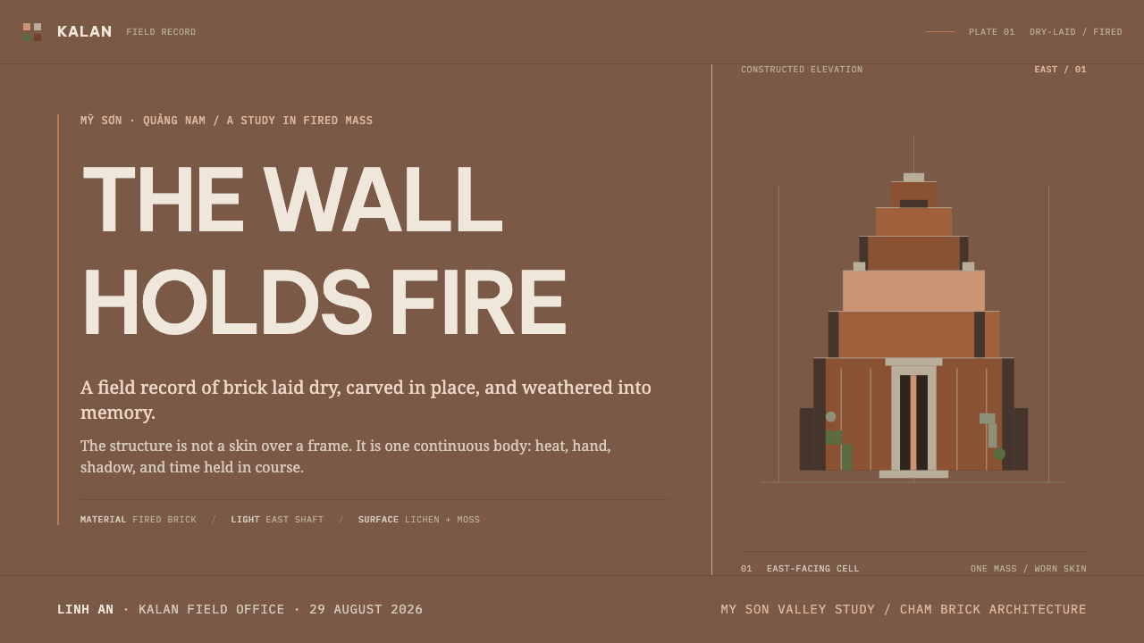
The towers rise in tiers that step back as they climb, and the wall below is divided into bays by pilasters and false doors. This gives the style its rhythm: repeated, diminishing bands, vertical divisions of equal logic, and a clear sense of upward taper. In a layout it translates into stacked sections that narrow or lighten as they ascend, and columns divided by flat vertical bars.
One Line of Eastern Light
Contrast is not spread evenly; it is decided by a single directional light coming from the east. This gives the cut recesses their shadows and lets the sandstone and the high edges of each tier catch a thin bright edge. Design-wise it means a consistent light direction across the whole interface, one source and one angle, so that all inset shadows and highlights agree with each other.
Lichen and Moss
Weathering is admitted as the one organic note. Lichen and wet-season moss creep across the north faces in a muted green-grey, the only colour outside the red-brown family apart from sandstone. It appears as texture and small patches, never as a decorative pattern. In practice it suggests quiet success and warning states in a low-key way, and gives long, flat surfaces a trace of age without any fake distressing.
Who shaped Cham My Son Towers?
Bhadravarman is the name linked with the earliest phase of the sanctuary at Mỹ Sơn, at the fourth-century start of the site's long building span. For a designer he stands for the idea of a founding gesture: a place chosen and dedicated first, with everything afterwards built in relation to it, the way every later surface of this system is built in relation to its first plain wall.
Parmentier is the archaeologist associated with the EFEO survey of Mỹ Sơn between 1898 and 1904. His work belongs to the early modern survey of the towers, and the record that survey created is part of how the site is understood as a related group of buildings. For the design system, that early record gives a fixed point from which later weathering can be read.
Kwiatkowski is the name attached to the restoration campaign of 1980 to 1988. His work is a large part of why the surviving towers can be read and studied today. For the design system the restoration period fixes a stance toward age: real weathering is admitted as part of the look, imitation age is not.
The École française d'Extrême-Orient is the institution behind the archaeological survey of 1898 to 1904, and it stands for the whole movement the record calls EFEO archaeology. Its documentary habit, measuring, describing and ordering what the builders made, mirrors the sober, structural tone of the design system.
How do you use Cham My Son Towers today?
Cham My Son Towers works best where a design wants weight, calm and a sense of time. Its dark ground and single colour family make it a natural fit for serious, long-horizon subject matter, and its sequence-first rule gives layouts a dependable order. The key to using it is restraint: build the surfaces first and cut details into them second.
On presentation slides, a cover can be a single large dark surface with a title cut into it, an inset panel or recessed band rather than text floating on top, with a small pale sandstone mark at one edge to act as the only highlight. Content slides should be divided into clear bays using flat vertical divisions, with each bay holding one idea. Data slides suit the system's tiered logic: stacked or stepped bars in graduated red-brown tones, a single sandstone-coloured series for the figure being discussed, and moss green held back for a small status note.
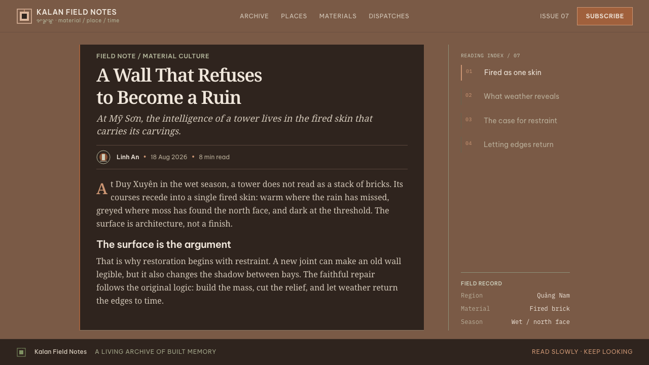
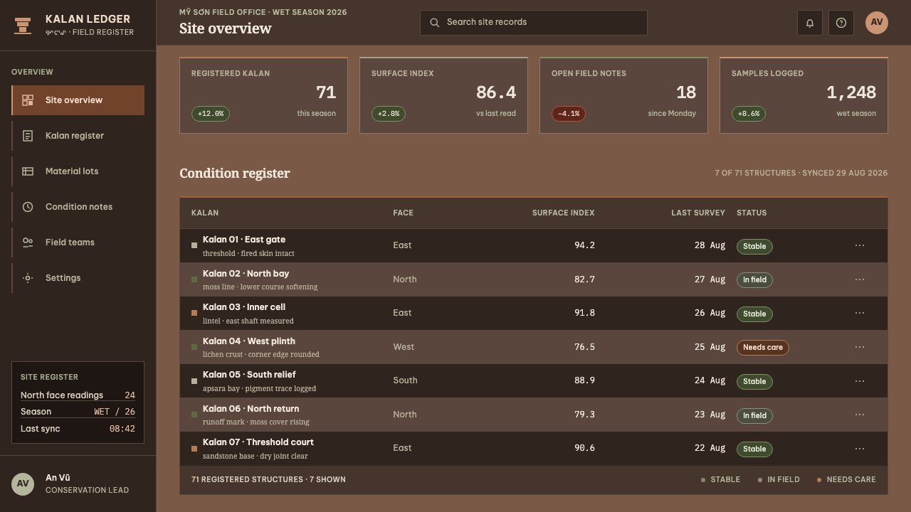
For web interfaces the style fits heritage, archival, museum, culture, travel and long-form reading products, as well as dark-mode dashboards that want a mature, low-glare feel. Panels should look recessed into the page, with inner shadows and quiet borders instead of raised cards. Navigation is set into a plain band, and the active item takes the sandstone tone. Primary buttons use sandstone on a dark field, and inputs are carved-in fields with their shadow on the inside. Keep every interactive state inside the same colour family, using lightness changes rather than new hues.
In editorial and marketing work, the system gives you a convincing way to present place, history and craft. Article layouts can use a tall plain wall of dark brown as the opening, with the headline recessed into it, followed by sections that step in and back like tiers. Pull quotes and captions suit pale sandstone lines. Photography works best when it is desaturated toward the same red-brown family and sits flush in its container, as though inlaid.
The common mistake is to treat the style as a brown filter over an ordinary layout. Without recessed ornament and a consistent light direction, you get a muddy page with no depth. The second mistake is adding bright accent colours; the system gets its authority from the unbroken family, so a saturated blue or green would break it. A third is borrowing the apsara and deity imagery as decorative clip-art. The system is about how the builders worked, so use its construction logic and credit the Champa tradition rather than reproducing sacred figures as ornament.
Cham My Son Towers — FAQ
What is a kalan?
Kalan is the Cham word for a temple sanctuary tower, the central brick structure of a Champa temple group. At Mỹ Sơn the kalan towers are built in fired brick laid dry, with pilasters, false doors and apsaras cut into the finished wall and the surface fired afterwards. The word names a building type, and the style uses it as its structural reference.
Why is this a dark theme?
Because the building is read as mass and shadow. Weathered brick under overcast monsoon light, deep recesses and a single line of light from the east all produce a low-key, dark-dominant image, and a light ground would erase the cut shadows that define the carving. The dark ground is where recessed ornament becomes legible, so it is a structural choice rather than a mood preference.
Can I add a bright accent colour?
It is better not to. The palette gets its force from staying inside one greyed red-brown family, lifted only by pale sandstone and the muted green-grey of lichen and moss. A saturated accent would read as foreign to the material. If you need emphasis, increase lightness within the family or use the sandstone tone, and keep the moss green for small, quiet status notes.
How do I show carved, recessed ornament in a user interface?
Use subtraction. Panels, inputs and dividers should look cut into their container, with shadows falling inside the edge and a light that consistently comes from one side, matching the single line of light from the east. Avoid outer drop shadows and floating cards. A good test is whether an element would still make sense if the ornament were removed, since the wall must stand before the carving.
Is it appropriate to use Cham religious imagery with this style?
Be careful. The towers are Shaiva sanctuaries, and apsaras and false doors are part of a sacred building. The design system borrows the way the builders worked, meaning wall first, carving second, one colour family, and not the figures themselves. If you do refer to the tradition in a project, credit it by name and treat the imagery with the respect you would give any living cultural heritage.
Related design styles
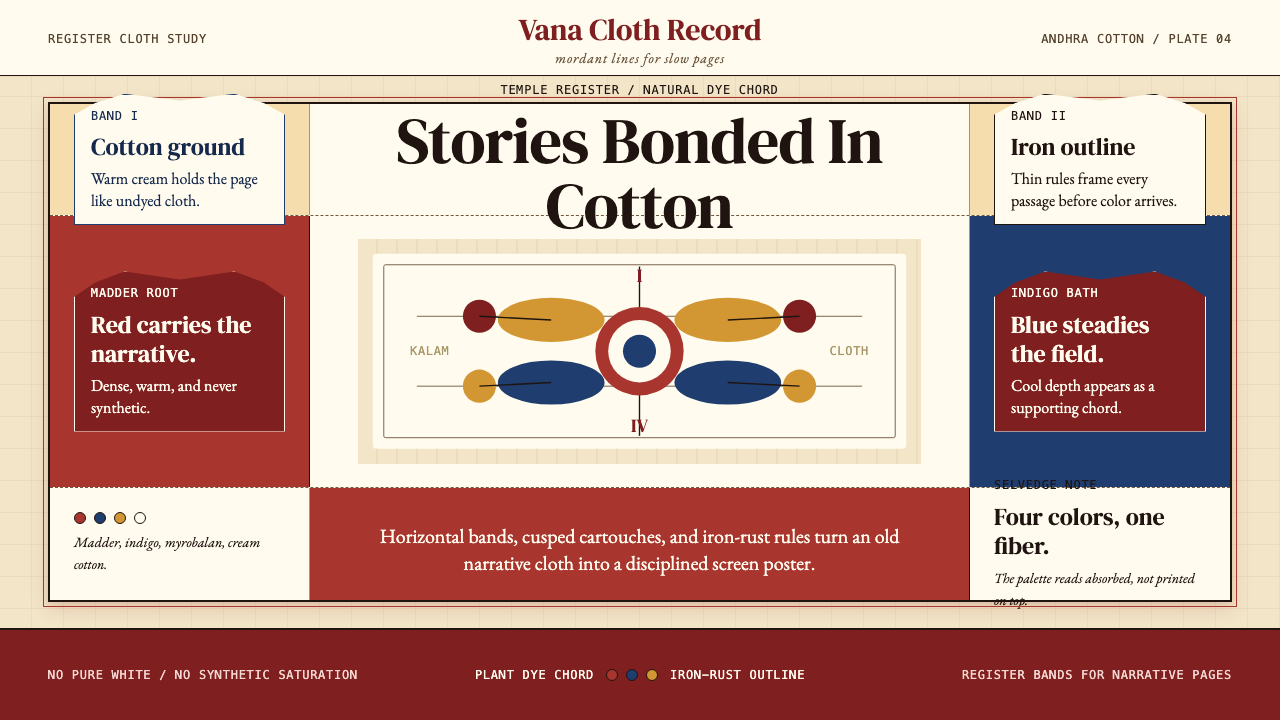 Kalamkari (Andhra Pradesh)Cloth becomes narrative. Madder bands, indigo panels, and iron rules stack li…
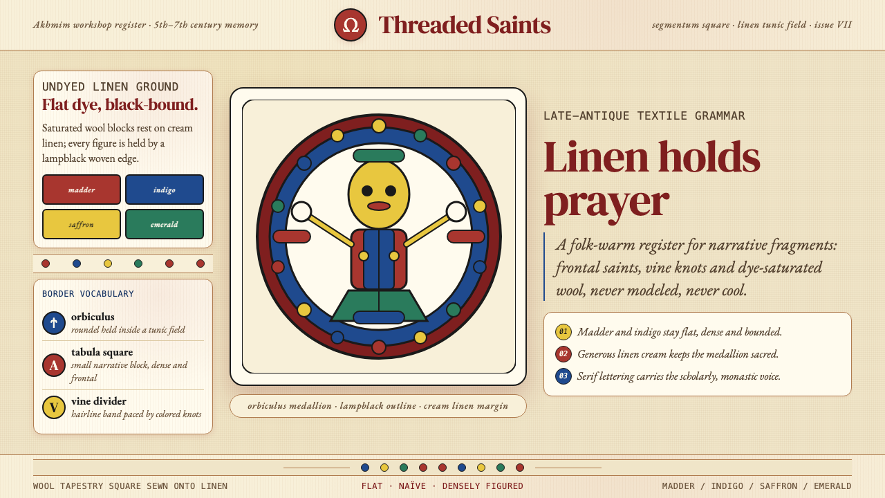 Egyptian Coptic TextileWarmth woven flat. Madder, indigo and saffron medallions sit on linen cream.
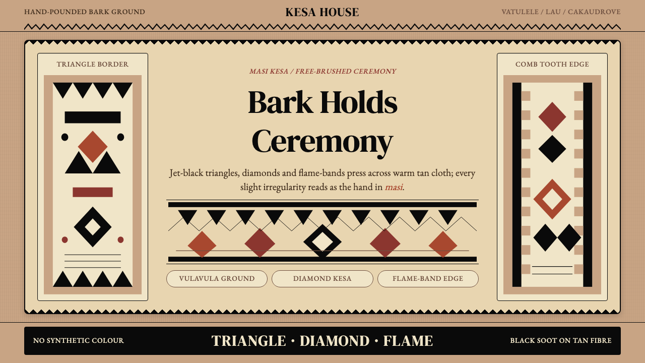 Fijian Masi (Tapa Cloth)Ceremony hits in black. Tan bark ground carries diamonds, zigzags and flame-b…
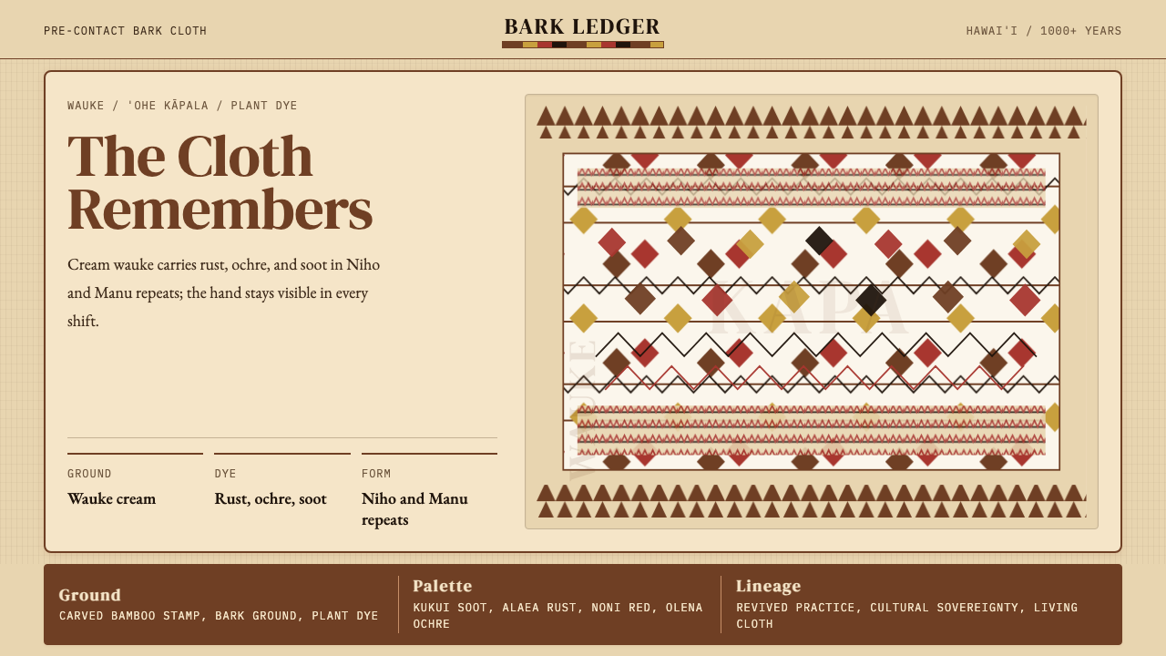 Hawaiian Kapa (Bark Cloth)Ceremonial geometry. Cream wauke, rust, ochre, and soot stamped in repeat.
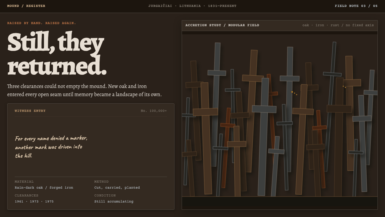 Hill of CrossesMemory returns by hand. Rain-black oak and rusted iron overlap until density…
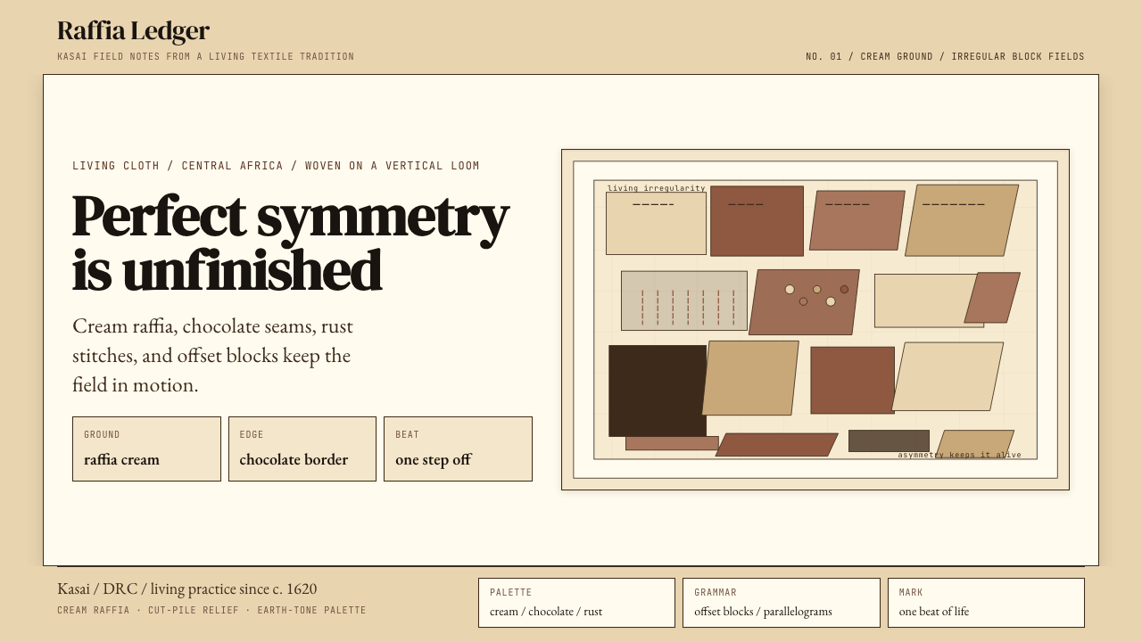 Kuba Raffia Cloth (Congo)Deliberate asymmetry lives. Cream raffia, chocolate seams, and rust blocks.