What is Mexican Amate Bark Paper?
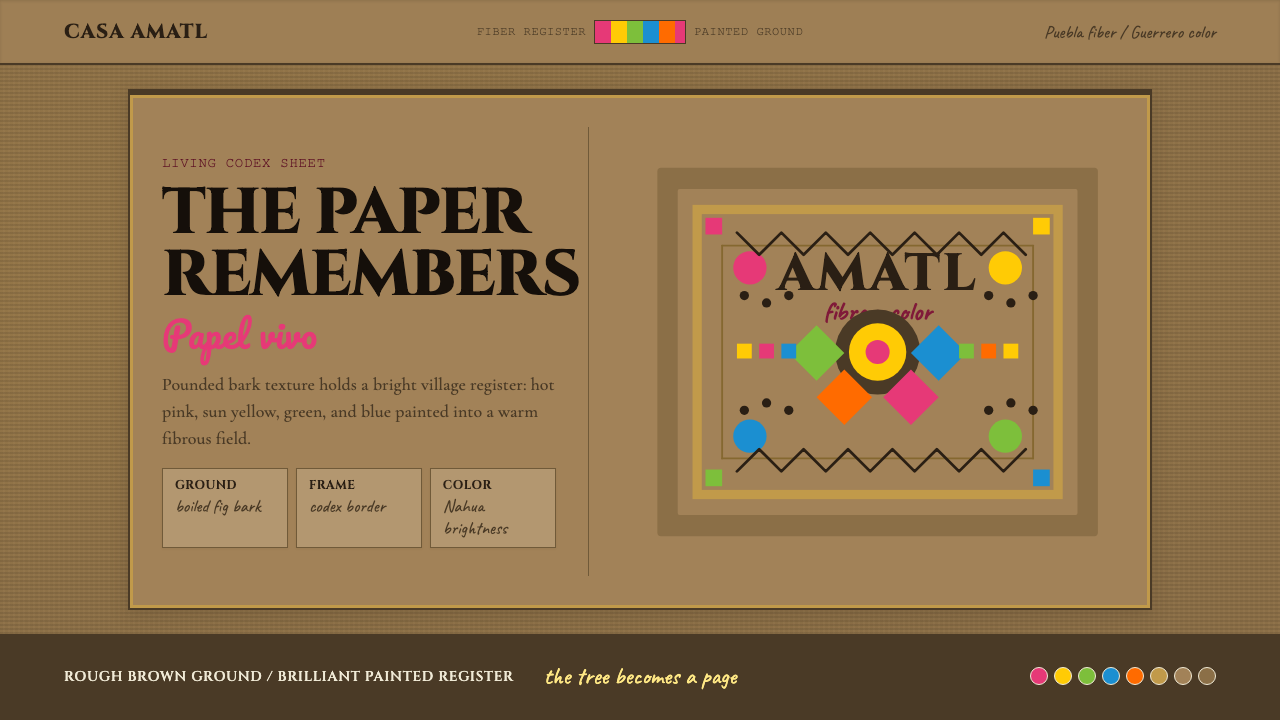
Amate bark paper carries a thousand years of Mesoamerican civilization on its rough, fibrous surface — and the vivid folk paintings layered onto it make it one of the boldest design languages still practiced by hand today.
Mexican Amate Bark Paper in brief
Mexican Amate Bark Paper is a design system rooted in a living craft tradition — one of the few pre-Columbian visual languages that survived Spanish colonization and continues to evolve in indigenous communities today. The system draws from two intertwined sources: the dark, fibrous, organically textured sheets of pounded fig-tree bark that form the medium itself, and the saturated, flat-color folk paintings that Nahua artists have applied to those sheets since the 1960s revival.
Visually, the style operates at two registers simultaneously. The first is material: the bark surface itself carries a woven, irregular grain — not a geometric pattern but an organic web of interlocking fibers that reads as warm, earthy, and handmade. This texture is always present as a ground, giving every composition a sense of physical weight and tactile depth that printed or digital approximations must deliberately reconstruct. The second register is the painted imagery layered on top: flat, outline-defined forms filled with saturated hot pinks, electric yellows, deep greens, and terracotta reds, arranged in dense, symmetrical compositions that leave almost no empty ground visible.
Together these two registers produce a visual language that feels simultaneously ancient and vivid — simultaneously quiet in its earthy ground and loud in its painted surface. It is a system built around abundance rather than restraint, pattern rather than negative space, and the celebration of natural cycles — birds, plants, village life, ritual — rather than abstraction or geometry.
Where does Mexican Amate Bark Paper come from?
The production of amate bark paper — the word amate derives from the Nahuatl āmatl, meaning paper or fig tree — dates back at least to the early Classic period of Mesoamerican civilization, around 500 CE, though some scholars trace its use to earlier Preclassic contexts. The Aztec empire maintained large tribute payments in amate paper: historical codices record that subject communities were required to deliver tens of thousands of sheets annually to Tenochtitlan, where the paper served as the writing surface for religious calendars, genealogical records, tax accounts, and astronomical observations. The sheets were also used for ritual purposes — cut into figures of deities, burned as offerings, worn as ceremonial garments by priests.
Spanish colonizers recognized the paper as a vehicle of indigenous religion and knowledge, and in 1577 a royal decree effectively banned its production in an attempt to eradicate what the colonial administration classified as idolatrous use. The paper did not disappear entirely — Otomi communities in the mountainous sierra of Puebla state, particularly in and around the village of San Pablito Pahuatlán, maintained the craft in relative isolation for centuries, continuing to produce amate sheets for local ceremonial use in healing rituals, fertility ceremonies, and offerings to earth spirits. The paper's religious function kept it alive precisely because it was valuable enough to preserve in secret.
The modern painted-amate tradition has a more precisely documented origin. In the early 1960s, a merchant from Guerrero state brought blank amate sheets produced by Otomi papermakers in Puebla to Nahua-speaking villages in Guerrero — particularly Ameyaltepec and Xalitla — where artisans had a long tradition of painted ceramics and lacquerware. The Nahua painters, working with commercial aniline dyes on the unfamiliar bark surface, began producing brightly colored scenes of village life and the natural world. The imagery was new but drew on deep visual conventions: the bilateral symmetry of pre-Columbian textile patterns, the outline-first drawing method of indigenous pictorial manuscripts, and a Mesoamerican cosmological understanding of nature as populated by named, personified beings.
The craft expanded rapidly through the 1960s and 1970s, driven partly by the Mexican government's promotion of folk art as a national cultural resource and partly by the growing tourist market in Mexico City and Acapulco. Anthropologists and collectors — including the Danish researcher Bodil Christensen, who documented the paper-making traditions in Puebla from the 1940s onward, and the scholar Catharine Good Eshelman, who studied the painted-amate economy in Guerrero — played important roles in making the craft visible to outside audiences. By the 1970s, painted amate had become a recognized category in the Mexican folk-art market, with individual artist signatures appearing on works and a range of styles developing across different villages and families.
What defines the Mexican Amate Bark Paper look?
Textured Ground
The defining material quality of the amate system is the bark sheet itself: a warm brown ground crossed by visible fiber lines and irregular surface variations that no printing process perfectly replicates. The texture is neither fine nor smooth — it reads as coarse, organic, and handmade, with visible pressed-fiber grain running in loose diagonal patterns across the sheet. In digital applications, this quality must be reintroduced through deliberate surface treatments, because the texture is not decorative but structural — it gives the palette its warmth and the imagery its sense of physical embeddedness.
Saturated Folk Palette
The painted-amate color palette is high-saturation and warm-dominant: hot pinks and magentas, sun yellows and golds, electric greens and turquoises, deep reds and terracottas, with occasional ultramarine blue as a contrast note. These colors are applied flat and opaque — there are no gradients, no color blending at edges, no tonal transitions within a single filled area. The colors are dense enough to read clearly against the brown ground without losing their identity to the texture beneath. In digital contexts, these hues should remain warm and earthen in character even at high saturation — cooler versions of the same hues immediately lose the folk-art warmth that defines the system.
Dense Symmetrical Composition
Painted-amate compositions are typically dense and symmetrical, leaving almost no unoccupied ground. The center of a composition often holds a focal creature or figure — a flowering tree, a large bird, a central deity — flanked by mirroring elements on each side, with additional motifs filling the corners and edges until the sheet is covered. This bilateral symmetry echoes pre-Columbian textile and manuscript conventions and creates a sense of visual fullness that is the opposite of negative-space design philosophies. In application, the system calls for layouts that feel populated and complete rather than spare.
Outline-First Drawing
All figurative elements in painted amate are defined by a dark, confident outline drawn before color is applied. The outline is thick relative to the scale of the figure, creating a clean boundary between differently colored areas and giving every form a clear, almost graphic silhouette quality. This is not a naturalistic approach — the outline is not a contour following three-dimensional form but a convention inherited from indigenous pictorial manuscripts where line served both descriptive and symbolic functions. The result is imagery that reads well at distance and at small scale, making it well-suited to contexts where legibility across sizes matters.
Botanical and Zoological Motifs
The iconographic vocabulary of painted amate is drawn almost entirely from the natural world: birds (especially eagles, hummingbirds, and tropical species), flowering plants and fruit-bearing branches, butterflies, deer, rabbits, fish, and agricultural plants like maize. Human figures appear in narrative scenes — farmers, dancers, market vendors — but rarely as isolated subjects. These motifs are not purely decorative; in the Mesoamerican cosmological framework from which the imagery descends, each species carries cultural meaning tied to seasonal cycles, agricultural rituals, and relationships between human communities and the living landscape. The motifs should be understood as a symbolic vocabulary, not merely an ornamental repertoire.
Handmade Irregularity
Unlike design systems derived from industrial or digital production, the amate system carries deliberate irregularity as a value rather than a flaw. Bark sheets vary in thickness, color, and surface smoothness from sheet to sheet and across a single sheet. Brushwork is confident but not mechanical — outlines are consistent in intent but not in precise width, fills are opaque but may show slight variations in tone at the edge of a dried stroke. In digital application, this quality should be preserved rather than corrected: perfect circles and mathematically identical repeated motifs undermine the system's essential character. The goal is controlled handmade quality, not machine precision.
Narrative Density
Amate compositions typically tell a story or evoke a world rather than presenting a single isolated subject. A market scene might include dozens of figures, goods, and architectural elements; a nature scene might layer multiple species of birds across multiple flowering trees, with smaller creatures in the interstices. This narrative density is not congestion — within the dense surface, each element is given its own defined outline and color area, maintaining readability through contrast rather than through space. The system rewards slow reading and repeated looking; it is the opposite of a design language optimized for first-glance comprehension.
Who shaped Mexican Amate Bark Paper?
One of the most prominent Nahua painters associated with the painted-amate revival in Guerrero state, Flores Medina helped establish the visual conventions that came to define the Ameyaltepec style. His works — large-format sheets densely populated with birds, flowers, and village scenes in the characteristic hot-pink and yellow palette — were among the first to attract serious collector attention and helped move painted amate from tourist souvenir to recognized folk-art form. His approach to bilateral symmetry and his treatment of flowering-tree compositions became widely referenced templates for the Guerrero school.
A master papermaker from San Pablito Pahuatlán in Puebla, Pedro de Jesús became one of the most documented practitioners of the Otomi bark-paper craft, producing sheets using the traditional methods of bark stripping, boiling in lime water, and pounding with basalt stones. His workshops helped maintain the continuity of papermaking technique through the late twentieth century even as the demand for paper shifted from ceremonial to artistic and commercial use. The sheets produced in his tradition are distinguished by their density and surface quality — characteristics that directly determine the visual properties of the painted works built upon them.
A Danish anthropologist and textile researcher who worked extensively in Mexico from the 1940s onward, Bodil Christensen was among the first outside scholars to systematically document the bark-paper traditions of the Otomi communities in Puebla. Her field research and publications — particularly her studies of the ceremonial uses of amate figures in healing and agricultural rituals — established the foundational scholarly record on which later researchers and collectors built. Christensen's work was instrumental in making the craft visible to the international folk-art community before the painted-amate market emerged.
An American anthropologist who studied the Nahua communities of Guerrero state over several decades, Catharine Good Eshelman produced detailed economic and cultural analyses of the painted-amate market as it developed through the 1970s, 1980s, and 1990s. Her research examined how individual Guerrero villages became specialized in particular compositional styles or color approaches, how the art market shaped which imagery was produced and which was suppressed, and how the craft functioned as a livelihood strategy within the broader Mexican economy. Her work provides the most rigorous account of how the painted-amate tradition is an ongoing, commercially embedded, living culture rather than a preserved historical relic.
The painted-amate tradition that is now recognized globally was not the invention of any single master but emerged from the collective practice of Nahua-speaking communities in two Guerrero villages — Ameyaltepec and Xalitla — where multiple families developed the painted-bark-paper form simultaneously in the early 1960s. This collective origin distinguishes amate from design systems attributed to individual designers: the visual language was worked out through dozens of artists experimenting in parallel, and it continues to evolve as a community practice rather than as a style controlled by any single author or estate. The collaborative dimension is essential to understanding both the diversity within the tradition and its remarkable vitality.
How do you use Mexican Amate Bark Paper today?
The Amate Bark Paper system is not a universally transferable style — its warmth, materiality, and visual density make it highly effective in specific contexts and actively counterproductive in others. Understanding where it works requires recognizing that the system's core value proposition is sensory richness and cultural authenticity, not clarity or rational structure. It is a system for contexts where the goal is to evoke place, tradition, craft, and the natural world, not to optimize information hierarchy.
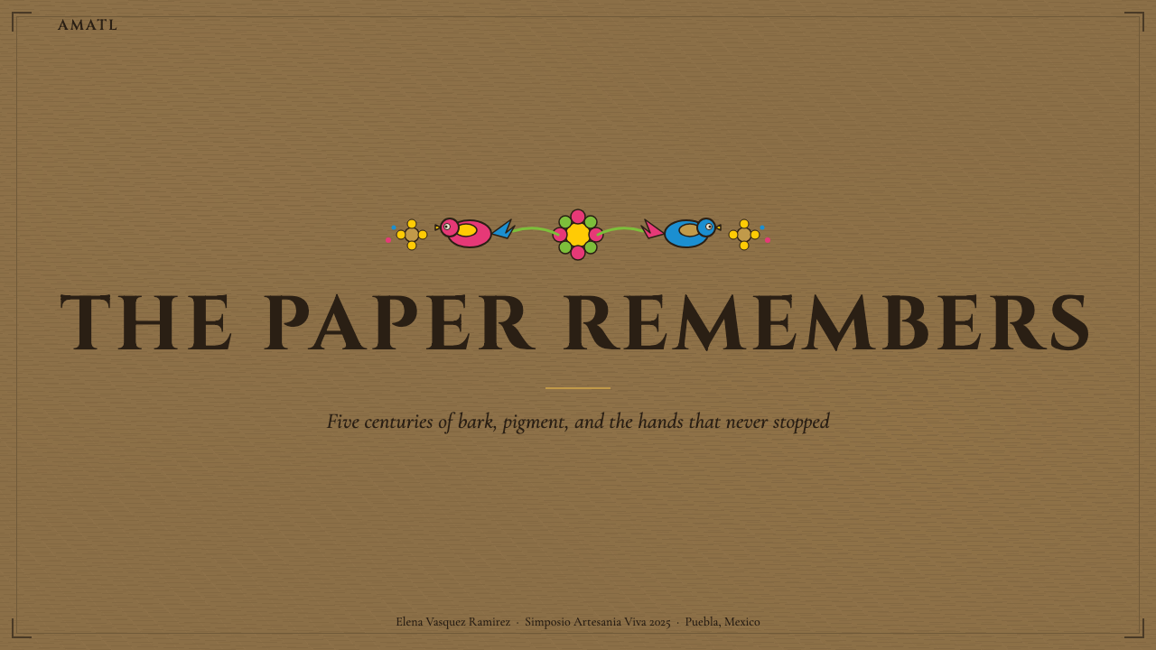
For presentation slides, the style works best on covers and section dividers rather than content slides. A cover slide built on an amate-derived vocabulary might use the bark-texture ground as a full-bleed background, a single bold botanical motif as a centrepiece, and title text in a display typeface with enough weight to hold its own against the visual density beneath it. Section dividers can carry smaller compositional elements — a single bird or branch — allowing the density to punctuate the presentation at transition points. Content slides, however, should use only minimal amate-derived elements — perhaps a border or a single small motif — because the style's density works against the scannability and information hierarchy that content slides require. Data visualizations in this system should use the characteristic warm palette for color-coding, with the bark-textured ground providing warmth to what might otherwise feel like a generic chart.
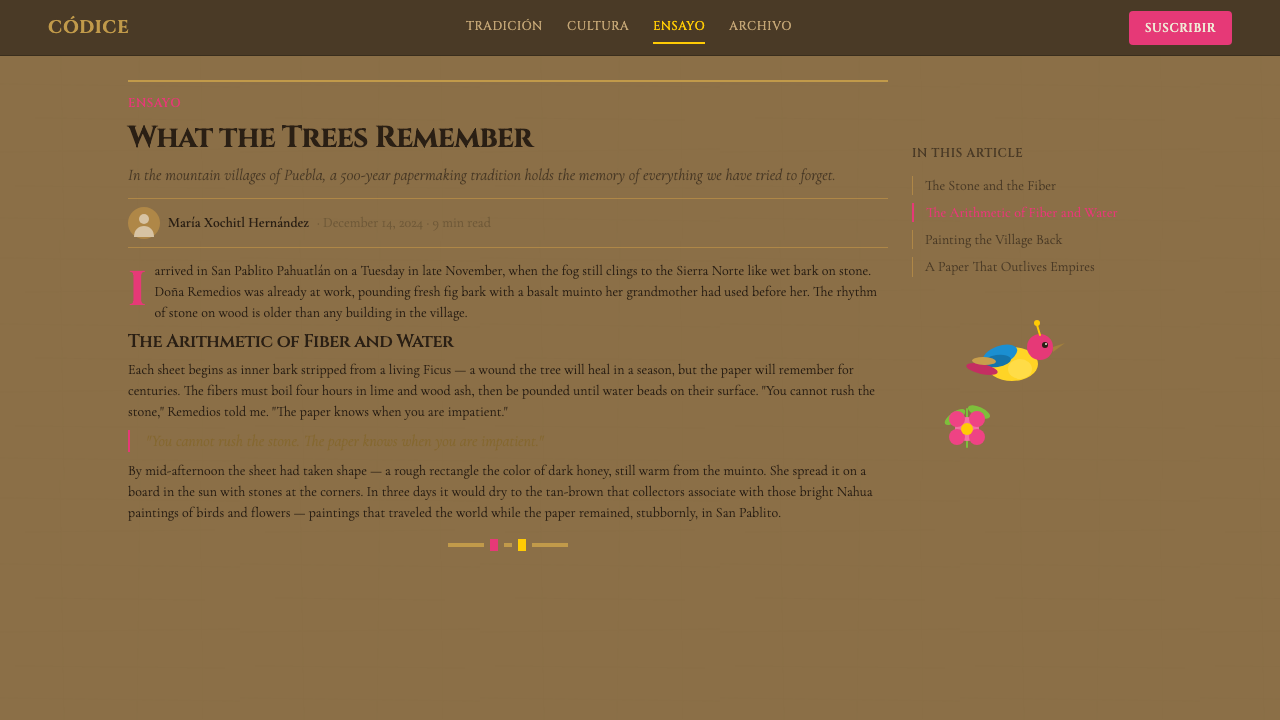
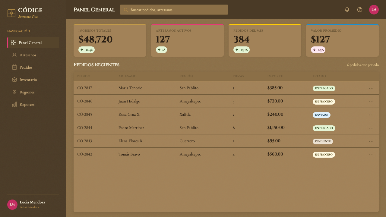
For web interfaces and dashboards, the amate system applies most naturally to landing pages, hero sections, and marketing material for brands rooted in craft, sustainability, food, travel, or cultural heritage. A pricing page in this register might use the bark texture as a muted background wash, with hot-pink or golden-yellow accents highlighting featured tiers, and botanical motifs used as section dividers or feature icons. Full-density amate composition should generally be confined to hero imagery or illustration — applying it to UI components like cards, buttons, or navigation would create visual noise that impedes interaction.
For editorial and marketing contexts, the style suits campaigns for artisan goods, travel and tourism, food and beverage brands with a craft or regional identity, cultural institutions, and organizations working with indigenous or folk-art traditions. A brand identity built in this register might use the bark-texture ground as a signature material quality on packaging and print, with the saturated folk palette applied to illustration while the text system remains clean and legible. The contrast between textured, illustration-rich amate zones and clean typographic zones is a productive tension — it makes both elements stronger rather than weakening either.
A common mistake when applying the amate system is attempting to digitally recreate the bark texture with generic grunge or noise overlays that lack the specific warmth and organic directionality of actual pressed-fiber grain. The texture in amate work reads as fibrous and woven, not as aged or dirty — the distinction matters because the wrong texture type signals decay rather than craft. A second common error is applying the saturated folk palette without the defining outline treatment: isolated saturated colors on a textured ground without confident black outlines lose the clarity that makes the style work at scale. Finally, the style's density should not be confused with chaos — every motif in a traditional amate composition has a defined outline boundary, and visual richness comes from the number and variety of well-defined elements, not from blending or overlapping them without separation.
Mexican Amate Bark Paper — FAQ
Is painted amate a pre-Columbian art form or a modern invention?
Both, in different senses. The bark paper itself — produced by the Otomi communities of Puebla — is genuinely pre-Columbian in method, continuing techniques documented from at least 500 CE. But the painted-amate tradition as it is now recognized — Nahua artists from Guerrero painting vivid folk scenes on Otomi-made bark sheets — originated in the early 1960s, when the two craft traditions were brought together by commercial intermediaries. The imagery draws on deep Mesoamerican visual conventions, but the specific combination of bark ground, aniline-dye palette, and Guerrero Nahua subject matter is a mid-twentieth-century creation. This hybrid origin does not make the tradition less authentic — it reflects the ongoing, adaptive nature of living craft practice.
How does amate design differ from other Mexican folk-art styles like Talavera or Huichol art?
The three traditions share a Mexican folk-art context but are visually and culturally distinct. Talavera is a tin-glazed ceramic tradition originating in Puebla with Spanish and Moorish influences, characterized by blue-and-white or polychrome floral patterns on a white ground — its palette is cooler, its ground is always white or cream, and its imagery is more formally contained within repeating tile patterns. Huichol art (Wixáritari beadwork and yarn painting) uses an almost entirely different visual grammar: perfectly symmetrical mandala-like compositions, extremely fine geometric patterning, and a bright jewel-tone palette that includes many cooler hues. Amate's distinctive qualities are its warm brown ground, its confident outline-and-flat-fill approach, its narrative density with recognizable plants and animals, and its large-format compositional freedom.
Can amate aesthetics work in a minimal or pared-back context, or does it require visual density?
It can work at reduced density, but it requires deliberate adaptation. The system's essential elements — the warm brown ground, the saturated palette, the confident outline treatment, the botanical motifs — can each be used selectively without requiring full compositional density. A minimally applied amate aesthetic might use a single large outlined bird on a bark-textured ground, with the rest of the composition held in clean negative space. This works better than simply removing texture entirely, which strips the system's material character. What should not be reduced is the outline treatment — isolated saturated color areas without defining outlines lose the visual clarity that makes the style legible, and drift toward generic tropical decoration rather than the specific amate register.
What is the relationship between the amate system and sustainability or ethical sourcing considerations?
The traditional amate paper is produced from the inner bark of several species of wild fig tree (Ficus), which requires harvesting bark from living trees. Responsible producers use partial-bark harvesting methods that allow trees to regenerate, and some communities have developed cultivation practices to supplement wild-harvested material. The craft's survival is directly tied to the economic viability of the communities that produce it — demand for authenticated amate works supports both the papermakers of Puebla and the painters of Guerrero. When applying amate aesthetics digitally or in print, practitioners working with cultural sensitivity may wish to credit the tradition's origins, source materials from authenticated producers when physical bark paper is involved, and avoid designs that appropriate the visual vocabulary while severing it from its community context.
Does the system work equally well for dark and light background applications?
The system is inherently light-ground: the warm brown of the bark paper is the canonical background, and the saturated palette was developed in relation to that specific ground tone. A dark-background inversion is possible but fundamentally changes the character of the system. On a very dark ground, the warm-brown ground tone disappears and must be replaced by another warm dark — a very deep terracotta or a near-black with warm undertone works better than a neutral dark gray or pure black, which cools the palette. The outline treatment remains effective on dark grounds and actually gains in drama. The botanical motifs continue to work. But the material warmth that distinguishes amate from other saturated folk styles is harder to maintain on dark grounds — the result tends to look more like generalized folk art than specifically like the amate tradition.
Related design styles
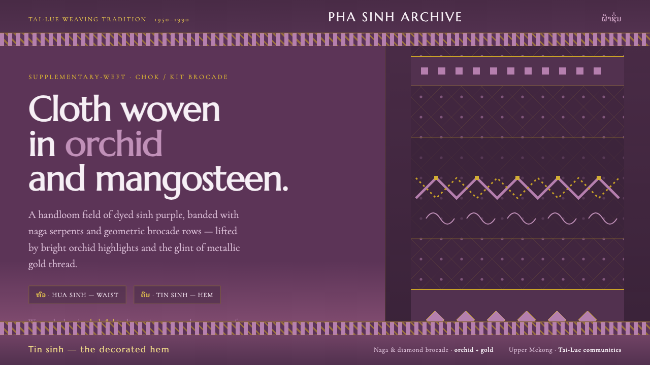 Lao Orchid Mauve TextileHandwoven sinh silk made digital. Orchid-mangosteen ground banded with naga b…
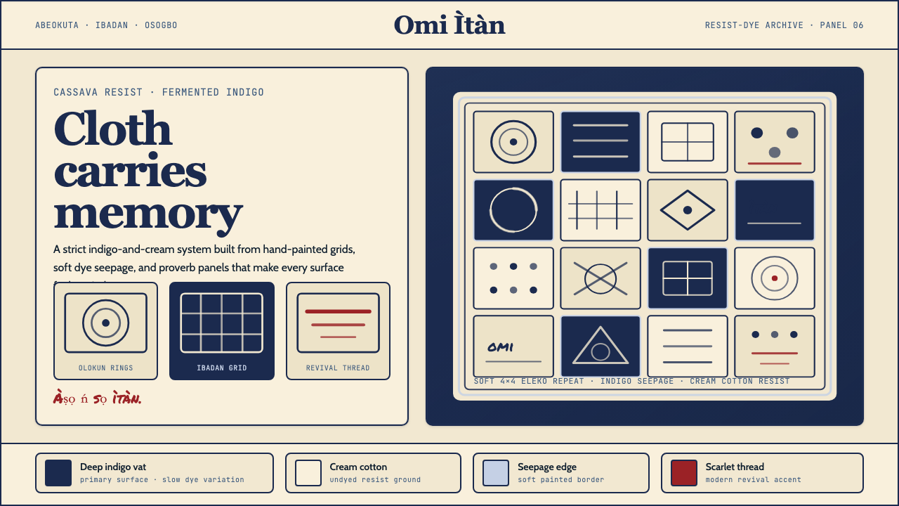 Yoruba Adire IndigoMemory lives in cloth. Deep indigo grids on cream cotton carry hand-painted p…
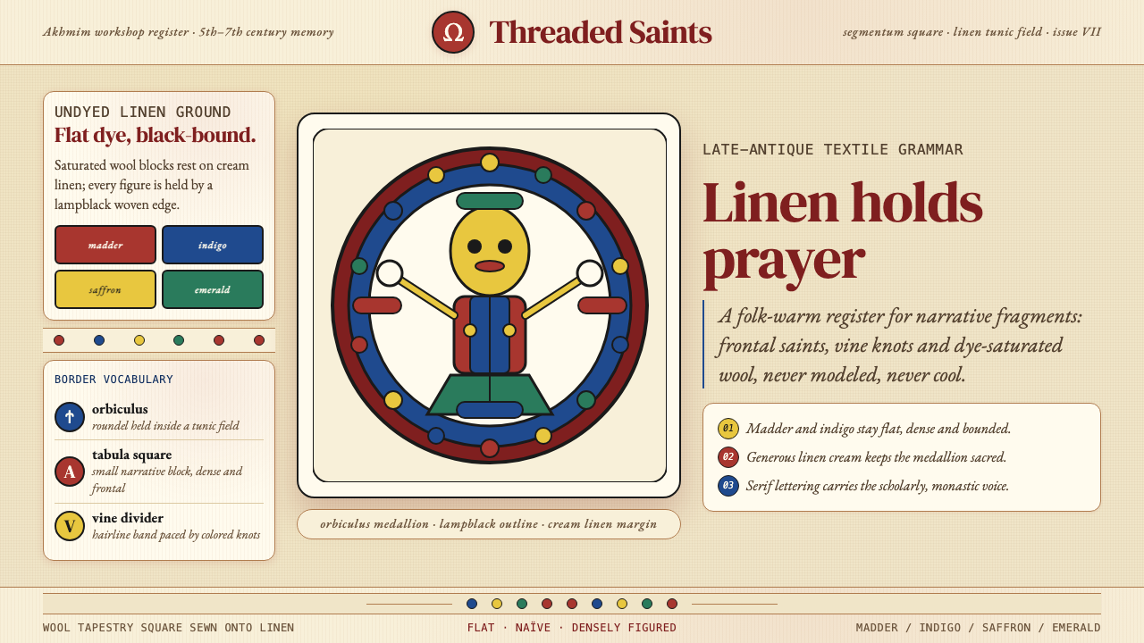 Egyptian Coptic TextileWarmth woven flat. Madder, indigo and saffron medallions sit on linen cream.
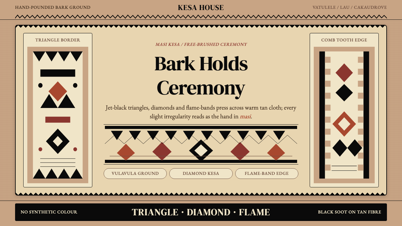 Fijian Masi (Tapa Cloth)Ceremony hits in black. Tan bark ground carries diamonds, zigzags and flame-b…
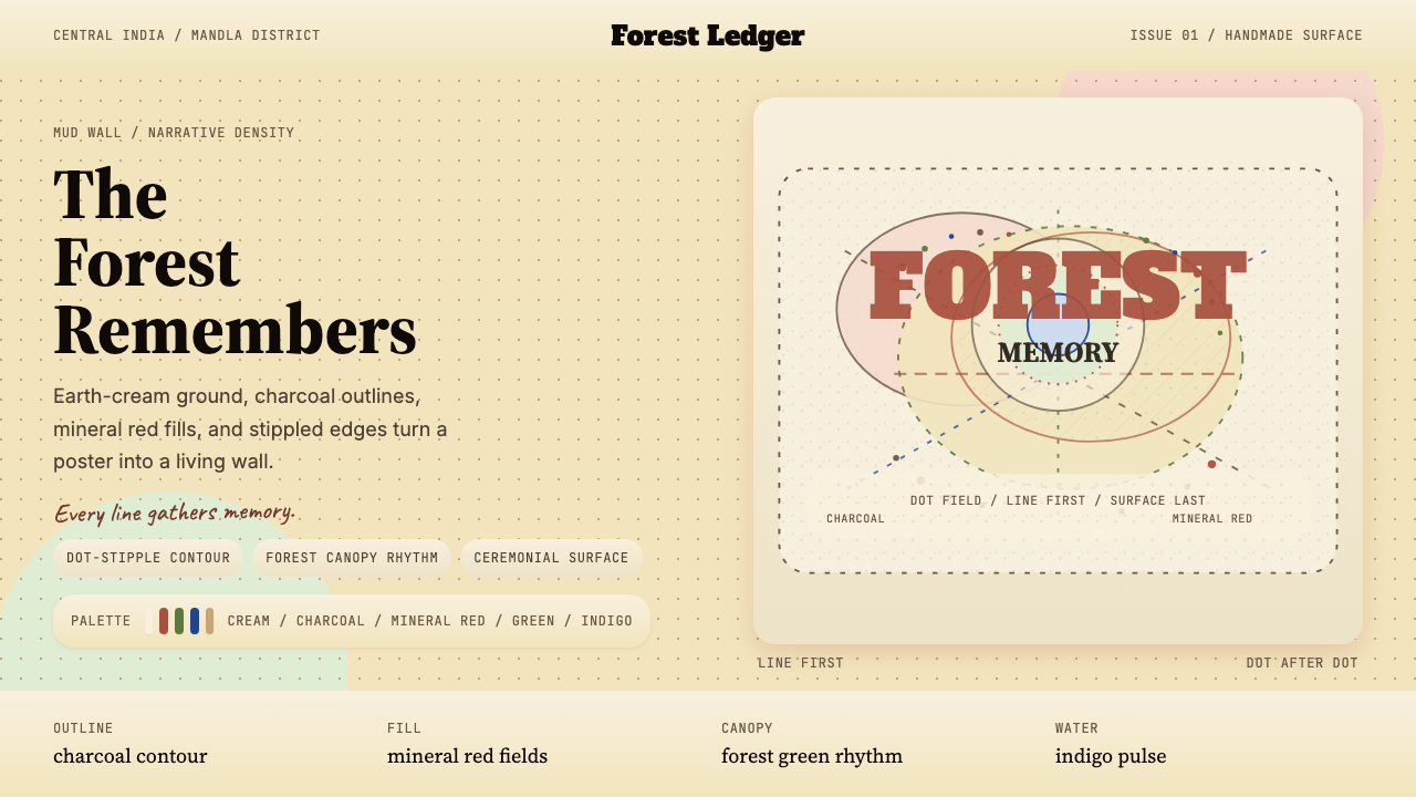 Gond Tribal Art (Madhya Pradesh)The wall becomes a forest. Earth-cream, charcoal, and stippled red make it ce…
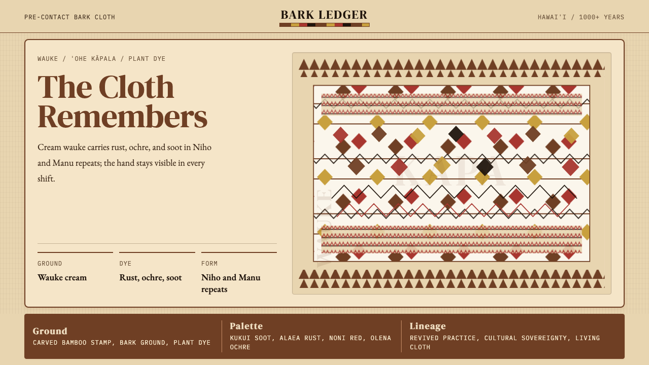 Hawaiian Kapa (Bark Cloth)Ceremonial geometry. Cream wauke, rust, ochre, and soot stamped in repeat.