What is Haida Formline?
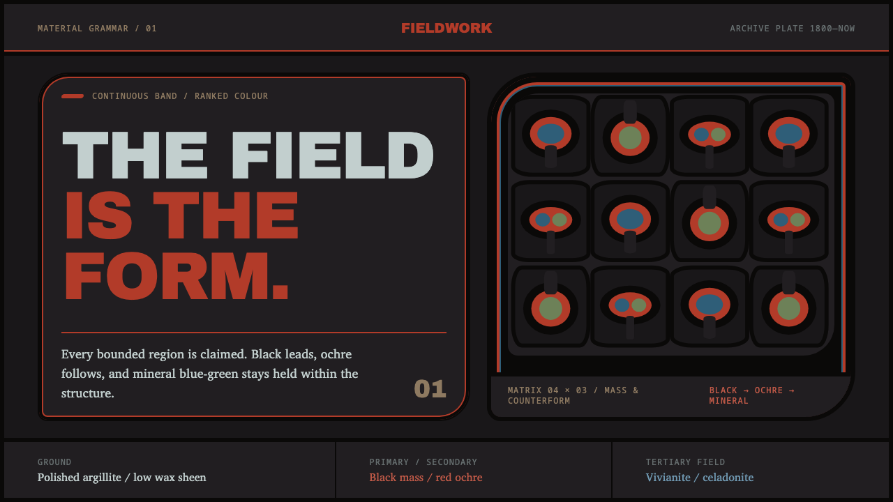
Every field is claimed. A single black band swells and tapers through ovoids and U-forms until nothing on the page is left unaccounted for.
Haida Formline in brief
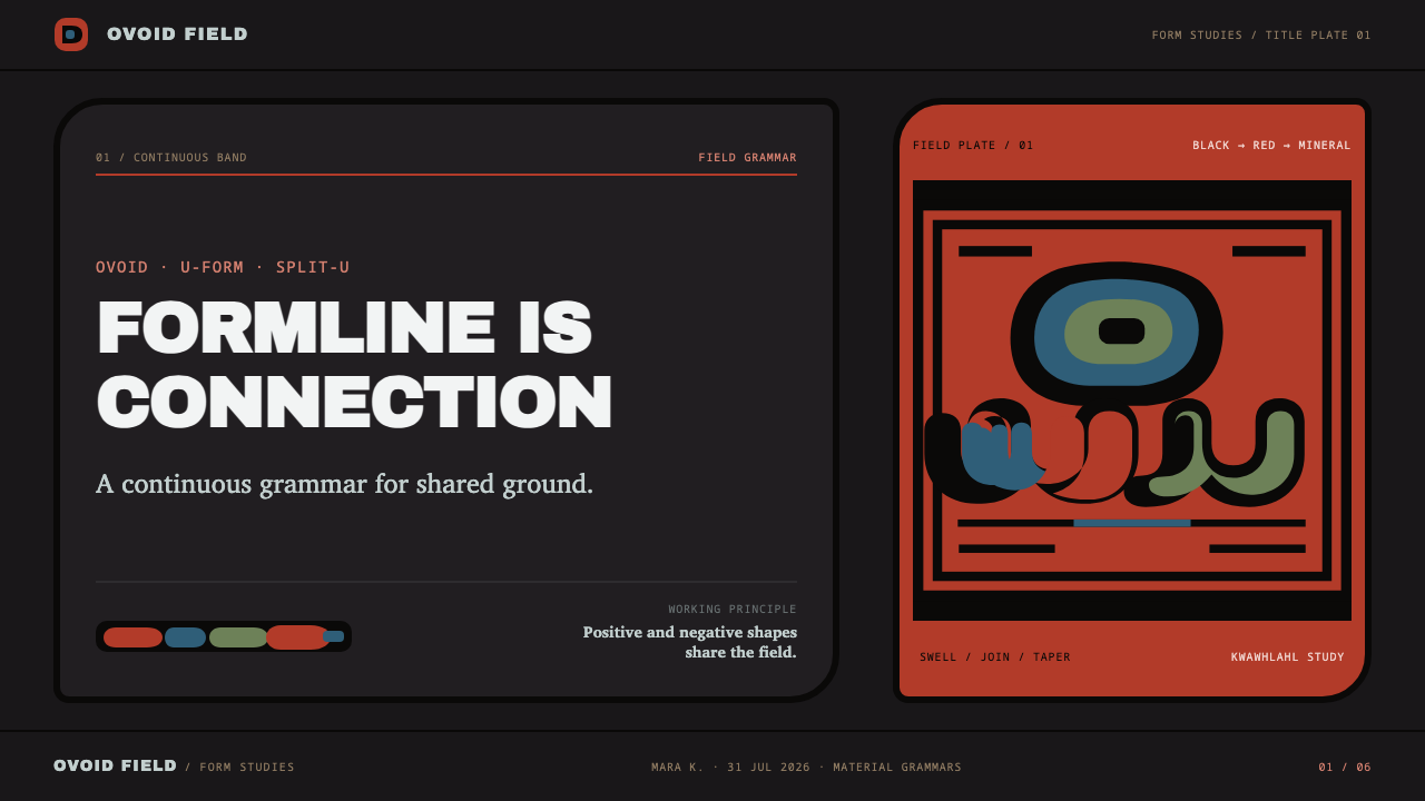
Haida formline is not ornament applied to an object's surface — it is the organizing system of the surface itself. A single continuous line, thick at its joints and narrow at its terminations, swells and tapers to build interlocking ovoids, U-forms, and split U-forms until an entire field is accounted for. Positive shape and negative background are treated as equally deliberate; there is no leftover space, because leftover space in this system reads as an unfinished thought rather than a restful pause.
The visual result is dense, continuous, and almost topological — the eye follows one line as it thickens into a joint, narrows into a limb, and turns back on itself to define the next form, the way a single road might loop through an entire town without a dead end. This is a system built from relationships between forms rather than from isolated motifs placed on a ground; nothing in a formline composition can be removed without collapsing the shapes around it.
Color plays a strictly secondary, hierarchical role to this linework. A formline composition is read first as line and shape, and only second as color — the palette exists to differentiate primary structural lines from secondary infill, never to compete with the line itself for attention.
Where does Haida Formline come from?
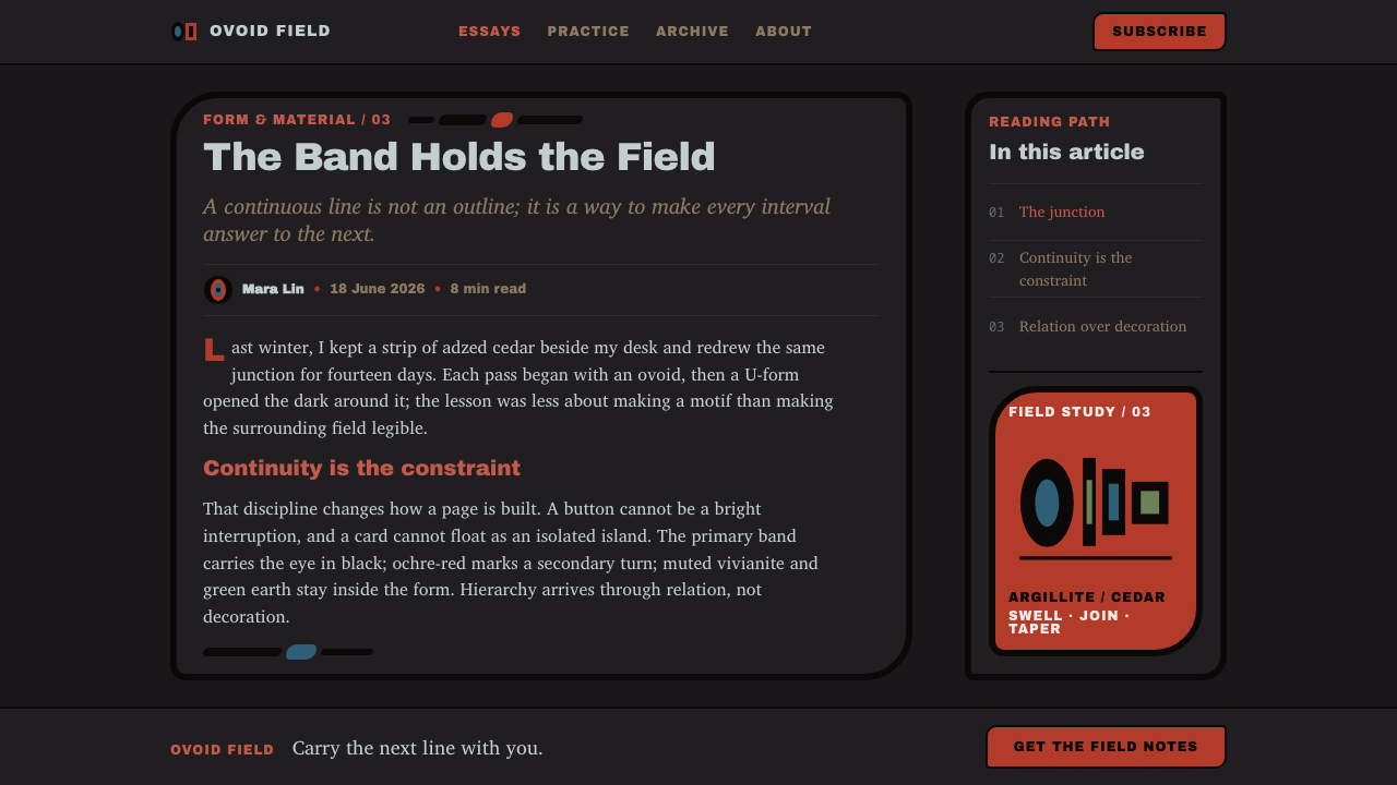
Formline design belongs to the Haida people of Haida Gwaii, an archipelago off the coast of what is now British Columbia, part of a broader visual tradition shared across the Pacific Northwest Coast. Painted formline predates any surviving physical record by a considerable margin; the tradition that can be dated with confidence is argillite carving, which is documented from around 1800, when Haida carvers began working the dense black shale quarried at Slatechuck on Graham Island — a stone whose color and workability shaped an entire branch of the tradition.
The system's rules were transmitted through practice long before they were written down as theory. Formline compositions were applied across an enormous range of objects and surfaces — house fronts, bentwood boxes, canoe paddles, ceremonial regalia, and totem poles — meaning the grammar of swelling and tapering lines, interlocking ovoids, and hierarchical color had to work at radically different scales and on radically different materials, from a flat painted house screen to a three-dimensional carved box lid.
Charles Edenshaw, working through the second half of the nineteenth century and into the early twentieth, is among the most historically significant practitioners of this tradition, carrying formline principles across argillite, wood, and silver at a moment when Haida communities faced severe external pressure on their cultural institutions. His work, along with that of other master carvers of his generation, preserved and transmitted formline's structural logic to the artists who followed.
In the twentieth century, the anthropologist and artist Bill Holm undertook the first systematic written analysis of formline's underlying grammar — codifying the relationships between primary, secondary, and tertiary lines, the behavior of ovoids and U-forms, and the rules governing how a form is allowed to swell or taper. That analysis gave later generations, including Haida artists Bill Reid and Robert Davidson, a shared vocabulary for both practicing and teaching the tradition, and it remains the reference framework most commonly used to describe formline's construction today.
What defines the Haida Formline look?
Color Hierarchy
Color follows a strict rank rather than free choice. Black leads as the primary structural line, a warm mineral red follows as the secondary line and infill, and a muted blue-green is reserved for tertiary infill only. This is a rule, not a preference — a composition that reverses or flattens this hierarchy stops reading as formline, no matter how accurately the line shapes are drawn.
Mineral Palette
The blue and green in traditional formline work come from iron-bearing minerals rather than bright synthetic pigment, which is why they read as dulled, slightly grey-cast tones — closer to slate or moss than to a clean turquoise. The red carries the same weathered, earthbound quality, an ochre-red rather than a hot, saturated crimson.
The Formline Itself
The line is a single continuous band that varies in width along its own length — thick and rounded at a joint, thin and pointed at a termination. It is never a uniform-width outline; its swelling and tapering is what generates the sense of tension and movement across an otherwise flat, two-dimensional surface.
Ovoids and U-Forms
The ovoid — a rounded, slightly irregular shape narrower at the top than the bottom — and the U-form, along with its split variant, are the basic building blocks of the system. They interlock and repeat at different scales to build eyes, joints, wings, and other anatomical elements of the creatures the design represents, functioning the way modular units function in any grid-based visual language.
Total Field Coverage
Every part of the working surface is accounted for by either a positive form or a deliberately shaped negative space; nothing is left as unconsidered background. This produces a density that can look, to an unfamiliar eye, like ornamental horror vacui, but functions instead as a structural principle — every negative shape is drawn with the same intent as every positive one.
Symmetry and Formal Balance
Many formline compositions, particularly on house fronts and box lids, are built on a strict bilateral or radial symmetry, with a design mirrored around a central axis. This formal discipline coexists with the dense, organic-feeling linework — the symmetry provides the overall order that lets the eye process an otherwise extremely dense field of interlocking shapes.

Who shaped Haida Formline?
Edenshaw worked through the second half of the nineteenth century into the early twentieth, carrying formline principles across argillite carving, wood, and silverwork during a period of severe external pressure on Haida cultural institutions. His carving is now regarded as among the most historically significant bodies of formline work, and his approach to composition and line quality has been closely studied by generations of carvers who followed.
Holm, an anthropologist and artist, produced the first systematic written analysis of formline's underlying grammar — the relationships between primary, secondary, and tertiary lines, and the rules governing how ovoids and U-forms are allowed to swell and taper. His codification gave later practitioners a shared analytical vocabulary that remains the standard reference for describing how formline is constructed.
Reid was a central figure in the twentieth-century revival and international recognition of Haida formline art, working across jewelry, sculpture, and monumental carving. His work brought formline principles to a much wider audience while remaining grounded in the structural logic of the line-based tradition he had studied.
Davidson continued and extended the formline tradition into contemporary practice, working in argillite, wood, and print while drawing directly on the analytical framework that Bill Holm had codified and the compositional lineage established by carvers such as Charles Edenshaw. His work represents formline as a living, still-developing visual language rather than a fixed historical style.
How do you use Haida Formline today?
Formline is a system of relationships, not a set of decorative motifs, so applying it responsibly starts with respecting what it actually is: a specific, living visual language belonging to Haida artists and the Northwest Coast tradition, with formal rules developed over generations. Contemporary design work that draws on its structural logic should credit the tradition explicitly and, where the context calls for it, engage or commission Indigenous artists directly rather than treating the line grammar as a generic 'tribal' texture to lift and recolor.
For presentation slides, formline's real lesson is total-field thinking: instead of scattering icons and text boxes across empty background, treat every region of the slide — including the gaps between elements — as a shape that was deliberately drawn, not left over. A cover slide can use one continuous, swelling-and-tapering line as a structural divider between title and image field, rather than a straight rule; content slides benefit from the discipline of a strict, limited color hierarchy — one dominant tone for structure, one secondary tone for emphasis, and a third used sparingly, echoing the black-red-blue rank rather than a free palette.
For web interfaces, the total-field principle translates well to dashboards and data-dense layouts that struggle with visual noise: instead of adding more whitespace to solve clutter, the formline lesson is to make every negative space intentional — a consistent gutter treated as a designed shape rather than leftover margin, and a strict three-tier color hierarchy (one primary, one secondary, one rare tertiary accent) applied to status indicators or data categories instead of an open-ended color palette.
In editorial and brand contexts, the swelling-tapering line itself — used abstractly, and never as a literal reproduction of a specific formline crest or figure — can inform how a single graphic rule or divider behaves: thickening at a junction, thinning toward its end, giving a static page a sense of directional movement. This should remain a structural borrowing of line behavior, not an attempt to recreate specific Haida crest imagery, which carries meaning and ownership specific to particular families and lineages.
The most common mistake is treating formline as a flat, low-detail 'tribal pattern' to be recolored in a brand's existing palette — which discards the entire logic of the system, since the swelling line and the strict color hierarchy are the substance, not decoration on top of something else. A second common mistake is leaving open, undesigned negative space in a supposedly formline-inspired layout; the system's core discipline is that no space is left unaccounted for, and reintroducing casual empty space undoes the effect entirely.
Haida Formline — FAQ
Is formline the same thing as totem pole art in general?
They overlap but are not identical. Formline is the underlying two-dimensional visual grammar — the swelling-and-tapering line, ovoids, U-forms, and color hierarchy — that can be painted flat on a house front or a box lid. Totem poles are one three-dimensional application of related design principles, carved in the round rather than drawn on a flat plane, and they draw on a broader Northwest Coast carving tradition that extends beyond formline's specifically two-dimensional grammar.
Why is the negative space treated as just as important as the drawn shapes?
Because the system's basic unit is not a shape sitting on a background but a relationship between adjoining shapes. If the background is left arbitrary, the positive forms lose the edges that define them, and the whole composition loses the tension that makes it read as coherent rather than as scattered motifs. Treating every negative shape with the same deliberateness as every positive one is what keeps the entire field legible as a single, connected structure.
Can the color hierarchy be swapped — for example, leading with blue-green instead of black?
Not without abandoning the system's own logic. Black leading as the primary structural line, red following as secondary, and blue-green appearing only as tertiary infill is not an arbitrary stylistic choice — it reflects both the historical materials available (mineral-derived pigments with different degrees of saturation and permanence) and a deliberate visual hierarchy that lets the eye process the line before the color. Reversing it produces a composition that may borrow formline's shapes but no longer functions the way the system is built to function.
Is it appropriate to use formline-derived patterns in a commercial design project?
This depends heavily on context and intent. Formline is a living tradition belonging to Haida artists and communities, not a historical style free for generic reuse — specific crests and figures within it carry meaning tied to particular families and lineages. Design work that wants to draw on its structural principles — the line hierarchy, the total-field density, the color rank — should do so transparently, credit the tradition by name, and, where the project's scope and budget allow, commission Haida or Northwest Coast Indigenous artists directly rather than approximating their visual language secondhand.
Does formline only apply to depictions of animals and mythological figures?
In its traditional context, yes — formline's ovoids, U-forms, and swelling lines are primarily a way of constructing the eyes, joints, wings, and bodies of the creatures and beings central to Haida crests and narratives. The grammar itself, however — line behavior, total-field coverage, color hierarchy — is what contemporary design borrows structurally, and that grammar is what should transfer, not an attempt to reproduce specific figurative crest imagery outside its original cultural context.
Related design styles
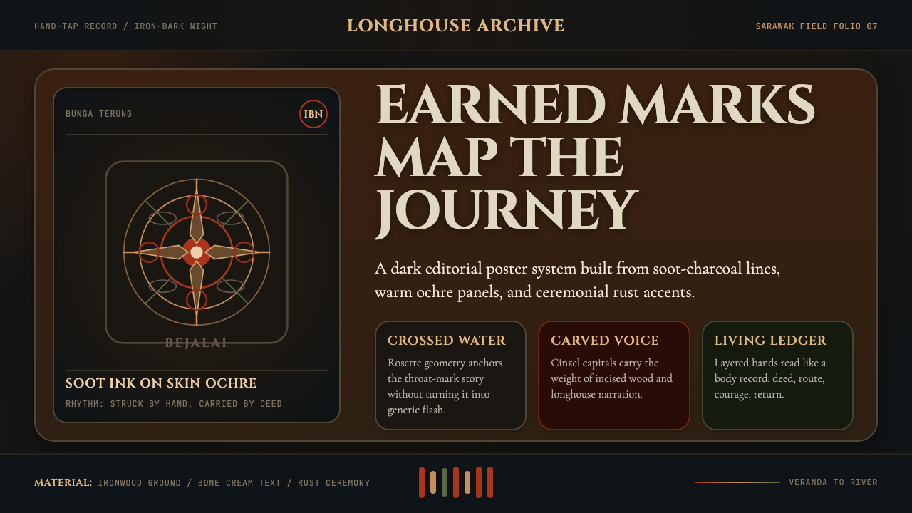 Dayak Borneo Tattoo (Iban)A living journey ledger. Soot lines, ochre panels, and rust rosettes feel han…
 Papuan Asaro MudmenRitual stillness commands the frame. Bone-pale Cinzel rises against jungle-da…
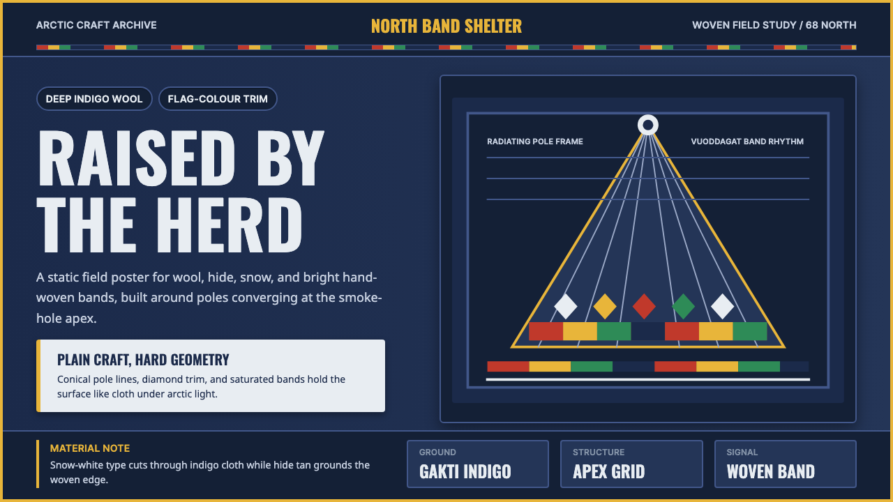 Sámi LavvuArctic craft stays bold. Indigo wool, Oswald type, and woven flag bands conve…
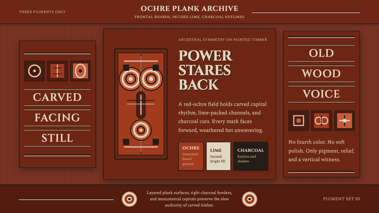 Sepik Spirit BoardThree-pigment power. Ochre, lime, and charcoal lock into frontal carved symme…
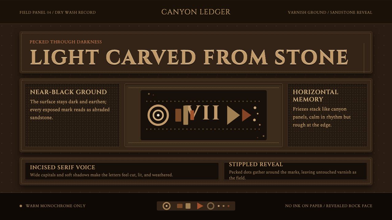 Desert VarnishStone remembers. Sandstone glyphs cut through near-black varnish in stacked f…
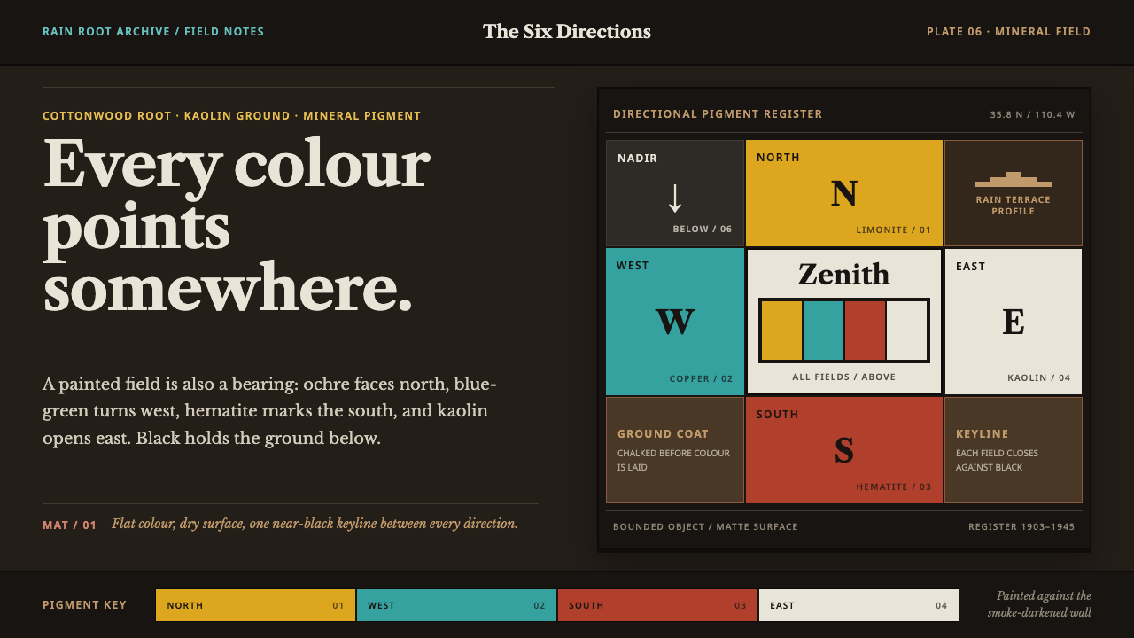 Hopi Katsina TihuEvery colour is a direction. Matte mineral fields meet in smoke-black keyline…