What is Sámi Lavvu?
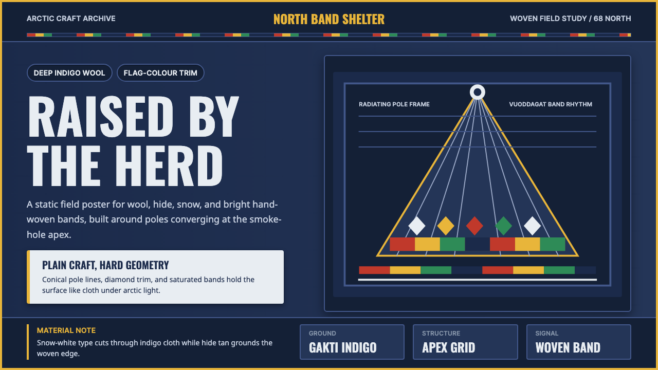
A herding people's tent, clothing, and craft become an interface language — deep indigo wool, radiating pole lines, and bands of flag-bright color woven at the edges.
Sámi Lavvu in brief
This system is built from the material culture of the Sámi, the Indigenous people of Sápmi — the arctic region spanning northern Norway, Sweden, Finland, and Russia's Kola Peninsula. Its two anchor references are the lavvu, the portable conical tent used by reindeer-herding families for shelter on the move, and the gákti, the traditional wool garment whose color and trim announce a wearer's home region, family, and status at a glance.
Visually, the palette leads with a deep, near-black indigo — the traditional gákti wool color — set against arctic snow-white and a warm reindeer-hide tan. Cutting across those grounds are bands of hand-woven trim in flat, saturated red, yellow, green, and blue: the same four colors that appear on the Sámi flag. Nothing here is pastel. The craft this system draws from was made for visibility across snow and distance, so color reads as flag-bright signal rather than decorative accent.
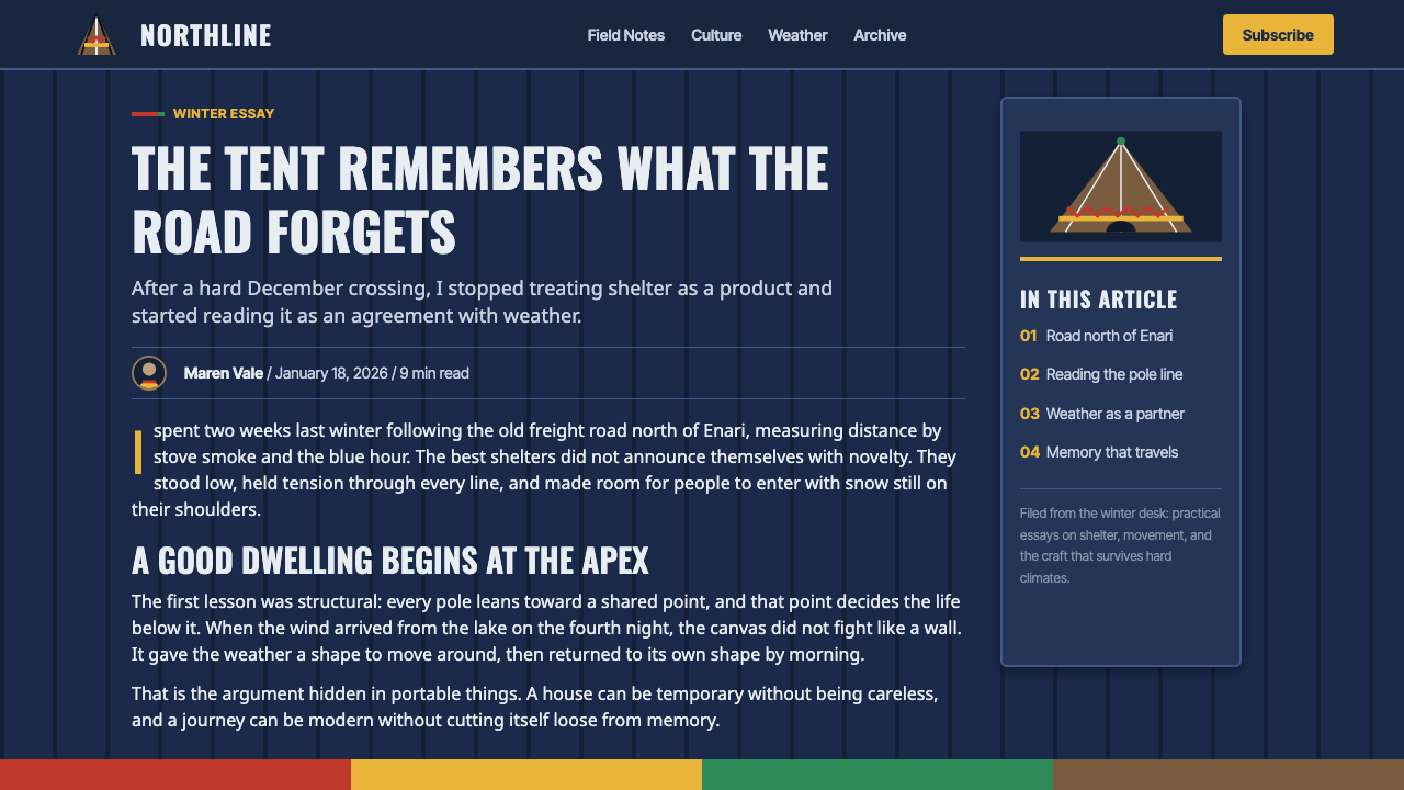
Structurally, the system borrows the geometry of the tent itself. A lavvu is built from poles that lean inward and converge at a single point above a smoke hole, so radiating, converging lines read as a native compositional device rather than an imported motif. Layered against that structural geometry are the smaller repeating patterns of the woven bands — zigzags, diamonds, and stripes — used the way the Sámi themselves use them: as borders, dividers, and marks of identity, not as filler ornament.
Where does Sámi Lavvu come from?
The Sámi are Europe's northernmost Indigenous people, with a documented presence in Sápmi stretching back millennia and a semi-nomadic reindeer-herding economy that reached its classic form well before 1900 and continues, in adapted form, today. Reindeer herding shaped nearly everything about the material culture this system draws on: the lavvu had to be light enough to pack onto a sled or a reindeer's back and quick enough to pitch that a family could move with the herd's grazing pattern through an arctic year.
The gákti and its woven trim, vuoddagat, carry information the way a uniform or a coat of arms would in other cultures. Historically, the cut, color, and pattern of a person's gákti signaled which of Sápmi's regions they came from, and details in the trim could mark marital status or family lineage. This is craft as language, made by hand over long winters using wool, tin thread, pewter, and leather — the tradition collectively known as duodji, which spans everything from knives and drums to woven bands and silverwork.
That same visual vocabulary carries political weight. The Sámi flag, adopted in 1986 at the 13th Sámi Conference, is built from the four colors of the gákti trim — red, green, yellow, and blue — arranged in a circle referencing the sun-and-moon symbol found on old Sámi shaman drums. Its adoption came during a period of growing Sámi political organizing across Norway, Sweden, Finland, and Russia, asserting a shared Indigenous identity across national borders that had otherwise divided Sápmi.
Sámi visual culture also produced its own fine artists working against a long history of colonization and suppression of Sámi language and dress. Early twentieth-century painters and printmakers began exhibiting Sámi subject matter as fine art rather than ethnographic curiosity, and by the late twentieth century, contemporary Sámi artists were using traditional techniques like textile and embroidery to make explicitly political work — connecting duodji craft directly to Sámi land rights and cultural survival movements that continue into the present.
What defines the Sámi Lavvu look?
Color
A deep, saturated indigo carries most surfaces — the color of dyed gákti wool, never a cool corporate navy. It sits against arctic snow-white and a warm hide tan, with the four Sámi-flag colors (red, yellow, green, blue) reserved for bands, badges, and accents rather than large fields. Every hue is flat and fully saturated; nothing is muted or pastel, because the reference craft was made to stay legible against snow.
Typography
Lettering leans bold, condensed, and upright — closer to expedition signage or a woven name-band than to a soft editorial serif. Headlines read as if they were stitched or stamped rather than printed, with generous letter tracking on smaller labels to keep dense information legible at a glance, the same way a gákti's trim communicates status from across a room.
Radiating Geometry
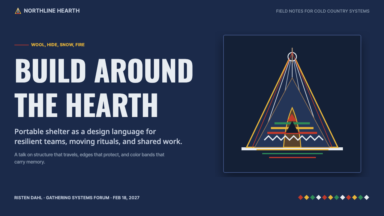
The lavvu's structural logic — poles leaning inward to a single apex above the smoke hole — becomes a recurring compositional device. Lines converge toward a focal point rather than running parallel or symmetrical, giving layouts a sense of gathering inward, like a shelter closing over a fire.
Woven Band Motifs
Borders and dividers draw directly from vuoddagat trim patterns: tight repeating zigzags, diamonds, and stripes rendered as flat bands rather than fine embroidery detail. These bands do structural work — marking a section edge, separating a header from content — the same role they play stitched along a garment's hem or cuff.
Layout Rhythm
Large flat fields of indigo or tan dominate, punctuated — not filled — by narrow bands of the flag colors. This mirrors how a gákti actually distributes color: a big block of wool cloth carries most of the visual weight, and the woven trim appears only at edges, seams, and hems, never spread across the whole surface.
Craft Honesty
Nothing here imitates luxury materials or courtly ornament. Textures read as woven wool and tanned hide, edges as hand-finished rather than machine-precise, and every decorative element traces back to a duodji technique that had a practical origin — warmth, durability, or signaling — rather than being invented purely for visual effect.

Who shaped Sámi Lavvu?
The herding families of Sápmi are the actual authors of this visual language — not a single studio or designer, but generations who developed the lavvu's portable structure and the gákti's coded color system to fit the practical demands of a nomadic arctic life. Their duodji craft traditions remain living practice today, passed down and still made by hand.
Savio, born in northern Norway in the early twentieth century, is regarded as the first Sámi person to work as a professional visual artist, known for bold woodcut prints depicting Sámi reindeer-herding life and arctic landscapes. His work helped establish Sámi subject matter as fine art in its own right, at a time when Sámi culture faced significant pressure to assimilate into mainstream Norwegian society.
A contemporary Sámi textile artist working primarily in embroidery, Marakatt-Labba is known for large narrative works stitching together Sámi history, mythology, and political struggle — including the movement against the damming of Sámi land at Alta-Kautokeino. Her work treats traditional needlework not as craft separate from fine art, but as a primary medium for telling Sámi history on its own terms.
How do you use Sámi Lavvu today?
This is a bold, high-contrast system best deployed where a brand wants to feel rooted, resilient, and unmistakably crafted rather than generic. It is not a subtle style — the flag-bright bands and deep indigo grounds make a definite statement, so it rewards products and stories that actually want that weight and directness.
On a slide cover, the radiating pole geometry gives a natural, non-cliché way to frame a title: converging lines drawing the eye to a single point, with a woven band running along one edge as a signature device. Content slides work best as large indigo or tan fields with information organized in clear blocks, using thin woven-pattern rules to separate sections rather than soft dividers or drop shadows. Data visuals should stay flat and boldly colored — bars and segments in the flag palette read as confident rather than folksy when kept geometric and clean.
For web interfaces, the palette's restraint matters: use the indigo and tan as the dominant surface colors, and let the four accent colors appear only in small, deliberate places — a status badge, an active tab underline, a category tag — echoing how the woven trim appears only at seams and edges on a real gákti. Dashboards benefit from the radiating-line motif as a subtle background or divider treatment rather than a literal illustration.
In editorial and marketing contexts, this system supports stories about heritage, craft, sustainability, and resilience particularly well — anything that benefits from a sense of hard-won, hand-made authenticity rather than polish for its own sake. A full-bleed indigo section with a single woven-band accent line can carry a strong statement headline without needing a photograph to do the emotional work.
The most common mistake is treating the flag colors as a free palette to use everywhere at once — scattering red, yellow, green, and blue evenly across a layout turns the reference into generic 'folk pattern' decoration and washes out the deliberate restraint of the source craft. Keep large surfaces to indigo, white, and tan, and let the four accent colors stay rare and purposeful, the way they are on the trim of an actual gákti.
Sámi Lavvu — FAQ
Is this style specific to one Sámi region, or does it represent Sápmi as a whole?
It draws on shared, pan-Sámi material culture — the lavvu tent form, the general logic of gákti color-and-trim signaling, duodji craft techniques, and the Sámi flag — rather than the highly specific regional variations of any single Sámi community. In reality, gákti patterns and colors vary significantly from one part of Sápmi to another; this system reads as a general, recognizable expression of Sámi visual identity rather than a reproduction of one particular community's exact dress code.
Why is the palette so bold and saturated instead of muted arctic tones?
Because the reference craft itself is bold. Gákti wool and vuoddagat trim were made to be seen clearly across snow and distance, and the Sámi flag was deliberately built from flat, saturated colors with strong symbolic meaning. A muted, desaturated arctic palette would actually misrepresent the source — the real material culture this system draws from has always favored strong, legible color over pale or washed-out tones.
Does the woven band pattern need to be literal embroidery to work in a digital layout?
No — and it shouldn't be. The system translates vuoddagat patterns into flat, geometric bands: repeating zigzags, diamonds, and stripes rendered as clean vector shapes rather than textured embroidery renders. Trying to simulate thread texture or fabric weave tends to push the style toward kitsch; the honest move is to keep the pattern crisp and flat, the same discipline the source craft itself carries in its clean, repeating geometry.
What kind of products or brands does this style suit best?
It suits brands and stories built around resilience, craftsmanship, outdoor life, sustainability, and cultural heritage — travel and expedition products, outdoor gear, artisan or slow-craft goods, and any story that wants to feel rooted in a real place and a real practice rather than an abstract 'northern' mood board. It is a poor fit for anything that needs to feel light, playful, or corporate-neutral, since the palette and geometry are inherently emphatic.
Related design styles
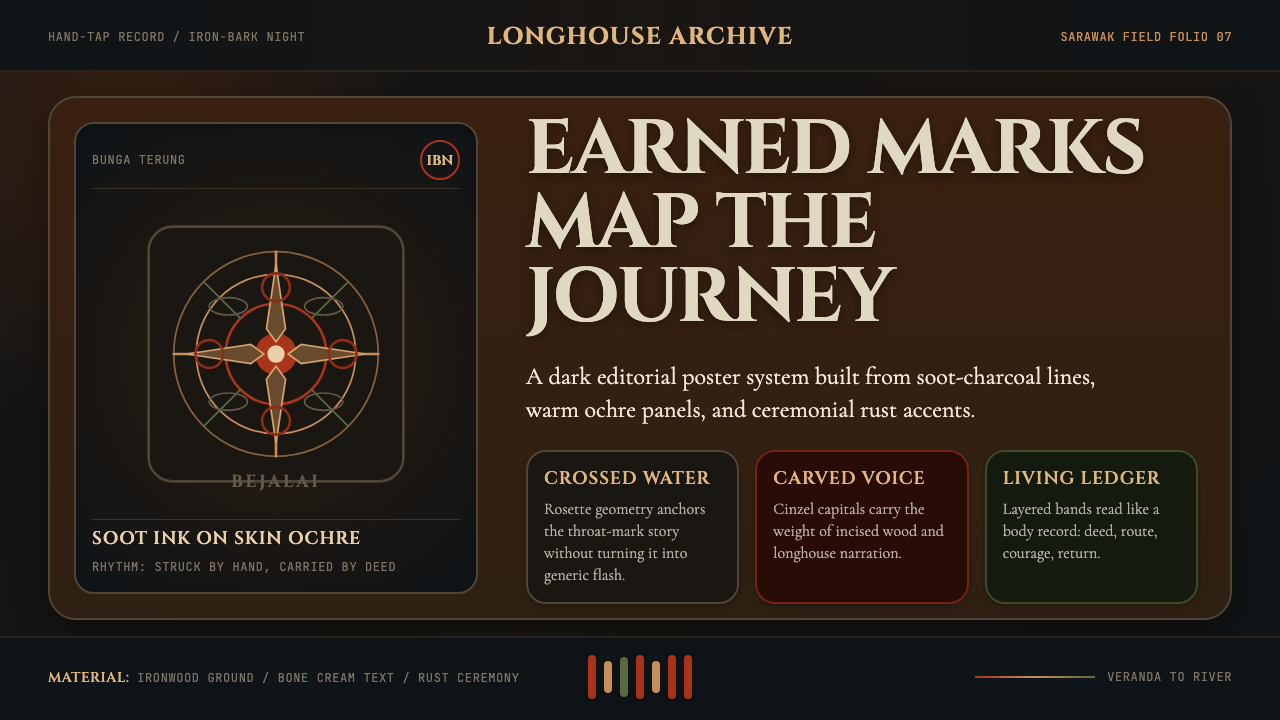 Dayak Borneo Tattoo (Iban)A living journey ledger. Soot lines, ochre panels, and rust rosettes feel han…
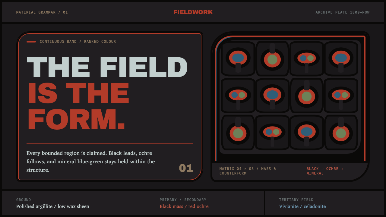 Haida FormlineEvery field is claimed. Black bands lead ochre and mineral blue-green through…
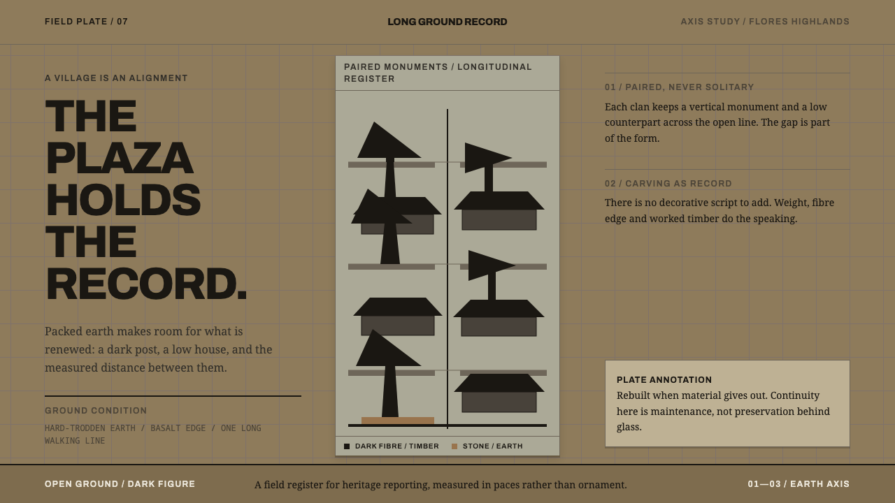 Ngada Ancestor PostsThe plaza is the record. Ijuk-black pairs stand on packed earth along one mea…
 Papuan Asaro MudmenRitual stillness commands the frame. Bone-pale Cinzel rises against jungle-da…
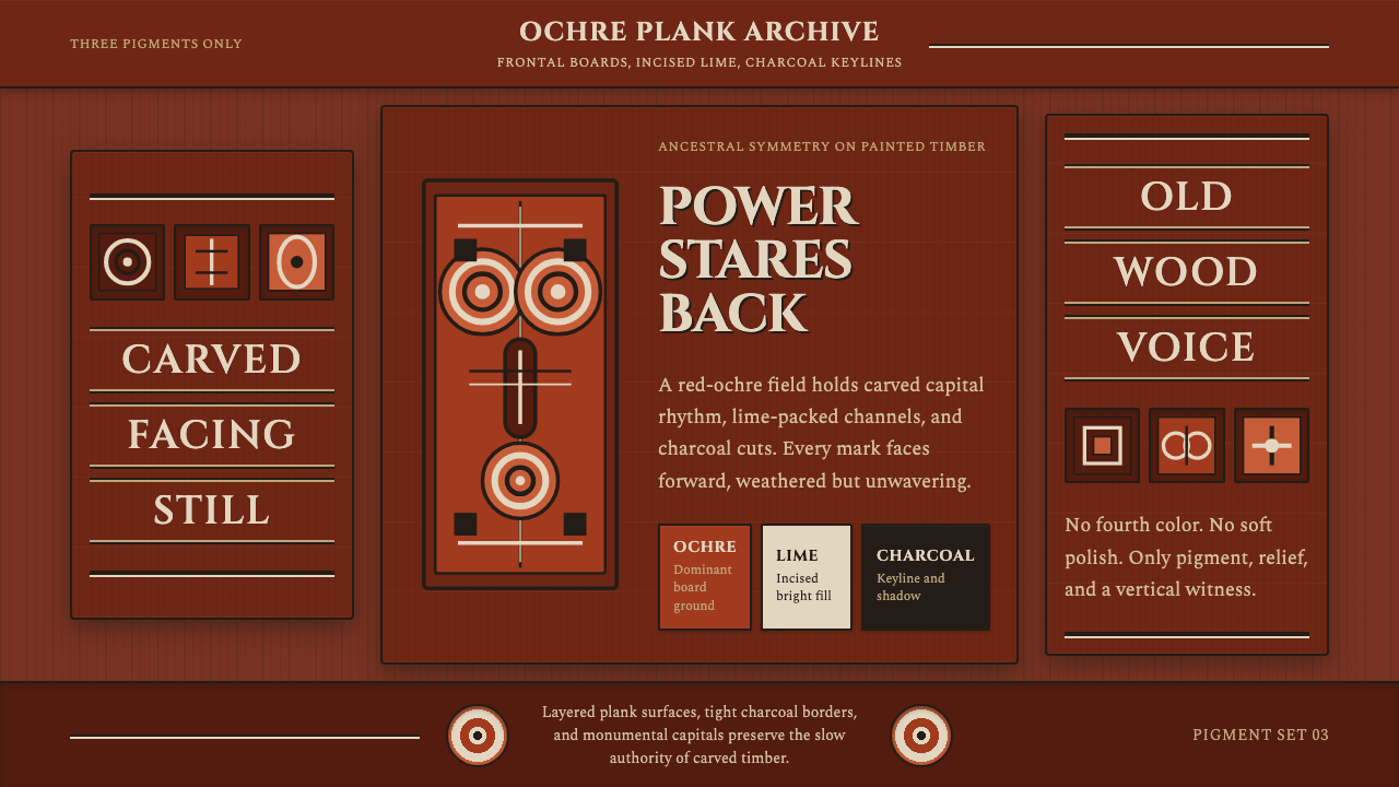 Sepik Spirit BoardThree-pigment power. Ochre, lime, and charcoal lock into frontal carved symme…
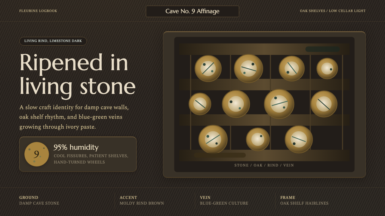 Cheese Affinage CavePatience reads as stone. Rind brown, mold green, and oak shelf grids glow in…